I foresee that in a couple of years pretty much any Web site will be easy to consume from within mainstream devices. I deliberately used the term “mainstream devices” instead of more specific terms like tablets and smartphones just to give a measure of how fluid the situation is.
I foresee that in a couple of years pretty much any Web site will be easy to consume from within mainstream devices.
Cell phones are a thing of the past, as modern as a dinosaur. The definition of smartphones is changing too and devices that are only two years old are significantly different in terms of capabilities and power from the latest ones. In this context, nobody can reasonably afford to stick to Web Forms Web sites that get stretched into the device viewport and need users to zoom in and out to read and follow links.
Cell phones are a thing of the past, as modern as a dinosaur.
A forecast is only a forecast and not an absolute truth, but I firmly believe in this vision and feel inspired to warmly recommend everybody to make plans for updating existing Web sites by adding device-specific views to existing pages.
So the question becomes: How should you do this? What's the mainstream approach to creating Web sites that look great and are highly usable on a broad range of devices?
For what I've seen, there are two main schools of thought. Some claim that you should always focus on the features that the device actually exposes. Called feature-detection, this approach is inherently client-side and uses CSS and JavaScript frameworks to decide which layout is more appropriate for the requested page. Also related to client-side solutions for multi-view sites is Responsive Web Design (RWD)-a popular design methodology that pushes liquid layouts that take advantage of advanced CSS capabilities to flow pieces of content into the available space.
Some claim that you should always focus on the features that the device actually exposes.
At the other extreme of the scale, there are server-side products. They prefer to sniff out the user agent string that the device's browser sends in and figure out statically some of the capabilities that the detected device is known to have. Then, based on this information, a server-side solution can intelligently serve ad hoc markup that is tailor-made for the requesting device.
Paraphrasing Billy Joel in “Goodnight Saigon,” I'd say that while in the thick of the fight, it doesn't really matter who's wrong and who's right. What really matters is crafting a solution that works and keeps - more than just makes - your client happy.
Paraphrasing Billy Joel in “Goodnight Saigon,” I'd say that while in the thick of the fight, it doesn't really matter who's wrong and who's right.
RWD is a good approach and server-side is also a good approach. Both can be used to work out solutions, and sometimes a mix of the two is even more powerful. Supporters of the client-side solution definitely scream louder than supporters of the server-side approach. This has attracted more and more people who bought the argument that feature-detection is smarter and quicker than any kind of search in an unmaintainable mess of weird user agent strings. RWD suggests that you programmatically look for a feature in the browser before using it and you do this regardless of the browser's name. This means that a new device is just checked for capabilities and there's nothing to update in the code to support new devices.
On the other side, the server-side family of solutions uses the browser's user agent as a key to access an internal database and read known capabilities of just that device. This requires hard maintenance work, as any new devices must be catalogued and code is likely to contain multiple branches.
On the other side, the server-side family of solutions uses the browser's user agent as a key to access an internal database and read known capabilities of just that device.
If you stop here, the winner seems to be clear: RWD is far better. This is what makes too many supporters of RWD scream loud and generate a lot of buzz. But I suggest you read on.
Personally, I'm in a sort of nowhere land. I started loving the RWD solutions I've seen; but when I had to sit down and work out solutions for customers, I could see a potential in the server-side approach that is far superior to anything you can do on the client.
In this article, I'll first discuss the pillars of the client approach and touch on some frameworks you can use. Next, I'll move to the server side of the force and discuss pillars and frameworks for a server solution. In doing so, I'll present an example based on ASP.NET MVC and WURFL.
Why People Seem (to Me) Scared By Server-side Solutions
Building a mobile site can really be an easy task if all you need is to adapt some content to a smaller screen. If this is the scenario you address, then you don't need to care about the effective capabilities of the requesting browsers. However, things can get a lot more complicated if you need to serve tailor-made markup to each device.
Most developers and technical managers remember well the nightmare it was a decade ago to build Web sites for a variety of browsers. There was a time when Internet Explorer had a different set of features than Firefox or Safari, or even just an earlier version of the same Internet Explorer. That really made authoring markup for pages a mess. It is said that about 70% of the code that makes up jQuery today deals with quirks of older browsers, most notably Safari and Internet Explorer. I'd even say that developers started forgetting the “browsers war” as jQuery-conquered ground; at the same time, the browsers war was definitely one of the factors for jQuery's rapid adoption.
It is said that about 70% of the code that makes up jQuery today deals with quirks of older browsers, most notably Safari and Internet Explorer.
In the mobile space, the order of magnitude of different devices is thousands, not dozens, as with desktop browsers a while back. If the browsers fragmentation of a decade ago scared you, what about the hugely larger fragmentation you can see for mobile devices today? This can be a real hell. Mindful of that, good developers tend to avoid device-centered solutions no matter what.
As you'll see in the article, a mobile server-side approach based on device detection is not as dumb as it was ten years ago when desktop browsers were the only option. You don't have to write sniffing code yourself and don't have to add a branch to your rendering code for each new device you intend to support. Things are much easier - and more powerful - at the cost of using ad hoc frameworks.
Responsive Web Design
The key lesson that developers and architects have learned is to focus on effective capabilities rather than pointing out a generic behavior associated with a browser's brand and name. This principle, however, is simple in understanding but yet hard in adoption. This is the starting point of RWD.
RWD sprang to life from the following example of lateral thinking. “Detecting devices is hard? Don't do it, then.” You grab a few handfuls of basic information from the client side (for example, the size of the browser window), set up ad hoc style sheets, and let the browser reflow content in the page accordingly.
The magic potion that gave life to responsive Web design is CSS Media Queries.
The magic potion that gave life to responsive Web design is CSS Media Queries.
Introduced with CSS 3, Media Queries is a syntax for developers to define conditional CSS style sheets that the browser will load dynamically any time the window is resized or some other system event takes place. CSS Media Queries allows developers to easily create multi-view pages that can be consumed through devices of different screen sizes ranging from the 24 inches of a desktop monitor to the three inches of most smartphones.
It is key to note that CSS media queries are not specifically a technology for mobile development. However, the inherent power and flexibility of the solution makes it suitable for use in the building of a mobile site too.
The key benefit for developers is obvious. Developers write one set of pages and one back-end that targets the desktop size. Then designers come up with multiple CSS files to be applied as the size of the browser falls below a given threshold. For example, you can have two CSS files one of which is the default and the other that is applied only when the width of the browser window is less than, say, 480 pixels. This ensures that if the user resizes the browser window at some point the page layout changes to render the content in a way optimized for the tinier viewport. At the same time, if the same page is viewed with a smartphone, the CSS for small screens is automatically applied. One stone and two birds killed.
At the same time, if the same page is viewed with a smartphone, the CSS for small screens is automatically applied. One stone and two birds killed.
The good news doesn't end here. Why should you limit yourself to just two birds? By adding another screen size - technically called a layout break point - and another CSS file, you can create an ad hoc view when the screen size is between 480 and 800 pixels. In this way, you address tablets and mini-tablets as well. Do you need to support large screens, such as smart TVs? No problem. You just add another CSS file and one extra line in the master page for conditionally linking the CSS file.
It's really easy and it really works great. It works great - at least when you see demos of it. Setting up a RWD solution for a realistically complex set of pages may not be a walk in the park. Anyway, it not even be a mission-impossible task, as the number of case-studies is growing on a daily basis. Let's see what it means to work with CSS media queries.
Playing with CSS Media Queries
Browsers available on smartphones and tablets can automatically scale the original Web site to the actual size of the screen - referred to as the viewport. Given the different dimensions of site view and device screen, the content displayed to the user is hardly legible without zooming. The idea behind CSS media queries is to instruct the browser to use a viewport that matches exactly the physical screen and to force a layout that fits well in the available real estate.
The question is: How many different screen resolutions you want to support? The answer depends on the expected audience and also on the content to render. Consider that when you enable media queries, you can have a different layout even if the user simply resizes the browser window. However, there's a huge difference between a desktop browser resized to a width of 400 pixels and a smartphone screen of the same size. They're quite different as far as computing power and resources are concerned. CSS media queries, though, are unable to distinguish on a per-device basis.
Consider that when you enable media queries, you can have a different layout even if the user simply resizes the browser window.
Let's say that this isn't an issue for now and assume it's acceptable from a business viewpoint to focus only on the size of the viewport. Here's how CSS media queries can help.
First, you decide how many resolutions you intend to have a different layout for. A sample classification might consist of the following breakpoints:
- Up to 480 px
- Up to 800 px
- Beyond 800 px
Nothing prevents you from adding more breakpoints, such as:
- Up to 320 px
- Up to 768 px
- Up to 1024 px
- Up to 1200 px
- Beyond 1200 px
For each breakpoint, you create a distinct CSS file that takes care of styling elements, including flowing them toward the bottom of the screen or hiding some. You can also decide to reference smaller images, if your pages link static images.
You can reference such CSS files using a slight variation of the classic syntax for the LINK element:
<link type="text/css"
      rel="stylesheet"
      href="view320.css"
      media="only screen and (max-width: 320px)">
In this case, the file view320.css will be used only when the page renders on a screen and when the browser window is no larger than 320 pixels. When media queries are used and no match can be found, no style sheet will be applied to the page.
Historically, the media attribute indicates the medium for which the CSS is intended - screen, printer, TV, video terminals, and more. In modern browsers that support the full CSS 3 standard the value of the media attribute can include a query that selects the medium as well as some run time conditions.
The CSS media query language is based on a pair of Boolean operators - and and not - and a few browser properties. The table below lists the browser properties that you can use to select the most appropriate style sheet.
The full documentation about media queries can be found at https://www.w3.org/TR/mediaqueries-3/.
Note that device-width, device-height as well as width and height properties also support min/max prefixes. To be precise, the CSS media query standard contains more properties, but those in the table are the most frequently used.
The only keyword you will often find at the beginning of media query expressions doesn't really play a functional role. The keyword is added for the sole purpose of keeping older browsers away from the media query statements. Older browsers, in fact, don't understand the media type when it is prefixed with only and blissfully go ahead with their rendering.
You can use the media query expression within the LINK element of the host page as shown earlier. In this way, you end up with one distinct CSS file for each breakpoint. You can also create a single CSS file that contains multiple media sections, as below:
@media screen and (min-width: 480px) {
    body {
        background: yellow;
    }
    :
}
@media screen and (min-width: 800px) {
    body {
        background: blue;
    }
    :
}
I prefer multiple CSS files that help to keep each rendering scenario neatly separated. Whether you create a single file or multiple files, consider that in an RWD solution, you deal with a ton of CSS settings that are repetitive, for the most part. For this reason, it may be worth taking a look at dynamic stylesheet frameworks like LESS (https://lesscss.org/). Frameworks like LESS let you create the CSS settings programmatically using programmer-friendly constructs like variables and functions.
Whether you create a single file or multiple files, consider that in an RWD solution, you deal with a ton of CSS settings that are repetitive, for the most part.
In Table 1, you'll find two similar-looking properties: width and device-width. As mentioned, the former refers to the browser's width and the latter indicates the device screen width. For adaptive rendering, you should always be using width. However, on mobile devices (i*.e.,* smartphones and tablets) any application is always available in full-screen mode so there's really no actual difference between the two. In this regard, Windows 8 tablets are notable exception because they let applications run in snapped and filled mode and not just in full-screen mode. Understanding the real difference between width and device-width helps you avoid pitfalls.
To prevent a mobile browser from scaling the content to fit the actual screen size, you should always use the VIEWPORT meta tag.
Another gotcha to avoid is automatic scaling of the rendered content operated by mobile browsers. To prevent a mobile browser from scaling the content to fit the actual screen size, you should always use the following meta tag:
<meta name="viewport" content="width=device-width; initial-scale=1.0">
Introduced by Apple for Safari Mobile a while back, the viewport meta tag is today considered a standard.
Fluid Layout
What you have seen so far is not really a responsive layout. It responds to dynamically changing conditions, but it is not as prompt as you might desire. If your design caters only for a few preset breakpoints, users will get the same layout whenever their browser width falls in between two breakpoints. For example, suppose you have the following:
@media screen and (min-width: 480px) {
    body {
        background: yellow;
    }
    #container {
        width: 480px;

    }
    :
}
@media screen and (min-width: 800px) {
    body {
        background: blue;
    }
    #container {
        width: 800px;
    }
    :
}
You have one breakpoint set when the browser width reaches 480 pixels - at that point the background becomes yellow and the container element is set to 480 pixels. You can enlarge the browser window but you won't notice any change until the width reaches 800 pixels. Let's take a screenshot at 600 pixels, as in Figure 1.
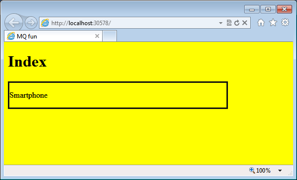
The CSS didn't change because the next breakpoint has not been reached yet. Because the layout uses fixed measures, you have some empty and unused space.
The impact of unused space can be mitigated by adding more breakpoints and then by authoring and maintaining more CSS files. However, for non-toy sites, you can't realistically deal with more than three or four breakpoints.
A truly responsive layout is a layout that adapts to any change in the width and/or height of the browser window. To achieve this, you need to build your layout using CSS measures based on ems or percentages. In this way, your design can scale up and down with nearly no limits. This is also sometimes referred to as a fluid or proportional layout.
A truly responsive layout is a layout that adapts to any change in the width and/or height of the browser window.
In CSS, you can use a number of units to set width, height and font sizes. A unit that is becoming increasingly popular is em. One “em” equals the current font size; subsequently, “1.2 em” increases the current font size by 20%. Pixels and points are both fixed unit and can't scale with the size of the window. Percentage and em, instead, are both relative measures-although relative to different things. The unit “em” is always relative to font size, whereas percentage is relative to the containing block (e.g., BODY or DIV). A percentage can also be applied to a font size. In this case, it indicates a variance related to the parent font size. In general, I'd say that using percentages to express dimensions of Web elements (blocks and text) is more reliable and consistent across browsers.
Having said that, a fluid layout results primarily from expressing whatever is in the layout through percentages.
Frameworks for RWD
It should be self-evident so far that creating a fluid layout on top of the same set of Web pages is a nice idea, allows for impressive demos, but also requires a lot of work and fine-tuning to produce real-world sites.
I see here an analogy with the invention of the wheel. There's no doubt that the wheel is a quantum leap and the enabler of a long list of opportunities, but why reinvent it each and every time?
There's no doubt that the wheel is a quantum leap and the enabler of a long list of opportunities, but why reinvent it each and every time?
Conceptually speaking, building a fluid layout is no big deal: All it requires is relative measures and containers of child elements. You can build that using DIV elements and CSS attributes such as float and inline-block. You can express width and sizes using em and percentages. It all works in the end; but it takes time and, let's say it, it's boring and annoying.
That's why a growing number of RWD frameworks are emerging. Personally, I experienced this already in my nearly twenty year career. The first time was when the industry was looking for the “perfect” format for digital images. There was a time in the 1990s in which we went close to the umpteenth religious war between supporters of lossless formats such as BMP and fans of lossy-but-smaller formats such as JPEG and GIF. For a while, we also had a fractal format that promised to be the perfect fit. It took a few years, but in the end, we had a clear winner: JPEG.
Today, a new RWD framework comes out every day. I don't know which one is the best and which one will eventually be the winner. For me, all that matters is that I can find help and do what I need to do on time and within budget.
For me, all that matters is that I can find help and do what I need to do on time and within budget.
In this regard, I currently have only one certainty: For painless RWD, you take one of the two routes. If you're writing the HTML layout yourself, then you likely need to pick up an existing RWD framework; if not, you buy a HTML template that supports at least a few breakpoints.
Here's a very quick tutorial on a fairly popular framework for RWD: Bootstrap. You can download it from https://getbootstrap.com/.
Once you download files, you set up your pages as below. If you're using ASP.NET MVC, you can recreate the structure below in your _Layout.cshtml file:
<!DOCTYPE html>
<html>
<head>
    <meta charset="utf-8">
    <title> </title>
    <link rel="stylesheet" href="Content/Styles/bootstrap.min.css">
    <link rel="stylesheet" href="Content/Styles/bootstrap-responsive.min.css">
</head>
<body>
    :
</body>
</html>
Bootstrap creates a fixed or fluid layout. It offers CSS styles that you apply to elements in your layout to move them around properly within a given container. If you're interested in a fixed layout that only supports a fixed number of (hard-coded) breakpoints, you import only bootstrap.min.css; otherwise, you include both files. Needless to say, you can edit breakpoints by simply editing CSS files. Here's how to create a flexible container.
<div class="row">
    <div class="span4">
        <h2>Great for desktop</h2>
        <p>Lorem ipsum dolor sit amet, ... </p>
        <p><a class="btn" href="#">More</a></p>
    </div>
    <div class="span4">
        <h2>Mobile-friendly</h2>
        <p>Lorem ipsum dolor sit amet, ... </p>
        <p><a class="btn" href="#">More</a></p>
    </div>
    <div class="span4">
        <h2>Not optimized</h2>
        <p>Lorem ipsum dolor sit amet, ... </p>
        <p><a class="btn" href="#">More</a></p>
    </div>
</div>
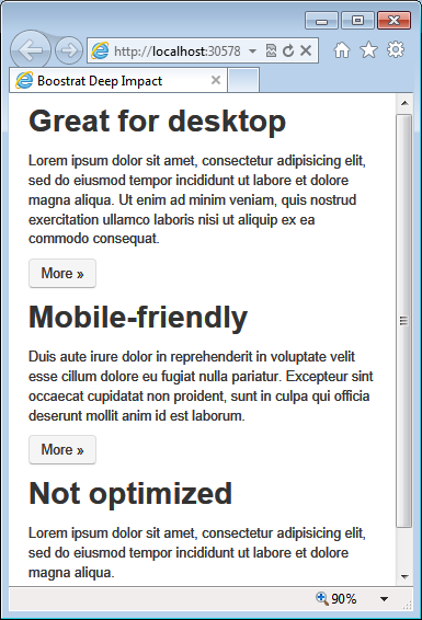
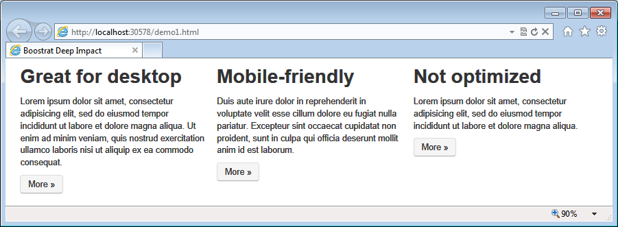
You use the row class to define a container that spans horizontally. You use the spanX class to define a child block that aligns to the left. You can easily fit as many child blocks as you like by calculating the “X” in the spanX class name. By design, Bootstrap has a grid system based on 12 columns and a span here represents a column. To have three columns in the layout, you set the span's index to 12/3: here's where span4 comes from. To have four columns perfectly aligned all you need to do is create the fourth DIV block and replace the class name to span3. Nicely enough, the resulting HTML page reacts very well to resize events. (See Figure 2 and Figure 3.)
You can certainly achieve the same results using your own CSS and HTML skills, but using a framework speeds things up significantly. Learning the intricacies of a framework certainly requires some time. As I see things, time spent in learning a good framework that you use over and over pays off fairly soon.
Bootstrap has a lot more features and reusable classes than are discussed here.
Bootstrap has a lot more features and reusable classes than are discussed here. Investigating it on your own and follow your own needs to prioritize aspects and areas of interest to delve into.
Where Does Mobile Fit in RWD?
You should know by now that RWD is definitely a powerful approach to Web design. It helps you in two ways: it makes your site look better whatever the browser's size and, through frameworks, it also enables non-designers to create nice templates quickly.
RWD, however, was not devised to serve mobile devices specifically, but it is so powerful and flexible that it can be used to adapt views of pages on nearly any mobile device.
RWD, however, was not devised to serve mobile devices specifically, but it is so powerful and flexible that it can be used to adapt views of pages on nearly any mobile device.
One of the key characteristics of mobile devices is a smaller screen-around 400 pixels for a smartphone and around 800-1000 pixels for a tablet. Once RWD renders your views well on those screen sizes, you should be all set. Right?
RWD requires CSS and CSS media queries to work. With CSS, you can do a lot, but CSS is not about programming. CSS media query properties tell you something about the device, but not all you may need to know. For example, you have no clue about the operating system, whether the device is mobile or not, whether it's a tablet, smart TV, or perhaps even a bot.
RWD lets you know that your page is currently hosted on a viewport, say, 800 pixels wide. But it can't tell you whether that viewport belongs to a tablet or a resized Internet Explorer desktop window. Sometimes, this is a detail that makes a huge difference for the end user; and subsequently for developers.
So the question is, where exactly does RWD fit into a mobile scenario? Is it really reliable to use RWD when you are about to create a mobile site?
Why Mobile Is Not a Desktop
A mobile device is different from a classic personal computer. It has a smaller screen-sometimes a significantly smaller screen. It doesn't have the same computing power and storage. It doesn't have the same power. It is touch-enabled. Furthermore, a mobile device is often used on-the-go and to do things quickly and immediately. Because of this, connectivity may come and go at any time and may sometimes be slow and unreliable.
When users are on a mobile device, they need to find options and actions that are one or two taps away; they don't need a lot of functions and information. They sometimes need information or aggregates of information different. Mobile users may need a different metaphor for work and definitely need you to devise the use-cases of the application carefully.
Mobile users may need a different metaphor for work and definitely need you to devise the use-cases of the application carefully.
Limited power - typically battery - is also problematic as it requires that your client code be as lightweight as possible and downloads kept to the very minimum.
The challenge I see these days is how we can find a programming paradigm that weds together mobile needs with desktop needs. The challenge I see many addressing is how to make mobile apps look and behave like they do on the desktop. In five years, we may have even more powerful devices, but this won't change the basic characteristics of the mobile device. Businesswise, also, there's the problem of the long-tail to address. How many devices you lose along the way (possibly leaving them to your competitors) by addressing only the high-end of devices?
The Server-side Approach
To overcome some of the structural limitations of RWD solutions, you need to add some server-side logic. This means that you identify the requesting device, figure out its capabilities, and serve ad hoc markup. This guarantees that an 800-pixel tablet will receive content that is tailor-made for a mobile audience whereas users who connect through an 800-pixel browser window will receive desktop-specific content.
With client-side logic, you can't determine if the browser viewing the page is hosted on a mobile device or in small-sized browser window.
With client-side logic, you can't determine if the browser viewing the page is hosted on a mobile device or in small-sized browser window.
When making the request, the browser identifies itself through the user agent. Subsequently, a deep analysis of the user agent string is in order to correctly identify the device. The most common approach for this kind of task consists of using the user agent string as the key to access a database of devices. Figure 4 explains.
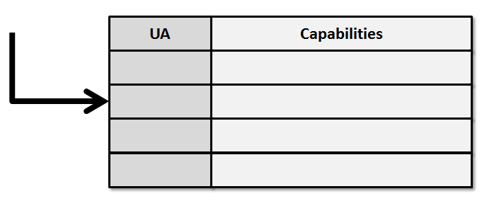
Who provides the database and parses the user agent string? If you had to write and maintain it yourself, that would be a nightmare many times worse than the browser hell of a decade ago-there are several thousand different mobile devices whereas at the time, there were only ten or perhaps twenty different browsers.
You need a framework to help you out with device information. There are quite a few out there, but none that I know of is completely free.
For some reasons, a server-side approach is perceived as one that leads to code duplication as opposed to RWD that builds on a single codebase. This is a false perspective of things. In a server-side approach, you have to provide different views in much the same way that you provide different CSS files when you implement RWD manually. However, having different views is precisely the benefit you're looking for if you opt for a server-side approach. On the server, you have the power to identify more precisely the device that is making the request and its known capabilities.
Another point that is sometimes raised against the server-side approach is that capabilities are guessed instead of detected.
Another point that is sometimes raised against the server-side approach is that capabilities are guessed instead of detected. So it is, in a way, a matter of trust and reliability. At the current stage of the browser technology, there's no way to reliably know about the operating system on the client; not to mention other specific aspects, such as touch support, radio system, SMS, streaming and so forth. If gaining access to these details is essential for you, the server-side route is the only reliable route. Let's see how to build an adaptive solution on top of ASP.NET MVC.
Display Modes in ASP.NET MVC 4
Even for RWD applications, you often have an ASP.NET site in the back. In an RWD scenario, though, you don't need to have distinct CSHTML views: each request is routed to the same view. The view includes CSS media queries and based on that, the browser picks up the appropriate style sheet.
In a server-side solution, you still have an ASP.NET Web site but each request is routed to a different view. The view-routing logic is not client-side and is not based on CSS media queries; it is simply up to you.
You start by deciding how many views you intend to support; you do that by identifying classes of devices. A common classification includes legacy devices, smartphones, tablets, laptops, perhaps smart TVs. You can easily see that these “classes of devices” more or less match the RWD breakpoints. The difference is that now a tablet view is only rendered on a mobile device and not when the page is requested in a small-sized desktop browser.
The difference is that now a tablet view is only rendered on a mobile device and not when the page is requested in a small-sized desktop browser.
So given an Index method on the Home controller, you create a number of distinct view files. For example:
Index.cshtmlIndex.smartphone.cshtmlIndex.tablet.cshtmlIndex.legacy.cshtml
Each is an independent view file and can render the content using its own layout. But what about the view model?
That mostly depends on your needs. Based on past experience, I hardly had the need to pass different views to different view models. Should different view models be required, you can do this:
public void Index()
{
    if (IsTablet())
        return View("index.tablet", tabletModel);
    if (IsSmartphone())
        return View("index.smartphone", smartphoneModel);
    :
}
This works, but admittedly it's neither elegant nor effective. I solve this issue by having a view model that is large enough to be the union of all possible data. With proper caching and various other specific tricks, you can manage to keep the overhead of getting unnecessary data for certain scenarios to a minimum. In this way, your controller code remains as lean as possible:
public void Index()
{
    var model = _service.GetModelForIndex(...);
    return View("index", model);
}
How would you manage the view routing in ASP.NET MVC without adding a long list of IF branches to each controller method? In ASP.NET MVC 3, you need to write your own view engine. In ASP.NET MVC 4, you use display modes. You add the following to Application_Start:
var desktop = new DefaultDisplayMode("")
{
    ContextCondition = (c => c.Request.IsDesktop())
};

var smartphone = new DefaultDisplayMode("smartphone")
{
    ContextCondition = (c => c.Request.IsSmartphone())
};

var tablet = new DefaultDisplayMode("tablet")
{
    ContextCondition = (c => c.Request.IsTablet())
};

var legacy = new DefaultDisplayMode("legacy")
{
    ContextCondition = (c => c.Request.IsLegacy())
};

DisplayModeProvider.Modes.Clear();
DisplayModeProvider.Modes.Add(smartphone);
DisplayModeProvider.Modes.Add(tablet);
DisplayModeProvider.Modes.Add(legacy);
DisplayModeProvider.Modes.Add(desktop);
Each instance of DefaultDisplayMode identifies a class of device for which you are providing a view. Each display mode is characterized by a suffix. Appended to the view name, the suffix points to the actual view file to use. For example, index.tablet.cshtml indicates the view file to use when the request comes from a tablet.
Device Description Repositories
In the snippet above, I use fancy methods, like IsTablet. Where do they come from? In the listing, they are presented as custom extension methods built on top of the HttpRequestBase class. Their actual logic, though, is up to you. Note that the ContextCondition property of the DefaultDisplayMode class is the following delegate:
Func<HttpContextBase, Boolean>
Here's the sample IsTablet extension method:
public static bool IsTablet(this HttpRequestBase request)
{
    var wurfl = WURFLManagerBuilder.Instance;
    var device = wurfl.GetDeviceForRequest(request.UserAgent);
    return device.IsTablet();
}
All that matters is that IsTablet analyzes the user agent string and the HTTP context to return a Boolean value. In the example, I use WURFL - an open-source device description repository (DDR) - to sniff the user agent into an object that summarizes the known capabilities for the requesting device.
WURFL is not the only DDR available; it is, however, the de facto standard, as it is the one used by big shots such as Facebook and Google. WURFL is available for ASP.NET through a Nuget package. WURFL is open-source, but it goes under the AGPL license, meaning that you need a license for any commercial use. For more information, see https://www.scientiamobile.com/.
Available for ASP.NET through a Nuget package, WURFL is the de facto standard for DDRs and is the one used by big shots such as Facebook and Google.
Summary
RWD and server-side are two ways to build multi-view Web sites. If you don't care to build mobile-specific views, then go for RWD. But RWD will hardly let you distinguish an iPhone from an Android and a tablet from a small-sized browser window. If you look for optimized mobile views, definitely go for server-side. Building server-side solutions is a breeze with ASP.NET MVC 4 and WURFL.
Finally, note that RWD and server-side are not mutually exclusive. In the context of a server-side solution, all you do is generate different chunks of markup. Nothing prevents you from adding CSS media queries to that markup if that helps your client rendering. On mobile devices, pages are forced to a fixed size, but on laptops, you can still enjoy the benefit of RWD when the user resizes the browser. Solving problems is matter of thought; it's never a matter of religion.
Table 1: These are the principal browser properties to build CSS media queries.
| Browser Property | Description |
|---|---|
| device-width, device-height | Width and height of the physical device screen. |
| width, height | Width of the rendering viewport - i.e., the browser's window. |
| orientation | Returns portrait when height is greater or equal than width. Otherwise, it returns landscape. |
| aspect-ratio | Indicates the ratio between width and height. It's a value such as "16/9". |
| device-aspect-ratio | Indicates the ratio between device-width and device-height. It's a value such as "16/9". |