In prior articles, I have shown how to create WPF-based client applications using the CODE Framework and the default themes it ships with. This is a great way to create applications quickly yet make them very reusable and maintainable. However, using the default themes is just the tip of the iceberg. CODE Framework’s theming system is completely open and the default options are just that: defaults. And it turns out to be surprisingly straightforward to create your own themes.
All CODE Framework WPF applications (and, in fact, all CODE Framework apps using any of the XAML technologies, such as WinRT) follow the same fundamental ideas for UI development: The developer creates a view model to represent the data and logic that goes with a UI, as well as a XAML-based view that defines the visual elements of the user interface. The framework then loads this construct into the overall application for display. The details on this can vary greatly. The user interface in question may be a standard “form” such as a customer search dialog. Or, it may be a popup dialog, or perhaps even a message box, a toast notification, or a status message. All of these examples follow the same pattern of using a view model and an associated view. Some of these scenarios also offer shortcuts. Message boxes, for instance, can be displayed with a single line of code that is practically identical to calling MessageBox.Show() in WinForms or raw WPF. But those are just shortcuts and the full-featured view model and view approach is always available for extra functionality.
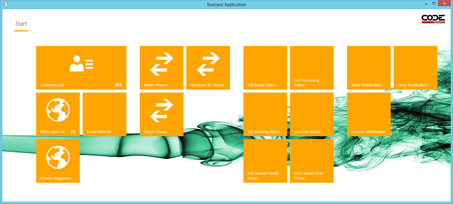
What makes CODE Framework exceptionally powerful is the way all these elements are loaded and displayed. Rather than providing a static and hardcoded approach, CODE Framework uses styles and themes to handle the overall UI. For instance, most applications provide a root window that hosts the application-specific UI components. This main window has certain characteristics. In a typical Windows-style application, it may feature a menu or a Ribbon. Or perhaps the main window follows the Metro-style of UI presentation and displays live tiles. See Figure 1 and Figure 2 for examples of differently styled versions of the same exact application main screen.
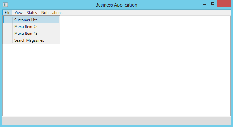
The main window also provides a way to load other UI elements. In some UI styles, views are opened inside the main window (perhaps in tabs), while others prefer to pop up a new stand-alone window for each form. All those aspects are stylistic choices CODE Framework defers to swappable styles implemented as XAML Resource Dictionaries.
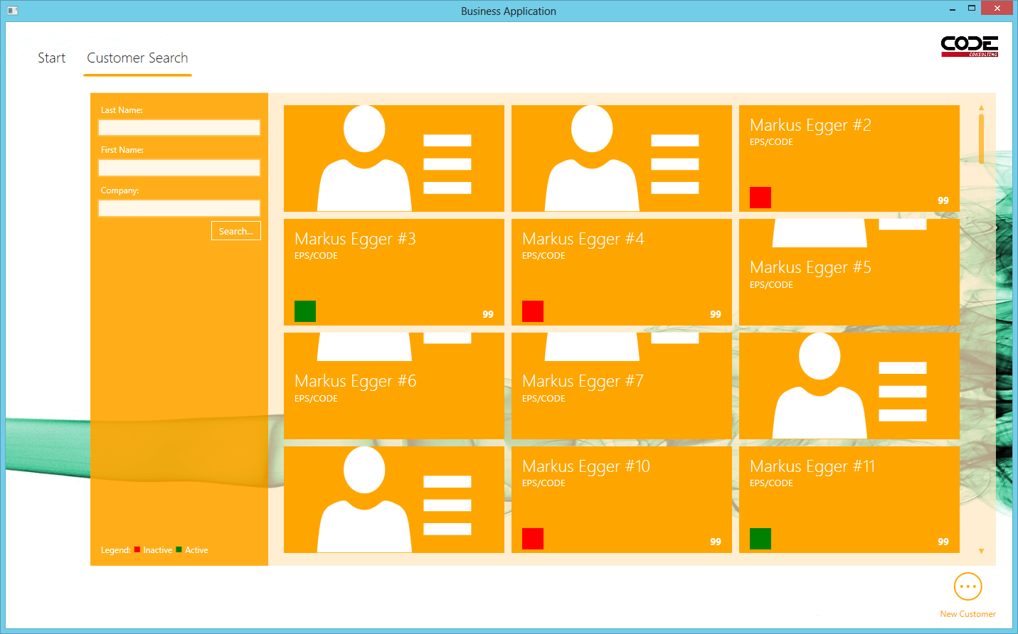
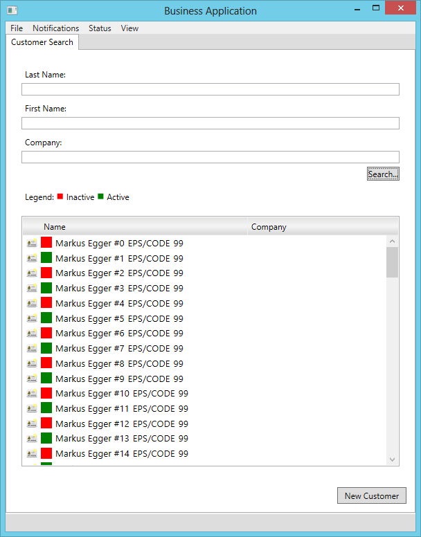
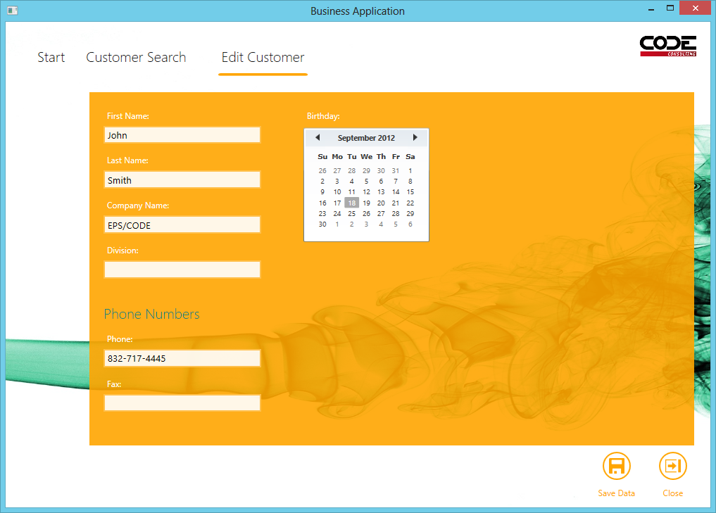
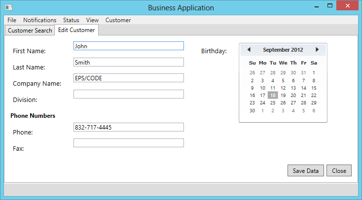
Furthermore, the framework provides other heavy-lifting styles and templates, such as the ability to create automatic screen layouts that are appropriate for a certain UI style, or standard data templates for items in lists, and much more. Figures 3 and 4 show two identical customer search screens but with different themes applied. Figure 5 and 6 show the same customer edit form with two different styles.
On a more simplistic but nevertheless very important level, themes define colors and font settings as well as a list of standard graphical elements (icons). In fact, in many cases, one can create the appearance of creating completely new themes simply by switching the color and/or font palettes.
First Steps: Changing Colors and Fonts
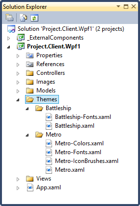
While it is possible to create completely new themes from scratch, the easiest way to get started is to modify the themes that ship out of the box. To follow my example, simply create a new CODE Framework WPF project by creating a new Visual Studio project based on the CODE Framework WPF MVVM/MVC Application project template. (If you do not have this project template, make sure you install the CODE Framework Tools as described in the sidebar.) This creates the basic project setup, which includes a “Themes” folder with sub-folders for the various themes the application supports (by default typically at least the “Metro” and “Battleship” themes). For convenience, key resource dictionaries are put into the default folders which provide a simple way to override defaults provided by the built-in themes (see Figure 7). Note that these are not the complete themes (those are compiled into the DLLs) but instead they are just some likely dictionaries you may want to override.
You can take a look at the contents of the resource dictionaries to discover that they mostly contain commented out settings. You can simply uncomment the ones you want to change and change their values. For instance, to change the default font used by Metro-style applications, you can open the Metro-Fonts.xaml file, uncomment the “FontFamily” line and change it to the following:
<FontFamily x:Key="DefaultFont">Broadway</FontFamily>
Similarly, you can change the default theme color by setting the following line in Metro-Colors.xaml:
<Color x:Key="CODE.Framework-Application-
ThemeColor1">DarkRed</Color>
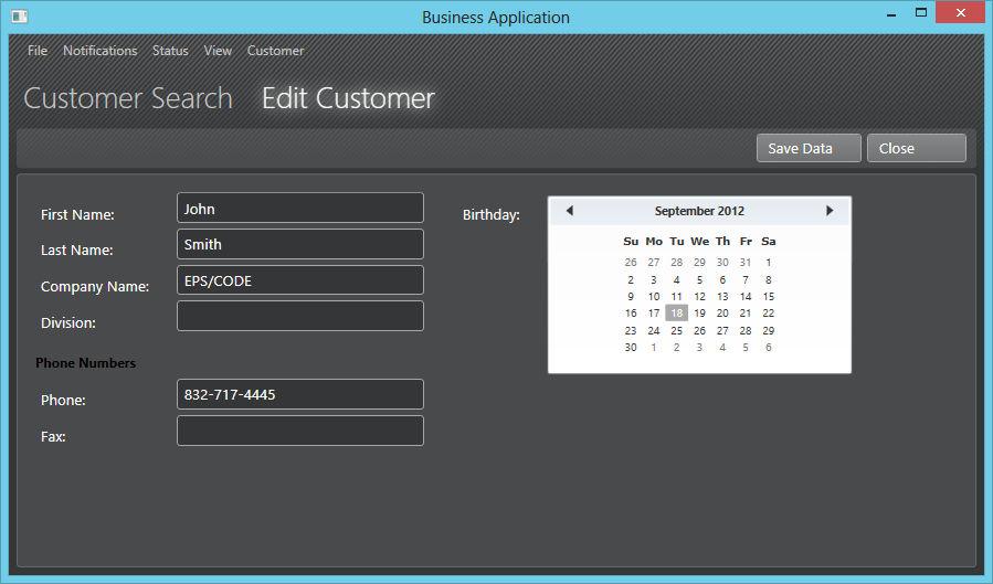
This simple change turns the UI from Figure 5 into the one shown in Figure 8. It is still fundamentally a Metro UI, but colors have changed (background, icons, labels,…) and the font style is now quite outside the Metro norm.

For a slightly more sophisticated customization of the main window, we can change the style for an object called Shell. The Shell is a special subclass of a WPF Window class, which we use as the main application window. The details of these internals do not really matter for theming. What is important is that the framework provides a default style for the Shell that sets its overall appearance (and even some behavior). The resource dictionary in which this style is defined is not automatically added to the project as source code (there would be too many such dictionaries overall and it would only be confusing and resource intensive to add them all manually) and it is normally just loaded from the DLL it is compiled into. However, we can easily retrieve that resource dictionary and add it manually.
To do so, download the “WPF Theme Resource Dictionaries” ZIP file from http://codeframework.codeplex.com">http://codeframework.codeplex.com (Downloads section). Find the “Metro-Shell.xaml” file and copy it into the Themes\Metro folder of your project. Note that this file does not load automatically when your app runs. The framework only loads a single theme resource dictionary automatically and that is the one of the same name as the theme itself. Since we are currently manipulating the “Metro” theme, the file that is automatically loaded is “Metro.xaml” in the “Themes\Metro” folder. In most scenarios, this file serves no purpose other than “holding everything together.” This means that all it contains is links to all the other resource dictionaries we want to load as part of the theme. Add another line with a reference to Metro-Shell.xaml like this:
<ResourceDictionary.MergedDictionaries>
    <ResourceDictionary Source="Metro-Fonts.xaml" />
    <ResourceDictionary Source="Metro-IconBrushes.xaml"/>
    <ResourceDictionary Source="Metro-Colors.xaml"/>
    <ResourceDictionary Source="Metro-Shell.xaml" />
</ResourceDictionary.MergedDictionaries>
Metro-Shell.xaml contains a number of different styles and resources. Most of them we will not have to touch for our purposes. At the very top, the file defines the style for the Shell class. For instance, it defines that background color as black. It also defines the “TopLevelViewLaunchMode” as “InPlace.” This is a special property on the Shell class that defines how popups are loaded. Are they to be shown in a separate window (Popup), or are they supposed to be displayed inside the main window as an overlay (InPlace). You can change this setting to stylistically change the behavior of the app as part of the theme. In our case, however, we are not interested in this three-line style and you can remove it if you want. (In fact, I would recommend it as it does us no good and just represents overhead.)
More interesting is the ControlTemplate resource that follows next (named “CODE.Framework.Wpf.Mvvm.Shell-Template”). This is the template that defines the exact makeup of the Shell. For instance, it defines that the Shell is composed out of a background image and a logo as well as a funky tab control that hosts all the “normal views” (the standard UIs that can open inside the Shell). We can make some visual modifications. For instance, we can remove the background image in the top-level Grid and instead just make the background white. We can also remove the Image that shows a logo entirely (or change it to something else or perhaps just change its size and position). We are also free to add other elements if we want, such as different logos or labels that display a copyright notice or any other WPF element.
The template also includes some important mechanical elements. For instance, it contains a ShellTabControl, which is a special subclass of the standard WPF TabControl, used to display open UIs in a Metro-style. It shows one tab page per open UI as well as an optional Start page (with a special header label). Note that a common approach to displaying views is to simply bind the actual UIs into the control as the ItemsSource. This is the grand secret behind displaying of the UIs in CODE Framework: When a UI is loaded, it is simply added to a collection called NormalViews (and there is a second collection called TopLevelViews which contains all the popup views) and this tab control then binds itself to that collection to display the UIs in a tabbed fashion. It is a simple mechanism that wouldn’t be immediately obvious to new WPF developers. And yes, you could replace this with a completely different control. You could also take a look at the template used for each page in the tab control, which defines how each and every UI is displayed (usually it just takes up the entire available space, but you could change that). For now, however, we will simply change one of the properties called “HomeTitle” to something like “My App’s Home.” Everything else in this resource dictionary remains the same for now. In fact, you can remove everything after the definition of this control template as it is redundant. Figure 9 shows the resulting new app homepage.

NOTE: Since the Metro-Shell.xaml file we downloaded was the one compiled into a DLL, some of the namespaces declarations at the very top are relative to resources inside the current DLL and thus do not have to include the name of the DLL. Since we are now using the same resource dictionary outside that DLL, the namespace declarations will change slightly, as they have to include the DLL name. If you are using a tool such as JetBrains’ ReSharper, the tool will offer to fix those references automatically. Without such a tool, you will have to fix them manually, or simply download the example that comes with this article.
Changing existing themes is a very useful approach to customizing your application to a look and behavior you like. Every single aspect of every single UI element in CODE Framework, whether that is as big as the main Shell, or a smaller dialog such as message boxes, or something as detailed as a small part that makes up a control, can be customized in this way. Take a look at the list of provided resource dictionaries and you will find that it is not nearly as overwhelming as it first seems.
Creating New Themes
Changing existing themes is good, but it is not nearly as exciting as creating completely new themes. When you create new themes, not only do you have a huge degree of control, but these themes are reusable and you can swap between different themes on the fly, even while the application is running.
I’ll demonstrate how to create a custom theme as an example. To create something representative, I have chosen to create a homage to Valve Software’s Steam service and Steam’s client software (to see this software in action, go to www.SteamPowered.com and download the Windows client software). It provides a nice visual style that is simple enough to be suitable for a demo. I shall call my new theme “Vapor.”
When creating new themes, there are several components every theme must support (such as providing a Shell) and other components that are optional (such as re-styling individual controls). Some of the required elements are not entirely trivial. For instance, a theme needs to load a main menu based on defined “actions.” Luckily, CODE Framework makes this easy because it provides ready-to-go components and helper objects for all the difficult bits. As a result, creating new themes is surprisingly easy considering the enormous amount of power, freedom, and reuse it provides.
I find it generally helpful to follow a logical path through required components as they are needed for an application to load. For instance, it makes no sense to create custom control templates when no Shell has been defined, as you could never start the application up to see if your template works. So let us start with first things first. When our application starts up, it will look to load a theme of a name specified in App.xaml and its “Theme” property, which by default is usually set to “Metro.” The framework follows a simple pattern when loading the theme, which means it looks in a folder called “Themes” (“Theme,” “Style,” and “Styles” are also supported) with a sub-folder of the same name as the desired theme and a file of the same name as the theme with .xaml as the extension. So for Metro, the framework looks for a file called “Themes\Metro\Metro.xaml.” To create our new Vapor theme, we thus simply create a “Vapor” folder as a sub-folder of the “Themes” folder and add a WPF Resource Dictionary called “Vapor.xaml.”
NOTE: You can also compile Themes into their own DLLs in which case the pattern followed is slightly different (instead of Metro.xaml, the system looks for ThemeRoot.xaml in that folder) to avoid conflicts between compiled themes and locally defined themes.
How do we modify our app to use that new theme? One way would be to change the Theme in App.xaml. This will work fine once we complete our entire theme, but initially, we are probably going to be missing a few required elements. For this reason, it is better to initially keep launching into an existing theme and then switch to the new theme on the fly. We can switch the Theme programmatically during runtime by setting the Theme property on the application object. Another way is to add a SwitchThemeViewAction to the StartViewModel (the view model used by the Shell). This is the approach taken by the example that goes with this article.
For our new theme resources, the first thing we really need is a style for our Shell. Add a new Vapor-Shell.xaml resource dictionary and link it from Vapor.xaml like so:
<ResourceDictionary xmlns="http://schemas.microsoft.com/winfx/
2006/xaml/presentation"
    xmlns:x="http://schemas.microsoft.com/winfx/2006/xaml">
    <ResourceDictionary.MergedDictionaries>
        <ResourceDictionary Source="Vapor-Shell.xaml"/>
    </ResourceDictionary.MergedDictionaries>
</ResourceDictionary>
This is where things get interesting. What should our Shell be like? The sky is the limit here and you can create anything you would like. In our case, we want to create something that looks like Valve’s Steam client. We thus create a Shell with a dark background and a graphical pattern over it. We would also like a dark menu across the top that shows all the available actions the user can take (replacing the live tiles of the Metro home screen). Furthermore, we would like to load all UIs right into this main window and place a list of all open UIs across the top in a nice large font with a glow effect.
Implementing this is actually relatively simple. We can conceptually split our Shell into two different areas: The menu across the top and the area that loads the UIs (views) taking up the rest of the window. We can create this setup using a WPF Grid with two rows sized “Auto” and “*”. We then create a background for the Grid using a Rectangle filled with a pattern brush (this is actually the longest part of this style as you can see when you download the example code).
The trickier parts concern themselves with the mechanics of making the menu and the UI display work. We have to populate the menu with the actions available to the user. These actions are defined in the view model associated with the Shell (called StartViewModel). So instead of hand-coding a certain style of menu, the developer simply populates this collection of actions in the view model and the style then picks up those actions and displays a certain UI (such as live tiles or menus) associated with those actions.
This sounds tricky, but luckily it is not, because CODE Framework provides out-of-the-box UI elements for you to use. In our case, where we want to show a conventional menu, we can simply use a control called ViewActionMenu and pop it into our template. We can simply bind this special menu control to a view model that implements actions and it would automatically populate itself. As luck would have it, the data associated with the Shell is already the right kind of view model we need. So we only need to bind it to the current data context and we are good to go. We can even get a bit fancier. Perhaps we do not just want an overall menu, but we also want possible additional actions from whatever view/UI might be open to be also displayed in the same menu (for example, an edit form could provide a “Save” or “Close” action that could be added to the File menu). The standard menu control provides this functionality as well. All we have to do is bind the SelectedView property to the currently open UI (which is going to be the selected item in a tab control, as we will see momentarily). Here is the XAML segment for the menu:
<mvvm:ViewActionMenu Model="{Binding}"
    SelectedView="{Binding SelectedItem,
    ElementName=OpenViews, Mode=OneWay}" />
This provides us with a working menu populated based on abstractly defined view actions. Of course at this point, the menu is just a standard Windows menu displayed in the standard light-gray color. To change this, we can create an implicit menu style and then define different colors in that style so all menus take on the desired look. Take a look at the style provided in the code sample (defined in Vapor-Shell.xaml at the very bottom). This is standard WPF styling and not specific to CODE Framework.
When you look at the example, you may also notice that every time any of the styles or templates refer to colors or fonts, these settings are not hardcoded but instead refer to other resources. This is generally a good idea and I implemented this by adding Colors.xaml and Fonts.xaml resource dictionaries (make sure you link them in from Vapor.xaml!) in which I define those settings.
This only leaves the need to show the open views. As mentioned above, we can achieve this by means of a tab control, where the content of each tab page is bound to the actual UI we want to display. The Shell’s view model exposes a collection called NormalViews, which provides access to the loaded list of UIs. The framework populates this collection automatically whenever the developer opens a new view (returns a View() from a controller class). We can use a standard tab control and bind it like this:
<TabControl x:Name="OpenViews" Grid.Row="1"
    ItemsSource="{TemplateBinding NormalViews}"
    SelectedIndex="{Binding SelectedNormalView, Mode=TwoWay,
        RelativeSource={RelativeSource TemplatedParent}}"
    Style="{DynamicResource
        CODE.Framework.Wpf.Mvvm.Shell-NormalViewsHost}" />
Note that both the ItemsSource and the SelectedIndex are bound, which means that not only does the tab control show one tab for each open UI, but it also communicates the selected UI back to the view model so the framework always knows which UI is the currently active one (which in turn gets picked up by the menu we created above as well as other things).
Creating the View Host
At this point, we are very close to a Shell that looks and behaves the way we want it to, except we are still using a simple gray tab control. To fix this, we have to also create a style for the tab control we are using. In fact, if you look at the code snippet above, you can see that the tab control is already calling for a style called “CODE.Framework.WPF.Mvvm.Shell-NormalViewsHost” (you can call it anything you want). This very style is also defined in Vapor-Shell.xaml (see example code).
Tab controls are quite simple, although they can be a bit confusing at first. The entire control itself is a combination of a row of headers (usually across the top) and an area that shows the selected tab/page in the remaining area below. Whatever data source is bound to the tab control (list of open views in our case) populates the list of tabs across the top.
In our case, we do not really want the tab control to look like a real tab control. Instead, we just want header labels to show up at the top, and we want the associated UI (view) to appear at the bottom when we click the header. We do not want to draw an outline around the tab control or anything like that. This means that the visual style of our tab control is very simple. We can set the background color and the border brush to null (which makes the control’s background and outline appear transparent).
To define the composition of the tab control, we define a template that contains a Grid with row heights of “Auto” (for the area at the top that will display the headers) and “*” (for the remaining content). For the header, we put down a horizontal scroll viewer (in case we have too many items to show them all) and slap a stack panel into it that acts as the “items host,” which means that WPF will automatically put the header items there (the title of the views in our case). Finally, we display the selected UI in the main content area using a ContentPresenter that is bound to the tab control’s selected content (which happens to be our view).
This gives us a tab control that works for our needs, but we have not defined the style for each header item yet (we have only defined that there are headers but not what they look like). We can do this in a separate style for each TabItem (tab items are automatically loaded for each tab in the control and they are technically separate from the tab control, hence the separate style). The tab item style defines a template that uses a label with a large font. There also are triggers that add a drop shadow effect when the mouse is moved over the label (so it looks “hot” when the user moves the mouse over) and another one that changes the foreground color to bright white when the tab is the selected one.
With this, our view setup for standard views is almost complete. In fact, it is already fully functional and we could use it as is, but I would like to add one more detail: Each view we load could potentially define its own list of actions. For instance, when we load a customer edit form, the developer will likely decide to create UI elements for data entry textboxes and so forth. However, the developer may not want to add controls for things like save buttons, as these controls should appear different in different styles (and it is also less work to not have to add those in manually). Instead, the developer may just populate a collection of actions in that view’s view model. In our style we want to respect that and display appropriate controls for those actions. To do so, we inspect the current view model to see whether it may have such a collection of actions, and if so, display controls for those actions. In the Vapor example, I would like to have a list of buttons going across the top in an element that looks like a simple right-aligned toolbar.
To implement this, we go back to our tab control style and set its ContentTemplate property (which defines the template for the selected page in the tab control) to yet another Grid with two rows (one for the toolbar and the other for the actual view). We put a ContentControl in the bottom row and bind it to the “View” property of the current data context (this is what actually makes the views show up as UIs).
In the first row, we put whatever UI elements we want to show up to represent actions in the view model. You can do this any way you want. The easiest way is to use CODE Framework’s special ActionGrid class, which is a special Grid that sets itself visible whenever the current data context has actions (implements the IHaveActions interface). Otherwise, this is a perfectly normal Grid inside of which I put a border element to provide something that visually looks like a toolbar type of element (as used by Steam). This leaves the problem of showing a UI control for each action. Again, this task is made easy as we can use the special ActionItemsControl element provided by CODE Framework. We can bind it to the current view model and define a data template for each action that is to be displayed (a simple button in this case). And that is it! This completes the mechanical aspects of the setup! Figure 10 shows the results.
Note: At this point you may be somewhat confused about what properties and features the data context of the Shell provides. It actually provides a number of different things, starting with the start view model as well as other aspects such as the collection of views. You may want to take a look at the Shell class (IntelliSense is sufficient) to explore the different members and properties it has. It provides a treasure-trove of information and functionality.
You may notice that the controls used in this view (such as the buttons, labels, and textboxes) look different from the standard Windows controls. The reason is that they all have their own control styles to slightly alter the appearance of these controls to match the visual style used by Steam. All that is standard XAML control styling. You can inspect the resource dictionaries included in the example for more information on how to do standard WPF styling and templating. Unfortunately, a detailed discussion of this subject is beyond the scope of this article, even though styling controls is a common and fundamental element for themes. However, since it is not specific to CODE Framework (other than the styles being automatically loaded if they are defined in theme-specific resource dictionaries), I will sidestep this topic for now.
More View Hosts
We have now created a view hosting setup that is quite functional and handles all the fundamentals we need to display a shell and standard views. There is a bit more to this, however. Not all views are created equal. If the developer writes code that returns a standard view, the framework adds that view to the NormalViews collection, which we are now handling properly. However, developers can also return special views, such as popup views. The framework adds those to the TopLevelViews collection. We are not yet handling that collection in any way. What we should do is add another host for top-level views. For instance, we could show the top-most view in the middle of the screen to simulate a window (as Metro would do it). The approach here is practically identical to our approach for the normal views, except that we would have to add a second host control and bind it to TopLevelViews.
A different approach is to open popup views in a separate window. To do so, we have to set the behavior for top-level views to “Popup” in the Shell, which causes the Shell to create a new window whenever the developer issues a popup. The Window used is a standard WPF window, but it tried to look for a specific style called “CODE.Framework.WPf.Mvvm.Shell-TopLevelWindowStyle.” So if you create a style of that name, the framework automatically applies it to such a popup window. (You can take a look at the source code for the Battleship style to see this in action.)
There are other special types of views as well. Message boxes are pretty simple because they are really just special popup windows. So defining view hosts for popup windows will automatically also enable message boxes. The only thing special about message boxes is that if they are popped up as special windows (rather than in-place hosted through the TopLevelViews collection), they use a style called “CODE.Framework.Wpf.Mvvm.Shell-TopLevelMessageBoxWindowStyle” rather than the standard window style mentioned above. This allows for a different visual appearance of message boxes compared to other popups (if desired).
Other special types of views are notification messages (typically shown for a certain period of time as a “notification toast”) as well as status messages (typically implemented as a status bar). Both are relatively simple and very similar to other views. For status messages, there always is only one status (the latest one set) which is exposed through a property called CurrentStatusView, which you can simply bind to in your Shell template. (Again, see the Battleship or Metro standard Shell templates for an example.) Notifications are implemented as a collection called CurrentNotifications and there may be more than one notification visible at any given time. They can usually be displayed as a fancy stack in the bottom right or top right corner of the application window. (See the Metro Shell for a good example.)
Other features we could implement could be tightly coupled to the view models in use. For instance, view models can optionally have a status indicator (if they implement IModelStatus as the standard CODE Framework view model does). This way, a model can indicate whether it is currently loading or saving or whether it has all actions completed. Certain features in CODE Framework automatically set this status (such as background loading) and developers are also free to set this status manually. This allows us to bind a UI element to this status and provide a useful indicator to the user. The Metro and Battleship skins automatically show progress indicators when the view model indicates an operation is in progress. You can see how this is done in the content template of the style for the shell tab control.
This is only one example for a tweak we could make. You can probably imagine using other properties on view models for similar purposes. Keep in mind that this works with your own extensions as well. Let’s say you are creating view models that have features the default view models do not have. Perhaps you are adding some sort of security mechanism for instance. The content template you create for your view host can look for that information and do something meaningful with it, such as setting a whole UI read-only based on the security setup. Again, the sky is the limit and the framework is architected to be completely open.
Layout Theming
The theme we have created so far enables us to launch an application and hosts its views in a new and exciting way. This is a great start, but CODE Framework supports so much more, and we should support a number of those things in our theme. For instance, the framework allows for extremely simple and quick UI definition and then let the framework handle the layout of the UI. The customer edit form shown in Figure 10 is an example for such as UI. The definition of the UI only contains a few lines of code defining labels and textboxes and their data bindings, as well as a layout template that sets to layout of the form. This layout template is called “CODE.Framework-Layout-EditFormLayout.” When this template is applied to a view (or a sub-section of a view), the framework picks up all the UI elements within the view and arranges them using a “layout panel” defined by the style. This is why various versions of the customer edit form shown in the screen shots of this article look slightly different. Some have the labels to the left, others above the textboxes. The views can easily adjust to different font sizes, and so forth.
While it may sound daunting to create styles that can automatically create screen layouts, it turns out to be relatively simple since CODE Framework handles all the hard parts for us (again, you may notice a pattern there). Unless we really want to go to a high degree of customization, we can simply use ready-made components and set a few properties. Here is an example definition of the edit form layout style used in my Vapor example:
<Style TargetType="ItemsControl"
       x:Key="CODE.Framework-Layout-EditFormLayout">
    <Setter Property="ItemsPanel">
        <Setter.Value>
            <ItemsPanelTemplate>
                <Layout:EditForm Margin="10" />
            </ItemsPanelTemplate>
        </Setter.Value>
    </Setter>
</Style>
This defines the style with the appropriate name and then defines the ItemsPanel. This is a standard WPF/XAML technique to define how items controls position their children. In this case, we use the special CODE Framework class called EditForm to perform the layout. The default behavior of this layout element works for us, so all we have to do is add a bit of a margin around it, so our controls won’t be pushed all the way to the edge of the available space. We could have also set a number of properties on this control (such as a property that moves the labels above the controls rather than to the left). I encourage you to take a look at this control (which you can easily explore just by using IntelliSense) and experiment with the different settings. The EditForm layout element is a powerful control that provides interesting features. To tease you with one: Take a look at “layout elasticity.” Check out the “Quick Tips” Documentation section on http://codeframework.codeplex.com">http://codeframework.codeplex.com for more on this subject.
NOTE: The layout templates provided by CODE Framework are an interesting starting point, and they are now widely used. However, as with everything in CODE Framework (yet another emerging pattern), you can freely extend this system and add your own layout panels. If you are interested in creating a layout panels (for CODE Framework or otherwise), see our article called “WPF Super Productivity: Using WPF and Silverlight’s Automatic Layout Features in Business Applications” published in Nov/Dec 2010 issue of CODE Magazine.
This is just one example for standard layout styles in CODE Framework. Ideally, your theme should provide all the standard ones. There currently are six standard layout styles (and we might add a few more). You can easily explore the ones that are there by looking at the theme resource dictionary source and at all files that have “-Layout-“ in their name (such as “Metro-Layout-EditForm.xaml”). Of course you may also be extending the layout options of each and every theme on your own. In that case, you should make sure that each of your themes supports the entire range of layout templates so you can swap the themes at will.
Graphical Resources
Another feature developers enjoy using with CODE Framework are the standard graphics resources the framework provides. For instance, you can show a save icon (typically a floppy disk symbol) using the following XAML:
<Rectangle Fill="{DynamicResource CODE.Framework-Icon-Save}"/>
The actual icon brought in by this depends on the resource defined by the style. Figure 11 shows the icons for Metro and Battleship styles respectively. Note that all these resources are high quality vector images, resulting in high quality and high performance display.

Each theme should support all standard images (see the documentation on Codeplex for a complete list of all the standard icons). The easiest way to do so is to copy a set from an existing theme. The Battleship theme defines its standard icons in a single resource dictionary called Battleship-Icon-Standard.xaml. Metro has a Metro-Icon-Standard.xaml equivalent. A good starting point for the Vapor theme is the Battleship version.
To change icons, simply take a look at the individual resources in those files and replace the actual visual with new vector images. The easiest way to get vector images is from our www.Xamalot.com website, which offers thousands of free clipart in XAML vector format. Simply choose to download them as a WPF resource dictionary and copy and paste the XAML defining the image into your resource dictionary.
Standard Data Templates
Yet another very powerful feature in CODE Framework is standard data templates. This enables developers to use existing data templates in various types of UIs (such as lists) rather than constantly having to create new ones. Imagine a customer search form as we have been using it as an example in this article. Developers could either create custom view models and custom views with a list and custom data templates, or they could use CODE Framework’s standard view model and tie it to one of over 50 standard data templates. The latter option is fast, simple, and eliminates most sources of errors. It cannot handle all scenarios, but it is very efficient for those scenarios where it works.
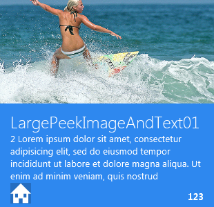
When using standard data templates, the definition of a list in a view can be as simple as the definition of the customer list used in many figures of this article:
<ListBox ItemsSource="{Binding Customers}"
  Style="{DynamicResource Customer-List}"
  ItemTemplate="{DynamicResource CODE.Framework-
StandardTemplate-LargePeekImageAndText01}"/>
This creates a ListBox where each item is defined by a standard template called “CODE.Framework-StandardTemplate-LargePeekImageAndText01”. Figure 12 shows the Metro version of this template. (You can find full documentation of all templates with a screen shot of each on Codeplex.) This particular template happens to display as a large standard live tile with a built-in animation. Note that different styles can define this template quite differently. In a Battleship style for instance, the same template would probably show all the information in a single row with columns from left to right.
An easy way to get started is to take a look at the StandardViews folder in the Metro or Battleship themes and copy all the files that are in those folders and create your own version of it. The best starting place for the Vapor theme is probably the Battleship version, which is closer in concept than the Metro approach.
Having to create all the theme files may be a daunting approach. However, it is not quite as bad as it seems. The CODE Framework architecture accounts for the lack of certain standard views. Rather than always assuming all views are there, the framework can use a standard view factory class that serves up the views by name and can substitute other views for missing ones. If you want, you can implement such a factory yourself. The following snippet shows an example implementation:
public class VaporStandardFeatures : IThemeStandardFeatures
{
    public IStandardViewFactory StandardViewFactory
    {
        get { return _standardViewFactory; }
    }

    private readonly IStandardViewFactory _standardViewFactory
       = new VaporStandardViewFactory();
}

public class VaporStandardViewFactory : IStandardViewFactory
{
    public FrameworkElement GetStandardView(string viewName)
    {
        if (string.IsNullOrEmpty(viewName) ||
            viewName == "None")
            return null;
        return new Fallback();
    }
    public FrameworkElement GetStandardView(
        Mvvm.StandardViews standardView)
    {
        if (standardView == Mvvm.StandardViews.None)
            return null;
        return GetStandardView(standardView.ToString());
    }
}
The framework can now use this class to request a standard view. Whenever that happens, the class can return anything it wants. In this case, regardless of the standard view requested, it always returns the same class called Fallback. This may result in a lot of monotony (and in a real scenario you should provide as many standard views as possible), but it guarantees that things continue to work, even when the required view is not available in that theme.
How does CODE Framework know to use this class? You have to tell it. And you can do so by defining two string settings in your theme’s XAML (I usually create a separate resource dictionary for these types of settings) which the framework looks for when a theme is loaded. Here are the two settings you need to add so the framework knows to invoke your factory:
<System:String x:Key="ThemeStandardFeaturesType"
  >VaporStandardFeatures</System:String>
<System:String x:Key="ThemeStandardFeaturesAssembly"
  >MyAssembly</System:String>
Note that the name of the class needs to be fully qualified (with the namespace) and the name of whatever assembly the class lives in.
Conclusion
Theme creation is a fascinating topic. The ability to very quickly create an application by defining user interfaces with standard layout styles, standard data templates, and standard view models where possible, and let the theme handle the rest is highly appealing. This article only scratches the surface of the abilities provided by this approach. Further themes could now be implemented that support completely different scenarios. Some themes may be optimized for touch. Others for the visually impaired. Yet another theme may be useful for presentations, while a completely different approach may be useful for mobile devices and phones. Yet the code base of the application using them themes need not change! It almost sounds like science fiction, but with this approach, it has become highly realistic and feasible. Not only is it possible to do this, but you will likely be faster implementing your app like this than you would be without the theming approach. What’s not to like?