Most programmers have a hard time making applications that look interesting and fun. We are great at creating functionality that makes the application do exactly what the user wants, but many applications often look very utilitarian. However, with just a few little XAML tricks, you can make your Silverlight or WPF applications look like an artist had a hand in their creation. In this article I will provide you with a couple of very easy XAML tips that you can use right away to spice up the images in your Silverlight and WPF applications.
A Simple Image Is Boring
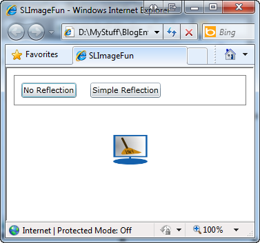
Adding an image is very easy to do in Silverlight and WPF. You simply add an Image control to a User Control or Window and set the Source property to the path where your image is located. That image is displayed within that image control in the location you specified on your User Control. In addition, you may size or stretch the image to fill up the space allocated to that image. As an example, the following code will produce the image shown in Figure 1.
<Image Source="Computer_Cleaner.png" />
The sample in Figure 1 is an example of a simple, utilitarian screen. Sure, it does the job, but the image looks flat and uninteresting. The buttons at the top of the page are just to navigate between the different samples in this article.
A Mirror Reflection
Through the “magic” of XAML you can make this image a little more interesting. One of the neat things you can do with XAML is to flip an image completely upside down by using a RenderTransform. Adding a ScaleTransform within the RenderTransform element on your image and setting the ScaleY property to minus one (-1) causes the image to flip upside down. Look at Figure 2 to see what this flipped image looks like.
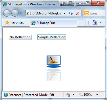
One of the neat things you can do with XAML is to flip an image completely upside down by using a RenderTransform.
Listing 1 demonstrates the XAML needed to create Figure 2 and the code will take a little explanation. First off, there are two image controls within a StackPanel control. The first image is the same as shown in the first example, but I’ve set the Name property and an explicit Height and Width. The second image uses data binding to use the same Source, Height and Width as the first image control.
Three additional properties are added to the second image control. First, the Opacity property is set to a value of .20 or 20%. This is what gives the second image the opaque, “reflection” look. A RenderTransform of a ScaleTransform with its ScaleY set to -1 is used to flip the image. The last property is an offset to make this image appear below the first image. This is done by setting the RenderTransformOrigin to “0,0.15”. There are two values separated by a comma in this origin property. They are the X and Y coordinates to set the center point of the render transform. Since we are not using ScaleX in the ScaleTransform, you only need to set the Y coordinate to a 15% offset of the center point. This is what moves the image a little below the first image.
A Background Using a Border
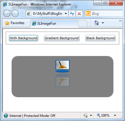
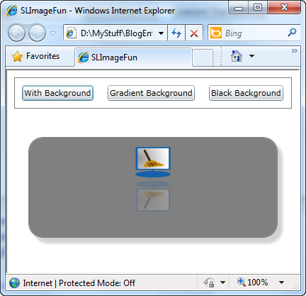
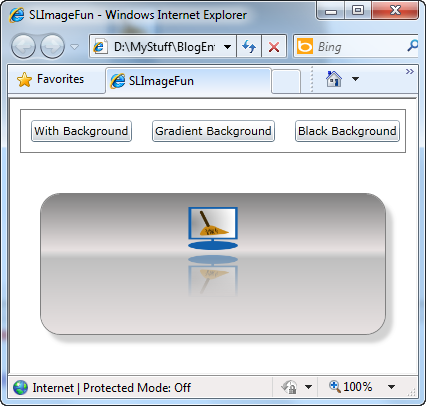
To make this reflected image really stand out you can place that image within an interesting background. An easy way to add a background is to place a <Border> control around the stack panel that contains your two images. Consider the following Border control where you set the Background equal to Gray. If you wrap this Border control around the StackPanel control in the last example, you will get something that looks like Figure 3.
<Border BorderBrush="Gray"
        BorderThickness="1"
        Background="Gray"
        CornerRadius="20">

  ... The Stack Panel with the Images is here

</Border>
While this does add a background, it is not very interesting and looks somewhat “flat”. To add some more interest to this background you might want it to pop out a little. You can accomplish this by adding a DropShadowEffect to the border. For example, just adding these next few lines of XAML within the Border control will add some dimension to your background as shown in Figure 4.
<Border.Effect>
  <DropShadowEffect Color="LightGray"
                    ShadowDepth="10" />
</Border.Effect>
Using a Gradient for the Background
The problem with using just a single solid color is your background looks sterile and artificial. If you were to look at one of the walls in your office or your house, would it look like it is all one color? Well, you know it is painted all the same color, but because of light being reflected on the surface of the wall from either sunlight or a lamp, the color of the wall actually looks like different shades of the same color.
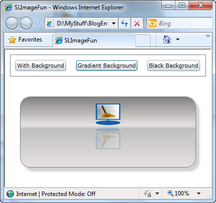
Just like that wall, using different shades of your background color on your background border will make any control on that background really stand out. In addition, this background will look more natural to your users, and thus your application will have a more appealing “feel” to it. Figure 5 shows an example of using different shades for your background. You accomplish this by using a LinearGradientBrush as the background of the Border control.
A Discussion of Linear Gradients
Now don’t let a LinearGradientBrush scare you; it is really not that big of a deal. Linear, or course, means lines, Gradient means gradations of something (think of shades of color) and a brush is just a term used to specify that you will be painting something on a surface. In this case, the surface is the background of the Border control.
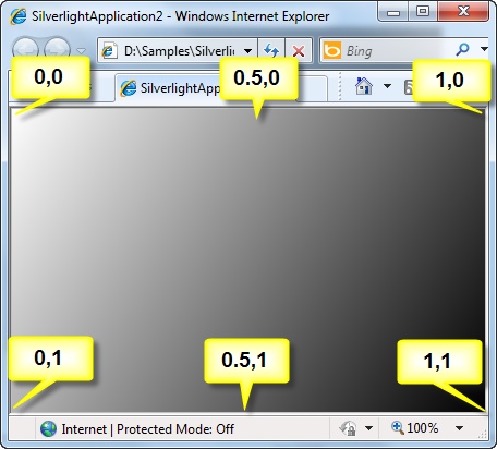
If you just add a Border control to a blank Silverlight user control or WPF window and write the XAML in Listing 2, you will end up with a gradient that looks like Figure 6. The StartPoint attribute on the LinearGradientBrush tells where to start the gradient within the control. In Figure 6 I added the coordinates for these StartPoint and EndPoint attributes so you can get an idea of how you can make gradients go one way or the other. I highly recommend that you try placing the XAML in Listing 2 into a user control and try changing the StartPoint and EndPoint attributes to get a feel for how this changes the direction of the colors. Remember that each number in the StartPoint and EndPoint is a decimal value between 0 and 1.
The StartPoint and EndPoint attributes only control where within the border the colors start and end. You specify which colors you start with and gradually fade into using GradientStop elements within your LinearGradientBrush control. In Listing 2 there were just two stops; one with a color of White and one with a color of Black. The Offset attribute in each GradientStop specifies where within the gradient brush that each color starts. So this gradient starts with White at 0% and will gradually fade into Black at 100%. XAML takes care of graduating the colors from one to the other. You can add more stops to your gradient brush to add even more flair to your background as shown in Figure 5.
More Stops in Your Gradient
Listing 3 shows the XAML that you add to your Border control to achieve the background shown in Figure 5. By using a series of color stops within your LinearGradientBrush you make the background look more like an element you would find in nature as opposed to the flat surface of a computer screen. This not only makes the image pop out at the user more, it is less intimidating to new computer users as this background is similar to images that they see in the real world.
By using a series of color stops within your LinearGradientBrush you make the background look more like an element you would find in nature as opposed to the flat surface of a computer screen.
Notice that there are 5 stops in this gradient. Typically, I use no more than 5-6 stops in my gradient brushes. I find this gives me enough to add some interesting effects without overwhelming the user. Keep the colors from one stop to another close to one another on the color palette as this makes the gradient not so dramatic.
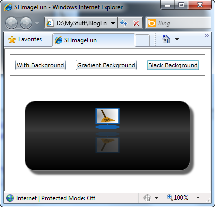
Figure 7 shows another gradient brush, this time using black as the background color. Once again, notice that different shades of black are used throughout the gradient. This effect makes your image look like it is sitting on a surface and that some light is shining on that surface. The XAML used to create Figure 7 is shown in Listing 4.
Create Gradients Using Visual Studio
Most people think you have to use Expression Blend to get these gradient backgrounds. You can do that, but Visual Studio 2010 includes a drop down on the Properties window that will help you create these linear gradient brushes. To use this tool, click on a Border control, or any control, and click on the Background property. Then click on the “Open” icon that you find to the right of the Background property. If you keep clicking on this you will eventually open up the Properties window to see what looks like Figure 8.

Most people think you have to use Expression Blend to get gradient backgrounds; however, you can build them just as easily in Visual Studio.
In Figure 8 at the top-left you choose the type of brush you want to use. There is a null brush, a solid color brush, a gradient brush and an image brush. Click on the gradient brush and you will open a color palette from which you can choose your start color and an end color for the gradient. Choose the type of gradient in the lower left corner. You may choose from a vertical, a horizontal or a radial gradient brush. In the samples in this article I used a horizontal gradient. By default there are two gradient stops.
You can click on the bar at the bottom of this gradient window and add additional stops. For each stop you can set a new color by using the color palette. Just click on the stop you want to set a color for and move the individual RGB and A sliders to create a color, or move the bulls-eye in the color palette on the left side of this window.
It will take you a little time to get the hang of working with this particular tool in the Property Window, but in very little time you will be able to create interesting backgrounds for your application. Remember: keep the number of stops to a minimum and choose colors that are not too drastically different from each other for the best effects.
Gradients Using Transparency
In the previous examples you used a single decimal value for the Opacity property of the Image control. While this gives you a semi-transparent look to the image, you may also add an OpacityMask that uses a LinearGradientBrush. When you use this OpacityMask property, the result will look like Figure 9. Notice that the image is less transparent near the top of the page and gradually disappears as it moves to the bottom of the page.
To accomplish this gradient transparency, change the value of the Opacity property on the 2nd image to .45. Within the Image control itself you will need to add an OpacityMask. The OpacityMask will use a linear gradient brush to determine how to fade from the value in the Opacity property to a completely transparent color. You can place the following XAML within the Image control:
<Image.OpacityMask>
  <LinearGradientBrush StartPoint="0.5,0"
                        EndPoint="0.5,1">
    <GradientStop Offset="1"
                  Color="White" />
    <GradientStop Offset="0"
                  Color="Transparent" />
  </LinearGradientBrush>
</Image.OpacityMask>
Notice that this is a very simple linear gradient brush that goes from any color to “Transparent”. The first color in the Offset=”1” does not matter as long as it is not Transparent. This is just used to ensure that the image is displayed with a starting opacity as set in the Opacity property. In the 2nd gradient stop you can specify Transparent as the color and any offset from 0 to .99. The higher the number, the sooner the image will fade out.
Summary
Adding a few well-placed reflections and a couple of gradient brushes can make your application go from “drab” to “fab!” You can see how you could use the technique described in this article to create an interesting menu system. Using a series of images on a gradient background is a great way to spice up your application’s navigation.
Having just a few different gradient brushes in your toolbox for Silverlight and WPF is all you really need. You do not want to use too many different backgrounds for your application or your user will find your application too busy. Visual Studio 2010 supplies all the tools you need to create some interesting backgrounds. You do not need to use Expression Blend in order to add some flair to your XAML applications. So, go ahead, have some fun and spice up your applications.
NOTE: You can download the complete sample XAML code at my website. http://www.pdsa.com/downloads">http://www.pdsa.com/downloads. Choose Tips & Tricks, then “Silverlight Mirror Images” from the drop-down.