


There are popular frameworks out there that many developers use to style their websites and Web projects. Alternatively, some developers learn CSS to style their Web projects without resorting to a framework. Which of these approaches works better? Like most things in development, it depends.
Although you can plop down components from something like Bootstrap and go about your day, ultimately, you'll need to learn enough CSS to customize it, or your projects will look exactly like every other website. The “Bootstrapification” of the Web is one reason that many Web developers are hesitant to use CSS frameworks.
On the other hand, it can be difficult to build your site from scratch using CSS. Understanding multiple layout semantics, unit systems, and cascading rules can be overwhelming for developers who just want to be able to get back to building functionality.
Somewhere between these two extremes lives Tailwind CSS. Tailwind CSS focus provides utility to build ideas without spending much of that time building CSS style sheets. By using utility CSS classes, Tailwind allows you to build prototypes of designs quickly and find the look and feel of what you want. As the design matures, Tailwind CSS allows you to compose these utility classes into CSS that is built to simplify your markup once you've found the design you want. Let's dig in and see how that works.
Using Tailwind CSS
At its heart, Tailwind CSS is just a set of CSS utility classes. What can be confusing at the start is that Tailwind CSS uses a build process to generate those classes. This might feel as though it's overkill for what could be a simple .css file. But if you can get beyond it and see how it works, it will start to make sense. Let's start from the beginning.
At its heart, Tailwind CSS is just a set of CSS utility classes.
Installation
Tailwind CSS can be installed with your favorite framework like Vue, Nuxt, React, and Gatsby. It can also be used as a plug-in for PostCSS if you're using that. For my examples, I'm going to use it with NPM and HTML so you can see how the guts work. To get started, install Tailwind CSS via NPM:
> npm i tailwindcss
With Tailwind installed, you can run it via the npx tool in Node Package Manager (essentially running it from the local ./node_modules/.bin directory):
> npx tailwind
But what does it do? It takes in a CSS file and exports a generated CSS file. To get started, let's start with the essential Tailwind CSS file:
/* src/site.css */
@tailwind base;
@tailwind components;
@tailwind utilities;
The @tailwind command is what the processor looks for to create the parts of the Tailwind CSS classes for you. Once you have this file, you can use tailwind to build it:
> npx tailwind build src/source.css
-o css/site.css
Normally I add this to my npm file:
{
    "scripts": {
        "build:css": "npx tailwind build src/source.css -o ./css/site.css"
    },
    "dependencies": {"tailwindcss": "^2.0.3"}
}
When you build the CSS, you can just add it to your HTML:
<!DOCTYPE html>
<html lang="en">

<head>
...
    <link rel="stylesheet" href="css/site.css">
</head>
If you're thinking that this is a lot of work just to include a single CSS file, you can use the CDN version (via unpkg):
https://unpkg.com/tailwindcss@^2/dist/tailwind.min.css
If you do that, you'll lose many of the features of how Tailwind CSS really works. Stay with me using the build: it'll become clear, I promise.
Utilities
Let's start out with the focus of the library: utility classes. Unlike products like Bootstrap, there are no components. No button class, no card class, no form classes. Instead, there are classes for applying common CSS styles. For example:
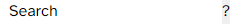
<form>
    <label for="search">Search</label>
    <input name="search" />
    <input type="submit" value="?" />
</form>
This small snippet is without any CSS. Confusing though it is, when it renders (with Tailwind CSS), it looks like Figure 1.
Although it might not be intuitive, part of what Tailwind CSS does is a full CSS reset so that you're not fighting against the base browser styles. Let's start with your first utility classes:
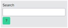
<form class="bg-gray-200 m-1 p-2">
This results are in Figure 2.
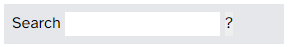
What did you do? You applied a simple background of light gray (colors are applied with a scale of 100-900 with steps of 100). The m-1 and p-2 add margin and padding. The 1 and 2 are levels of padding for consistency, not specific units. It's better, but not great. To make each of the elements stay on their own row, let's apply a display to each item:
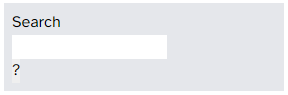
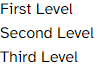
<form class="bg-gray-200 m-1 p-2">
    <label class="block" for="search">
        Search
    </label>
    <input class="block" name="search" />
    <input class="block" type="submit" value="?" />
</form>
By applying a block class (which applies “display: block”), you get each item on its own, as shown in Figure 3.
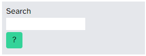
Unlike other frameworks, this allows you to create the look and feel from scratch using these classes. But it still requires you to understand the basics of CSS. Looking at that submit button, it could really use some work. Let's add some properties: margin padding and radius:
<input class="block my-1 px-3 py-1
              bg-green-400 rounded"
       type="submit" value="?" />
You end up with a better-looking button, as seen in Figure 4.
You're using padding and margin classes to specify the properties. These (like others) support specifying the four directions (left, right, top, and bottom). The way that these classes are named are like this:
- The class name alone with unit is for all sides (e.g., m-1 for margin).
- The class name with x or y with unit is for left/right or top/bottom (e.g., my-1 is setting top and bottom, or the y axis).
- The class names with l, t, r, b are for just that side (e.g., mr-1 is only for the right side).
This applies to margin (m), padding (m), border (border) and other directional properties.
Let's finally make that input look better. You can set the width of the input by specifying w-* classes. Width supports fixed sizes (between 0 and 96 in specific units) or relative sizes like w-1/3 or w-1/6 (one third or one sixth the size of the container). In this case, you want it to fill the width, so setting w-full addresses this.
<input class="block w-full" name="search" />
You can then add some classes to add a border, make it rounded, and add some padding between the text, like so:
<input class="block w-full border border-gray-400 p-1 rounded" name="search" />
This results in what you see in Figure 5.
You finally end up with a form that's nice, but there are a lot of classes there. Is there a better way?
Applying Styles
In many ways, the classes aren't for production, but for development. This allows you to stylize your project quickly during prototyping - but what about in the long run? Copying and pasting those same classes is a nightmare for maintainability. That's where the build-step starts to really help.
Tailwind CSS adds a new keyword into your CSS file called @apply. This keyword lets you apply CSS classes to a CSS rule. For example, let's add a new class called .small-form that you want to use for the form. In the CSS, you can add this rule (after the @tailwind directives). Inside, you can use @apply to apply the other styles to your CSS:
@layer components {
    form.small-form {
        @apply bg-gray-200 m-1 p-2;
    }
}
The wrapper called @layer makes sure that the styles are exported in the right place in the generated CSS (the component layer). Just wrap your components in this construct.
You see that you're not specifying the CSS properties, but telling it to take the same classes you used in prototyping to apply them here because you want to re-use this form class in more than one place. If you then compile with the tailwindcss tool, it ends up with the expected CSS:
form.small-form {
    --tw-bg-opacity: 1;
    background-color: rgba(229, 231, 235, var (--tw-bg-opacity));
    margin: 0.25rem;
    padding: 0.5rem;
}
For re-usable cases like this form, you can use @apply to style the entire form:
form.small-form {
    @apply bg-gray-200 m-1 p-2;
}

form.small-form label {
    @apply block;
}

form.small-form input:not([type=submit]) {
    @apply block w-full border border-gray-400 p-1 rounded;
}

form.small-form input[type=submit] {
    @apply block my-1 px-3 py-1 rounded bg-green-400;
}
Then the markup is pretty clean:
<form class="small-form">
    <label for="search">Search</label>
    <input name="search" />
    <input type="submit" value="?" />
</form>
You can even apply your own classes. Let's assume that you want to introduce a standard button style:
.button {
    @apply my-1 px-3 py-1 rounded;
}
You can then apply this to the submit button by adding it to the @apply:
form.small-form input[type=submit] {
    @apply button block bg-green-400;
}
This pays off as a way to prototype and then move your styling into the styling sheets as you approach uniformity and reuse. Let's talk about modifiers for the utility classes.
Responsiveness
In Tailwind CSS, there are five responsive breakpoints (being mobile-first):
- sm: 640px+
- md: 768px+
- lg: 1024px+
- xl: 1280px+
- 2xl: 1536px+
These are based on common device sizes. In order to use them, just use these prefixes on any of the utility classes. For example, to hide an element on small devices:
<div class="bg-white hidden lg:flex">
In this case, it's hidden until it reaches lg (1024px+) and sets the display to be Flexbox. This prefixing can be used on any property, but imagine it for a typical grid scenario:
<div class="grid grid-cols-1 md:grid-cols-2 lg:grid-cols-3">
This uses grid display, setting a single column for small devices, two columns for medium devices, and three columns for large (and larger) devices. In this way, you can control the look and feel of any utility class based on responsiveness. This use of prefixes goes further and is used in other scenarios.
States
One place where prefixes can be really useful is to handle states, including hover and focus as well as some specialized states. Let's start with hover and focus. They can be used to specify a different property on focus and hover. Let's do this to your input element:
<input class="hover:bg-gray-200 focus:bg-yellow-100" name="search" />
In this case, you change the background when you hover on the input and change it again when it's focused. These prefixes allow you to control the states of elements. In addition, Tailwind supports a few custom states, including one called group-hover. In this case, if you specify a group class, you can then use group-hover to specify that something should change (like text color) if the group is hovered, not only that element:
<div class="group border rounded p-1 m-1 bg-gray-100">
    <img src="axe.jpg" alt="title" />
    <h2 class="text-yellow-800 group-hover:text-yellow-600">Blog Item Title</h2>
    <p>Lorem ipsum dolor sit...</p>
    <ul class="text-yellow-700 ml-2 text-lg">
        <li>Jan 14 2021</li>
        <li>0 Comments</li>
    </ul>
</div>
For performance reasons, these custom states are limited to what classes it applies to. I can help you build more user-friendly pages.
I've talked about using the utility classes but sometimes you want to make changes to the generated code that isn't exactly about specific classes.
Customizing Tailwind CSS Generation
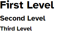
When generating the CSS from Tailwind, there's the concept of doing the base styling, then components, and then utility classes. One of the first customizations that you'll want to look at is the base styling. Because Tailwind CSS uses the concept of resetting the properties of the CSS, you might be disappointed by the look of certain elements. Let's take the example of the header tags (h1, h2, etc.):
<h1>First Level</h1>
<h2>Second Level</h2>
<h3>Third Level</h3>
Out of the box, the headers are unstyled, as seen in Figure 6.
You could try to add styling to these, but like you used @layer in the components above, you'd want to inject these into the base layer (again using @apply instead of your own):
@layer base {
    h1 {
        @apply text-4xl font-bold mb-2;
    }
    h2 {
        @apply text-2xl font-bold mb-1;
    }
    h3 {
        @apply text-xl font-bold mb-1;
    }
}
Now the headers look better, as seen in Figure 7.
I'm using the standard text sizes and bold instead of using my own. The reason for this is that there's another way to customize the CSS styling: Themes.
In using Themes, you can specify a complete replacement of standard properties in the Tailwind CSS generation. To do this, you first need to create a configuration file. You can use Tailwind's init command:
> npx tailwind init
This creates a JavaScript file that's read by the compiler:
module.exports = {
    purge: [],
    darkMode: false, // or 'media' or 'class'
    theme: {
        extend: {},
    },
    variants: {
        extend: {},
    },
    plugins: [],
}
This allows for several features, but I'm going to focus on theme. By adding properties to the theme, you can change how some of the basic properties of the generated code work. This assumes that you're going to set all of your own properties. For example, you could set the breakpoints:
theme: {
    screens: {
        'sm': '640px',
        'md': '768px',
        'lg': '1024px',
        'xl': '1280px',
        '2xl': '1536px',
    }
},
In most cases, you just want to extend the default theme, which allows you to change the properties you need:
theme: {
    extend: {
        screens: {
            '2xl': '1920px',
        },
    },
},
A common use for themes is to change the font-face of your site:
theme: {
    extend: {
        fontFamily: {
            sans: ['Atkinson-Hyperlegible', 'sans-serif'],
            serif: ['Atkinson-Hyperlegible', 'serif']
        }
    },
},
The font-family sets some standard fonts for sets of fonts (e.g., sans, serif, mono). This allows you to specify a list of fallback font family names. In my case, I just wanted to replace it with a single font for my whole site. This replaces the text-sans and text-serif fonts with my new font family names. This can extend to all sorts of different base properties.
Where Are We?
I've only scratched the surface on Tailwind CSS, but I hope you can see the benefit of using Tailwind CSS. It doesn't negate your need to know and understand how CSS layout and properties work, but can help you quickly prototype your design without having to write a ton of CSS. Tailwind allows you to convert these classes into simple CSS. Tailwind CSS avoids the problem of making every website look exactly the same, but, at the same time, can improve the speed in developing custom CSS solutions.