Ten years after the release of the .NET Framework, Microsoft is stirring the pot again with a new development platform that set’s to focus your talents on what everyone is betting is the next big thing, mobile devices; specifically in this case, tablets. The Windows Runtime, or WinRT, is the foundation for the development of applications designed to target Windows 8-driven touch-enabled devices, but what does that mean for .NET developers and their existing skill sets?
The move from VB6, which was from where many of us came, to .NET, was pretty significant. For the first time, Microsoft-centric, non C++ developers saw true object orientation, and many other new concepts and features. Even IDE-related programming characteristics shifted considerably: code files independent of classes, many new project templates, and language independence (of course that started a whole new war, didn’t it). The move to WinRT and Metro applications will not be that drastic. Your skills as .NET developers, whether you’re a VB or C# programmer, will be far more leveraged than was the case a decade ago.
What Is Metro and WinRT?
WinRT is short for the Windows Runtime and it is the new generation runtime that will replace Win32. Metro is Microsoft’s new UX style for applications. For the most part, Metro is for a touch-enabled device such as a tablet or a phone. But this does not necessarily rule out the ability for a desktop app to be designed with Metro in mind. Metro apps are designed to be content-centric. This means that they are immersive and chromeless. The best definition I read once for an “immersive application” was an application that has the complete attention of the user. This means an application that is intuitive, attractive and requires very little or even no training in order to use quickly. The Metro UI achieves this through its concentration on content and easy navigation through the use of tiles as well as the lack of chrome. Chrome is all the additional UI doohickeys that go around your content or embedded within it. Chromeless is essentially the antithesis of the kinds of applications we’ve been designing for many years.
That is not to say that chrome made our older applications bad or ugly. Metro apps with their lack of window border, group frames, ribbons, toolbars, and conventional menus are merely different, and the user interface that they represent fits nicely into the hardware that they target. I’ve worked with and designed applications with ribbons, dockable tool windows, and MDI tabs that looked beautiful and were very intuitive. The style that many are calling legacy now, served very well for many years and will more than likely still have a place going forward for some time. Take any of the Office apps for example; the non-Metro look and feel works perfectly for them. In fact, I can’t honestly imagine how a Metro version of Word or Excel would look or behave.
I’m saying this because it is too often that I see developers embrace something new and automatically label the previous technology, design, or platform as bad and wrong. That is not the case with Metro apps and the next version of the .NET Framework (4.5) will keep and enforce the technologies we use today. And as you’ll soon learn, .NET is alive and well in Metro style apps themselves. Also, please note that Metro and Visual Studio 11 are still not in full release and we may still see changes down the line in both the style of the UI and the development environment.
The Metro Style Apps Development Environment
Developing Metro style apps will require Visual Studio 11 and Windows 8. As of the time of this writing, Microsoft has just released the Windows 8 Consumer Preview (Beta) as well as the Visual Studio 11 Beta.
Visual Studio 11’s New Project dialog is broken up into languages, similar to Visual Studio 2010, and under Visual Basic and Visual C# is a new project type called Windows Metro App. I will focus my attention on this project type in this article. Selecting “Windows Metro App” under either of these two languages will let you build a Metro style app using C# or VB in conjunction with the .NET API for Metro Apps. This API contains a set of managed types used for building Metro apps with XAML. So for you WPF or Silverlight developers (such as myself), your skills are far from lost and will be crucial going forward down this particular path. The .NET API for Metro style apps can be considered a subset of the whole .NET Framework but in fact, it’s a bit different. There are several differences in the API with that of the one exposed in the larger .NET Framework, particularly in the area of reflection. The .NET API for Metro style apps also serves as the abstraction layer between your code and the Windows Runtime (WinRT).
A new language node in the New Project dialog of Visual Studio 11 is JavaScript. You can also create Metro style apps using HTML5/CSS and JavaScript/jQuery. In this case you would be using the Windows Library for JavaScript. This is a JavaScript API that serves as the abstraction layer to WinRT. I won’t be covering this platform any further in this article.
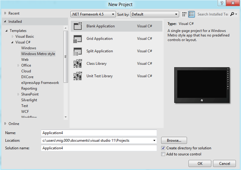
I’ll select “Windows Metro Style” from the C# node in the New Project dialog. I’m now presented with the five new project types under this category (see Figure 1). The “Grid” and “Split” applications are there to help you get started on some of the more commonly used navigation styles of a Metro application. This will be more important than you might think because if your goal is to eventually place your application in the Windows Marketplace, it will undergo a scrutiny phase and adhering to certain common navigation and display styles will be crucial. Keep in mind, at the time of this writing, the marketplace is for tablet Metro apps, but soon it will be expanded to include apps for Windows Phone 8 as well.
The Class Library project is the typical assembly library that you would use to develop your components and down-level tiers in a Metro application. That’s not to say that you cannot interoperate with a conventional .NET 4.5 (or older) assembly. Referencing a non-Metro assembly is perfectly possible but you’ll have to use compiler directives to prohibit incompatible code-areas from compiling. I’ll make that the topic of another article; in this article I will stick to Metro-only projects to get you going quickly. For .NET developers like us, using the WinRT API will be nearly a no-brainer thanks to the way it integrates with .NET. In fact, thanks to the .NET APIs for WinRT, you probably will not even have an indication that you’re calling into WinRT.
For this article I’ll use the Blank Application project which will allow me to start from scratch and not be aided by any pre-built views.
Metro Application Characteristics
Metro apps have certain characteristics that make them just that, Metro. Before there was the term “Metro app”, there was the “Metro UI” introduced in the Windows Phone 7 platform. Metro UI defines a style of user interface components, typefaces, navigation techniques and animations that when combined, manifest themselves in a user interface that is unique from any other out there. Whether you like the look of Metro or not, the fact that there is a UI style that is attached to Microsoft and is unlike in appearance to anything else out there is a good thing. Let’s look at some Metro style characteristics.
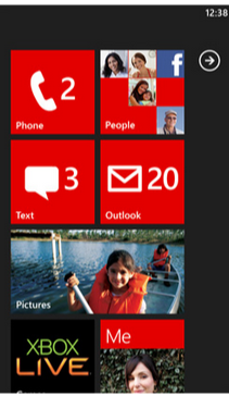
If I were to start anywhere else I’d get yelled at, so I’ll have to start with the tiles. Tiles make up the typical user interface list selection visual metaphor in a Metro app. When a view has to display a list of selectable items to the user, it can use tiles. This is sometimes a substitute for a conventional ListBox and sometimes a substitute for menu selections. You can use a grid of Metro tiles to display options to which a user can navigate and expand on for more detailed views. For this reason, the tiles have the ability to become alive. You can see live tiles in both WP7 and Windows 8 on their home pages. Home screen tiles in both of these operating systems have the ability to not only display a bit more information about what’s behind them, but also to actively change in content appearance when any information for which they are responsible changes. For example, the Mail tile on WP7 shows you how many unread emails you have and should a new one come in, the tile updates. The Photo tile may show you a preview of the first photo in the first album, and so on. Figure 2 shows a Windows Phone 7 home screen illustrating what I’ve explained.
The tiles, however, are not what make Metro identifiable. In fact, the latest version of MSN Messenger claims to have a “Metro interface” and has no tiles. There’s also a popular Twitter client called MetroTwit which has no tiles. If I had to look at a UI claiming to be Metro and attempt to isolate exactly what it is about it that makes it unique, I would have to say the use of a specific typeface, Segoe UI Light. Seeing the use of that typeface in all its various sizes and weights, snaps out to me more than anything else. Look at Windows 8 and WP7 and you’ll see the typeface used everywhere.
Menus are pretty distinctive in a Metro application as well. For one, they’re all in the aforementioned Segoe UI Light typeface. But what makes them really unique is the way Metro style applications lay out their menus for navigation. As opposed to relying on chrome around the menus, Metro menus consist simply of the selections placed next to each other with the currently selected one set in bold face. This style is followed down to sub-menus. In fact, the overall lack of chrome is a large part of the underlying philosophy of the Metro design style. See Figure 3 for an example of how the MSN Messenger application displays its menus now. You can see another example of “content of chrome” in Visual Studio 11 Beta, where even tool windows lack a border. Instead, the use of gray shading illustrates where the tool windows separate from the main “tabbed-MDI-area.”

Metro applications have also done away with the concept of overlapping windows. This is a design that takes some time to get used to, but if you’re a WPF or Silverlight developer it should not be strange to you. The lack of form-inheritance in WPF and Silverlight in combination with the push toward MVVM-based client-tier architectures has driven WPF/SL developers to create more “containment”-based views. This is a style where the application consists of a primary or “shell” view which fires on startup. The shell view is split into various regions and their contents are filled with various views based on application usage. Microsoft themselves so embraced this development style that they have a framework to assist with it and more, called Prism.
Your First Metro App
Now that you have a basic understanding (I hope) of the makings of a Metro application, let’s jump in and create a simple one. Keep in mind; in this article I’m going to keep things very simple. I’ll create a simple application first, and then introduce some navigation and view details for displaying information. I’ll cover live tiles and other advanced features in a future article. My goal here is to make you comfortable with creating Metro applications and knowing you can leverage your existing XAML and C# (and even Visual Basic) skills, and almost ignore the fact that you’re going to be calling into a new runtime.
In the interest of simplicity, I’ll use conventional code-behind techniques in this article. In a real production application you should follow the Model-View-ViewModel pattern. Happily, you can apply the MVVM pattern to Metro applications in ways that are no different than in a WPF or Silverlight application.
Let’s create a new project. In Visual Studio 11 Beta, in the Add Project dialog, choose Visual C# and pick the Windows Metro Style selection. I’ll select Blank Application from the selections on the right. This will create a single view called BlankPage.xaml. If you look at the reference list in the project you’ll see two items. The Windows item is a reference to the WinRT library and the .NET for Metro Style Apps item is the .NET API for WinRT.
In a lot of ways, this project environment is similar to a WPF or Silverlight application. For example, there is an App.xaml file that gives me a place for application-wide resources just like there is in WPF/SL. The code-behind for the App.xaml file offers a virtual method called OnLaunched. Even in a blank project, I get some helper code in here to instantiate a new frame (something you’ll learn about later), navigate to my startup view, and tie all of that to the application. Think of this as the bootstrap process for a Metro application’s first view, in this case my BlankPage.xaml view.
The BlankPage.xaml view is for all intents and purposes (ours anyway) a regular XAML view and should be very familiar to anyone that has worked with XAML in the past. In fact, I’m going to whip together a quick example using skills that should not be new to you.
In the interest of not being cliché, I’m not going to do a “Hello World”, but instead a “Hello-x”, where x is a name you type in. How’s that for original and exciting?
Metro App’s Code
The App.xaml file, like in a WPF app, lets me contain resources that will be application-wide. One such resource is already included in this file, StandardStyles.xaml. This XAML file is included automatically in the Common folder and includes visual styles that will come in handy when adhering to Metro design guidelines and specifications. The first such guideline is the screen background. The brush that is set up to give me the correct background is included in a static resource called ApplicationPage-BackgroundBrush. I’ll use this resource as the background for the view’s primary panel, the Grid.
My simple example will allow you to enter text into a TextBox, let you press a button, and display that text in a TextBlock.
If the code in Listing 1 looks familiar to you, it should; especially if you’re a XAML developer already. It’s identical to what you would write to accomplish the same results in WPF or Silverlight. Let’s run this application and go over the results.
App Execution
First of all, in Visual Studio 11 you might have noticed that the green run-button is gone (yes, I miss it too). In fact, all trace of color is gone, isn’t it? Instead, we’ve been given a new “run” button whose action is changeable through its accompanying drop-down. The three options are Local Machine, Simulator and Remote Machine. I’m not going to connect to a remote machine in my execution so I’ll concentrate on the other two options.
Changing the “run” button to Simulator will launch a complete tablet emulator with your windows instance running in it. You’ll be able to do just about anything you can do from a real tablet including change orientation and access other apps from the start-screen. The default option for the “run” button is Local Machine and it’s the one that is most like what you are accustomed to in Visual Studio 2010. If I execute my app in this mode, my entire screen will display the execution as shown in Figure 4.
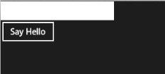
I want to bring a few things to your attention here. First that controls have a flat appearance. Remember, it’s all about content over chrome, so things are going to default to a plainer appearance. I can, however, attach any type of styling I want to these elements. Metro controls have characteristics that appeal specifically to a touch environment, and you can see one of them here. The second I start to type into the textbox, an X appears in the TextBox over to the right. Tapping the X will clear the current text. When you’re using a Metro app from a touch device, it’s much more convenient to simply tap on this X to clear the TextBox than it is to touch the end of your text and use the virtual keyboard to backspace over all the text. Except for the black & white, flat appearance, the screen is nothing exciting and the behavior is what I programmed. If I enter text into the box and press the Say Hello button, I’ll see the text below the button. Now I need to stop the execution.
This is not so trivial. Metro apps are not really designed to “stop” in the sense of the word. Instead they suspend when you access another application or the Start page. I’ll discuss this in depth later. When you run an application from Visual Studio, you need to get back to Visual Studio to stop its execution. If I hover just below the upper-left corner on the screen against the left edge, a thumbnail of Visual Studio will appear. I can click (or tap, if I’m using a real tablet) now and VS will come back up. Of course, I can also simply ALT-TAB to return to VS where I can then press the Stop button. Let’s get back to the code now.
Views
What may look different in the XAML code is the top-level tag, which in this case is Page. Though available in WPF, most views you create are Window or UserControl-based in WPF. In a Metro app, it will be page.
The idea is that your application displays information by either switching between user controls displayed on a view (just like in WPF or Silverlight) or by navigating to another page, where you’d be given an easy ability to come back. Think about tablet or phone devices you’ve used to date and you’ll recognize this navigation style.
Overlapping windows are not possible in a Metro application and, in fact, would be undesired in the kind of environment Metro aims to target. When adding new views to an application, Visual Studio gives you two choices: Page and UserControl, not Window. Including UserControls in a page is no different than placing them in the XAML of a WPF window. Now I’ll show you how easy it is to navigate among views in a Metro application.
Navigation
Navigation from page to page is done in a very organized fashion. Gone are the days of haphazardly showing a window in an either modal or non-modal way. A Metro Page has a property called Frame. You use this property to assist in navigation by taking you to your next view as well as navigating backward or all the way home. Of course, home refers to the startup view in the application.
Navigating Forward
To begin at the basics, navigating to another view is as easy as calling the Navigate method of the page’s Frame property. I modified the button in my last example to navigate to another view, at the same time sending that view the contents of the TextBox.
private void btnSayHello_Click(
   object sender, RoutedEventArgs e)
{
    this.Frame.Navigate(
      typeof(GreetingPage), txtName.Text);
}
The instantiation of the new view is performed by the Navigate method, which simply receives the type of the upcoming view (the framework will take care of the instantiation). My new view is the GreetingPage view and includes a TextBlock control called txtGreeting, in which I will place the value carried into the view.
In a WPF or Silverlight view, it is common to rely on either the constructor or the Loaded event as a place to put code that will either initialize or render onto the view. These two places still exist and are still used but there is a special method that gets fired when a view opens from a previous navigation action, OnNavigatedTo. This method gets fired after the constructor but before the Loaded event.
protected override void
OnNavigatedTo(NavigationEventArgs e)
{
    txtGreeting.Text =
       string.Format("Hello there {0}.",
         e.Parameter.ToString());
}
Any data passed into the second argument of the Navigate method is accessed from the Parameter property of the event argument. If data carried into this method is to be used as identifiers to access data from a resource (database), it should be stored in a class variable and used in the Loaded event of the page. I’ll explain the reasons for this when I cover reverse navigation later. Of course, the correct thing to do is to use ViewModel state to determine what gets shown on a view. That way you don’t have to bother with these methods and events, with the exception of whatever “click” event is needed to fire off a new view.
There are two other methods of importance here. They are OnNavigatingFrom and OnNavigatedFrom. These two methods occur upon calling the Frame property’s Navigate method prior to the target page’s OnNavigatedTo (there is no OnNavigatingTo) method. The OnNavigatingFrom method’s event argument gives you a Cancel property allowing you the chance to cancel the navigation.
It’s important to understand the order of operations here because even after the target page’s OnNavigatedTo method gets fired; the source page is not totally out of programmatic scope yet. When I press my button on the source page, the Click event is of course the first thing to fire as the infrastructure has no idea that navigation is about to take place. As soon as I execute the Navigate method in the Frame property, the following methods are fired in this order:
- OnNavigatingFrom on the source page
- OnNavigatedFrom on the source page
- OnNavigatedTo on the target page
- The rest of the code after the Navigate method call, back in the source page.
Keep in mind that every view appears in what we know as “full screen” mode. This is the only mode of a Metro app view. With the elimination of overlapping windows comes the elimination of non-full-screen views. The exception to this is something called “snapping”, which allows two Metro apps to be shown side-by-side for the purpose of user multi-tasking. I’m not going to cover snapping in this article.
The Navigate method can take me from one view to any other. You as the developer can decide what view gets opened from another view. There is no requirement to pre-establish an order of views. One action on a view can take you to one location while another action can navigate you to an entirely different location. However, whatever the navigation path is, based on navigation actions, is stored and accessible for the purposes of getting back. Think of it this way: every call to the Navigate method leaves a bread crumb. Later the app can use those breadcrumbs to find your way home.
Navigating Backward
In my view, Greeting.xaml, I’ve also placed two buttons to navigate me back and to navigate me home. It just so happens that in this case they are the same. I’ll show you the “back” button’s code first.
private void btnBack_Click(
   object sender, RoutedEventArgs e)
{
    if (this.Frame != null &&
        this.Frame.CanGoBack)
        this.Frame.GoBack();
}
Notice that I’m relying on the view’s Frame property again. This property contains the ability to traverse me back one breadcrumb step in navigation. Not only that, it contains a Boolean property that I can check to see if I can navigate backward or not. This property, CanGoBack, is my key to getting all the way back home, as shown in the code for my home button.
private void btnHome_Click(
   object sender, RoutedEventArgs e)
{
    if (this.Frame != null)
        while (this.Frame.CanGoBack)
            this.Frame.GoBack();
}
Here I am testing for CanGoBack value repeatedly until it returns a value of False. Each time it returns True, I execute the GoBack method in the Frame property. In essence, I’m going back and back and back until I cannot go back any more, hence I am home. If you recall, earlier I told you that an action on the Frame property kicks off the events on the source and target pages, and lastly the code after the original action continues. This is why I am able to repeatedly call GoBack within the source page.
Another method of the Frame property called GoForward does exactly what you’re probably thinking. It navigates forward through the breadcrumb trail, provided there is a place to navigate. It’s equally important to call this method only upon a successful result from checking CanGoForward. If a view has not been a target of navigation yet, then there will obviously be no place to go when this method is called. This is why specific navigation points throughout your view should rely on the Navigate method, while the GoBack and GoForward should be left to general navigation buttons that would usually reside on the top of the page.
Note that each execution of the GoBack and GoForward methods fire the OnNavigatedTo method on what would then be the target page. This is important to know because if your navigation takes you from home through five pages one by one, then on the fifth you “go home”; you will hit the OnNavigatedTo methods of the subsequent four pages in reverse order. This means that you should be mindful of what you put in this method. Putting calls to databases or resources is probably not a very good idea here since it might get fired simply on its way to a higher-level view. This is why I stated earlier that any code to access resources should still be placed in the Loaded event of the view (non-MVVM-technique of course). While navigating backward hits the OnNavigatedTo method on each view visited, it only hits the Loaded event of the final target view.
Another item of interest is that state is not persisted by the views, as they are targets of navigation forward or backward. This is another reason why the MVVM pattern is important, as part of its job is to maintain state.
To assist me in much of this navigation stuff is a base class that I can use from which to inherit my pages.
Layout Aware Pages
In the Common folder, you’ll find a class called LayoutAwarePage. This class inherits from Page, and thus its purpose is to serve as the base class for your views. Visual Studio provides a project item called “Basic Page” that creates a page that inherits from LayoutAwarePage for me. If you need to modify existing pages to inherit from this or any other alternative base class, see the sidebar, Changing the Base Class for a XAML View.
Among other things, this base class gives me two methods called GoBack and GoHome. These two methods simply wrap the exact same functionality I showed you in the previous two Click event methods. This makes it a little easier to wire event methods to the Click events of buttons you want to use for these two purposes. This is because the two methods provided by this class are simply event methods and follow the Click event’s signature. Furthermore, a back-button wired into the GoBack method can also bind its IsEnabled property like this:
IsEnabled="{Binding Frame.CanGoBack,
            ElementName=pageRoot}"
Notice that the binding must include a reference to the view’s top-level element, which in this case had a "x:Name=pageRoot" attribute assigned. This is because the Frame property used in this binding belongs to the code-behind class of the view.
Application Execution States
Metro apps should not give the user a way to completely terminate the application. The user should rely on the runtime to manage the perception of application start and stop by simply allowing the user to access the application, and then navigate away by accessing another or returning to the Windows 8 start page (or coming soon, the Windows Phone 8 home page).
When a user navigates to another application or to the Start page, the runtime will suspend your application. The content of your data and the view you were using is saved when your application suspends so it can be resumed automatically when you come back. Re-launching your application from the Start page constitutes “returning” to the already running app if it happens to be in a suspended state. Because your application cannot receive messages when in a suspended state, it would not know if it gets terminated. If the system does not have the necessary resources to keep your application suspended in the background or your application crashes for some reason, any state that was maintained will be lost. Let me now discuss some events that you can use to assist in overcoming this problem.
In the code-behind for the App.xaml file I can wire in the Suspending event. This event will fire when the application goes into suspension mode. Here is where I want to save my application’s state. In the event that the application is terminated and the state is lost, you can reload the state you saved later if the application is launched again. You should use the LocalSettings storage API to save state information. See the References sidebar for information on this API.
To reload an application’s state, I need to use the OnLaunched method of the same class file. Here I can check the previous execution state of the application and test to see if it was terminated like this:
if (args.PreviousExecutionState ==
    ApplicationExecutionState.Terminated)
{
    //TODO: Load state from previously
            suspended application
}
This has the effect of a crashed application being able to continue where it left off before the crash. This may include navigating to a different view other than the one that was originally configured to start in the new frame when the application first launched.
There are also other things you might want to take into consideration when an application resumes. For example, a newsreader’s information might be stale after a certain amount of time has elapsed. If a newsreader application was in a suspended state for too long, you might want to refresh its view or go to a home screen when resumed. For this and similar purposes, you can also wire into the Resuming event. Of course, when suspending, part of the state you should save would be a timestamp noting when the suspension took place so you can later perform this check.
Metro Styles
Metro applications are not only characterized by their navigation style, but also by their appearance. For this we get plenty of help from the framework and from Visual Studio. The StandardStyles.xaml file I spoke of and briefly used earlier contains several other styles that will come in handy.
Text Styles
If your view is going to have a title, it must live up to Microsoft Marketplace acceptance scrutiny in terms of size and typeface. For this I can use the PageHeaderTextStyle static resource defined in the StandardStyles.xaml file. You can use this resource in a Style property of a TextBlock and it will display the contents in the correct size and typeface as required by Metro standards and guidelines (Figure 5).

Button Styles
As well as font styling, the StandardStyles.xaml file contains button styles that I can apply to buttons used for “Back” and “Home” navigation. Not only am I able to set the Click event and IsEnabled property of a button to members provide me by the LayoutAwarePage class (as shown in a previous code snippet), but I can also set the style of my buttons to the HomeAppBarButtonStyle and BackButtonStyle static resources. You can see the end result in Figure 6.

The StandardStyles.xaml file contains several other styles including a PageSubheader-TextStyle that is typically used for the sub-header that would add information to the page header and be positioned below it. There are also many resources on the Web where you can find styles and icons for assisting in the creation of Metro applications.
Another characteristic of Metro Applications is, of course, those tiles I mentioned earlier. The idea of setting up a list of items to be displayed as tiles and have that set of tiles repeat based on the content count has all the indications of a ListBox. The .NET API for Metro not only provides us with navigation and styling ability but also with some controls to further help us in adhering to Metro guidelines.
Metro Controls
The toolbox in Visual Studio 11 will contain several new controls that Microsoft designed for the “Metro” way of doing things. I want to discuss three of these controls: GridView, ListView and SemanticZoom.
GridView
If you’re familiar with the concept of repeatable item-container controls in WPF and Silverlight, you are already very well versed in how the GridView and ListView work. In fact, ListView is available in WPF today and GridView is simply another repeater control that lists its items top-to-bottom, then left-to-right. Its container automatically determines the dimensions of the grid. Each grid cell of a GridView control makes up what you already know of as a Metro tile. What makes these controls Metro-special is simply the styles contained within StandardStyles.xaml that let me style the item contents the Metro way.
Providing an item template for the GridView is identical to the way with which you’re already familiar in the ListBox, so I will not cover item template fundamentals here as there is plenty of information available on the topic. Listing 2 demonstrates a simple GridView that displays its contents using an Item Template. As the listing demonstrates, the StandardStyles.xaml file contains several brush and text styles to assist me in styling the contents of each tile the “Metro way.” My code listing example shows a pretty standard set of dimensions and content items that you would use in a conventional Metro tile grid, including the image that takes up most of the tile and the text areas toward the bottom of each tile. The bindings you see in the various XML elements are conventional property bindings to an underlying binding source. Binding and MVVM usage of this control or any other in Metro does not change one bit from the way we’ve been doing it in WPF and Silverlight for some time now.
The GridView provides a feature that other repeater controls do not offer - grouping. Grouping lets me have a summary field in the content item data that I would bind to a GridView. Then I can configure the control to use this key to show a separation between the items whose key is the same and even display the key information within each separate section. Think of the Windows Phone 7 People view, where you get a scrollable list of people but in alphabetical order and with each letter of the alphabet at the top of each grouping of people.
Another unique characteristic of the GridView control is the visual effect built into tiles when they are clicked or touched. Their contents will shrink a tiny bit; just enough to show you that it is about to be acted upon. This is a nice effect on touch devices and is one that is also shared by another Metro control, the ListView.
ListView
This control, also a XAML repeater control, lists items top-to-bottom. It is functionally the same as the GridView and its contents will depend once again upon styling. The difference is simply how the contents are laid out.
SemanticZoom
This control has no real counterpart in WPF or Silverlight as its functionality is quite unique to a touch environment. You might want a view that displays tiles from which to choose. However, you might have a large quantity of tiles. For this reason it may become handy to zoom out and see a more summarized view where more items fit on the screen space or perhaps showing a higher category of the items, such as the groups I discussed in the GridView.
The idea of semantic zoom is different from conventional zoom, which would be purely a visual increase or decrease of view contents without altering their layout of even the data that is showed. The SemanticZoom control lets me define two views: a zoomed-in view and a zoomed-out view. The zoomed-in view is the full detail view that contains all the information you would normally show in a view not benefiting from semantic zooming. The zoomed-out view would show more summarized data and it would possibly lay out differentially. Semantic zooming requires a relation between the items displayed in the two views. Going back to the Windows Phone 7 People example I mentioned in the GridView section, think of a list of letters of the alphabet. The SemanticZoom control treats the zoomed-out view as a quick navigator. Clicking on any of its items immediately jumps back into the zoomed-in view and navigates to the point in the item list that corresponds to the item clicked in the zoomed-out view.
You switch between the views using pinch gestures on touch devices or by holding down the Ctrl key while scrolling on mouse-controlled machines. View-switching can also be achieved with the ToggleActiveView method of the SemanticZoom control.
Setting up a view to display two different GridView controls used as the zoomed-in and zoomed-out views of a SemanticZoom is one of the more powerful characteristics of a Metro application and definitely merits an article dedicated to the step-by-step instructions on how to achieve it properly. Since the purpose of this article is to get you started with Metro, I will not do it here (perhaps the next one).
MVVM-Quick
While Metro applications are fully compatible with the MVVM pattern and its usage encouraged, Metro contains some built-in ViewModel support that I should discuss.
Pages in Metro application have a property called DefaultViewModel. From the code-behind class, this property is set up to accept key-value pairs like this:
DefaultViewModel["Items"] =
   ((Home)e.Parameter).Rooms;
From the XAML view, you can use contents associated with a key of DefaultViewModel for binding as if they were a property like this:
ItemsSource="{Binding Items}"
Much, Much, More
I can go on and on with this article but I wrote it to deliver two primary things. First, I meant to provide you an introduction to Metro and the Metro development environment, and second (more importantly) I wanted to demonstrate that it is not complicated to get started. XAML was intimating for many people when it first came out, primarily because of how drastically different it was to create WPF applications from Windows Forms applications. Because of this intimidation factor, its adoption cycle took longer than Microsoft and many in the community had hoped. Metro applications, from a C#/XAML perspective anyway, should not suffer a similar acceptance fate. If you’re a XAML developer today, it will be a matter of learning new controls and some other features, but you should be able to hit the ground running quickly; and I hoped I’ve contributed to your running-start.
Access Hardware and Software
There are many other cool things that make developing Metro applications a lot of fun. This includes access to tablet or phone hardware sensors and built-in devices. This includes things like the Wi-Fi antenna and what it may be picking up, the accelerometer, GPS, gyroscope and of course the device orientation sensor. You can also access a device’s camera if one is available.
Metro also offers resource access for data storage on your device, like the contact list, the calendar, photos, etc.
Asynchronous Programming
All of these things together open the possibilities for some pretty amazing applications. With this potential comes the responsibility of responsive applications. Metro applications should not hang while trying to access a resource. The user should always have the ability to go back a view or cancel the current process. This means that your Metro application should only access data in an asynchronous fashion. .NET 4.5 offers the new async and await keywords to make asynchro-nous programming a bit less painful.
Conclusion
Microsoft is pitching Metro as its development platform for the future. Visually, as a look for applications, Metro is simple, elegant, clean and draws attention to the content an application is there to manifest. Truthfully, it remains to be seen as to how the platform will be received outside of the scope of touch-based applications. The general consensus I have seen in the community is that Metro will be great for tablet applications but many are unsure as far as desktop applications are concerned.
Microsoft hasn’t been entirely clear as to the exact future of the current desktop environments - WPF and Silverlight - but rather than dwell over this uncertainty, rest assured that it’s around now and that .NET 4.5 continues full support for it. That being said, WPF and Silverlight continue to be my platforms of choice for rich desktop applications, while I prefer ASP.NET MVC and Web Forms for websites, and Metro for touch applications on Windows 8 tablets and soon for Windows Phone 8 devices. As to the future of WPF and Silverlight: who knows? I’m convinced that businesses will continue to want a platform for rich desktop (non-touch) applications and I’m hoping WPF or some WinRT-based incarnation continues to see life in that arena in the future, if not under that label then perhaps another - it’s the technology that counts, not the name. As for Metro today, if you need to write touch-based Windows 8 tablet and Windows Phone 8 applications, it totally rocks.