It’s becoming less and less common to show raw data directly to the user. At the very least, portions of your data may require reformatting to make it more readable for your users. But applying a simple format, say showing a numeric value as a percentage, only goes so far. WPF offers an impressive data transformation tool called Data
Templates that can radically change the visualization applied to business data.
Data visualization is a popular buzzword in the UI community these days. But what does it mean? To me it means finding a clear and effective way to show data to the user. If done correctly it should simplify my understanding of the information and help me see relationships between my data.
For an excellent example of visualization I’ll turn to a graphic on U.S population (see Figure 1) from TIME magazine. Imagine putting the thousands of data points shown in this population map into a chart or ListBox. The density would overwhelm the information while leaving the user with little insight into the meaning of the data. This sample map, which is clean and informative, manages to show the same data in a concise and understandable arrangement.

While the examples accompanying this article are not as complex as the TIME magazine graphic, I can assure you that WPF is fully capable of producing similar visualizations.
I’ll start the journey with a look at the motivations for creating the Windows Presentation Foundation (WPF) Data Template system.
Transforming Your Data
What do you do when you wish to allow your user to choose from an assortment of predefined items? If you are like most UI developers, you’re likely to display your data in a UI component like the Listbox, ComboBox or ListView. These time-tested controls have graced data entry forms for decades because they’re easy to understand and simple to use. While they are a common UI item they are not without limitations. Let’s look at a few of the drawbacks inherent in the classic ListBox. Figure 2 shows an example of a classic Windows ListBox.
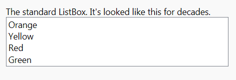
Serviceable but boring UI: You get a list of black text on a white background. You can spice up the colors and change the font but that is the extent of customization allowed by the ListBox.
Complex data is shown as a string: Your data is detailed and rich. You’ve built your business classes and structured your class relationships to reflect your business model. Your business class probably has many related pieces of data contained within its boundaries. Yet all you can see of your intricate data is one simple string.
What would be a better model than the classic ListBox behavior? How about allowing the display of any or all of the class data within each row? It would be even better if you could include other UI components too. Microsoft has endeavored to solve this problem in the recent past. Both Windows Forms and ASP.NET have made solid progress toward fixing these problems but the WPF template model is light years ahead of what they can accomplish.
Templates
In WPF, the UI shown in a WPF control is cleanly decoupled from the behavior of that control. This allows one person, say a designer, to create a UI template, and another person, say a developer, to apply the template. WPF works its magic at runtime and combines the two into a seamless whole.
WPF offers many kinds of templates. The first template you usually encounter when learning WPF is the control template. Each control ships with a default UI, defined in an embedded Control Template, which is shown unless replaced with an alternate template. This is extremely beneficial and is a key pillar of the WPF content model. The other category of templates, the Data Template, is the focus of this article.
The key to understanding Data Templates is that they are generally affiliated with the data, not the bound control. So when defining the template you specify the Type name as follows:
<DataTemplate
    DataType='{x:Type local:ClassName}'>
Within the template specify the UI elements that should be rendered in conjunction with your data:
<DataTemplate
  DataType='{x:Type local:Food}'>
  <Border  BorderBrush="Tomato"
    BorderThickness='2' Margin='5,2'
    Padding='2'>
    <TextBlock
    <!-- note the binding within the template
         Path refers to a property on the Type-->
      Text="{Binding Path=FoodName}"
      ToolTip='{Binding Path=Category}'
      Foreground="DarkRed"
      MinWidth='150'>
    </TextBlock>
  </Border>
</DataTemplate>
I stated earlier that a Data Template is just an alternate UI for your data. You can define global templates that are used throughout your application or define multiple templates within a single Window for different views of your data. You have the freedom to dress up your data in any way imaginable.
In the example (see Figure 3) you’ll find the Food class wrapped in the custom template. As you can see, the same template is shown whether the data is located in a ComboBox, ListBox or TabControl.
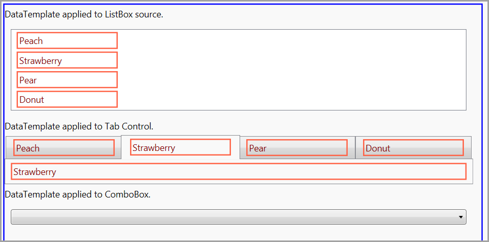
Because templating is a major feature of WPF, most of the included controls have a least one property that accepts a Data Template. For the ListBox that is the ItemsTemplate property while for the Button class it is the ContentTemplate property.
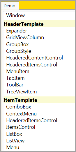
To see a complete list of Data Template properties, run the sample application and open the “What Controls support the Data Template” demo. Figure 4 shows a partial list of these controls and properties.
I find LINQ to Objects to be so helpful that I wind up using it on nearly every new project I start. While researching this article I used LINQ to determine which classes contain a Data Template. The list shown in Figure 3 is generated by the following LINQ query.
In C#:
Assembly assembly =
Assembly.Load("PresentationFramework..",);
var q = from type in assembly.GetTypes()
where type.IsPublic
from prop in type.GetProperties()
where prop.PropertyType ==
typeof(System.Windows.DataTemplate)
orderby prop.Name,
prop.ReflectedType.FullName
select new { PropertyName = prop.Name ,
 ControlName = prop.ReflectedType.Name, };
In Visual Basic:
Dim [assembly] As  System.Reflection.Assembly
    = Assembly.Load("PresentationFramework..",)
Dim q = From type In [assembly].GetTypes() _
        Where type.IsPublic From prop In
        type.GetProperties()
        Where prop.PropertyType Is
         Type(System.Windows.DataTemplate) _
        Order By prop.Name,
         prop As var
         prop.Name, ControlName =
         prop.ReflectedType.Name
Content Template
As you have just seen there are numerous elements in WPF that support the Data Template. Here are some of the categories of templates available for the UI.
- ContentTemplate
- ItemTemplate
- SelectedContentTemplate
- SelectionBoxItemTemplate
- HeaderTemplate
- CellTemplate
- ColumnHeaderTemplate
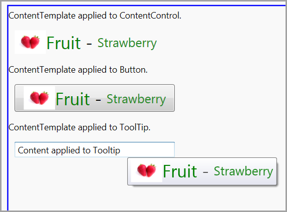
Developers who are new to WPF are often astonished to find that elements like the Button control are not restricted to text-only content. Instead, WPF designers can go crazy and embed images, panels, checkboxes or any other valid content within the control. As long as you follow the prime Content Control rule; “there can only be one content element within the content property”, any sub-content is welcome. The key is that the one content element can be a container, like the DockPanel, which can then contain other child elements. Content can come directly from the XAML or via a ContentTemplate. The XAML for creating a ContentTemplate is nearly identical to the previous DataTemplate example:
<--Define template in a Resources section. -->

<DataTemplate
  DataType='{x:Type local:Food}'>
  <StackPanel
    Orientation="Horizontal">
    <!-- template XAML here... -->

<!-use the template in main XAML-->
<TextBlock
 Text='ContentTemplate applied to Button.'
 Margin='0,5' />
<Button
  Content="{Binding }"
  Margin="10" />
Look at Figure 5 to see an example of a ContentTemplate applied to several controls:
ItemsControls and DataTemplates
Look at any business data and you will see a common pattern. Business data naturally collects into tables and lists. Therefore a good UI framework should have a strong toolset for working with list-based data. As UI developers, it’s instinctive to reach for the ListBox or other similar control when showing these lists. The WPF architects planned for templates in lists just as they did in every other corner of WPF.
The ItemsControl class is the root for everything list driven in WPF. Treeview, DataGrid, ListBox, ListView, Menu, TabControl and many other classes derive from the ItemsControl. The ItemTemplate is the main template used with list data. The HeaderTemplate and SelectedContentTemplate are also popular items templates.
I’d say the most common scenario in showing a list in an ItemsControl is to apply the same template to each item in the list. Let me show you how to accomplish the one-template-for-all model for any ItemsControl.
One Template for All
You’ve already seen an example of an ItemTemplate earlier in this article. The first example defined a Data Template as follows:
<DataTemplate
  DataType='{x:Type local:Food}'>
This template is applied to the data because the ListBox is bound to a collection of Food. Since the ListBox class defines an ItemTemplate property (typed as DataTemplate) and the bound data matches the DataType specified in the DataTemplate, WPF automatically applies the template.
Another way to assign a template is to use a key when adding a DataTemplate to the Resources section:
<DataTemplate
  x:Key='explicitTemplate'>
Then in your ListBox declaration, retrieve the resource via the ItemTemplate property:
<ListBox
  ItemsSource="{Binding }"
  ItemTemplate=
    '{StaticResource explicitTemplate}'
  Margin="10" />
A Separate Template per Type
Not every list is made up of homogenous data. Imagine a list of Invoices, Sales Orders and Contracts. Each type in the list shares a common ancestor (Document) yet you want to define a different template for each descended type. I’ll illustrate several ways to accomplish this task. First I’ll show you the Data Templates differentiated by DataType pattern.
Differentiate by Data Type
Imagine you have a simple class hierarchy like the following:
In C#:
public class Food{
public string FoodName { get; set; }
public Int32 StockCount { get; set; }

public Food(string foodName)
{
this.FoodName = foodName;
}
}
class Beverage : Food {
}
class Seafood : Food {
}
In Visual Basic:
Public Class Food
‘ property details omitted
Public Property FoodName() As String
Public Property StockCount() As Int32

Public Sub New(ByVal foodName As String)
Me.FoodName = foodName
End Sub
End Class
Friend Class Beverage
Inherits Food
End Class
Friend Class Seafood
Inherits Food
End Class
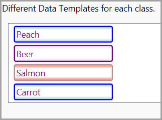
In your code behind file, create a list filled with instances of these types:
// C# version
var foods = new ObservableCollection<Food>();

Food f = new Food("Peach");
foods.Add(f);

var b = new Beverage();
b.FoodName = "Beer";

foods.Add(b);

var s = new Seafood();
s.FoodName = "Salmon";
foods.Add(s);
this.DataContext = foods;
Creating your Data Template is simple; just denote each class as the DataType for the template:
<DataTemplate
      DataType='{x:Type data:Food}'>
   <DataTemplate
      DataType='{x:Type data:Beverage}'>
<DataTemplate
      DataType='{x:Type data:Seafood}'>
Examine Figure 6 to see the differing looks resulting from applying these Data Templates.
There is another mechanism provided by WPF for changing the template which is even more customizable-the Template Selector. If you’ll indulge me for a few minutes I’d like to talk about Triggers before covering this exciting topic.
Triggers Overview
Invoking an action is a common scenario in programming. In years past you’d likely create a function/method and call that function directly. In more recent times the event pattern has dominated UI development. This pattern requires the creation of code in an Event Procedure and instructing .NET to call the event procedure whenever the event is fired. This is still a very code-centric way of designing your UI interaction.
In WPF this poses a problem due to the declarative nature of XAML. XAML was conceived as a way to express UI in a static XML file. Within XAML you can define UI elements and their hierarchical relationships with children elements. WPF Triggers are the solution to the question of how to define actions within the XAML file without having to write code. WPF offers a number of Triggers. See Table 1 for a summary.
Property Triggers
The Trigger, often called the “Property Trigger”, is the simplest member of the trigger family. You must create the Trigger within a Styles section. It monitors a DependencyProperty on the target class, in this example a TextBox, and applies one or more property changes when the target condition is met. The trigger condition is a simple compare; in the example below it is looking for the hello string, no complex logic allowed. Since triggers are part of the “WPF Dependency System” the applied changes are instantly reverted when the trigger condition is no longer true:
<Style x:Key="TextBoxStyle1"
       TargetType="{x:Type TextBox}">
  <Style.Triggers>
  <!-- Watch the Text DependencyProperty
       for the value "hello "-->
    <Trigger Property="Text"
             Value="hello">
      <!-- apply this property value -->
      <Setter Property="FontWeight"
              Value="Bold" />
    </Trigger>
  </Style.Triggers>
</Style>
Some elements expose DependencyProperties that look like events. In the next example the Trigger monitors the IsMouseOver property and changes two property values when the mouse is over the TextBox:
<Style x:Key="TextBoxStyle2"
       TargetType="{x:Type TextBox}">
  <Style.Triggers>
    <Trigger Property="IsMouseOver"
             Value="True">
      <!-- Can apply more than one property
            setter -->
      <Setter Property="Foreground"
              Value="Orange" />
      <Setter Property="Background"
              Value="Black" />
    </Trigger>
  </Style.Triggers>
</Style>
Event Triggers
If you are familiar with the .NET event model you will feel an odd sense of déjà vu when studying Event Triggers.
An Event Trigger waits for a designated event to occur. When the chosen event fires the trigger is activated. What happens next is completely different from the Property Trigger behavior. Event triggers are used to manipulate animations and are tied to storyboards actions like start, stop, pause and reset
The basic syntax for an Event Triggers looks like this:
<EventTrigger RoutedEvent="Mouse.MouseEnter">
Note that the RoutedEvent attribute in the sample uses a dotted syntax like this pseudo code (TypeThatRaisesEvent.EventName).
The first part of the dotted item is the type that fires the event (Mouse) and the second part is the name of RoutedEvent (MouseEnter) that is registered to that type. The following list shows the RoutedEvents available for the System.Input.Keyboard class.
Varying the UI of Bound Data
As you’ve seen, data-binding is a fundamental part of most WPF applications. There will be times when you want to alter the appearance of your UI based on the underlying bound data-value. A classic example of this technique is changing the font color of a TextBox when the inventory count (the bound value) drops below a threshold amount. In WPF there are three ways to accomplish this.
Value Converter: Value Converters are classes that implement IValueConverter. They are injected into the binding stream and called whenever data is moved into the bound control or returned to the data source. If you want to change a format related property, like Foreground, you create a converter that takes the incoming bound value and returns a Brush. Then apply the brush to the target property.
See my article, “Flexible and Powerful Data Binding with WPF” in CODE Magazine ((Part 1 appeared in the Nov/Dec 2008 issue, Quick ID 0811081; Part 2 appeared in the Jan/Feb 2009 issue, Quick ID 0902061) for more details about value converters.
Template Selector: These provide a powerful way to conditionally change the UI of bound data. I’ll discuss this rich technique later in the article.
Data Trigger: Applies a change to a property when monitored data changes to the desired value.
Data Triggers
Data Triggers are similar to Property Triggers. Both monitor a value; the Property Trigger watches a dependency property on the bound element, the Data Trigger eyes a property on the bound data. Once a trigger is activated it changes properties on the target. In other words, data triggers only affect properties. For more sophisticated changes you’ll need to look at data templates.
I’ll start by showing a simple data trigger that changes the font color and bold properties on a TextBox. I’ll use a simple Book class for the business data.
In C#:
// business class for example
  public class Book
  {
    public string Title { get; set; }
    public string Author { get; set; }
    public Decimal Price { get; set; }
  }
In Visual Basic:
' business class for example
  Public Class Book
' property details omitted for article
Public Property Title() As String
Public Property Author() As String
Public Property Price() As Decimal

  End Class
In the constructor of the WPF Window create an instance of the Book class and assign to the Window DataContext.
In C#:
// in constructor of the Window
Book b = new Book();
b.Title = "WPF for Farmers";
b.Author = "Walt Ritscher";
b.Price = 149.00M;

// assign context to all child elements
this.DataContext = b;
In Visual Basic:
' in constructor of the Window
Dim b As New Book()
b.Title = "WPF for Farmers"
b.Author = "Walt Ritscher"
b.Price = 149.00D

' assign context to all child elements
Me.DataContext = b
The Data Trigger is defined in a Style element as shown in Listing 1.
You’ll note that the Style applies to all TextBoxes within the Window and is activated whenever the book price equals 200. A couple of observations are in order. You might not expect the trigger value to be applied to all the textboxes but it is. Why? Because the Style that contains the trigger is scoped to any textbox. Once the Price equals 200, WPF applies the trigger to each textbox. To prevent this, use a Key for the style and assign the style to the desired element.
<TextBox Style=’{StaticResource StyleName}’ />
Data triggers are limited to changing properties on the target element. As I previously mentioned, they also are restricted to simple data compares. Template Selectors exist for times when you need more complex logic or must apply more intricate changes to the UI.
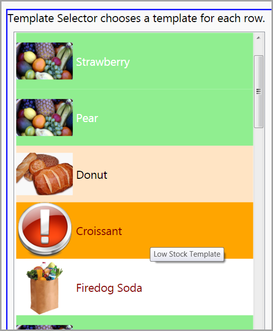
Template Selectors
The last topic I’d like to explore is the Template Selector. In WPF you can write a custom class that determines which template to apply to a data item. Essentially the WPF engine calls your Template Selector for each item in an ItemsControl. Your code can analyze the data for each row and return instructions to WPF as to which template to expand. It’s important to note that you are not returning the template XAML here. You are merely returning which of your predefined templates should be expanded. The designer must still write separate Data Templates in the main XAML file.
Let’s review the steps.
- The developer creates a custom Template Selector class. See Listing 2.
- The Template Selector class defines each potential template by name.
- The Template Selector SelectTemplate method analyzes each bound row and returns one of the potential templates. See Listing 2.
- The designer creates one Data Template in XAML for each template that is defined in the Template Selector. See Listing 3.
Take a look at Figure 7 to see the results.
Having Fun with Templates
As you’ve seen there is limitless potential in WPF for restyling the presentation of your data with templates and triggers. I’d like to close with a few examples that show-off the templating of the ListBox in interesting ways.
-
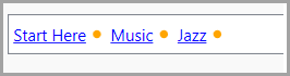
Bread Crumb: Add some hyperlinks and bullets to your template and you have the making for a Bread Crumb control. See Figure 8. -
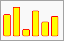
Bar Chart: Render your numerical data with a rectangle in your Data Template. Presto! You have an instant chart at your disposal. See Figure 9. -
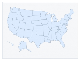
Maps: There is plenty left to discuss regarding WPF data binding. For example, I’ve yet to talk about XML data and Hierarchical Data Templates. The details of XML binding will have to wait until another article but to whet your appetite, check out this post by Murugan http://tinyurl.com/cdnfqz. It shows a Data Template that uses custom paths and XML data to render a ListBox as a US map. See Figure 10.
I’ve included all the source and links for these examples in the companion project. Enjoy your new WPF knowledge and show us the beauty of your Data Templates.
Listing 1: Data Trigger in XAML
<Page.Resources>
<!-- Apply style to all TextBoxes. -->
  <Style TargetType="TextBox">
    <Style.Triggers>
      <!-- Monitor the Price property on the
      bound Book class. -->
   <DataTrigger Binding="{Binding Path=Price}"
                                  Value="200">
        <Setter Property="Foreground"
                Value="Orange" />
        <Setter Property="FontWeight"
                Value="700" />
      </DataTrigger>
    </Style.Triggers>
  </Style>

</Page.Resources>
<StackPanel Margin='20'>
  <TextBlock>Change the price to 200 and move
  the focus to another control. All the TextBoxes will have the
  DataTrigger applied.</TextBlock>

  <TextBlock>Title</TextBlock>
  <TextBox Text='{Binding Title}'></TextBox>

  <TextBlock>Author:</TextBlock>
  <TextBox Text='{Binding Author}'></TextBox>

  <TextBlock>Price:</TextBlock>
  <TextBox Text='{Binding Price}'></TextBox>
</StackPanel>
Listing 2: Custom template selector code
public class FoodTemplateSelector : DataTemplateSelector
{
// Define a set of properties that
// represent all the templates that
// this selector can return.
public DataTemplate FruitTemplate { get; set; }
public DataTemplate BakeryTemplate { get; set; }
public DataTemplate GeneralTemplate { get; set; }
public DataTemplate LowStockTemplate { get; set; }

public override DataTemplate SelectTemplate
                (object item, DependencyObject container)
{

// Get the individual row from the source,
// examine the item and determine
// which of the templates to return.

Food f = (Food)item;

if (f.StockCount < 5)
{
return LowStockTemplate;
}

if (f.Category == Category.Bakery)
{
return BakeryTemplate;
}
else if (f.Category == Category.Fruit)
{
return FruitTemplate;
}
else
{
return GeneralTemplate;
}
}
}
Listing 3: Data Templates defined in XAML
<Page
x:Class="DataTemplates.Templated.FoodsDataTemplateSelector"
xmlns="<a href="http://schemas.microsoft.com/winfx/2006/xaml/presentation">http://schemas.microsoft.com/winfx/2006/xaml/presentation</a>"
xmlns:x="<a href="http://schemas.microsoft.com/winfx/2006/xaml">http://schemas.microsoft.com/winfx/2006/xaml</a>"
xmlns:food='clr-namespace:DataTemplates.DataSources'
>
<Page.Resources>
<!-- Designer creates one template in the XAML
for each template returned from the Template Selector class.
-- >
<DataTemplate
x:Key="fruitTemplate">
<Border
Background="LightGreen">
<StackPanel
Orientation='Horizontal'
MinWidth='150'
ToolTip='Fruit Template'>
<Image
Source='../Images/food_fruits.jpg'
Width='90'
Height='90'
Margin='0,0,5,0' />
<TextBlock
Text="{Binding Path=FoodName}"
Foreground="White"
VerticalAlignment='Center' />
</StackPanel>
</Border>
</DataTemplate>
<DataTemplate
x:Key="bakeTemplate">
<Border
Background="Bisque">
<StackPanel
Orientation='Horizontal'
MinWidth='150'
ToolTip='Bakery Template'>
<Image
Source='../Images/food_bread03.png'
Width='90'
Height='90'
Margin='0,0,5,0' />
<TextBlock
Text="{Binding Path=FoodName}"
Foreground="Black"
VerticalAlignment='Center' />
</StackPanel>
</Border>
</DataTemplate>
<DataTemplate
x:Key="genTemplate">
<!-- Details of template omitted for article. -->
</DataTemplate>
<DataTemplate
x:Key="lowStockTemplate">
<!-- Details of template omitted for article. -->
</DataTemplate>
<!-- Create instance of the custom
Template Selector class in a
Resources section. -->
<food:FoodTemplateSelector
x:Key="foodTemplateSelectorKey"
FruitTemplate="{StaticResource fruitTemplate}"
BakeryTemplate="{StaticResource bakeTemplate}"
GeneralTemplate="{StaticResource genTemplate}"
LowStockTemplate="{StaticResource lowStockTemplate}" />
</Page.Resources>
<Border
Margin="30"
BorderBrush="Blue"
BorderThickness="2">
<Grid
HorizontalAlignment="Left">
<!-- Assign the Template Selector declared in the
Resource section above. -->
<ListBox
ItemsSource="{Binding }"
MinWidth='400'
ItemTemplateSelector="{StaticResource foodTemplateSelectorKey}"
Margin="10"
HorizontalContentAlignment='Stretch' />
</Grid>
</Border>
Table 1: Partial list of Trigger types available in WPF.
| Trigger Name | Description |
|---|---|
| Trigger | Sometimes called a Property Trigger. This trigger watches a DependencyProperty for your configured value and then modifies one or more property values. |
| EventTrigger | Usually there is a one-to-one correspondence between an EventTrigger and a RoutedEvent, for example, the Click event is affiliated with the Click Event Trigger. It is used to start, stop and manage animations. |
| DataTrigger | This trigger is useful in data-binding scenarios. |