In Chapter 3, we saw the Repeater control in ASP.NET and how we can use it to bind and unbind data in our applications. In this chapter, we will discuss the DataList control, which, like the Repeater control, can be used to display a list of repeated data items.
In this chapter, we will cover the ASP.NET DataList control. We will learn about the following:
- Using the DataList control
- Binding images to a DataList control dynamically
- Displaying data using the DataList control
- Selecting, editing and delete data using this control
- Handling the DataList control events
The ASP.NET DataList Control
The DataList control like the Repeater control is a template driven, light weight control, and acts as a container of repeated data items. The templates in this control are used to defi ne the data that it will contain. It is fl exible in the sense that you can easily customize the display of one or more records that are displayed in the control. You have a property in the DataList control called RepeatDirection that can be used to customize the layout of the control.
The RepeatDirection property can accept one of two values, that is, Vertical or Horizontal. The RepeatDirection is Vertical by default. However, if you change it to Horizontal, rather than displaying the data as rows and columns, the DataList control will display them as a list of records with the columns in the data rendered displayed as rows.
This comes in handy, especially in situations where you have too many columns in your database table or columns with larger widths of data. As an example, imagine what would happen if there is a field called Address in our Employee table having data of large size and you are displaying the data using a Repeater, a DataGrid, or a GridView control. You will not be able to display columns of such large data sizes with any of these controls as the display would look awkward. This is where the DataList control fits in.
In a sense, you can think the DataList control as a combination of the DataGrid and the Repeater controls. You can use templates with it much as you did with a Repeater control and you can also edit the records displayed in the control, much like the DataGrid control of ASP.NET. The next section compares the features of the three controls that we have mentioned so far, that is, the Repeater, the DataList, and the DataGrid control of ASP.NET.
When the web page is in execution with the data bound to it using the Page_Load event, the data in the DataList control is rendered as DataListItem objects, that is, each item displayed is actually a DataListItem. Similar to the Repeater control, the DataList control does not have Paging and Sorting functionalities built into it.
Using the DataList Control
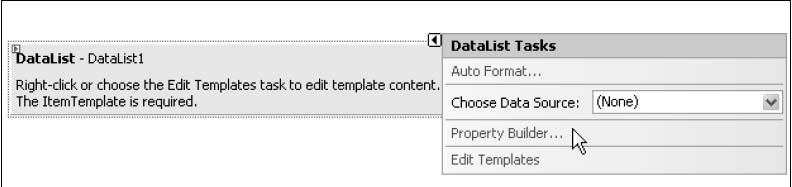
To use this control, drag and drop the control in the design view of the web form onto a web form from the toolbox.
Refer to the following screenshot, which displays a DataList control on a web form:
The following list outlines the steps that you can follow to add a DataList control in a web page and make it working:
- Drag and drop a DataList control in the web form from the toolbox.
- Set the DataSourceID property of the control to the data source that you will use to bind data to the control, that is, you can set this to an SQL Data Source control.
- Open the .aspx file, declare the <ItemTemplate> element and define the fi elds as per your requirements.
- Use data binding syntax through the Eval() method to display data in these defined fields of the control.
You can bind data to the DataList control in two different ways, that is, using the DataSourceID and the DataSource properties. You can use the inbuilt features like selecting and updating data when using the DataSourceID property. Note that you need to write custom code for selecting and updating data to any data source that implements the ICollection and IEnumerable data sources. We will discuss more on this later. The next section discusses how you can handle the events in the DataList control.
Displaying Data
Similar to the Repeater control that we looked at in Chapter 3, the DataList control contains a template that is used to display the data items within the control. Since there are no data columns associated with this control, you use templates to display data. Every column in a DataList control is rendered as a <span> element.
A DataList control is useless without templates. Let us now lern what templates are, the types of templates, and how to work with them. A template is a combination of HTML elements, controls, and embedded server controls, and can be used to customize and manipulate the layout of a control. A template comprises HTML tags and controls that can be used to customize the look and feel of controls like Repeater, DataGrid, or DataList. There are seven templates and seven styles in all. You can use templates for the DataList control in the same way you did when using the Repeater control. The following is the list of templates and their associated styles in the DataList control.
The Templates are as follows:
- ItemTemplate
- AlternatingItemTemplate
- EditItemTemplate
- FooterTemplate
- HeaderTemplate
- SelectedItemTemplate
- SeparatorTemplate
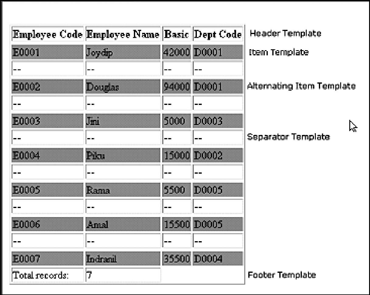
The following screenshot illustrates the different templates of this control.
As you can see from this figure, the templates are grouped under three broad categories. These are:
- Item Templates
- Header and Footer Templates
- Separator Template
Note that out of the templates given above, the ItemTemplate is the one and only mandatory template that you have to use when working with a DataList control. Here is a sample of how your DataList control's templates are arranged: See Code Listing 1.
The following screenshot displays a DataList control populated with data and with its templates indicated.
Customizing a DataList control at run time
You can customize the DataList control at run time using the ListItemType property in the ItemCreated event of this control as follows: See Code Listing 2.
The Styles that you can use with the DataList control to customize the look and feel are:
- AlternatingItemStyle
- EditItemStyle
- FooterStyle
- HeaderStyle
- ItemStyle
- SelectedItemStyle
- SeparatorStyle
You can use any of these styles to format the control, that is, format the HTML code that is rendered.
You can also use layouts of the DataList control for formatting, that is, further customization of your user interface. The available layouts are as follows:
- FlowLayout
- TableLayout
- VerticalLayout
- HorizontalLayout
You can specify your desired fl ow or table format at design time by specifying the following in the .aspx file.
RepeatLayout = "Flow"
You can also do the same at run time by specifying your desired layout using
the RepeatLayout property of the DataList control as shown in the following code snippet:
DataList1.RepeatLayout = RepeatLayout.Flow
In the code snippet, it is assumed that the name of the DataList control is DataList1.
Let us now understand how we can display data using the DataList control. For this, we would first drag and drop a DataList control in our web form and specify the templates for displaying data. The code in the .aspx file is as follows: See Code Listing 3
The DataList control is populated with data in the Page_Load event of the web form using the DataManager class as usual. See Code Listing 4
Note that the DataBinder.Eval() method has been used as usual to display the values of the corresponding fi elds from the data container in the DataList control. The data container in our case is the DataSet instance that is returned by the GetEmployees () method of the DataManager class.
When you execute the application, the output is as follows:
Handling Events
The Repeater, DataList, and DataGrid controls support event bubbling. What is event bubbling? Event Bubbling refers to the ability of a control to capture the events in a child control and bubble up the event to the container whenever an event occurs. The DataList control supports the following six events:
- ItemCreated
- ItemCommand
- EditCommand
- UpdateCommand
- DeleteCommand
- CancelCommand
We will now discuss how we can work with the events of the DataList control. In order to handle events when working with a DataList control, include a Button or a LinkButton control in the DataList control. These controls have click events that can be used to bubble up the triggered event to the container control, that is, the DataList.
The following code snippet illustrates how you can attach a handler to an ItemCommand event of a DataList control:
   <asp:DataList ID="DataList1" runat="server" onItem
        Command ="ItemCommandEventHandler"/>
The corresponding handler that gets called whenever the event is fired is as follows:
   void ItemCommandEventHandler (Object src, DataList
   CommandEventArgs e....)
   {
      //Some event handling code
   }
Similarly, you can handle the ItemCreated event by specifying the handler in the .aspx file as follows:
   <asp:DataList ID="DataList1" runat="server" onItem
           Created = "ItemCreatedEventHandler" />
The corresponding handler that is triggered whenever this event occurs is as follows.
void ItemCreatedEventHandler ( Object src, DataList
CommandEventArgs e)
{
      //Some event handling code
}
Similarly, you can use the CancelCommand event by specifying the event handler in your .aspx file as follows:
<asp:DataList ID="DataList1" runat="server" onCancel
Command =.........."CancelCommandEventHandler" />
The corresponding event handler that would get fired is as follows:
void CancelCommandEventHandler ( Object src, DataList
CommandEventArgs e )
{
      //Some event handling code
}
You can handle any of the other events similarly and execute your event handlers appropriately. We will discuss more about using these events to Select, Edit, and Delete data using the DataList control later in this chapter.
We will explore how we can display images using the DataList control in the next section.
Binding Images Dynamically
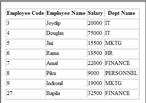
Let us now see how we can display images using the DataList control. Here is a situation where this control scores over the other data-bound controls as you can set the RepeatDirection property of this control to Horizontal so that we can display the columns of a particular record in one single row.
The following screenshot illustrates how the output of the application would look when it is executed:
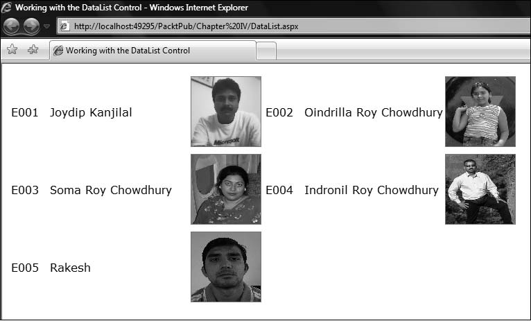
We will now discuss how we can implement this application that displays the employee details, like code, name, and the individual's photo. We need an Image control that we will use inside the ItemTemplate of the DataList control in use. Here is how you can use the Image control.
<img src='<%# DataBinder.Eval(Container.DataItem, "EmpName") %>.png'
style="height:100px;width:100px;border:1px solid gray;"/>
Note that all the images have a primary name corresponding to the employee's name with a .png extension. The complete source code of the DataList control in your .aspx file would be similar to what follows: See Code Listing 5
Note the use of the properties RepeatColumns and RepeatDirection in this code snippet. While the former implies the number of columns that you would like to display per record in the rendered output, the later implies the direction of the rendered output, that is, horizontal or vertical.
Binding data to the control is simple. You need to bind the data to this control in the Page_Load event of this control in your code-behind file. Here is how you do the binding:
DataManager dataManager = new DataManager();
DataList1.DataSource = dataManager.GetEmployees();
DataList1.DataBind();
Wow! When you execute the application, the images are displayed along with the employee's details. The output is similar to what we have seen in the screenshot earlier in this section.
In the following sections, we will explore how to Select, Edit, and Delete data using the DataList control.
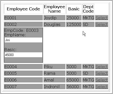
Selecting Data
You need to specify the event handler that will be invoked in the OnItemCommand event as follows:
OnItemCommand = "Employee_Select"
You also need to specify a LinkButton that the user would have to click on to select a particular row of data in the DataList control. This command button would be specified in the ItemTemplate as shown here:
<asp:LinkButton ID="lnkSelect" runat="server" CommandName
="Select" >
Select </asp:LinkButton>
The reason why we choose to use the ItemTemplate to place the command button to select data is that the contents of this template are rendered once for each row of data in the DataList control. The code for the event handler is as follows:
protected void Employee_Select(object source,
                              DataListCommandEventArgs e)
      {
         DataList1.EditItemIndex = e.Item.ItemIndex;
         DataList1.DataBind();
      }
The output on execution is shown in the following screenshot.
Resizing a DataList control when the browser's size changes
When you change the width or height of a browser that has a DataList control in it, the size of the DataList doesn't change. Here is a workaround to this.
Create a CSS class that you will use in as the control's CssClass as shown below.
<script type="text/css">
   .ResizeDataList
   {
      height:100%;width:100%;
   }
</script>
Next, use this CSS class in the DataList control as shown here.
<asp:DataList ID="dl" runat="server" CssClass="ResizeDa
taList">
<!-- Usual code here -->
</asp:DataList>
Editing data
The DataList control can be used to edit your data, bound to this control from a data store. This section discusses how we can edit data using this control. You can edit data using the DataList control by providing a command-type button control in the ItemTemplate of the DataList control. These command-type button can be one of the following.
- Button
- LinkButton
- ImageButton
In our example, we will be using an ImageButton control. Further, you need to specify the OnEditCommand event and the corresponding event handler that will be triggered whenever the user wants to edit data in the DataList control by clicking on the ImageButton meant for editing the data.
Note that whenever the user clicks on the command button for editing the data, the data items in the DataList control are set to editable mode to enable the user to edit the data. This is accomplished by the use of the EditItemTemplate. It should be noted that the EditItemTemplate is rendered for a data item that is currently in the edit mode of operation.
The following code listing shows how your .aspx code for this control with edit mode enabled would look: See Code Listing 6
The corresponding event handler to handle the edit operation, Employee_Edit, is defined as follows:
protected void Employee_Edit(object source, DataList
CommandEventArgs e)
      {
         DataList1.EditItemIndex = e.Item.ItemIndex;
         DataList1.DataBind();
      }
The .ItemIndex property of the DataListCommandEventArgs instance gives us the row index of the DataList control that is being edited. This index starts with a value of zero, that is, the index for the first row of data that is rendered in the DataList control is 0.
The following screenshot shows the output on execution.
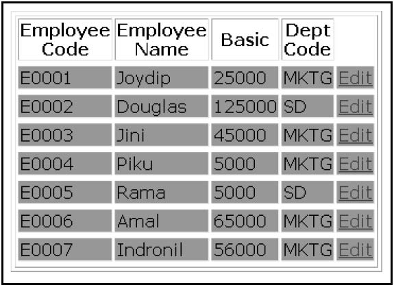
Note that the Edit command button is rendered for each of the rows of the DataList control. Now, when you click on this button on any of the rows to edit the data for that row, the output is as follows:
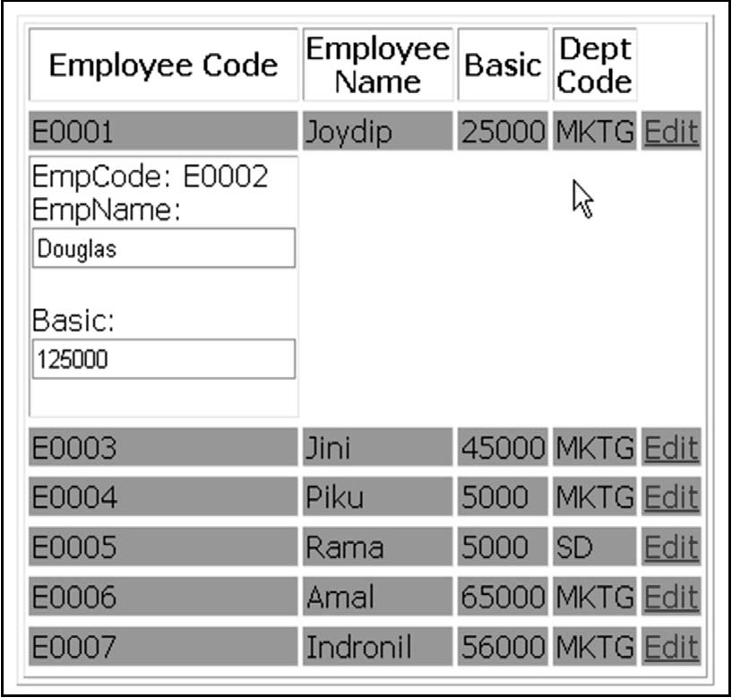
Note that the second record is set to editable mode on clicking the Edit command button that corresponds to the second record.
How to enable/disable an embedded control within the DataList control
To enable or disable any control contained within the DataList control, use the following technique in the ItemDataBound event of the control. (See Code Listing 7)
Deleting data
This section discusses how we can delete data using the DataList control. Similar to what we have done in the previous section for editing data using the DataList control, you need to specify the event handler that will be triggered for the delete operation in the .aspx file. You also require a LinkButton as usual.
The following code snippet illustrates the code that you need to write for the .aspx file to specify the event handler that will be invoked for the delete operation.
OnDeleteCommand = "Employee_Delete"
The code for the Employee_Delete event handler that you need to write in the code-behind file, that is, DataList.aspx.cs is as follows:
   protected void Employee_Delete(object source,
   DataListCommandEventArgs e)
      {
       DataList1.EditItemIndex = e.Item.ItemIndex;
       //Code to delete the row represented by ItemIndex
       DataList1.EditItemIndex = -1; //Reset the index
       DataList1.DataBind();
      }
The following is the output on execution.
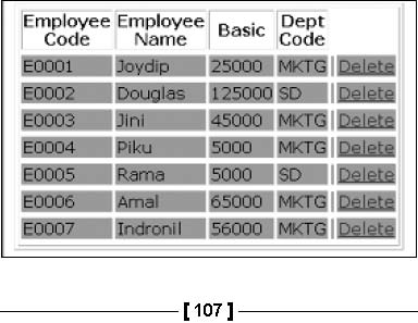
As is apparent from the given screenshot, you just need to click the Delete Link Button that corresponds to the employee record that you need to delete. Once you do so, the specific record gets deleted.
Summary
We have had a bird's eye view of the DataList control in this chapter and how we can use it in our ASP.NET applications. We have discussed how to select, edit, and delete data with this control and how to work with the events of this control. We also discussed how we can bind images to the DataList control programmatically. The next chapter will discuss the DataGrid control, one of the most widely used data controls in ASP.NET.