In the last issue, I discussed the fundamental blocks of the page model. For those who missed that article, here's a 10,000-foot view of the page framework.
Every UI development system has the notion of screens: separate units of UI real estate that divide the application into work areas. They go by different names; you may know them as views, forms, dialogs, or pages. Whatever the name, they serve a useful purpose: keeping the UI bits separated into logical sub-areas of the application.
Pages are the top-level elements in the Xamarin UI. Think of pages as the screens in your app. Most of the time, a page takes up the entire screen of the device. However, pages can have sub-pages embedded within their content. In that case the sub-pages are more like a composite user control. If you're an experienced mobile developer, a Xamarin Page corresponds to iOS View Controller, Android Activity, or Windows Phone Page.
Navigation: Moving Between Pages
When faced with building an app containing multiple pages (see Figure 1), you have to determine your navigation strategy. There are plenty of questions to ask your stakeholders and team including:
- How do the users move between pages?
- Does the content of the next page depend on choices made on current page?
- How is state passed between pages?
- Do you need to track the navigation history?
- A healthy app should be forgiving; how will you handle undo and associated navigation?
Once you have the strategy in place, it's time to choose the navigation's UI. There are plenty of patterns available. Here's a partial list:
- Buttons on the page that navigate to another page
- Drop-down menus
- Pagination links
- Breadcrumb links
- Appbar
- Tabs
- Carousel
This article is not the place to discuss the UX principles for good navigation. But it is the place to show what navigation tools are available in Xamarin.Forms.
The Page Types
There are a number of page types available in the Xamarin library (see Figure 2). Let's look at the ones that are helpful for navigation purposes.

In this article, I'll explore the TabbedPage and CarouselPage. The TabbedPage and CarouselPage are containers for child pages. They host the child content (usually contained in a ContentPage) and provide the UI affordances to enable the user to switch between pages. The main difference between the two page types is how they encourage users to move between pages. The TabbedPage uses the familiar tab metaphor; you switch between child pages by touching a tab. The CarouselPage depends heavily on the left-right swipe gesture to move between child pages.
That leaves the NavigationPage. Its main benefit is to provide a navigation stack, which holds the page history, and a navigation appbar for Android and iPhone devices. I'll explore the NavigationPage in another article.
To learn more about the Page base class, the ContentPage or MasterDetailPage check out the last article in this series: Xamarin Pages: The Screens of an App (CODE Magazine, July/August 2015).
Tabbed Content
Using tabs for application navigation has a long history in the PC world. You've seen examples of it on your computer in dozens of programs. The basic concepts are shown in Figure 3.
Tabbed UI usually has a flat section on one side of the UI (most commonly the top side) that contains a list of tab items. Each tab has text describing the page. Some implementations mimic the tabbed look of office tab folders; others choose a minimalist look showing a set of horizontal links. Good implementations indicate which tab is selected, so the user can tell at a glance where they are in the app.
Use a tabbed interface to provide a readable list of page choices. Because of the limited width of mobile devices, a tabbed interface is not a good choice if the tab names are long or there are more than three or four pages.
Each mobile platform has different UI metaphors for the tab appearance. Luckily for us, the Xamarin TabbedPage takes care of providing the right look for each platform.
Luckily for us, the Xamarin TabbedPage takes care of providing the right look for each platform.
Making the TabbedPage
The TabbedPage is simple to use. In XAML, add each page as child elements, as shown in this code snippet.
<TabbedPage
    xmlns="..."
    xmlns:x="..."
    xmlns:local="clr-namespace:Nav;assembly=Nav"
    x:Class="Nav.WeatherTabbedEmpty">

    <ContentPage Title="Maps"
                 BackgroundColor="#FF60337F"/>
    <ContentPage Title="Forecasts"
                 BackgroundColor="Teal"/>
    <local:SingaporePage />
</TabbedPage>
The first two tabs are empty, created entirely in XAML. Here, I'm setting the BackgroundColor and Title properties. Setting the title property is important as it's shown on the tab UI.
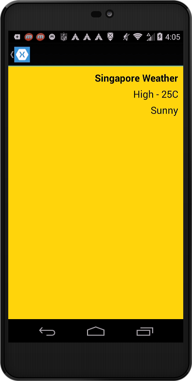
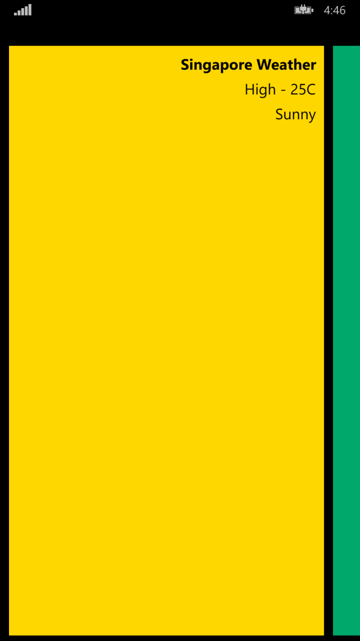
The third tab page is more complex; I'm adding it via a custom XML namespace. The Singapore page is defined in a separate XAML file (see Listing 1).
Listing 1: SingaporePage.xaml
<? xml version="1.0" encoding="utf-8" ?>
<ContentPage xmlns="http://xamarin.com/schemas/2014/forms"
             xmlns:x="http://schemas.microsoft.com/winfx/2009/xaml"
             x:Class="Nav.SingaporePage"
             Title="Singapore">
    <ContentPage.Resources>
        <ResourceDictionary >
            <Style TargetType="Label">
                <Setter Property="VerticalOptions" Value="Center" />
                <Setter Property="HorizontalOptions" Value="End" />
                <Setter Property="FontSize" Value="20" />
                <Setter Property="TextColor" Value="Black" />
            </Style>
        </ResourceDictionary>
    </ContentPage.Resources>

    <StackLayout BackgroundColor="#FFd700" Padding="10">
        <Label Text="Singapore Weather"  FontAttributes="Bold"/>
        <Label Text="High - 25C" />
        <Label Text="Sunny" />
    </StackLayout>
</ContentPage>
Finally, I'm adding a fourth page dynamically in the code behind page, as shown in the following snippet.
namespace Nav {
    public partial class WeatherTabbed : TabbedPage {
        public WeatherTabbed() {
            InitializeComponent();

            this.Children.Add(new BarcelonaPage());
        }
    }
}
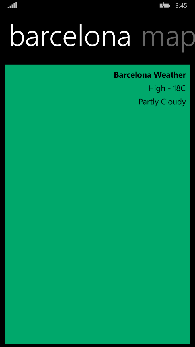
Check out the full XAML for the Barcelona page in Listing 2.
Listing 2: BarcelonaPage.xaml
<? xml version="1.0" encoding="utf-8" ?>
<ContentPage xmlns="http://xamarin.com/schemas/2014/forms"
             xmlns:x="http://schemas.microsoft.com/winfx/2009/xaml"
             x:Class="Nav.BarcelonaPage"
             Title="Barcelona">
    <ContentPage.Resources>
        <ResourceDictionary >
            <Style TargetType="Label">
                <Setter Property="VerticalOptions" Value="Center" />
                <Setter Property="HorizontalOptions" Value="End" />
                <Setter Property="FontSize" Value="20" />
                <Setter Property="TextColor" Value="Black" />
            </Style>
        </ResourceDictionary>
    </ContentPage.Resources>
    <StackLayout BackgroundColor="#00a86b" Padding="10">
        <Label Text="Barcelona Weather"  FontAttributes="Bold" />
        <Label Text="High - 18C"   />
        <Label Text="Partly Cloudy"  />
    </StackLayout>
</ContentPage >
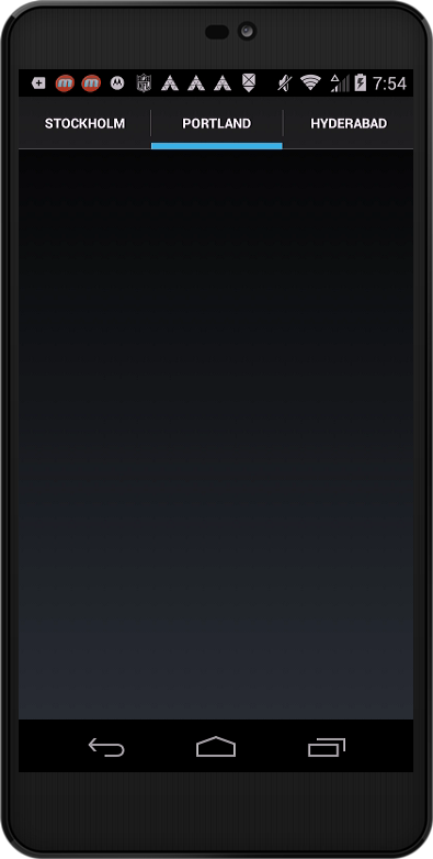
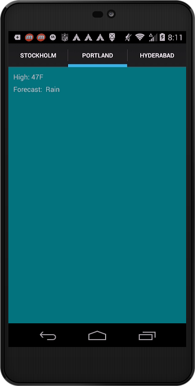
That's it! When the WeatherTabbed page is opened, this is what you see (Figure 4) on an Android device (running KitKat v.4.4).
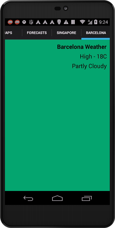
On my Moto G phone (720p, 4.5 inch display), the four tabs can't all fit on the screen at the same time. See how the Maps tab is scrolled off the left edge of the screen? The Android tab implementation supports swipe-left/swipe-right to move to hidden tabs.
The tab text defaults to all caps. On my device, there's a blue bar below the selected tab to indicate that it's the active tab.
Here's the same UI (Figure 5) running on an iPhone 5S (iOS 8.1).
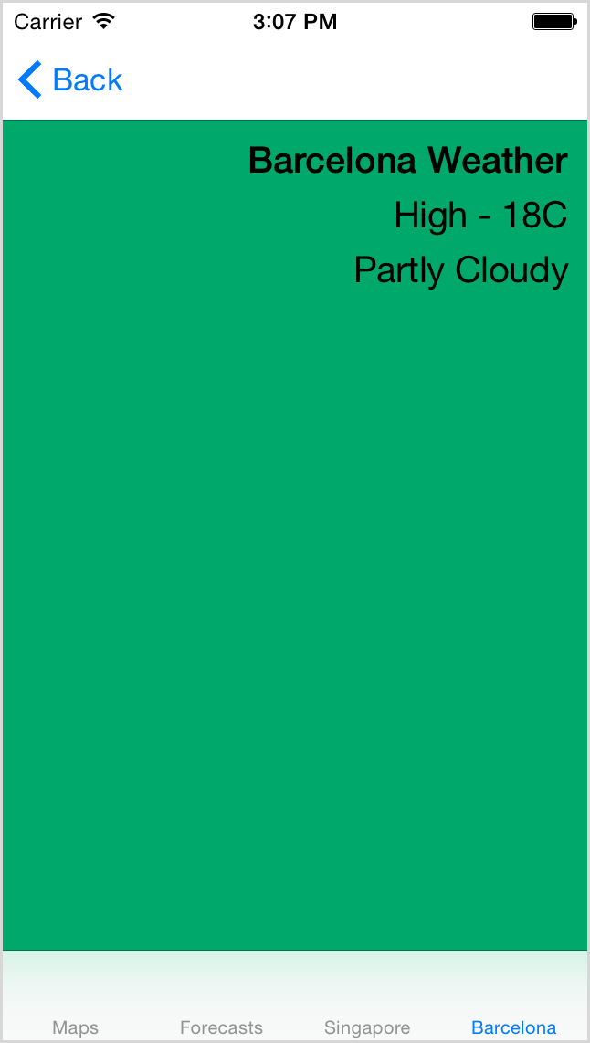
On this device, the tabs are located on the bottom of the screen. As you can see, all of the tabs fit on the screen. The selected tab is indicated with a different color font, blue in this screenshot.
Finally, here is the same UI running on a Windows Phone (Figure 6).
This phone uses a giant typeface for the tab text. As a result, only two tab items fit on this screen (1080p, 6- inch display). It does support swipe-left/swipe-right gestures for the tab bar. Windows phone also wraps the content, so I can see part of the Maps tab to the right of the Barcelona tab.
Let's have a round of applause for the Xamarin team; they make the tabbed UI work in the familiar ways on each device.
The CarouselPage
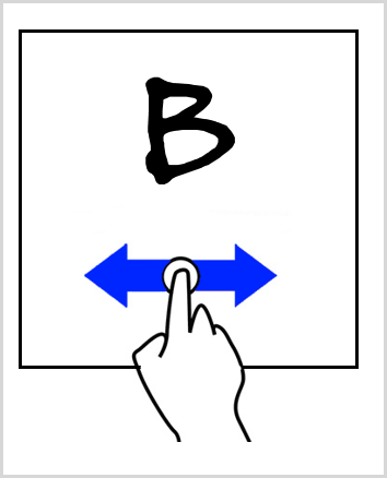
The side-swipe gesture is a fundamental part of modern mobile interfaces. This makes it easy to do away with the tabbed metaphor (where the user has to touch the tab portion of the screen in order to navigate) and provide a gesture-based way to move between child pages (see Figure 7).
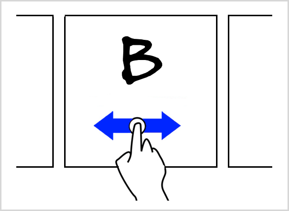
One drawback of carousels on touch devices is that the user may not know that a swipe gesture is available for navigation. Some implementations solve this issue by showing a small slice of the side pages when looking at the current page (see Figure 8). Because most mobile developers prefer to maximize screen real estate, many carousel controls don't show the off-screen page edges.
One drawback of carousels on touch devices is that the user may not know that a swipe gesture is available for navigation.
Making a CarouselPage
Using a CarouselPage is a snap! The XAML/code is nearly identical to the TabbedPaged code; just change the page type to CarouselPage, as shown in the following XAML snippet.
<CarouselPage
    xmlns="..."
    xmlns:x="..."
    xmlns:local="clr-namespace:Nav;assembly=Nav"
    x:Class="Nav.WeatherCarousel">

    <ContentPage Title="Maps"
                 BackgroundColor="#FF60337F"/>
    <ContentPage Title="Forecasts"
                 BackgroundColor="Teal"/>
    <local:SingaporePage />
</CarouselPage>
Of course, the C# code needs a few minor tweaks.
namespace Nav {
    public partial class WeatherCarousel : TabbedPage {
        public WeatherCarousel() {
            InitializeComponent();

            this.Children.Add(new BarcelonaPage());
        }
    }
}
Here's a screenshot of the CarouselPage on Android (Figure 9) and Windows Phone (Figure 10).
Using a Data Source and Data Template
If you're a data binding fan, you'll be happy to learn that the TabbedPage supports binding of the child page collection.
If you're a data binding fan, you'll be happy to learn that the TabbedPage supports binding.
For my databinding implementation, I'll use a ViewModel class for the data-source (shown in Listing 3).
Listing 3: WeatherViewmodel.cs
internal class WeatherViewModel : INotifyPropertyChanged {

    public WeatherViewModel() {
        CityWeatherList = WeatherDataSource.GetAllCities();
        this.SelectedItem = CityWeatherList.First();
    }

    public event PropertyChangedEventHandler PropertyChanged;

    private CityWeather _selectedCity;

    public CityWeather SelectedItem {
        get { return _selectedCity; }
        set {SetProperty(ref _selectedCity, value);}
    }

    private List<CityWeather> _cityWeatherList;

    public List<CityWeather> CityWeatherList {
        get { return _cityWeatherList; }
        private set { SetProperty(ref _cityWeatherList, value); }
    }

    // A ShowMaster property would be nice in the ViewModel
    // Xamarin binding didn't work with IsPresented property
    // So I removed it from the class

    protected void SetProperty<T>(ref T field, T value,
      [CallerMemberName] string name = "") {
        if (!EqualityComparer<T>.Default.Equals(field, value))
        {
            field = value;
            var handler = PropertyChanged;
            if (handler != null)
            {
                handler(this, new PropertyChangedEventArgs(name));
            }
        }
    }
}
It's a very simple view model; with just a few members suitable for the databinding in the XAML file. It contains a property named CityWeatherList which I'll use as the data-source for the TabbedPage ItemsSource property. As you can see in the following snippet, the property is typed as a ObservableCollection<CityWeather>.
public ObservableCollection<CityWeather> CityWeatherList {}
The CityWeather class is a simple data transfer object.
public class CityWeather {
    public string CityName { get; set; }
    public string HighTemp { get; set; }
    public string Forecast { get; set; }
}
I'll use the ViewModel in the TabbedPage by setting the ItemsSource property in the TabbedPage constructor.
public partial class WeatherTabbedBound : TabbedPage {
    public WeatherTabbedBound() {
        InitializeComponent();
        var vm = new WeatherViewModel();
        this.ItemsSource = vm.CityWeatherList;
    }
}
In the XAML for the TabbedPage, I'll create a DataTemplate for each bound item. Remember that the TabbedPage derives from MultiPage.
public class TabbedPage : MultiPage<Page>
Because of this, I need to use a page class in the data template. In this example, I use a ContentPage and set its Title property via a binding. The results are visible in Figure 11.
<TabbedPage.ItemTemplate>
    <DataTemplate>
        <ContentPage Title="{Binding CityName}">

        </ContentPage>
    </DataTemplate>
</TabbedPage.ItemTemplate >
Next, I'll add some child elements to the ContentPage and bind them to the same ViewModel.
<DataTemplate>
    <ContentPage Title="{Binding CityName}">
        <StackLayout Padding="10" BackgroundColor="#FF00757D">
            <Label Text="{Binding HighTemp, StringFormat='High: {0}'}" />
            <Label Text="{Binding Forecast, StringFormat='Forecast: {0}'}" />
        </StackLayout>
    </ContentPage>
</DataTemplate>
And the results are shown in Figure 12.
The full power of DataTemplates are available in the TabbedPage. You can build a complex child page using the any of the built-in views and bind any of the properties of the views to the data-source. The CarouselPage also supports binding and data templates. The only significant difference in the CarouselPage is that the data template must be a ContentPage. That's because of the way the class derives from MultiPage.
public class CarouselPage : MultiPage<ContentPage>
Using a Navigation Bar
When you need more control over the navigation process, perhaps the ability to add or remove pages from the navigation history, turn to the NavigationPage. It exposes the Navigation property, which lets you push and pop items to the NavigationStack. As an added benefit, it adds an appbar to the Android and iOS pages. The user can interact with the appbar to travel forward or backward through the page history. Look for details in the next issue.