


Over the last few years, I've written articles about ETL and back-end processes in data warehousing applications. A few months ago, I started writing a similar article on a “playbook” for analytic reporting. I've built many business intelligence applications for several industries. Although the specifics differ, there are common key elements. Just like Visual Studio and .NET have properties, events, and methods, BI applications have flashpoints, activities, and strategies that occur along the life cycle of the application. I began to write an article that organized these “PEMs” into a playbook. I initially took an actual business application and mocked up the data for the example. Then in February/March of 2020, news of COVID-19 began to affect us all. I changed my example application to use COVID-19 data and will present it here.
Related Article
Stages of Data: A Playbook for Analytic Reporting Using COVID-19 Data, Part 2
Disclaimer
Before I talk about my goals for this article, I realize that writing about COVID-19 and presenting a reporting application can seem odd and even morbid. Every number is a human being, and as I type this, the United States and World Death counts are roughly 87K and 312K respectively and growing every day. These are victims with family and friends.
We have health care workers who are dealing directly with the crisis of their lifetimes. Millions of individuals have lost their jobs and/or have experienced major economic hardships. Parents and children are dealing with the massive shift in the education model and the challenges of kids staying at home. For all the items I just mentioned, there are countless others. I struggle to find the words to convey how serious this is.
Over the years, I've collected data for personal projects, ranging from my daily health numbers to election counts to sports statistics. I started collecting data on COVID because I wanted to track the trends - not just in the big cities, but in smaller areas where I'd heard news stories of outbreaks. Along the way, several people alerted me to some very attractive public dashboards on COVID data. They were visually impressive, but I found that several lacked the types of analytic paths I wanted to track. (I'll cover those below in the “Goals for This Application” section).
We see coverage of these numbers every day, with many positions/opinions related to policy decisions to deal with this crisis. I'm writing this without injecting any personal view or bias. Because I can never resist a pop culture analogy, many will recall that in all the years of the Johnny Carson “Tonight Show,” he talked about all sorts of news events, but you never knew his opinions on the content. Likewise, I'm not offering any opinion or looking to make any statement about potential policy decisions to deal with COVID, other than to state the obvious: There are no easy answers for this.
In this article, I'm going to use some of the mapping features in Power BI, and to keep things simple, I'm restricting the scope of this article and COVID data to the “lower-48 states” in the United States. I acknowledge that CODE has many readers outside the U.S, as well as the U.S. states of Alaska and Hawai'i. I'm in no way minimizing their shared experiences through this horrible crisis. Writing an article and presenting a case application requires some economizing in a fixed window of time, and for that reason I've restricted this to the 48 states.
Also, many in the news have discussed the accuracy of the case/death counts and the context surrounding the data collection. I'm going to assume, for purposes of this article, that the numbers are valid. At the end of the article, I've listed all of my data sources.
I understand if readers react that this is too dark a topic. But to the degree that people compare current events to past history of pandemics, discussions today potentially become the history of tomorrow. The books we read today on pandemics from 50-100 years ago (filled with statistics) were at one time “current events”.
Goals for This Application
I've looked at several public COVID-19 dashboard reporting applications. Some have eye-popping displays, but don't always have as many drill-down features. Some show more detailed information but spread across several pages in such a way that putting it together to form a picture is difficult.
Building the proverbial Holy Grail of reporting applications takes a long cycle of continuous improvements. There's an old variation of a Murphy's Law joke that the perfect application does not exist, and if it did, few would likely use it. Even so, I wanted to put together a reporting piece that would cover some of my questions about numbers across the country with respect to certain metrics, such as population densities. Therefore, I decided to re-work my article to cover a COVID data and reporting application. I'll present the application and then talk about the “plays” in my report application playbook to see how many plays I actually covered.
First, the granularity of the data would be daily cases count and deaths by United States County.
- The county population (from 2019)
- County square miles
- Population per square mile
- Daily count of new CV cases and CV deaths
- CV deaths as a % of cases
- CV cases and CV deaths as a percent of population, square mile, and population/square mile
Here are some of the things I'd like to include:
- Summaries of this information by week, because there can be dramatic day-to-day changes
- Ranking the counties and states in the U.S. by any of the listed metrics. This will allow me to find hotspots that some might not initially believe would be a hotspot.
- Assign a key performance indicator (KPI), to see which counties are trending downward enough to start re-opening. For instance, a state might declare that a county can re-open when the number of cases over the last two weeks is less than X cases per Y-thousand people
- Rendering this data in bar charts, tables, and basic state/county maps filled based on a metric.
- Easy drill-down from a state into the counties.
- When looking at cumulative numbers by county, easily see the daily and weekly progression of these metrics.
If you've been following the news on this general subject, you know that there's been discussion on hospital counts, hospital resource usage, nursing home statistics, and breakouts by age group. I wanted to include statistics in these areas, but for the following reasons couldn't:
- I tried to pull statistics on hospital case counts. I found some at local levels but not across enough of the country.
- I also tried to pull statistics on counts in long-term care facilities, as well as breakouts by age group. Confidentiality laws and regulations make this data hard to attain. As of early May 2020, roughly 35 of the 50 states provide some/all of these statistics. Currently the NY Times reports that as many as 33% of COVID-19 deaths in the United States are in nursing homes, with several states well above 50%. My home state of Pennsylvania reports nearly 70% of COVID deaths are in nursing homes, with some counties reporting as high as 80%.
Based on the Data, Find Out the Following
There are nine questions I'd like to use this application to answer. I've put them into three categories:
General statistics:
- On any given day, how did the states rank for a particular metric?
- For the state with the highest deaths, what was the county breakout?
- For a specific county and a rate/based metric (deaths per square mile, deaths per population), how easily can I see, all at once, the rate for the county, the related state, and the U.S.? (Note: at the risk of giving the plays away too soon, this is an important topic: the ability to show percentages for an entity, the parent entity, the grandparent entity, etc.)
- Even if I'm looking at cumulative numbers as of a certain point in time, can I see the daily/weekly progression?
- Can I sort counties across the country by one number (population, or population per square mile), and then compare another metric (deaths or cases per population)?
Mapping questions:
- Can I render this information in maps and show a geographic county map to illustrate which counties in a state have the worst metrics?
- I know that major cities like NYC have been devastated. However, there are smaller counties in the continental U.S. with very high death/population rates. Is there any easy way to see them?
State comparison question:
- We know that New York has had the highest state numbers. What about the next five highest states? How have they trended over the last month? And when I look at their county populations, is there direct correlation?
Assessment of readiness (Key Performance Index) question:
- As of this writing (early May 2020), some states have set guidelines for partial re-openings by county. For instance, in Pennsylvania, one major guideline is that, for the last 14 days, a county must have less than 50 total new cases in those fourteen days per 100,000 residents. For counties in PA (and for that matter, across the nation), which counties are in the best relative position to meet this, and which are the worst?
The Tools I've Chosen
I'm using SQL Server Integration Services to pull down daily CSV case/death counts. I used SQL Server to hold the data and Microsoft Power BI for the visualizations. Could I have done this in SQL Server Reporting Services? Yes. However, Power BI's dashboard offerings have improved to the point where it's a legitimate tool for this type of work. Yes, there are still SSRS features that should be in Power BI, but Power BI is still a strong tool for this type of work.
I deployed this report to my Power BI Pro site in the cloud, and I published a public version. My website (www.kevinsgoff.net) has a link to the application (the URL is much too long to include here and could change).
This article will contain some T-SQL code to deal with some allocation of data, and some Power BI DAX code to deal with dynamic measures/calculations. My website (www.kevinsgoff.net) has information on the public version of this Power BI application, along with the Power BI Desktop (PBIX) file and other necessary files.
Begin with the End in Mind: The Data
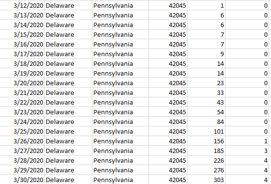
Here is the core data I need to collect. First, I need a table of counties in the continental United States, along with a recent population count and square mile measurement (Figure 1).

The population count comes from the July 1, 2019 United States Census Bureau. The FIPS code (Federal Information Processing Standard) is a combination of a zero-filled two-digit state code and a zero-filled three-digit county code. From Figure 1, 42045 uniquely indicates Delaware County in Pennsylvania. (There are six counties named “Delaware” in the United States). As it turns out, the COVID-19 daily count source I've been using has the FIPS code as the key.
In the Data Sources section at the end of this article, I've included the websites where I pulled the county FIPS codes and population. I was determined to pull square miles by land, as I wanted to include population density as a metric. Given the early statistics on infection rates, population per square mile can be a major correlating factor.
I was determined to pull square miles by land, as I wanted to include population density as a metric. Given the early statistics on infection rates, population per square mile can be a major correlating factor.
This was quite a challenge: the only source I could find was a PDF that I had to convert to Excel, and then parse the columns carefully. The values had spaces instead of commas for any four-digit values, which made it tricky. Knowing this would likely be a one-and-done effort (county land area doesn't change much, and certainly not to any degree of analytic significance), I didn't mind doing a one-time pattern hack, so long as I could manually verify small and large counties in each state.
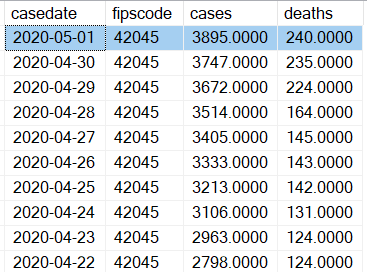
Next, I needed to find a daily count of confirmed cases and deaths by county. I found a great one from GitHub (listed in the Data Sources section at the end of this article). This daily feed is available for download as a CSV file and contains cumulative counts of cases and deaths by day/county (Figure 2).
As it turns out, this was all I needed. I wrote a basic SSIS package that parsed the columns into a table called COVIDHistory (Figure 3).
I want to report on daily numbers, even though the feed only contains cumulative counts for every county. Therefore, I need to write something to parse the difference in cases/deaths from one day going backwards. I want the result set like Figure 4:
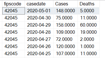
I can use a little bit of T-SQL, specifically the LAG function, to line up cases for the current day and the prior day.
Note: I am taking significant advantage of the fact that once a data feed identifies a county case for a day, the data feed continues to include that county on each subsequent data, even if the cumulative counts have not changed.
truncate table  covid19DailyCounts
insert into covid19DailyCounts (FipsCode, CaseDate, Cases, Deaths)
    select fipscode, casedate, cases - casesyesterday as Cases, deaths - deathsyesterday as Deaths
    from (select fipscode, casedate, cases, deaths,
                 lag(cases,1,0) over (partition by fipscode order by casedate) as CasesYesterday,
                 lag(deaths,1,0) over (partition by fipscode order by casedate) as DeathsYesterday
          from CovidHistory) temp
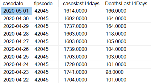
Finally, I want to create a daily table with the cumulative number of new deaths and cases in the last 14 days, relative to each day. (Figure 5).
At this point, I'm reminded of the old joke about getting 10 published economists in the room who give 10 different answers to a question. (There's an alternate joke about getting 10+ answers!). Similarly, database people might look at my approach and say something like, “Why don't you just store those two columns in the snapshot history table and not create a new table?” or even, “Why are you materializing this data at all? Just let the reporting tool create it on the fly.”
All valid questions. So long as I'm not talking about an astronomical amount of data, and so long as the ETL processes deal with this in an automated fashion, I don't mind materializing this into a separate table.
I've created a third table called CovidLast14days, using the CROSS APPLY function to marry up each county/date with the sum of cases and deaths going back the last 14 days inclusive. When Microsoft released the CROSS APPLY function, many writers (myself included) praised it as a way to apply (thus the name) the results of a table-valued function to a query. CROSS APPLY also has a nice ability to act as a COBOL-like “Perform Varying” to self-join a table based on a sliding condition (yes, I'm sure many readers just fainted that I used a COBOL analogy!)
truncate table Covid19Last14Days
insert into Covid19Last14Days
    select casedate, fipscode, caseslast14Days, DeathsLast14Days
    from covid19DailyCounts outside
    cross apply (select sum(cases) as CasesLast14days, sum(deaths) as DeathsLast14Days
    from covid19DailyCounts inside
    where inside. fipscode = outside. fipscode and inside. casedate between dateadd(d,-13,outside. casedate) and outside. casedate) temp
As far as the data goes, that's it! Table 1 contains the calculated measures I'd like to create in the Power BI report.
Some Source Data Challenges:
I encountered two data source challenges with the daily count feed. First, the data source summarized NY city as a whole, instead of breaking it out by the five counties/boroughs:
- New York County (Manhattan)
- Kings County (Brooklyn)
- Bronx County
- Richmond County (Staten Island)
- Queens County
I took the New York city tally as a whole and spread it across the five counties based on population. Yes, I could have searched for a second website source. Given the significant population density of these counties and the issue of county reporting, I can understand the challenges in trying to get a 100% accurate count down to the county level.
Second, the data feed contained some state tallies with a county of Unknown. To address this, I spread those counts across the counties in the state based on population.
The Power BI Application Pages
Here's the first page of the Power BI application (Figure 6), along with some tabs at the bottom for different pages. I'll address the questions above across the different pages.
General Statistics
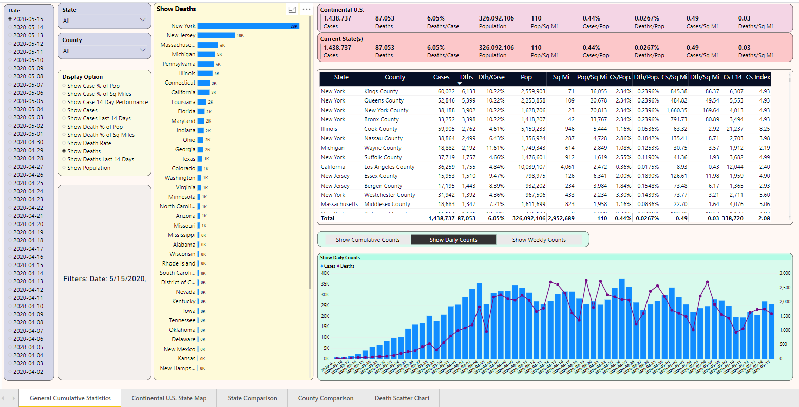
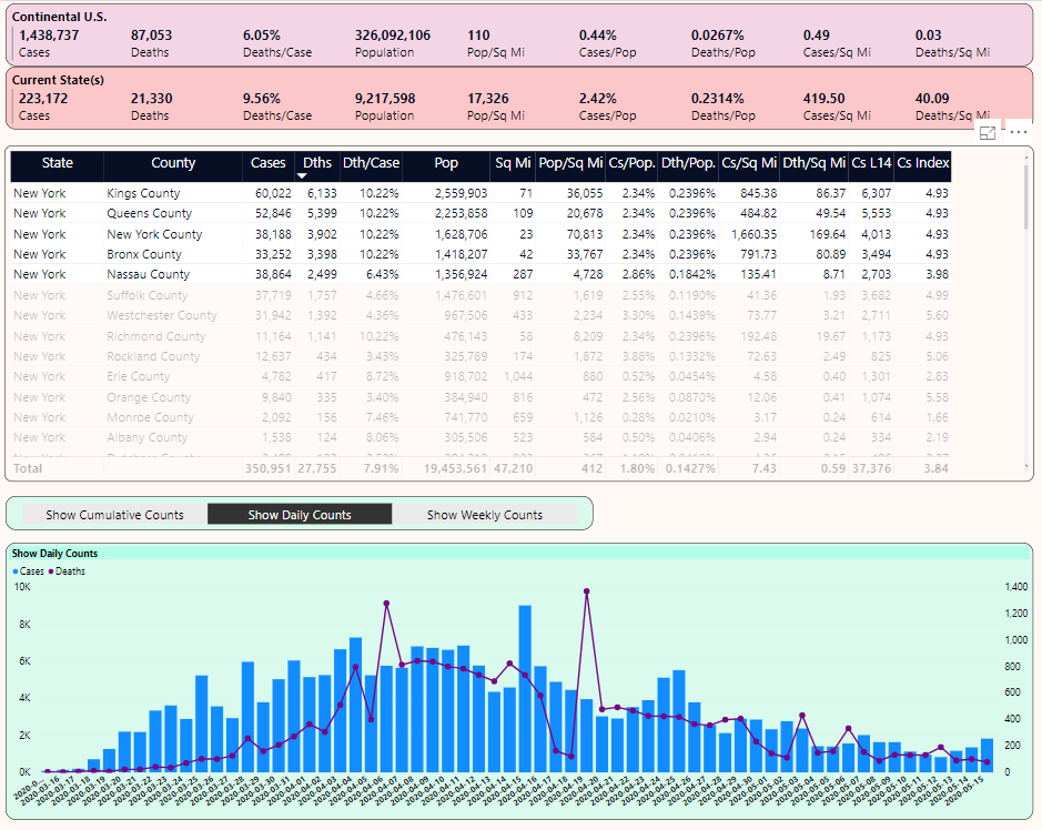
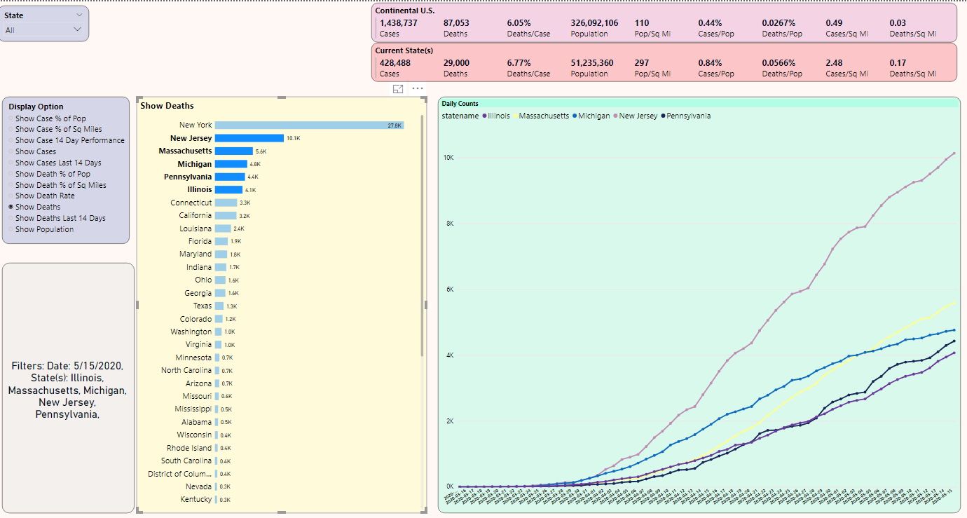
Let's take the first five questions and walk through a few scenarios. I'll start with Figure 7. First, notice the drop-down for the Display Option. Based on that selection, the page ranks the 48 states based on that metric. I've selected “Deaths,” although I could have picked any of the aggregated counts or any of the metrics from Table 1. (I'll talk about the drop-down for “Display Daily Chart Option” in a minute).
Note the filters caption, with the date of 5/15. I've selected 5/15 from a date list drop-down (from back in Figure 6, but not shown here, simply to conserve screen real estate). The output ranks the states by cumulative death counts, with NY first at 27,755, New Jersey a distant second at 10,138 deaths, and so on. Again, this is “as of 5/15”. I could pick a prior day to view of snapshot of cumulative counts as of that date.
I've selected New York with the mouse, which filters the list of counties on the right. In that list of counties, I've sorted on the metric for Deaths Per Square Mile.
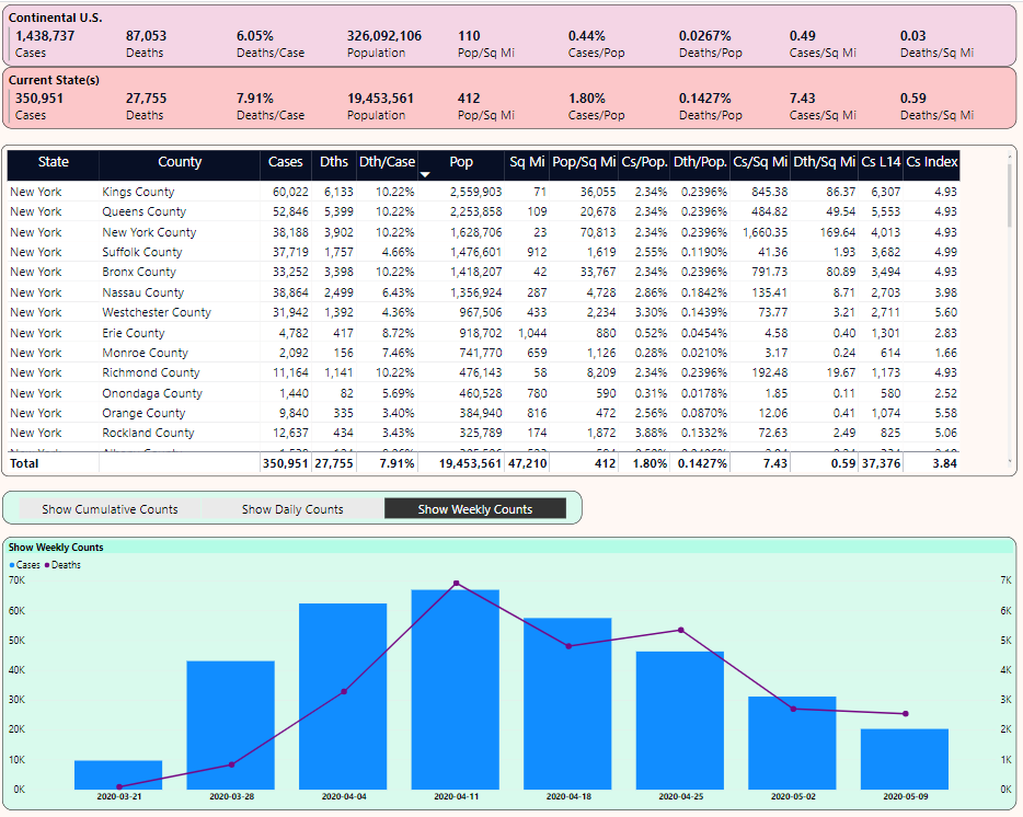
Note the chart in the lower right that currently shows daily case and death counts. If I want to show weekly counts instead (Figure 8), I can take advantage of a dynamic measure based on the user selection.
DynamicDailyDeathsMeasure =
    switch(values(DailyTrendOption[Option]),
    "Show Daily Counts", sum(covid19DailyCounts[Deaths]),
    "Show Cumulative Counts", sum(CovidHistory[deaths]),
    "Show Weekly Counts", sum(covidweeklycounts[Deaths]))
With very little navigation, I'm able to see the following:
- The ranking of states by cumulative death count
- By selecting New York, I'm able to see (from the two pink rectangular panels in the upper right) that NY's Cases and Deaths Per Population and Per Square Mile are many times greater than the national average.
- The five counties that make up NYC (New York/Manhattan, Kings, Bronx, Queens, and Richmond) have even higher rates than the NY state figures as a whole. These are very densely populated counties with rates per square mile that reflect the severe crisis situation they have faced.
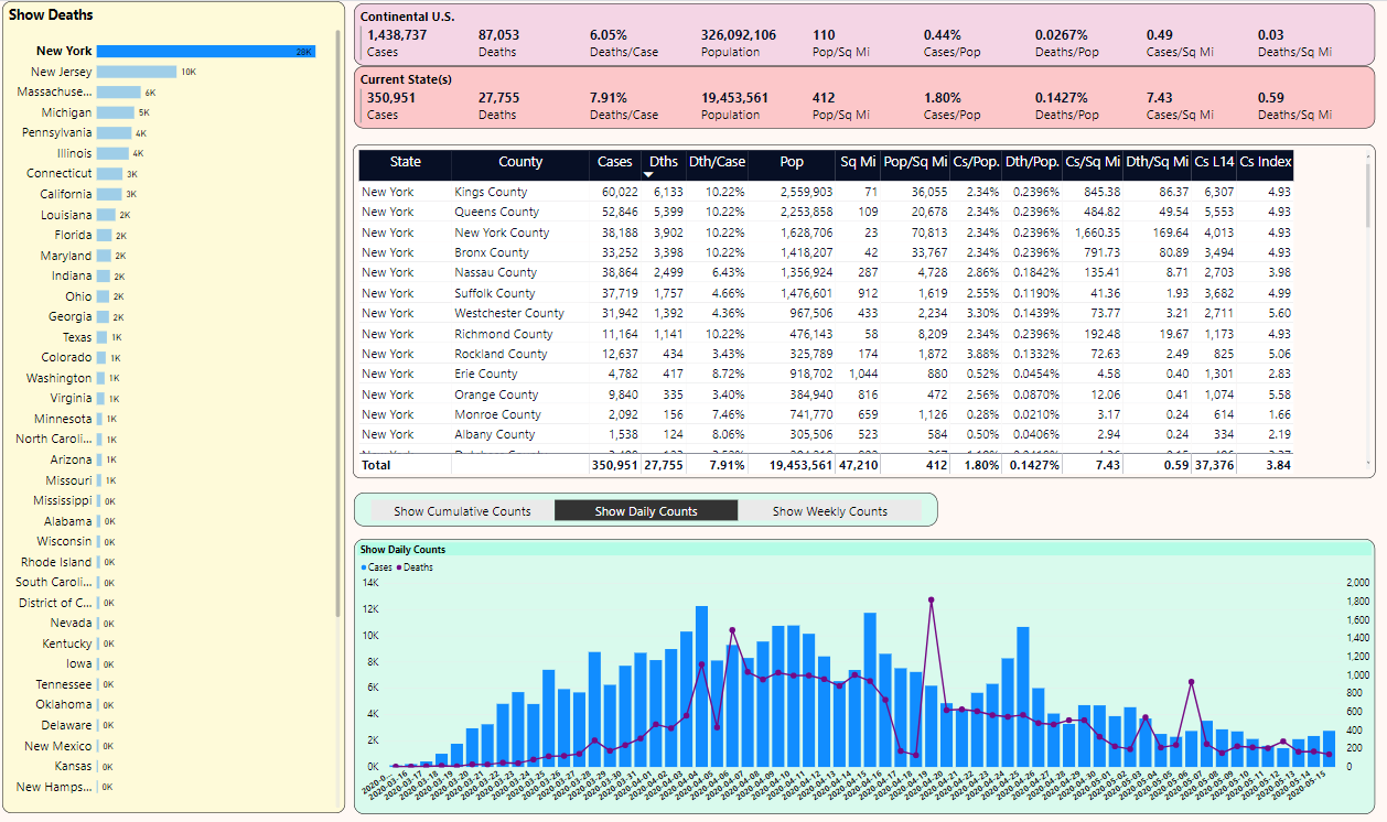
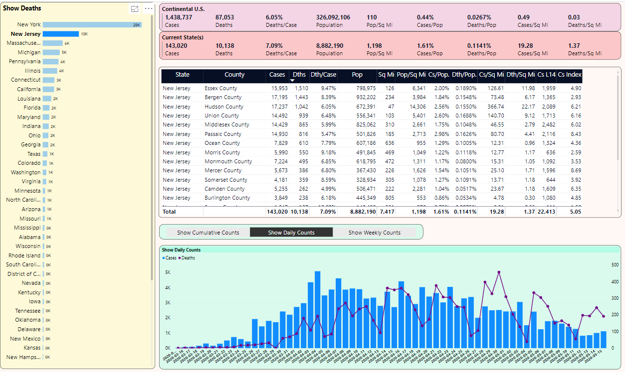
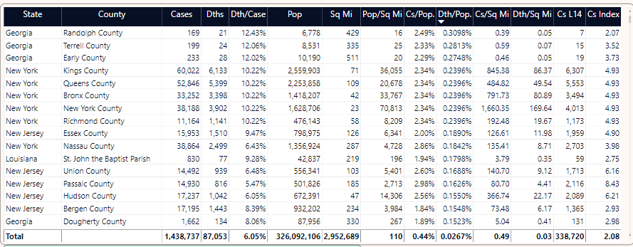
Now let's select New Jersey from the list of states on the left and continue to sort the counties on the right by Deaths/Square Mile. You can see in Figure 9 that although Hudson County is third in cases with 819, it's first in NJ with 17.43 deaths per square mile. Also note that NJ's 1.02 deaths per square mile is roughly two-and-a-half times greater than NY's 0.39 deaths per square mile (from back in Figure 7).
Let's go back to Figure 7 (New York) and on the right, click-CTRL-CLICK on the top five counties (Figure 10). Notice that the national average stays the same, but the second recap line is filtered based on the five counties. This is exponentially sobering: The five counties that make up New York City collectively cover just under 400 square miles, yet account for about 25% of the nation's deaths.
Also notice that at the bottom of Figure 10, there's a daily chart of cases and deaths.
OK, let's stop and talk about a few things in the chart back in Figure 7, specifically the bar chart that ranked states by a dynamic measure I selected in a drop-down. In Power BI, you can use a DAX formula to determine which measure to use, based on the Measure option the user selects.
DynamicMeasure =
    switch(values(ShowMeasure[OptionName]),
    "Show Cases", sum(CovidHistory[Cases]),
    "Show Deaths", sum(CovidHistory[deaths]) ,
    "Show Case % of Pop", [Cases Per Population] ,
    "Show Death % of Pop", [Deaths Per Population],
    "Show Death Rate", [Deaths per case],
    "Show Case % of Sq Miles", [Cases Per Square Mile], etc. )
Also, note the “filter recap” label, which is also a DAX formula that reads the current filter selections:
SelectedFilter =
    "Filters: " &
    if(isfiltered(DateList[casedate]), "Date: " &
    CONCATENATEX(filters(DateList[casedate]), DateList[casedate], ", ") & ", ","") &
    if(isfiltered(statemaster[statename]), "State(s): " &
    CONCATENATEX(filters(statemaster [statename] ), statemaster[statename],", ") & ", ","")
Finally, for general population and death statistics, Figure 11 sorts the counties in the U.S. by population, so that you can see case/death rates for these counties.
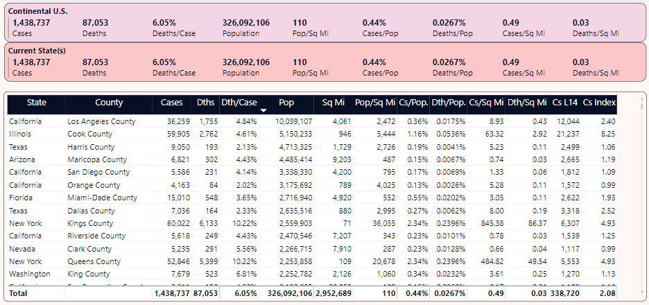
Some observations:
- Cook County in Illinois has twice the population of either Kings County or Queens County in NY, yet the two NY counties are far more densely populated (36K and 20K per square mile versus 5.4K per square mile) and the difference in deaths per square mile is exponentially sobering.
- Additionally, the cumulative deaths in either Kings or Queens County NY is “roughly” near the sum of the other displayed counties combined.
- There are large counties in Texas, Arizona, and California with death rates/population below the national average.
Mapping
Figure 12 shows a map, based on cumulative numbers on 5/1. I've chosen "Death as a % of Population:". The country map fills states based on the measurement I selected in the drop-down.
Note that New York is the “reddest,” with the highest death rate per population in the U.S.
However, note that Pennsylvania, Louisiana, Georgia, and Michigan have a slightly darker shade than other states. I'll take a look at those states one at a time.
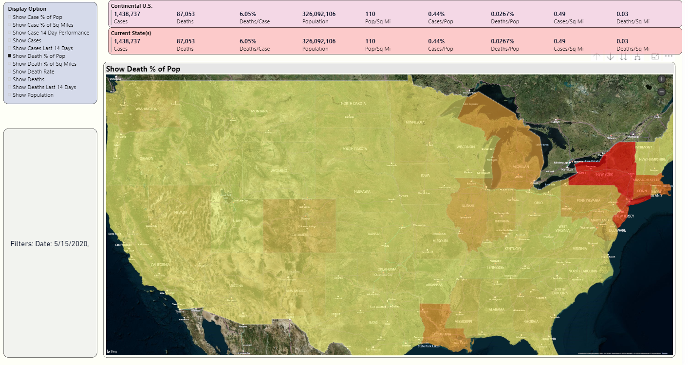
Because I live in Pennsylvania, I'll click on that state, and Power BI will plot the counties by the metric I've chosen ("Death as a % of Population), in Figure 13.
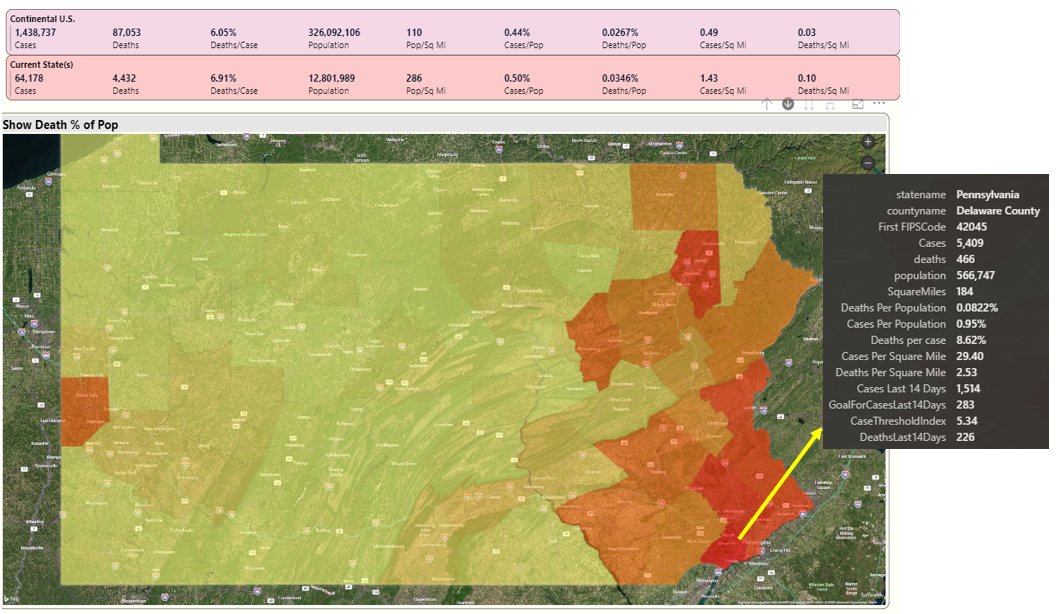
This has largely been the story in Pennsylvania for over a month. The southeastern part of the state (closest to New Jersey and NY) have the highest percentages. Inside each of the counties are incredibly sad and tragic stories. Lehigh County (Allentown) has reported that over 70% of deaths have occurred in long-term care facilities.
Note that I've placed the mouse over Delaware County, which is just west of Philadelphia county. I've got a tooltip with all the available information. Later in the article, in the Playbook section, I talk about the value of tooltips. Delaware County has percentages that are generally worse than the overall national averages.
In a moment, I'll look at a few other states (Louisiana, Georgia, and Michigan). They have counties and scenarios that you might or might not have heard about on the national news, but are still far above the national averages.
But before then, you might want to know something. How have deaths progressed in Pennsylvania? I can provide a right-click drill-through option to show a scatter graph that plots population and deaths by county, along with a daily timeline (Figure 14):
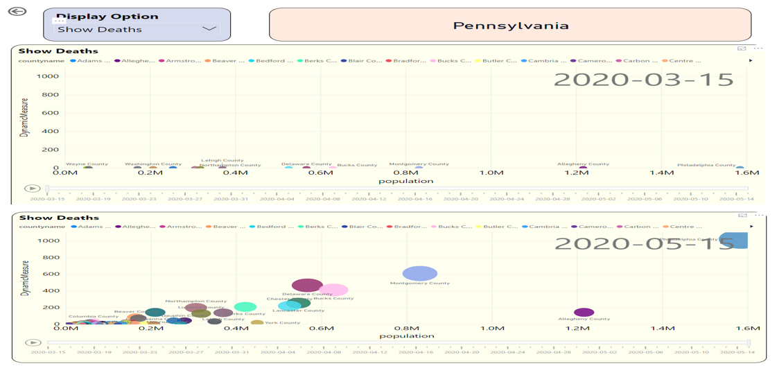
At the top of Figure 14, note that on April 7th, the Y-axis for death count was nearly the same for most counties. But then as I slide the date axis at the bottom forward by day, I interactively see that the death count in Philadelphia has risen sharply. And even though Allegheny county is the second most populated county in PA, the deaths in smaller counties like Bucks, Delaware, and Lancaster are higher.
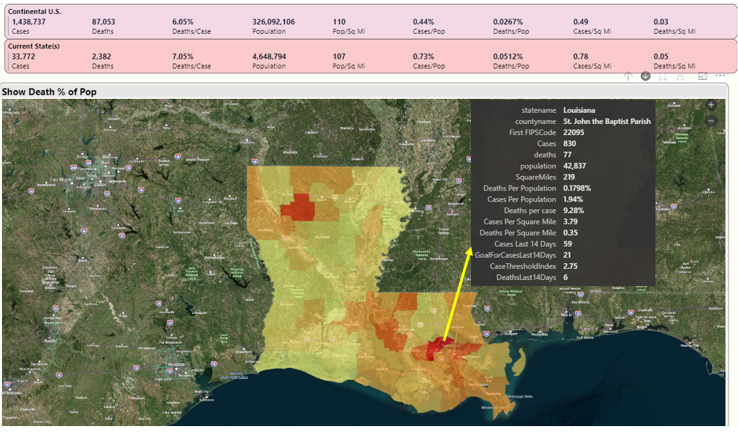
Let's go back to the national map and then drill into Louisiana. Note: Louisiana is broken out by Parish, which is roughly the equivalent of a county. Louisiana was originally part of Spain and then France, and those countries divided their lands according to church parish boundaries. Even after Louisiana became part of the U.S., they continue to refer to regions as parishes and not counties.
In Figure 15, you can see that St John the Baptist Parish has the highest death rate (red) in the state. Even though it isn't a large region (about 43K residents), the case and death rates are very high: as you'll see in a minute, some of the highest in the nation.
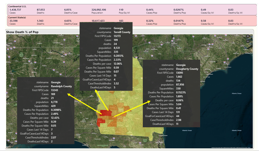
In Figure 16, I'll take a look at Georgia. I lived in Atlanta in the 1990s and travelled to nearly every county health department as part of a state-wide automation project. I was surprised and saddened to learn that Dougherty County, a few hours south of Atlanta with a population of about 88K, had been severely hit. The neighboring county of Randolph, with just 6.7K residents, has also been severely hit, with one of the highest cases and death/population percentages in the nation. Several news sources reported that many of the deaths occurred in a nursing home that received essential services from neighboring Dougherty County. Additionally, Terrell County, just east of Randolph County, has death per population figures that are much higher than the national average.
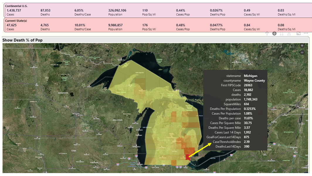
In Figure 17, I'll look at Michigan. I've spent time in Michigan the last 15 years, both in Traverse City and also in Dearborn. Right now, Wayne County (both Detroit and Dearborn) has also faced very high case and death rates. You can see from Figure 17 that Wayne County has nearly half the deaths in Michigan (2,192 vs. 4,765) despite occupying only 614 square miles.
Now that you've seen some county scenarios for a handful of states, let's see how many of them show up when I sort all counties in the U.S. by death/population. Let's go back to the grid on the first page of the dashboard, make sure all states on the left are selected, and sort the counties on the right by Death/Population (Figure 18). Although you can see several counties in NY in the list, you also see several counties in Georgia at the top of the list, as well as St John the Baptist Parish in Louisiana. And although not pictured, Wayne county in Michigan is also high on the list if you scroll down a few more counties.
State Comparisons
You know that New York has, by far and away, the highest number of cases and deaths. But for the next five states based on deaths, how much do they account for the nation's total and how do they compare to each other?
In Figure 19, I've gone to the tab for state comparisons and I've selected states two through six (New Jersey, Michigan, Massachusetts, Pennsylvania, and Illinois.) You can see that in the last few weeks, deaths have spiked in New Jersey at a higher rate than other states. Also, of interest, Massachusetts is close to Michigan in cumulative deaths, even though Michigan has roughly three million more residents. Deaths in Massachusetts have risen sharply in the last month.
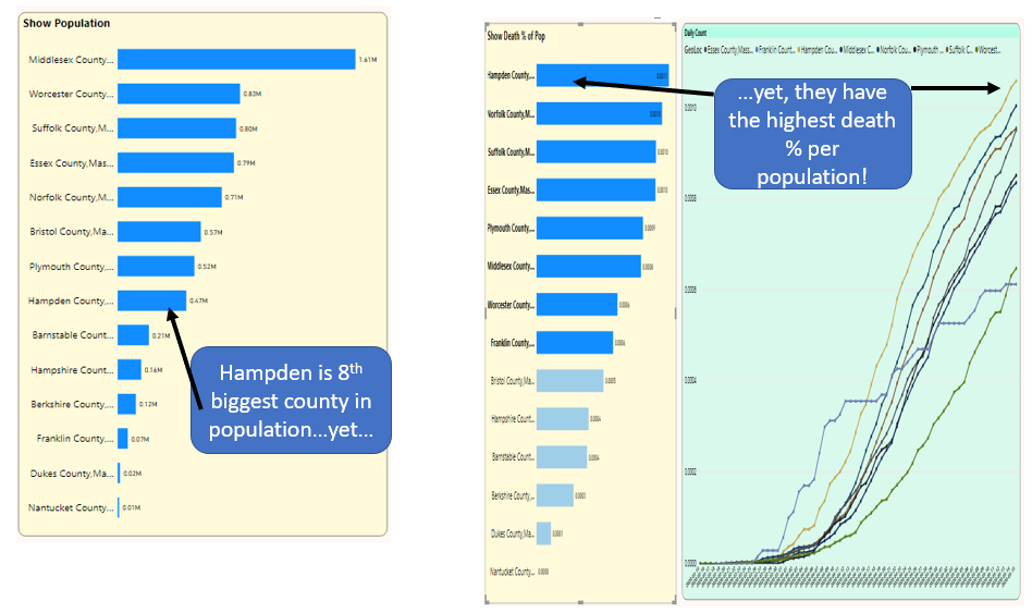
Here's a question: Is the rise in Massachusetts directly correlated to population? As it turns out, not always. In Figure 20, on the far left, Hampden County in Massachusetts is the eighth largest county in Massachusetts in terms of population but has the highest death per population statistic.
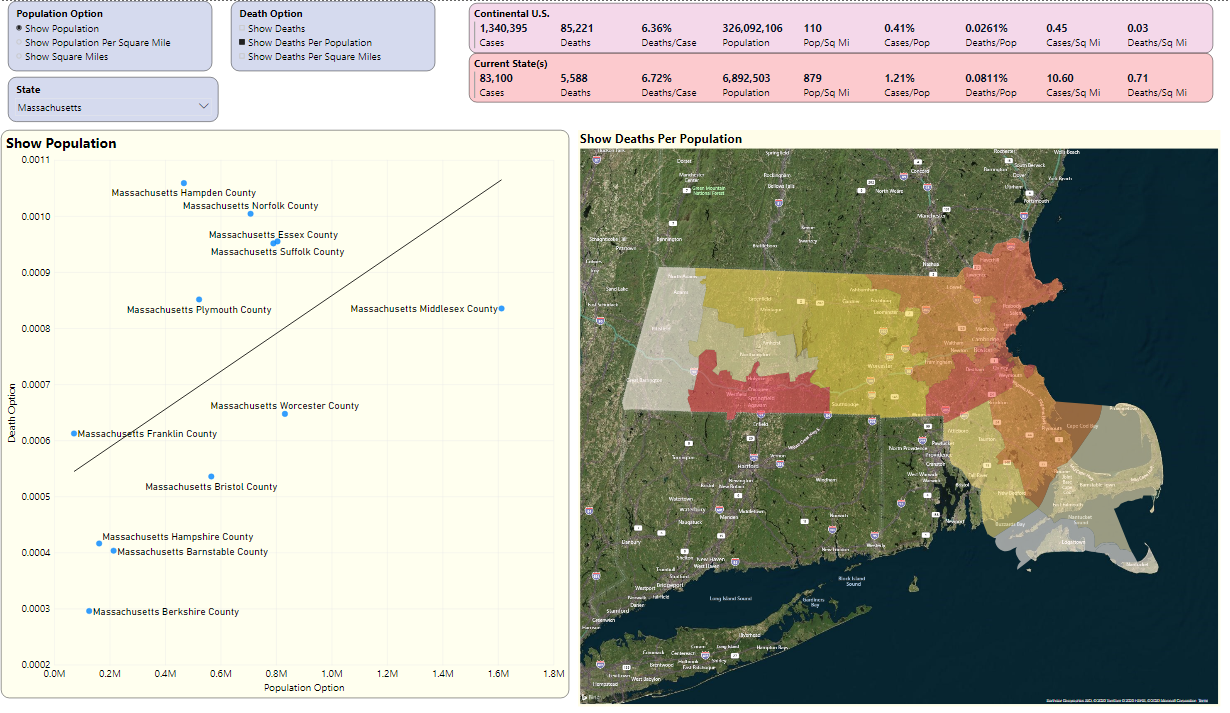
It occurred to me that another visualization could be a scatter chart where the user could select the option for one axis (Population, or Population Per Square mile, etc.) and then the other axis (Deaths, Deaths per population, etc.).
The scatter chart in Figure 21 is just another way to show that Hampden County is far from the most populated county but has the highest death rate per population. In the scatter chart, Hampden represents the furthest “negative” distance from the regression line on the relationship between population and deaths per population. Scatter charts help us to see distribution of values and relationships between two variables.
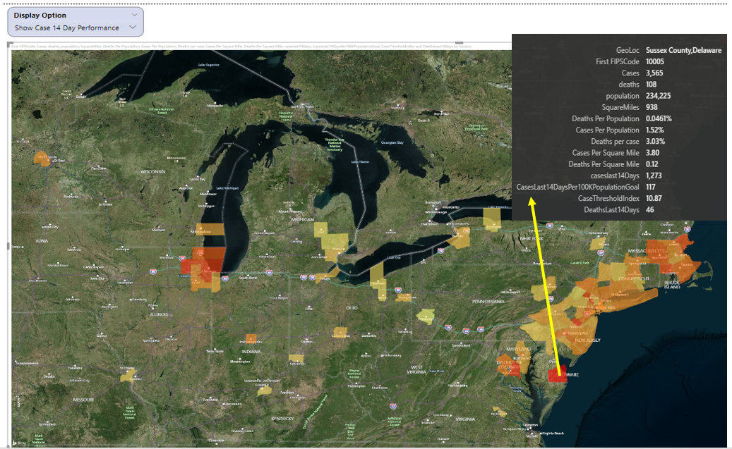
Assessment of Readiness
Finally, if there were a nationwide goal of fewer than 50 new total cases per county over the last 14 days for every 100K residents in that county, which counties would be the best (or worst) position for that? (Note: I realize that many will have opinions on the parameters for such a goal. My objective here is simply to show the mechanics of a KPI).
Figure 22 plots that measure and find that Sussex County in Delaware has had 1,273 cases over the last 14 days. They have a population of 234,225. If you applied that metric goal above, you'd want no more than 117 total cases over the last 14 days.
Okay, so that's 1,273 divided by 117, which is an index of roughly 10.87. Basically, according to the rules of this KPI goal, cases over the last 14 days are roughly 10.87 times greater than they should be, in order to start re-opening. That represents one of the higher indexes in the country in terms of readiness. In other words, the lower the index, the better.
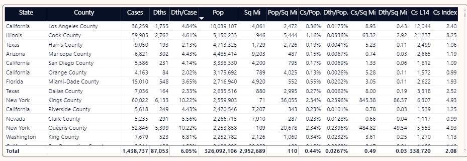
If you go back to the grid on the opening page and add in the 14-day case total and the performance index, you can see that, of the largest counties in the U. S., some are close to (or under) the threshold and some are not (Figure 23).
For instance, Harris County in Texas has had 2,499 cases in the last 14 days (relative to May 15). They have a population of 4.7 million people. Using the rule of no more than 50 cases per 100K residents, that means a possible indicator for reopening would be no more than ((4.7 million / 100,000) multiplied by 50), or roughly 2,350 new cases. As a result, they are slightly above 1 for the index.
Playbook: Presentation Layer
Now that I've gone through the application, I'll cover some of the items I've borrowed from my “playbook,” both on the Presentation and Non-Presentation layer. I'll start with items I often consider on the presentation end, whether talking about COVID statistics or inventory/order book dashboards or financial dashboards:
Shared Filters
Recently, I needed to filter on data from a website and found that I couldn't. The data element I needed was a pretty common one for the business context and had a fairly short list of discrete values. Unfortunately, the website didn't permit me to filter. To make matters worse, the site made it difficult for me to pull back raw data and filter it myself.
I tend to be a pretty grumpy user when I can't get what I think shouldn't be realistically difficult, and that's precisely why I try to be very sensitive to user filtering needs. I also get cranky when I set a filter on one page and there's no option to persist that filter on subsequent pages where the specific filter would hold the same context.
There weren't many filters in this COVID dashboard report, but I did try to make as much available as possible and persisted common filters (like current snapshot date) across pages.
Keep the Door Open for Exporting Raw Detailed Data
Granted, applications can only drill-down so far. Having said that, don't assume that users will be satisfied with summary information. Users will want details, and they'll often want to export those details to Excel to do their own analysis.
Fortunately, Power BI provides native ability for an end user to export the results of a visualization (i.e., a chart, a table, etc.) to a CSV file. Every Power BI visualization has a run-time option in the upper-right hover menu to export data.
Content Reward
Just like the old TV show where a contestant won by “naming that tune in four notes,” a successful reporting application provides meaningful content reward with a minimal number of mouse-clicks. In my career, I've built what I thought were great reporting applications, only to learn that users found them too difficult to use. Users are busy and don't have time to learn all sorts of system intricacies. This is profoundly seen in Apple products. The more information you provide to users with a minimal amount of effort, the more they'll want to use your applications.
I've tried to demonstrate this theme in Figures 7 through 9, where someone could see country and specific state/county metrics in one glance. I've also tried to demonstrate this in tooltips to show as much supporting data as possible.
Just like the old TV show where a contestant won by “naming that tune in four notes,” a successful reporting application provides meaningful content reward with a minimal number of mouse-clicks.
Dynamic Measures
If you have a reporting application with many key metrics, it's tempting to create a page or page segment for each measure. In some cases, you can alternatively display all the possible measures in a drop-down and then plot the selected measure dynamically in a chart.
In this application, Figure 7 showed where you can rank states by a variable metric and Figure 8 shows where you can show daily counts or cumulative counts by day. I definitely recommend considering this approach to avoid repeating the same visualization across many pages.
Again, Power BI doesn't currently seem to have any elegant way of specifying dynamic attributes (such as allowing a user to show geographies or products or GL codes, etc.). Some have suggested a workaround of exploding/normalizing the result set and joining to a bridge table of attribute definitions. If the result set isn't large, this can work, but isn't practical for larger applications. Hopefully Microsoft will provide the ability to set dynamic attributes via a simple DAX formula, in the same way we can do it now with measures.
Maps
Some developers love maps and want to show them to users (whether users ask for them or not). Other developers will avoid them at all costs. You can use them to create great visualizations, but anyone who's worked with mapping components knows that they can be challenging. I've made moderate but not heavy use of mapping here. I think they provide a nice touch and serve a particularly great role in presentations. However, you need to learn the rules and any nuances for what geography elements (names or geospatial/latitude-longitude points) the mapping visualization expects. You also need to be careful about overloading a map, which can take much longer than a few seconds.
This application has only used maps as a visual launching point to talk about certain states and to help the user easily identify counties. Other applications use maps for more intricate geographic definitions than what I've provided here, such as distances between grocery stores. (Ironically, the recent discussion of contact tracing opens discussions about far more elaborating mapping than what I've provided here).
Tooltips
A long time ago, I had a boss who was adamant about providing as much tooltip content as possible. He felt that any calculated field should also immediately show all the values involved in the calculation. Periodically he'd go through my applications, print out any screen shots where the tooltip didn't sufficiently provide all the background information for a calculation, and leave the printouts on my desk (and also email everyone in the company). He was brutal. I didn't care for the tactics, but he was almost always correct.
Figures 13, 15-17, and 22 all show examples of tooltips. Perhaps I went overboard, but it's usually better situation to remove unnecessary content than to add it.
Final note: Microsoft also has a feature in Power BI called Report Tooltips. You can define a separate report page and make it available as a tooltip for a plotted page. I've seen applications that have gone overboard with this concept, but it provides a powerful way to give context to a plotted point on a chart, far more than a regular tooltip list of values. In my next article, I'll cover this in detail.
Cross-Filtering
Power BI provides some fantastic capabilities for cross-filtering. If you're not familiar with the term, imagine if you have a chart on the left of Sales by Product and the chart on the right of Sales by Week. If you click on a product on the left, the chart on the right auto-refreshes based on the product(s) you selected. Conversely, if you click on specific weeks on the right, the chart on the left is auto-refreshed based on the weeks you selected.
This is a great feature that most users expect. The only catch is that you want to test all the possible behaviors and selection options. If you've applied visual-level filters for things like Top 25 Products, the cross-filtering on the right might not behave exactly the way you expect.
A few years ago, I wrote here in CODE Magazine about how to mimic this feature in SQL Server Reporting Services, using invisible hot parameters. You can find the solution in the May/June 2016 issue of CODE Magazine, tip #3 (https://www.codemag.com/Article/1605111). Although I still use that feature today in SSRS, there's no question that Power BI's native feature for cross-filtering is much snappier.
It's difficult to see the impact of cross-filtering in a printed article, but certainly the ability to click a state back in Figures 7 and 8 and immediately see the relevant counties on the right is an example of cross-filtering.
Easy Way to See “Best/Worst 25”
Going back the theme of “I can name that tune in X mouse-clicks,” it's very important for a user to be able to see a list of top/bottom values with little effort. The “best” or “worst” of a metric is often key to any analysis: Users will appreciate seeing this information easily.
My reporting applications have all sorts of “Top/Bottom 25” lists of worst orders by margin, best sales reps by margin, etc. Often business users will be quite vocal up front about wanting to see this, and never hesitate to raise it as a possible feature.
In this COVID reporting application, the list of counties in the figures for general statistics showed how you could easily get the top N or bottom N based on a metric. Power BI makes this particularly easy by allowing native sorting on a column in ascending or descending order.
Recap of Main Numbers: Your Version of “The Magic Wall”
I have saved the most esoteric top for last. If you watch news shows on television, some stations have analysts who show interactive maps of voting trends, voting demographics, etc. I frequently watch these shows, but not for the reason you might think. More than anything, I'm utterly fascinated with the use of technology to tell a story. In particular, CNN's John King is a master in using the multi-touch collaboration wall (nicknamed “The Magic Wall”) to tell a story.
When you create dashboard pages to show company financial performance, company costs, or sales trends by product/market, essentially you have a story to tell regarding the data. Maybe margin rates are down this month because you had to offer lower prices and could not lower the costs as well. Maybe margin rates are down because you wound up selling more of lower margin products than higher margin products. Bottom line, some aspect of overall performance is up or down because of this and this and this. The factors could be simple, or more complicated.
A business intelligence application is the means by which you tell that story. This means three things:
- The data in the story needs to be accurate.
- The presentation of the data needs to be clear and representative of how you label/annotate it on the screen.
- Regardless of whether you use a bar chart, scatter chart, or just a sorted table, the visualization needs to be simple enough to be obvious, but not so simple that it prevents the user from being able to get more information.
On that last note, there can be instances where some think a vertical bar chart is better than a horizontal bar chart. Sometimes people use bar charts when line charts might arguably be better. (Pro tip: Don't use a pie chart if you'll have more than a few entries!)
Every once in a while, maybe before a major release, pretend like you're a news analyst using your tool to explain why some aspect of the business is up or down. Here's an even crazier suggestion: Capture a five-minute video and watch it. In the same way you do code reviews and design reviews, a presentation review can flush out quirks.
Playbook: Non-Presentation Layer
Now that I've talked about some of the presentation plays, let's talk about the playbook for the non-presentation layer. I mentioned at the beginning of this article that I've written past articles about ETL components in data warehousing. That's one aspect (and a BIG one) of all the work that the user doesn't directly see. However, there are others. Let's look.
Trends and Variances, Yes! But What Type?
Trend analysis and variance analysis can mean different things to different groups. Sometimes people just want to see the biggest increases or decreases from month to month. Other times people want to see when a product suddenly sells far more (or less) than the average over the last six months.
I have an application that shows the standard shipping rate for a city, and the different carrier rates, ranked by the highest carrier variance over the average. This shows which carriers are charging the most, relative to the average. I have another application that shows, month to month, the highest margin rate increase/decrease by geography/product. Out of dozens of products and hundreds of customers, for those with more than X dollars of sales to begin with, what single customer/product had the biggest increase or decrease in margin from month to month?
The KPI at the end is an example of a trend-basic metric, as I'm evaluating if counties are ready to re-open based on 14-day trends.
Spotlight: Combining Metrics to Form a Picture
This is one of the most important elements of valuable analytic reporting applications: bringing together different elements to help form a narrative. I cannot stress this enough:
Reporting on cases and deaths from COVID-19 gives you one picture. But aligning those measures with population density will frame a better picture. Similarly, a dashboard of shipment trends gives you one picture, but integrating the upcoming order booking and inventory turnover trends gives a much more insightful and compelling picture.
Where this can get tricky is when the elements don't share the same level of granularity. Metrics won't align properly if they don't share a common business context. Sometimes it's obvious and sometimes it's subtle. I've seen applications that mixed aggregations (both summary and averages) at different levels and gave a misleading picture. Ralph Kimball wrote profoundly about this in his data warehouse books. Even though he has retired, you can still find links to his books and design tips at https://www.kimballgroup.com/. I highly recommend that all data warehouse and business intelligence professionals read Kimball's works, even if you only implement a small portion of his ideas in your work. In particular, the book “The Data Warehouse Toolkit: The Definitive Guide to Dimensional Modeling” truly deserves a rating of “5 out of 5 stars, a must-read”.
Reporting on cases and deaths gives you one picture. But aligning those measures with population density frames a better picture. Similarly, a dashboard of shipment trends gives you one picture, but integrating the upcoming order booking and inventory turnover trends gives a much more insightful and compelling picture.
Scheduled Refreshes
Another theme to stress in any reporting application is defining and annotating the data refresh schedule. Although there are a growing number of “real-time” analytic applications, many still work on a scheduled refresh that could be hourly, daily, twice a day, etc. In this instance, the COVID-19 reporting application is simple: The data is updated once a day from the GitHub source (typically by noon, Eastern Standard time) for the prior business day.
Materializing Data from a Mode; Table or View?
Opinions vary on this topic, but I try to keep views materialized and fairly simple. Nearly any database feature can be misused, and I've seen views misused more than any other database object. When effectively possible, I'd rather generate a flat report structure table for a set of visualizations.
ETL, Data Lineage, and Data Munging
I've written on this topic in prior CODE articles (particularly back in 2017) and so I don't want to repeat large amounts of text. If you go to my CODE Magazine bio page, there are multiple articles on Data Warehouse ETL techniques. Once again, I pay a lifetime of homage to the great works of Ralph Kimball, who wrote extensively on ETL and related activities.
In this reporting exercise, most of the ETL was basic. The only real issues I encountered with the data were that some state death counts had a county of “Unknown” and a few counties in the data feed did not have a FIPS code. I dealt with the former by spreading out the “unknown” case/death counts across the counties in that state by population. Admittedly, I took a shortcut with a hard-wired case statement to deal with the few counties that did not have a FIPS code. In an actual application, I'd want to use a lookup table.
Know the gaps and quirks in your source data. Here, I had to spread out NY cases by county based on population. I also had to spread out state cases with unknown counties by population. Recognize and account for it, document it, and make your key users aware of it.
Know the gaps and quirks in your source data. I had to spread out NY cases by county based on population and with unknown counties by population.
There are great data profiling tools to spot data anomalies. No one should ever overlook their value - just like no one should overlook a tried-and-true data profiling approach: The good old-fashioned pair of eyes (and extra pair of eyes).
No one should overlook a tried-and-true data profiling approach. The good, old fashioned pair of eyes (and extra pair of eyes).
Validation with Other Systems
I validate numbers constantly. Maybe it's part of my obsessive nature. When I started producing output for this reporting application, I checked other websites to make sure my numbers were the same or at least reasonably close.
Within an organization, rarely will an application exist in isolation of others. People will compare your output to other systems, general ledger numbers, etc. I highly encourage people to stay on top of data validation, as difficult as it can be.
Here's an example: Over the last year, I've been working on a costing application. Users of this application compare the results against data in their Great Plains accounting/financial modules. Because they'd been using Great Plains for years and this new costing application was the new kid on the block, it was my responsibility to research any differences in the numbers. As a result, I had to quickly learn how to manually query Great Plains tables. Fortunately, I found a fantastic website with valuable information on GP tables: https://victoriayudin.com/gp-tables/gl-tables/.
Version History (Set Preach On)
What color shirt were you wearing on the night of January 16th?
OK, that sounds like an odd question to ask. But here's a different one.
I see from your product price table that product XYZ has a price of $405, and was last updated on 1/16/2020. What was the price before that? And what was the price a year ago?
If the answer is something along the lines of the following, that's sad:
- “Well, we'd have to restore a backup”
- “We had a developer who suggested that, but that's just too much storage”
- “Why? None of our users have ever asked for that”
That last one is particularly sad (and a response I've heard before). If you are waiting for users to suggest the end result of a practice you should know about, you might have made some deeper errors.
As recently as in the last five years, I've seen key data in regulated industries that doesn't store version history. Databases have had triggers for decades. Change Data Capture has been in systems for years. And if all else fails, an application can have its down home-grown process for storing version history. I try not to get preachy, but there is just no excuse for this. So repeat after me: store version history. Store Version History. STORE VERSION HISTORY!
Repeat after me: store version history. Store Version History. STORE VERSION HISTORY!
This application makes use of version history: The user can view cumulative counts for any day since this crisis began.
Final Thoughts:
This concludes my first version of this application, with more to come. Here are some random thoughts to close:
Our World Has Changed, but Good Hasn't
I'm 55 years old, which means I can remember the end of the Vietnam war, the handful of rough economic times, and certainly most CODE Magazine readers are old enough to recall the tragedy of 9/11/2001. I also remember the brief fear in spring 1979 when I lived about 30 minutes from the Three Mile Island nuclear power plant in Pennsylvania.
This situation is far different. Our world has changed dramatically. In another year, will our lives go back to the way they were? I have no way of predicting and won't offer any guesses. The old cliché of, “Hope for the best, prepare for and expect the worst” seems as good advice as any.
I've re-learned some personal lessons from this and I'm sure others have as well. One is that small acts of kindness can still go a long way these days. Rod Paddock (CODE editor-in-chief) and I talked on the phone about a month ago. At the time I was quite down. If you've ever talked to Rod, you know that he can lift your spirits. Then about a week ago, he texted me and shared some good personal news he had, which made me feel happy. Again, small acts of kindness. . .
Beware of Third-Party Tools
If you've read my prior articles in CODE Magazine or you've attended my presentations, you might remember that I caution people about diving into third party tools. Sometimes they are fantastic. Sometimes they are frustrating or worse. Sometimes you have to do some research to discover that they offer great functionality over the core product, but they are either missing a few key seemingly standard features or suffer from performance problems. I've evaluated several Power BI third-party visualization components over the last year with mixed results. There are some that offer great user experiences that I'd never be able to do quite the same with the regular Power BI visualizations, but also come with some nasty side-effects.
Microsoft offers some nice (and free) add-on visualizations for Power BI on their Marketplace website. I use some for commercial work but have chosen to keep this application free of third-party visualizations, at least for now.
How Can I Run This App? Where Can I Get the Necessary Files?
Because this application contains data from the public domain (i.e., nothing proprietary), Microsoft Power BI Pro allows me to publish this web app to an open public URL.
The URL is a long one, and because of the chance it could change, you can find it on the opening page of my website, http://www.kevinsgoff.net. My site also contains the necessary code to embed the application in an iFrame.
As of this writing, I'm manually republishing the data daily. In my next article when I cover enhancements, I'll talk about setting up a data source and ETL process in Azure to do it automatically.
That future article will contain T-SQL code to deal with some allocation of data, and Power BI DAX code to deal with dynamic measures/calculations. My website (http://www.kevinsgoff.net) has information on the public version of this Power BI application, along with the Power BI Desktop (PBIX) file and other necessary files.
Data Sources
I used the following location on GitHub to pull down daily COVID-19 data. I'm not associated with this data source in any way: I've simply been using it to populate my sets of data for this application: https://github.com/nytimes/covid-19-data
Here are three links that talk further about the source of data.
- https://www.nytimes.com/interactive/2020/us/coronavirus-us-cases.html
- https://raw.githubusercontent.com/nytimes/covid-19-data/master/us-counties.csv
- https://www.nytimes.com/interactive/2020/us/coronavirus-us-cases.html
Where Do We Go from Here?
I wrote this article to serve as a model (playbook) for creating analytic reporting applications. It's certainly not a complete list. Football teams put new plays in the playbook when they see a need or an opportunity. Additionally, teams win some games without using every play in the playbook, just like specific reporting applications use some of the plays but not others.
In the last year, I've made major changes in my life. I “retired” from all conference speaking and community speaking and from the Microsoft MVP program. My main area of focus is my family, my health, and my full-time job as a database specialist. However, I still plan to continue writing articles here and there, and will look to expand this project. I want to devote an article to incorporating Power BI content into a .NET application, and deploying this project to the cloud. As public sites continue to publish more and more county-wide data, I'll look to incorporate it.
Also, as I look back over this application, there are some features I'd like to add/change, particularly in the trending area and expanding the use of report tooltips. If I could add one additional report page for this article, it would be ranking states and counties by % of increase/decrease in cases/deaths, from the current week going back a week. Although I've included population density, I'd like to add some correlation coefficients to provide mathematical context to how strong density plays a factor in these numbers.
I'm sure others will look at this application and say, “I can think of a better way to do ZYZ.” Sometimes I'll look at how I'm presenting data and I'll say to myself, “How I'm doing this is okay, but I know there's a shorter and more elegant path.” We all live in the world of Continuous Improvement. Until next time!
Related Article
Stages of Data: A Playbook for Analytic Reporting Using COVID-19 Data, Part 2
| **Calculated Measure** | **Notes** |
| Population across all 48 states | |
| Square miles across all 48 states | |
| Population Per Square Mile (current slice of data) | |
| Population Per Square Mile across all 48 states | |
| Cases Per Population | |
| Cases Per Population across all 48 states | |
| Cases Per Square Mile | |
| Deaths Per Case | |
| Deaths Per Population | |
| Deaths Per Square Mile | |
| CasesLast14DaysGoal | For current slice, the Population divided by 100K, then multiplied by 50. This is for the metric to compare the cumulative cases over the last 14 days. |
| CasesLast14DaysGoalPerformanceIndex | The performance index of the cumulative cases over the last 14 days against the goal. A county with a population of 200K would have a goal of no more than 100 new cases in the last 14 days. If they had 90 new cases in 14 days, the index would be . 9 (which is good). If they had 110 new cases in the last 14 days, the index would be 1. 1 (not as good). |