SharePoint Framework, or SPFx for short, is growing up. At the Ignite conference, Microsoft released a number of improvements to SPFx, along with promises for the very near future. Now you can use SPFx on-premises with SharePoint 2016 Feature Pack 2. Not everything that works in the cloud also works on-premises. For instance, the topic here, extensions, is currently a SharePoint online-only thing. This is because SharePoint 2016 on-premises doesn't support Modern UI yet. But there is a good chance that with SharePoint 2019, it will. Classic sites could get this feature working down the road as well. Most certainly, you shouldn't be investing in techniques such as JSLink given that you have SharePoint framework extensions available now.
Other things, such as the very welcome improvement of Tenant-level deployment, are also not available on SharePoint on-premises yet. This may change in the future, but as a high-level guidance, on-premises will always be a subset of SharePoint online. Whatever you write for on-premises will work in the cloud. The other way around is not true. Also, bit by bit, features from SharePoint online will make it to on-premises.
One of the very interesting improvements that Microsoft has recently released is SharePoint Framework Extensions. This brings SPFx to more than just Web Parts, and truly expands the applicability of SPFx and establishes it as a solid dev story going forward.
What Are SPFx Extensions?
SharePoint Framework extensions can be used to extend the SharePoint user experience. Specifically, you can customize more than just Web Parts. You can change how lists render. You can add content to specific parts of the page or add new actions at specific areas within SharePoint.
Think of this new development experience as a “development experience on rails.” Microsoft wants to enable all the facilities you may need to solve a business need. At the same time, they're providing your train with rails, so you stay on track, while enjoying the beautiful scenery outside! Can you abuse SPFx to completely take over a SharePoint page? Absolutely! But you shouldn't. Microsoft is making it very clear what's acceptable and what's not. It's best to keep your train on the rails, even though riding a train in the jungle sounds like fun.
There are three kinds of extensions currently:
- Application Customizers: Allow you to add scripts to a page, or access well-known HTML element placeholders and put custom rendering logic there
- Field Customizers: Allow you to modify how a list renders. For instance, a “progress” field might be a lot more interesting as a progress bar than a number. With field customizers, you can change that number to look like a progress bar.
- Command Sets: Allow you to add new actions and provide client-side code for implementing behaviors.
Let's examine each one of these one by one. For the purposes of this article, I'll assume that you're familiar with the basics of SPFx and have a working SPFx dev environment ready. I'm working with version 1.3.2 of the yeoman generator for SharePoint.
Application Customizers
Application Customizers allow you to add scripts on a page, or to access well known HTML element place holders and put custom rendering logic there. If you're a seasoned SharePoint developer, you may remember something called “delegate controls.” You can think of Application Customizers as delegate controls for the SPFx world. Microsoft wants to make it possible for you to change certain elements, such as the header and footer among others, in a supported manner.
This is quite useful because now you can do things, such as examine a site URL and provide users with a disclaimer. Or embed functionality that lets users change the view of a site that affects all your other SPFx customizations. Best of all, a certain very valuable scenario opens up. When you do tenant-wide deployment of SPFx solutions, they “skip feature deployment;” in other words, your feature.xml is ignored. This means that if your solutions depend on, say, having a list or a content type present, tenant-wide solutions can't really support that at the moment.
This problem may get solved down the road if we get a “hook,” a place where you can run code when a solution is deployed or removed. But right now, you can use two possible workarounds:
- You can use PnP PowerShell to enable those features in the sites you want to have that feature in
- You can use an Application Customizer that runs a one-time script to enable those features
Also note that currently, Application Customizers are supported at site, Web, and list scopes. Let's see how to write a simple Application Customizer.
As always, create a new SPFx project using this command:
yo @microsoft/sharepoint
This leads you through a wizard, where you'll:
- Target “SharePoint Online only.”
- Choose “N” when asked to make it a tenant-wide solution.
- Chose “Extension” as the kind of component type.
- Choose “Application Customizer.”
Once the project is created, type code . to open it in VS Code.
Once your project opens, go to the src\extensions folder and locate your customizer. There should be only one, and it should match the name you provided when creating the solution. Inside there, you should see a manifest.json file which describes to SharePoint the details of your customizer. It should look like Figure 1.
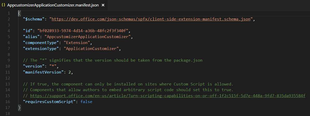
Note that there is a GUID there, the “id” field. That's the unique identifier for your customizer; take a note of that because you'll need it soon.
Next, open the .ts file for your customizer. You should find it in the same folder as the manifest.json file. My .ts file can be seen in Listing 1.
Listing 1: The Application Customizer
import { override } from '@microsoft/decorators';
import { Log } from '@microsoft/sp-core-library';
import { BaseApplicationCustomizer } from '@microsoft/sp-application-base';
import { Dialog } from '@microsoft/sp-dialog';

import * as strings from 'AppcustomizerApplicationCustomizerStrings';

const LOG_SOURCE: string = 'AppcustomizerApplicationCustomizer';

export interface IAppcustomizerApplicationCustomizerProperties { testMessage: string; }

export default class AppcustomizerApplicationCustomizer
    extends BaseApplicationCustomizer < IAppcustomizerApplicationCustomizerProperties> {

    @override
    public onInit(): Promise<void> {
        Log.info(LOG_SOURCE, `Initialized ${strings.Title}`);

        let message: string = this.properties.testMessage;
        if (!message) { message = '(No properties were provided.)';
        }

        Dialog.alert(`Hello from ${strings.Title}:\n\n${message}`);

        return Promise.resolve();
    }
}
As can be seen in Listing 1, an Application Customizer is simply a class that inherits from BaseApplicationCustomizer. Just like Web Parts, it can be strongly typed to reflect the properties it supports. Also note that our customizations go in the “OnInit” method and not the constructor. This is because the state of the customizer isn't available in the constructor.
In order to run the customizer, run gulp serve –nobrowser, and access the following URL:
https://yoursitecollectionurl/loadSPFX=true&
debugManifestsFile=https://localhost:4321/temp/manifests.js&
customActions={
    "theGUIDOfYourCustomizer":{
        "location":"ClientSideExtension.ApplicationCustomizer",
        "properties": {"testMessage":"Hello as property!"}
    }
}
Note that I've broken down the URL with return characters to make it easier to read. But it's a URL, so write it in a single line. Also, the GUID mentioned above is the GUID from your manifest.json file.
Your browser should show you a dialog box, as shown in Figure 2.
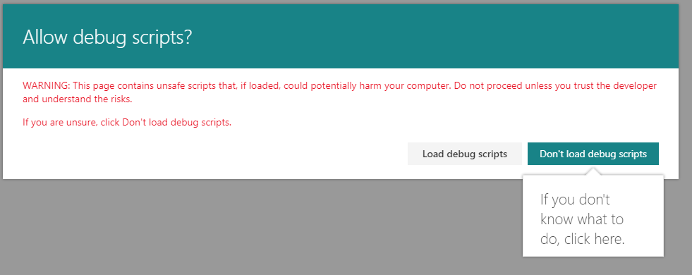
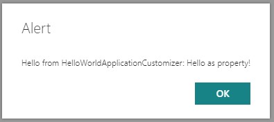
This disclaimer in Figure 2 is a good idea, because by allowing debug scripts to load, you're effectively running them within the context of the page. It serves as a good warning to end-users not to load any random stuff from the Internet, while giving developers an easy way to inject and test their code. Go ahead and load debug scripts and verify that you can see the customization, as shown in Figure 3.
Using this technique, you can run any arbitrary JavaScript on the page. Is this ripe for abuse? Absolutely, but what isn't!? You should make an effort to stay within the “rails” Microsoft has provided for your train to run in. One acceptable use of Application Customizers is to use them to access certain predefined areas of your page. Let's extend the Application Customizer to support that. In your .ts file for the customizer, edit the import statement as follows:
import {
    BaseApplicationCustomizer,
    PlaceholderContent,
    PlaceholderName
} from '@microsoft/sp-application-base';
The intention here is that you wish to customize the top and bottom place holders, so also go ahead and edit the interface specifying the properties to support the Top and Bottom placeholder messages, as shown here:
export interface IAppcustomizerApplicationCustomizerProperties {
    testMessage: string;
    Top: string;
    Bottom: string;
}
You wish to show the top and bottom place holders in a particular style, which you need to define in a new scss file. Go ahead and import the file in the .ts file as shown next:
import styles from
'./AppcustomizerApplicationCustomizer.~
~module.scss'
Note that for the import to work, the file must be named *.module.scss. This is how the SPFx templates are wired to use Web Pack. The import statement in TypeScript can access the styles mentioned in a .module.scss file.
Inside this new scss file, add the styles as shown in Listing 2.
Listing 2: AppcustomizerApplicationCustomizer.module.scss
.app {
    .top {
        height:60px;
        text-align:center;
        line-height:2.5;
        font-weight:bold;
        display: flex;
        align-items: center;
        justify-content: center;
    }

    .bottom {
        height:40px;
        text-align:center;
        line-height:2.5;
        font-weight:bold;
        display: flex;
        align-items: center;
        justify-content: center;
    }
}
Next, you need to make appropriate changes to take advantage of these new place holders and properties. The new code for the Application Customizer can be seen in Listing 3.
Listing 3: Application Customizer rendering top and bottom place holders
import { override } from '@microsoft/decorators';
import { Log } from '@microsoft/sp-core-library';

import styles from './AppcustomizerApplicationCustomizer.module.scss';
import { escape } from '@microsoft/sp-lodash-subset';

import {
    BaseApplicationCustomizer,
    PlaceholderContent,
    PlaceholderName
} from '@microsoft/sp-application-base';
import { Dialog } from '@microsoft/sp-dialog';

import * as strings from 'AppcustomizerApplicationCustomizerStrings';

const LOG_SOURCE: string = 'AppcustomizerApplicationCustomizer';

export interface IAppcustomizerApplicationCustomizerProperties {
    testMessage: string;
    Top: string;
    Bottom: string;
}

export default class AppcustomizerApplicationCustomizer
    extends BaseApplicationCustomizer <IAppcustomizerApplicationCustomizerProperties> {

    private _topPlaceholder: PlaceholderContent | undefined;
    private _bottomPlaceholder: PlaceholderContent | undefined;

    @override
    public onInit(): Promise<void> {
        Log.info(LOG_SOURCE, `Initialized ${strings.Title}`);
        this.context.placeholderProvider.changedEvent.add(this,
        this._renderPlaceHolders);

        // Call render method for generating the HTML elements.
        this._renderPlaceHolders();
        return Promise.resolve<void>();
    }

    private _renderPlaceHolders(): void {
        // Handling the top placeholder
        if (!this._topPlaceholder) {
            this._topPlaceholder = this.context.placeholderProvider.tryCreateContent(
                PlaceholderName.Top,
               { onDispose: this._onDispose });
        if (!this._topPlaceholder) {
            return;
        }

        if (this.properties) {
            let topString: string = this.properties.Top;
            if (!topString) {topString = '(Top property was not defined.)';
        }

        if (this._topPlaceholder.domElement) {
            this._topPlaceholder.domElement.innerHTML = `
                <div class="${styles.app}">
                    <div class="ms-bgColor-themeDark ms-fontColor-white ${styles.top}">
                    <i class="ms-Icon ms-Icon--Info" aria-hidden="true"></i> ${escape(topString)}
                    </div>
                </div>`;
        }
        }
    }

    // Handling the bottom placeholder
    if (!this._bottomPlaceholder) {
        this._bottomPlaceholder = this.context.placeholderProvider.tryCreateContent(
            PlaceholderName.Bottom,
            { onDispose: this._onDispose });

    if (!this._bottomPlaceholder) {
        return;
    }

    if (this.properties) {
        let bottomString: string = this.properties.Bottom;
        if (!bottomString) {
            bottomString = '(Bottom property was not defined.)';
        }

       if (this._bottomPlaceholder.domElement) {
           this._bottomPlaceholder.domElement.innerHTML = `
               <div class="${styles.app}">
                   <div class="ms-bgColor-themeDark ms-fontColor-white ${styles.bottom}">
                       <i class="ms-Icon ms-Icon--Info" aria-hidden="true"></i> ${escape(bottomString)}
                   </div>
               </div>`;
        }}
    }}
    private _onDispose(): void {}
}
As can be noted from Listing 3:
- Not every placeholder is guaranteed to be present on every page. You can iterate through the list of available place holders using
this.context.placeHolderProvider.placeHolderNamesproperty. - You need to check to see whether or not a certain placeholder is present.
- If the placeholder is present, render it as you wish.
In order to run this, use a similar URL as before, but just make sure that you now also pass in the Top and Bottom properties. The query string portion of the URL you can use to test this is shown in Listing 4. Note that I have broken the URL apart into new lines to make it easier to read.
Listing 4: The URL you can use to test the Application Customizer.
https://yoursiteurl?loadSPFX=true&
debugManifestsFile=https://localhost:4321/temp/manifests.js&
customActions={
    "theGUIDofYourCustomizer":{
        "location":"ClientSideExtension.ApplicationCustomizer","
        properties":{
            "Top":"The Top", "Bottom":"The Bottom"
}}}
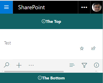
Verify that this customizer now produces an output, as shown in Figure 4.
Deploying the Customizer
So far, you've been running the customizer in debug mode. You can't expect users to remember that long URL. In order to deploy the Application Customizer, you need to do two main things:
- Set the
ClientSideComponentIdandClientSideComponentPropertiesvalues. - Perform the usual packaging, CDN, and deployment that's typical to any SPFx package.
The idea is that using a feature.xml file, you specify to SPFx that a certain customizer with a given GUID, as specified in the ClientSideComponentId property, is going to customize using properties specified as escaped JSON in ClientSideComponentProperties.
You may be scratching your head here, wondering if you really have to hard-code these properties into an escaped JSON inside an XML file. Yes, you do! But these properties are just an initial starter. You can use these properties to point to a Web service that can give you dynamic values, or simply calculate dynamic values based on context. So, this isn't really a show stopper. Also remember that there's a concept called tenant properties, so this initial starter value could point to a tenant property, the value of which can be set by an administrator. And that tenant property can point to a Web service, etc., for a further set of run-time configurable parameters for your solution to run.
At this point, edit the sharepoint\assets\elements.xml file, and ensure that:
- The
ClientSideComponentIdproperty matches the GUID of your manifest.json - The
ClientSideComponentPropertiesinclude an escaped JSON string indicating the properties you'd wish to use. An example of such a string could be, {"Top":"The top","Bottom":"The bottom"}
Next, for this elements.xml file to get activated during deployment, ensure that in the config\package-solution.json file, it's included under features\assets\elementManifests node. This should already be in place; I just wanted to point out how things are wired up.
Finally, do the usual sppkg packaging and deployment, activate the app, and deploy files to a CDN. Verify that now the application customizer is available by default on the site on which you have activated the customizer.
There is, however, an important thing to consider about tenant-wide deployment of SPFx solutions that contain extensions. Tenant-wide solutions don't activate your feature XML files. This means that although you can deploy these solutions, they don't take effect. However, using PnP PowerShell, you can manually activate the features that you require to get around this requirement. This way, you can use tenant-wide deployment with customizers and easily enable your customizations across a number of sites.
Field Customizers
Next, let's turn our attention to Field Customizers. The deployment steps are exactly the same as an Application Customizer, so I'll keep the discussion pertinent only to the differences.
Put simply, Field Customizers allow you to change how list views for a particular field get rendered. This gives you immense flexibility in how the user views the data. An important consideration here is that the list view doesn't finish rendering until each field renderer method has done its job. So, keep these either short and quick, or leave heavy-duty rendering for asynchronous operations.
Beyond the obvious usage of custom rendering fields, field renderer methods can use be used to present master-detail information or even information from other systems.
Creating a Field Customizer is quite simple! Just run the SharePoint yeoman generator, as shown under the Application Customizer, but instead of picking to create an Application Customizer, choose to create a Field Customizer instead.
When the application is finished scaffolding, visit the .ts file for your FieldCustomizer. Note that it's just a class that inherits from BaseFieldCustomizer, and it's strongly typed to an interface that represents Field Customizer properties. There seems to be a pattern here! Yes, all SPFx artifacts follow this obvious pattern.
All SPFx artifacts follow an obvious pattern.
Also note that your custom rendering goes in a simple method called onRenderCell. Here, you can access event.domElement to access the domElement where the field is being rendered. Once you have hold of the DOM element, you can pretty much render it however you wish. This can be seen in Listing 5.
Listing 5: The default implementation of a Field Customizer
public onRenderCell(
    event: IFieldCustomizerCellEventParameters): void {
        // Use this method to perform your custom cell rendering.
    const text: string = `${this.properties.sampleText}: ${event.fieldValue}`;
    event.domElement.innerText = text;
    event.domElement.classList.add(styles.cell);
}
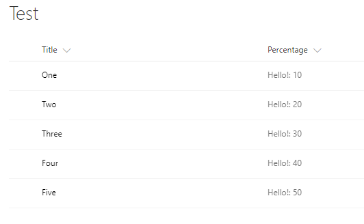
This Field Customizer is written to look for a field called Percentage, so in a modern UX site, go ahead and create a list, and add a column called “Percentage”. Go ahead and add some data into this list. In order to run this customizer, visit a URL, as shown in Listing 6.
Listing 6: Running your Field Customizer
yoursiteurl?loadSPFX=true&
debugManifestsFile=https://localhost:4321/temp/manifests.js&
    fieldCustomizers={"Percentage":{
        "id":"yourFieldCustomizeGUID",
        "properties":{"sampleText":"Hello!"

    }}
}
Verify that it changes the UX of the Percentage field, as shown in Figure 5.
Command Sets
Command Sets allow you to add your own custom actions within the UX of SharePoint. Remember custom action? Think of this as the modern custom action.
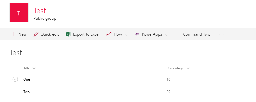
As always, generate a new SharePoint project, choose to target SharePoint online, create an extension, and this time create a command set kind of an extension. Now, visit the manifest.json for your command set, and you'll note that the various commands you'd like to add are defined in this file. The relevant snippet from this JSON file can be seen in Listing 7.
Listing 7: Commands defined in the manifest.json file
"items": {
    "COMMAND_1": {
        "title": { "default": "Command One" },
        "iconImageUrl": "icons/request.png",
        "type": "command"
    },
    "COMMAND_2": {
        "title": { "default": "Command Two" },
        "iconImageUrl": "icons/cancel.png",
        "type": "command"
    }
And as usual, the actual definition of the command set extension can be found in the associated .ts file. Note that, as usual, it's a class that inherits from a strongly typed instance of BaseListViewCommandSet, which is strongly typed to the properties your command set supports. Inside this class, you'll see two methods overridden.
The onListViewUpdated method is an event. It's called whenever the ListView state changes. This is where you can hide/show it, change its title, etc. This is called for each command for every list view change.
The onExecute method is where you put the handling logic when the command is executed by the user.
Additionally, you can use tryGetCommand to find out whether a certain command exists, or use the ID property to get the ID of the current command.
As usual, go ahead and run this command-set extension. Verify that your command shows up in the command bar of any list where this command-set extension is activated. Also verify that when you select an item, both commands show up. These can be seen in Figure 6.
You can imagine that this would be incredibly useful, for instance, in a document that you can implement and “send to another system” or a proposal where you can enable “discuss in a meeting” functionality etc.
Summary
With extensions, the SharePoint framework is boldly charging into different areas of customizing SharePoint. These are all very valid requirements, and also give a good dev story to modern sites. Not only that, with SharePoint framework's applicability to on-premises, we finally have a programming model that's consistent between on premises and cloud.
SharePoint Framework isn't “done” yet. There are still critical features and functionalities that are still being built. But it's getting close, and it's forming well into a very good development mechanism for SharePoint.
Speaking of things that aren't done yet, here's a short list of what's missing: an API to manage deployment of SharePoint packages, the ability to call graph and custom APIs easily, site collection-level app catalogs, and maybe even the ability to use Angular with SPFx. All of these are coming, and I hope to talk about them in the very near future.