What You’ll Learn in This Hour:
- The basics of layout
- How to customize an element’s size
- How to customize an element’s position
- Rotating, scaling, and skewing elements with 2D and 3D Transforms
When building an app, one of the first things you must do is arrange a bunch of elements in its window. This sizing and positioning of elements is called layout. XAML apps are provided a feature-rich layout system that covers everything from placing elements at exact coordinates to building experiences that scale and rearrange across a wide range of screen resolutions and aspect ratios. This is essential for handling the diversity of Windows devices, as well as intelligently handling when your app isn’t the only one on the screen.
In XAML apps, layout boils down to interactions between parent elements and their child elements. Parents and their children work together to determine their final sizes and positions. Parent elements that support the arrangement of multiple children are known as panels, and they derive from a class called Panel. All the elements involved in the layout process (both parents and children) derive from UIElement.
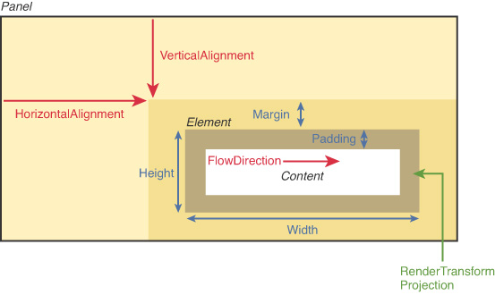
Because layout is such an important topic, the next two hours are dedicated to it. This hour focuses on the children, examining the common ways that you can control layout on a child-by-child basis. Several properties control these aspects, most of which are summarized in Figure 3.1 for an arbitrary element inside an arbitrary panel. Size-related properties are shown in blue, and position-related properties are shown in red. In addition, elements can have transforms applied to them (shown in green) that can affect both size and position.
The next hour continues the layout story by examining the variety of built-in parent panels, each of which arranges its children in unique ways.
Controlling Size
Every time layout occurs, such as when an app’s window is resized or the screen is rotated, child elements tell their parent panel their desired size. Elements tend to size to their content, meaning that they try to be large enough to fit their content and no larger. This size can be influenced on individual instances of children via several straightforward properties.
Height and Width
All FrameworkElements have simple Height and Width properties (of type double), and they also have MinHeight, MaxHeight, MinWidth, and MaxWidth properties that can be used to specify a range of acceptable values. Any or all of these can be easily set on elements in C# or in XAML.
An element naturally stays as small as possible, so if you use MinHeight or MinWidth, it is rendered at that height/width unless its content forces it to grow. In addition, that growth can be limited by using MaxHeight and MaxWidth-as long as these values are larger than their Min counterparts. When using an explicit Height and Width at the same time as their Min and Max counterparts, Height and Width take precedence as long as they are in the range from Min to Max. The default value of MinHeight and MinWidth is 0, and the default value of MaxHeight and MaxWidth is Double.PositiveInfinity (which can be set in XAML as simply "Infinity").
CAUTION: Avoid setting explicit sizes!
Giving controls explicit sizes makes it difficult to adapt to different screen sizes and orientations, and could cause text to be cut off if you ever translate it into other languages, as demonstrated in the preceding hour. Therefore, you should avoid setting explicit sizes unless absolutely necessary. Fortunately, setting explicit sizes is rarely necessary, thanks to the panels described in the next hour.
Unlike the six properties that are input to the layout process, FrameworkElement exposes read-only ActualHeight and ActualWidth properties representing output from the layout process: the final size of the element after layout is complete. That’s right-whether an element specified an explicit size, specified a range of acceptable sizes, or didn’t specify anything at all, the behavior of the parent can alter an element’s final size on the screen. These properties are, therefore, useful for advanced scenarios in which you need to programmatically act on an element’s size. The values of the other size-related properties, on the other hand, aren’t very interesting to base logic on. For example, when not set explicitly, the value of Height and Width are Double.NaN, regardless of the element’s true size.
CAUTION: Be careful when writing code that uses ActualHeight and ActualWidth!
Every time the layout process occurs, it updates the values of each element’s ActualHeight and ActualWidth. However, you can’t rely on the values of these properties at all times. It’s safe to rely on their values within an event handler for the LayoutUpdated event defined on FrameworkElement. At the same time, you must not alter layout from within a LayoutUpdated hander. If you do, an exception will be thrown pointing out that you introduced a cycle.
UIElement defines an UpdateLayout method to force any pending layout updates to occur, but you should avoid using this method. Besides the fact that frequent calls to UpdateLayout can harm performance because of the excess layout processing, there’s no guarantee that the elements you’re using properly handle the potential reentrancy in their layout-related methods.
Margin and Padding
Margin and Padding are two similar properties that are also related to an element’s size. All FrameworkElements have a Margin property, and all Controls (plus many other elements) have a Padding property. Their only difference is that Margin controls how much extra space gets placed around the outside edges of the element, whereas Padding controls how much extra space gets placed around the inside edges of the element.
Both Margin and Padding are of type Thickness, an interesting class that can represent one, two, or four double values. Here is how the values are interpreted when set in XAML:
- When set to a list of four values, the numbers represent the left, top, right, and bottom edges, respectively.
- When set to a list of two values, the first number is used for the left and right edges and the second number is used for the top and bottom edges. So "12,24" is a shortcut for "12,24,12,24".
- When set to a single value, it is used for all four sides. So "12" is a shortcut for "12,12", which is a shortcut for "12,12,12,12".
- Negative values may be used for margins (and often are), but are not allowed for padding.
- The commas are optional. You can use spaces instead of, or in addition to, commas. "12,24" is the same as "12 24" and "12, 24".
When creating a Thickness in C#, you can use its constructor that accepts either a single value or all four values:
this.TextBox.Margin = new Thickness(12);          // Margin="12" in XAML
this.TextBox.Margin = new Thickness(12,24,12,24); // Margin="12,24" in XAML
Note that the handy two-number syntax is a shortcut only available through XAML. Thickness does not have a two-parameter constructor.