By Adam Nathan, Published Jul 30, 2013 by Sams. Part of the Unleashed series. Copyright 2014, ISBN-10: 0-672-33697-9 ISBN-13: 978-0-672-33697-3. Sample Chapter is provided courtesy of Sams Publishing. http://www.informit.com/store/wpf-4.5-unleashed-9780672336973">http://www.informit.com/store/wpf-4.5-unleashed-9780672336973
WPF Fundamentals - Chapter 3
In this chapter, Adam Nathan examines some of the main concepts that WPF introduces above and beyond what .NET programmers are already familiar with. The topics in this chapter are some of the main culprits responsible for WPF’s notoriously steep learning curve.
To finish Part I, “Background,” and before moving on to the really fun topics, it’s helpful to examine some of the main concepts that WPF introduces above and beyond what .NET programmers are already familiar with. The topics in this chapter are some of the main culprits responsible for WPF’s notoriously steep learning curve. By familiarizing yourself with these concepts now, you’ll be able to approach the rest of this book (or any other WPF documentation) with confidence.
Some of this chapter’s concepts are unique to WPF (such as logical and visual trees), but others are just extensions of concepts that should be quite familiar (such as properties). As you learn about each one, you’ll see how to apply it to a very simple piece of user interface that most programs need-an About dialog.
A Tour of the Class Hierarchy
WPF’s classes have a very deep inheritance hierarchy, so it can be hard to get your head wrapped around the significance of various classes and their relationships. A handful of classes are fundamental to the inner workings of WPF and deserve a quick explanation before we get any further in the book. Figure 3.1 shows these important classes and their relationships.
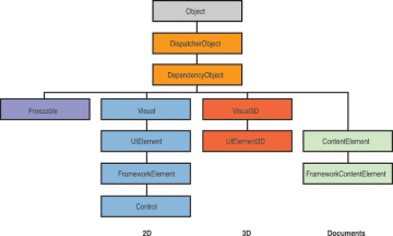
These 12 classes have the following significance:
- Object-The base class for all .NET classes and the only class in the figure that isn’t WPF specific.
- DispatcherObject-The base class meant for any object that wishes to be accessed only on the thread that created it. Most WPF classes derive from DispatcherObject and are therefore inherently thread-unsafe. The Dispatcher part of the name refers to WPF’s version of a Win32-like message loop, discussed further in Chapter 7, “Structuring and Deploying an Application.”
- DependencyObject-The base class for any object that can support dependency properties, one of the main topics in this chapter.
- Freezable-The base class for objects that can be “frozen” into a read-only state for performance reasons. Freezables, once frozen, can be safely shared among multiple threads, unlike all other DispatcherObjects. Frozen objects can never be unfrozen, but you can clone them to create unfrozen copies. Most Freezables are graphics primitives such as brushes, pens, and geometries or animation classes.
- Visual-The base class for all objects that have their own 2D visual representation. Visuals are discussed in depth in Chapter 15, “2D Graphics.”
- UIElement-The base class for all 2D visual objects with support for routed events, command binding, layout, and focus. These features are discussed in Chapter 5, “Layout with Panels,” and Chapter 6, “Input Events: Keyboard, Mouse, Stylus, and Touch.”
- Visual3D-The base class for all objects that have their own 3D visual representation. Visual3Ds are discussed in depth in Chapter 16, “3D Graphics.”
- UIElement3D-The base class for all 3D visual objects with support for routed events, command binding, and focus, also discussed in Chapter 16.
- ContentElement-A base class similar to UIElement but for document-related pieces of content that don’t have rendering behavior on their own. Instead, ContentElements are hosted in a Visual-derived class to be rendered on the screen. Each ContentElement often requires multiple Visuals to render correctly (spanning lines, columns, and pages).
- FrameworkElement-The base class that adds support for styles, data binding, resources, and a few common mechanisms for controls, such as tooltips and context menus.
- FrameworkContentElement-The analog to FrameworkElement for content. Chapter 11, “Images, Text, and Other Controls,” examines the FrameworkContentElements in WPF.
- Control-The base class for familiar controls such as Button, ListBox, and StatusBar. Control adds many properties to its FrameworkElement base class, such as Foreground, Background, and FontSize, as well as the ability to be completely restyled. Part III, “Controls,” examines WPF’s controls in depth.
Throughout the book, the simple term element is used to refer to an object that derives from UIElement or FrameworkElement, and sometimes ContentElement or FrameworkContentElement. The distinction between UIElement and FrameworkElement or between ContentElement andFrameworkContentElement is not important because WPF doesn’t ship any other public subclasses of UIElement and ContentElement.
Logical and Visual Trees
XAML is natural for representing a user interface because of its hierarchical nature. In WPF, user interfaces are constructed from a tree of objects known as a logical tree.
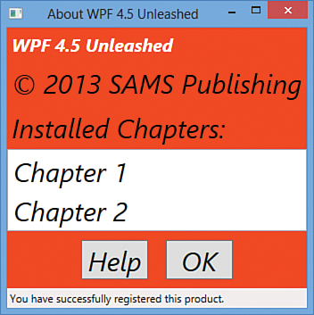
Listing 3.1 defines the beginnings of a hypothetical About dialog, using a Window as the root of the logical tree. The Window has a StackPanel child element (described in Chapter 5) containing a few simple controls plus another StackPanel that contains Buttons.
Figure 3.2 shows the rendered dialog (which you can easily produce by pasting the content of Listing 3.1 into a tool such as the XAMLPAD2009 sample from the previous chapter), and Figure 3.3 illustrates the logical tree for this dialog.
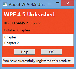
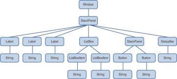
Note that a logical tree exists even for WPF user interfaces that aren’t created in XAML. Listing 3.1 could be implemented entirely in C#, and the logical tree would be identical.
The logical tree concept is straightforward, but why should you care about it? Because just about every aspect of WPF (properties, events, resources, and so on) has behavior tied to the logical tree. For example, property values are sometimes propagated down the tree to child elements automatically, and raised events can travel up or down the tree. This behavior of property values is discussed later in this chapter, and this behavior of events is discussed in Chapter 6.
The logical tree exposed by WPF is a simplification of what is actually going on when the elements are rendered. The entire tree of elements actually being rendered is called the visual tree. You can think of the visual tree as an expansion of a logical tree, in which nodes are broken down into their core visual components. Rather than leaving each element as a “black box,” a visual tree exposes the visual implementation details. For example, although a ListBox is logically a single control, its default visual representation is composed of more primitive WPF elements: aBorder, two ScrollBars, and more.
Not all logical tree nodes appear in the visual tree; only the elements that derive from System.Windows.Media.Visual or System.Windows.Media.Visual3D are included. Other elements (and simple string content, as in Listing 3.1) are not included because they don’t have inherent rendering behavior of their own.
TIP
Some lightweight XAML viewers, such as the XamlPadX tool mentioned in the preceding chapter, have functionality for exploring the visual tree (and property values) for the objects that it renders from XAML.
Figure 3.4 illustrates the default visual tree for Listing 3.1. This diagram exposes some inner components of the user interface that are currently invisible, such as the ListBox’s two ScrollBars and each Label’s Border. It also reveals that Button, Label, and ListBoxItem are all composed of the same elements. (These controls have other visual differences as the result of different default property values. For example, Button has a default Margin of 10 on all sides, whereas Label has a default Margin of 0.)
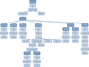
Because they enable you to peer inside the deep composition of WPF elements, visual trees can be surprisingly complex. Fortunately, although visual trees are an essential part of the WPF infrastructure, you often don’t need to worry about them unless you’re radically restyling controls (covered in Chapter 14, “Styles, Templates, Skins, and Themes”) or doing low-level drawing (covered in Chapter 15). Writing code that depends on a specific visual tree for a Button, for example, breaks one of WPF’s core tenets-the separation of look and logic. When someone restyles a control such as Button using the techniques described in Chapter 14, its entire visual tree is replaced with something that could be completely different.
WARNING
Avoid writing code that depends on a specific visual tree!
Whereas a logical tree is static without programmer intervention (such as dynamically adding/removing elements), a visual tree can change simply because a user switches to a different Windows theme!
However, you can easily traverse both the logical and visual trees using the somewhat symmetrical System.Windows.LogicalTreeHelper and System.Windows.Media.VisualTreeHelper classes. Listing 3.2 contains a code-behind file for Listing 3.1 that, when run under a debugger, outputs a simple depth-first representation of both the logical and visual trees for the About dialog. (This requires adding x:Class="AboutDialog" and the corresponding xmlns:x directive to Listing 3.1 in order to hook it up to this procedural code.)
When calling these methods with a depth of 0 and the current Window instance, the result is a text-based tree with exactly the same nodes shown in Figures 3.2 and 3.3. Although the logical tree can be traversed within Window’s constructor, the visual tree is empty until the Windowundergoes layout at least once. That is why PrintVisualTree is called within OnContentRendered, which doesn’t get called until after layout occurs.
TIP
Visual trees like the one represented in Figure 3.4 are often referred to simply as element trees, because they encompass both elements in the logical tree and elements specific to the visual tree. The term visual tree is then used to describe any subtree that contains visual-only (illogical?) elements. For example, most people would say that Window’s default visual tree consists of a Border, an AdornerDecorator, an AdornerLayer, a ContentPresenter, and nothing more. In Figure 3.4, the top-most StackPanel is generally not considered to be the visual child of theContentPresenter, despite the fact that VisualTreeHelper presents it as one.
TIP
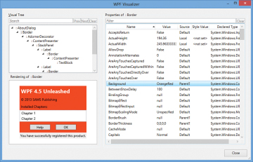
In the Visual Studio debugger, you can click the little magnifying glass next to an instance of a Visual-derived variable to invoke WPF Visualizer, as shown in Figure 3.5. This enables you to navigate and visualize the visual tree.
Navigating either tree can sometimes be done with instance methods on the elements themselves. For example, the Visual class contains three protected members (VisualParent, VisualChildrenCount, and GetVisualChild) for examining its visual parent and children. FrameworkElement, the common base class for controls such as Button and Label, and its peer FrameworkContentElement both define a public Parent property representing the logical parent and a protected LogicalChildren property for the logical children. Subclasses of these two classes often publicly expose their logical children in a variety of ways, such as in a public Children collection. Some classes, such as Button and Label, expose a Content property and enforce that the element can have only one logical child.
Dependency Properties
WPF introduces a type of property called a dependency property that is used throughout the platform to enable styling, automatic data binding, animation, and more. You might first meet this concept with skepticism, as it complicates the picture of .NET types having simple fields, properties, methods, and events. But when you understand the problems that dependency properties solve, you will likely accept them as a welcome addition.
A dependency property depends on multiple providers for determining its value at any point in time. These providers could be an animation continuously changing its value, a parent element whose property value propagates down to its children, and so on. Arguably the biggest feature of a dependency property is its built-in ability to provide change notification.
The motivation for adding such intelligence to properties is to enable rich functionality directly from declarative markup. The key to WPF’s declarative-friendly design is its heavy use of properties. Button, for example, has more than 100 public properties (most of which are inherited from Control and its base classes)! Properties can be easily set in XAML (directly or by using a design tool) without any procedural code. But without the extra plumbing in dependency properties, it would be hard for the simple action of setting properties to get the desired results without the need to write additional code.
In this section, we briefly look at the implementation of a dependency property to make this discussion more concrete, and then we dig deeper into some of the ways that dependency properties add value on top of plain .NET properties:
- Change notification
- Property value inheritance
- Support for multiple providers
Understanding most of the nuances of dependency properties is usually important only for custom control authors. However, even casual users of WPF need to be aware of what dependency properties are and how they work. For example, you can only style and animate dependency properties. After working with WPF for a while, you might find yourself wishing that all properties would be dependency properties!
A Dependency Property Implementation
In practice, dependency properties are just normal .NET properties hooked into some extra WPF infrastructure. This is all accomplished via WPF APIs; no .NET languages (other than XAML) have an intrinsic understanding of a dependency property.
Listing 3.3 demonstrates how Button effectively implements one of its dependency properties, called IsDefault.
The static IsDefaultProperty field is the actual dependency property, represented by the System.Windows.DependencyProperty class. By convention, all DependencyProperty fields are public, static, and have a Property suffix. Several pieces of infrastructure require that you follow this convention: localization tools, XAML loading, and more.
Dependency properties are usually created by calling the static DependencyProperty.Register method, which requires a name (IsDefault), a property type (bool), and the type of the class claiming to own the property (Button). Optionally (via different overloads of Register), you can pass metadata that customizes how the property is treated by WPF, as well as callbacks for handling property value changes, coercing values, and validating values. Button calls an overload of Register in its static constructor to give the dependency property a default value of false and to attach a delegate for change notifications.
Finally, the traditional .NET property called IsDefault implements its accessors by calling GetValue and SetValue methods inherited from System.Windows.DependencyObject, the low-level base class from which all classes with dependency properties must derive. GetValue returns the last value passed to SetValue or, if SetValue has never been called, the default value registered with the property. The IsDefault .NET property (sometimes called a property wrapper in this context) is not strictly necessary; consumers of Button could directly call the GetValue/SetValuemethods because they are exposed publicly. But the .NET property makes programmatic reading and writing of the property much more natural for consumers, and it enables the property to be set via XAML. WPF should, but does not, provide generic overloads of GetValue and SetValue. This is primarily because dependency properties were invented before .NET generics were widely used.
TIP
Visual Studio has a snippet called propdp that automatically expands into a definition of a dependency property, which makes defining one much faster than doing all the typing yourself!
WARNING
.NET property wrappers are bypassed at runtime when setting dependency properties in XAML!
Although the XAML compiler depends on the property wrapper at compile time, WPF calls the underlying GetValue and SetValue methods directly at runtime! Therefore, to maintain parity between setting a property in XAML and procedural code, it’s crucial that property wrappers not contain any logic in addition to the GetValue/SetValue calls. If you want to add custom logic, that’s what the registered callbacks are for. All of WPF’s built-in property wrappers abide by this rule, so this warning is for anyone writing a custom class with its own dependency properties.
On the surface, Listing 3.3 looks like an overly verbose way of representing a simple Boolean property. However, because GetValue and SetValue internally use an efficient sparse storage system and because IsDefaultProperty is a static field (rather than an instance field), the dependency property implementation saves per-instance memory compared to a typical .NET property. If all the properties on WPF controls were wrappers around instance fields (as most .NET properties are), they would consume a significant amount of memory because of all the local data attached to each instance. Having more than 100 fields for each Button, more than 100 fields for each Label, and so forth would add up quickly! Instead, almost all of Button’s and Label’s properties are dependency properties.
The benefits of the dependency property implementation extend to more than just memory usage, however. The implementation centralizes and standardizes a fair amount of code that property implementers would have to write to check thread access, prompt the containing element to be re-rendered, and so on. For example, if a property requires its element to be re-rendered when its value changes (such as Button’s Background property), it can simply pass the FrameworkPropertyMetadataOptions.AffectsRender flag to an overload of DependencyProperty.Register. In addition, this implementation enables the three features listed earlier that we’ll now examine one-by-one, starting with change notification.
Change Notification
Whenever the value of a dependency property changes, WPF can automatically trigger a number of actions, depending on the property’s metadata. These actions can be re-rendering the appropriate elements, updating the current layout, refreshing data bindings, and much more. One of the interesting features enabled by this built-in change notification is property triggers, which enable you to perform your own custom actions when a property value changes, without writing any procedural code.
For example, imagine that you want the text in each Button from the About dialog in Listing 3.1 to turn blue when the mouse pointer hovers over it. Without property triggers, you can attach two event handlers to each Button, one for its MouseEnter event and one for its MouseLeave event:
<Button MouseEnter="Button_MouseEnter" MouseLeave="Button_MouseLeave"
        MinWidth="75" Margin="10">Help</Button>
<Button MouseEnter="Button_MouseEnter" MouseLeave="Button_MouseLeave"
        MinWidth="75" Margin="10">OK</Button>
These two handlers could be implemented in a C# code-behind file as follows:
// Change the foreground to blue when the mouse enters the button
void Button_MouseEnter(object sender, MouseEventArgs e)
{
  Button b = sender as Button;
  if (b != null) b.Foreground = Brushes.Blue;
}

// Restore the foreground to black when the mouse exits the button
void Button_MouseLeave(object sender, MouseEventArgs e)
{
  Button b = sender as Button;
  if (b != null) b.Foreground = Brushes.Black;
}
With a property trigger, however, you can accomplish this same behavior purely in XAML. The following concise Trigger object is just about all you need:
<Trigger Property="IsMouseOver" Value="True">
  <Setter Property="Foreground" Value="Blue"/>
</Trigger>
This trigger can act on Button’s IsMouseOver property, which becomes true at the same time the MouseEnter event is raised and false at the same time the MouseLeave event is raised. Note that you don’t have to worry about reverting Foreground to black when IsMouseOver changes to false. This is automatically done by WPF!
The only trick is assigning this Trigger to each Button. Unfortunately, because of a confusing limitation, you can’t apply property triggers directly to elements such as Button. You can apply them only inside a Style object, so an in-depth examination of property triggers is saved for Chapter 14. In the meantime, to experiment with property triggers, you can apply the preceding Trigger to a Button by wrapping it in a few intermediate XML elements, as follows:
<Button MinWidth="75" Margin="10">
<Button.Style>
  <Style TargetType="{x:Type Button}">
  <Style.Triggers>
    <Trigger Property="IsMouseOver" Value="True">
      <Setter Property="Foreground" Value="Blue"/>
    </Trigger>
  </Style.Triggers>
  </Style>
</Button.Style>
  OK
</Button>
Property triggers are just one of three types of triggers supported by WPF. A data trigger is a form of property trigger that works for all .NET properties (not just dependency properties), also covered in Chapter 14. An event trigger enables you to declaratively specify actions to take when a routed event (covered in Chapter 6) is raised. Event triggers always involve working with animations or sounds, so they aren’t covered until Chapter 17, “Animation.”
WARNING
Don’t be fooled by an element’s Triggers collection!
FrameworkElement’s Triggers property is a read/write collection of TriggerBase items (the common base class for all three types of triggers), so it looks like an easy way to attach property triggers to controls such as Button. Unfortunately, this collection can only contain event triggers, so its name and type are misleading. Attempting to add a property trigger (or data trigger) to the collection causes an exception to be thrown at runtime.
Property Value Inheritance
The term property value inheritance (or property inheritance for short) doesn’t refer to traditional object-oriented class-based inheritance but rather the flowing of property values down the element tree. A simple example of this can be seen in Listing 3.4, which updates the Window from Listing 3.1 by explicitly setting its FontSize and FontStyle dependency properties. Figure 3.6 shows the result of this change. (Notice that the Window automatically resizes to fit all the content thanks to its slick SizeToContent setting!)
For the most part, these two settings flow all the way down the tree and are inherited by children. This affects even the Buttons and ListBoxItems, which are three levels down the logical tree. The first Label’s FontSize does not change because it is explicitly marked with a FontSize of 20, overriding the inherited value of 30. The inherited FontStyle setting of Italic affects all Labels, ListBoxItems, and Buttons, however, because none of them have this set explicitly.
Notice that the text in the StatusBar is unaffected by either of these values, despite the fact that it supports these two properties just like the other controls. The behavior of property value inheritance can be subtle in cases like this for two reasons:
- Not every dependency property participates in property value inheritance. (Internally, dependency properties can opt in to inheritance by passing FrameworkPropertyMetadataOptions.Inherits to DependencyProperty.Register.)
- There may be other higher-priority sources setting the property value, as explained in the next section.
In this case, the latter reason is to blame. A few controls, such as StatusBar, Menu, and ToolTip, internally set their font properties to match current system settings. This way, users get the familiar experience of controlling their font via Control Panel. The result can be confusing, however, because such controls end up “swallowing” any inheritance from proceeding further down the element tree. For example, if you add a Button as a logical child of the StatusBar in Listing 3.4, its FontSize and FontStyle would be the default values of 12 and Normal, respectively, unlike the other Buttons outside of the StatusBar.
Digging Deeper: Property Value Inheritance in Additional Places
Property value inheritance was originally designed to operate on the element tree, but it has been extended to work in a few other contexts as well. For example, values can be passed down to certain elements that look like children in the XML sense (because of XAML’s property element syntax) but are not children in terms of the logical or visual trees. These pseudochildren can be an element’s triggers or the value of any property (not just Content or Children), as long as it is an object deriving from Freezable. This may sound arbitrary and isn’t well documented, but the intention is that several XAML-based scenarios “just work” as you would expect, without requiring you to think about it.
Support for Multiple Providers
WPF contains many powerful mechanisms that independently attempt to set the value of dependency properties. Without a well-defined mechanism for handling these disparate property value providers, the system would be a bit chaotic, and property values could be unstable. Of course, as their name indicates, dependency properties were designed to depend on these providers in a consistent and orderly manner.
Figure 3.7 illustrates the five-step process that WPF runs each dependency property through in order to calculate its final value. This process happens automatically, thanks to the built-in change notification in dependency properties.

Step 1: Determine the Base Value
Most of the property value providers factor into the base value calculation. The following list reveals the ten providers that can set the value of most dependency properties, in order from highest to lowest precedence:
- Local value
- Parent template trigger
- Parent template
- Style triggers
- Template triggers
- Style setters
- Theme style triggers
- Theme style setters
- Property value inheritance
- Default value
You’ve already seen some of the property value providers, such as property value inheritance (#9). Local value (#1) technically means any call to DependencyObject.SetValue, but this is typically seen with a simple property assignment in XAML or procedural code (because of the way dependency properties are implemented, as shown previously with Button.IsDefault). Default value (#10) refers to the initial value registered with the dependency property, which naturally has the lowest precedence. The other providers, which all involve styles and templates, are explained further in Chapter 14.
This order of precedence explains why StatusBar’s FontSize and FontStyle were not impacted by property value inheritance in Listing 3.4. The setting of StatusBar’s font properties to match system settings is done via theme style setters (#8). Although this has precedence over property value inheritance (#9), you can still override these font settings using any mechanism with a higher precedence, such as simply setting local values on StatusBar.
TIP
If you can’t figure out where a given dependency property is getting its current value, you can use the static DependencyPropertyHelper.GetValueSource method as a debugging aid. This returns a ValueSource structure that contains a few pieces of data: a BaseValueSource enumeration that reveals where the base value came from (step 1 in the process) and Boolean IsExpression, IsAnimated, and IsCoerced properties that reveal information about steps 2 through 4.
When calling this method on the StatusBar instance from Listing 3.1 or 3.4 with the FontSize or FontStyle property, the returned BaseValueSource is DefaultStyle, revealing that the value comes from a theme style setter. (Theme styles are sometimes referred to as default styles. The enumeration value for a theme style trigger is DefaultStyleTrigger.)
Do not use this method in production code! Future versions of WPF could break assumptions you’ve made about the value calculation. In addition, treating a property value differently, depending on its source, goes against the way things are supposed to work in WPF applications.
Digging Deeper: Clearing a Local Value
The earlier “Change Notification” section demonstrates the use of procedural code to change a Button’s Foreground to blue in response to the MouseEnter event and then changing it back to black in response to the MouseLeave event. The problem with this approach is that black is set as a local value inside MouseLeave, which is much different from the Button’s initial state, in which its black Foreground comes from a setter in its theme style. If the theme is changed and the new theme tries to change the default Foreground color (or if other providers with higher precedence try to do the same), this change is trumped by the local setting of black.
What you likely want to do instead is clear the local value and let WPF set the value from the relevant provider with the next-highest precedence. Fortunately, DependencyObject provides exactly this kind of mechanism with its ClearValue method. This can be called on a Button b as follows in C#:
b.ClearValue(Button.ForegroundProperty);
(Button.ForegroundProperty is the static DependencyProperty field.) After calling ClearValue, the local value is simply removed from the equation when WPF recalculates the base value.
Note that the trigger on the IsMouseOver property from the “Change Notification” section does not have the same problem as the implementation with event handlers. A trigger is either active or inactive, and when it is inactive, it is simply ignored in the property value calculation.
Step 2: Evaluate
If the value from step one is an expression (an object deriving from System.Windows.Expression), WPF performs a special evaluation step to convert the expression into a concrete result. Expressions mostly appear in data binding (the topic of Chapter 13, “Data Binding”).
Step 3: Apply Animations
If one or more animations are running, they have the power to alter the current property value (using the value after step 2 as input) or completely replace it. Therefore, animations (the topic of Chapter 17) can trump all other property value providers-even local values! This is often a stumbling block for people who are new to WPF.
Step 4: Coerce
After all the property value providers have had their say, WPF passes the almost-final property value to a CoerceValueCallback delegate, if one was registered with the dependency property. The callback is responsible for returning a new value, based on custom logic. For example, built-in WPF controls such as ProgressBar use this callback to constrain its Value dependency property to a value between its Minimum and Maximum values, returning Minimum if the input value is less than Minimum and Maximum if the input value is greater than Maximum. If you change your coercion logic at runtime, you can call CoerceValue to make WPF run the new coercion and validation logic again.
Step 5: Validate
Finally, the potentially coerced value is passed to a ValidateValueCallback delegate, if one was registered with the dependency property. This callback must return true if the input value is valid and false otherwise. Returning false causes an exception to be thrown, canceling the entire process.
TIP
DependencyObject has a SetCurrentValue method that directly updates the current value of a property without changing its value source. (The value is still subject to coercion and validation.) This is meant for controls that set values in response to user interaction. For example, theRadioButton control modifies the value of the IsChecked property on other RadioButtons in the same group, based on user interaction.
Attached Properties
An attached property is a special form of dependency property that can effectively be attached to arbitrary objects. This may sound strange at first, but this mechanism has several applications in WPF.
For the About dialog example, imagine that rather than setting FontSize and FontStyle for the entire Window (as is done in Listing 3.4), you would rather set them on the inner StackPanel so they are inherited only by the two Buttons. Moving the property attributes to the inner StackPanelelement doesn’t work, however, because StackPanel doesn’t have any font-related properties of its own! Instead, you must use the FontSize and FontStyle attached properties that happen to be defined on a class called TextElement. Listing 3.5 demonstrates this, introducing new XAML syntax designed especially for attached properties. This enables the desired property value inheritance, as shown in Figure 3.8.

TextElement.FontSize and TextElement.FontStyle (rather than simply FontSize and FontStyle) must be used in the StackPanel element because StackPanel does not have these properties. When a XAML parser or compiler encounters this syntax, it requires that TextElement (sometimes called the attached property provider) have static methods called SetFontSize and SetFontStyle that can set the value accordingly. Therefore, the StackPanel declaration in Listing 3.5 is equivalent to the following C# code:
StackPanel panel = new StackPanel();
TextElement.SetFontSize(panel, 30);
TextElement.SetFontStyle(panel, FontStyles.Italic);
panel.Orientation = Orientation.Horizontal;
panel.HorizontalAlignment = HorizontalAlignment.Center;
Button helpButton = new Button();
helpButton.MinWidth = 75;
helpButton.Margin = new Thickness(10);
helpButton.Content = "Help";
Button okButton = new Button();
okButton.MinWidth = 75;
okButton.Margin = new Thickness(10);
okButton.Content = "OK";
panel.Children.Add(helpButton);
panel.Children.Add(okButton);
Notice that the enumeration values such as FontStyles.Italic, Orientation.Horizontal, and HorizontalAlignment.Center were previously specified in XAML simply as Italic, Horizontal, and Center, respectively. This is possible thanks to the EnumConverter type converter in the .NET Framework, which can convert any case-insensitive string.
Although the XAML in Listing 3.5 nicely represents the logical attachment of FontSize and FontStyle to StackPanel, the C# code reveals that there’s no real magic here, just a method call that associates an element with an otherwise-unrelated property. One of the interesting things about the attached property abstraction is that no .NET property is a part of it!
Internally, methods such as SetFontSize simply call the same DependencyObject.SetValue method that a normal dependency property accessor calls, but on the passed-in DependencyObject rather than the current instance:
public static void SetFontSize(DependencyObject element, double value)
{
  element.SetValue(TextElement.FontSizeProperty, value);
}
Similarly, attached properties also define a static GetXXX method (where XXX is the name of the property) that calls the familiar DependencyObject.GetValue method:
public static double GetFontSize(DependencyObject element)
{
  return (double)element.GetValue(TextElement.FontSizeProperty);
}
As with property wrappers for normal dependency properties, these GetXXX and SetXXX methods must not do anything other than make a call to GetValue and SetValue.
Digging Deeper: Understanding the Attached Property Provider
The most confusing part about the FontSize and FontStyle attached properties used in Listing 3.5 is that they aren’t defined by Button or even Control, the base class that defines the normal FontSize and FontStyle dependency properties! Instead, they are defined by the seemingly unrelated TextElement class (and also by the TextBlock class, which could alternatively be used in the preceding examples).
How can this possibly work when TextElement.FontSizeProperty is a separate DependencyProperty field from Control.FontSizeProperty (and TextElement.FontStyleProperty is separate from Control.FontStyleProperty)? The key is the way these dependency properties are internally registered. If you were to look at the source code for TextElement, you would see something like the following:
TextElement.FontSizeProperty = DependencyProperty.RegisterAttached(
  "FontSize", typeof(double), typeof(TextElement), new FrameworkPropertyMetadata(
  SystemFonts.MessageFontSize, FrameworkPropertyMetadataOptions.Inherits |
  FrameworkPropertyMetadataOptions.AffectsRender |
  FrameworkPropertyMetadataOptions.AffectsMeasure),
  new ValidateValueCallback(TextElement.IsValidFontSize));
This is similar to the earlier example of registering Button’s IsDefault dependency property, except that the RegisterAttached method optimizes the handling of property metadata for attached property scenarios.
Control, on the other hand, doesn’t register its FontSize dependency property! Instead, it calls AddOwner on TextElement’s already-registered property, getting a reference to exactly the same instance:
Control.FontSizeProperty = TextElement.FontSizeProperty.AddOwner(
  typeof(Control), new FrameworkPropertyMetadata(SystemFonts.MessageFontSize,
  FrameworkPropertyMetadataOptions.Inherits));
Therefore, the FontSize, FontStyle, and other font-related dependency properties inherited by all controls are the same properties exposed by TextElement!
Fortunately, in most cases, the class that exposes an attached property (the GetXXX and SetXXX methods) is the same class that defines the normal dependency property, avoiding this confusion.
Digging Deeper: Attached Properties as an Extensibility Mechanism
As in previous technologies such as Windows Forms, many classes in WPF define a Tag property (of type System.Object) intended for storing arbitrary custom data with each instance. But attached properties are a more powerful and flexible mechanism for attaching custom data to any object deriving from DependencyObject. It’s often overlooked that attached properties even enable you to effectively add custom data to instances of sealed classes (and WPF has plenty of them)!
A further twist to the story of attached properties is that although setting them in XAML relies on the presence of the static SetXXX method, you can bypass this method in procedural code and call DependencyObject.SetValue directly. This means that you can use any dependency property as an attached property in procedural code. For example, the following code attaches ItemsControl’s IsTextSearchEnabled property to a Button and assigns it a value:
// Attach an unrelated property to a Button and set its value to true:
okButton.SetValue(ItemsControl.IsTextSearchEnabledProperty, true);
Although this seems nonsensical, and it certainly doesn’t magically enable new functionality on this Button, you have the freedom to consume this property value in a way that makes sense to your application or component.
There are more interesting ways to extend elements in this manner. For example, FrameworkElement’s Tag property is a dependency property, so you can attach it to an instance of GeometryModel3D (a class you’ll see again in Chapter 16, that is sealed and does not have a Tag property), as follows:
GeometryModel3D model = new GeometryModel3D();
model.SetValue(FrameworkElement.TagProperty, "my custom data");
This is just one of the ways in which WPF provides extensibility without the need for traditional inheritance.
Although the About dialog example uses attached properties for advanced property value inheritance, attached properties are most commonly used for layout of user interface elements. (In fact, attached properties were originally designed for WPF’s layout system.) Various Panel-derived classes define attached properties designed to be attached to their children for controlling how they are arranged. This way, each Panel can apply its own custom behavior to arbitrary children without requiring all possible child elements to be burdened with their own set of relevant properties. It also enables systems such as layout to be easily extensible, because anyone can write a new Panel with custom attached properties. Chapter 5, “Layout with Panels,” and Chapter 21, “Layout with Custom Panels,” have all the details.
Summary
In this chapter and the preceding two chapters, you’ve learned about all the major ways that WPF builds on top of the foundation of the .NET Framework. The WPF team could have exposed its features via typical .NET APIs, as in Windows Forms, and still have created an interesting technology. Instead, the team added several fundamental concepts that enable a wide range of features to be exposed in a way that can provide great productivity for developers and designers.
Indeed, when you focus on these core concepts, as this chapter does, you can see that the landscape isn’t quite as simple as it used to be: There are multiple types of properties, multiple trees, and multiple ways of achieving the same results (such as writing declarative versus procedural code)! Hopefully you can now appreciate some of the value of these new mechanisms. Throughout the rest of the book, these concepts generally fade into the background as we focus on accomplishing specific development tasks.