Chapter 15: How to use jQuery Mobile to build mobile web sites
This chapter is from the book Murach’s HTML5 and CSS3by Zak Ruvalcaba and Anne Boehm18 chapters, 636 pages, 264 figuresISBN 978-1-890774-66-0. For more information visit https://www.murach.com/books/htm5/index.htm">https://www.murach.com/books/htm5/index.htm .
In sections 1 and 2, you learned how to create and format web pages that will be displayed on a computer screen. Now, you’ll learn how to create web pages that are displayed on mobile devices like cell phones, tablets, and PDAs. To do that, you’ll use an exciting new jQuery library called jQuery Mobile.
How to work with mobile devices
Many different types of mobile devices are in use today, and these devices are frequently used to access web sites. Because the screens on these devices are much smaller than standard computer screens, a web site that’s designed to be used on the desktop can be difficult to work with on a mobile device. To accommodate mobile users, then, web developers typically provide pages that are designed specifically for mobile devices.
How to provide pages for mobile devices
Figure 15-1 presents five ways to provide web pages for mobile devices. To start, you can use a style sheet for the “handheld” media type. Unfortunately, that media type is considered antiquated and not all mobile browsers recognize it. That includes the Safari browser used by Apple’s iPhone, current versions of the Opera Mobile and Opera Mini browsers, and others. These browsers support the standard screen media type instead of the handheld type.

On the other hand, iPhone’s Safari and other mobile browsers including Opera’s Mobile and Mini browsers do support a new feature of CSS3 called media queries. These queries let you use a conditional expression for a media type. If, for example, the maximum screen width for a mobile device is 480 pixels, you can code a link element like this if you want to use a different style sheet for those devices:
<link rel="stylesheet" href="styles/mobile.css" media="only screen and (max-device-width: 480px)">
Then, you can code another link element for screen media with a minimum screen width of 481 pixels. The style sheet for this element would then be used for standard computer screens.
The next technique requires that you develop a separate web site for mobile devices. When you use this technique, you include a link on the home page that lets the user switch to the mobile version of the site. The trouble with this is that users don’t always enter a site at the home page, so you may need to provide links to the mobile site on other pages.
When you use the last three techniques in this figure, the web site detects when a mobile device is being used and then redirects the user to the mobile version of the site automatically. This is what is done on most commercial web sites that service many mobile device users. For these sites, one common convention for the mobile site name is to precede the domain name for the main site with m and a period as in m.yahoo.com.
To detect a mobile device, a web site can use JavaScript on the client, a scripting language on the server, or WURFL on the server. Because this book isn’t about JavaScript or server-side programming, though, these techniques aren’t presented in this book. Instead, this chapter shows you how to develop the web pages for a mobile web site, which you need to learn how to do no matter how the user gets to that site.
How to set the viewport properties
When you develop a web site for mobile devices, you can use a special meta element that lets you configure a device’s viewport. This meta element is presented in figure 15-2.
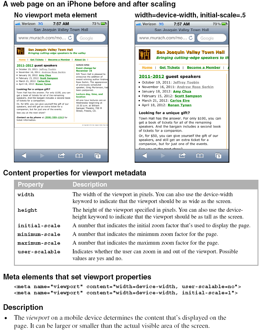
To start, you should know that the viewport on a mobile device works differently from the viewport on a computer screen. On a computer screen, the viewport is the visible area of the web page. However, the user can change the size of the viewport by changing the size of the browser window.
In contrast, the viewport on a mobile device can be larger or smaller than the visible area and determines how the page content appears in that area. In this figure, for example, you can see that the first web page is displayed so almost all of the width of the page is visible. In contrast, the second web page extends beyond the visible area of the screen. Because this display is larger, however, it’s easier to work with.
To configure the viewport, you use a meta element with the name attribute set to “viewport”. Then, for the content attribute, you can specify any of the properties listed in this figure to set the dimensions and scaling of the web page within the mobile device.
The two coding examples in this figure illustrate how this meta element works. The first example sets the width of the viewport to the width of the mobile device. You can use this setting if a page is wider than the device width but narrower than the default viewport width. Then, the page will be enlarged so it fills the visible area. Because this example also sets the user-scalable property to “no”, the user can’t zoom in or out of the page.
The second example shows the code that is used for the pages in the rest of this chapter. Here again, this example sets the width of the viewport to the width of the mobile device, but it also sets the zoom factor, or scale, for the viewport. In this case, this scale is set to 1, which represents the default width for the viewport. For the iPhone, that means the viewport width is set to 320 pixels.
If you want the viewport to appear to be larger or smaller, you can change the initial scale to a value that is higher or lower than 1. This is illustrated by the two screens in this figure. Since the HTML for the first screen doesn’t include a viewport meta element, its initial scale is 1 and the content for this full screen is small. For the second screen, though, a meta element sets the initial scale to .5. As a result, a smaller portion of the page is shown on a mobile device, but what’s shown is easier to read because it’s larger.
Guidelines for designing mobile web pages
If you create web pages specifically for mobile devices, you should follow some general guidelines so it’s easy for users to work with those pages. Figure 15-3 presents these guidelines.
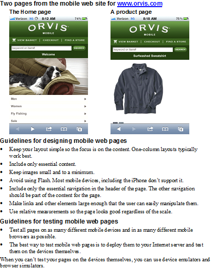
In general, you want to simplify the layout and content of your pages. This is illustrated by the two pages in this figure. The first shows the home page for the mobile version of a large web site. Here, the page consists primarily of links to the major types of products that the site offers. The second page shows how the page for one product has been simplified. If you review the full version of this site, you’ll get a better idea of just how much the full version has been simplified.
Guidelines for testing mobile web pages
Because there are so many different mobile devices, it’s important to test a mobile web page on as many devices and in as many browsers as possible. Although the best way to test a mobile web page is to deploy the page on a web server and then display it on a variety of devices, that isn’t always possible. In that case, you may want to use the device emulators and browser simulators that are available for many of the mobile devices and browsers.
In most cases, you need to download the required emulator or simulator from the manufacturer’s web site so you can run it on your desktop. In a few cases, though, you can run the emulator or simulator online. To do that, though, you sometimes need to deploy the web page so it can be accessed online. Also, when you use an emulator or a simulator, it may not always provide accurate results, although it should approximate what a page will look like.
To capture the screens for this chapter, I used my iPhone. To do that, I first deployed the pages to my web server. Then, I used the Safari browser on my iPhone to display the pages. To capture each page image, I held down the Home button and pressed the Power button. After I captured all of the page images, I copied the images from my iPhone to my computer.
If you don’t have a web server that you can deploy the mobile pages on, one easy option is to size your browser window so it’s about the size of a mobile device. That will give you a good idea of what the pages will look like on a mobile device. Another option is to use the iPhone simulator that’s available at
With this simulator, you can paste the location of a page on your computer into the address bar and click the Refresh button to display the page.
An introduction to jQuery Mobile
In chapter 14, you learned how to use jQuery to enhance your web pages. Now, in this chapter, you’ll learn how to use the new jQuery Mobile library to develop mobile web sites. Although there are other ways to develop mobile web sites, we think jQuery Mobile sets a standard that other development methods are going to have a hard time beating.
What jQuery Mobile is and where to get it
As figure 15-4 summarizes, jQuery Mobile is a free, open-source, cross-platform, JavaScript library that you can use for developing mobile web sites. This library lets you create pages that look and feel like the pages of a native mobile application.

Although jQuery Mobile is currently available as a beta test version, this version already provides all of the features that you need for developing an excellent mobile web site. As a result, you can start using it right away. You can also expect this version to be continually enhanced, so jQuery Mobile will only get better.
To include jQuery Mobile in your pages, you can use a Content Delivery Network as shown in the next figure. Otherwise, you will need to download the files that it requires. To download the jQuery library that JQuery Mobile requires, go to the jQuery web site that you learned about in the last chapter. To get the jQuery Mobile files, go to the jQuery Mobile web site.
How to include jQuery Mobile in your web pages
To use jQuery Mobile, you need to include the three files listed at the top of figure 15-5 in your web pages: the jQuery file, the jQuery Mobile file, and the jQuery Mobile CSS style sheet. As this figure shows, there are two ways to do that.
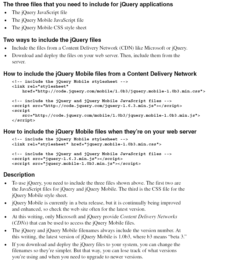
The first way to include the three files is illustrated by the first set of examples in this figure. Here, the link element for the CSS file and the script elements for the jQuery and JQuery Mobile files use a Content Delivery Network (CDN). A CDN is a web server that hosts open-source software, and Microsoft and jQuery are the only CDNs at this writing that you can use for getting the jQuery Mobile library. In this example, the jQuery CDN is used.
The benefit to using a CDN is that you don’t have to manage the jQuery and jQuery Mobile versions on your server as new ones become available. Instead, you just have to change the version numbers in the link and script elements for these files.
The second way is to download the three files and deploy them on your system or web server. To do that, you download the compressed zip files, extract the files from the zip files, and copy the files to your web server.
Then, for each web page that uses jQuery Mobile, you code one link element that includes the CSS file and two script elements that include the jQuery and jQuery Mobile files. This is illustrated by the second set of examples in this figure. Here, the names for the current versions of the files are retained. Although you can change those names once they’re on your server, keeping the downloaded names makes it easy to tell which versions of the files you’re using.
No matter which method you use, you must code the script element for jQuery Mobile after the one for jQuery. That’s because jQuery Mobile uses functions that are in the jQuery file.
How to create one web page with jQuery Mobile
To give you an idea of how jQuery Mobile works, figure 15-6 shows how to create one web page with it. In the HTML for a page, you use data-role attributes to identify the components of the page: page, header, content, and footer. You also use an h1 element for the content of the header, and an h4 element for the content of the footer.
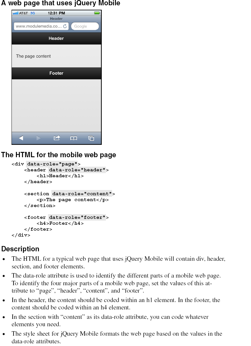
In the page that’s displayed, you can see how jQuery Mobile automatically formats these components. Here the text for both the header and footer is centered in white type against a black background, while the text for the content is black against a gray background. This is the default styling that’s done by jQuery Mobile, and it’s similar to the styling for a native iPhone application.
Within the header, footer, and content components, you can code the HTML for whatever content you need. You’ll see this illustrated in the examples that follow. However, this simple example should give you some idea of how easy it is to code and format a single web page.
How to use jQuery Mobile to create a mobile web site
In the four topics that follow, you’ll learn the basic techniques for creating the pages of a mobile web site. That will include the use of dialog boxes, buttons, and navigation bars.
How to code multiple pages in a single HTML file
In contrast to the way you develop the web pages for a screen web site, jQuery Mobile lets you create multiple pages in a single HTML file. This is illustrated by figure 15-7. Here, you can see two pages of a site along with the HTML for these pages. What’s surprising is that both pages are coded within a single HTML file.
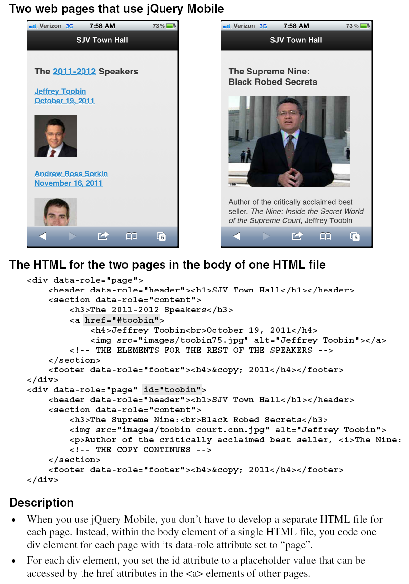
For each page, you code one div element with “page” as its id. Then, within each of those div elements, you code the div elements for the header, content, and footer of each page. Later, when the HTML file is loaded, the first page in the body of the file is displayed.
To link between the pages in the HTML file, you use placeholders as shown in figure 7-11 of chapter 7. For instance, the <a> element in the first page in this example goes to “#toobin” when the user taps on the h2 or img element that is coded as the content for this link. This refers to the div element with “toobin” as its id attribute, which means that tapping the link takes the reader to the second page in the file.
Although this example shows only two pages, you can code many pages within a single HTML file. Remember, though, that all of the pages along with their images, JavaScript, and CSS files are loaded with the single HTML file. As a result, the load time will become excessive if you store too many pages in a single file. When that happens, you can divide your pages into more than one HTML file.
How to use dialog boxes and transitions
Figure 15-8 shows how to create a dialog box that opens when a link is tapped. To do that, you code the dialog box just as you would any page. But in the <a> element that goes to that page, you code a data-rel attribute with “dialog” as its value.
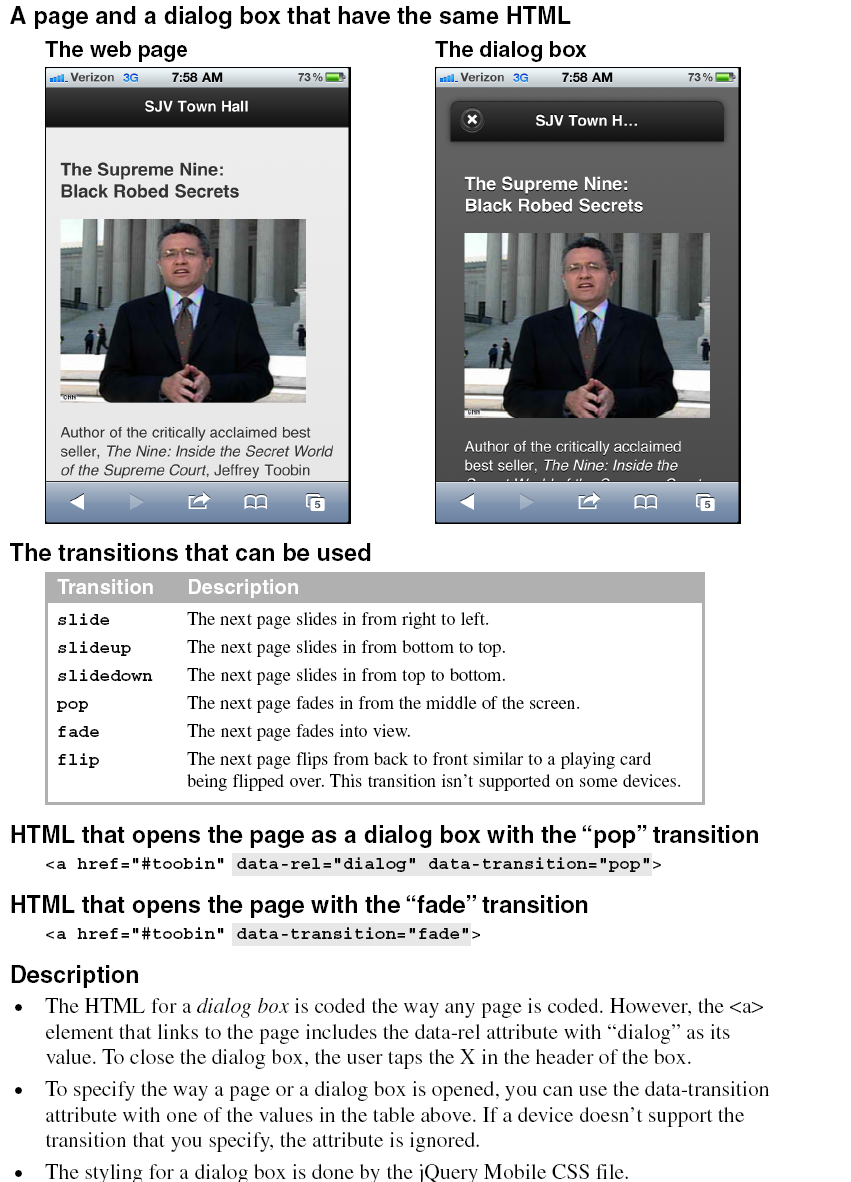
As the examples in this figure show, the jQuery Mobile CSS file formats a dialog box differently than a normal web page. By default, a dialog box will have a dark background with white foreground text, and the header and footer won’t span the width of the page. A dialog box will also have an “X” in the header that the user must tap to return to the previous page.
When you code an <a> element that goes to another page or dialog box, you can also use the data-transition attribute to specify one of the six transitions that are summarized in the table in this figure. Each of these transitions is meant to mimic an effect that a mobile device like an iPhone uses.
How to create buttons
Figure 15-9 shows how to use buttons to navigate from one page to another. To do that, you just set the data-role attribute for an <a> element to “button”, and jQuery Mobile does the rest.
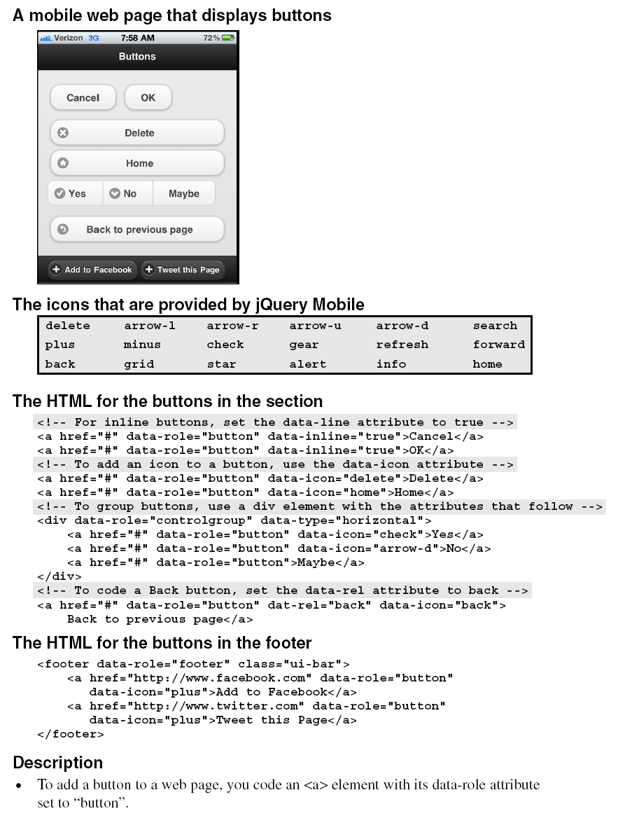
However, you can also set some other attributes for buttons. If, for example, you want two or more buttons to appear side by side, like the first two buttons in this figure, you can set the data-inline attribute to “true”.
If you want to add one of the 18 icons that are provided by jQuery Mobile to a button, you also code the data-icon attribute. For instance, the third button in this example uses the “delete” icon, and the fourth button uses the “home” icon. All of these icons look like the icons that you might see within a native mobile application. Incidentally, these icons are not separate files that the page must access. Instead, they are provided by the jQuery Mobile library.
If you want to group two or more buttons horizontally, like the Yes, No, and Maybe buttons in this figure, you can code the <a> elements for the buttons within a div element that has “controlgroup” as its data-role attribute and “horizontal” as its data-type attribute. Or, to group the buttons vertically, you can change the data-type attribute to “vertical”.
If you set the data-rel attribute for a button to “back” and the href attribute to the pound symbol (#), the button will return to the page that called it. In other words, the button works like a Back button. This is illustrated by the last button in the content for the page.
The last two buttons show how buttons appear in the footer for a page. Here, the icons and text are white against a black background. In this case, the class attribute for the footer is set to “ui-bar”, which tells jQuery Mobile that it should put a little more space around the contents of the footer. You’ll learn more about that in figure 15-12.
How to create a navigation bar
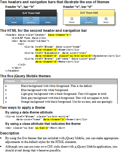
Figure 15-10 shows how you can add a navigation bar to a web page. To do that, you code a div element with its data-role set to “navbar”. Within this element, you code a ul element that contains li elements that contain the <a> elements for the items in the navigation bar. Note, however, that you don’t code the data-role attribute for the <a> elements.

To change the color for the items in the navigation bar, the code in this example includes the data-theme-b attribute for each item. As a result, jQuery Mobile changes the background color of each item from black, which is the default, to an attractive blue. In addition, this code sets the class attribute for the active button to “ui-btn-active” so jQuery Mobile changes the color for the active button to a lighter blue. This shows how you can change the formatting that’s used by jQuery Mobile, and you’ll learn more about that next.
How to format content with jQuery Mobile
As you’ve already seen, jQuery Mobile automatically formats the components of a web page based on its own style sheet. Now, you’ll learn more about that, as well as how to adjust the default styling that jQuery Mobile uses.
The default styles that jQuery Mobile uses
Figure 15-13 shows the default styles that jQuery Mobile uses for common HTML elements. For all of its styles, jQuery Mobile relies on the browser’s rendering engine so its own styling is minimal.
This keeps load times fast and minimizes the overhead that excessive CSS would impose on a page.
As you can see, jQuery Mobile’s styling is so effective that you shouldn’t need to modify its styling by providing your own CSS style sheet. For instance, the spacing between the items in the unordered list and the formatting of the table are both acceptable the way they are. Also, the black type on the gray background is
consistent with the formatting for native mobile applications.
How to apply themes to HTML elements
In some cases, you will want to change the default styles that jQuery Mobile uses. You’ve already seen that in the navigation bar of figure 15-10. To change the default styles, you can use the five themes that jQuery Mobile provides. These are summarized in figure 15-12. Here again, these themes are meant to mimic the appearance of a native mobile application.
One way to apply themes is to code a data-theme attribute with the theme letter as its value. You saw this in the navigation bar in figure 15-10, and you can see this in the code for the second navigation bar in this figure. Here, the data-theme attribute applies theme “e” to the header and theme “d” to the items in the navigation bar.
The other way to apply themes is to set the class attribute for an element to a class name that indicates a theme. This is illustrated by the first example after the table. Here, the class attribute is used to apply both the “ui-bar” and “ui-bar-b” classes to the div element. As a result, jQuery Mobile first applies its default styling for a bar to the element and then applies the b theme to that styling. In the pages that follow, you’ll see other examples of this type of styling.
Please note that the table in this figure says to use theme e sparingly. That’s because it uses an orange color that works okay for accenting an item, but isn’t attractive in large doses. This is illustrated by the second header and navigation bar in this figure, which tends to be jarring when you see it in color.
In general, it’s best to stay with the default styles and the first three themes, which usually work well together. Then, you can experiment with themes d and e when you think you need something more.
How to use jQuery Mobile for page layout
The last four topics in this chapter show how to use jQuery Mobile for special page layouts.
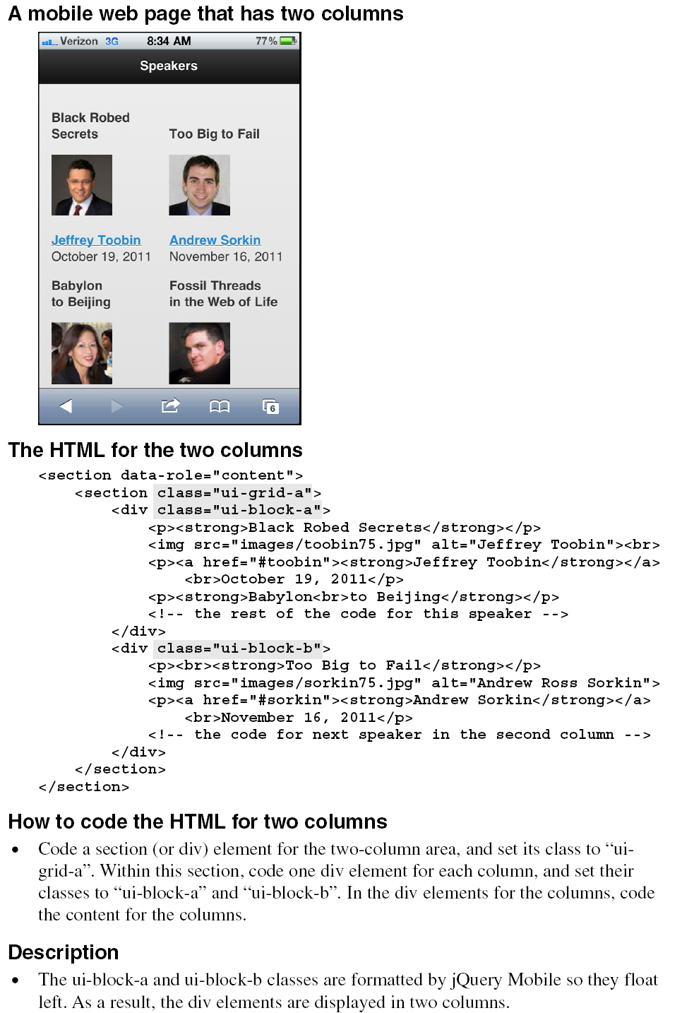
How to lay out your content in two columns
Figure 15-13 shows how you can lay out the content for a page in two columns. This can be useful for a photo gallery or product list because it can reduce the amount of scrolling that’s needed to see all of the items.
In the HTML for a two-column layout, you start with a section (or div) element that has its class set to “ui-grid-a”. Then, within this section, code one div element for each column with the class for the first element set to “ui-block-a” and the class for the second element set to “ui-class-b”. Within these two div elements, you code the content for each column.
In this example, the content for each speaker consists of a paragraph, an image, and another paragraph. Also, all of the speakers for the first column are coded in the first block, and all of the speakers for the second column are coded in the second block. However, you could also code this as a series of grids with just two blocks (or speakers) in each grid: one for the left column, and one for the right column.
In the code for this example, you may note the heading for each speaker is coded as a strong element within a paragraph. Although it would be better semantically to code this as a heading element, you sometimes need to make an accommodation like this to get the content to fit in the mobile web page. Also, you can see that speaker name and date are coded as the content for <a> elements within paragraphs. As a result, these items are formatted in blue and underlined.
How to create collapsible content blocks
Figure 15-14 shows how you can display content in collapsible content blocks. Then, the user can tap on an item to display (or expand) the content within the block. By default, jQuery Mobile formats these blocks and adds plus and minus signs to them as shown in this figure.
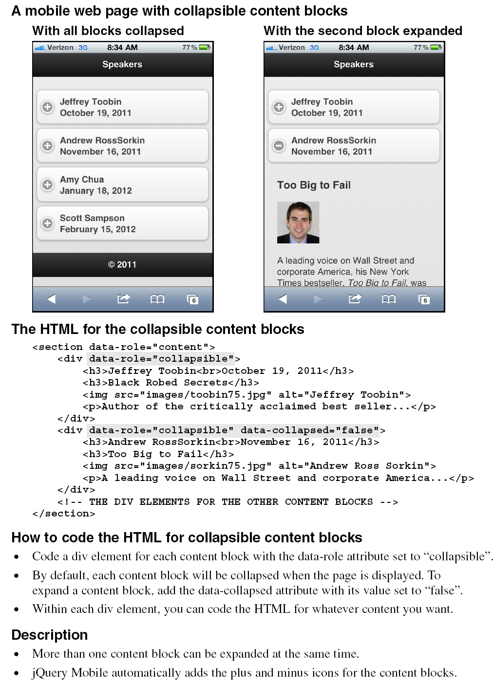
In the code for this feature, you can see that there’s one div element for all of the blocks with its data-role attribute set to “content”. You can also see that there’s one div element for each content block with its data-role attribute set to “collapsible”. By default, the content blocks are collapsed when the page is loaded, but you can change that by setting the data-collapsed attribute for one or more blocks to “false”.
How to create an accordion
When you create an accordion, you code the content blocks the same way you code the collapsible content blocks of the previous figure. This is illustrated by figure 15-15. However, you code these content blocks within a section or div element that has its data-role attribute set to “collapsible-set”.
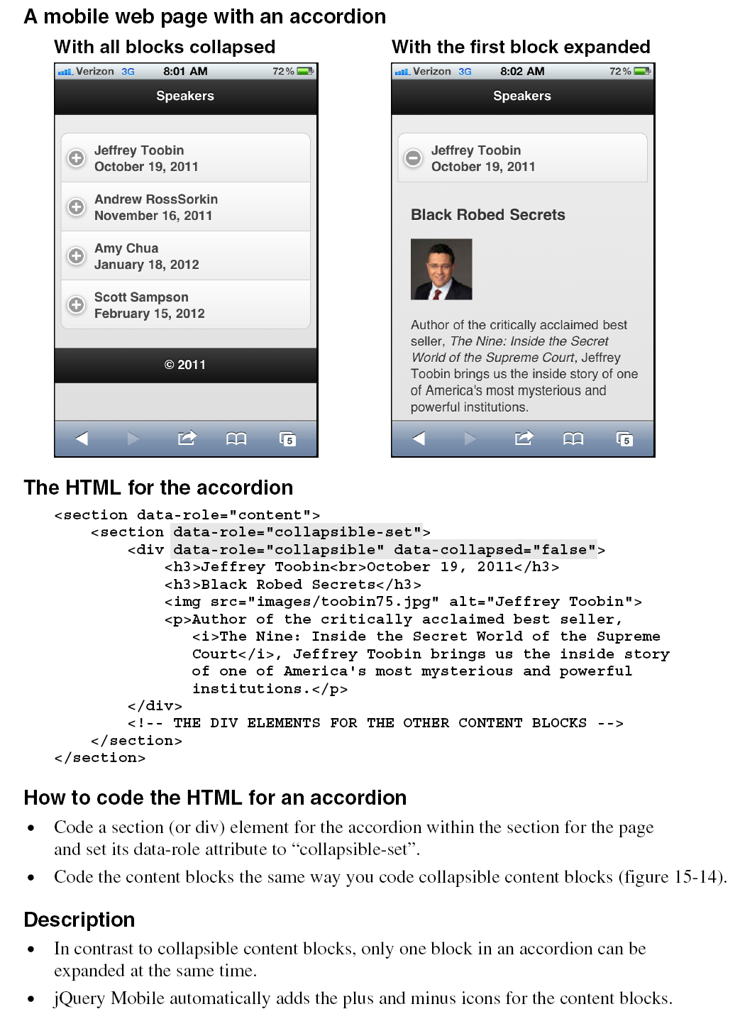
One difference between an accordion and collapsible content blocks is that jQuery Mobile formats the blocks in the accordion as a unit. You can see this if you compare the example in this page with the one in the previous page. The other difference is that the user can only expand one block at a time in an accordion. So, when one block is expanded, the other block is collapsed.
How to create a contents list
Figure 15-16 shows how to create a list that can be used to link to other pages. In the first example, the user can tap on the image, the text, or the right-arrow icon to go to a page that gives more information about the speaker. In the second example, the user can tap on the image or the text to go to the speaker’s page, or the user can tap on the gear icon to go to a Buy Tickets dialog box.
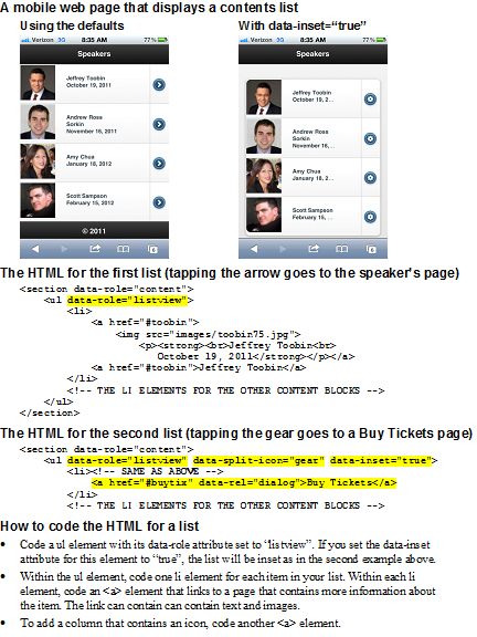
To create a list like this, you start with a ul element that has “listview” as its data-role attribute. Then, you code the HTML for each block in an li element. Within each li element, you code an <a> element that contains the image and text that you want in the first two columns. After that, you can code another <a> element that provides the icon in the third column.
In the HTML for the first example, both <a> elements in each block link to the page for the speaker. As a result, the user can tap anywhere in the block to go to the speaker’s page. In this case, the default icon is used for the second link, and that icon is the right arrow.
In the HTML for the second example, the first <a> element in each block is coded the same way it is in the first example. However, the second <a> element links to a page with “buytix” as its id, and it treats this page as a dialog box. The HTML for the second example also uses the data-split-attribute to set the icon that’s used to a gear, and it uses the data-inset attribute to inset the list as shown in this example.
When you code the HTML for a list, especially an inset list, it’s often difficult to get all the information to display fully. For instance, none of the items in the second example display the date fully. That’s why you may be forced to limit the information that each block provides.
A mobile web site that uses jQuery Mobile
To show how the features you’ve just learned work together in a complete web site, this chapter ends by presenting several pages of a mobile web site that uses jQuery Mobile. This should give you a better idea of how you can use jQuery Mobile to build your own sites.
The layout for the mobile web site
Figure 15-17 presents four pages of the mobile version of the Town Hall web site. That includes the Home, Speakers, and Contact Us pages, as well as one of the speaker’s pages. On all of these pages, you can see the navigation bar that lets the user go from one page to another.
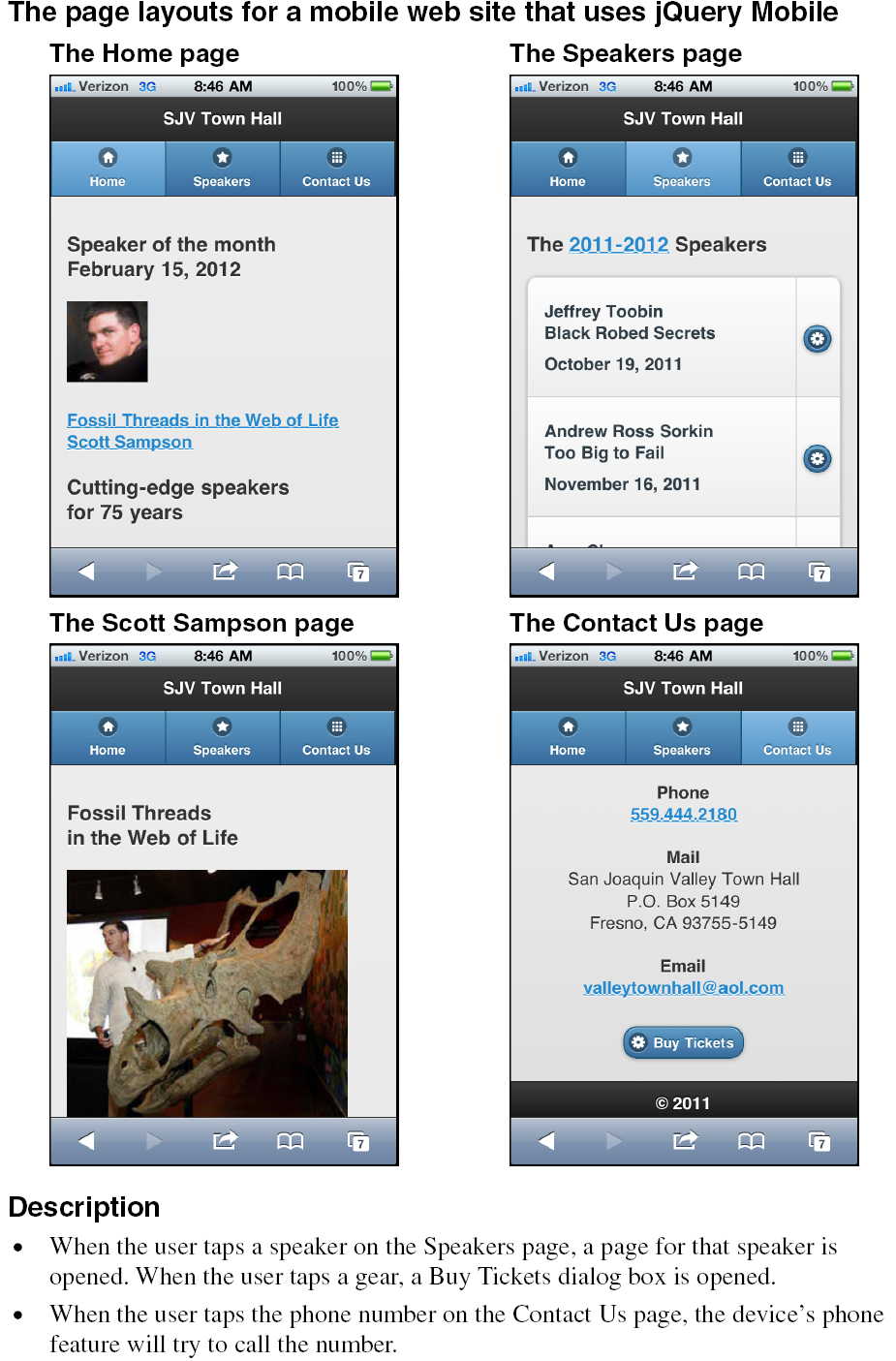
On the Home page, you can see the speaker of the month, and the link that will take the user to that speaker’s page. This is followed by copy that tells what the web site does.
On the Speakers page, the user can tap on any item in the first column of the contents list to go to the page for that speaker. Or, the user can tap on the gear icon to open a dialog box that shows how to buy tickets. Unlike the contents list in the previous figure, this one doesn’t include images so the text is more prominent.
On the Contact Us page, you can see a phone number, an email address, and a Buy Tickets button that includes a gear icon. If the user taps on the phone number, the user’s device will try to call that number. If the user taps on the email address, the user’s system will try to start an email to that address. And if the user taps on the Buy Tickets button, the Buy Tickets page will be opened as a dialog box. This is the same page that’s opened when the user taps on the gear icon on the Speakers page.
The HTML for the mobile web site
Figure 15-18 presents the primary HTML for this web site in three parts. Since this HTML uses the features that you’ve learned about in this chapter, you should be able to understand it on your own. In case you’re interested, though, here are a few highlights.
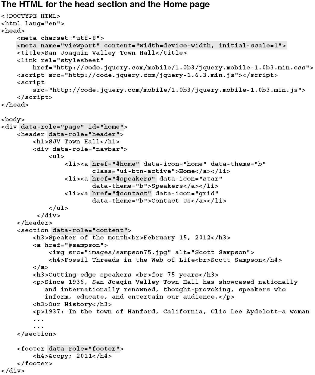
In the head section in part 1, the viewport metadata specifies a width equal to the devices width and an initial scale of 1. This should work for all mobile devices, include iPhones and Android devices.
In the body section in part 1, you can see the HTML for the Home page of the site. Since this page is first in the file, it is the one that will be displayed when the HTML file is loaded. Other than the data-role attributes, this page uses normal HTML code with none of the features that jQuery Mobile provides.
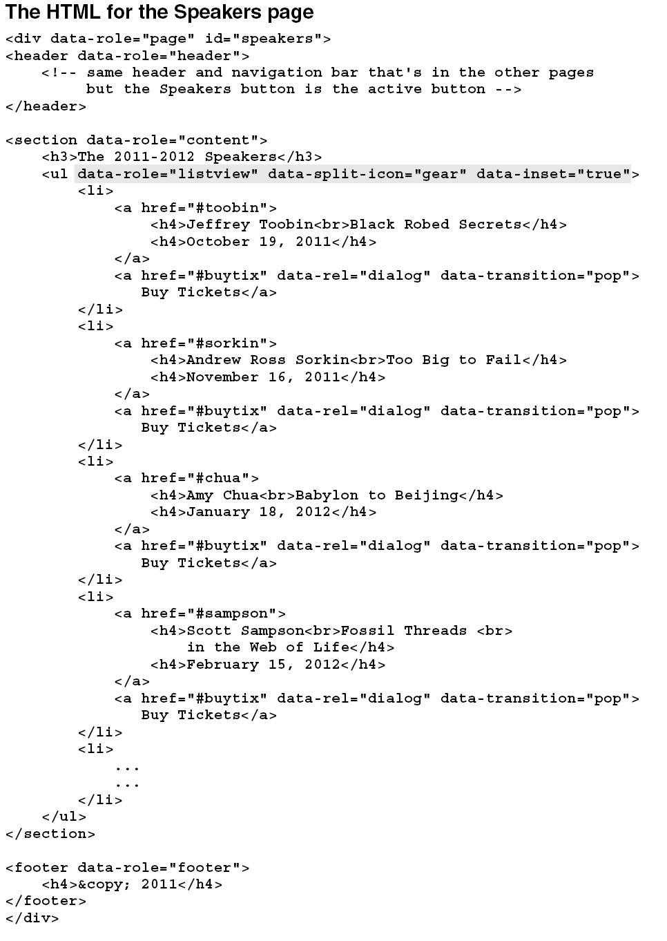
In part 2 of this figure, you can see the code for the Speakers page. This uses a list like the one in figure 15-16, but without the images. That provides more room for the text so none of the text is missing, even though heading elements are used for the text and the list is inset. This list also includes the gear icon that opens the Buy Tickets page as a dialog box when it is tapped.
In part 3 of this figure, you can see the code for Scott Sampson’s page. This page can be reached from the Home page as well as the Speakers page. Then, to return to the previous page, the button at the bottom of this page is coded as a Back button. In other words, it will return to either the Home or the Speakers page based upon which page linked to it.
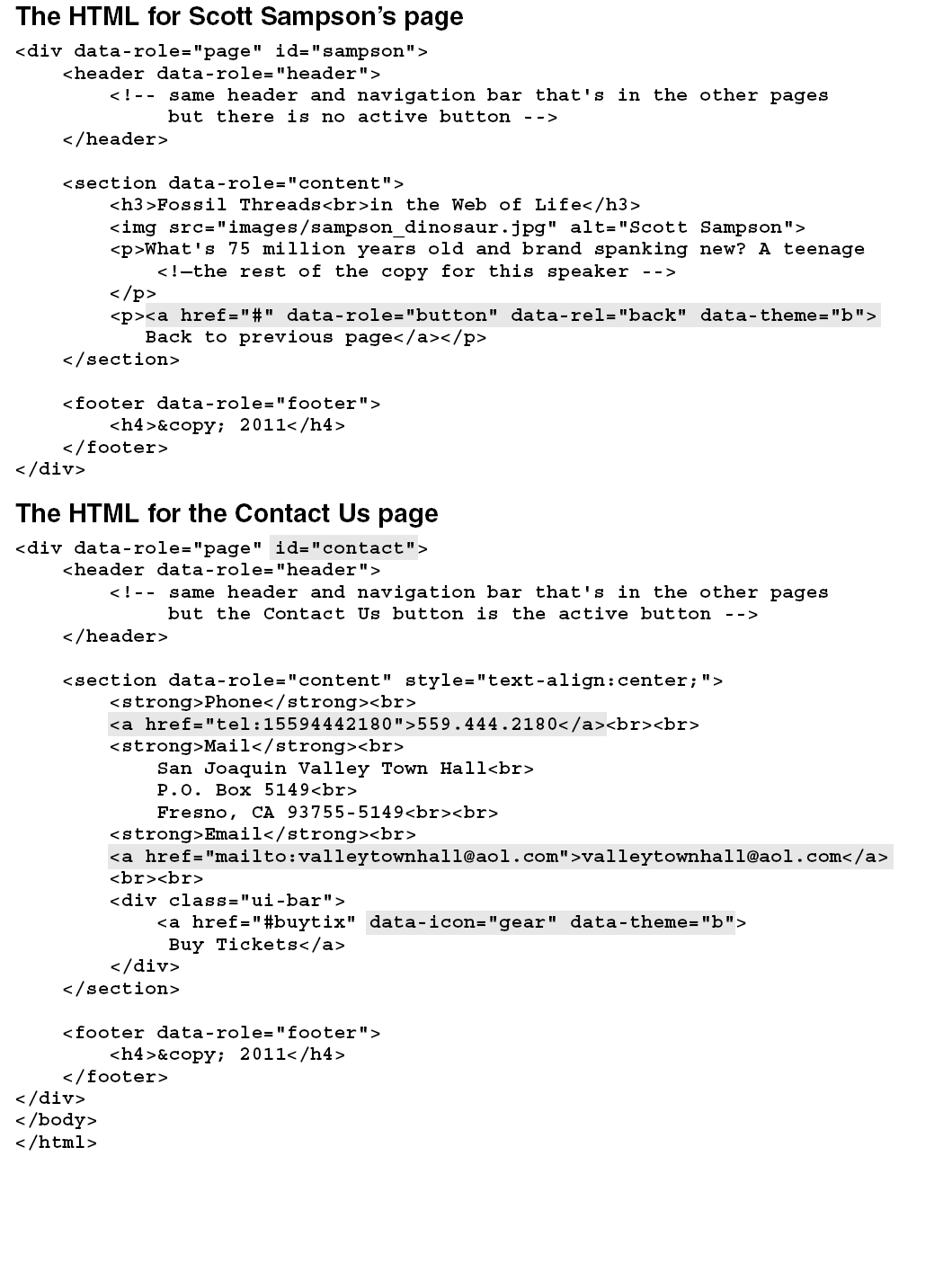
In part 3, you can also see the code for the Contact Us page. Here, <a> elements are used for the phone number and email address. That’s why the device will try to call the phone number when the phone number is tapped and why the device will try to start an email message when the email address is tapped.
This Contact Us page uses a third <a> element for the button on the page. It specifies the gear icon in its data-icon attribute, so the gear appears on the button. It also specifies “b” as its data-theme attribute so the button is blue. Note, however, that it doesn’t have a data-role attribute that is set to “button”. Instead, this <a> element is coded within a div element that has its class set to “ui-bar”, and that’s what makes the link look like a button.
Perspective
The use of mobile devices has increased dramatically over the past few years. Because of that, it has become increasingly important to design web sites that are easy to use from these devices. Although that usually means developing a separate web site, this can be a critical aspect of maintaining your presence on the Internet.
Fortunately, the task of building a mobile web site has become much easier with the advent of jQuery Mobile. No longer are mobile web pages limited to static pages that contain headings, paragraphs, links, and thumbnail images. With jQuery Mobile, web developers can now build feature-rich web sites that look and feel like native mobile applications.
Terms
Media query
CDN (Content Delivery Network)
WURFL (Wireless Universal Resource File)
Dialog box
Viewport
Transition
Scale
Theme
jQuery Mobile
collapsible content blocks
accordion
Summary
- The best way to provide web pages for mobile devices is to build a separate web site for those devices. Then, you can redirect users from your full web site to your mobile web site.
- To redirect users to the mobile version of a web site, you can use JavaScript, server-side code, or WURFL (Wireless Universal Resource File).
- The viewport on a mobile device determines the content that’s displayed. To control how that works, you can code a viewport meta element in the head section of a page.
- jQuery Mobile is a JavaScript library that’s designed for developing mobile web sites. jQuery Mobile uses the core jQuery library along with its own CSS file.
- To include the jQuery Mobile and jQuery libraries in a web page, you code script elements in the head section. Because jQuery Mobile uses jQuery, the script element for jQuery Mobile must be coded after the one for jQuery.
- jQuery Mobile lets you code the HTML for many mobile pages in a single HTML file. jQuery Mobile also supports the use of dialog boxes, transitions, buttons, navigation bars, collapsible content blocks, accordions, and more.
- By default, jQuery Mobile provides formatting that relies on a browser’s native rendering engine. jQuery Mobile also provides five themes that you can use to adjust the default formatting without using CSS style sheets of your own.Exercise 15-1 Test and modify the mobile web site for Town Hall
Exercise 15-1 Test and modify the mobile web site for Town Hall
In this exercise, you’ll first test the mobile version of the Town Hall web site that’s presented in this chapter. Then, you’ll make some modifications to it, like changing the Speakers page so it looks like the one that follows. This should demonstrate how easy it is to build mobile web sites when you use jQuery Mobile.
Open and test the mobile web site for Town Hall
- Use your text editor to open this HTML page:
- c:\html5_css3\exercises\town_hall_3\mobile\index.html
- Test this page and the navigation from one page to another within the site. The easiest way to do that is to run the page in Firefox and then reduce the size of the browser window so it’s about the size of a mobile window. As you go from page to page, remember that all of the pages come from one HTML file.
- Click on the image on the home page to go to the page for Scott Sampson, and then click the button at the bottom of that page to return to the home page. Next, click the Speakers button in the navigation bar and then the link for Scott Sampson to go to the page for Scott Sampson. This time, when you click on the button at the bottom of the page, you return to the Speakers page.
Modify the way the pages work and test these changes
- Review the code for the button on Scott Sampson’s page. Then, modify the code so it returns to the Speakers page no matter how the user got there.
- In the HTML for the Speakers page, delete the second <a> element for each speaker. Then, test this change to see how the Speakers page has changed and how the navigation works.
- Add the small images of the speakers to the Speakers page as shown in figure 15-16. Then, adjust the formatting for the text so the page looks something like the page above, but don’t use CSS to do that. Instead, experiment with HTML elements like the h4, p, and strong elements. Without using CSS, this formatting can be time-consuming.
- Add a page for Andrew Ross Sorkin that’s like the ones for the other speakers. Use “Too Big to Fail” as the heading for the page and follow that with the large image for him, but don’t bother adding any content beyond that. Then, test to make sure that this works and that the navigation to and from the page works.
Experiment on your own
- Experiment with themes. Try using CSS to format the Speakers page. Add a page that uses a table. You’ll soon see how quickly you can build a mobile web site with jQuery Mobile. Keep in mind, though, that this chapter has only presented about 25% of the features of jQuery Mobile.
How to work with mobile devices 2
How to provide pages for mobile devices 2
How to set the viewport properties 3
Guidelines for designing mobile web pages 4
Guidelines for testing mobile web pages 4
An introduction to jQuery Mobile 5
What jQuery Mobile is and where to get it 5
How to include jQuery Mobile in your web pages 6
How to create one web page with jQuery Mobile 7
How to use jQuery Mobile to create a mobile web site 8
How to code multiple pages in a single HTML file 8
How to use dialog boxes and transitions 9
How to create buttons 10
How to create a navigation bar 11
How to format content with jQuery Mobile 12
The default styles that jQuery Mobile uses 12
How to apply themes to HTML elements 13
How to use jQuery Mobile for page layout 14
How to lay out your content in two columns 14
How to create collapsible content blocks 15
How to create an accordion 16
How to create a contents list 17
A mobile web site that uses jQuery Mobile 18
The layout for the mobile web site 18
The HTML for the mobile web site 19
Perspective 20