


As readers of this magazine, you are all experts at certain facets of software development, be it for the desktop, the web, SQL Server and now mobile platforms. Mobile programming was a fairly arcane development arena up until the recent announcement of Windows Phone 7 (WP7). Prior to WP7, you had to become intimately familiar with the myriad platforms and form factors available and write your programs to each of those phones. With the advent of WP7, Microsoft is now controlling the hardware capabilities of the phone making it much easier to develop for these platforms. You can now also leverage existing skills in Silverlight and XNA to write your apps. But the question always remains: how do I get started and what is the best way to write for the new WP7? In a previous article, CODE Magazine Jan/Feb 2011, I showed you what to do to get started; now I want to show you the best way to apply what you have learned in that article. I will use Silverlight, the Model-View-ViewModel (MVVM) pattern, and Silverlight Unit testing to build a sample app.
Silverlight
Silverlight is a great programming environment and is well-suited for mobile development because it is lightweight and self-contained. It has its own CLR and all functionality is, by default, contained in a single .xap file. You can transfer this .xap file anywhere that has the silverlight runtime and you can execute the code contained in it.
There are a few basic tenets to Silverlight programming that you need to be aware of. Silverlight leverages layout containers to position its control content. In the Silverlight world, you want controls to flow into the space given them rather than using the absolute positioning paradigm familiar to web/win forms programmers. Silverlight has five layout controls, but in normal use, you'll probably only use two: the grid and the stack panel.
The grid is analogous to the HTML Table as it can contain columns and rows for precise control over content placement. The stack panel allows you to stack controls either horizontally or vertically. You can also nest grids within grids and stackpanels. You can create a precise hierarchy of layout containers to completely constrain your page layout to your satisfaction.
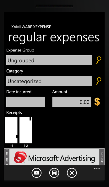
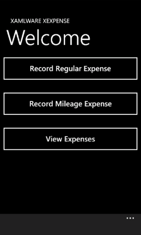
Listing 1 shows a fairly complex layout with nested grids and stackpanels to layout the controls in an even flowing manner. It shows the use of a data template for the listbox. Figure 1 shows the results of the layout on the phone screen.
Listing 1: Main Page layout
<Grid x:Name="LayoutRoot" Background="Transparent">
  <Grid.RowDefinitions>
    <RowDefinition Height="Auto" />
    <RowDefinition Height="*" />
  </Grid.RowDefinitions>

  <StackPanel
      x:Name="TitlePanel"
      Grid.Row="0"
      Margin="24,24,0,12">

    <TextBlock
        x:Name="ApplicationTitle"
        Text="{StaticResource ApplicationTitle}"
        Style="{StaticResource PhoneTextNormalStyle}" />

    <TextBlock
        x:Name="PageTitle"
        Text="{Binding PageName}"
        Margin="-3,-8,0,0"
        Style="{StaticResource PhoneTextTitle1Style}" />
  </StackPanel>

  <Grid x:Name="ContentGrid" Grid.Row="1">
      <Grid.RowDefinitions>
      <RowDefinition Height="Auto" />
      <RowDefinition Height="Auto" />
      <RowDefinition Height="Auto" />
      <RowDefinition Height="*" />
      <RowDefinition Height="80" />
    </Grid.RowDefinitions>

    <Button
       x:Name="btnExpenses"
        Grid.Row="0"
        Height="100"
        Margin="0,0,0,20"
       MouseLeftButtonDown=" btnExpenses_MouseLeftButtonDown" >

        <Button.Content>
          <StackPanel Orientation="Horizontal">
            <Image />
            <TextBlock Text="Record Regular Expense"/>
          </StackPanel>
    </Button>

    <Button
      x:Name="btnMileage"
      Grid.Row="1"
      Height="100"
      Margin="0,0,0,20"
      Visibility="Collapsed"
      MouseLeftButtonDown="btnMileage_MouseLeftButtonDown" >

        <Button.Content>
          <StackPanel Orientation="Horizontal">
            <Image />
            <TextBlock
                Text="Record Mileage Expense"/>
          </StackPanel>
        </Button.Content>
    </Button>

    <Button
       x:Name="btnViewExpenses"
        Grid.Row="2"
        Height="100"
        Margin="0,0,0,20"
       MouseLeftButtonDown="btnViewExpenses_MouseLeftButtonDown" >

      <Button.Content>
        <StackPanel Orientation="Horizontal">
          <Image />
          <TextBlock Text="View Expenses"/>
        </StackPanel>
      </Button.Content>
    </Button>

    <UI:AdControl
        x:Name="AdControl"
        Grid.Row="4"
        VerticalAlignment="Bottom"
        ApplicationId="{StaticResource AdApplicationId}"
        AdUnitId="{StaticResource AdUnitId}"  />
  </Grid>

  <Preview:BindableApplicationBar x:Name="AppBar" BarOpacity="1.0" >
    <Preview:BindableApplicationBar.MenuItems>
      <Preview:BindableApplicationBarMenuItem
        Text="Settings" Command="{Binding SettingsCommand}" />
    </Preview:BindableApplicationBar.MenuItems>
  </Preview:BindableApplicationBar>
</Grid>
One of the most powerful features of Silverlight is its capability to bind to almost any kind of data. The binding engine allows you to specify the datacontext of a page or control and then looks to that context for the name you've declared in the binding. If it finds it, it displays the value; if not, it simply ignores it - there is no error generated. You can bind to data from the DataContext or to values of other controls in the page (Element-To-Element binding).
Imagine a page with about 30 checkboxes (I actually had to write something close to this) of options that allow the user to include or exclude specific data from a report. In WinForms, you would have to write tons of code to check the state of all checkboxes, and then have a number of methods where you would enable/disable the checkbox on a given condition. Some of these routines could be hundreds of lines of code. With Silverlight, you bind the value of each checkbox to the content of a related item, greatly reducing the amount of maintenance code.
In the following snippet, the Visibility of the TextBox is tied to the CheckBox's IsChecked property through element-to-element binding.
<CheckBox
  x:Name="chkAddCategoryType"
  Grid.Row="0"
  Content="Add new category type"
  HorizontalAlignment="Left"
  VerticalAlignment="Center" />

<TextBlock
  Text="Category type"
  Grid.Row="1"
  Grid.Column="0"
  VerticalAlignment="Bottom"
  Visibility="{Binding
     ElementName=chkAddCategoryType,
     Path=IsChecked,
     Converter={StaticResource
        BooleanToVisibilityConverter}" />
In addition to powerful binding constructs, Silverlight also includes a rich data-templating capability. With data-templating, you can change the look and feel of any data presentation simply by altering the template. The following code snippets demonstrate the difference in the XAML between the two ComboBox controls used to generate the comboboxes displayed in Figure 2.
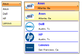
In addition to powerful binding constructs, Silverlight also includes a rich data-templating capability.
The first snippet shows two ways to create the combobox without using data templates: one with the ComboBoxItems manually declared and the other with the ItemsSource set to a List
<ComboBox
  HorizontalAlignment="Left"
  VerticalAlignment="Top"
  Margin="15"
  Width="90" >
  <ComboBoxItem Content="Asus" IsSelected="True"/>
  <ComboBoxItem Content="Dell" />
  <ComboBoxItem Content="HP" />
  <ComboBoxItem Content="Lenovo" />
</ComboBox>

<ComboBox
  ItemsSource="{Binding ContentList}"
  DisplayMemberPath="ManName"
  Margin="15"
  HorizontalAlignment="Left"
  VerticalAlignment="Top"
  Width="90" />
This snippet demonstrates the use of data templating to produce a rich display layout in the ComboBoxItem. Notice that the ComboBox ItemsSource is bound to a List
<UserControl.Resources>
 <pv:ComboBoxItemImagePathConverter
    x:Key="ComboBoxItemImagePathConverter" />

  <DataTemplate x:Key="ComboBoxItemTemplate">
    <Border
     BorderBrush="Blue"
     BorderThickness="0,0,0,1">

     <Grid>
      <Grid.RowDefinitions>
       <RowDefinition Height="Auto" />
       <RowDefinition Height="Auto" />
      </Grid.RowDefinitions>

      <Grid.ColumnDefinitions>
       <ColumnDefinition Width=".25*" />
       <ColumnDefinition Width=".75*" />
      </Grid.ColumnDefinitions>

      <Image
       Grid.Row="0"
       Grid.RowSpan="2"
       HorizontalAlignment="Left"
       Height="40"
       Width="40"
       Margin="0,0,15,0"
       Stretch="Uniform"
       Source="{Binding
               Converter={StaticResource
            ComboBoxItemImagePathConverter}}"
      />

      <TextBlock
       Text="{Binding ManName}"
       FontSize="12"
       FontWeight="Bold"
       Foreground="Blue"
       Grid.Row="0"
       Grid.Column="1" />

      <TextBlock
       Text="{Binding ManHome}"
       FontSize="10"
       Grid.Row="1"
       Grid.Column="1" />
     </Grid>
    </Border>
  </DataTemplate>
</UserControl.Resources>

<Grid x:Name="LayoutRoot" Background="White">
  <ComboBox
   ItemsSource="{Binding ContentList}"
   ItemTemplate="{StaticResource
                        ComboBoxItemTemplate}"
   Margin="15"
   HorizontalAlignment="Left"
   VerticalAlignment="Top"
   Width="250" />
</Grid>
The key part of the above code is the addition of the ItemTemplate attribute and assigning the data template we created in the UserResource section to it. The converter specified simply takes a string location to the graphic image and converts it to a format consumable by the user control. Type and value converters are another powerful feature of Silverlight.
/// <summary>
/// Convert string to image path...
/// </summary>
public class ComboBoxItemImagePathConverter :
                              IValueConverter
{
  public object Convert(
object value, Type targetType,
object parameter, CultureInfo culture)
  {
    var path = "/PhillyDotNet;Component/Media/";
    var item = (ComputerManufacturers) value;

if (item != null)
      {
        switch (item.ManName)
        {
          case "Asus":
          {
             path += "AsusLogo.jpg";
             break;
           }
           case "Dell":
           {
             path += "DellLogo.png";
             break;
           }
           case "HP":
           {
             path += "HPLogo.png";
             break;
           }
           case "Lenovo":
           {
             path += "LenovoLogo.jpg";
             break;
           }
        }
      }

      return path;
    }

    public object ConvertBack(
            object value, Type targetType,
            object parameter, CultureInfo culture)
    {
            return null;
    }
}
Silverlight has more flexible functionality that makes it a great programmer's language and you can learn more about it at: www.silverlight.net
Metro
Metro is the new UI look and feel from Microsoft. It embodies a crisp definition of text against a background of opposite coloring, rendering a document, page or screen that is much easier to read. It stems from the signage used in train stations, airports, street signs, etc., across the world. These signs provide information to the user in a concise, clear, easy to read format. Metro's goal is to leverage that clarity for the phone. You should develop your applications taking advantage of the pre-defined metro themes and styling. You can find excellent guildelines in the Microsoft UI Design and Interaction Guide for Windows Phone 2.0. This 69-page document lists current best practices and development guildines for WP7. You can download it from:
Jeff Wilcox, a Senior Software Development Engineer at Microsoft, member of the Silverlight team and author of the popular 4th & Mayor application for WP7, has a great blog and has authored a number of resources for the WP7 developer. You can find his post concerning Metro guildlines, which provides specific insights for the serious devleoper, at: http://www.jeff.wilcox.name/2011/03/metro-design-guide-v1/.
Professional WP7 Development
In my opinion, any professional who desires to design and code for WP7 must follow a few common standards that have become best practices in other endeavors and are now extending to the phone. If you are going to develop for WP7, you need to understand:
- MVVM
- Unit testing
- Phone best practices and concepts
Model-View-ViewModel (MVVM)
Developing user interfaces in today's world of whirlwind change is not an easy task. An ongoing spate of research tells us that this is the proper technique to use to create effective user interaction. What are we to believe? A number of dedicated WPF/Silverlight developers have put forth much effort to determine the most effective way to present the UI in XAML-based solutions. Recent experience points to one emerging best practice.
Standard Silverlight development is done using a User Control (.xaml) and a code-behind file (.cs). The user creates their XAML page and then adds methods and funcitons to the code behind to accomplish their intentions. Using this default methodology to code your application results in a fully functioning application; however, there are also a few problems with this approach. The main problem is that you cannot unit test the application code. Other problems include a lack of loose coupling in the application as well as the fact that multiple developers cannot modify the given page at the same time leading to bottlenecks in development.
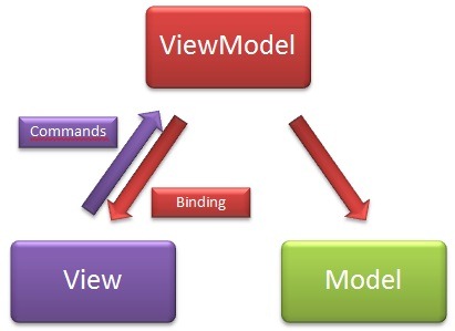
The Model-View-ViewModel (MVVM - pronounced move-em) pattern, which has recently emerged as a best practice, addresses most of these problems for Silverlight/WP7 developers. MVVM is a design pattern that had its beginnings at Microsoft and is a modification of Martin Fowler's MVP design pattern. The major difference between MVP and MVVM is that in MVVM, the ViewModel doesn't need a reference to the view. MVVM segments the program architecture into UI (View), Data (Model) and the interface code (ViewModel). Figure 3 shows the relationships between elements of the MVVM pattern.
The
Model-View-ViewModel(MVVM - pronounced move-em) pattern, which has recently emerged as a best practice, addresses most of these problems for Silverlight/WP7 developers.
MVVM, however, also has drawbacks:
- Lack of standardization and guidance
- It may be overkill for simple UI programming
- If not managed well, there is a tendency for duplicated code
In my opinion, the positive aspects of MVVM outweigh the negative, if managed well, and careful consideration is given to construction of the various tiers.
Model
The model is the static data repository. It can be anything from simple POCO (Plain old CLR objects) classes, complex data structures from the Entity Framework, or data being returned from web services. Some people think of the model as the data access layer. The model knows nothing about the other parts of the application; it simply exists to serve data to the application ViewModel when requested.
View
The View is the main .xaml file which contains your page layout and child controls to display data and allow the user to perform actions on that data such as add, edit and save. The View knows nothing about the other portions of the application; however, it has a non-explicit relationship to the ViewModel because the ViewModel is instantiated in the View and receives binding update requests from the ViewModel. The View can also initiate communication with the ViewModel through the Commanding interface. The View exists simply to receive data through binding and display it. It could be navigation page, a report, or a chart. The visualization of the data doesn't matter - it simply displays it.
ViewModel
The ViewModel is the bridge between the Model and the View. It contains the code which interfaces with the model and manipulates the properties in itself to which the View is bound. The ViewModel is the only part of the MVVM pattern that can communicate to the other parts. The ViewModel can request data from the Model and can notify the View to perform UI-related activities that should not be part of the View model. This communication with the View is normally done through some sort of messaging/event subsystem.
Key Concepts
MVVM operates by a set of key concepts:
-
Binding - Any property/attribute on the View that changes is bound to an analogous property in the `ViewModel,` using Two-Way binding mode. -
Commanding - Any object that inherits from button contains a `command` attribute that should be bound to a `command` property in the `ViewModel.` -
INotifyPropertyChanged - Raising this event is the magic that causes the View to update when a property in the `ViewModel` changes. -
`InterViewModel` `and` ViewModel-View communications are done through either events or a messaging system.
Creating the ViewModelBase
If you are not using an MVVM framework, you have a little bit of work to do to set up the required pieces for easy use. As mentioned in the key concepts, binding depends on properties in the ViewModel that raise INotifyPropertyChanged to update the View. Most MVVM users develop a base class to centralize the requisite functionality for MVVM. The following snippet shows the beginning of a simple base class to implement INotifyPropertyChanged.
using System.Windows;
using System.Windows.Input;
using System.ComponentModel;

namespace Xamlware.ViewModels
{
  public class ViewModelBase :
                   INotifyPropertyChanged
  {
    public event PropertyChangedEventHandler
                   PropertyChanged;

    /// <summary>
    /// On property changed event handler
    /// </summary>
    /// <param name="name">Property name</param>
    protected virtual void
             OnPropertyChanged(string name)
    {
      if (this.PropertyChanged != null)
      {
        this.PropertyChanged(this,
             new PropertyChangedEventArgs(name));
      }
    }
  }
}
In order to implement commanding, we will rely on the ICommand interface and add that to our ViewModelBase. ICommand implements three methods:
-
Execute - The code to execute when the command button is clicked. -
CanExecute - This method returns a Boolean signifying whether the execute command can actually process the `request.` Any kind of logic can be placed here that returns a Boolean value. -
CanExecuteChanged - This event is raised whenever the value returns from the CanExecute method changes.
*NOTE: * There is a known bug in Silverlight that prevents the CanExecute from firing more than once. The workaround for this is to use a property like IsEnabled for each command button and in its Setter, raise the CanExecuteChanged event, which causes a requery of the CanExecute.
public class DelegateCommand : ICommand
 {
    private Action<object> _execute;
    private Func<object, bool> _canExecute;
    public DelegateCommand(Action<object> execute,
                Func<object, bool> canExecute)
    {
      _execute = execute;
      _canExecute = canExecute;
    }

    public bool CanExecute(object parameter)
    {
      if (_canExecute != null)
      {
        return _canExecute(parameter);
      }
      return true;
    }

    public event EventHandler CanExecuteChanged;
    public void Execute(object parameter)
    {
      if (_execute != null)
      {
        _execute(parameter);
      }
    }
 }
The last concept we must add to our base class is our interprocess messaging system. In our ViewModelBase, we'll raise an event to broadcast our intent. Other components of the MVVM system can register and listen for this broadcast. This snippet shows the addition of the event for communication.
public event EventHandler<NotifyEventArgs> Notify;

public void OnNotify(string notification,
                     object data)
{
if (this.Notify != null)
   {
      this.Notify(this, new NotifyEventArgs
                  {
                     Notification = notification,
                     Data = data });
                   }
    }
}

public class NotifyEventArgs : EventArgs
{
public string Notification { get; set; }
   public object Data { get; set; }
}
Creating an MVVM Project
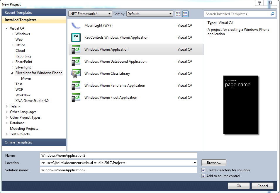
If you are using your custom ViewModelBase, then you are set to implement your MVVM solution. You will begin by creating a new project in Visual Studio, utilizing the Windows Phone application template (Figure 4).
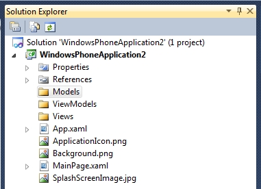
When you create your MVVM project, the first step is normally to add three new folders to your project (Figure 5), Views, ViewModels and Models.
In our sample program, we'll implement the three parts of MVVM.
Defining a Model
Listing 4 shows a simple POCO class definition for the category model. Listing 5 shows the definition for the Expense Model. Both models contain a number of classes and methods to build each data collection. If we needed additional methods to add functionality or manipulate our collection, those methods would be added here in the model as public methods and would be called from the ViewModel. Remember, our model exists solely to serve up data when requested by the ViewModel.
Listing 5: The ExpenseModel
using System;
using System.Collections.Generic;
using System.Linq;
using System.Runtime.Serialization;
using Xamlware.Extensions;

namespace xExpense.Model
{
  public class ExpenseModel
  {
    private List<ExpenseType> _expenseList;


    /// <summary>
    /// Add expense to list
    /// </summary>
    /// <param name="expense">expense</param>
    public void AddExpenseToList(ExpenseType expense)
    {
      _expenseList.Add(expense);
    }

    /// <summary>
    /// delete expense from list
    /// </summary>
    /// <param name="expense"></param>
    public void DeleteExpenseFromList(ExpenseType expense)
    {
      _expenseList.Remove(expense);
    }


    public bool IsExpense(ExpenseType expense)
    {
      List<ExpenseType> list = this.GetExpenseList
                    (
                       expense.Date,
                       null,
                       expense.CategoryTypeName,
                       expense.CategoryName,
                       expense.GroupName,
                       expense.Amount);

      return list.Count > 0;
    }


    public List<ExpenseType> GetExpenseList
                     (
                        DateTime? startDate = null,
                        DateTime? endDate = null,
                        string categoryTypeName = null,
                        string categoryName = null,
                        string groupName = null,
                        double? startAmount = null,
                        double? endAmount = null)
    {
      List<ExpenseType> list = _expenseList;

      if(startDate == null && endDate == null)
      {
        list = _expenseList;
      }
      else if (startDate != null && endDate == null)
      {
        list = _expenseList.Where(e => e.Date
                                        .Equals(startDate))
                           .ToList();
      }
      else if (startDate == null && endDate != null)
      {
        list = _expenseList.Where(e => e.Date
                                        .Equals(endDate))
                           .ToList();
      }
      else if(startDate != null && endDate != null)
      {
        list = _expenseList.Where(e => e.Date >= startDate &&
                                       e.Date <= endDate)
                           .ToList();
      }

      if (groupName.IsNotNullOrEmpty())
      {
        list = list.Where(l => l.GroupName
                                .Equals(groupName))
                   .ToList();
      }

      if (categoryTypeName.IsNotNullOrEmpty())
      {
        list = list.Where(l => l.CategoryTypeName
                                .Equals(categoryTypeName))
                   .ToList();
      }

      if (categoryName.IsNotNullOrEmpty())
      {
        list = list.Where(l => l.CategoryName
                                .Equals(categoryName))
                   .ToList();
      }

      return list;
    }

    public IEnumerable<string> GetDistinctGroupNameList
                               (
                                 List<ExpenseType> list)
    {
      return list.Select(s => s.GroupName).Distinct();
    }

    public IEnumerable<string> GetDistinctCategoryTypeNameList
                               (
                                 List<ExpenseType> list,
                                 string groupName)
    {
      return list.Where(t => t.GroupName.Equals(groupName))
                 .Select(s => s.CategoryTypeName)
                 .Distinct();
    }

    public IEnumerable<string> GetDistinctCategoryNameList
                               (
                                 List<ExpenseType> list,
                                 string groupName,
                                 string categoryTypeName)
    {
      return list.Where(w => w.GroupName.Equals(groupName) &&
                             w.CategoryTypeName
                              .Equals(categoryTypeName))
                 .Select(s => s.CategoryName)
                 .Distinct();
    }


    public IEnumerable<DateTime?> GetDistinctDateList
                                  (
                                    List<ExpenseType> list,
                                    string groupName,
                                    string categoryTypeName,
                                    string categoryName)
    {
      return list.Where(w => w.GroupName.Equals(groupName) &&
                             w.CategoryTypeName
                              .Equals(categoryTypeName) &&
                             w.CategoryName
                              .Equals(categoryName))
                 .Select(s => s.Date)
                 .Distinct();
    }

    public ExpenseType GetDistincTransactionList
                       (
                         List<ExpenseType> list,
                         string groupName,
                         string categoryTypeName,
                         string categoryName)
    {
      string summary = string.Empty;
      var query = list.Where(w => w.GroupName.Equals(groupName) &&
                                  w.CategoryTypeName
                                   .Equals(categoryTypeName) &&
                                  w.CategoryName
                                   .Equals(categoryName))
                      .Select(s =>s);

     double amount = 0.00;
     int count = query.Count();
     foreach(var item in query)
     {
       amount += item.Amount;
     }

     ExpenseType ex = new ExpenseType();
     ex.PK_Expense = -1;
     ex.GroupName = groupName;
     ex.CategoryTypeName = categoryTypeName;
     ex.CategoryName = categoryName;
     ex.Amount = amount;
     ex.ExpenseSummary = string.Format
                               ("{0} ({1}) - {2}",
                                categoryName, count, amount);

      return ex;
    }

        public List<ExpenseType> GetTestData()
        {
            DateTime date = DateTime.Now;

            List<ExpenseType> list = new List<ExpenseType>();
            list.Add(new ExpenseType
                         {
                           GroupName = "Atlanta",
                           CategoryTypeName = "Transportation",
                           CategoryName = "Bus",
                           Date = date,
                           Amount = 12.44,
                           NumImages = 0,
                           PK_Expense = 1
                         });
            list.Add(new ExpenseType()
                         {
                           GroupName = "Tampa",
                           CategoryTypeName = "Transportation",
                           CategoryName = "Car Rental",
                           Date = date,
                           Amount = 14.55,
                           NumImages = 1,
                           PK_Expense = 2
                         });
            list.Add(new ExpenseType()
                         {
                           GroupName = "Atlanta",
                           CategoryTypeName = "Transportation",
                           CategoryName = "Bus",
                           Date = date,
                           Amount = 12.34,
                           NumImages = 1,
                           PK_Expense = 3
                         });
            list.Add(new ExpenseType()
                         {
                           GroupName = "Atlanta",
                           CategoryTypeName = "Transportation",
                           CategoryName = "Car Rental",
                           Date = date,
                           Amount = 12.44,
                           NumImages = 0,
                           PK_Expense = 4
                         });
            list.Add(new ExpenseType()
                         {
                           GroupName = "Tampa",
                           CategoryTypeName = "Transportation",
                           CategoryName = "Bus",
                           Date = date,
                           Amount = 45.67,
                           NumImages = 0,
                           PK_Expense = 5
                         });
            list.Add(new ExpenseType()
                         {
                           GroupName = "Tampa",
                           CategoryTypeName = "Transportation",
                           CategoryName = "Car Rental",
                           Date = date,
                           Amount = 12.44,
                           NumImages = 0,
                           PK_Expense = 6
                         });

            date = DateTime.Now.AddDays(1);

            return list;
        }

    }

    /// <summary>
    /// Definition of the Expense object
    /// </summary>
    public class ExpenseType
    {
        public int PK_Expense { get; set; }
        public string GroupName { get; set; }
        public string CategoryTypeName { get; set; }
        public string CategoryName { get; set; }
        public DateTime? Date { get; set; }
        public double Amount { get; set; }
        public int NumImages { get; set; }
        public string ExpenseSummary { get; set; }
    }

    [DataContract]
    public class ExpenseTypeReceipts
    {
        [DataMember]
        public IList<ReceiptType> Receipts { get; set; }
    }
}
Listing 4: The CategoryModel
using System;
using System.Collections.Generic;
using System.Linq;
using Xamlware.IsolatedStorage;

namespace xExpense.Model

  public class CategoryModel
  {
    private List<CategoryType> _categoryList;
    private string _categoryFileName = "category.dat";

    public CategoryModel()
    {
      if (_categoryList == null ||
                           _categoryList.Count.Equals(0))
      {
        if(IsoHelper.IsDataFile(_categoryFileName))
        {
                    _categoryList = IsoHelper.
                                  LoadDataFile<List<CategoryType>>
                                  (_categoryFileName);
        }
        else
        {
          this.SetDefaultList();
        }
      }
    }

    /// <summary>
    /// Get the cateogry list
    /// </summary>
    /// <returns>category list</returns>
    public List<CategoryType> GetCategoryList()
    {
       return _categoryList;
    }

    /// <summary>
    /// Set the default list
    /// </summary>
    public void SetDefaultList()
    {
      _categoryList = this.CreateCategoryList();
    }

    /// <summary>
    /// Add Category to list
    /// </summary>
    /// <param name="category"> Category</param>
    public void AddCategoryToList(CategoryType category)
    {
      if (!IsCategory(category.CategoryName))
      {
        _categoryList.Add(category);
      }
    }

    /// <summary>
    /// Delete Category from list
    /// </summary>
    /// <param name="category"> Category</param>
    public void DeleteCategoryFromList(CategoryType category)
    {
      _categoryList.Remove(category);
    }

    /// <summary>
    /// Does the specified Category exist?
    /// </summary>
    /// <param name="CategoryName"> Category</param>
    /// <returns>t/f</returns>
    public bool IsCategory(string CategoryName)
    {
      return _categoryList.Where(w => w.CategoryName
                .Equals(CategoryName))
                .Count() > 0;
    }

    /// <summary>
    /// Get Category Key by Category name
    /// </summary>
    /// <param name="name">Category name</param>
    /// <returns></returns>
    public int GetCategoryKey(string name)
    {
      return Convert.ToInt32(
                    _categoryList.Where(w => w.CategoryName
                      .Equals(name))
                      .Select(c => c.PK_Category)
                   .SingleOrDefault());
    }

    /// <summary>
    /// Get Category Name by Category key
    /// </summary>
    /// <param name="key">Category key</param>
    /// <returns></returns>
    public string GetCategoryName(int key)
    {
      return _categoryList.Where(w => w.PK_Category
                      .Equals(key))
                .Select(s => s.CategoryName)
                .SingleOrDefault();
    }

    /// <summary>
    /// Get Category Name by Category key
    /// </summary>
    /// <param name="key">Category key</param>
    /// <param name="name">category name</param>
    /// <returns></returns>
    public string GetCategoryTypeName(int? key = null,
                     string name = null)
    {
      string retVal = string.Empty;
      if(key != null)
      {
        retVal = _categoryList
                 .Where(w => w.PK_Category
                                 .Equals(key))
                 .Select(s => s.CategoryTypeName)
                 .SingleOrDefault();
      }
      else if(name != null)
      {
        retVal = _categoryList
                 .Where(w => w.CategoryName.Equals(name))
                 .Select(c => c.CategoryTypeName)
                 .SingleOrDefault();
      }

      return retVal;
    }

    /// <summary>
    /// Create a new Category List form default values
    /// </summary>
    /// <returns></returns>
    private List<CategoryType> CreateCategoryList()
    {
      List<CategoryType> list = new List<CategoryType>();

      //Transportation
      list.Add(new CategoryType {
          Categ1oryName = "Airfare",
             PK_Category = 1,
             CategoryTypeName = "Transportation" });

      list.Add(new CategoryType {
             CategoryName = "Bus",
             PK_Category = 2,
             CategoryTypeName = "Transportation" });

      list.Add(new CategoryType {
             CategoryName = "Car Rental",
             PK_Category = 3,
             CategoryTypeName = "Transportation" });

      return list;
    }
  }

  /// <summary>
  /// Create Category List Type

  /// </summary>
  public class CategoryType
  {
    public int PK_Category { get; set; }
    public string CategoryName { get; set; }
    public string CategoryTypeName { get; set; }
  }
}
Creating the Views
In the MainPage.xaml, we've added a number of buttons and setup navigation to other application pages. Listing 1 shows our MainPage Xaml setup and Listing 2 shows the code behind and navigation.
Listing 2: Main Page code behind and navigation methods
using System;

namespace xExpense
{
    public partial class MainPage
    {
        // Constructor
        public MainPage()
        {
            InitializeComponent();
        }

        private void btnExpenses_MouseLeftButtonDown
                         (object sender, MouseButtonEventArgs e)
        {
            this.NavigationService.Navigate
                         (
                             new Uri("/Views/ExpenseView.xaml",
                                     UriKind.RelativeOrAbsolute));
        }

        private void btnMileage_MouseLeftButtonDown
                          (object sender, MouseButtonEventArgs e)
        {
            this.NavigationService.Navigate
                          (
                             new Uri("/Views/MileageView.xaml",
                                     UriKind.RelativeOrAbsolute));
        }

        private void btnViewExpenses_MouseLeftButtonDown
                          (object sender, MouseButtonEventArgs e)
        {
            this.NavigationService.Navigate
                         (
                           new Uri("/Views/ViewExpensesView.xaml",
                                   UriKind.RelativeOrAbsolute));
        }
    }
}
Add a new user control to the Views folder and name it ExpenseView. It will follow the definition shown in Listing 3 and look like Figure 1.
Listing 3: Page layout showing nested grids and stack panels
<Grid
  x:Name="LayoutRoot"
  Background="Transparent">

<Grid.RowDefinitions>
   <RowDefinition Height="Auto" />
   <RowDefinition Height="*" />
</Grid.RowDefinitions>

<StackPanel
   x:Name="TitlePanel"
   Grid.Row="0"
   Margin="24,24,0,12">

<TextBlock
   x:Name="ApplicationTitle"
   Text="{StaticResource ApplicationTitle}"
   Style="{StaticResource PhoneTextNormalStyle}"
   FontSize="{StaticResource PhoneFontSizeSmall}"/>

<TextBlock
   x:Name="PageTitle"
   Text="{Binding PageName}"
   Margin="-3,-8,0,0"
   Style="{StaticResource PhoneTextTitle1Style}"
   FontSize="{StaticResource ExpenseFontSizeExtraLarge}"/>
</StackPanel>

<Grid
  x:Name="ContentGrid"
  Grid.Row="1">

  <Grid.RowDefinitions>
    <RowDefinition Height="Auto" />
    <RowDefinition Height="Auto" />
    <RowDefinition Height="Auto" />
    <RowDefinition Height="Auto" />
    <RowDefinition Height="Auto" />
    <RowDefinition Height="Auto" />
    <RowDefinition Height="Auto" />
    <RowDefinition Height="Auto" />
    <RowDefinition Height="Auto" />
    <RowDefinition Height="*" />
    <RowDefinition Height="80" />
  </Grid.RowDefinitions>

  <Grid.ColumnDefinitions>
    <ColumnDefinition Width="*" />
  </Grid.ColumnDefinitions>

  <TextBlock
    Grid.Row="0"
    Style="{StaticResource PhoneTextNormalStyle}"
    VerticalAlignment="Center"
    Text="Expense Group" />

  <Grid Grid.Row="1" >
     <Grid.ColumnDefinitions>
     <ColumnDefinition Width=".9*" />
     <ColumnDefinition Width=".1*" />
     </Grid.ColumnDefinitions>

     <my:C1MaskedTextBox
       Grid.Column="0"
       IsHitTestVisible="False"
       Text="{Binding SelectedExpenseGroup.GroupName,
       Mode=TwoWay}" />

     <Image
       Grid.Column="1"
       Source="/Xamlware;Component/Images/Search1.png"
       Height="60"
       Width="60"
       Margin="-20,0,0,0"
       Stretch="UniformToFill" />
  </Grid>

  <TextBlock
       Grid.Row="2"
       Style="{StaticResource PhoneTextNormalStyle}"
       VerticalAlignment="Center"
       Text="Category" />

  <Grid Grid.Row="3" >
    <Grid.ColumnDefinitions>
       <ColumnDefinition Width=".9*" />
       <ColumnDefinition Width=".1*" />
    </Grid.ColumnDefinitions>

    <my:C1MaskedTextBox
       Grid.Column="0"
       IsHitTestVisible="False"
       Text="{Binding SelectedExpenseCategory}" />

    <Image
       Grid.Column="3"
       Source="/Xamlware;Component/Images/Search1.png"
       Height="60"
       Width="60"
       Margin="-20,0,0,0"
       Stretch="UniformToFill" />
  </Grid>

  <Grid Grid.Row="6" >
     <Grid.ColumnDefinitions>
      <ColumnDefinition Width=".4*" />
      <ColumnDefinition Width="10" />
      <ColumnDefinition Width=".5*" />
     </Grid.ColumnDefinitions>

     <TextBlock
      Grid.Row="6"
      Grid.Column="0"
      Style="{StaticResource PhoneTextNormalStyle}"
      VerticalAlignment="Center"
      Text="Date incurred" />

     <TextBlock
      Grid.Row="6"
      Grid.Column="2"
      Style="{StaticResource PhoneTextNormalStyle}"
      VerticalAlignment="Center"
      Text="Amount" />

  </Grid>

   <Grid Grid.Row="7" >
     <Grid.ColumnDefinitions>
      <ColumnDefinition Width=".4*" />
      <ColumnDefinition Width="10" />
      <ColumnDefinition Width=".4*" />
      <ColumnDefinition Width=".2*" />
     </Grid.ColumnDefinitions>

     <toolkit:DatePicker
      Grid.Row="1"
      Grid.Column="0"
      Value="{Binding SelectedExpenseDate, Mode=TwoWay}" />

     <my:C1NumericBox
      Value="{Binding SelectedExpenseAmount, Mode=TwoWay}"
      ShowButtons="False"
      Format="F2"
      Grid.Column="2"
      TextAlignment="Right"
      InputScope="TelephoneNumber" />

     <Image
      Grid.Column="3"
      Source="../Images/USDollarSign64.png"
      Height="40"
      Width="40"
      Margin="-20,0,0,0"
      Stretch="UniformToFill" />
   </Grid>

   <TextBlock
    Grid.Row="8"
    Style="{StaticResource PhoneTextNormalStyle}"
    VerticalAlignment="Center"
    Text="Receipts" />

   <ListBox
    x:Name="lbTiles"
    Grid.Row="9"
    ItemsSource="{Binding ReceiptList, Mode=TwoWay}"
    HorizontalAlignment="Left"
    RenderTransformOrigin="-0.5,-0.5"
    d:LayoutOverrides="HorizontalAlignment">

    <ListBox.ItemsPanel>
      <ItemsPanelTemplate>
       <StackPanel
         Orientation="Horizontal"
         HorizontalAlignment="Right"/>
      </ItemsPanelTemplate>

    </ListBox.ItemsPanel>

    <ListBox.ItemTemplate>
      <DataTemplate >
        <StackPanel>
          <Image
             Height="125"
             Width="60"
             Stretch="Fill"
             Margin="5,10,5,0"
             Source="{Binding Path=ReceiptImage}"/>

          <TextBlock
             Text="{Binding Path=Name}"
             FontSize ="15"
             HorizontalAlignment="Center" />
        </StackPanel>
      </DataTemplate>
    </ListBox.ItemTemplate>
  </ListBox>

  <UI:AdControl
    x:Name="AdControl"
    Grid.Row="10"
    VerticalAlignment="Bottom"
    ApplicationId="{StaticResource AdApplicationId}"
    AdUnitId="{StaticResource AdUnitId}" />
  </Grid>
</Grid>
Creating the ViewModel
Add a class to the ViewModels folder and name it ExpenseViewModel. Listing 6 shows the code for the ViewModel and Listing 7 shows the ViewModel wireup for the ExpenseView. Notice the inheritance from ViewModelBase, the reference to the CategoryModel and the use of Notify (our interprocess event).
Listing 7: Wiring up the ViewModel
using Microsoft.Phone.Controls;
using Microsoft.Advertising.Mobile.UI;

using xExpense.ViewModel;

namespace xExpense.Views
{

    /// <summary>
    /// Description for ExpenseView.
    /// </summary>
    public partial class ExpenseView : PhoneApplicationPage
    {
        public ExpenseViewModel ViewModel { get; set; }

        /// <summary>
        /// Initializes a new instance of the ExpenseView class.
        /// </summary>
        public ExpenseView()
        {
            InitializeComponent();
            this.Loaded += ExpenseView_Loaded;
            AdControl.TestMode = true;
        }

        /// <summary>
        /// Loaded event handler
        /// </summary>
        private void ExpenseView_Loaded(object sender,
                                        RoutedEventArgs e)
        {
            this.ViewModel = new ExpenseViewModel();
            this.DataContext = this.ViewModel;
        }
    }
}
Listing 6: The ExpenseViewModel
using System;
using System.Collections.Generic;
using System.Windows;
using System.Windows.Media.Imaging;

using Xamlware.IsolatedStorage;
using Xamlware.MvvmHelper;
using xExpense.Model;

namespace xExpense.ViewModel
{
  /// <summary>
  /// This class contains properties that a View can data bind
  /// to.
  /// </summary>
  public class ExpenseViewModel : ViewModelBase
  {
    #region Commands
    private DelegateCommand _getCategoryCommand;
    public DelegateCommand GetCategoryCommand
    {
       get
       {
          return _getCategoryCommand;
       }
       set
       {
          _getCategoryCommand = value;
          this.OnPropertyChanged("GetCategoryCommand");
       }
    }

    private DelegateCommand _expenseGroupCommand;
    public DelegateCommand ExpenseGroupCommand
    {
       get
       {
          return _expenseGroupCommand;
       }
       set
       {
          _expenseGroupCommand = value;
          this.OnPropertyChanged("ExpenseGroupCommand");
       }
    }

    private DelegateCommand _captureReceiptCommand;
    public DelegateCommand CaptureReceiptCommand
    {
       get
       {
          return _captureReceiptCommand;
       }
       set
       {
          _captureReceiptCommand = value;
          this.OnPropertyChanged("CaptureReceiptCommand");
       }
    }

    private DelegateCommand _saveExpenseCommand;
    public DelegateCommand SaveExpenseCommand
    {
       get
       {
          return _saveExpenseCommand;
       }
       set
       {
          _saveExpenseCommand = value;
          this.OnPropertyChanged("SaveExpenseCommand");
       }
    }

    private DelegateCommand _cancelExpenseCommand;
    public DelegateCommand CancelExpenseCommand
    {
       get
       {
          return _cancelExpenseCommand;
       }
       set
       {
          _cancelExpenseCommand = value;
          this.OnPropertyChanged("CancelExpenseCommand");
       }
    }

    private DelegateCommand _getDefaultCurrencyCommand;
    public DelegateCommand GetDefaultCurrencyCommand
    {
       get
       {
          return _getDefaultCurrencyCommand;
       }
       set
       {
          _getDefaultCurrencyCommand = value;
          this.OnPropertyChanged("GetDefaultCurrencyCommand");
       }
    }
    #endregion

    #region Data Members
    #region Page Name
    public string PageName
    {
      get
      {
        return "regular expenses";
      }
    }
    #endregion

    #region Selected Expense Group
    public const string SelectedExpenseGroupPropertyName =
                                       "SelectedExpenseGroup";
    private GroupType _selectedExpenseGroup = new GroupType
           {GroupName = "Ungrouped", IsLastUsed = true};
    public GroupType SelectedExpenseGroup
    {
      get { return _selectedExpenseGroup; }
      set
      {
        if (_selectedExpenseGroup == value)
        {
          return;
        }

        _selectedExpenseGroup = value;
          this.OnPropertyChanged(
            SelectedExpenseGroupPropertyName);
      }
    }
    #endregion

    #region Selected Expense Category
    public const string SelectedExpenseCategoryPropertyName =
                 "SelectedExpenseCategory";
    private string _selectedExpenseCategory = "Uncategorized";
    public string SelectedExpenseCategory
    {
      get { return _selectedExpenseCategory; }
      set
      {
        if (_selectedExpenseCategory == value)
        {
          return;
        }

        _selectedExpenseCategory = value;
            this.OnPropertyChanged(
               SelectedExpenseCategoryPropertyName);
      }
    }
    #endregion

    #region Selected Expense Date
    public const string SelectedExpenseDatePropertyName =
                    "SelectedExpenseDate";
    private DateTime _selectedExpenseDate;
    public DateTime SelectedExpenseDate
    {
      get { return _selectedExpenseDate; }
      set
      {
        if (_selectedExpenseDate == value)
        {
          return;
        }

        _selectedExpenseDate = value;
        this.OnPropertyChanged(
               SelectedExpenseDatePropertyName);
      }
    }
    #endregion


    #region Receipt List
    public const string ReceiptImagePropertyName =
                   "ReceiptImage";
    private BitmapImage _receiptImage;
    public BitmapImage ReceiptImage
    {
      get { return _receiptImage; }
      set
      {
        if (_receiptImage == value)
        {
          return;
        }

        _receiptImage = value;
        this.OnPropertyChanged(
              ReceiptImagePropertyName);
      }
    }
    #endregion

    #region Receipt List
    public const string ReceiptListPropertyName =
                 "ReceiptList";
    private List<ReceiptType> _receiptList =
                 new List<ReceiptType>();
    public List<ReceiptType> ReceiptList
    {
      get { return _receiptList; }
      set
      {
        if (_receiptList == value)
        {
          return;
        }

        _receiptList = value;
        this.OnPropertyChanged(
             ReceiptListPropertyName);
      }
    }
    #endregion

    #region Selected Expense Amount
    public const string SelectedExpenseAmountPropertyName =
                   "SelectedExpenseAmount";
    private double _selectedExpenseAmount;
    public double SelectedExpenseAmount
    {
      get { return _selectedExpenseAmount; }
      set
      {
        if (_selectedExpenseAmount == value)
        {
          return;
        }

        _selectedExpenseAmount = value;
        this.OnPropertyChanged(
                SelectedExpenseAmountPropertyName);
      }
    }
    #endregion

    #region Current Expense Key
    public const string CurrentExpenseKeyPropertyName =
                   "CurrentExpenseKey";
    private int _currentExpenseKey;
    public int CurrentExpenseKey
    {
      get { return _currentExpenseKey; }
      set
      {
        if (_currentExpenseKey == value)
        {
          return;
        }

        _currentExpenseKey = value;
        this.OnPropertyChanged(
           CurrentExpenseKeyPropertyName);
      }
    }
    #endregion
    #endregion

    public ExpenseViewModel()
    {
      this.GetCategoryCommand = new DelegateCommand
                                    (
                                      this.GetCategory,
                                      this.CanGetCategory
                                    );
      this.GetExpenseGroupCommand = new DelegateCommand
                                    (
                                      this.GetExpenseGroup,
                                      this.CanGetExpenseGroup
                                    );
      this.CaptureReceiptCommand = new DelegateCommand
                                    (
                                      this.CaptureReceipt,
                                      this.CaptureReceipt
                                    );
      this.SaveExpenseCommand = new DelegateCommand
                                    (
                                      this.SaveExpense,
                                      this.CanSaveExpense
                                    );
      this.CancelExpenseCommand = new DelegateCommand
                                    (
                                      this.CancelExpense,
                                      this.CanCancelExpense
                                    );
      this.GetDefaultCurrencyCommand = new DelegateCommand
                                    (
                                      this.ChangeDefaultCurrency,
                                      this.ChangeDefaultCurrency
                                    );

      this.SelectedExpenseDate = DateTime.Now;
      this.CurrentExpenseKey = this.GetCurrentExpenseKey();
    }

    public void GetCategory(object parm)
    {
MvvmHelper.GoToPage("ExpenseCategoryView"))
    }

    public void CanGetCategory(object parm)
    {
return true;
    }

    public void GetExpenseGroup(object parm)
    {
MvvmHelper.GoToPage("ExpenseGroupView"))
    }

    public void CanExpenseGroup(object parm)
    {
return true;
    }

    public void CaptureReceipt(object parm)
    {
MvvmHelper.GoToPage(CaptureReceiptView "))
    }

    public void CanCaptureReceipt(object parm)
    {
return true;
    }

    public void GetCategory(object parm)
    {
MvvmHelper.GoToPage(MainPage "))
    }

    public void CanGetCategory(object parm)
    {
return true;
    }

    public void ChangeDefaultCurrency (object parm)
    {
    }

    public void CanChangeDefaultCurrency(object parm)
    {
return true;
    }

    private int GetCurrentExpenseKey()
    {
      int? key = (int?)IsoHelper.GetAppSetting("ExpenseKey");
      if (key == null)
      {
        IsoHelper.AddAppSetting("ExpenseKey", 1);
        key = 1;
      }
      else
      {
        key++;
      }

      return (int)key;
    }

    private void SaveExpense(object parm)
    {
      if (SaveValid())
      {
        ExpenseType ex = new ExpenseType
           {
             PK_Expense = this.CurrentExpenseKey,
             CategoryTypeName = new CategoryModel()
                   .GetCategoryTypeName(null,
                   this.SelectedExpenseCategory)
                   ?? "Uncategorized",
             CategoryName =
                   this.SelectedExpenseCategory,
             Date = this.SelectedExpenseDate,
             Amount = this.SelectedExpenseAmount
           };

        IsoHelper.SaveDataFile("Expense" +
              this.CurrentExpenseKey + ".dat", ex);

        if (this.ReceiptList.Count > 0)
        {
          int index = 0;
          foreach (var item in this.ReceiptList)
          {
            string name = "ExpenseReceipts" +
                   this.CurrentExpenseKey +
                   "-" + index++ + ".dat";
            IsoHelper.SaveImage(name,
                      item.ReceiptImage);
          }
        }

        This.Notify("ExpenseSaved",
             "The current expense has been saved.");
        this.ClearExpense();
      }
    }

    private bool CanSaveExpense(object parm)
    {
      return true;
    }

    private bool SaveValid()
    {
      bool retVal = true;
      if(this.SelectedExpenseAmount < .01)
      {
        this.Notify("Amount cannot be 0", null);
        retVal = false;
      }

      return retVal;
    }

    private void ClearExpense()
    {
      this.SelectedExpenseDate = DateTime.Now;
      this.ReceiptList = new List<ReceiptType>();
      this.SelectedExpenseAmount = 0.00;

      IsoHelper.UpdateAppSetting
            ("ExpenseKey", this.CurrentExpenseKey);
      this.CurrentExpenseKey = this.CurrentExpenseKey++;
    }

    private void UpdateProperty(UpdatePropertyMessage action)
    {
      if (action.PropertyName.Equals("SelectedCategory"))
      {
        this.SelectedExpenseCategory = action.
                    PropertyValue.ToString();
      }
      else if (action.PropertyName
              .Equals("SelectedExpenseGroup"))
      {
        this.SelectedExpenseGroup = (GroupType)action
                       .PropertyValue;
      }
      else if (action.PropertyName.Equals("ReceiptList"))
      {
        string name = this.GetReceiptName();
        BitmapImage image = ((ReceiptType)action
                  .PropertyValue).ReceiptImage;

        this.ReceiptList.Add(new ReceiptType
              {Name = name, ReceiptImage = image});
      }
    }

    private string GetReceiptName()
    {
      int? key = this.CurrentExpenseKey ==null
              ? 1 : this.CurrentExpenseKey;
      int count = this.ReceiptList != null
              ? this.ReceiptList.Count + 1 : 1;
      return key + "-" + count;
    }
  }
}
Conclusion
In this part of the article, we've covered the basic concepts of Silverlight, Metro and an introduction to MVVM. By embracing these principles, you will be on the right path to developing professional software and applications for WP7. In Part 2 of this article, I'll discuss the MVVM Light Framework, the Silverlight Unit Test Framework, and show you how to put it all together to develop a simple application.