Developing for Windows Phone is easy if you have been doing any XAML at all. That’s because you use Silverlight for Windows Phone development.
This is a great thing because everything you already know can be applied immediately. This is not to say that there are no new things that you will have to learn. In fact, with the reduced screen size, the ability to change the orientation of the phone and some of the new types of pages, there are actually quite a few things you will need to learn. This article and the next one is your introduction to some of these new UI techniques.
This article assumes that you have Visual Studio 2010 and the Windows Phone tools installed along with it. The Windows Phone tools must be downloaded separately and installed with VS 2010. You may also download the free Visual Studio 2010 Express for Windows Phone developer environment.
Working with the List Box Control
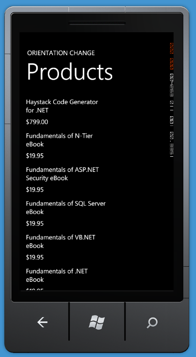
To start out, you will first build a list box that displays a list of products as shown in Figure 1. This is just a standard Windows Phone Page onto which you drag a ListBox control and bind the ItemsSource property of the list box to a collection class of Product objects. You then create a DataTemplate for each ListBoxItem to display the product name and price.
Build the Product Class
In order to get the list box populated with products, you will need two classes: a Product class with three properties, and a collection class of Product objects. The Product class contains the ProductName, Price and ImageUri properties. For this first sample you will not use the ImageUri, but that property will be used in the next sample. Create the Product class as shown in the following code:
public class Product {
  public Product() { }

  public Product(string name, decimal price,
                 string imageUri)
  {
    this.ProductName = name;
    this.Price = price;
    this.ImageUri = imageUri;
  }

  public string ProductName { get; set; }
  public decimal Price { get; set; }
  public string ImageUri { get; set; }
}
The Products class contains an ObservableCollection of Product objects in a property named DataCollection. The constructor of the Products class calls a method named BuildCollection to populate the DataCollection with some sample data as shown in Listing 1.
Value Converter
As you can see in Figure 1, Price is shown in a currency format. Unfortunately, in the current version of Silverlight for Windows Phone, the StringFormat attribute on the Binding class is absent. Therefore, you need to create a value converter for displaying a value in currency format. Create the PriceConverter class shown in Listing 2 that implements the IValueConverter interface. In the Convert method, you take the “value” parameter passed in and convert it to a decimal value. You then return that value as a string formatted with the “c” option in the ToString() method.
Create Classes in XAML
Now that you have the Product class, the Products class and the PriceConverter classes created, you need to create an instance of the Products collection class and the PriceConverter class in your XAML. In your MainPage.xaml, add an xml namespace to the name of your project as shown here:
xmlns:data="clr-namespace:WPListBox"
Next, you create an instance of the Products and PriceConverter class in XAML. The constructor for the Products class will create the initial collection of product objects and load the DataCollection property.
<phone:PhoneApplicationPage.Resources>
  <data:Products x:Key="productCollection" />
  <data:PriceConverter x:Key="priceConvert" />
</phone:PhoneApplicationPage.Resources>
These two classes may now be used within the rest of your XAML by referencing them by their x:Key name.
Create List Box
Now it is time to create the List Box and connect it to the static resource you created in the XAML above. Listing 3 shows the XAML you use to build the list box for this sample.
Let’s break down each of the areas of the ListBox XAML shown in Listing 3. The ItemsSource property references the static resource you created named “productCollection”. This is an instance of the Products class. The Path attribute refers to the DataCollection property that was populated by the BuildCollection method that is called in the constructor of the Products class.
Next, you have the definition for each row in the list box defined in the ItemsTemplate. The ItemsTemplate should not be too foreign to anyone that has done XAML. Each row of the ListBox is defined within the <DataTemplate> area of the ItemsTemplate. The DataTemplate contains a <StackPanel> control with two TextBlock controls within it. This allows the two TextBlock controls to be displayed one on top of the other.
Notice in the text block that displays the Price the use of the value converter class you created earlier. You bind to the Price property using the Path attribute of the Binding class. However, before the Binding class displays the Price, it passes the value to the converter. The Convert() method of the PriceConverter class formats the price and returns it as a string to be displayed in the TextBlock.
Change the Template when the Orientation Changes
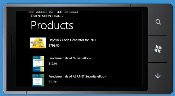
When you have a phone in your hands you can turn the phone on its side. This gives you a wide view of the screen. If the user switches from the normal portrait orientation of the phone (Figure 1) to a landscape orientation (Figure 2) you end up with more room to display your data horizontally. You can take advantage of this extra room by switching between two different XAML templates when the phone orientation changes.
When you have a phone in your hands you can turn the phone on its side. You can take advantage of this extra room by switching between two different XAML templates when the phone orientation changes.
Create the Portrait Template
The list box that you first built in this article contained a DataTemplate that worked for a portrait mode of the phone. You will now remove that DataTemplate from the ListBox and put it into the Resources section of your page. You will also need to assign a Key to this DataTemplate. Name it “listPortrait” as shown in Listing 4.
Now you can modify your list box to set this template as the default ItemTemplate. You will remove all other XAML from your list box except what is shown in the code below:
<ListBox x:Name="lstData"
     ItemTemplate="{StaticResource listPortrait}"
     ItemsSource="{Binding Source=
                  {StaticResource productCollection},
                    Path=DataCollection}" />
Create the Landscape Template
Create another DataTemplate in the Resources section of your page to display the landscape view as shown in Figure 3. Copy the existing DataTemplate you created for the portrait mode and paste it back in below the listPortrait DataTemplate. Change the x:Key to be listLandscape. Add a StackPanel control around the existing StackPanel and set the new StackPanel’s orientation property to Horizontal. Immediately after this new StackPanel’s opening tag, add an Image control. Modify the Width property of the TextBlock that displays the ProductName property to 400. Since you have more room in landscape mode, most product names will not have to wrap as they might when in portrait mode. Listing 5 shows the complete landscape DataTemplate.
Responding to the OrientationChanged Event
Now that you have created two different templates, all you need to do is write code to switch between the two templates when the orientation of the phone changes. To accomplish this, first set an attribute in the PhoneApplicationPage called SupportedOrientation to the value PortraitOrLandscape. This attribute will allow the OrientationChanged event to fire.
<phone:PhoneApplicationPage
   x:Class="WPListBox.MainPage"
   ...
   SupportedOrientations="PortraitOrLandscape"
   ...
   ... >
Also, within the PhoneApplicationPage attributes you add an OrientationChanged event and have Visual Studio create the event procedure in the code behind for this page.
<phone:PhoneApplicationPage
   x:Class="WPListBox.MainPage"
   ...
   OrientationChanged=
   "PhoneApplicationPage_OrientationChanged"
   SupportedOrientations="PortraitOrLandscape"
   ...
   ... >
In the OrientationChanged event procedure, write the following code:
private void
PhoneApplicationPage_OrientationChanged(
   object sender, OrientationChangedEventArgs e)
{
  if (e.Orientation.ToString().Contains("Portrait"))
    lstData.ItemTemplate =
      (DataTemplate)this.Resources["listPortrait"];
  else
    lstData.ItemTemplate =
      (DataTemplate)this.Resources["listLandscape"];
}
When the OrientationChanged event fires, the new orientation is passed in the “e” argument as the Orientation property. This property can be one of seven enumeration values; None, Portrait, PortraitUp, PortraitDown, Landscape, LandscapeRight, and LandscapeLeft. Since we are just concerned with Portrait or Landscape, you will just convert the Orientation property to a string and see if the value contains Portrait. If it contains Portrait, then you find the “listPortrait” resource, cast it as a DataTemplate and assign it to the list box control’s ItemTemplate property. This causes the list box to redraw itself using the defined data template.
Panorama Control
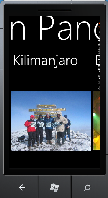
The Windows Phone Panorama control makes creating a wrap-around list of items very quick and easy to accomplish. In this example, I’ll show you how to create a nice panorama out of a collection of photos. You will be able to take a set of your photos, drop them into this project and try out this sample right away. In Figure 3 you can see an example of an application that you can create. I named my panorama page “My Life in Panorama” to show a list of pictures from my life. In Figure 3 I am showing one page of my panorama that shows me at the top of Kilimanjaro in 2004 with some of my fellow climbers, including Richard Campbell and Stephen Forte.
The Windows Phone Panorama control makes creating a wrap-around list of items very quick and easy to accomplish.
Create the Panorama Page
To get started creating your own Panorama application, open Visual Studio 2010 and choose New Project. Click on the Silverlight for Windows Phone tab, then click on Windows Phone Application and set the name to WPPanoramaSample. For this particular sample, do NOT choose the “Windows Phone Panorama Application.” You will want to start with just creating a simple panorama page and not worry about all the data stuff that this project template adds.
Once VS has your new project created, click on MainPage.xaml and delete it. Right-mouse click on the project and select Add | Add New Item… from the context menu. Select Windows Phone Panorama Page from the item list and set the Name to MainPage.xaml. Click the OK button and your new main page will be ready for you to start adding pictures to in the Panorama control. Locate the XAML for the Panorama control within this page; it will look like the following.
<controls:Panorama Title="my application">
  <!--Panorama item one-->
  <controls:PanoramaItem Header="item1">
    <Grid />
  </controls:PanoramaItem>
  <!--Panorama item two-->
  <controls:PanoramaItem Header="item2">
    <Grid />
  </controls:PanoramaItem>
</controls:Panorama>
You can find the Panorama control in the Microsoft.Phone.Controls.dll, so Visual Studio added an assembly reference to your project. Visual Studio added an xml namespace with an alias of “controls” to the MainPage.xaml. This is why there is a “controls:” prefix on the Panorama control you see in the XAML. Each Panorama control allows you to create a title that will be displayed across all items that make up your Panorama page. Change the Title property of the Panorama control to “My Life in Panorama.”
Add Pictures and PanoramaItem Controls
You are now ready to start adding your own pictures to your project and to the panorama. The Panorama control is made up of one or many PanoramaItem controls. Into the “content” of each of these PanoramaItem controls you may put any XAML you want. For our purposes here you will replace the <Grid /> control with an <Image> control. Create a \Images folder in your VS project. Gather any amount of pictures from your life that you wish to display and copy them into the \Images folder in the VS project.
Now you are ready to take each picture and create one PanoramaItem control for each picture. Modify the XAML in the MainPage.xaml to look like the following:
<controls:Panorama Title="My Life in Panorama">
  <controls:PanoramaItem Header="Me in 1963">
    <Image Source="Images/MeIn1963.jpg" />
  </controls:PanoramaItem>
  <controls:PanoramaItem Header="Me in 1967">
    <Image Source="Images/MeIn1967.jpg" />
  </controls:PanoramaItem>
  <controls:PanoramaItem Header="Me in 1971">
    <Image Source="Images/MeIn1971.jpg" />
  </controls:PanoramaItem>
</controls:Panorama>
Replace my image file names with your image file names and modify the Header of each PanoramaItem control with appropriate headers. Keep the headers short so they are not chopped off. I find that less than 12 characters works best for the Header attribute. After putting in your images go ahead and run your application and you will be able to pan through all your images both forward and backward. When you get to the beginning (or the end) you will see that the control simply scrolls around in a continuous loop.
Pivot Control
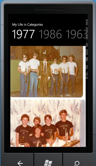
Another cool UI feature of the Windows Phone is the Pivot control. You can think of a Pivot as similar to a Tab control in Windows Forms, WPF or Silverlight. Each “Tab” or PivotItem you create is like a separate little page where you can create any XAML you need. I will now show you how to create a set of PivotItem controls where each control (tab) will display a list box of photos. You will be able to take a set of your photos, drop them into this project and try out this sample right away. In Figure 4 you can see the sample application that you will create. I named it “My Life in Categories” and it has a list of “tabs” across the top. Each tab is a different year and in each year is a list box with a list of pictures from your life.
Create the Pivot Page
Create this by opening a new instance of VS 2010 and choose New Project. Click on the Silverlight for Windows Phone tab, then click on Windows Phone Application and set the name to WPPivotSample. Do NOT choose the Windows Phone Pivot Application as this will add some extra data stuff that you don’t want to mess with right now.
Once Visual Studio has your new project created, click on MainPage.xaml and delete this page. Right-mouse click on the project and select Add | Add New Item… from the context menu. Select Windows Phone Pivot Page from the item list and set the Name to MainPage.xaml. Click the OK button and your new main page will be ready for you to start creating the different Pivot Item controls in your Pivot page. Locate the XAML for the Pivot control within this page; it will look like the following:
<!--Pivot Control-->
<controls:Pivot Title="MY APPLICATION">
  <!--Pivot item one-->
  <controls:PivotItem Header="item1">
    <Grid />
  </controls:PivotItem>
  <!--Pivot item two-->
  <controls:PivotItem Header="item2">
    <Grid />
  </controls:PivotItem>
</controls:Pivot>
Just like the Panorama control, a Pivot control is located in the Microsoft.Phone.Controls.dll, so VS added an assembly reference to your project. VS also added an xml namespace with an alias of “controls” to the MainPage.xaml. This is why there is a “controls:” prefix on the Pivot control you see in the XAML. Each Pivot control allows you to create a title to display at the top of your Pivot control. Modify the Title property to “My Life in Categories.”
Add Pictures and PivotItem Controls
The Pivot control is made up of one or many PivotItem controls. In each PivotItem control you can put any XAML that you want. In this sample you will replace the Grid control with a ListBox control into which you will place one or more images. Once again, create an \Images folder and add your own pictures to this folder. Next, create a ListBox control within one of your PivotItem controls and add as many ListBoxItem controls as you want, one for each picture.
<ListBox>
  <ListBoxItem>
    <Image Source="Images/1965-1.jpg" />
  </ListBoxItem>
  ...
  ...
</ListBox>
Modify the Header of each PivotItem control with your appropriate headers. Keep the headers short so they are not chopped off. I find less than 12 characters works best for the Header attribute, just like for the Panorama control. Listing 6 shows an example of a couple of PivotItem controls where you group your pictures into a ListBox control within each PivotItem control.
Summary
This article introduced you to a few of the different UI features you have on a Windows Phone. While you are using Silverlight for your development, there are some unique features that you need to learn how to handle in your code. One of the features is working with orientation changes. When the user changes from a portrait to a landscape mode, you end up with more width, so you can take advantage of this room by switching a DataTemplate for your list box. Panorama pages and Pivot pages make it very easy to create “virtual” scrolling pages of data. In Part 2 of this article you will learn about Launchers, Choosers and using the Application Bar on the Windows Phone. So, download the Windows Phone tools for Visual Studio 2010 and start developing phone apps!