This excerpt is from the new book, ‘101 Windows Phone 7 Apps, Volume I: Developing Apps 1-50’, authored by Adam Nathan, published April 2011, ISBN 0672335522, Copyright 2011. For more info, please visit the publisher site http://www.informit.com/store/product.aspx?isbn=0672335522
A flashlight app is one of the canonical simple apps that anybody can create. The idea is that the app makes the screen completely white, so the screen itself becomes a decent flashlight when it’s dark. (Another variation would be a “mirror” app that makes the screen completely black!) Certainly a “blank white screen” app is even simpler to implement than the Tally app. But this chapter’s Flashlight app is no ordinary flashlight! It supports custom colors, flashing SOS in Morse code, and even a strobe light mode!
Can my app turn on the phone camera’s flash and use that as a real flashlight?
No, this is not currently supported. Leveraging the light from the screen is the best you can do.
Creating this multi-mode application gives a good opportunity to understand and use the application bar, a central part of the Windows Phone experience. The application bar is used by almost all of the apps in this book.
The Application Bar
The application bar is the 72-pixel-thick strip of buttons docked on the edge of the screen adjacent to the hardware buttons. Figure 2.1 shows a two-button application bar from the built-in Alarms app in a variety of situations.
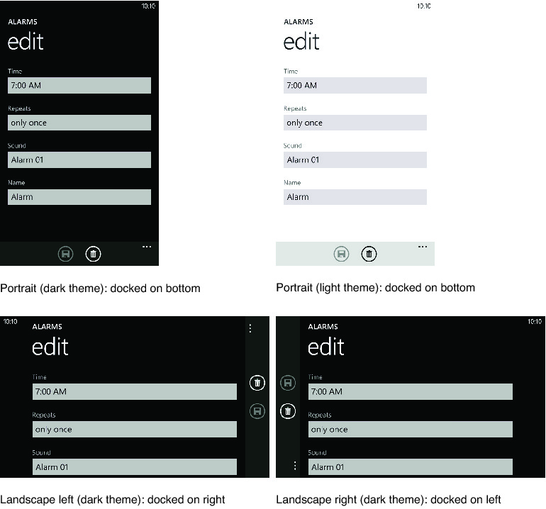
Each button represents a common action relevant to the current content, such as the “save” and “delete” actions relevant to the current alarm shown in Figure 2.1. Sometimes it makes sense for actions to be disabled, such as “save” in Figure 2.1. In this example, the current alarm has not been modified so there are no changes to save.
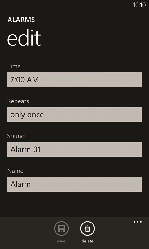
Every application bar button has an icon and text label, although the labels can only be seen when you tap or drag the ellipsis (or left margin), as shown in Figure 2.2. This controversial idea minimizes clutter, consistent with one of the Metro mottos, “content, not chrome,” also expressed as “the content is the interface.” Although users might not know what each button does the first time they see them, they will probably remember in the future after peeking at the labels once or twice. Of course, this design places major importance on using understandable icons. (Although my sons have never seen a real floppy disk, even they recognize it as a save icon!)
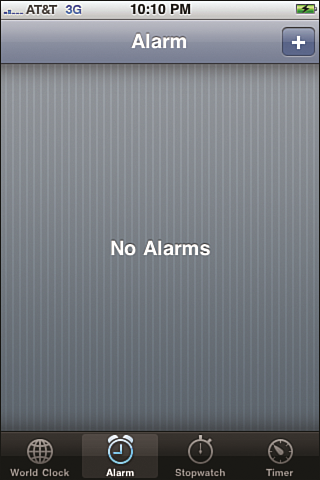
The application bar is designed to act differently than the iPhone tab bar!
In an iPhone tab bar, pictured in Figure 2.3 for the iPhone Clock app, each button typically switches to a different page, and each button has a selection state to communicate which page you’re currently looking at. Buttons on the Windows Phone application bar, however, do not have any notion of being selected. Often, the action each one triggers does not involve taking you to a different page. And if it does, the new page likely has a different application bar (or none at all). In such cases, the user is expected to return to the previous page using the hardware Back button. This difference in how the two mechanisms are designed means that a proper Windows Phone app often has a much different navigation flow than a proper iPhone app. Chapter 6, “Baby Sign Language,” examines best practices for navigation, which influences when you should use an application bar and what you should put in it.
The application bar can only fit four buttons!
The actions that occupy these limited slots must therefore be carefully chosen. Additional actions can be placed in the application bar menu, which has no limit on the number of items.
Before we build Flashlight, the rest of this section examines:
- The application bar menu
- Creating button icons
- Using an application bar in your app
The Application Bar Menu
The application bar menu is an unbounded list of text-only items that can appear below the application bar buttons when the user taps or flicks the ellipsis or left margin (the same gestures used to show the button text labels). These items are meant to be used for a few different types of actions:
- Advanced and/or infrequent actions.
- Actions that are hard to convey with an icon.
- Actions that simply won’t fit as buttons on the application bar because all four slots are already being used.
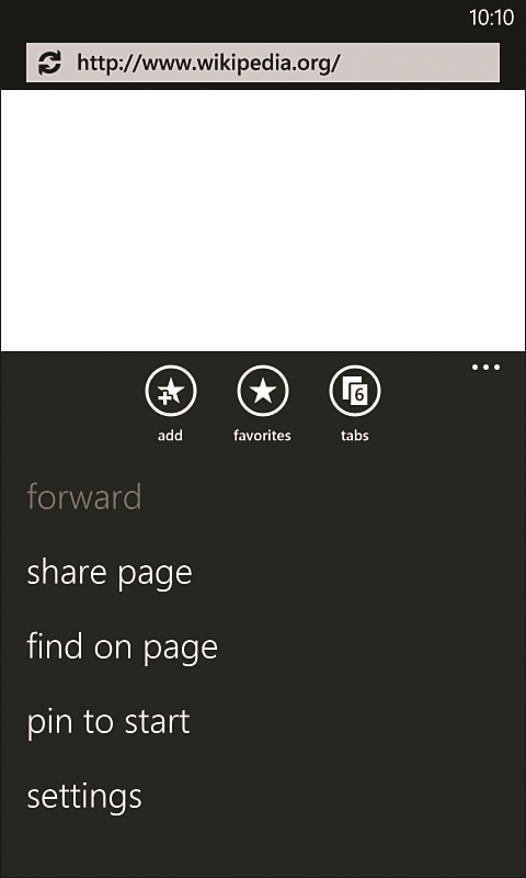
Figure 2.4 shows an application bar menu used by Internet Explorer 7. (IE9, due for release on Windows Phone by the end of 2011, uses a modified application bar menu.)
Do not jam as many buttons as you can onto an application bar just because there is room for them. Instead, save them only for commonly used actions-even if there are only one or two such actions (or no such actions) -and consider using an application bar menu for the rest.
For example, most apps place links to their settings and about pages on an application bar menu even if there is room for them as buttons, despite the fact that they are very easily represented as icons. Because accessing settings should be rare (and accessing an about page even more rare), adding them to an application bar would add a lot of unnecessary clutter. The Pictures hub uses an application bar with several menu items but no buttons when viewing an individual picture. And of course, Internet Explorer 7 only uses three buttons despite having several menu items, as seen in Figure 2.4.
Text in an application bar menu gets cut off if it is too long!
Although the menu scrolls vertically when there are more than five items, it never scrolls horizontally. The amount of characters that fit varies based on the letters used, although the available width remains consistent for both portrait and landscape orientations. Using trial and error, take care to keep the labels short enough to avoid truncation.
Image files used for application bar button icons should not include the outer circle. The application bar automatically places the circle around each icon.
To avoid a low-quality result, be sure that every image file used for an application bar button icon is 48x48 pixels.
Many users may never discover your menu items, especially if the meaning of each icon button is obvious! Thatís because thereís no visual indication that menu items exist until the user taps the ellipsis (which is always present even if there are no menu items). Therefore, it does not make sense to rely on an application bar menu for primary navigation, such as a main menu.
To avoid the need for the user to scroll the menu, the design guidelines recommend using no more than five menu items. However, for some appsósuch as Flashlightóusing additional menu items is better than many alternatives.
The Program Files\Microsoft SDKs\Windows Phone\v7.0\Icons includes black icons in addition to white icons, and other files that can be useful for prototyping or for contexts other than the application bar, such as the outer circle that gets automatically placed on each button. It also includes a vector-based file with all the icons, so you can tweak the existing icons to create new ones.
Creating Button Icons
Icons for application bar buttons should be all white with a transparent background. (The white will automatically appear black instead when the light theme is used.) The image file should be 48x48, although the drawing inside should approximately fit in a 22x22 area in the center (leaving a 13-pixel margin on all sides). The drawing should be composed of simple geometric shapes and be recognizable without further explanation. Except for the sizing, these guidelines should sound familiar, as they are the same as the guidelines for creating app icons. In some rare cases, a little bit of color can be appropriate (such as in a red-circle “record” icon), but you should generally avoid using anything other than white.
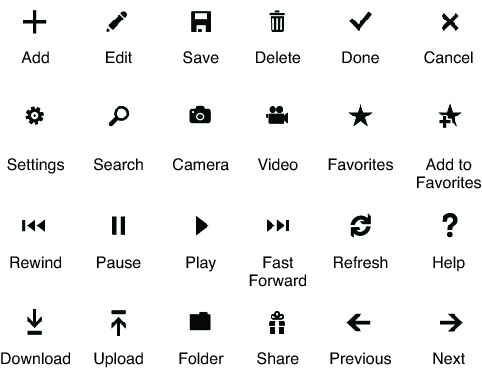
The Windows Phone Developer Tools includes a set of white-on-transparent icons for common application bar buttons installed in the Program Files\Microsoft SDKs\Windows Phone\v7.0\Icons\dark folder. Figure 2.5 shows some of them-but in black so they show up on these white pages-along with their meaning.
Using an Application Bar in Your App
You can give any page an application bar by setting its ApplicationBar property to an instance of an ApplicationBar object. It can contain up to four ApplicationBarIconButton children, and it also has a separate MenuItems collection that can be filled with as many ApplicationBarMenuItems as you want. The following XAML shows the application bar used by Flashlight, shown at the beginning of this chapter:
<phone:PhoneApplicationPage …>
  <phone:PhoneApplicationPage.ApplicationBar>
    <!-- The ApplicationBar object: -->
    <shell:ApplicationBar Opacity=”.5”>
      <!-- Two buttons: -->
      <shell:ApplicationBarIconButton Text=”sos” IconUri=”Images/sos.png”
                                      Click=”SosButton_Click”/>
      <shell:ApplicationBarIconButton Text=”strobe” IconUri=”Images/strobe.png”
                                      Click=”StrobeButton_Click”/>
      <!-- Eight menu items: -->
      <shell:ApplicationBar.MenuItems>
        <shell:ApplicationBarMenuItem Text=”red”/>
        <shell:ApplicationBarMenuItem Text=”orange”/>
        <shell:ApplicationBarMenuItem Text=”yellow”/>
        <shell:ApplicationBarMenuItem Text=”green”/>
        <shell:ApplicationBarMenuItem Text=”cyan”/>
        <shell:ApplicationBarMenuItem Text=”purple”/>
        <shell:ApplicationBarMenuItem Text=”gray”/>
        <shell:ApplicationBarMenuItem Text=”white”/>
      </shell:ApplicationBar.MenuItems>
    </shell:ApplicationBar>
  </phone:PhoneApplicationPage.ApplicationBar>
…
</phone:PhoneApplicationPage>
The two buttons enable switching the flashlight’s mode to SOS or strobe, and the menu items change the color of the flashlight from white to one of seven other colors (and back). Note that this follows the guideline of not using all four application bar buttons just because we can. (It would not be appropriate to have “red” and “orange” be two more buttons on the application bar with the rest of the colors as menu items, for example.)
The resultant application bar is the exact same control used by the built-in phone apps, complete with buttons and menu items that tilt when pressed and many other animations: menu items and buttons that slide in and out, buttons that rotate when the orientation changes, and so on. It would be ill-advised to work around application bar limitations by creating your own control that mimics it, considering all the subtle behaviors it contains.
Although you can give an application bar any opacity between 0 and 1, the design guidelines recommend that you choose a value of 1 (the default), .5, or 0.
ApplicationBar
The ApplicationBar object exposes the following read/write properties:
- BackgroundColor and ForegroundColor-Enables customizing both colors used by the application bar. (ForegroundColor is used by the button icons, button labels, menu items, and ellipsis.) Apps should not override these colors except for special circumstances.
- IsVisible (true by default)-Enables showing and hiding the application bar.
Why doesn’t my icon show up on my application bar? I get an “X” icon instead!
This happens when the image file’s build action is not set to Content (assuming you have already included the image file in your project and have set IconUri to the correct path and file). This is a very easy mistake to make because Visual Studio chooses a default build action of Resource when you add an image file to your project. You can change this in Visual Studio’s Properties window, as shown in the preceding chapter.
- IsMenuEnabled (true by default)-When set to false, the application bar behaves as if there are no menu items. The user can still tap the ellipsis to reveal the labels under each button.
- Opacity (1 by default)-Adjusts the opacity of the background color. When Opacity is 1, the page is not given the space underneath the application bar. (In the portrait orientation, for example, the page’s actual height is reduced by 72 pixels when the application bar is visible.) When Opacity is any value less than 1, the page is given the space underneath so it can place content underneath the translucent or transparent background.
ApplicationBar also defines a StateChanged event that is raised whenever the menu is shown or hidden, in case an app wants to adjust the page content when this happens.
ApplicationBarIconButton and ApplicationBarMenuItem
The ApplicationBarIconButton object used for each button has two mandatory properties: IconUri, a URI pointing to the image file to be used for the icon, and Text, the string to be used for the label. The string used for Text should be short-ideally one word. If the string is too long, the resulting label will be ellipsized. As with a normal button, ApplicationBarIconButton’s Click event is used to react to the button being tapped.
ApplicationBarIconButton also defines an IsEnabled property (true by default) for enabling/disabling it, and a corresponding (and poorly-named) Changed event that gets raised when IsEnabled changes. When an application bar button is disabled it becomes translucent (“faded out”) and unclickable, as seen with the save button back in Figures 2.1 and 2.2.
The ApplicationBarMenuMenuItem object that represents each menu item has all the same properties and events as ApplicationBarIconButton, except for IconUri, naturally, because menu items cannot have icons.
Marking items in an application bar with x:Name does not work!
Although using x:Name on an application bar button or menu item causes the XAML compiler to generate a field for the item, the field will always be null at run-time. This is because the FindName method (used inside InitializeComponent) is unable to find these items, as they are not Silverlight UI elements inside the page’s visual tree. They are special phone shell elements that happen to be exposed via convenient .NET APIs.
The fact that the application bar and its contents are not true Silverlight UI elements has further implications. You cannot use data binding with any of its properties, you cannot apply styles, animations, and/or transforms, and so on. For the most part, this isnít a big deal. (Even if you could have, you should not use custom animations or alternate styles with an application bar anyway.) The lack of data binding, however, means that you cannot use some common coding practices that Silverlight developers have gotten accustomed to.
Donít rely on relative button placement in the application bar for communicating information. When the orientation changes, the rotated buttons can effectively appear in the reverse order (when scanning from top-to-bottom compared to left-to-right). You can see this phenomenon back in Figure 2.1. In the landscape left orientation, the delete button appears to be placed before the save button.
To read the entire chapter go to http://www.informit.com/store/product.aspx?isbn=0672335522