From its earliest beginnings, Silverlight has tried to excite and inspire. Now that Silverlight 3 has shipped, it is time to determine if this is the magical version that every developer should finally take a look at. In this article, I will show you the changes Microsoft has made in hopes of helping you make that decision for your own organization.
Is Silverlight Ready?
Excitement for the next version of any technology is apt to be high, but Microsoft has a history of making the version 3 of their products the jumping-on point. Microsoft has done its best to convince application developers that Silverlight is ready for business. While many of the features are focused to help build line-of-business applications, there are features that should appeal to most developers using the Silverlight 3 platform.
On the face of it, Silverlight 3 is an evolutionary release, not a revolutionary one. In many ways, you should consider that Silverlight 3 is an additive release. This means Silverlight 2 applications should continue to work (whether you leave them as Silverlight 2 or convert them to Silverlight 3) but they may get some unexpected behavior changes. Please see the “What’s New in Silverlight 3” topic in the official product documentation for a full list of changes for Silverlight 2 applications.
The new features in Silverlight 3 run the gamut from very visible features (like Out of Browser support) to tiny jewels of functionality that will help developers do their job easier. This article will walk through all the changes by category.
Controls
While not revolutionary, the control set in Silverlight 3 has a number of changes in packaging and content. The focus is primarily to help application developers be more productive but there are other surprises as well.
Packaging
The strategy of having built-in controls, controls that exist in the Silverlight SDK and others that exist in the Silverlight Toolkit, has changed a bit in Silverlight 3. Controls that used to be part of the Silverlight Toolkit but have been deemed to have matured have been migrated to the Silverlight SDK. The packaging of these controls is still outside of the Silverlight plug-in, but they are shipped with the Silverlight Tools instead of requiring the additional download of the Silverlight Toolkit. The controls that have made the leap to the SDK include:
- AutoCompleteBox
- HeaderedItemsControl
- TreeView
Validating Controls
Microsoft enhanced the existing control set to support displaying validation errors. For example, you can now set the TextBox to know about validation errors by specifying the NotifyOnValidationError and ValidatesOnExceptions like so:
<TextBox Text="{Binding Name,
                Mode=TwoWay,
                NotifyOnValidationError=true,
                ValidatesOnExceptions=true}"
         Width="100"
         Height="25"/>
The Name property that you are binding to may have some validation (in this case a simple check for length validation):
string _name;
public string Name
{
  get { return _name; }
  set
  {
    if (value.Length > 10)
    {
      throw new InvalidOperationException(
                              "String too long");
    }
    _name = value;
  }
}
At runtime, the validation causes the validation UI in the button to show up as shown in Figure 1. This validation UI is now part of the template of all the controls. If you styled your controls in Silverlight 2, you will need to add these template parts to your templates to get the new behavior.

Data Controls
Microsoft added new controls to specifically target line-of-business applications and rapid application development. Developers can now choose from a number of small controls to create smart line-of-business applications. These include:
-
DataPager: Supports paging through a variety of different types of data. -
Label: A control that supports feedback to the user of required and non-required fields. -
DescriptionViewer: Indicator that relates information about the field. -
ValidationSummary: Shows a list of validation errors, if any. -
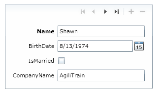
DataField: Wraps a Label and a DescriptionViewer around a content section as shown in Figure 2. -
DataForm: A container to give a rapid-application experience for creating an editing experience to data. You can see this control in Figure 3.

The benefit of these controls is squarely in the ability to quickly create line-of-business applications, but they do depend on using the DataAnnotations to attribute your classes. The DataAnnotations allow you to decorate your classes to help the data controls know more about your controls. For example:
using System.ComponentModel.DataAnnotations;

public class Person
{
  [Required]
  [StringLength(100)]
  [Description("Full Name")]
  public string Name {get;set;}

  [Required]
  [StringLength(15)]
  [RegularExpression(@"^\d{3}-\d{2}-\d{4}$")]
  public string SocialSecurity { get; set; }
}
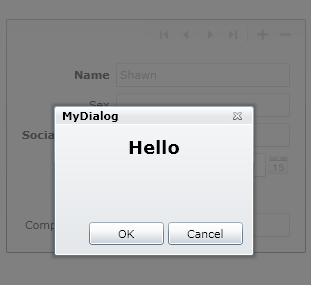
Dialog-like Windows
While not really a control, the new ChildWindow class is an important inclusion to the Silverlight tool set. The ChildWindow (available as part of the Silverlight Toolkit) is a base class for a new XAML document that developers can use as a makeshift dialog window. In Visual Studio, there is a new Item template for the ChildWindow as well. In Listing 1, you can see a default ChildWindow XAML file. Notice that the ChildWindow is the root of the XAML document (instead of UserControl in a typical XAML file). This base class gives you the default look/feel of a dialog-like window. The ChildWindow uses an animation for showing/hiding as well as graying out the screen below the dialog, as shown in Figure 4.
ListBox
The venerable ListBox now includes the ability to support multiple selections. You can use this feature by setting the SelectionMode attribute/property:
<ListBox SelectionMode="Multiple" />
The SelectionMode enumeration supports three values:
-
Single: Same as the Silverlight 2 behavior. -
Multiple: Allows multiple selections with modifier keys (Ctrl/Shift). -
Extended: Allows multiple selections without modifier keys.
In addition, the default item creation for the ListBox uses the new VirtualizingStackPanel, which will improve performance of large lists of items.
ComboBox
In Silverlight 2, the ComboBox was the most notorious control for having odd behavior. Microsoft made some beneficial changes to this control in Silverlight 3. In Silverlight 2, if you had the ComboBox’s popup larger than the ComboBox itself and required a scrollbar, the width of the ComboBox was too narrow by the width of the scrollbar so your items would get clipped. Microsoft fixed this in Silverlight 3.
In addition, when using Enumerations with the ItemsSource of a ComboBox, the ComboBox correctly shows strings instead of numbers as shown below:
myComboBox.ItemsSource =
  new SelectionMode[] { SelectionMode.Single };
  // Works now
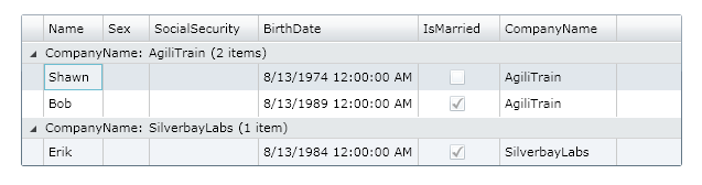
DataGrid
The DataGrid now supports grouping. To use the paging you’ll need to use a PagedCollectionView to wrap your collections and then set the GroupDescriptions as shown below:
// Wrap some collection in the view
var view = new PagedCollectionView(data);

// Group by Company Name
view.GroupDescriptions.Add(new
  PropertyGroupDescription("CompanyName"));

// use the new view as the data source
theGrid.ItemsSource = view;
This allows grouping in multiple levels to create true hierarchies from non-heirarchical data. You can see the grouping in Figure 5.
Design Changes
In Silverlight 3, Microsoft has added some nice benefits for the design of your XAML objects. These include pixel shader support, 3-D projection, easing functions and behaviors.
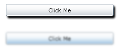
Pixel Shader Effects
Any XAML element that derives from UIElement (all visual elements) now supports a new property called Effect. Effect allows you to use pixel shader effects to affect an element (or collection of elements). Pixel shaders are visual effects that are applied as an object is drawn. The two supported pixel shaders that ship with Silverlight 3 are DropShadowEffect and BlurEffect though you can also use any DirectX pixel shaders (version 2) in Silverlight 3. You apply these using the Effect property as shown below and Figure 6:
<Button Content="Click Me"
        Height="25"
        Margin="16">
  <Button.Effect>
    <DropShadowEffect />
  </Button.Effect>
</Button>
<Button Content="Click Me"
        Height="25"
        Margin="16">
  <Button.Effect>
    <BlurEffect />
  </Button.Effect>
</Button>
Projections
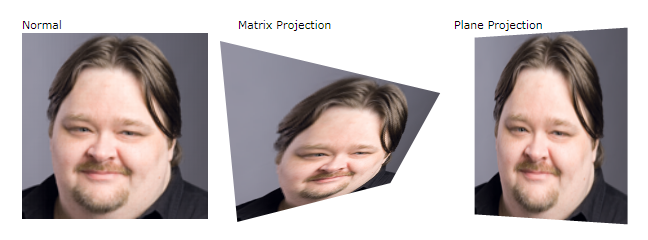
When Microsoft shipped Silverlight 1.0, they didn’t have support for 3-D. At MIX ’09, Microsoft created a lot of buzz when they announced that they support 3-D transforms. In fact, these are called projections not transforms. A project is simply a way to move a 2-D object in three-dimensional space. This allows for some common UI patterns like Cover Flow (from iTunes) and other nice effects. Projections are supported on all UIElement-derived classes as well. There are two types of projections:
-
Matrix3DProjection: Performs 3-D transform matrices based on homogeneous space. -
PlaneProjection: A simpler X/Y/Z plane projection into 3-D space.
Projections are accomplished by using the new Projection property of the UIElement class as seen in Listing 2 and Figure 7.
Easing Animations
Another key design feature that made it into Silverlight 3 is a more straightforward way to make non-linear animations. In Silverlight 2, an animation’s interpolation could be linear, Bezier or discrete. This allowed for simple interpolation but to do anything really interesting, you were stuck. In Silverlight 3, the framework introduces easing functions. Easing functions allow for pre-packaged interpolations. While these are typically curve types (e.g., sine, quadratic, etc.), easing functions also let you do more esthetic easing as well like bouncing or elastic easing. You use easing functions inside timeline animations as shown below.
<Storyboard x:Name="moverStory">
  <DoubleAnimation From="0"
                   To="100"
                   Storyboard.TargetName="mover"
                   Storyboard.TargetProperty="Y">
    <DoubleAnimation.EasingFunction>
      <BounceEase Bounces="3" />
    </DoubleAnimation.EasingFunction>
  </DoubleAnimation>
</Storyboard>
You can also use easing functions inside of Keyframe animations. For specific needs, you can author your own easing functions as well.
Behaviors
Finally, a new feature called behaviors has made its way into Silverlight 3 from the Expression Blend team (instead of via the Silverlight team). Behaviors are pre-packaged user interactions. For example, one common behavior is to control a storyboard through some event. In the case shown in Listing 3, the ControlStoryboardAction is starting the Storyboard once the Rectangle is clicked with the Mouse (MouseLeftButtonUp event).
Behaviors are similar in function to the way that triggers work in WPF, but not as powerful and more usable at the same time. Because you can create behaviors to share common user interactions and they are supported in Blend, they become a very common strategy for creating common interface elements that designers can use.
The behaviors included are:
-
ChangePropertyAction: Changes a specified property. -
ControlStoryboardAction: Controls a storyboard (e.g., Play, Stop, Pause). -
FluidMoveBehavior: Causes movement of an element to animate it smoothly instead of just changing locations. -
GoToStateAction: Moves to a specific state in a VisualStateManager. -
HyperlinkAction: Causes the browser’s page to navigate to a specific URI. -
MouseDragElementBehavior: Allows an element to be dragged with the mouse. -
PlaySoundAction: Plays a sound file. -
RemoveElementAction: Removes an element from the visual tree.
I mentioned that the Blend team authored behaviors (and the ability to write your own). As of the writing of this article, the only way to get this feature is to install Blend 3 (preview or full release copy). It is expected that this will be packaged in a release they are calling the “Blend SDK.” This will be available without having to have Blend 3 installed but it is not yet released.
Data Binding
While the data binding story in Silverlight 2 is pretty spectacular, the WPF developers out there are still missing some pieces they’ve become accustomed to working with. Silverlight 3 tries to mollify some of these missing pieces with new functionality to come closer (though certainly not on par) with its WPF sibling.
ElementName Binding
Luckily for us, Microsoft has brought in one of my favorite features of data binding, element to element binding. By using the ElementName markup extension, you can bind one element to another. While many people lauded this feature early on to make contrived examples in WPF demos, for me it makes one of the most obvious data binding stories natural again:
<ListBox x:Name="theList" />
<StackPanel DataContext="{Binding SelectedItem,
                           ElementName=theList}">
  <TextBlock Text="{Binding Name}" />
</StackPanel>
Note that this code snippet is binding the details of the item selected by the user to the StackPanel. This makes it incredibly easy to create master-detail forms in Silverlight 3.
RelativeSource
When creating control templates in Silverlight 2, it was common to do TemplateBinding to take the natural property from the original control. In Silverlight 3, Microsoft extend to two new scenarios that are common, especially in data validation scenarios.
The first of these is a TemplatedParent relative source. This tells the binding to use, as the source of the data binding, the control that is the destination for a data template. While similar to TemplateBinding, TemplatedParent allows you to use the parent as a source instead of just the property on that parent. For example, Listing 4 shows how to use the TemplatedParent to set the Fill of the template’s background to the background of the template.
The second scenario is where you want to use the element as a source to its own data binding. For example, Listing 4 also shows how the RadiusY can use a Self relative source to bind to the RadiusX property.
Styling
Like other parts of the new Silverlight 3, the Styling framework also received some evolutionary change to bring it close to the WPF styling stack.
Merged Resource Dictionaries
In Silverlight 2, the App.xaml file was the major place for sharing of styles across an application, but sharing styles from one application to another was often a solution of copy and paste. Silverlight 3 remedies this by introducing merged resource dictionaries. App.xaml is a resource dictionary which is simply a large set of key’d resources. With merged dictionaries, you can specify your styles in an external file (or files) that contain the shared resources that are merged into the App.xaml (or other resource dictionaries) at runtime. You accomplish this by adding a ResourceDictionary.MergedDictionaries section and listing the dictionaries to merge into the main application resource section as shown below:
<Application xmlns="..."
             xmlns:x="..."
             x:Class="RelativeBindings.App">
  <Application.Resources>

    <ResourceDictionary>
      <ResourceDictionary.MergedDictionaries>
        <ResourceDictionary
                  Source="SharedStyles.xaml" />
      </ResourceDictionary.MergedDictionaries>
    </ResourceDictionary>

  </Application.Resources>
</Application>
Cascading Styles
When I teach Silverlight, I often try to contrast CSS and the Silverlight styling stack to help Web developers to understand the differences. Now that Silverlight styles can actually cascade (you know, the “C” in CSS) Microsoft has made it easier to explain as well as author styles in Silverlight 3. Cascading styles are specified using a BasedOn property on the style. In that case, the new Style will use the BasedOn style as the base-style as shown below:
<Style x:Key="ControlStyle"
       TargetType="Control">
  <Setter Property="FontFamily"
          Value="Verdana" />
</Style>

<Style x:Key="ourButton"
       TargetType="Button"
       BasedOn="{StaticResource ControlStyle}">
  <Setter Property="FontWeight"
          Value="Bold" />
</Style>
Reapplying Styles
While truly dynamic styles are still not part of Silverlight 3, the Silverlight team gave us the ability to reapply a style to an element. In Silverlight 2, you could only set a style once and if you needed to reapply the style, the changes would not affect your application. Setting a style (via code) now causes the styling to affect the control immediately.
Programming
Not all the changes in Silverlight 3 take place in the XAML itself. There are a number of changes that change the very way you develop applications (not just design them). In this section, I will highlight the most important of these.
Out of Browser
With some surprise, the Silverlight 3 team announced that Silverlight applications could live outside the browser and run similarly to a desktop application. In Visual Studio, you can select to allow your application to enable running out of browser as shown in Figure 8:
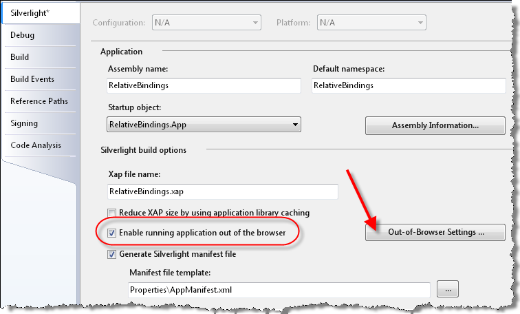
The “Out-of-Browser Settings…” dialog allows you to specify the name, description, icons (et al.) settings for the out-of-browser application. These are important to help your users determine if they want the application to run out of browser.
The Out-of-Browser Settings adds a new option on the context menu of the Silverlight control to allow you to install the application locally for the user. Installing the application does not require administrative privileges so it is an easy story for users.
You can also install and update the application when running out of browser by using the Application class. These include:
Methods:
-
Install: This method causes the application to be installed locally. -
CheckAndDownloadUpdateAsync: This method starts the process of checking and updating the locally installed application.
Properties:
-
InstallState: This property returns the state the application is in as it relates to being installed locally. -
IsRunningOutOfBrowser: This property returns whether the application is running in the browser or not.
Events:
-
InstallStateChanged: This event fires when the state of the installation changes. -
CheckAndDownloadUpdateCompleted: This event fires when the CheckAndDownloadUpdateAsync method completes and returns information about whether an update was necessary and was performed.
SaveFileDialog
To compliment the OpenFileDialog, Silverlight 3 now supports a dialog for saving files to the user’s machine. Much like the OpenFileDialog, most details of the process are hidden from you for security reasons. But, when you need to allow the user to save a file directly, you no longer need to have the server send down a file. You can use the SaveFileDialog very similarly to using the OpenFileDialog as shown below:
var dlg = new SaveFileDialog();

if (true == dlg.ShowDialog())
{
  var fileName = dlg.SafeFileName;
  var fileStream = dlg.OpenFile();
  var writer = new StreamWriter(fileStream);
  writer.WriteLine("Hello World");
  writer.Close();
}
Navigation Framework
Microsoft also included navigation framework for Silverlight 3. The navigation framework is mostly made up of the Frame and Page classes, which allow you to create a Frame in which to allow navigation to individual pages. While this is a great starting point for simple wizard applications, it also supports a full-application template. The navigation framework is especially helpful for a full application as it also supports integration with the URL bar and forward/back browser buttons. For certain applications this can be a huge boon.
The Frame class supports a Navigate method that you can use to navigate to a specific Page-derived class. The following shows a typical use of the Frame class to navigate to different Page instances.
this.Frame.Navigate(new
  Uri("/Views/AboutPage.xaml", UriKind.Relative));
The Navigate method looks for the XAML file in the right place in the project and then creates a new instance of that class and places it in the frame. A typical Page is similar to a UserControl class except it uses a Page class as the base class as shown here:
<n:Page x:Class="NavigateSL.AboutPage"
        xmlns="..."
        xmlns:x="..."
        xmlns:n="..."
        Title="AboutPage Page">
  <Grid x:Name="LayoutRoot"
        Background="White">
    <StackPanel>
      <TextBlock Text="About" />
    </StackPanel>
  </Grid>
</n:Page>
Application Services
In Silverlight 2, the Application class became the storehouse for a lot of functionality that did not need to be tightly coupled the application. Since the Application class was available everywhere it became simple to throw new functionality in this class, but this practice could make Application classes quite cumbersome. Adding arbitrary code to the Application class was especially problematic for users whom wanted to share their functionality across multiple applications. To address this need, Silverlight 3 includes support for creating application services.
An application service is any class that supports the IApplicationService interface (and optionally the IApplicationLifetimeAware interface). The convention is to also support a static Current property to ease access to the service. Listing 5 shows a sample application service.
You can instantiate these services in the App.xaml file by simply listing the services that the application supports:
<Application xmlns="..."
             xmlns:x="..."
             xmlns:my="clr-namespace:NavigateSL"
             x:Class="NavigateSL.App">
  <Application.ApplicationLifetimeObjects>
    <my:MyApplicationService />
  </Application.ApplicationLifetimeObjects>
  ...
</Application>
Communications
While there are some Silverlight applications out there that do not rely on communications with servers, they are the exception to the rule. To make this easier, Silverlight 3 comes with a number of improvements in the way that applications can communicate.
Offline Support
Now that Silverlight 3 lives outside the browser (see the section called Out of Browser earlier in this article), the need to work without a network connection is pressing. Microsoft didn’t tie the offline support in Silverlight to the out-of-browser functionality so you can use it for long-lived in-browser applications as well.
Offline support is made up of two pieces of functionality. First, the NetworkInterface class (in the System.Net.NetworkInformation namespace) has a static method called GetIsNetworkAvailable that returns a Boolean that indicates whether the network is live. Note that this is a network, not an Internet connection:
if (NetworkInterface.GetIsNetworkAvailable())
{
  // Make networking call
}
Additionally, you can register for NetworkChange’s NetworkAddressChanged to be notified of networking changes including coming on and offline:
NetworkChange.NetworkAddressChanged +=
    new NetworkAddressChangedEventHandler(
      NetworkChange_NetworkAddressChanged);

// ...

void NetworkChange_NetworkAddressChanged(
  object sender, EventArgs e)
{
  if (NetworkInterface.GetIsNetworkAvailable())
  {
    // Make networking call
  }
}
WCF Support
Windows Communication Foundation (WCF) still represents a major way that many applications are communicating with servers. Silverlight only supports a handful of scenarios where the communication can be secured (e.g., no WS-Security). Silverlight 3 has added a couple of new features to support WCF.
The first of these features is support for binary XML. Being able to binary encode the bodies of messages can improve the size of messages (but mostly only for large message sizes). For new Silverlight-enabled Silverlight WCF services created, binary XML is turned on by default. But for existing services, you will need to update the configuration by adding the binaryMessageEncoding element:
<bindings>
  <customBinding>
    <binding name="customBinding0">
      <binaryMessageEncoding />
      <httpTransport />
    </binding>
  </customBinding>
</bindings>
In the Silverlight application, you will need to re-generate your proxy to the service to get the new behavior in your ServiceReferences.ClientConfig file.
Silverlight 3 offers another WCF-specific change that allows you to send client credentials as part of the message. To use this you use the ClientCredentials property of the WCF service:
var svc = new MyBinaryServiceClient();
svc.ClientCredentials.UserName.UserName = "Shawn";
svc.ClientCredentials.UserName.Password =
                                       "P2ssw0rd";

svc.DoWorkAsync();
Using the client credentials requires an SSL connection (typically https) to make the request (so eavesdroppers cannot grab your credentials) even when testing it under the debugger.
Client Stack
In Silverlight 2, the browser handles all server communication to make the network request. This has the benefit of acting like the Web page when the requests are made. That way the cookies and other data are sent with the call without any work on the developer’s part.
The browser network stack has its limitations though. Several of the browser helper components show their age and weren’t developed with the deep set of features that http-protocol-based development now needs. For example, the browser network stack only supports GET and POST verbs and they limit the types of status codes returned (200 and 404).
When using REST services, the limitation of the http verbs becomes an obstacle since REST APIs often use the entire set of standard verbs (GET, PUT, POST, DELETE and OPTION). To address this need, Silverlight 3 now supports a client networking stack. This stack can use all the http verbs as well as return more status codes.
Silverlight 3 implements the new stack two ways. First, you can create your own instances of the client request objects using the WebRequestCreator class like so:
var req = (HttpWebRequest)
  WebRequestCreator.ClientHttp.Create(
    new Uri("http://..."));
The WebRequestCreator class has two properties to give access to BrowserHttp and ClientHttp creation. But, since most HttpWebRequests are created under the covers (e.g., inside Web service/data service proxies), it would be more helpful to be able to opt-in to this facility. The WebRequest class lets you register a prefix and tie it to a specific Web request type. The prefix is whatever starts a URI so it could be as simple as “http” to get all requests or something like this to assign it for a specific domain:
// Use the client stack for every request that
// starts with "http://agilitrain.com"
WebRequest.RegisterPrefix("http://agilitrain.com",
  WebRequestCreator.ClientHttp);
Local Connection
Silverlight 3 also adds to the communications stack a facility called local connection, which lets two Silverlight applications communicate with each other. The communication is handled as a named pipe between the two applications and setting up the communication is relatively uncomplicated.
This communication channel is a one-to-one communication (though you can create as many as you need). The communication sends a one-way message that can optionally return a message back to the sender. If you need truly two-way messaging, you need to create two local connections; one for each direction.
To prepare to send messages, you can instantiate the LocalMessageSender class using a name that is shared by both sides. Then you can use that class to send messages to the receiver. Listing 6 shows how to create a sender.
Creating a receiver is almost as simple. You create an instance of the LocalMessageReceiver class specifying the same string used by the sender. Next, you handle the MessageReceived event handler as well as call the Listen method to start listening for messages as shown in Listing 7.
Media Stack
Since its inception, Silverlight has been a platform for delivering rich media experiences. Silverlight 3 offers a number of improvements.
For anyone delivering media, Silverlight 3’s new support for common Internet codecs is a welcome addition. These new codecs include:
- H.264 (Video)
- AAC (Audio)
- fMP4 (Smooth Streaming MP4)
The inclusion of AAC and H.264 codecs is a big step to allowing ubiquitous videos to be played via Silverlight.
In addition, Silverlight 3 includes smooth streaming support out of the box. In Silverlight 2 you could get access to smooth streaming but had to use an external library. Now it is part of the base library.
For those of you who aren’t familiar with it, smooth streaming is an IIS 7-based adaptive media streaming technology that adapts the stream of media to the bandwidth of the user’s machine. It monitors the bandwidth as the video plays and can upgrade/downgrade the experience as necessary.
Lastly, in the Media space Silverlight 3 allows you to create your own codecs in managed code. This involves creating your own MediaStreamSource in which you convert the codec into audio/video streams manually. It is not for the faint-of-heart but when you need your own codec, you now have that ability.
Optimizations
As the Silverlight 3 platform matures, developers are building larger and more complex applications. To support those large applications, Silverlight 3 adds a number of pieces of functionality to improve the performance of these applications.
Bitmap Caching
Sometimes it is hard to tell exactly how complex the XAML of an application really is. When you take your control tree and apply each control’s XAML plus any control templates, the actual render tree of XAML elements can get very large and complex. Some of this XAML is fairly static. In Silverlight 2, developers tried to optimize the render tree of XML elements by taking complex backgrounds and other static pieces and converting them into a bitmap to reduce the size of the render tree. Silverlight 3 now has this capability built directly into the framework.
To enable bitmap caching, you can choose what part(s) of the XAML tree to cache as bitmaps. You accomplish this in the XAML using the UIElement.CacheMode property:
<StackPanel>
  <StackPanel.CacheMode>
    <BitmapCache RenderAtScale="1" />
  </StackPanel.CacheMode>
  <TextBlock>Hello World</TextBlock>
</StackPanel>
The CacheMode property takes a type of cache (though only BitmapCache is supported at this time). The BitmapCache takes an optional RenderAtScale attribute which describes how large to render the bitmap. You can find this useful in situations where the XAML may grow at runtime and you want to allow that to happen without pixelization.
Plug-in Options
The Silverlight plug-in supports a number of settings that can aid in improving or diagnosing performance issues. These include:
-
enableGPUAcceleration: Enabling allows the GPU to handle composition of the XAML. Does not work on every browser/platform. -
enableCacheVisualization: Shows where bitmap caching is being utilized. -
enableAutoZoom: Allows the Silverlight application to react to a browser’s zoom setting and resize itself accordingly.
Caching Assemblies
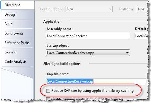
Because Silverlight uses a packaging mechanism (the .xap file), it is very easy for this package to grow over time to include many assemblies. This size is not always appropriate as multiple Silverlight applications may be sharing assemblies (from Microsoft, from third parties as well as your own). To address this problem, Silverlight 3 supports caching assemblies. A cached assembly is loaded on demand by the application via a special URI and the resulting assembly is packaged up by zipping up the file to be put on your file server. This is useful because when the assemblies are requested, they would be loaded from browser cache instead of downloading them. This is mostly useful for assemblies that are not apt to change (e.g., Silverlight SDK, Silverlight Toolkit, third parties).
Visual Studio supports application library caching via a checkbox in the Silverlight project settings as seen in Figure 9.
This option will take any Microsoft assemblies and package them as .zip files in your output directory and change the AssemblyManifest to include these new cached assemblies:
<Deployment xmlns="..."
            xmlns:x="..."
...>
  <Deployment.ExternalParts>
    <ExtensionPart Source="System.Xml.Linq.zip" />
  </Deployment.ExternalParts>
</Deployment>
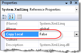
You can actually add this Deployment.ExternalParts section to your own AssemblyManifest file to add your custom assemblies to the cache. If you add your own assemblies, you can prevent them from being included in the .xap file by changing their project CopyLocal setting to false, as shown in Figure 10.
One important caveat to using assembly caching is that if you plan on using out of browser with your application, assembly caching is not compatible with out of browser. Visual Studio won’t let you enable both settings and your own assemblies will not be delivered when delivered out of browser.
Text and Fonts
The most notable change to Silverlight 3 text rendering is that text is now rendered using ClearType (anti-aliasing the text), which makes small text much more readable than it was in Silverlight 2. Using the new rendering mode is not an option and there is no way to disable it currently, but you’ll likely not want to.
While you could always use downloaded fonts in your applications, Silverlight 3 adds support for using operating system fonts in several specific situations. The biggest change here comes in its support for using East Asian fonts. These fonts must exist on the local machine and there is no way to install a font locally from Silverlight. Because of the large sizes of East Asian fonts, this can directly impact the size of your application when you localize it to Asian markets. You can see the complete list of supported East Asian fonts in the Silverlight 3 documentation.
Accessibility Changes
While Silverlight has had support for screen readers and other accessibility requirements, Silverlight had minimal support for low-sighted individuals. To address that need, Silverlight 3 now allows you to test for whether the HighContrast settings are enabled in the user’s operating system. You can test this with the SystemParameters.HighContrast property:
if (SystemParameters.HighContrast)
{
  LayoutRoot.Background =
    new SolidColorBrush(Colors.Black);
}
On Windows this option is enabled in the Control Panel’s High Contrast setting and on OS X when the “White on Black” option in enabled in Universal Access.
Visual Studio Templates
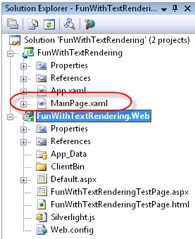
The Silverlight 3 Tools for Visual Studio make some changes that can impact the way you write Silverlight applications. The first major change is in the standard Silverlight Application template. As shown in Figure 11, the main XAML document has been changed to be MainPage.xaml (whereas in Silverlight 2 it was Page.xaml).
The MainPage.xaml makes a couple of other changes to the XAML that makes up that initial page:
<UserControl x:Class="Foo.MainPage"
             xmlns="..."
             xmlns:x="..."
             xmlns:d="..."
             xmlns:mc="..."
             mc:Ignorable="d"
             d:DesignWidth="640"
             d:DesignHeight="480">
  <Grid x:Name="LayoutRoot">

  </Grid>
</UserControl>
The Silverlight team removed the default height and width (to allow the page to resize) and replaced them with design sizes so it’s simple to edit in Blend 3. In addition, they’ve removed the white background of the LayoutRoot Grid. I think developers will welcome these changes.
Another unobvious change is in the test ASP.NET page. In Silverlight 2, the test HTML page used an object tag to host Silverlight and the test ASP.NET page contained the Silverlight ASP.NET AJAX control. In Silverlight 3, Microsoft dropped that control from the tools installer. The general recommendation is to migrate to using the object tag syntax. If you want/need to use the control, you can get a whitepaper (and link to the source for the control) from http://silverlight.net/learn/whitepapers.aspx.
The Silverlight team added a number of new project/item templates to support new Silverlight 3 features including:
-
Silverlight Navigation Application: New project that uses the navigation framework. -
Silverlight Application Class: Creates a new Application class. -
Silverlight Page: A new page for use with the navigation framework. -
Silverlight ChildWindow: A new dialog window using the ChildWindow class. -
Silverlight Template Control: Creates a new custom control with the template in the generic.xaml file. -
Silverlight Resource Dictionary: A new resource dictionary that can be merged into the app.xaml file.
Where Are We?
With only a year between releases, the Silverlight team has been really busy trying to meet all the customer requests for the new version. I hope that your request made it into the list of new features and that you are excited about writing for the Silverlight platform. If not, make sure you contact Microsoft and have your voice heard before it is too late for Silverlight 4.
Listing 1: ChildWindow XAML
<c:ChildWindow x:Class="Foo.MyDialog"
               xmlns="..."
               xmlns:x="..."
               xmlns:c="..."
               Width="400"
               Height="300"
               Title="MyDialog">
  <Grid x:Name="LayoutRoot"
        Margin="2">
    <Grid.RowDefinitions>
      <RowDefinition />
      <RowDefinition Height="Auto" />
    </Grid.RowDefinitions>
    <Button x:Name="CancelButton"
            Content="Cancel"
            Click="CancelButton_Click"
            Width="75"
            Height="23"
            HorizontalAlignment="Right"
            Margin="0,12,0,0"
            Grid.Row="1" />
    <Button x:Name="OKButton"
            Content="OK"
            Click="OKButton_Click"
            Width="75"
            Height="23"
            HorizontalAlignment="Right"
            Margin="0,12,79,0"
            Grid.Row="1" />
  </Grid>
</c:ChildWindow>
Listing 2: Projections
<StackPanel Margin="15">
  <TextBlock>Normal</TextBlock>
  <Image Source="stwhead.png" />
</StackPanel>
<StackPanel Grid.Column="1"
            Margin="15">
  <TextBlock>Matrix Projection</TextBlock>
  <Image Source="stwhead.png">
    <Image.Projection>
      <Matrix3DProjection ProjectionMatrix="2.7, .73, 0, .0075,
                                            .09, 1.88, 0, 0.0048,
                                            0, 0, 1, 0,
                                            -18, 8, 0, 1" />
    </Image.Projection>
  </Image>
</StackPanel>
<StackPanel Grid.Column="2"
            Margin="15">
  <TextBlock>Plane Projection</TextBlock>
  <Image Source="stwhead.png">
    <Image.Projection>
      <PlaneProjection RotationX="0"
                       RotationY="35"
                       RotationZ="0" />
    </Image.Projection>
  </Image>
</StackPanel>
Listing 3: Using a behavior to control a storyboard
<Grid.Resources>
  <Storyboard x:Name="moverStory">
    <DoubleAnimation To="100"
                     Storyboard.TargetName="mover"
                     Storyboard.TargetProperty="Y"/>
  </Storyboard>
</Grid.Resources>
<Rectangle Width="200"
           Height="200"
           Fill="Blue">
  <i:Interaction.Triggers>
    <i:EventTrigger EventName="MouseLeftButtonUp">
     <im:ControlStoryboardAction
                        Storyboard="{StaticResource moverStory}"/>
    </i:EventTrigger>
  </i:Interaction.Triggers>
</Rectangle>
Listing 4: RelativeSource data binding
<UserControl.Resources>
  <Style x:Key="shinyButton"
         TargetType="Button">
    <Setter Property="Template">
      <Setter.Value>
        <ControlTemplate TargetType="Button">
          <Grid>
            <Rectangle Fill="{Binding Background,
                 RelativeSource={RelativeSource TemplatedParent}}"
                       RadiusX="16"
                       RadiusY="{Binding RadiusX,
                 RelativeSource={RelativeSource Self}}" />
            <ContentPresenter VerticalAlignment="Center"
                              HorizontalAlignment="Center" />
            <Rectangle RadiusX="16"
                       RadiusY="16"
                       Margin="4">
              <Rectangle.Fill>
                <LinearGradientBrush EndPoint="0.5,1"
                                     StartPoint="0.45,-0.001">
                  <GradientStop Color="#7FFFFFFF"
                                Offset="0.011" />
                  <GradientStop Color="Transparent"
                                Offset="1" />
                </LinearGradientBrush>
              </Rectangle.Fill>
            </Rectangle>
          </Grid>
        </ControlTemplate>
      </Setter.Value>
    </Setter>
  </Style>
</UserControl.Resources>
<Grid x:Name="LayoutRoot">
  <Button Margin="22,8,0,0"
          Style="{StaticResource shinyButton}"
          Content="Button"
          Height="47"
          Background="Blue"
          HorizontalAlignment="Left"
          VerticalAlignment="Top"
          Width="107" />
</Grid>
Listing 5: An application service
public class MyApplicationService : IApplicationService
{
  static MyApplicationService _svc;

  public static MyApplicationService Current
  {
    get
    {
      return _svc;
    }
  }

  #region IApplicationService Members

  public void StartService(ApplicationServiceContext context)
  {
    _svc = this;
  }

  public void StopService()
  {
    _svc = null;
  }

  #endregion

  public string DoStuff()
  {
    return "";
  }
}
Listing 6: Sending a local message
public partial class MainPage : UserControl
{
  LocalMessageSender sender = new LocalMessageSender("myReceiver");

  public MainPage()
  {
    InitializeComponent();

    sender.SendCompleted += new
      EventHandler<SendCompletedEventArgs>(sender_SendCompleted);

    sender.SendAsync(this.theMessage.Text);
  }

  void sender_SendCompleted(object sender,SendCompletedEventArgs e)
  {
    recMessages.Items.Add(e.Response);
  }
}
Listing 7: Receiving a local message
public partial class MainPage : UserControl
{
  LocalMessageReceiver receiver = new
    LocalMessageReceiver("myReceiver");

  public MainPage()
  {
    InitializeComponent();

    receiver.MessageReceived += new
      EventHandler<MessageReceivedEventArgs>(
        receiver_MessageReceived);

    Loaded += new RoutedEventHandler(MainPage_Loaded);
  }

  void MainPage_Loaded(object sender, RoutedEventArgs e)
  {
    receiver.Listen();
  }

  void receiver_MessageReceived(object sender,
                                MessageReceivedEventArgs e)
  {
    recMessages.Items.Add(e.Message);
    e.Response = string.Concat("Received: ", e.Message);
  }

}