I’d guess that everyone reading this magazine has heard of Silverlight™.
I’ll also guess that not everyone has jumped at the opportunity to “play” with something that had been in beta. The good news is that Silverlight 1.0 is now released! I’ve spent a lot of time with Silverlight since Microsoft made the Community Technology Preview version available as WPF/E. The delta between a Web site without Silverlight and a Web site that allows you to experience the wonderfulness of Silverlight is huge. Before you finish reading this article, I hope you’ll realize how very easy it is to bridge that gap.
Some Basics
Silverlight is a small ActiveX control that gets instantiated onto your Web page, maybe in more than one place. During the instantiation, the control is told to take direction from an XML file. That’s all there is to it! Everything else is involved in either the wiring-up of getting the instantiation going or learning how to “give directions” to the control.
If you set the canvas background property to #FFC0C0C0, you will get a gray background that enables you to see the edges of the canvas while working with objects.
To keep this discussion simple, I’ll specifically discuss Silverlight 1.0. Since you can use JavaScript to code Silverlight, I don’t need to talk about pre-release versions of Visual Studio.
To get the pieces necessary to add Silverlight to your Web page, first go to http://www.silverlight.net">http://www.silverlight.net. Choose the Get Started menu. On the next page, under the section called DOWNLOAD THE RUNTIME AND TOOLS, scroll down to "Software Development Kit" and click the link for the "Microsoft Silverlight 1.0 Software Development Kit."
Extract the files downloaded to a folder of your choice. There’s plenty of information in there:
- QuickStart. A great tutorial. When you finish this article, go through the QuickStart, you won’t be disappointed.
- Silverlight.chm. The Help file documentation. Many sections have example code.
- Resources. JavaScript and schema files.
For the purposes of this article, you want the Silverlight.js file in the Resources folder.
The HTML file
So that everyone begins the same, let me supply a base HTML file for the starter page I’ll use in this article (Listing 1).
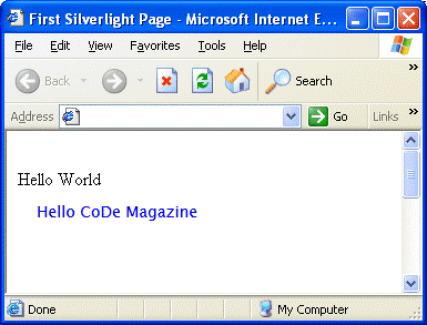
If you save the code for Listing 1 to a file with an .htm or .html extension, either drag that file to a browser window or double-click the file in an Explorer window. You should see the browser window of your choice open and the text, "Hello World".
Adding Silverlight
To add Silverlight to this page, you need to do four things:
- Add a link to Silverlight.js.
- Add a DIV tag for the ActiveX control.
- Instantiate a control into the DIV tag.
- Create an XML file to direct the control.
The first three are fairly simple and are highlighted in color in Listing 2.
The code shown in Listing 2 is the template that I use for pages. I tweak it from here, but for purposes of this article, you can use this code. I will explain the tweaks below.
"Add a link to Silverlight.js" is in red, and is simply a link to the location of the Silverlight.js file mentioned in the downloaded resources. I have a js folder containing any external JavaScript files, and that’s where I put Silverlight.js, hence the js/Silverlight.js reference.
"Add a DIV tag for the ActiveX control" is next and in green. This is a standard DIV tag declaration with an ID label of your choice. I chose a background of white just because that’s the normal color I use for article pages. Next is a bit of JavaScript that declares a variable you’ll be using in a minute. The variable is the document element defined by the ID label.
If you have multiple canvases on your page, you will need multiple unique DIV tag IDs and unique variable names.
"Instantiate a control into the DIV tag" is the most complex part of the HTML side of this process and is in blue. Remember this is a template and you can therefore just drop it into place. You can do this instantiation in a couple different ways. The way I am explaining is the most complex, but gives you the most control. The QuickStart you downloaded with the SDK advocates the use of an external JavaScript module. If you have multiple Silverlight canvases you will end up with either multiple external files or multiple sections in one external file. I’ve chosen to keep this all inside the HTML file that it’s associated with. The approach to take in this section depends on how you plan to present and use your site.
The following is a breakout explanation of each section in createObjectEx as used in this article. Changes to the files as advocated by the QuickStart will have similar sections.
source: ‘xaml/HelloWorld.xml’
The source defines the location of the XAML file controlling the ActiveX control. I have placed this in a subfolder named XAML and have given it the file extension .xml. Multiple canvas applications would need multiple XAML files.
parentElement:pe1
The parentElement is a reference to the variable that the DIV tag defines for the control. Multiple canvas applications would need multiple DIV tags and, therefore, unique parentElements.
id:’Ag1’
This ID is a unique ID for the object.
width:’300’
The width of the canvas-depends upon the project.
height:’300’
The height of the canvas-depends upon the project.
background:’#FFFFFFFF’
The color of the canvas itself, including the opacity. In this case, the opacity is 100% and the color is white.
isWindowless:’true’
If this is true and the background color of the canvas has an alpha value, Silverlight blends with the HTML page.
framerate:’24’
Framerate is the maximum number of frames to display per second. 24 is the default and the maximum is 64.
version:’1.0’
The version required to run the page.
events
The default values are listed.
I’ve glossed over “events” and shown the default for “framerate”. The documentation details other parameters in CreateObjectEx that you might want to look at after you get more involved with Silverlight. For the time being, what is here will get the job done.
XAML
The XAML file that Silverlight uses to control the object is the last thing it needs to convert your HTML.
It would take a series of articles to fully explain XAML, so I’m only going to explain what I show. The Silverlight.chm file that you downloaded with the SDK and the examples in the QuickStart have a lot of good information about this as well.
You could have set the opacity of the outer Rectangle in this example to 0 and it would still pick up the MouseLeave message, yet be invisible to the user.
For now, Listing 3 shows a good basic XAML template.
“Canvas” is the basic container object for XAML, and as such, you need an outer canvas to hold anything.
The two xmlns lines define the XML syntax that you will use. The xmlns:x one allows you to give your objects names that you can reference in JavaScript.
“TextBlock” is one of the simpler objects in XAML and displays text at a location on the canvas. As you can see, I’ve named this text block to be "HelloText" and I’m using the default font, size 14. The upper-left corner of the box bounding the text is 17 pixels from the left of the canvas border and 10 pixels from the top. The Foreground color is Blue and the Text is "Hello CoDe Magazine".
Since Beta 01, I’ve been giving my XAML files an .xml extension so my editor gives me nice color-coded template editing and lets me know if I’ve left off something important. You can also give the file the extension .xaml.
Putting it Together
If you have Silverlight.js in its js folder and HelloWorld.xml in its XAML folder, at this point, you should be able to double-click your HTML file and produce the screenshot shown in Figure 1.
Take a Break
Now would be a good time to take a break, and then come back and play with this example some more. Maybe change the text color or place a rectangle around it. Browse through the QuickStart or Silverlight.chm and experiment a little with the XAML file to start getting familiar with the syntax and what you can do, and then come back and join me for the second part.
Considerations
When you download the SDK and install Silverlight 1.0, one of the choices will be to install the Visual Studio 2005 template for Silverlight. As a general rule, I do this; however, as I’ve demonstrated here and in the next section, you don’t have to fire up Visual Studio at all to use Silverlight.
If you are putting Silverlight into an existing Web page, the template will be of no use to you because you simply need to add the Silverlight.js link, the DIV tag for locating the control, and the JavaScript to instantiate it as shown above.
If you are building a new page, by all means investigate the use of the template for Visual Studio 2005. The template will place slightly different code in your page. After reviewing what I’ve shown above, there should be no problems understanding what the template produces.
Part 2
In part 1, I showed how to insert a basic Silverlight canvas into a Web page. In Part 2, I’m going to extend that basic canvas into something useful.
If you pick up a Web template from one of the popular sites and want to use that as a MasterPage, you might want to add a toolbar to navigate between major sections of your site. I’m going to envision a MasterPage with a Header across the top. Just beneath it is a Navigation Bar, and then below that is all the sub-page content.
Using the '.5' locations for the delineation lines is a trick to avoid antialiasing of the 1-pixel line into effectively 2 pixels.
To avoid making the HTML difficult to read, or confusing the Silverlight additions with part of the page content, I’m simply going to extend the canvas of Part 1 a bit and modify the XAML to produce a sample Navigation Bar.
Requirements
My requirements for the Navigation Bar are as follows:
- Provide UI characteristics for the Navigation Bar that look standard to users for ease of use.
- Write the XAML and JavaScript so that the object names from the XAML do not appear in the JavaScript, providing simple extensibility.
When you press a button on an application, there are a few things that happen that largely go unnoticed unless they are missing. These are the actions that convince your eyes that a “press” action has taken place and also provide interaction between the mouse cursor and the button to expand the believability of the whole process.
It’s not a requirement to provide rollover effects as the mouse crosses a button, but when using “flat” buttons, such as in IE7, providing a rollover is a good user experience.
To convince the eye that a button is “pressed,” designers typically move the artwork down and to the right by one pixel. On elaborate desktop applications, the artwork may even show a depressed image. Normally this is not done on a Web application, but the down and right effect is fairly standard. You can easily see and test this by pressing down but not releasing the left mouse on a button, such as a submit button on a form. Pushing down will show the pressed state of the button. If you now pull the mouse away from the area of the button, the button will change back to the normal position and coloration. With the mouse still held down, you can move back and forth over the button artwork to see the state change. This is the best way to test your state changes as you work with new configurations of Silverlight.
One extra item comes into play in this situation: A button is only “clicked” if you press and release the mouse inside the button artwork. I can press down, pull away, move the mouse all around, and then move back inside the button, release it, and still expect the button action to take place. However, if I press down, move away from the button, and then release the mouse prior to returning to the button, no “click” action takes place.
These mouse/artwork interactions must take place in your Navigation Bar to live up to the expectations of your users.
With Silverlight, there is one more UI item that you must handle: What do you do if the mouse exits the canvas completely? This is a situation that leaves the mouse in an unknown state. The best you can do for the user is to return the application to a default state and allow them to continue from there.
JavaScript
JavaScript handles this code in the HTML file and utilizes two functions and two local variables:
- sender.CaptureMouse() Forces an object to receive mouse messages even if the mouse is not inside the object. You need this to know what is going on with the mouse after a mouse press on a button.
- sender.releaseMouseCapture() Releases the forced capture of mouse messages by an object to make the mouse messages globally available.
- sCaptured A local string variable with the name of the object that has capture.
- sState A local string variable holding the name of the state the application is in. States used are “Normal”, “Rollover”, and “Pressed”.
Using the functions and variables above in pseudo code, you can see what the JavaScript functions look like in this snippet:
MouseEnterButton
{
   if this button has the mouse
      set state to "Pressed"
      set button display to pressed
   else
      set state to "Rollover"
      set button display to rollover

   set button image to highlighted image
}

MouseLeaveButton
{
   if state is "Pressed"
      set button position to normal

   set button image to normal image
   set button display to normal
   set state to "Normal"
}

LeftMouseDown
{
   Button captures the mouse
   Captured set to Button name
   State set to "Pressed"

   Set button display to pressed
}

LeftMouseUp
{
   if state is "Pressed"
      set button position to normal
      execute button action

   button releases capture
   Captured set to blank
   State set to "Normal"
   set button display to normal
}

MouseExitCanvas
{
   Captured set to blank
   State set to "Normal"
}
You can see, for example, that the only way the button action is executed is if a user releases the left mouse while in the "Pressed" state. Examining the MouseEnter and MouseLeave code shows that the state is only "Pressed" if the mouse is inside the button that has capture. So that resolves the problem surrounding pressing and moving the mouse before release.
You can examine the other state and button interactions using this simplified code as well.
The JavaScript code in the HTML file has as many comments as it does lines of code, so it should be very easy to read. More important to this examination is how the JavaScript and XAML interact, which I will now investigate.
Desired Solution
Let me first show you a few screen shots of the Navigation Bar in action before this discussion gets too detailed.
Figure 2 shows the Navigation Bar in its default state.

As the mouse rolls over the "Configure" artwork or text, the Navigation Bar changes to show the “Configure” button highlighted as shown in Figure 3. The change is subtle: The image changes to a highlighted image and the background receives an off-white color.

If you press down the mouse on the "Configure" artwork or text, the Navigation Bar changes to that shown in Figure 4. Now the template displaces the image, text, and rectangle to the right and down, the background becomes yellow, and you can see a detectable border around the artwork and text.

Modified XAML
The XAML file for this page contains:
- A rectangle the size of the outer canvas used to cause the "MouseExitCanvas" function.
- Two Lines to delineate the upper and lower borders of the Navigation Bar.
- One Canvas for each of the five buttons. These canvases are identical except for naming, placement, image name, and text.
The outer rectangle is:
<Rectangle Canvas.Left="0"
           Canvas.Top="0"
           Width="500"
           Height="300"
           Stroke="White"
           StrokeThickness="1"
           MouseLeave="MouseExitCanvas" />
This places a single-pixel, white-bordered rectangle at the outermost pixel all the way around the outer canvas. The only purpose for this rectangle is the MouseLeave handler definition. If the mouse leaves the rectangle, it is off the canvas and that causes problems if you do not handle it properly.
Since the background of the page is white, setting the Stroke of this Rectangle to white makes it invisible.
The two delineation lines are:
<Line Stroke="lightgray"
             StrokeThickness="1"
             X1=".5" Y1="2.5"
             X2="455.5" Y2="2.5"/>

<Line Stroke="lightgray"
             StrokeThickness="1"
             X1=".5" Y1="37.5"
             X2="455.5" Y2="37.5"/>
These are 1-pixel width, light gray lines drawn across the canvas.
Each of the button canvases is similar to this one for ButtonOne:
<Canvas  x:Name="ButtonOne"
         Canvas.Left="5"
         Canvas.Top="5"
         MouseEnter="MouseEnterButton"
         MouseLeave="MouseLeaveButton"
         MouseLeftButtonDown="LeftMouseDown"
         MouseLeftButtonUp="LeftMouseUp"
         Cursor="Hand">

      <Rectangle x:Name="ButtonOneRect"
                 Width="70"
                 Height="30"
                 RadiusX="5"
                 RadiusY="5"
                 StrokeThickness="1"
                 Stroke="White"
                 Fill="White"/>

      <Image  x:Name="ButtonOneImage"
                 Source="images/Save.png"
                 Canvas.Left="3"
                 Canvas.Top="3"
                 Tag="Save"/>

      <TextBlock x:Name="ButtonOneText"
                 Canvas.Left="32"
                 Canvas.Top="5"
                 FontSize="16"
                 Foreground="Black"
                 Text="Files" />
 </Canvas>
The bold red text is a visual of the only thing that changes from one button canvas to the next.
The template contains each of the buttons within a sub-canvas. This allows the canvas to move and the objects contained within the canvas to move with it. The containing canvas also is the object that asserts the mouse events as shown: MouseEnter, MouseLeave, MouseLeftButtonDown, and MouseLeftButtonUp. These events point to the JavaScript methods and all five button canvases point to the same JavaScript functions.
The only differences between the container canvases for the individual buttons is the x:Name and Canvas.Left location. Each is at Canvas.Top="5", but they progress across the canvas with spacing controlled by the size of the artwork and text, determined at design time.
Each button has a round-cornered rectangle behind the artwork and text that the template fills with an off-white color when you roll over it and a yellow color when you press it. In addition, the template paints the rectangle border light gray when you press it. The Canvas.Left and Canvas.Top for the rectangle default to the container canvas, but the artwork and text control the width and height.
Each button has an Image object. For the images chosen, the Canvas.Left and Canvas.Top locations all must match. Use the Tag element of the Image object to hold the root name of the image being displayed, which I will discuss below.
Each button has a TextBlock. For the images chosen, the Canvas.Top value is consistent and the Canvas.Left value is dependent upon the artwork. All are the same font size and color. The text of the TextBlock is the displayed text that you associated with the artwork. This object is the only one that does not need a name in the current design, but I assigned one to it just in case.
The canvas elements are all consistently named to make it simple to not only navigate the XAML, but also to find the objects from the JavaScript.
For instance, for the first button on the left, I named the container canvas "ButtonOne".
- The Rectangle is "ButtonOneRect".
- The Image is "ButtonOneImage".
- The TextBlock is "ButtonOneText".
When the template executes the LeftMouseDown handler, Silverlight passes it two values:
function LeftMouseDown(sender, args)
sender is the object that caused the handler to fire, and in the case of a mouse message, args contains the location of the mouse.
sender.Name for the ButtonTwo container canvas is "ButtonTwo".
The Rectangle associated with ButtonTwo is "ButtonTwoRect", and at run time, you can find the Rectangle using:
sender.Name + "Rect"
In a like manner, the Image associated with ButtonTwo is "ButtonTwoImage".
Using any valid object will return the object of that name:
sender.findName("object name")
You build up the base image name used to switch images at run time as follows:
sender.findName(sender.name + "Image").Tag
In the case of ButtonTwo, sender.Name is "ButtonTwo", so this becomes:
sender.findName("ButtonTwoImage").Tag
The Tag element for ButtonTwoImage is "Search", so the base image for ButtonTwo is Search, and the two images used for ButtonTwo are:
"images/Search.png"
and:
"images/Search_h.png"
which you can easily build up at run time using the tag value.
Using the object names and the Tag element of the Image object provides the capability to have only one set of button-agnostic JavaScript for handling the entire page. This not only makes the code smaller and easier to read, but extending the Navigation Bar becomes simple.
Possible Enhancements
A few quick enhancements to this come to mind.
You could set up a button or configuration element for "Large/Small" icons. You could easily handle having two sets of icons without changing the JavaScript by changing the Tag value for the Icon to be "SearchSmall", for instance, and the font size for the TextBlock changed accordingly based on configuration selection. Similarly, you could work out choices for Icon-only or Text-only.
Tooltips might be an interesting puzzle because of interaction between the rollover state and enabling a tooltip canvas.
Adding a Tag element to each container canvas containing a page or URL could allow navigation from within the LeftMouseUp function, simply by reading the Tag.
Conclusion
I hope I’ve shown you that you can easily use Silverlight 1.0 to extend your HTML or ASPX page into the next generation of usability without an exorbitant amount of effort or knowledge. Starting with a few simple XAML elements and expanding element by element allows you to incrementally test and build with the foreknowledge of success at each step.
Looking into the future, everything learned and used in this article is directly applicable to Silverlight 1.1, when the time comes to move into a managed code environment.
Stay in the 'Light!