Visual FoxPro 8 offers many new features and opportunities to make life easier.
In this article Rick describes how to build a native VFP-based status bar that fixes some of the problems found in the Windows Common Control OCX version (MSCOMCTL.OCX) that ships with VFP and other development tools. This article introduces several new VFP 8 features: Collections, the Empty object, AddProperty() and BindEvents(), and shows how to integrate these new features into a useful component.
One of the really cool features of VFP 8 is its ability to work with Windows Themes and provide fully themed user interfaces. Some people say that XP themes are nothing more than fancy window dressing that suck up CPU cycles and screen real estate, but once you start using themes it's hard to look back on the classic Windows interface and not have it feel archaic.
Visual FoxPro 8 now supports fully themed controls for all of its own native controls. Unfortunately, the same is not true of the Common Controls ActiveX controls (MSCOMCTL.OCX) that many of us use to build enhanced user interfaces for our users. Even when using a Manifest file (see sidebar), the various controls like the treeview, listview, statusbar, progressbar and others do not inherit the Windows XP look and feel and instead render in the 'classic' style, which looks a little bit funky when you run them inside an otherwise themed application. To me this is most noticeable with the StatusBar control, which gives away a non-XP compliant application immediately.
It's too bad we have a nice XP style interface for our forms but are stuck with statusbars, treeviews, and listviews that are stuck in the 'classic' era.
What's wrong with MSCOMCTL StatusBar?
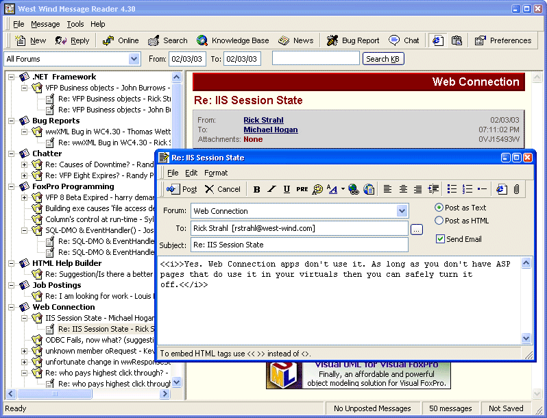
The StatusBar ActiveX control has always had a number of problems. The most obvious is that the StatusBar does not properly show the sizing grip even when you enable the sizing grip in the control. Well, it does ? sometimes. If you define the control in code and add it to the form and run it in an MDI form inside of the main VFP or another Fox application window, then it works. But in a Top Level Form the sizing grip never shows. Many of us have gotten around this by utilizing an image and embedding it on the statusbar (see Figure 1).
I use the StatusBar control in almost all of my applications and in many of them it has serious timing problems with form rendering. The result is that the StatusBar often doesn't show up correctly ? either completely missing or missing the panels ? when the form first loads. It will show up correctly after the form is resized for the first time. To work around this funky (and very inconsistent) behavior, you need to insert several DoEvents and refresh the StatusBar from the Form's Activate event. And even then it sometimes doesn't behave correctly.
Now with VFP 8 supporting Windows Themes, the most visible problem is that the StatusBar isn't themed. Figure 1 shows a VFP 8 application running under XP with the nice themed user interface, but a status bar that is stuck in Windows Classic mode, which looks funky and rather unprofessional.
Using a VFP based wwStatusBar class
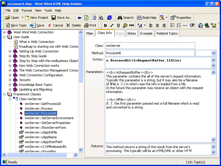
To work around this problem, I decided to ditch the ActiveX control and write a new VFP class that simulates a StatusBar using VFP code. The control can render in XP style, in 'classic' style, and in a modified classic style that mixes XP and classic styles. It doesn't mimic all of the functionality of the ActiveX control, but implements most of the important functionality in an easy to use container class. Figure 2 shows a VFP application running with the wwStatusBar control in XP themes mode.
Here's how the end result works: The class is implemented as a VFP Container class, which builds a panel collection and then dynamically renders the collection's content into various dynamically added form controls.
To use the control, you first you drop the wwStatusBar control onto a form. The next step is to define the panels, which you can add to the Init method of either the form or the wwStatusBar class. Listing 1 uses the latter.
The AddPanel method receives 4 parameters, the last two of which are optional: The text, the width, whether you want the width to stretch, and the text alignment. The method then returns an instance of a panel object which you can further customize. Note that the third parameter ? the stretch value ? can only be assigned to a single panel and causes that panel to take up all the remaining space of the status bar. In Figure 2, the first panel springs and resizes to the width of the form while the second panel remains a fixed size.
Collections make all sorts of list based operations much easier to use by providing an intuitive way to manipulate the list.
You can also configure the StatusBar overall by setting the backcolor, font, and fontsize, which will be passed down to the individual objects. In addition, you can set the nStyle property to determine how the bar renders (see Table 1).
To modify a panel, you have two options. You can use the UpdatePanel method:
THISFORM.oStatus.Updatepanel(2,"New Text", ;
"bmp\classheader.gif")
which automatically updates the text and icon (optional) based on the parameters passed. You can also access the Panels collection directly. The Panels collection consists of custom Panel objects which contain the following properties: Text, Width, Spring, Align (same as VFP's Alignment property), and Icon. You can manipulate the panel like this:
loPanel = THISFORM.oStatus.Panels(2)
loPanel.Text = "New Text"
loPanel.Icon = "bmp\ClassMethod.gif"
loPanel.Width = 300
THISFORM.oStatus.RenderPanels()
If you don't modify the size of the Panel you can use the RenderPanel(lnPanel) method which is more efficient. Anytime the size of a panel changes however, the entire status bar must be redrawn by calling RenderPanels().
By default the StatusBar can automatically resize itself and stay anchored to the bottom of the form. Note that at design time the status bar just sits anywhere on the form, but at runtime the Resize() method knows how to automatically resize the StatusBar. If lAutoResize is .T. wwStatusBar uses BindEvent() to hook the parent container's Resize event and automatically resizes when the form is resized. You can override this auto resizing behavior by setting the flag to .F. and manually calling wwStatusBar::Resize() when needed. This may be important if your form's Resize() handles many different items on a form and the order of the various resize operations is important.
Finally, you can implement PanelClick() events that fire when you click on any of the panels. An event will fire and pass the number of the panel, at which point you can change the text or otherwise manipulate the panel.
How does it work?
The wwStatusBar class is based on a container control that hosts several controls that together simulate Statusbar operation. It's made of disabled, non-themed, transparent textbox controls and a few images that make up the sizing grips and separators, which are placed onto the container in just the right order. The new VFP Collection class is used to manage the panels. The process begins with the AddPanel method (Listing 2), which creates a new object to add to the Panels Collection:
AddPanel adds a new item to the Panels Collection, but it doesn't render anything yet. Collections make life much easier when you are building lists like the Panels here. In VFP 7.0 I might have used an array, which is more work to size and then parse and retrieve values from. With a collection, the process of adding and retrieving items from the list is much easier.
The new 'Empty' object and ADDPROPERTY command make it possible to dynamically build clean objects from scratch at runtime.
Notice also the new Empty object which creates an object with no properties or methods. It's similar to a SCATTER NAME object we could create in VFP 7 from a table record, except now we can create it directly and with no properties on it at all. The new AddProperty() function then allows you to dynamically add properties to this object. AddProperty() works on any object, but it's specifically designed for Empty and SCATTER NAME objects which don't have AddProperty methods. To match, there's also a RemoveProperty() function in VFP 8.
To display the panels in the container the RenderPanels method is called. RenderPanels() walks through the Collection, figures out the total width of the bar and then fits the panels into the available space. RenderPanels() figures the size and walks through the collection, but then delegates the actual drawing to the RenderPanel() method (Listing 3).
There's nothing tricky about this method, which only serves to dynamically throw controls on the container and format and size them correctly and in the correct order. First, a textbox is put down. Then if an icon is specified, it's created at the beginning of the panel and overlaid and the text adjusted to skirt the icon. Finally, a panel separator is laid down.
When the form or container is resized, the status bar should resize with it and the code that handles this (Listing 4) resizes the statusbar to fit its parent container's width and locate itself on the bottom of it:
You can manually call this Resize() method, but by default the StatusBar automatically resizes itself based on the Parent container's resize. I used the new VFP 8 BINDEVENT() function in the Init() of the control to tie the StatusBar's Resize method to the parent container's Resize:
IF this.lAutoResize
   BINDEVENT(THIS.Parent,"Resize",THIS,"Resize")
ENDIF
This simple command tells VFP to monitor the Resize event of the parent container and call the Resize method on the wwStatusBar (THIS) if it fires. BINDEVENT() is a very powerful tool to allow user controls to handle events fired by parent controls, and Resize is a good example of an event that can be trapped and put to use in child controls without having to write code in the parent container.
wwStatusBar can figure out automatically whether it's running under Themes or not and render the appropriate view. To do so, it uses the new SYS(2700) function which returns .T. if Themes are active. The nStyle_Assign method deals with changes to the nStyle value and internally delegates to an nDisplayMode property that contains the real display mode. It uses XP Style for Themes and the modified Classic mode for 'classic' apps, which displays the thumb but doesn't use the block panels.
wwStatusBar also implements PanelClick events, which require a little more work. To do this, I originally figured I could just use the Click event on the textboxes I used as panels, but Click() doesn't fire on disabled controls (which I used to keep the controls transparent and inactive). Instead, I had to use the control's own MouseDown event which fires and bubbles up from the text controls to the container as shown in Listing 5.
This code simply looks through the Panels collection and tries to find the panel that the click occurred in based on the coordinates. If found, it passes on the event to the PanelClick method. You can handle the 'event' by overriding the PanelClick method on the control:
LPARAMETERS lnPanel
WAIT WINDOW "Here's my panelclick " + ;
   TRANSFORM(lnPanel) + CHR(13) + ;
   THIS.Panels(lnPanel).Text
Some Limitations
Keep in mind that this is a minimalist implementation that isn't completely event enabled. If you change certain properties of the wwStatusBar object, make sure that you always call RenderPanel() or RenderPanels() to refresh the status bar display properly. RenderPanels() is required anytime the sizes of panels change.
In design mode the status bar displays as a gray container and it doesn't automatically resize and attach itself to the bottom of a form like the ActiveX control does. The display mode for the control is set to Opaque by default, which guarantees that the sizing grips look proper regardless of color scheme or theme chosen by the user. In fact, most apps I checked (including IE) do not have the status bar follow the Windows color scheme. To get the best look with standard color schemes, however, Transparent will likely work better, or you can explicitly choose a color for your form that works with any mode. I suggest you play with the different modes and the wwStatusBar BackStyle property to see what works best for you.
The new BINDEVENT function makes it possible to build components that can encapsulate parent object manipulation right into the component without requiring the parent to take action.
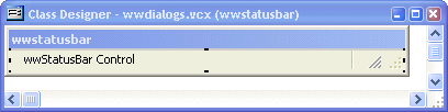
Finally, realize that wwStatusBar has a dependency on the images that are used to render the sizing grips and separators. Figure 4 shows the wwStatusBar with the embedded invisible image controls that hold the 3 required images. I chose to include them in the container to force these images to build into the project so you don't have to ship external files. The default path for these images is in a relative .\BMPS folder of the build directory. Make sure you include these images or you'll end up with broken images.
VFP 8 makes it easy
When I set out to create a proper status bar I wasn't planning on making it VFP 8 only. But after getting started, I realized right away that collections and the new Empty object would make this job a lot easier (even though this implementation barely pushes the collection functionality). This really paid off in code reduction and time saved. Some things would not have been easily done or would have been impossible in VFP 7, especially the event binding and the transparent image display of Gifs.
I hope you find this status bar control useful. It's simple and provides the most common functionality in a small package. And best of all, it does it with VFP code that you can easily adjust to your needs if necessary.
As always, if you have any questions or comments about this article, please post them on our message board at: http://www.west-wind.com/wwThreads/default.asp?forum=Code+Magazine">http://www.west-wind.com/wwThreads/default.asp?forum=Code+Magazine.