
One of the great features of all XAML dialects (and their underlying technologies) is the awesome power that comes with the provided layout engine. Unlike in many of the other UI development technologies, all XAML variations (WPF, Universal Windows Apps, etc.) provide a rich and flexible way of laying out elements on the screen in ways that range from simple, hand-coded UIs to completely automated and customized approaches. Where other systems provide few or no choices to lay out elements on the screen (such as WinForm's fixed position and size approach), and others offer just a handful of options (HTML's flow layout “with variations” comes to mind), XAML technologies provide a very rich layout system. You can position elements in absolute terms inside of Canvas or Grid containers. You can opt for flow or stack layouts and even lay out rich text documents. And it's even possible to create custom layout approaches that lay out screens for business applications (for instance, consider my article “Super Productivity: Using WPF's Automatic Layout Features in Business Applications” at http://www.codemag.com/Article/1011071, which is just as applicable in today's XAML dialects as it was a few years ago when I wrote the article).
When used correctly, the layout system is the very feature that makes XAML more productive than other UI technology and using it incorrectly qualifies as an anti-pattern. That's what takes me to the current installment of this article series.
When used correctly, the layout system is the very feature that makes XAML more productive than other UI technologies.
Layout Fundamentals
The basic idea behind “layout” (the act of positioning elements on the screen) in XAML follows a pretty simple pattern: UI elements are placed inside of other UI elements (containers). The container is the element that decides where its child elements are positioned. It does this based on its own rules, but also by taking the properties and attributes of the child element into consideration. This process is repeated ad-nauseam in a hierarchical fashion, from the largest of elements down to the smallest controls.
Let's look at a few simple examples. The root of many XAML apps is an object such as a Window or a Page. Let's pick WPF's Window UI element as an example. Inside of a Window, you can place exactly one child element. (Containers come in two variations: those that contain a single element and those that contain multiple elements). For instance, you could put a Button inside the Window. The code for such a set up would look like this (namespace shortened to keep the example readable):
<Window xmlns="http://..." >
    <Button/>
</Window>
As you can see, I haven't defined a placement or a size for the button. Instead, the button's position is automatically set by the window object. Because the window object doesn't really know what to do with the button, it makes the only choice that makes sense for any object that's limited to containing a single child: It gives the button the entire space available within the window. In other words, the button's size fills 100% of the available space in the window, no matter how big the window is. When the user resizes the window, the button is resized as well.
You could provide a bit more information to the layout engine. For instance, you could set the Margin property of the button. If you set the margin to 100 pixels on all four sides, the button takes up the available space, minus the defined margin, and it will continue to do so even after the user resizes the window.
I see few correct uses of the layout system in the wild.
The Margin property is only one example for a property that impacts layout. The point is that it's up to the container (the Window object in this case) to define where its children go. The child elements may have properties set that impact the placement, but it's still up to the container to decide where child elements go.
Of course, most scenarios call for more complex user interfaces than windows that are fully occupied by a single giant button. Instead, the generally accepted approach is to put a different element into the window that, in turn, can contain an unlimited amount of child elements and perform a certain kind of layout. This is Microsoft's way of nudging us toward the idea that the first decision that's made in UI development is which root layout approach to choose. A very common approach is to put a (confusingly named) Grid element into the window and then add the child elements inside that object:
<Window xmlns="http://..." >
    <Grid>
    <Button Content="Hello" Margin="10,10,0,0"
            VerticalAlignment="Top"
            HorizontalAlignment="Left"/>
    <Button Content="World" Margin="10,40,0,0"
            VerticalAlignment="Top"
            HorizontalAlignment="Left" />
    </Grid>
</Window>
In this set up, the window hosts the grid and gives it 100% of the available space (just like the button got 100% of the available space). The grid, in turn, decides where the two buttons go that are inside of the grid. The grid does this by looking at a variety of properties on the child elements, such as their alignment, and then places them accordingly. The buttons defined in this example are positioned 10 pixels from the left, and 10 and 40 pixels from the top edge of the grid respectively. Because the buttons are top- and left-aligned, the grid asks the buttons for their desired size and sets the height and width of those elements accordingly (which means that they will have just enough room to accommodate their contents). Had you set the horizontal and vertical alignments differently, the outcome would have been different as well. For instance, if the horizontal alignment were set to stretch, the button would stretch all the way across the grid with 0 pixel space on the right (because the right margin is set to 0).
Oh, and by the way, the buttons themselves were able to indicate their space requirement simply because their content is a sub-element (which happens to be a string in this case) and which the button lays out. In other words: The button is also a layout container (capable of holding a single element, just like the window object). Any XAML UI can really be thought of as a giant layout hierarchy.
It doesn't stop there. Try replacing the grid element in the above example with a StackPanel. This container arranges the buttons in a vertical top-to-bottom stack. Change the Orientation property on the StackPanel to Horizontal, and the stack arranges the individual buttons left to right, rather than top to bottom. Change the StackPanel to a WrapPanel, and you end up with a flowing layout, where each button is flown in left-to-right until there's no more horizontal space and it flows to the next line, much like document layout, or the layout on an HTML page.
But things get better! Consider a TabControl, for instance. This control is merely a layout container that contains a collection of TabItems (individual pages). The TabControl takes the Header elements from the contained TabItem elements and shows them across the top one after the other (creating a “tabbed dialog with multiple pages” appearance). The TabControl also chooses to show the selected page in the remaining main space, hiding all other child elements, until a different page is selected and the layout is refreshed. (Note: This is the default appearance and behavior. It's possible not only to move the headers to different locations, but to completely change the appearance of a tab control by replacing its layout logic through a mechanism called “items panel templating.” But that's a different story and not the focus of this article). Each TabItem in turn contains - you guessed it - a single main element that's given the entire space assigned to the tab item content by the TabControl. It's common to use a layout panel (such as a Grid) as the TabItem's content, which allows putting any number of elements into each page of a tab control. At this point, the whole story starts over and you can put arbitrary elements into the container and continue this whole hierarchy without limitation.
I find the TabControl/TabItem example particularly interesting because it highlights that “layout” can be more sophisticated than just statically putting elements at a certain position on the screen. TabControls handle both headers and content elements. They also arbitrarily hide and show different UI elements as needed. Layout combines appearance with behavior in very powerful ways.
Many developers don't realize it, but this approach is what makes XAML so exceptionally powerful.
Many developers don't realize it, but this very approach is what makes XAML so exceptionally powerful. Developers can create their own layout elements. In my XAML productivity article, I showed how to create custom layout containers that can lay out entire data entry dialogs and more.
Breaking the Layout Accidently
XAML layout drives home the point that with great power comes great responsibility. Crafty and knowledgeable XAML developers can use these techniques to program circles around other technologies. Unfortunately, I also often see developers who're thoroughly confused by the layout features. Or, to be more exact, they're unaware that there is such a thing as a “layout engine”. They simply assume that they should manually place elements on the screen. They tend to be befuddled by “this odd grid element in the window,” and they end up with strange layout behavior that's inexplicable to them and often only surfaces during testing (or later). This is unfortunate, because understanding the layout system isn't rocket science once you're aware that a layout system exists.
There are many different ways to get layout wrong in XAML. A very common problem is related to horizontal and vertical alignment settings, especially when visual designers are used rather than coding XAML by hand. Keep in mind that many XAML layout containers (such as the Grid) use these settings to determine where to anchor the element. A horizontal alignment setting (HorizontalAlignment property) of “Left” usually positions the element relative to the left edge of the container, with the distance from the edge determined by the left margin. The width of the control is then based either on the Width property of the element, or, when the width isn't set, is auto-determined based on the contents of the control (such as the space requirements of the caption of a button). Whatever space remains to the right of the control is thus not part of the equation. There may be a visual space on the right side of the control, or there may not be. In fact, if the control is too wide to fit, it will just “hang out” of the right side of the container (and likely be cut off, although some containers allow keeping even overhanging elements visible). The right margin is completely ignored in this case.
Note that setting the horizontal alignment to stretch changes the layout entirely! With a stretch-setting, the container doesn't even try to auto-determine the width of the element and instead sizes it to a certain margin. If the right margin is set to 10 pixels, for instance, the width of the element is always calculated so that it results in stretching all the way across to 10 pixels shy of the right edge of the container. This is also true when the user resizes the UI. The layout simply updates and keeps stretching the element across to keep the margin constant by adjusting the width of the control.
Now imagine the following scenario: A developer creates a data-entry UI with many text boxes and similar controls. Great care is taken to position all the elements so that they have the same width and their edges align. However, when the application is run and the UI is resized, some UI elements stretch and others stay in place, causing complete havoc and broken user interfaces. What happened? Most likely, the different elements had different alignment settings! An element that's set to appear 200 pixels wide may appear so because it's left-aligned and has a width of 200 pixels, or it may be stretch-aligned with a right-margin that's perfect to make it 200 pixels wide in the designer. When the app is executed and the container sizes change, the left-aligned controls remain at their widths, and the stretch-aligned controls grow and shrink, possibly overlaying other controls or disappearing completely. I see this problem happening regularly in real-world applications because it's easy to accidently “anchor” elements to the right edge in visual designers (which really merely sets the alignment). Some UI design tools even try to make smart guesses as to where to anchor controls (often causing two very similar controls to have different alignment settings). Luckily, the overall problem is easily fixed. Simply check the alignment settings to make sure they are consistent (both horizontally and vertically).
It's also interesting to note that explicitly specified width settings are considered even in stretch-scenarios, but can result in very odd outcomes. Let's say you have a container that's 500 pixels wide and the child control has a left and right margin of 50 pixels. This leaves 400 pixels for the element. However, if the width is forced to be 200 pixels, the element is actually centered in the 400-pixel space and thus adds an extra 100 pixels of space on each side. If the forced width is wider than the available space (let's say the width is 1000 pixels), it will be left-aligned within the available 400 pixels, and the 600 pixels that don't fit are clipped away. Needless to say, all of this results in some headscratchers on the side of the uninitiated. The lesson here is that explicitly setting the width on an element that is set to stretch horizontally is an anti-pattern. (The same goes for vertical stretch objects and the height setting).
These are just a few examples and each layout container exhibits different pitfalls. Most of them can be avoided simply by checking that settings are consistent across controls. It's also generally a good idea to verify that only those settings you really need are in the XAML code. UI design tools are notorious for adding lots of XAML code that isn't really needed. For instance, there's no reason to have a width setting if you intend to stretch-align the element horizontally. Even if things looked fine in design view, the setting isn't needed and will only cause problems down the road. Simply remove it from the XAML. Another example is margin settings. If you left-align an element, there shouldn't be a right margin set. It may not appear that setting the right margin has any impact, but you may be in for a surprise when the user resizes the UI. The best thing to do is set the right margin to 0, or, if you're familiar with the impact of setting the margin (having the control cut off, but not properly resized, before it overlaps the right edge) you should deliberately set it rather than going with some accidental or old value that might have been added to the XAML by some other means.
Wrong Layout Containers
Misunderstanding the layout system often leads to incorrect fixes of perceived problems. I can't even begin to enumerate all the possible scenarios that could lead to such problems, but there's one scenario in particular that stands out as a classic problem in XAML UIs: Imagine a UI into which the developer intends to place a ListBox with several items:
<StackPanel Margin="10">
    <Label>Items:</Label>
    <ListBox>
        <Label>List Box Item</Label>
        <Label>List Box Item</Label>
        <Label>List Box Item</Label>
        <Label>List Box Item</Label>
        <Label>List Box Item</Label>
    </ListBox>
</StackPanel>
Apparently, the developer intends to display a label as a sort of heading for a list of items, followed by the list itself. The list is populated with manually defined items in this example, but the control could also be data-bound and thus have an unpredictable number of items. All of this is achieved by putting the label and the list into a stack panel, which indeed arranges these elements top-to-bottom, as intended (with a nice margin around it all).
All of this looks fine and works as intended. However, problems start when the user resizes the UI to a point where it isn't tall enough to fit the entire list of items. At that point, you'd expect the list to show a scroll bar so the user can scroll up and down to see more items. However, this isn't what happens. Instead, the list is cut off and no vertical scroll bar appears. Even more confusingly, the horizontal scroll bar works just fine whenever the list gets too narrow to show all the items. What's going on here?!?
The answer lies in the chosen layout elements and their behavior. Let's examine the elements one by one. The stack panel has no settings other than the margin, which means everything else is using the defaults (unless there's a style in place that changes those defaults). So the question is whether the complete stack panel is sized correctly. How can you find out? A poor-man's debugging tool is to set the element's background color to a color that stands out (like red). This way, you can see exactly how much space the control occupies during runtime. However, depending on the parent element where this stack panel resides (such as a window or a grid), you're likely to discover that the element's size is exactly as you would anticipate. So that's not it.
The next step is to take a look at the child elements and at the layout behavior of the container. In the case of a stack panel with vertical orientation (which is the default orientation of stack panel contents), the layout algorithm takes each child and looks at the element's height. It then places the elements top-to-bottom based on the element's desired height, and the width is set to use the entire available width within the stack panel. So the label goes at the top and the list goes in next. The important part is that the list is given the height it asks for. If there are just a few items, that height may be 50 pixels. If there are a thousand items, the height may be 20,000 pixels. Whatever that height is, the stack panel grants that height to the list, with the overlap simply hanging out the bottom and most likely being visually clipped away so it's invisible (but still there). And that's exactly where the problem lies. The list box has the capability to create a scroll bar whenever there isn't enough vertical space to fit all the items, but since the stack panel grants the list what amounts to infinite vertical space, the list is never clued in to the fact that items may not be visible.
Even Internet research can produce bizarre suggestions and don't even come close to fixing the problem.
What's the solution to this issue? Well, that is where the problems really start for many developers. Even some Internet research can produce bizarre suggestions. One such suggestion is to set the height of the list box to a specific value (such as Height=“150”). This way, the list is always exactly 150 pixels tall, and that's the height the stack panel will allow. When there are more items than fit into 150 vertical pixels, a scroll bar appears. However, this is unacceptably awful because the list won't grow and shrink as the user resizes the UI. Instead, it always remains at 150 pixels. It allows you to scroll through thousands of items within that 150 pixel space, but it will never grow larger than that. Worse, it will never be smaller either. So if the user resizes the UI too small, the list will be cut off at the bottom. I see a lot of people resorting to this approach in desperation. Granted, it may be preferable over no scroll bar at all, but it's nowhere near what a professional UI should be like. As a general suggestion, it's usually a bad idea to start interfering with automatic layout by forcing hardcoded dimensions for specific scenarios.
Another approach I see suggested regularly on the Internet is to wrap the entire thing into a ScrollViewer:
<ScrollViewer Margin="10">
    <StackPanel>
    <Label>Items:</Label>
    <ListBox>
        <Label>List Box Item</Label>
        <Label>List Box Item</Label>
        <Label>List Box Item</Label>
        <Label>List Box Item</Label>
        <Label>List Box Item</Label>
    </ListBox>
    </StackPanel>
</ScrollViewer>
A scroll viewer is another layout container with a special trick up its sleeve. It allows its members practically infinite space. If these child elements use up more space than is available, scroll bars are displayed, allowing the user to slide the entire contents of the scroll viewer up and down as needed (and left/right as well). This means that no matter how large or small the list gets, the scroll viewer always allows the user to scroll up and down to see all the items.
This is another awful solution for a number of reasons. For one, this doesn't just scroll the list; it scrolls all of the contents, including the label. Therefore, when the user scrolls down, the label disappears out the top. But this is probably the least of its problems. The main issue is that the scroll viewer doesn't fix the original problem, which is that the list doesn't provide scrolling when needed. Instead, the list never scrolls but simply slides up and down in its entirety, which is very different. Depending on the exact style, it may create odd visual effects with the border. It also means that in large lists, the list box control must always render all items which, as you probably guessed, it does by laying out all its elements using a vertical stack layout. A list with a million items will have to lay out and render a million items so the scroll viewer can then slide the whole thing up and down. It is very inefficient, and completely disables the list's ability to manage large item numbers using “virtualization”.
Another issue is that you never see the scroll bar associated with the list box. Instead, you only see the scroll bar provided by the scroll viewer. This matters, because it means that whatever you do to change the list's scroll appearance and behavior never takes effect. For instance, if you create (or download) a style that specifically changes scroll bar appearance within lists, that won't apply to this hack, since it doesn't use its own scroll bar. Similarly, if there's special touch-behavior for lists that's different from general scroll viewers, your list won't get that benefit. You'll probably also experience problems with built-in list behavior, such as programmatically making items visible (depending on the exact elements and styles used). In short, it's fair to say that your list stopped behaving like a list, which is bad.
For this scenario, a general rule of thumb is that it's bad to introduce additional containers into the visual composition in an attempt to force behavior that you know is probably there by default, but doesn't show up for some odd reason. A control that has the ability to scroll should never require adding a scroll container. I've never seen a scenario where adding additional layout elements into the visual tree solves the underlying problem.
I've never seen a scenario where adding additional layout elements into the visual tree solves the underlying problem.
The right approach is to fix the root problem, which is that the chosen layout was not the right tool for the job. Although it created a vertical arrangement of the label and list, it didn't size the list correctly. Therefore, a different container is needed and there are several choices. One is to create a custom layout container. For instance, there's a special variation on the stack panel idea that allows you to specify a stack with the last item in the stack filling all remaining space by forcing it to a certain height. (You can download this element - called BidirectionalStackPanel - as part of the free and open-source CODE Framework, here: www.codemag.com/framework.) For this specific example, you can even use a grid to achieve the desired result:
<Grid>
    <Grid.RowDefinitions>
        <RowDefinitions Height="Auto">
        <RowDefinitions Height="*">
    </Grid.RowDefinitions>
    <Label>Items:</Label>
    <ListBox Grid.Row="1">
        <Label>List Box Item</Label>
        <Label>List Box Item</Label>
        <Label>List Box Item</Label>
        <Label>List Box Item</Label>
        <Label>List Box Item</Label>
    </ListBox>
</StackPanel>
In this scenario, you define a grid with two rows. The first one auto-sizes its height to whatever the content requires (the height of the label, in this case). The second row uses up the remaining space, which means that it will occupy all of the remaining vertical space. The list box is assigned to that second row and uses up all the space in that row, which is exactly what you want. Because the list is forced to take on the size of the second row, it knows how much vertical space it has been assigned, and can thus show a scroll bar as needed and also manage the number of items. If there's only enough space to show 10 items, it only shows and lays out those 10 items, rather than a million.
Overall, this approach is quite different when compared to the previous fixes. You've now chosen a layout that positions elements correctly, rather than trying to compensate for incorrect layout.
On a side note: It's possible to achieve something very similar with a grid without having to create rows. You could have set a top margin on the list to accommodate the label above, like this:
<Grid>
    <Label>Items:</Label>
    <ListBox Margin="0,30,0,0">
        <Label>List Box Item</Label>
        <Label>List Box Item</Label>
        <Label>List Box Item</Label>
        <Label>List Box Item</Label>
        <Label>List Box Item</Label>
    </ListBox>
</StackPanel>
Although I wouldn't consider this to be completely broken, I still consider it much inferior to the previous approach. The reason is that the row-based approach is capable of auto-adjusting the space allocated to the label. This allows changing the label's style to use different fonts or font sizes. It allows for scaling and zooming. It makes internationalization easier. It's generally more functional and maintainable, which is why I'd choose that approach every time. The more layout the layout engine can do automatically, the better. I admit that the more verbose nature of the row-based example is annoying, but there are solutions to that issue as well. For instance, in my recent “XAML Magic: Attached Properties” article (http://www.codemag.com/Article/1405061), I showed how to create an attached property that allows for this syntax:
<Grid ex:Ex.RowHeights="Auto,*">
    <Label>Items:</Label>
    <ListBox Grid.Row="1">
        <Label>List Box Item</Label>
        <Label>List Box Item</Label>
        <Label>List Box Item</Label>
        <Label>List Box Item</Label>
        <Label>List Box Item</Label>
    </ListBox>
</StackPanel>
With this, the two-rows version of the grid is similar in lines-of-code (or characters-of-code) to the one-row-with-margins version, but the two-row version is more advanced, and arguably less error-prone to create.
Manual Layout versus Automatic Layout
Generally speaking, not understanding the potential of automatic layout in XAML is one of the biggest issues I see in XAML apps. It's not so much that it's erroneous to manually put elements and controls onto hardcoded screen positions, but it's simply missing out on one of the most powerful features. It's a bit like using SQL Server but not creating relationally structured data. My most recent example with the grid's two rows automatically positioning elements barely begins to scratch the surface of what's possible. Things get really interesting once custom layout elements come into play.
A complete discussion of creating custom layout elements is beyond the scope of this article (and, as I've mentioned several times, I covered in depth in that earlier article). The short version is that you can create your own layout element by subclassing the Panel class and by then performing two tasks:
- Measure the elements in the screen.
- Arrange those elements on the display surface.
This is done by overriding the MeasureOverride() and ArrangeOverride() methods respectively. The beefy part of the operation is in the arrange step, which iterates through all the children of a panel and assigns them each their own rectangular space on the screen.
Fundamentally, creating arrange logic is a straightforward task. Envision what the StackPanel class would have to do, for instance. It starts at position 0,0 and assigns the first element its own rectangle that starts at that position and has the width of the entire panel. The height is the height the element desires, which was previously determined by measuring the control. The same process is then repeated for the next element, except it's moved further down vertically. This works the same for all other layout elements, except that the actual logic for arranging elements is different in order to arrive at different locations.
One example I like a lot is the creation of a layout panel that can arrange data edit forms. Figure 1 shows such a user interface (the one I show how to create in that referenced article). The idea is to organize the children of the panel into pairs so that they always have a label and a control, and then to arrange them in columns and rows to arrive at the result shown in Figure 1. You can add some special features, such as group breaks or multiple columns. In fact, in real-world implementations, such layout panels will have many more features to account for special cases and more sophisticated layout, but the underlying ideas remain the same. (Note: If you are looking for different implementations of standard layout elements, you can download the free CODE Framework from www.codemag.com/framework, which includes many such layout panels).
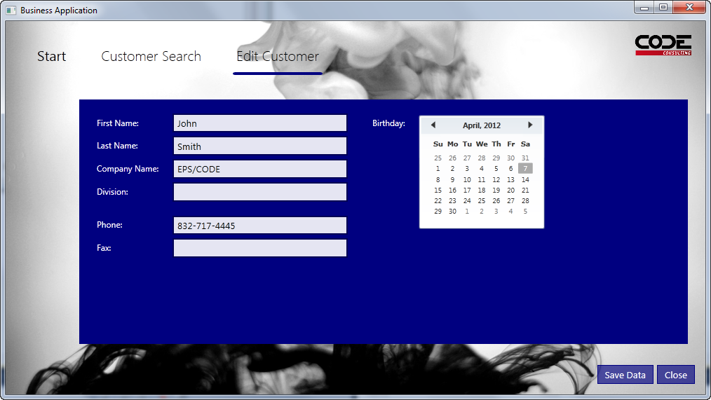
Listing 1 shows the XAML code associated with the UI shown in Figure 1.
Listing 1: The XAML code needed to create the result shown in Figure 1.
<l:View
    xmlns="http://schemas.microsoft.com/winfx/2006/xaml/presentation";
    xmlns:x="http://schemas.microsoft.com/winfx/2006/xaml";
    xmlns:l="clr-namespace:MyLayout">

        <TextBlock>First Name:</TextBlock>
        <TextBox Text="{Binding FirstName}" />
        <TextBlock>Last Name:</TextBlock>
        <TextBox Text="{Binding LastName}" />
        <TextBlock>Company:</TextBlock>
        <TextBox Text="{Binding Company}" />
        <TextBlock>Position:</TextBlock>
        <TextBox Text="{Binding Position}" />

        <TextBlock Margin="0,25,0,0">Phone:</TextBlock>
        <TextBox Text="{Binding Phone}" />
        <TextBlock>Email:</TextBlock>
        <TextBox Text="{Binding Email}" />
</l:View>
The interesting part of Listing 1 is not so much what is there, but what isn't there. Most people expect significantly more code to achieve what's shown. In fact, in many cases, I see hundreds or even thousands of lines of XAML code, when I could achieve the same result with just a handful of lines (another anti-pattern in itself). Clearly, it's more desirable to achieve the same result with much less code. But it goes a bit beyond that. Not only is there an advantage in writing less code, but the smaller code base is also more maintainable and flexible for future changes. It also often performs better. Therefore, it's better all around, and missing out on this advantage is an anti-pattern.
Conclusion
The layout systems found in all XAML technologies are one of the quintessentially unique features that set XAML apart from other environments. Yes, some of these things can also be achieved in other environments, but a lot of extra work has to be done; in XAML, it's just built in at the core. Missing out on any of these features, or perhaps disabling them by misunderstanding the fundamentals, is the cardinal sin of XAML development and the root cause of XAML projects that grow into slow and unmanageable monsters, an anti-pattern of the worst kind.