


Silverlight and WPF both are User Interface technologies that allow developers and designers to create amazing user interface experiences.
This apparently leads a lot of people to the conclusion that UI creation in these environments must be a complex and time consuming undertaking. I often hear, “I can do things so much faster in WinForms.” Yet nothing could be further from the truth! Using appropriate techniques, UI development should be much faster in WPF and Silverlight. Unfortunately, many such techniques often are overlooked as developers have settled into old UI paradigms, and new paradigms are misunderstood. This article discusses one such technique that can be used with equal success both in WPF and Silverlight. When applied properly, this technique allows for user interface development not just much faster, but also in a much more reusable and maintainable and yet less error prone way. I challenge anyone to come up with a faster UI development approach than outlined here, regardless of the utilized technology or platform!
WPF and Silverlight (which I will use interchangeably, as the techniques discussed in this article apply to both) introduce some very intriguing user interface paradigms. Unfortunately, many of these paradigms often go dismissed as “not applicable to my development effort,” or “not applicable to business applications.” Styling comes to mind as a primary example. Developers generally tend to think of styling as a way to create a graphically designed consumer experience. In reality, however, styling is a technique that allows for generic and interchangeable external definition of property settings. Of course, developers set a lot of properties, so why would styling, which is all about setting properties productively, not be applicable to development and only be thought of as a designer task? I suppose the word “style” is a poor choice of terms in this sense, as it carries a graphical connotation, but whoever is “in the know” about styles understands that this is a very useful feature for business application development.
Another example of a misunderstood WPF/SL paradigm is “layout elements.” Both WPF and Silverlight support an interesting list of layout options (with “layout” being the task of positioning UI elements on a window or other surface). Layout elements allow the developer to position controls inside of a “layout container” (such as a Grid, among many others) and have the system perform automatic arrangements of elements. Concepts such as “fixed positioning of controls” or “flow layout” or “stacks of elements” and much more are supported natively, and new layout elements can be created with ease. However, most developers stick to one or two of those elements (commonly the Grid and StackPanel elements) and ignore the vast potential custom layout can provide.
A Naïve Example
Let's start with some layout basics. Let's say we want to create a typical data entry form. The second most naïve approach (I am deliberately ignoring the most naïve approach of putting things into a Canvas, in the hope the world has moved beyond that pitfall) is to put elements inside a Grid and position the elements using margins and alignment. Listing 1 shows a simple user control (or Window) for a data interface. This code, in fact, is not entirely unlike the paradigm used in WinForms and many other rich-client UI environments: We put controls into some sort of UI container and position them by defining left and top positions as well as control height and width. (Left and top positions are expressed as margins in the case of a Grid layout element, but the idea remains the same.) Note that sometimes, default values work and do not have to be explicitly specified, as in the case of the height and width of text blocks (which simply means that these values are still there but the system handled them for us).
Listing 1: A naïve attempt at creating a user interface for a business application
<UserControl x:Class="LayoutArticle.NaiveLayout"
             xmlns="http://schemas.microsoft.com/winfx/2006/xaml/presentation"
             xmlns:x="http://schemas.microsoft.com/winfx/2006/xaml"
             >
    <Grid>
        <Grid.Resources>
            <Style TargetType="TextBlock">
                <Setter Property="VerticalAlignment" Value="Top" />
                <Setter Property="HorizontalAlignment" Value="Left" />
            </Style>
            <Style TargetType="TextBox">
                <Setter Property="VerticalAlignment" Value="Top" />
                <Setter Property="HorizontalAlignment" Value="Left" />
            </Style>
        </Grid.Resources>

        <TextBlock Margin="10,5,0,0">First Name:</TextBlock>
        <TextBox Margin="100,3,0,0" Width="200" Text="{Binding FirstName}" />

        <TextBlock Margin="10,30,0,0">Last Name:</TextBlock>
        <TextBox Margin="100,27,0,0" Width="200" Text="{Binding LastName}" />

        <TextBlock Margin="10,55,0,0">Company:</TextBlock>
        <TextBox Margin="100,52,0,0" Width="200" Text="{Binding Company}" />

        <TextBlock Margin="10,80,0,0">Position:</TextBlock>
        <TextBox Margin="100,77,0,0" Width="200" Text="{Binding Position}" />

        <TextBlock Margin="10,115,0,0">Phone:</TextBlock>
        <TextBox Margin="100,112,0,0" Width="200" Text="{Binding Phone}" />

        <TextBlock Margin="10,140,0,0">Email:</TextBlock>
        <TextBox Margin="100,137,0,0" Width="200" Text="{Binding Email}" />
    </Grid>
</UserControl>
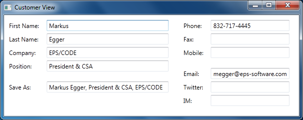
You may have never really thought about what happens here, but let's take a minute to reflect on how this code results in the UI shown in Figure 1. There really are at least three completely different types of information carried in this interface definition. First, XAML is used to define which controls we desire (text blocks and text boxes in this simple example). This provides quite a bit of business value and is part of the core problem we are trying to solve when we define an interface ("which controls should be used to show different elements of information?"). The second part of interest is that we bind elements to data. This is also a core business value we provide ("which data should be displayed and manipulated?"). Third, we are defining the details of the layout of the UI. In this example, I do this by setting margins as well as alignments. The alignments ensure that WPF understands that all control positions are to be relative to the top left edge, and no automatic resource logic of any kind is desired. (I took a shortcut of putting the alignment information into local resources as styles, since I didn't feel like typing it for every control.)
This, of course, begs the question “What business value was delivered by defining layout information (the third aspect)?” And frankly, the answer is “very little.” This simply is an annoying detail we must deal with in order to create any kind of useful UI. It is time consuming (setting the right positions was by far the part that took me the longest in this example) and it is annoying (most developers hate it, and are not good at creating good looking UI layouts). It is also error prone. Furthermore, the UI we created so far is not very “WPF-ish” in the sense that it can't do any resizing or any other fancy WPF stuff. Change the style of text elements to use a larger font throughout the app, and all of a sudden, our labels overlap the textboxes! It is also not very reusable. Try moving this UI to Windows Phone 7 and you will probably notice that although it works, it isn't very useful and probably doesn't fit on the screen at all.
So that's a bit of a bummer, isn't it? The majority of the time I spent creating this example went towards an annoying task that provided practically no business value, and created a result that is not very reusable and not very functional. Furthermore, I created this entire UI entirely by hand. Most people would probably want to use some sort of visual designer. If you do that, your XAML will probably contain a lot more code than shown in Listing 1. Most of it probably not being what you really want (changes are the controls towards the bottom of the UI are aligned relative to the bottom - a choice automatically made by the design tool - creating very odd results when the user resizes the screen). I often have people tell me that this is one of the greatest frustrations they face when working with WPF. Clearly, this needs to be fixed!
How Layout Works
Another aspect that is probably worth reflecting on for a moment is how the layout actually worked. Once again, this is probably something you normally don't care about very much, but humor me and follow along.
As you can see in Listing 1, I define a list of text blocks and text boxes inside a Grid element. Each of these controls has properties set (either to a default or a hardcoded value) that convey layout information, such as height and width, alignment, or margin of the control. This simply is data associated with the control. There is nothing magical about a text box having a width of 200. This doesn't automatically make the textbox 200 pixels wide. It is simply a small tidbit of information stored with the control instance.
A key aspect is that all these controls exist inside a Grid layout element. When the Grid is asked to render itself, it looks at all its child elements and various properties it cares about. In particular, the Grid looks at the margin, alignment, and dimension properties to determine what to do with the child element. For instance, it finds the first textbox, sees that it has a margin of 100 pixels on the left and 3 pixels at the top, and thus decides to use this information to position the element according to these settings. The grid also looks at the alignment information. The defined style sets the alignment to top and left, thus telling the Grid to ignore bottom and right margins and instead calculate the total space given to the textbox based on its height (which is automatically determined, since I didn't set it explicitly) and width.
What is important to realize is that it is totally up to the Grid to look at this information and decide what to do with it, or whether to respect it at all. The Grid can also choose to add other information. For instance, Grids can arrange elements in rows and columns, and in that case, row and column information is stored with the element. To do so, we could simply at Grid.Column=“10” indicate to a Grid that the element is meant to be put into the eleventh column of the Grid. This information can be stored with any element, regardless of whether it exists inside a Grid or not. However, chances are this type of setting would only be respected by Grids and no other layout element. Furthermore, this type of a setting can impact other things. If an element inside a Grid has a column set, then the Grid will look at the margin of the control and position it with that margin inside the column, rather than just within the Grid. A textbox with a left margin of 10 pixels with a column assignment of 2 will appear at a very different position than an element with the same margin but a different column setting.
All of this may appear very obvious in its use (it “just works” as expected), but there are some very interesting aspects here when you really think about it: Layout-related properties on elements are really just simple pieces of data that are only given meaning by the layout container those elements live in, and each container can choose to interpret this information differently.
A Slightly Better Approach
So how can we improve on our first example? One way would be to offload as much layout responsibility to the layout container as possible. A simple way to do this would be to remove as much position information as possible from each element, and instead configure the layout container in a more sophisticated way. Listing 2 shows such an example. You can see the result in Figure 2, which is practically indistinguishable from Figure 1.
Listing 2: Relying on the Grid's automatic layout capabilities to create the same interface as in Listing 1, but without the need to hand-code layout information
<UserControl x:Class="LayoutArticle.SlightlyBetter"
             xmlns="http://schemas.microsoft.com/winfx/2006/xaml/presentation"
             xmlns:x="http://schemas.microsoft.com/winfx/2006/xaml"
             >
    <Grid>
        <Grid.ColumnDefinitions>
            <ColumnDefinition Width="Auto" />
            <ColumnDefinition Width="20" />
            <ColumnDefinition Width="Auto" />
        </Grid.ColumnDefinitions>
        <Grid.RowDefinitions>
            <RowDefinition Height="Auto" />
            <RowDefinition Height="Auto" />
            <RowDefinition Height="Auto" />
            <RowDefinition Height="Auto" />
            <RowDefinition Height="15"/>
            <RowDefinition Height="Auto" />
            <RowDefinition Height="Auto" />
        </Grid.RowDefinitions>
        <Grid.Resources>
            <Style TargetType="TextBlock">
                <Setter Property="VerticalAlignment" Value="Center" />
                <Setter Property="Margin" Value="10,0,0,0" />
            </Style>
            <Style TargetType="TextBox">
                <Setter Property="Margin" Value="0,2,0,2" />
            </Style>
        </Grid.Resources>

        <TextBlock>First Name:</TextBlock>
        <TextBox Grid.Column="2" Width="200" Text="{Binding FirstName}" />

        <TextBlock Grid.Row="1">Last Name:</TextBlock>
        <TextBox Grid.Column="2" Grid.Row="1" Width="200" Text="{Binding LastName}" />

        <TextBlock Grid.Row="2">Company:</TextBlock>
        <TextBox Grid.Column="2" Grid.Row="2" Width="200" Text="{Binding Company}" />

        <TextBlock Grid.Row="3">Position:</TextBlock>
        <TextBox Grid.Column="2" Grid.Row="3" Width="200" Text="{Binding Position}" />

        <TextBlock Grid.Row="5">Phone:</TextBlock>
        <TextBox Grid.Column="2" Grid.Row="5" Width="200" Text="{Binding Phone}" />

        <TextBlock Grid.Row="6">Email:</TextBlock>
        <TextBox Grid.Column="2" Grid.Row="6" Width="200" Text="{Binding Email}" />
    </Grid>
</UserControl>
Listing 2 is longer than Listing 1, but it took less time to write. The idea is to not put any layout information without business value into each element. Therefore, it becomes trivial to define the elements with their binding information. (I do set the width of the textboxes, as I have a business need to show text input areas that indicate support for a certain amount of text.) I then define three columns within the Grid (one for all the labels, one for the textboxes, and a small spacer in between… which could have alternatively been handled by a styled textbox margin) as well as seven rows (one for each label and textbox, plus a spacer row between “Position” and “Phone”). Most of these rows and columns have their height/width set to “Auto” so they can automatically adjust to the size required by the element within. All that remains now is to assign each control its own row and column, and voila, we have our final form.
There are several advantages here. For one, the tedious and error-prone task of calculating element positions (margins) is now gone. This is the main reason Listing 2 is quicker to produce than Listing 1, even though it is longer. This approach is also more powerful. For instance, we could change the font size of all our text elements, and the layout would automatically adjust appropriately. If you look closely, you may even notice that the layout in Figure 2 is a bit better than Figure 1 in how the labels are positioned. In the naïve attempt, I hand-coded the position of the labels to line up with the textboxes vertically in a way that seemed to be reasonably pleasing to the eye (for the current font size). In the second approach, the labels are centered vertically within each row, thus being always perfectly aligned, no matter what.
Unfortunately, this approach also has some downsides. For one, there is a lot of typing. For every UI of this kind that I have to create (imagine a business app with 500 data entry forms), I also have to create a grid with the appropriate number of grid rows and columns. I also have to set the row and column setting for each element (where is the business value of that task?). And if I ever want to add another control (say a fax number) in between existing controls, I have to change my grid row definition and the row assignment of all the controls below the inserted element. Not good. Also, this approach still isn't nearly as flexible as we'd want it to be. Run this on Windows Phone 7 and the result is only slightly better than before. Yes, the second approach could adapt well to fonts available on the phone, but it can do little about the size problem. We can do a lot better than that!
Code Redux!
There are other layout elements we could try out. One approach is a StackPanel as shown in Listing 3. The result (shown in Figure 3) is clearly not as nice as the previous layouts, but there are some intriguing aspects here. As you can see, the amount of code required is drastically reduced. All the “non-business aspects” are now gone. Compared to the first naïve attempt, this new approach has now completely eliminated the annoying and benefit-free third aspect of this UI's definition! This is fast to create and not error-prone at all! We probably have little need for a visual design tool to create this user interface. Heck, we could use a code generator to create this UI, or even create it dynamically on the fly! We can also easily add more elements with little effort. We can use this layout in practically any environment. This would work much better on Windows Phone 7 than any of our other approaches.
Listing 3: Using a StackPanel to achieve completely automated layout
<UserControl x:Class="LayoutArticle.StackedApproach"
             xmlns="http://schemas.microsoft.com/winfx/2006/xaml/presentation"
             xmlns:x="http://schemas.microsoft.com/winfx/2006/xaml"
             >
    <StackPanel Width="200" Margin="10">
        <TextBlock>First Name:</TextBlock>
        <TextBox Text="{Binding FirstName}" />
        <TextBlock>Last Name:</TextBlock>
        <TextBox Text="{Binding LastName}" />
        <TextBlock>Company:</TextBlock>
        <TextBox Text="{Binding Company}" />
        <TextBlock>Position:</TextBlock>
        <TextBox Text="{Binding Position}" />

        <TextBlock Margin="0,25,0,0">Phone:</TextBlock>
        <TextBox Text="{Binding Phone}" />
        <TextBlock>Email:</TextBlock>
        <TextBox Text="{Binding Email}" />
    </StackPanel>
</UserControl>
Unfortunately, there are also downsides. The main problem being that the UI looks so simplistic. Frankly, it is useless in the real world. Especially if you take this beyond a simple example and add a lot more elements as you would likely have it in a real UI. So clearly, we could not use this in a real-world app. Nevertheless, the potential offered by eliminating all non-essential aspects should tickle your curiosity. We now have an interface approach that allows for very productive development. Ugly or not, you can't create a UI faster than this in WinForms! Perhaps we can travel further down this path?
A “Layoutless” Panel
What if we could take some of this “layout stuff” out of our UIs (again, consider a business application with hundreds of different data UIs) and create a single style that handles layout? Unfortunately, with the approaches we have taken so far, that isn't possible. If we code a Grid element into our UserControl, than that will always remain a Grid, no matter what styles you create. If you create a StackPanel, it will also always remain a StackPanel. You can't just re-style that. And you have to put one of these elements into the UserControl, because a UserControl requires a single layout panel as its only child.
But what if you had some sort of container element that didn't have a hardcoded layout associated with itself? What if the desired layout element for such a container could be entirely styled?
I call this approach a “layoutless panel.” WPF and Silverlight already have the concept of “lookless controls,” which are controls that have only behavior and all the visual aspects are provided by styles. So if you drop a button on a form, the button doesn't have an appearance. Instead, you can provide that appearance by defining a style. Oh, and if you don't define your own style, then the system brings in an appropriate default style. So why not do the same thing for layout? Create a panel that does not have a default layout behavior, and instead define the layout through a style. And of course, we can bring in a default style in case no explicit style is defined.
WPF and Silverlight already have a panel called ItemsControl that provides almost this very behavior. I like to derive my own panel from it so I can give it a meaningful name and set appropriate defaults. Since I mostly work with MVVM frameworks, I like to call my “layoutless panel” a “View.” And yes, I define all my Views with this panel. Here's what it takes to code such a View panel:
public class View : ItemsControl
{
    public View()
    {
        var defaultTemplate = new ItemsPanelTemplate(new FrameworkElementFactory(typeof(StackPanel)));
        defaultTemplate.Seal();
        ItemsPanelProperty.OverrideMetadata(typeof(View), new FrameworkPropertyMetadata(defaultTemplate));
    }
}
The ItemsControl class is a panel that can contain a number of children. It already comes with an ItemsPanel property that can be used to define the layout template that is to be applied to the children. Really, I could have gotten away with using the ItemsControl directly, but I like the ability to define a default layout strategy (a StackPanel in this case). Also, in real-world implementations, you'll probably end up adding more features to this object, as you'll see below.
Now that we have this control, we can redefine our interface as shown in Listing 4. As you can see, this code segment is even smaller than Listing 3, as we are getting closer to boiling our UI down to the bare business essentials. The only layout information left in this example is the margin definition in the “Phone” textblock, which creates a visual separator between blocks of elements. Note that I was able to completely get rid of the UserControl element, because the new View panel eliminates the UserControl container entirely (which surely can't be bad for performance and also creates a cleaner definition of the UI essentials).
Listing 4: Our interface defined using a stylable layoutless panel
<l:View x:Class="LayoutArticle.CustomerView"
        xmlns="http://schemas.microsoft.com/winfx/2006/xaml/presentation"
        xmlns:x="http://schemas.microsoft.com/winfx/2006/xaml"
        xmlns:l="clr-namespace:LayoutArticle"
        >
    <TextBlock>First Name:</TextBlock>
    <TextBox Text="{Binding FirstName}" />
    <TextBlock>Last Name:</TextBlock>
    <TextBox Text="{Binding LastName}" />
    <TextBlock>Company:</TextBlock>
    <TextBox Text="{Binding Company}" />
    <TextBlock>Position:</TextBlock>
    <TextBox Text="{Binding Position}" />

    <TextBlock Margin="0,25,0,0">Phone:</TextBlock>
    <TextBox Text="{Binding Phone}" />
    <TextBlock>Email:</TextBlock>
    <TextBox Text="{Binding Email}" />
</l:View>
If you run this, you end up with a user interface that's identical to the version shown in Figure 3, since we use a StackPanel as our default layout style. However, we could now create a completely different style to change the layout. Try putting this style definition into your app.xaml (or some other resource dictionary that's included in your project):
<Style TargetType="l:View">
    <Setter Property="ItemsPanel">
        <Setter.Value>
            <ItemsPanelTemplate>
                <WrapPanel IsItemsHost="True" />
            </ItemsPanelTemplate>
        </Setter.Value>
    </Setter>
</Style>
This uses a wrap panel as the layout strategy and thus positions one element after the other, left to right, until there is no more horizontal space, at which point the layout continues at the next line. (This is basically how document layout works, as in systems such as HTML pages). Not very beautiful, but it works.
You can also go back to a Grid layout using this approach:
<Style TargetType="l:View">
   <Setter Property="ItemsPanel">
       <Setter.Value>
           <ItemsPanelTemplate>
               <Grid IsItemsHost="True" />
           </ItemsPanelTemplate>
       </Setter.Value>
   </Setter>
</Style>
Since there is no Grid-specific information in our view, we'd have to add Grid.Column and Grid.Row information to every element again (as well as add grid rows and columns to the style definition). Note that it would be perfectly fine to add Grid-specific properties to the view definition. As discussed above, it is up to each layout element to decide which properties to consider and which ones to ignore. Therefore, if our layout strategy is a StackPanel, it will ignore Grid.Column and Grid.Row setting entirely. It does not hurt to have these settings there (except perhaps for a tiny bit of memory consumption).
Of course, putting Grid-specific information into the view definition is not exactly “clean UI code” in my opinion. Neither is the definition of margins. Using wrap panels or stack panels looks bad. So clearly we have not arrived at our goal in terms of the resulting style. But we are already getting very close with the UI definition. What we are lacking is a more sophisticated layout strategy.
Data Edit Layout Panel
So let's create our own layout container! This is actually much easier than you might think. Each layout container has to perform two fundamental tasks: First, the layout container has to iterate over all its children and give them a chance to measure themselves. This gives all the child elements, no matter what they are, and no matter whether they have more child elements themselves, an opportunity to indicate how much space they would like to occupy (with a little bit of optional guidance from the container as to how much space might actually be available). For instance, a text element with no height or width set, will try to lay out all its text in one line and will thus determine how much horizontal and vertical space it needs (unless the parent control indicates a horizontal or vertical space constraint, in which case the element could potentially choose to determine how much space would be needed if word wrapping was used). Similarly, a button may measure the space it wants to take up based on its contents or its height and width settings. Using this approach, we arrive at a fundamental idea as to how much space each child element would like to take up for itself. The layout panel can thus take this information and calculate the total space it would like to occupy itself.
The second step is to perform the actual layout by positioning the controls as needed. This is done by iterating over the child controls and setting their position as well as size. The size here may or may not be the size the control desires in the measurement step. For instance, a label may want to take up a lot of horizontal space, but it may be forced into a smaller space, resulting in text being cut off.
For the first example, I will create a simple data edit form layout container. You can see the code for this container in Listing 5. This panel follows the process outlined above. First, we override the MeasureOverride() method to measure all the child elements and determine the size the panel itself needs. To do so, we have to make sense of the child elements within the panel. Since this is a special data layout panel, we can make the assumption that the elements inside the panel are pairs, where one element is always some sort of label, and the next is some sort of edit control (as is the case in all our examples so far). Of course this is a bit of a simplistic approach as real-world UIs are generally a bit more complex. However, it would be relatively simple to construct a more sophisticated approach to derive meaning from the child element arrangements. For this example, our current approach suffices. Therefore, I created a method called GetColumns(), which iterates over all the child elements and sticks them into a simple ControlPair class, which holds references to a pair of elements that belong together.
Listing 5: A simple but efficient layout panel for data edit UIs
public class SimpleEditLayout : Panel
{
    public double VerticalSpacing
    {
        get
        {
            return (double)GetValue(VerticalSpacingProperty);
        }
        set
        {
            SetValue(VerticalSpacingProperty, value);
        }
    }

    public static readonly DependencyProperty VerticalSpacingProperty =
        DependencyProperty.Register("VerticalSpacing", typeof(double), typeof(SimpleEditLayout), new UIPropertyMetadata(5d));

    public SimpleEditLayout()
    {
        VerticalAlignment = VerticalAlignment.Top;
        HorizontalAlignment = HorizontalAlignment.Left;
    }

    /// <summary>
    /// Provides the behavior for the Measure pass of
    /// Silverlight layout. Classes can override this
    /// method to define their own Measure pass
    /// behavior.
    /// </summary>
    /// <param name="availableSize">The available size
    /// that this object can give to child objects.
    /// Infinity can be specified as a value to
    /// indicate that the object will size to whatever
    /// content is available.</param>
    /// <returns>
    /// The size that this object determines it needs
    /// during layout, based on its calculations of
    /// child object allotted sizes.
    /// </returns>
    protected override Size MeasureOverride(
        Size availableSize)
    {
        // First, we figure out how many columns we
        // have and what the controls are in each col
        List<List<ControlPair>> columns = this.GetColumns();

        // Now we calculate the space needed in
        // each column
        double totalHeight = 0;
        double totalWidth = 0;
        double space = VerticalSpacing;
        bool firstColumn = true;
        var large = new Size(100000, 100000);
        foreach (var column in columns)
        {
            double widestLabel = 0;
            double widestControl = 0;
            double columnHeight = 0;

            foreach (var pair in column)
            {
                pair.Label.Measure(large);
                pair.Edit.Measure(large);

                widestLabel = Math.Max(pair.Label.DesiredSize.Width, widestLabel);
                widestControl = Math.Max(pair.Edit.DesiredSize.Width, widestControl);
                columnHeight += Math.Max(pair.Label.DesiredSize.Height, pair.Edit.DesiredSize.Height) + space;
                if (View.GetGroupBreak(pair.Label) || View.GetGroupBreak(pair.Edit))
                {
                    pair.NewGroup = true;
                    columnHeight += 15;
                }
            }

            totalWidth += widestLabel + 15 + widestControl + (firstColumn ? 0 : 30);
            totalHeight = Math.Max(columnHeight, totalHeight);

            firstColumn = false;
        }

        base.MeasureOverride(availableSize);
        return new Size(totalWidth, totalHeight);
    }

    /// <summary>
    /// Provides the behavior for the Arrange pass of
    /// Silverlight layout. Classes can override this
    /// method to define their own Arrange pass
    /// behavior.
    /// </summary>
    /// <param name="finalSize">The final area within
    /// the parent that this object should use to
    /// arrange itself and its children.</param>
    /// <returns>
    /// The actual size used once the element
    /// is arranged.
    /// </returns>
    protected override Size ArrangeOverride(
        Size finalSize)
    {
        List<List<ControlPair>> columns = this.GetColumns();

        double totalHeight = 0;
        double totalWidth = 0;
        double currentY = 0;
        double currentX = 0;
        double space = VerticalSpacing;
        bool firstColumn = true;
        foreach (var column in columns)
        {
            double widestLabel = 0;
            double widestControl = 0;
            double columnHeight = 0;

            // We first need to know the widest
            // elements, since all controls need to be
            // aligned according to those controls
            foreach (var pair in column)
            {
                widestLabel = Math.Max(pair.Label.DesiredSize.Width, widestLabel);
                widestControl = Math.Max(pair.Edit.DesiredSize.Width, widestControl);
            }

            // Now we perform the layout for this col
            foreach (var pair in column)
            {
                if (pair.NewGroup) currentY += 15;

                pair.Label.Arrange(new Rect(currentX, currentY + 3, widestLabel, pair.Label.DesiredSize.Height));
                pair.Edit.Arrange(new Rect(currentX + 15 + widestLabel, currentY, widestControl,  pair.Edit.DesiredSize.Height));

                currentY += Math.Max(pair.Label.DesiredSize.Height, pair.Edit.DesiredSize.Height) + space;
            }

            totalWidth += widestLabel + 15 + widestControl + (firstColumn ? 0 : 30);
            totalHeight = Math.Max(columnHeight, totalHeight);
            currentX = totalWidth + 30;
            currentY = 0;

            firstColumn = false;
        }

        base.ArrangeOverride(finalSize);
        return new Size(totalWidth, totalHeight);
    }

    /// <summary>
    /// Iterates over all the controls and returns
    /// them in columns and tuples
    /// </summary>
    /// <returns></returns>
    private List<List<ControlPair>> GetColumns()
    {
        var columns = new List<List<ControlPair>>();
        columns.Add(new List<ControlPair>());
        var currentColumn = columns[0];
        for (int controlCounter = 0; controlCounter < this.Children.Count; controlCounter += 2)
        {
            var child = this.Children[controlCounter];
            if (View.GetColumnBreak(child))
            {
                columns.Add(new List<ControlPair>());
                currentColumn = columns[columns.Count - 1];
            }

            var tuple = new ControlPair()
            {
              Label = child,
              Edit = this.Children[controlCounter + 1]
            };
            if (View.GetGroupBreak(tuple.Label) || View.GetGroupBreak(tuple.Edit))
            {
                tuple.NewGroup = true;
            }
            currentColumn.Add(tuple);
        }
        return columns;
    }
}

public class ControlPair
{
    public UIElement Label { get; set; }
    public UIElement Edit { get; set; }
    public bool NewGroup { get; set; }
}
Note that I snuck in a bit of extra functionality in the View class as well. I added two attached properties that can be used to indicate grouping of elements as well as column breaks. Previously, I created a sort of visual grouping by adding a margin between controls (or a spacer row in the Grid). However, this approach was not elegant. After all, there was no real meaning in the margin beyond the creation of whitespace. It is much more desirable to express concepts such as groupings explicitly, which can then be handled by different styles and layout strategies in different ways. Perhaps a style chooses to implement a group distinction by adding whitespace, or perhaps the style creates a different indicator, such as a horizontal line. This can only be achieved by embedding real meaning into the UI definition, rather than plump spacing information.
The GetColumns() method uses this information to set a flag in the ControlPair class indicating a new group. The GetColumns() method sticks all these controls into a List<ControlPair>. In fact, it even goes a step further and also checks for a column break property. If a column break is indicated, a new List<ControlPair> is started entirely. Thus we end up with multiple lists, each representing a column of control pairs. All these columns are then returned as a list of columns, thus ending up as a List<List<ControlPair>>. This provides a very handy logical arrangement of all our controls.
Now that we have this arrangement, we can iterate over all columns and all control pairs within columns. We then trigger measuring for each label and each control (with an indication that all these elements are free to use up as much room as they desire). As we look at each of these measurements, we memorize the widest label and the widest control in each column. We also add up the total height for each column by summing up the heights of all elements within a column (plus some spacing). Whenever we encounter a control that indicates a group break, we add some extra vertical height. Once we are done with a column, we memorize its total height and the maximum width taken up, and we then move on to the next column, where the whole process repeats. Once we render that next column, we add the width of the widest elements, and we check whether the total column height was greater than the previous greatest column height, and so forth. This process repeats until we have handled all columns and pairs, and thus know how much room we desire for our layout. This is the value which we return to the WPF/SL infrastructure from the MeasureOverride() method.
Now, all that's left to do is the actual arrangement of the columns and controls. We do this in the ArrangeOverride() method. Once again, we get our list of columns and control pairs, and process column by column. In each column, we first look at all the labels and controls to find the widest of each. Once we have this information, we iterate over all pairs a second time and arrange all the labels at the same left position as well as all the controls at the same left position in a way that accommodates the widest label with all controls being left aligned. We stack each control pair vertically, and we add a bit of extra space before the pairs with a “new group” indicator. Once we are done, the same process is repeated for the next column. In the end, we return the actual total height and width we used up using this layout approach.
Voila! Our data edit layout panel is complete! To use it, we create a style that uses this panel as the layout element:
<Style x:Key="DataEditLayout" TargetType="l:View">
    <Setter Property="ItemsPanel">
        <Setter.Value>
            <ItemsPanelTemplate>
                <l:SimpleEditLayout IsItemsHost="True"/>
            </ItemsPanelTemplate>
        </Setter.Value>
    </Setter>
</Style>
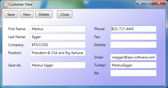
To make the view a bit more interesting, I added a few more elements to the view definition, as shown in Listing 6. You can see the resulting interface in Figure 4. Not bad at all, considering how simple the view definition now is, and how quickly it can be produced, even by entry-level developers!
Listing 6: A slightly more interesting customer view
<l:View x:Class="LayoutArticle.CustomerView"
        xmlns="http://schemas.microsoft.com/winfx/2006/xaml/presentation"
        xmlns:x="http://schemas.microsoft.com/winfx/2006/xaml"
        xmlns:l="clr-namespace:LayoutArticle"
        Style="{DynamicResource DataEditLayout}"
        >
    <TextBlock>First Name:</TextBlock>
    <TextBox Text="{Binding FirstName}" />
    <TextBlock>Last Name:</TextBlock>
    <TextBox Text="{Binding LastName}" />
    <TextBlock>Company:</TextBlock>
    <TextBox Text="{Binding Company}" />
    <TextBlock>Position:</TextBlock>
    <TextBox Text="{Binding Position}" />

    <TextBlock l:View.GroupBreak="True">Save As:</TextBlock>
    <TextBox Text="{Binding SaveAs}" />

    <TextBlock l:View.ColumnBreak="True">Phone:</TextBlock>
    <TextBox Text="{Binding Phone}" />
    <TextBlock>Fax:</TextBlock>
    <TextBox Text="{Binding Fax}" />
    <TextBlock>Mobile:</TextBlock>
    <TextBox Text="{Binding Mobile}" />

    <TextBlock l:View.GroupBreak="True">Email:</TextBlock>
    <TextBox Text="{Binding Email}" />
    <TextBlock>Twitter:</TextBlock>
    <TextBox Text="{Binding Twitter}" />
    <TextBlock>IM:</TextBlock>
    <TextBox Text="{Binding IM}" />
</l:View>
What is nice about this approach is that we can now stop worrying about UI layout. We set this up once and it gets used in every single data edit view we ever create. In real-world scenarios, the layout strategy may be more complex. After all, real-world UIs are more sophisticated than my example here. But that's OK. Whoever creates the layout panel simply adds more features to add more meaning to the view definition. It would be easy, for instance, to add the ability to add secondary controls (such as a “...” button after a file name textbox). But most of the developers on your team do not have to worry about the implementation of such concepts, as only the style and the layout panel it uses have to be concerned with such details. The layout panel becomes a very small part of the overall project.
Sometimes people ask me how far one can take this layout concept. “Can you really build real-world UIs beyond simple examples?” they wonder. And the answer is: Absolutely! After all, you can simply add more and more features to your layout logic. Think of it this way: If push came to shove, you could always add top, left, height, and width properties and thus have exactly the same features a Canvas or Grid would provide. In fact, you could use a Canvas or Grid as your layout strategy in those cases where you really can't figure out how to do it otherwise. Alas, it stands to reason that absolutely any kind of layout is achievable with this approach, with less effort (and potential sources of errors) than other UIs.
Note that although you always have the option to add positional information or use Grids, it is more desirable to stick to a more abstract approach. Once you start to hard-code positional or spacing information, you are back in a territory that provides little or no business value and serves a plain mechanical purpose. For instance, it is much better to indicate that "this „...' button goes with the file name textbox" than it is to say "I want to position a „...' button on the right edge of the window and I want to make the file name textbox 30 pixels narrower." The first approach simply allows for much more flexible styling and reuse.
Adding Actions
At this point, we are missing the ability to trigger actions such as “Save” or “New” in our edit form. Of course, we could add buttons to our screen layout and trigger appropriate code in their event handlers. However, that approach would be somewhat inflexible and not nearly as reusable as we would like it to be. Also, a professional UI may want to use advanced concepts such as Ribbons or a fancy toolbar of some sort. New form factors, such as slate PCs with NUIs (Natural User Interfaces) may want completely different UI elements to trigger such actions. Phones may need an entirely different approach again. So clearly, if we want to create truly reusable UIs, we need a more flexible approach. Furthermore, we want to make sure we can define these elements as quickly as possible to retain our productive development approach.
The fastest approach is to not create any such UI elements at all. Instead, define the available abstractions more generic, and create a style that detects this definition and shows appropriate UI elements.
Here at EPS/CODE Consulting, we are generally doing this by defining a collection of what we call, for want of a better term, “Actions”. An “Action” is simply a specialized Command object. There are tons of different implementations of commands in WPF and Silverlight, and I am not going to engage in a discussion of which command approach is best. Instead, I am going to introduce you to a simple implementation of our action pattern and you can then apply it to your preferred command setup (or simply go with the simple setup presented here).
Our approach starts with two interfaces: An IAction interface as well as a collection of action objects called IHaveActions:
public interface IHaveActions
{
    IEnumerable<IAction> Actions { get; }
}

public interface IAction : ICommand
{
    string Caption { get; set; }
    bool BeginGroup { get; set; }
}
As you can see, IHaveActions is a trivial interface with only an enumerable list of actions. The IAction interface itself is a bit more interesting. It implements ICommand and adds more features to it. In this case, all I have added is a Caption and an indicator that tells us whether this action represents the start of a new group. In real-world implementations, we often add a lot more, such as visuals (icons), descriptions (often used in tooltips), and even hierarchies of actions. You can make this setup as complex and powerful as you want. The basic idea always remains the same.
The actual implementation of IAction is pretty simple, although a bit longer. You can see it in Listing 7. It simply implements the interfaces by creating the required properties and delegates and it also provides a convenient way to create a new action by passing parameters to the constructor, all of which have default values for ease of use.
Listing 7: A simple implementation of the IAction interface
public class Action : IAction
{
    public Action(string caption = "",
                  bool beginGroup = false,
                  Action<IAction, object> execute=null,
                  Func<IAction, object, bool>
                      canExecute = null)
    {
        Caption = caption;
        BeginGroup = beginGroup;
        _executeDelegate = execute;
        _canExecuteDelegate = canExecute;
    }

    public string Caption { get; set; }
    public bool BeginGroup { get; set; }

    Func<IAction, object, bool> _canExecuteDelegate;
    public bool CanExecute(object parameter)
    {
        if (_canExecuteDelegate != null)
          return _canExecuteDelegate(this, parameter);
        return true;
    }

    public event EventHandler CanExecuteChanged;

    Action<IAction, object> _executeDelegate;
    public void Execute(object parameter)
    {
        if (_executeDelegate != null)
           _executeDelegate(this, parameter);
    }
}
We can now use this setup in our customer view model by implementing IHaveActions and creating a list of whatever actions we desire. You can see a simple example in Listing 8. Note how this view model simply defines actions by creating instances of the Action object and passing in parameters, including lambda expressions as execution delegates. This enables for extremely straightforward and productive definition of behavior that can be triggered from the user interface. (On a side note: I am using message boxes in the lambda expressions. This is an absolute no-no in the real world, as it completely ties our UI to the WPF/SL message box classes, thus killing reuse. It is only used here to present a simple example.)
Listing 8: An implementation of a customer view model with actions
public class Customer : IHaveActions
{
    public Customer()
    {
        FirstName = "Markus";
        LastName = "Egger";
        Company = "EPS/CODE";
        Phone = "832-717-4445";
        Email = "megger@eps-software.com";
        Position = "President & CSA";

        CreateActions();
    }

    public string FirstName { get; set; }
    public string LastName { get; set; }
    public string Company { get; set; }
    public string Phone { get; set; }
    public string Email { get; set; }
    public string Position { get; set; }

    void CreateActions()
    {
        var actions = new List<IAction>();

        actions.Add(new Action(caption: "Save", execute: (a, o) => MessageBox.Show("Saving!")));
        actions.Add(new Action(caption: "New", execute: (a, o) => MessageBox.Show("New!")));
        actions.Add(new Action(caption: "Delete", execute: (a, o) => MessageBox.Show("Deleting!")));
        actions.Add(new Action(caption: "Close", beginGroup: true, execute: (a, o) => MessageBox.Show("New!")));

        Actions = actions;
    }

    public IEnumerable<IAction> Actions { get; private set; }
}
Now that we have our view model configured to have associated actions all that is left to do is creating a style for our View object that shows appropriate UI elements in case the view is bound to a model that has actions. Listing 9 shows a modified style that includes a Template definition. The template defines the overall arrangement of a view. By default, our view object simply shows all the items within itself, based on whatever layout strategy we styled. We can modify this template at will. In this simple example, I change the view's template to itself be a Grid with two rows. One for a toolbar-like element and the second row (which takes up the remainder of the view) is used to show the actual items in the view (which are then laid out by our layout style).
Listing 9: A complete style for a View including simple UI elements for actions
<Style x:Key="DataEditLayout" TargetType="l:View">
  <Setter Property="ItemsPanel">
    <Setter.Value>
      <ItemsPanelTemplate>
        <l:SimpleEditLayout IsItemsHost="True" Margin="10" />
      </ItemsPanelTemplate>
    </Setter.Value>
  </Setter>

  <Setter Property="Template">
    <Setter.Value>
      <ControlTemplate TargetType="ItemsControl">
        <Grid>
          <Grid.Background>
            <LinearGradientBrush EndPoint="0.63,1.02" StartPoint="0.28,0.011">
              <GradientStop Color="White" Offset="0"/>
              <GradientStop Color="#FFA9A9F5" Offset="1"/>
            </LinearGradientBrush>
          </Grid.Background>
          <Grid.RowDefinitions>
            <RowDefinition Height="Auto" />
            <RowDefinition Height="*" />
          </Grid.RowDefinitions>

          <l:ActionGrid Model="{TemplateBinding DataContext}" Margin="5">
            <ItemsControl ItemsSource="{Binding RelativeSource={RelativeSource TemplatedParent}, Path=DataContext.Actions}">
              <ItemsControl.ItemTemplate>
                <DataTemplate>
                  <Button Content="{Binding Caption}"
                          Command="{Binding}"
                          Margin="0,0,5,0"
                          Padding="10,3"
                          x:Name="button" />

                  <DataTemplate.Triggers>
                    <DataTrigger Binding="{Binding BeginGroup}" Value="True">
                      <Setter TargetName="button" Property="Margin" Value="10,0,5,0" />
                    </DataTrigger>
                  </DataTemplate.Triggers>
                </DataTemplate>
              </ItemsControl.ItemTemplate>
              <ItemsControl.ItemsPanel>
                <ItemsPanelTemplate>
                  <StackPanel Orientation="Horizontal" />
                </ItemsPanelTemplate>
              </ItemsControl.ItemsPanel>
            </ItemsControl>
          </l:ActionGrid>

          <ItemsPresenter Grid.Row="1" Margin="10" />
        </Grid>
      </ControlTemplate>
    </Setter.Value>
  </Setter>
</Style>
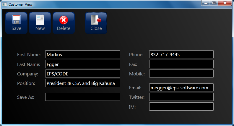
The toolbar row of the grid is set to auto size to accommodate whatever elements are within it. In this example, I made the content of the first row an “Action Grid.” This is a special subclass of the default Grid, which has one additional property called “Model.” Whenever this property is set (or bound) to an object that implements IHaveActions, the action grid sets itself visible, otherwise it collapses. Otherwise, an ActionGrid works just like any other Grid in WPF. (Listing 10 shows the implementation of the ActionGrid class.) Using this class bound to the current data context provides me an element that is automatically visible or invisible based on the bound view model. So everything I put inside the grid will only show up when there are actions. So I can now simply put an items control inside this grid and bind it to the list of actions. All that's left to do now is create a data template for each item, which I set to a simple button that is bound to the appropriate caption and command to automatically trigger our execute delegate. There also is a simple trigger that makes sure there is a gap before the button if the button starts a new group, by increasing the left margin. Figure 5 shows the result.
Listing 10: The implementation of an ActionGrid class, which automatically sets itself visible and invisible based on what model it is bound to
public class ActionGrid : Grid
{
    public object Model
    {
        get { return (object)GetValue(ModelProperty); }
        set { SetValue(ModelProperty, value); }
    }

    public static readonly DependencyProperty ModelProperty =
        DependencyProperty.Register("Model", typeof(object), typeof(ActionGrid), new UIPropertyMetadata(null, ModelChanged));

    static void ModelChanged(DependencyObject d, DependencyPropertyChangedEventArgs e)
    {
        var grid = d as ActionGrid;
        if (grid != null)
        {
            if (e.NewValue is IHaveActions)
                grid.Visibility = Visibility.Visible;
            else
                grid.Visibility = Visibility.Collapsed;
        }
    }
}
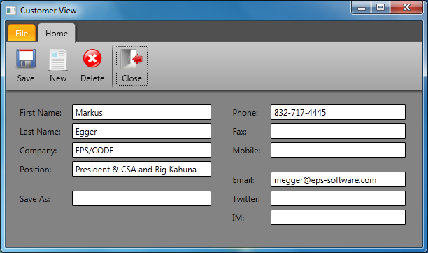
Of course, this is a pretty simple style since my space here is limited. But you can improve this style any way you want. You could use a real toolbar, or a Ribbon. You can even use multiple elements to do the same thing. For instance, you can use a toolbar as well as a menu, plus a right-click menu. The sky's the limit, once you grasp the power of styling**. Figure 6** and Figure 7 show two more example styles. I do not have enough room in this article to explain the details that go with the creation of these styles, but you can take a look at the sample code that comes with this article to see how it is done. (Note that both screens utilize a slightly enhanced version of the Actions infrastructure to support styleable icons. The implementation of this can also be seen in the downloadable source code.)
Now that we have this part of our little framework completed as well, we can be pretty happy with what we have achieved. We can now create data edit UIs extremely quickly with our layout element, and we can add actions even faster since we now don't have to worry about that part of the interface at all anymore. Our style simply is reused in all UIs we create. I encourage you to download the code sample associated with this article and try to add more interfaces by defining additional views. It should take no time at all and chances of introducing bugs should be minimal, even if you are not an experienced WPF or Silverlight developer.
Reusing the View
We have now achieved our task of creating WPF and Silverlight UIs in an extremely productive fashion. We can now have developers churn out UIs at a very rapid pace and we have eliminated many sources of errors. Developers now simply do not have to worry about creating good looking UIs, and designers can now tweak the visuals in just a handful of relatively simple styles. I simply cannot imagine a more productive way of creating user interfaces.
However, it gets better!
Not only can we now create professional UIs extremely fast, but the UIs we create are now also highly reusable. Look at the definition of our single example view in Listing 4 one more time. (We only have one view in this article, but real-world projects would have hundreds of such views, while there still is just one style.) The view definition is now extremely simple and there is nothing in it that would tie it to a specific screen size or layout, or even a specific device. As a result, the view can be used in many ways.
For instance, we can reuse the view as is in a Windows Phone 7 application. All we have to do to make that work is define a new set of styles and a different layout strategy to lay out the UI in a way that is appropriate for the smaller screen (most likely a relatively simple vertical stack or something similar). One of the issues I encounter when I take apps to the mobile space is that one often needs to scale down functionality and limit the number of fields shown. We could easily accommodate that need by adding a property to each element, such as View.Significance=“Low”, which can then be used by the layout engine to filter out less important elements on smaller resolutions.
In similar fashion, we could adapt our UI for different WPF or Silverlight setups. In particular, we can easily support Natural User Interfaces (NUIs) and other multi-touch and slate environments.
One of the things that might surprise you is that our view definition is now not confined to XAML scenarios anymore. Due to the extremely generic nature of our view definition, we can now simply use our view definition as XML. With that, a whole new set of options becomes available to us. For instance, we can use our view definition in ASP.NET MVC by adding a relatively simple view engine. Now think about this last statement again! We can use our XAML UI definition to create ASP.NET MVC web applications! This isn't something that is supported out of the box in MVC, but it is not rocket science to add that functionality.
In a similar fashion, we can use our XML/XAML in completely different environments such as iPhones, iPads, or Andriod devices. The idea here is similar to the MVC idea: Read the XAML and parse it as XML and dynamically create a UI in memory that contains everything the XAML view definition provides. This is possible because the view definition is now abstract enough to not tie us directly to WPF or Silverlight.
The actual implementation of an ASP.NET MVC view engine or an engine for iPhones or Andriod devices (and other platforms and devices) is beyond the scope of this article, but it is clearly possible and feasible. The amount of effort that goes into writing these algorithms is certainly going to be far less than the effort that would be required to re-write your UIs for those platforms.
Conclusion
There simply is no quicker and more productive way to create user interfaces! As I mention in the introduction, I challenge anyone to create WinForms or even web UIs faster than this and provide a similar level of flexibility. It can't be done. This is the power of WPF and Silverlight at its best! Focus on the business benefits only by creating mainly view models and relatively simple views. People often claim WPF and Silverlight are hard to learn. Well, creating the styles and layout strategies is an advanced task, but with these pieces in place you can use developers that are much more junior than any WinForms or ASP.NET project would allow.
Yes, you have to create your layout strategy and your styles. But you do that once (or at least only once per platform you would like to support) and be done with it. It is a very small task in the big picture. (And you can use the code provided here as a starting point.) Using these techniques, you should be able to shorten your development cycle drastically and at the same time improve quality and reusability. You can move your UIs to new platforms. You even gain abilities I can't discuss in detail in this article due to space constraints. For instance, it becomes very easy to create these views dynamically based on the underlying data models or customizable fields. It also gets much easier to create a UI editor for your user, in case you want to include such a feature in your application. And I would not be surprised if you could think of uses I have never thought of myself.
People often ask me why they should use WPF or Silverlight. “What is the business benefit?” they say. Or “Why would I put the extra effort into WPF when I am familiar with WinForms?” The simple answer is that you can build better and more professional UIs in less time and at a higher level of quality, and even reuse it widely and for a long time to come. I would be hard-pressed to name a lot of other technologies that provide such a wide range of business reasons for adoption at such a low entry barrier. There is a very large list of benefits and reasons that make WPF and Silverlight a great choice. But just the benefits demonstrated in this article alone should convince any CFO or CTO to take these technologies seriously.