In May, Xamarin introduced version 3.0 of their Cross-Platform Mobile Development tools. The new features include a new iOS Designer that allows you to build iOS interfaces in Visual Studio or Xamarin Studio without needing to rely on Apple's XCode design tools, a completely revamped UI in Xamarin Studio and an improved Visual Studio Extension, better NuGet support, and improved support for Portable Class Libraries and Shared Projects.
The most exciting new feature is a brand new cross-platform UI framework, called Xamarin.Forms. Xamarin.Forms allows you to design your UI once, using either C# or XAML, and target that UI for all three supported mobile platforms: iOS, Android, and Windows Phone. In this article, I'll take a deep look at how Xamarin.Forms can enable you to quickly write native UI that's shared among the three major mobile platforms.
Introducing Xamarin.Forms
Xamarin.Forms is a new cross-platform UI framework that allows you to define UI in a platform independent manner, using a library of common UI elements. The common UI definition is then compiled to the native UI engine for each platform, so the user experiences a platform native UI. UI elements are rendered according to the rules defined by each platform; for example, iOS renders tabs at the bottom of the user interface and Android renders them at the top.
Xamarin.Forms can be defined either via code or as a XAML markup; for the purposes of this article, I'll focus on the code-driven approach.
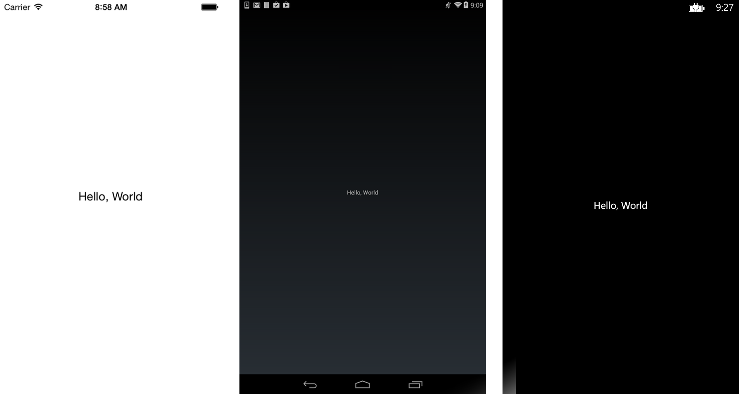
A simple Hello, World example can be built in Xamarin.Forms like this:
ContentPage page = new ContentPage {
    Content = new Label {
        Text  = "Hello, World"
    }
};
When rendered, this UI appears as native controls on each platform, as shown in Figure 1.
The code required to instantiate a Xamarin.Forms UI differs slightly on each platform. In iOS, you can add the following to your AppDelegate.cs FinishedLaunching event:
Forms.Init ();

window.RootViewController = App.GetMainPage ().CreateViewController ();
In Android, you modify the app's default Activity:
Xamarin.Forms.Forms.Init (this, bundle);
SetPage (App.GetMainPage ());
In Windows Phone, add this in the app's MainWindow.xaml.cs:
Forms.Init();
Content = App.GetMainPage().ConvertPageToUIElement(this);
In each case, note that I call Forms.Init() before executing any other forms code. You must do this when your app initializes in order to ensure that the Forms engine is loaded and initialized for the current platform. This process only needs to be done once in each application.
Xamarin.Forms Elements
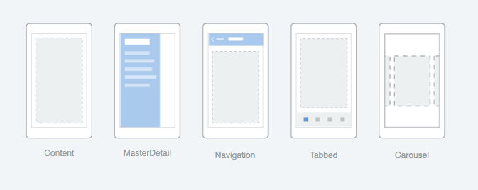
Xamarin.Forms consists of three major types of elements: Pages, Layouts, and Views. Pages are single-screen controls that contain other content. There are five types of pages available:
- ContentPage: A page that contains other content
- TabbedPage: A page that provides a tabbed UI, with each tab containing other content
- NavigationPage: A page that provides a navigation wrapper around content
- CarouselPage: A page that contains multiple content items in a rotating carousel
- MasterDetailPage: A page that contains two panes of content
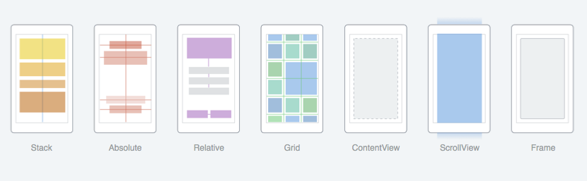
Layouts are container controls that allow you to arrange content in a variety of ways. There are seven layouts available:
- StackLayout: Controls can be stacked one after another either horizontally or vertically
- AbsoluteLayout: Controls are anchored at absolute positions
- RelativeLayout: Uses a system of constraints to position elements
- Grid: Elements are arranged in rows and columns
- ScrollView: Allows content to be scrolled within an element
- Frame: A simple container with a single child that supports framing options
- ContentView: An element with a single content child. Primarily used for creating user-defined views
Views are the control elements in Xamarin.Forms with which the user interacts:
- ActivityIndicator: A visual indicator that some activity is occurring
- BoxView: A simple box, intended for use as a placeholder
- Button: A clickable element containing text
- DatePicker: An element that allows the user to select a date and time
- Editor: a multi-line text edit control
- Entry: A single line text edit control
- Image: An element containing a bitmapped image
- Label: An element containing static text
- ListView: a list of items displayed in a vertical list
- OpenGLView: A container for OpenGL content
- Picker: A list of items that can be selected
- ProgressBar: A bar that shows the relative progress of a task
- SearchBar: a data entry field that allows the user to search a list or table
- Slide: A control to select a value from a range
- Stepper: A control to select a discrete value from a range
- Switch: A Boolean control
- TableView: A view that displays multiple rows of Cells
- TimePicker: Like the datepicker, but contains only the time
- WebView: A Web browser control that displays HTML markup from either a local or remote source
Finally, Cells are a special subtype of View intended for use with ListViews and TableViews:
- EntryCell: Contains an Entry
- SwitchCell: Contains a Switch
- TextCell: Contains two text labels
- ImageCell: A TextCell that also contains an Image
Building a Xamarin.Forms App
Now that I've discussed the basic building blocks of Xamarin.Forms, let's put them together to build an actual app. You'll put together a simple phone app that displays a list of restaurants that offer “kids eat free” deals. The app will consist of a number of UI elements:
- A listing of restaurants by name
- A listing of restaurants grouped by day of the week
- A detailed view that shows specific details about each restaurant's offer
- A map that shows the restaurant's location
- A tabbed UI that allows you to toggle between the two lists types
- A navigation UI that allows you to maneuver between the different views within a tab
Be sure that your app calls
Forms.Init(). If it doesn't, your code will build correctly but the UI won't display on the screen.
Let's first build a list of Restaurants sorted by name. As shown in Listing 1, NameList is a ContentPage that contains a single ListView as its content. ListView supports data binding, which allows you to specify an ItemsSource and then define an ItemTemplate for the ListView. You use a TextCell as the template, and bind properties of the Restaurant class to the Text and Detail properties of the TextCell. When rendered, our ListView will look like Figure 4.
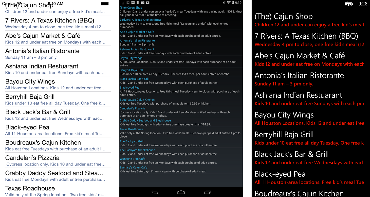
Listing 1: A Xamarin.Forms ListView
public class NameList : ContentPage
{
    public NameList ()
    {
        Title = "By Name";
        ListView list = new ListView ();

        list.ItemsSource = Restaurants.Data;
        list.ItemTemplate = new DataTemplate (typeof(TextCell))
        { Bindings = {
            { TextCell.TextProperty, new Binding("Name")},
            { TextCell.DetailProperty, new Binding("Detail")}
        }};

        Content = list;
    }
}
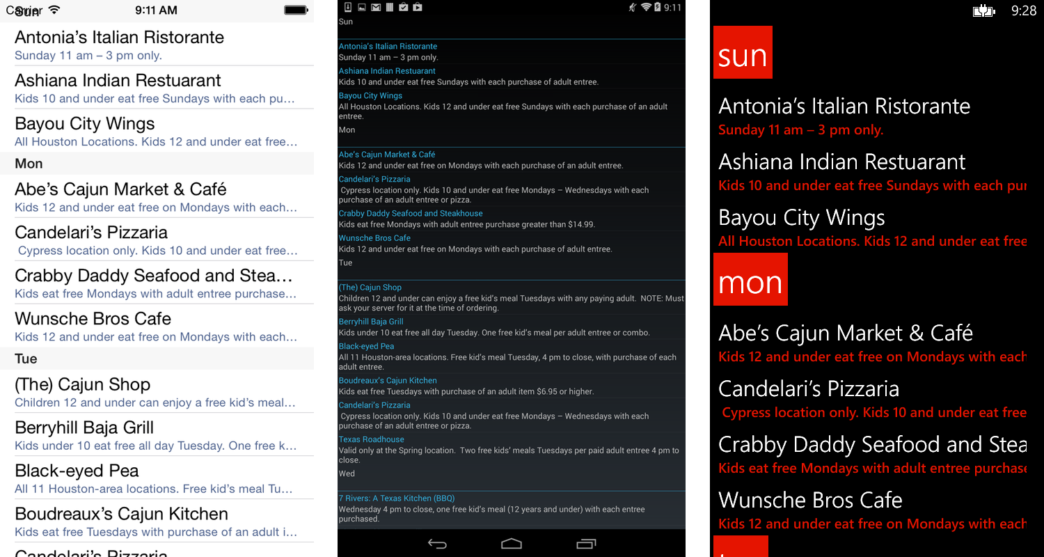
You also want to display a list of restaurants that are grouped by the day of week their offer is available. To do that, you'll build another page with a ListView that uses the grouping feature, as shown in Listing 2.
Listing 2: ListView with Group Headers
ListView lv = new ListView ();
lv.IsGroupingEnabled = true;
lv.GroupDisplayBinding = new Binding ("Day");
lv.GroupHeaderTemplate = null;

lv.ItemTemplate = new DataTemplate (typeof(TextCell))
{ Bindings = {
    { TextCell.TextProperty, new Binding("Name") },
    { TextCell.DetailProperty, new Binding("Detail") }
}};
This is very similar to the ListView you built in the last example. However, this time you've set the IsGroupingEnabled property to true, and defined a GroupDisplayBinding to tell the ListView how to render the header for each group. The rendered page is shown in Figure 5.
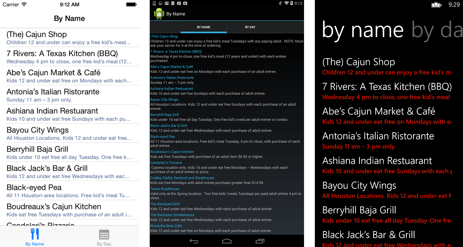
Now that the app has two different pages, you need to provide a way to switch between them. You'll do this by wrapping them in a TabbedPage:
TabbedPage tabs = new TabbedPage ();
tabs.Children.Add(new NavigationPage(new NameList())
{
    Title = "By Name"
});
tabs.Children.Add(new NavigationPage(new DayList())
{
    Title = "By Day"
});
Note that not only did you use a TabbedPage, you also wrapped each page in a NavigationPage. Doing this provides a title bar at the top of the page and also enables you to add navigation to the detail page once you've built it. The new tabbed UI now looks like Figure 6.
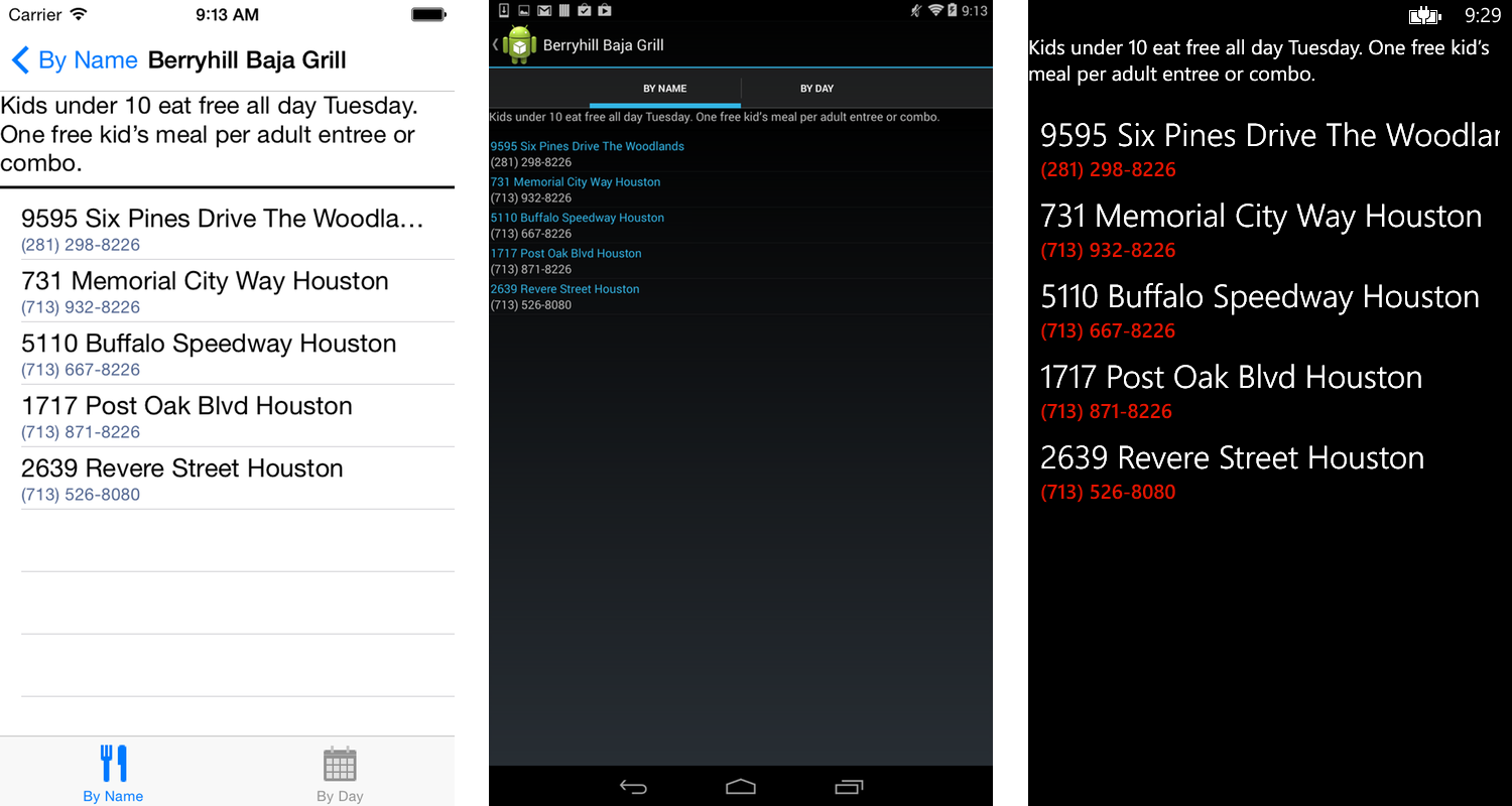
Now you need to build a detail page that shows the user more information about each restaurant in the list, as shown in Listing 3.
Listing 3: Restaurant DetailView
public class DetailView : ContentPage
{
    public Restaurant rest;

    public DetailView (Restaurant rest)
    {
        this.rest = rest;

        Title = rest.Name;

        StackLayout sl = new StackLayout ();

        sl.Children.Add(new Label()
        { Text = rest.Detail });

        ListView lv = new ListView ();

        lv.ItemsSource = rest.Locations;
        lv.ItemTemplate = new DataTemplate(typeof(TextCell))
        { Bindings = {
            { TextCell.TextProperty,new Binding("Address")},
            { TextCell.DetailProperty,new Binding("Phone")}
        }};

        sl.Children.Add (lv);

        this.Content = sl;
    }
}
The detail page consists of a Label containing the detailed information about this restaurant's offer, as well as another ListView that displays each location for the selected restaurant. Because you're including two different controls in the ContentPage, you need to wrap them in a Layout. You'll use a simple StackLayout to create a vertical stack of the two controls. The DetailView is shown in Figure 7.
In order to navigate to this DetailView from the two different ListViews, you'll need to add some event handlers.
list.ItemTapped += HandleItemTapped;
void HandleItemTapped (object sender,ItemTappedEventArgs e)
{
    Navigation.PushAsync (new DetailView((Restaurant)e.Item));
}
ListView exposes an ItemTapped event, for which you can add a handler. The handler creates a new instance of DetailView passing in the selected Restaurant, and then uses Xamarin.Forms's global Navigation property to push DetailView on the navigation stack.
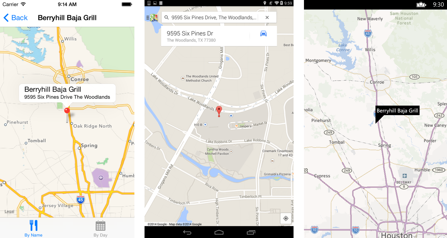
The app is coming along nicely; to finish it up, you just need to add a map that displays the location of the selected restaurant. First, you need to include the Xamarin.Forms.Maps NuGet package in the solution. Then you can add a MapView to the app, as shown in Listing 4.
Listing 4: The MapView page
public class MapView : ContentPage
{
    Map map;
    string name;
    string phone;

    public MapView(string name, string phone, string address) {

        map = new Map ();
        this.name = name;
        this.phone = phone;

        GetAddress (address);

        Content = map;
        Title = name;
    }

    public async void GetAddress(string addr) {

        Geocoder gc = new Geocoder ();
        Task<IEnumerable<Position>> result =
            gc.GetPositionsForAddressAsync (addr);

        IEnumerable<Position> data = await result;

        foreach (Position p in data) {
            map.MoveToRegion(new MapSpan(p,.5,.5));
            map.Pins.Add (new Pin() {
                Address = addr, Label = name,
                Position = new Position(p.Latitude, p.Longitude)
            });
        }
    }
}
As before, you're using a ContentPage and assigning a Map view as the content. Xamarin.Forms provides a cross-platform Geolocation service, which you will use to look up the address. When the lookup completes, you create a Pin for the selected restaurant and place it on the map.
To use the map, there are two final things you need to do. First, you have to add a handler to the locations ListView that navigate to the MapView:
void HandleItemTapped (object sender,
  ItemTappedEventArgs e)
{
    Navigation.PushAsync (new MapView (rest.Name,
      ((Location)e.Item).Phone,((Location)e.Item).Address));
}
Finally, when you first initialize Xamarin.Forms, you also need to initialize the Maps system:
Forms.Init ();
Xamarin.FormsMaps.Init ();
To use Google Maps in your app, you must register for a Google Maps API Key. Refer to http://goo.gl/1CIYfz for detailed instructions.
The completed Map is shown in Figure 8.
XAML
Like WPF and Silverlight, Xamarin.Forms also supports UI composition using XAML. The XAML equivalent of our NameList ContentPage is shown in Listing 5.
Listing 5: A ListView written in XAML
<?xml version= "1.0"  encoding= "utf-8"?>
<ContentPage  xmlns= "http://xamarin.com/schemas/2014/forms"
   xmlns:x= "http://schemas.microsoft.com/winfx/2006/xaml"
   xmlns:local= "clr-namespace:KidsEatFree;assembly=KidsEatFree"
   xmlns:constants= "clr-namespace:KidsEatFree;assembly=KidsEatFree"
       x:Class= "KidsEatFree.NameList"
       Title= "Restaurant List" >

    <ListView  x:Name= "listView"
        IsVisible= "true"
        ItemsSource= "{x:Static local:Restaurants.Data}"
        ItemSelected= "RestaurantSelected">
      <ListView.ItemTemplate>
          <DataTemplate>
              <TextCell Text="{Binding Name}"
                        DetailText="{Binding Detail}"/>
          </DataTemplate>
      </ListView.ItemTemplate>
    </ListView>
</ContentPage>
Unlike WPF and Silverlight, the initial release of Xamarin.Forms does not have a designer that allows you to generate and preview XAML. The XAML markup must be constructed manually.
Dependency Injection
If your app needs to use a platform feature that is not available in Xamarin.Forms, you can use the built-in Dependency Injection to allow your Forms code to access a platform-specific implementation. For example, if you wanted your app to have barcode scanning capability, you could use the DI system to achieve it.
First, you need to specify an Interface that each platform-specific barcode class will implement. This Interface lives in the shared PCL project.
public interface IBarCodeScanner {
    void Read(Action<string> onRead,
    Action<Exception> onError = null);
}
The interface defines a single method, Read, that accepts callback Actions for onRead and onError.
Next, you need to build a platform-specific implementation of this interface for each platform. For iOS, you'll do this by using the excellent ZXing.NET component that's available from the Xamarin Component Store. This code, shown in Listing 6, should be placed in your iOS platform project.
Listing 6: Platform specific behavior using Dependency Injection
[assembly: Dependency (typeof (BarCodeScanner))]

public class BarCodeScanner : IBarCodeScanner
{
    public BarCodeScanner() {}

    public void Read(Action<string> onRead,
      Action<Exception> onError)  {

        this.ReadAsync().ContinueWith(x => {
            if (x.Exception == null) onRead(x.Result);
            else if (onError != null) onError(x.Exception);
        });
    }

    public async Task<string> ReadAsync() {

        var scanner = new MobileBarcodeScanner
            { UseCustomOverlay = false };

        var result = await scanner.Scan();

        return
            (result == null || String.IsNullOrWhiteSpace(result.Text)
            ? string.Empty
            : result.Text
            );
    }
}
The assembly attribute at the top of the class tells the DI engine that this class is available for use as an implementation of IBarcocdeScanner.
You then repeat this for each additional platform that you want to support. In fact, you can use the exact same code in your Android and Windows Phone platform projects because the ZXing component is also available for both of those platforms.
Finally, in the Xamarin.Forms code, you can use the DI engine to access the scanner implementation.
DependencyService.Get<IBarCodeScanner> ().Read (delegate(string s) {
    // s is the value returned by read
});
This retrieves a reference to the IBarCodeScanner implementation and calls its Read method. The ZXing UI then displays and after it successfully reads a barcode, it returns control to the Xamarin.Forms code.
Platform Renderers
Standard Xamarin.Forms UI elements can be customized per-platform by the use of Platform Renderers. This is a platform-specific implementation of a control that modifies the underlying behavior or appearance.
For example, if you wanted to create a subclass of Label that has a unique appearance on each platform, you first define a subclass in the shared forms project.
public class ErrorLabel : Label {}
Next, you define a platform-specific renderer for each platform. If you don't provide a custom renderer, ErrorLabel is rendered with the default renderer for the platform. In the iOS project, create a renderer class for ErrorLabel, as shown in Listing 7.
Listing 7: Custom platform UI using Platform Renderers
using System;
using Xamarin.Forms;
using Xamarin.Forms.Platform.iOS;
using MonoTouch.UIKit;

[assembly: ExportRenderer (typeof (ErrorLabel),
typeof (ErrorLabelRenderer))]

public class ErrorLabelRenderer : LabelRenderer
{

    protected override void OnElementChanged (
      ElementChangedEventArgs<Label> e)
    {
        base.OnElementChanged(e);

        // perform initial setup
        if (e.OldElement == null) {
            var nativeLabel = (UILabel)Control;
            nativeLabel.BackgroundColor = UIColor.Red;
            nativeLabel.TextColor = UIColor.White;
        }
    }
}
Here you create an iOS UILabel and set its properties: a red background with white text, which stands out nicely against the default iOS7 color scheme. You also register the custom class so the rendering engine can find it.
You can then repeat this process for each additional platform. Android and Windows Phone use a default color scheme that is much darker than iOS - for those platforms, you might want the ErrorLabel to have a white background with red text instead.
Binding
Xamarin.Forms supports a data binding that is similar to Silverlight and WPF. Binding allows you to specify a connection between the UI objects and a backing datastore, so that a change to one is automatically reflected in the other. This frees you from having to write a great deal of boilerplate code that monitors objects for changes and then synchronizes those changes between the UI and data.
UI elements that cannot be manipulated by the user, like labels, support one-way data binding, where changes made to the source (data) are reflected in the target (UI object). In order for this to work automatically, the source object must implement the INotifyPropertyChanged interface.
Label label = new Label ();
label.BindingContext = restaurant;
label.SetBinding ("Text", "Name");
Here, you create a Label (the target) and set its BindingContext (the source) to an instance of Restaurant. You then bind the Text property of the target to the Name property of the source.
UI elements that the user can manipulate, like Entry, support two-way data binding, where changes to either the Target or the Source will be synchronized with the corresponding object.
Entry entry = new Entry ();
entry.BindingContext = restaurant;
entry.SetBinding ("Text", "Name");
The syntax is identical to setting the binding for a Label. However, if the user makes changes to the Entry field, those changes are automatically set on the instance of Restaurant you're using as the binding context.
Device Class
Xamarin.Forms also provides a static class, Device, which contains several methods to allow you to perform some simple per-platform customization of your app, as well as methods that provide cross-platform facades for common tasks.
Device.Idiom allows you to determine whether the device is a phone or a tablet.
if (Device.Idiom == TargetIdiom.Tablet) {
    // tablet only code
}
Device.OS tells you which OS your app is running on:
if (Device.OS == TargetPlatform.Android) {
    // Android only
} else {
    // all others
}
Device.OnPlatform allows you to customize execution per-platform:
Device.OnPlatform (
    iOS: () => {
        // iOS only
    },
    Default: () => {
        // all others
    });
Device.OpenUri provides a cross-platform method for opening a URL:
Device.OpenUri (new Uri ("http://www.xamarin.com"));
Device.StartTimer is a cross-platform timer mechanism.
Device.StartTimer (new TimeSpan (1000), delegate {
    // timer callback
});
Device.BeginInvokeOnMainThread allows you to force UI updates to execute on the main UI thread:
Device.BeginInvokeOnMainThread (delegate {
    // UI thread code
});
Conclusion
Xamarin 3.0 is a major step forward in providing a mature cross-platform mobile development framework. With the introduction of Xamarin.Forms, developers now have the ability to write a cross-platform UI that executes natively, while still maintaining the freedom to customize their apps on a per-platform basis.
The complete source code for the Kids Eat Free app featured in this article can be found online at https://github.com/jawbrey/Code-Xamarin.Forms.
For more information about Xamarin Forms and the other new features introduced in Xamarin 3.0, see the following links: