I’m sure by now you’ve read more than your share of books and articles describing new ASP.NET 2.0 features.
Master pages, themes, providers, etc., are all great, but have you read anything regarding custom Web control development and what has changed in 2.0? Well that’s what I’m here to tell you. If you’ve become involved in control development, either through my articles or on your own, I’ll describe some very cool enhancements that you can put to work right away in your controls using ASP.NET 2.0.
This article assumes a basic knowledge of custom Web control development as explained in my two-part article series, “Custom Web Controls Demystified” published in the Sept/Oct 2005 and Nov/Dec 2005 issues of CoDe Magazine. In this article, I’ll enhance the EmailContact control that I built in the second part of that article.
If you constantly forget to implement INamingContainer in your composite controls, the new CompositeControl class will be a welcome addition.
Ok, so before you misinterpret the title of this article or make any false assumptions about code compatibility, let me start by telling you that all of the Web controls you developed in ASP.NET 1.1 (or 1.0) will work just fine in 2.0. Feel better? Good. Microsoft has not changed anything that will break your existing code. Everything that I will teach you here involves new and exciting technologies that you can add to existing controls or use with new ones.
New Enhancements
Table 1 describes several of the most important enhancements for custom Web control development. These are the ones I will cover in this article, but if you choose to research this topic further, you’ll find that there are several other changes and enhancements in the Web control arena, including Control Adapters, several base classes, region editing, and others. Perhaps I will make some of them the topics of future articles.
Enhancing an Old Friend
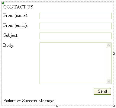
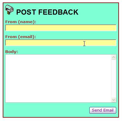
In my two-part article series called “Custom Web Controls Demystified” I developed a custom Web control named EmailContact (Figure 1) and allowed you to provide your sites with a “contact us” form, complete with e-mailing functionality. In this article, I’ll enhance that control with the functionality I’ve summarized above.
If you have not read the previous articles, I strongly recommend that you do so in order to familiarize yourself with this control. If you’re a seasoned Web control developer, you should have no trouble following along.
A New Base Class
For a while now, developers have used the WebControl class to derive their visual Web controls. I say “visual” because controls that do not render anything to the browser are typically derived from the Control class. This has not changed and you should continue to use the Control class for any controls that perform invisible functionality or render anything else other than visual HTML to the browser. You should also continue using the WebControl class for any controls you develop using the rendering technique. However, most of us develop composite controls in order to leverage the power of existing controls. In this case, you’ve always inherited from the WebControl class, but you’ve also been forced to remember a few other details and if you forget them, that has always caused a lot of grief.
Composite controls must implement the INamingContainer interface and simply needs to be included by your control class, and forgetting to do so causes all sorts of problems. This interface ensures unique tag naming in all the HTML tags that your control and any controls in its control hierarchy may render. This is crucial in case you have more than one composite control of the same type on a single page. In such a case, you need to ensure that any child elements render with unique names.
Prior to ASP.NET 2.0, composite control developers also needed to remember to call EnsureChildControls in the Render method of a control. If you read back in the previous articles, I showed you how to override the Render method and make this call just before calling the Render method of the base class. This step is necessary in order for the control to render correctly in the design surface of Visual Studio. Forgetting this detail caused some inconvenience.
These two steps were so common in composite controls that many developers had a base class that included these two details and developers derived all of their new composite controls from this base class. ASP.NET 2.0 offers the [appropriately named] CompositeControl. Use this class to build your composite controls and you’ll never again have to remember to implement INamingContainer or perform an EnsureChildControls call from the Render method.
There are a couple of other new base classes that deal with data bound controls and so forth, but I’ll make them the topic of a future article on data binding custom controls. (Are you salivating yet?)
ControlState
I’ve always preached that ViewState can be your best friend or your worst enemy depending on how you use it. If you’ve had trouble in the past deciding on when, where, and how to properly use ViewState, I once again direct you to my previous articles. However, if it’s a topic with which you feel comfortable then you’re going to love the new ControlState.
With the new Template Editing features, your controls can have the same functionality as commercial controls with very little work.
One of the biggest gripes about ViewState was its all-or-nothing approach to state management. A page developer has too much power at their disposal and can easily decide to turn ViewState off at either the control level, the page level, or on the entire site (web.config). In fact, if you can turn it off in the web.config for an entire site, guess where else you can turn it off? That’s right-the machine.config-in which case it will affect every site on that server. Tell me the practical joke possibilities are limitless with that one. Should a page developer decide to turn off the ability to maintain state in the ViewState, your controls may be rendered partially incapable or worse, totally useless.
Microsoft created ControlState for solving just that problem. Page developers CANNOT turn ControlState off so using it is safer for selected properties.
Using ControlState is almost the same as using ViewState. However, ControlState does not have a variable like the ViewState variable. ControlState offers methods called SaveControlState and LoadControlState that your controls can override. These methods work identically to the SaveViewState and LoadViewState methods, which I thoroughly describe in my previous articles.
Since ControlState lacks a variable to use in property statements, you have to revert back to the member variable/property statement notation that ASP.NET developers have used in their objects since the forming of the cosmos.
Protected _MailServer As String = "First name:"

Public Property MailServer() As String
    Get
        Return _ MailServer
    End Get
    Set(ByVal value As String)
        _MailServer = value
    End Set
End Property
However, since I’m using a standard member variable as my value store, I need a way to persist the data in the ControlState, and that’s where the aforementioned methods come in. As in their corresponding ViewState cousins, ASP.NET will call these two methods within the page lifecycle. The SaveViewState method returns an object type which will be persisted. Multiple values are persisted by this method by returning an object array. And just as it occurs in the SaveViewState method, it is customary to use the 0-position of the array to make a call to the SaveControlState method of the base class.
Protected Overrides Function SaveControlState() _
  As Object
    Dim state() As Object = New Object(2) {}
    state(0) = MyBase.SaveControlState()
    state(1) = _MailServer
    Return state
End Function
The LoadControlState method receives an object as an argument. This object is the one previously returned in SaveControlState. In this method I reassign the member variables by casting the argument to an object array, then obtaining each subscript’s value. As before, I use the 0-position to make a call to the LoadControlState method of the base class.
Protected Overrides Sub LoadControlState( _
                    ByVal savedState As Object)
    If savedState IsNot Nothing Then
        Dim state() As Object = _
            CType(savedState, Object())
        MyBase.LoadControlState(state(0))
        _MailServer = CType(state(1), String)
    End If
End Sub
By using these methods to persist data, this control becomes immune to a page developer’s evil and twisted attempt at application chaos if they try to turn ViewState off.
In case you’re wondering where ControlState gets stored; it is another hidden textbox rendered to the HTML page. As in ViewState where the persisted data gets stored in the __ViewState hidden textbox, ASP.NET uses the __ControlState hidden textbox to persist ControlState data.
Microsoft didn’t give developers the ability to use ControlState inherently as they did in the case of ViewState. You need to register your control for ControlState use. You do this by overriding the OnInit event of the control and calling the RegisterRequiresControlState method of the Page object.
Protected Overrides Sub OnInit( _
              ByVal e As System.EventArgs)
    MyBase.OnInit(e)
    If Page IsNot Nothing Then
        Page.RegisterRequiresControlState(Me)
    End If
End Sub
Now you can use ControlState to persist data you deem as important enough that your control is rendered useless if it’s not persisted.
Remember, changes to a property you make in design-time are hard-coded into the control’s ASPX declaration and are thereby automatically persisted between postbacks. However, if an action on the form changes a control’s property, it will invoke the use of a state mechanism. Without that property being stored in one of the two state-stores, it will revert to the “hard-coded” state upon the next postback.
Now I ask you to please use good judgment when deciding which state storage you will use for your control properties. In general, store appearance-related properties in ViewState and behavior-related properties in ControlState. That way, if a page developer turns ViewState off, your control may not look right, but it will behave correctly.
Smart Tags
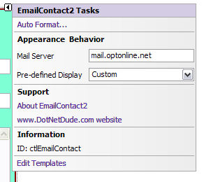
When you start using either Windows Form controls or ASP.NET Web controls in Visual Studio 2005, one of the first things you may notice is a little doohickey in the shape of an arrow in the upper right-hand corner of many controls (see an example in Figure 2). Clicking this arrow pops up a small window containing some of the control’s properties and maybe a link or two. Microsoft designed these smart tags to display properties that you need to look at in order to get the control working on a page or form properly, and you’ll notice that they are a bit more elaborate than just a shortcut menu. It’s worth mentioning that everything I will teach you in this section applies to both Windows Form controls and ASP.NET server controls.
In order to build your own smart tag you need to use a control designer class. In fact, you’ll use this class for a couple of other topics I’ll cover later as well. But before I get into the designer class, I first need to create an ActionList class. This class will define the elements that will go into my smart tag.
AutoFormat adds a professional touch to your controls and your users will appreciate the ease of formatting you’ve provided them.
An ActionList class inherits from the DesignerActionList class in the System.ComponentModel.Design namespace. But before I show you what goes into this class, let me explain that there are four types of elements that go into a smart tag: category headers, property mappings, action links, and information items. Figure 2 illustrates my goal in building this smart tag. Can you see the four types of elements I am referring to? I divided this smart tag into three categories as noted by the headings: Appearance & Behavior, Support, and Information. The Appearance & Behavior category contains two properties: Mail Server and Pre-defined Display. These are actually properties of the EmailContact control itself. The Support category contains two links that activate an action of some sort, and the Information category simply displays information. So keeping these four types of elements in mind, I’ll create my ActionList class.
I’ll create a class called EmailContactActionList and derive it from DesignerActionList as I mentioned above. (You can see the complete class in Listing 1). I’ll create a constructor that receives an EmailContact instance and amplifies its scope to a class-wide variable called ctlEmailContact. Later, when I add code to the designer class, you will see where and how this constructor gets used. Now I have a class-wide object that contains the instance of the Web control I am currently designing.
Next I’ll create property mappings for the properties that the smart tag will display. In Figure 2 you saw that I had labeled two properties in the smart tag “Mail Server” and “Pre-defined Display”. These will map to properties of the EmailContact control called MailServer and PreDefinedDisplay, respectively. Property mappings in an ActionList class return the control’s property in the get accessor and set the control’s property in the set accessor. However, due to the way Microsoft designed the ActionList infrastructure, you cannot “set” the control’s properties directly. Instead, you must use reflection in order to access the property in the control, and then set its value. To facilitate this, I have a method called GetControlProperty that returns a PropertyDescriptor object. This eliminates the need to have to repeat the reflection code in every property mapping. Here’s what one of the property mappings looks like.
Public Property MailServer() As String
    Get
        Return ctlEmailContact.MailServer
    End Get
    Set(ByVal value As String)
        GetControlProperty("MailServer"). _
        SetValue(ctlEmailContact, value)
    End Set
End Property
The next items I need to set up are the links that you saw in Figure 2: “About EmailContact” and a link to my Web site. These links will execute methods which I’ll write into this class. My first method is called ShowAboutBox and displays a Windows Form that will serve as an About box for my control. The second method is called LaunchWebSite and performs a call to System.Diagnostics.Process.Start to launch my Web site in a browser instance. The only requirement for these two methods is that the signature be a “Sub” (void in C#) and that they have no arguments.
This smart tag example only displays two properties and two links, but using the technique I just showed you, you can provide as many of both as you want. You should, however, use good judgment (I know, I keep saying that) and don’t overload a smart tag with too much information. Remember, you want to put things in there that you wish to immediately make available to the page developer in order to make the Web control more intuitive.
OK, now that I have my property mappings and my action methods coded, I’m going to actually create the smart tag contents. The DesignerActionList class provides a function to override called GetSortedActionItems. Later, a designer class will override this function and it will return an object of type DesignerActionItemCollection from the System.ComponentModel.Design namespace.
The implementation of this property override will create a new DesignerActionItemCollection object (which the function will return later) and fill it with instances of four different classes: DesignerActionHeaderItem, DesignerActionPropertyItem, DesignerActionMethodItem, and DesignerActionTextItem. These are all derivatives of the abstract DesignerActionItem class. I’ll walk you through these one by one.
Dim o_Items As DesignerActionItemCollection = _
   New DesignerActionItemCollection
This code uses the DesignerActionHeaderItem class to create smart tag category headers and receive the category name in their constructor. I’ll insert the instantiation of this class directly into the collection I’ve just created.
o_Items.Add( _
   New DesignerActionHeaderItem( _
   "Appearance & Behavior"))
The exact title used for each category is important in an additional way besides it being the text displayed as the category header in the smart tag. Earlier, I created two property mappings called MailServer and PreDefinedDisplay and now I’m going to add them to the smart tag. I will do this by creating instances of the DesignerActionPropertyItem class and adding them to the collection.
o_Items.Add( _
   New DesignerActionPropertyItem( _
   "MailServer", "Mail Server", _
   "Appearance & Behavior"))
Notice the constructor receives three arguments: the property name (as defined earlier), the caption text that will appear in the smart tag, and the exact title of the category as defined in the DesignerActionHeaderItem instantiations.
Next, I’m going to add the action links to the smart tag in the same fashion, only this time using instances of the DesignerActionMethodItem class.
o_Items.Add(New DesignerActionMethodItem( _
   Me, "ShowAboutBox", "About EmailContact2", _
   "Support", "Displays the about box.", True))
The constructor here receives the method name, the link caption, the category text, and a description that will serve as the link’s tooltip. The fourth argument in the constructor decides if this link will also appear at the bottom of the property browser.
Lastly, I’ll add the information item to the smart tag. I’ll do this in the same fashion but using the DesignerActionTextItem class.
o_Items.Add(New DesignerActionTextItem( _
   "ID: " & ctlEmailContact.ID, "Information"))
The constructor here only receives the text to display and the category under which to place it.
The final code in Listing 1 shows all the items I’m adding to this collection. At the end of the method, the collection is simply returned through the function. Now it’s time to work on the control designer class. While I could write an article just about the details of a designer class, I’ll summarize here.
Control Designers
A control designer class inherits from System.Web.UI.Design.WebControls.CompositeControlDesigner. The class is wired to the control using an attribute at the control’s class declaration.
DesignerAttribute(GetType(EmailContactDesigner))
It provides all kinds of appearance and behavior characteristics for the user’s experience while in the Web Form Designer. When a page developer drops a Web control on a Web Form, various properties are obtained at different points of interaction between the page developer and the control. These properties affect what the page developer will see, starting with the control itself and including more subtle, behind-the-scenes elements, such as smart tags.
You can use smart tags to expose crucial settings of your controls to page developers.
A control designer can actually render a different output for a control during design time than the one being displayed at run time. In some cases, a control may not have any visual rendering at run time but requires some kind of display at design time in order to make it easy to work with. Examples of this are the declarative data sources that come with ASP.NET 2.0. These controls provide data storage and caching, but no visual rendering. However, in design time, they render as a grey box with some descriptive text on the web Form design space. Another example of difference in rendering can be where controls don’t render anything unless they are bound to data. The GridView (or DataGrid in 1.1) looks great when it has data, but appears as nothing (or empty headers) when there are no rows to show. When you drop one onto a Web Form, you need to see what it will look like so the control renders with a few sample rows of dummy information. This is provided by the designer class.
When Visual Studio needs to determine what to display in a smart tag, it accesses a property of the designer class called ActionLists, and uses its results to build the smart tag. The ActionLists property returns an object of type DesignerActionListCollection in the System.ComponentModel.Design namespace. I will override this property in my designer class and build a DesignerActionListCollection object. The object I’ll return is going to be declared at the class-scope and checked against a “nothing” value in the ActionLists property.
Private o_ActionLists As _
   DesignerActionListCollection
Values in the control designer are cached and do not need to be recreated over and over again, allowing for more efficient designer rendering for controls.
One characteristic of a control designer class is a member called Component. This is declared in the base class from which a control designer class inherits, and contains a reference to the actual control to which the designer class is wired. I can take this variable and cast it to my actual control type since the variable is declared as object.
Dim ctlEmailContact As EmailContact = _
   CType(Component, EmailContact)
The result is an object called ctlEmailContact that contains a strongly-typed instance of the actual control this class is currently designing. Thus, any changes or actions I perform on this object will be immediately reflected on the Web Form design surface, and witnessed by the page developer.
The rest of the implementation of this property override includes adding an instance of the ActionList class I created earlier to the DesignerActionListCollection object I created at the class level.
o_ActionLists.Add( _
   New EmailContactActionList(ctlEmailContact))
Remember when I created a constructor in the EmailContactActionList class that received an instance of the EmailContact control? As you can see, I use that constructor here by passing the control instance I am designing into it.
Listing 2 includes the complete source needed by the control designer class in order to build the smart tag.
In this example, I created only one ActionList class, filled it with action list items, and added that class to the DesignerActionListCollection class to be returned by overriding the control designer’s ActionLists property. I can create as many ActionList classes as I need and simply add them to the collection in the ActionLists property. This may be useful if I wanted to logically organize smart tag items in order to reuse them in multiple controls. The decision as to why and when to do this would be up to you and your requirements.
When I compile my control and drop it onto a form, I will now see a little arrow in the upper right-hand corner, and clicking it will display what you see in Figure 2. Changing any of the properties here will be the same as changing them in the property browser. Clicking on the links will perform the actions defined in the methods of the EmailContactActionList class.
That’s all there is to it. Remember-don’t go overboard in filling up a smart tag with properties that are not immediately needed to get the control to work. Fill them only with what you want to put in the page developer’s face immediately.
Template Design-Time Editing
In the July/August 2006 issue of CoDe Magazine, I taught you how to add templating capability to your controls. I’m not going to go through that again, but I am going to review a part of that article since its subject matter falls under the context of this article as well. I’m referring to the ability to edit template contents from the Web Form’s design surface; something you couldn’t easily accomplish in ASP.NET 1.x.
Template design-time editing is visible in controls like the GridView where you can put the control into “template editing” mode and drag other controls into the template area. Without this ability, page developers must switch to ASPX view and create template contents there manually like this:
<dnd:EmailContact ID="ctl1" runat="server">
    <HeaderTemplate>
        <asp:Label ID="lbl1" runat="server"
             Text=”Label" />
        <asp:Textbox ID="txt1" runat="server"/>
    </HeaderTemplate>
    <FooterTemplate>
        <asp:LinkButton ID="lnk1" runat="server"
             Text="LinkButton" />
        </asp:LinkButton>
        <asp:DropdownList ID =”ddl1”
             runat="server" />
    </FooterTemplate>
</dnd:EmailContact>
While this is not that bad, it would be better to keep page developers in the designer surface.
In order to add template editing capability to a control, you must override the Initialize method of the control designer class and set a flag that informs the designer that you want to support template editing.
Public Overrides Sub Initialize(ByVal Component As
                                      IComponent)
    MyBase.Initialize(Component)
    SetViewFlags(ViewFlags.TemplateEditing, True)
End Sub
Notice I made a call to the base method to make sure I didn’t cancel anything I wasn’t supposed to. This call informs the designer that it will support template editing, but you still have to code the implementation of said editing.
Microsoft built their designer in such a way that you can categorize templates into template groups, in the case that you have many templates in your control. The template itself is defined in an object called TemplateDefinition and it is the TemplateGroup object that contains one or more of these definition objects. The TemplateGroup objects are contained in an object of type TemplateGroupCollection, so it is here that you’ll declare a variable of that type at the class level in the designer class. As in the case of smart tags, the infrastructure will cache this object which is why I declare it at a class-level scope.
Private o_TemplateGroups As
  TemplateGroupCollection = Nothing
This collection gets a built in property called TemplateGroups that I now have to override. It is the contents of this property that will be exposed to the page developer for template editing.
Public Overrides ReadOnly Property
TemplateGroups() As TemplateGroupCollection
    Get
        If o_TemplateGroups Is Nothing Then
	     ………
        End If
        Return o_TemplateGroups
    End Get
End Property
In this property override, I’ll build the TemplateGroupCollection that Visual Studio will use. The “is nothing” check in the property prevents the unnecessary rebuilding of this object.
First I’ll instantiate the o_TemplateGroups object.
o_TemplateGroups = New TemplateGroupCollection()
Now I need to grab the control I’m designing using the Component variable I talked about in the smart tags section.
Dim ctl As EmailContact = CType(Component,
  EmailContact)
I’ll use this variable in a few minutes, but first I have to set up the two object variables I want to use for the TemplateGroup and TemplateDefinition objects.
Dim o_TemplateGroup As TemplateGroup
Dim o_TemplateDefinition As TemplateDefinition
Now I can start defining groups and templates.
o_TemplateGroup = New TemplateGroup("Surrounding
  Templates")
The text “Surrounding Templates” will appear as the category heading for whatever template definitions I place in this group.
o_TemplateDefinition = New TemplateDefinition(Me,
"Header Template", ctl, "HeaderTemplate", False)

o_TemplateGroup.AddTemplateDefinition _
 (o_TemplateDefinition)
Let me walk you through the arguments in the TemplateDefinition constructor. I first have an instance of the designer incorporating template editing, usually just Me. The second argument is the name of template as it will be displayed in a shortcut menu or a smart tag. This is followed by the control being designed; remember, you obtained this earlier by casting the Component object. The next argument is the name of the template property in the control. The Boolean argument at the end of the argument list is set to False so this template will accept server controls and HTML controls. Setting it to True will only allow the addition of server controls (regular Web controls) to the template.
As you can guess, this is repeated for every template and every template group you want to define. The end result is my o_TemplateGroups object nicely filled with all my template definition information and that is what I return in this property.
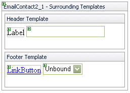
So now I’ll recompile and go to my test page. When I right-click on my EmailContact control, I’ll see “Edit Template” added to the shortcut menu. The listing in the submenu will display the template groups I defined in the designer class. And when I select the “Surrounding Templates” group, I’ll see something like what’s in Figure 3. You can see the controls that I manually added to the two templates and, in fact, I can now drag other controls directly from the toolbox. Right-clicking again and selecting “End Template Editing” will return back to the standard control view and display the template contents in the control.
Also notice that an “Edit Templates” link has also automatically been added to the control’s smart tag. If a smart tag did not exist previously, then one would have been automatically created for me when I added the template editing code to the designer class.
Listing 3 shows the complete template editing code as it fits in the control designer class.
Auto Format
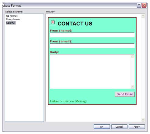
All right, hang on because now the ride is going to get fun! Have you ever dropped a GridView onto a form and noticed a little link under the property browser labeled “Auto Format…”? You know the one-you click on it and you get a choice of pre-defined formats like Corporate, Elegant, Classic, etc. In fact, the entire Security Control Suite that comes with ASP.NET 2.0 provides this feature. Well, you’ll be surprised how easy it is to supply your controls with this functionality.
Using Web Resources, you no longer have to worry about distributing images with your controls.
I need to decide what formats I want to provide for my control. I’ll keep it simple by creating three formats. I’ll call two of them “Monochrome” and “Colorful”. The third (it will actually be the first) I’ll call “No Format” which reverts the control to its original state when it was dropped onto a form. I suggest you add a format like this any time you apply this technology to your controls.
Each format I create will need its own class which will inherit from the DesignerAutoFormat class in the System.Web.UI.Design namespace; so I start with a class called ColorfulFormat and inherit DesignerAutoFormat. I need to provide a default constructor for this class and in it I will call the base constructor, sending to it one argument; the name of the format as it will appear in the list.
Public Sub New()
    MyBase.New("Colorful")
End Sub
Next I must override the Apply method. This method receives one argument of type Control. My control designer class will call this method and send the instance of my control (remember Component?) into this argument. Then I’ll to cast the argument to my control type so I can have a strongly-typed reference with which to work.
Public Overrides Sub Apply( _
   ByVal control As System.Web.UI.Control)

    Dim ourControl As EmailContact2 = _
       CType(control, EmailContact2)

    If ourControl IsNot Nothing Then

    End If

End Sub
Now I need to set whatever properties I want that will cause my control to appear in the context of what I consider a “colorful format.” This will usually include styling properties but it can, in fact, include anything I want. So inside the “IsNot Nothing” check, I simply set whatever style properties I want for this particular format. Listing 4 shows the complete list.
ourControl.BackColor = Drawing.Color.Aquamarine
ourControl.BorderStyle = BorderStyle.Double
ourControl.BorderWidth = Unit.Pixel(2)
ourControl.BorderColor = Drawing.Color.DarkRed
ourControl.HeadingStyle.Font.Name = "arial"
ourControl.HeadingStyle.Font.Bold = True
ourControl.HeadingStyle.Font.Size = FontUnit.Large
Next, I’ll create a class called MonochromeFormat and perform the same steps, only this time I’ll set the styling properties to something more black and white to adhere to a “monochrome” format. See Listing 5 for the complete class.
Finally, I have to create the NoFormat class. This class follows the same design as the previous two, but instead of setting styling property values to various colors and fonts, I call the Reset method on all style properties. This resets all style values to their default state.
Incidentally, since my EmailContact control derives from the CompositeControl class, which in turn derives from the all-to-familiar WebControl class, I also get styling properties at the class-level in my control. This means I have BackColor, ForeColor, etc., accessible directly from my control without having to go through one of its properties. This is used to style the container for my control and is explained in detail in my article series, “Custom Web Controls Demystified”. However, to reset these style values I don’t get a Reset method directly from my control class; instead the WebControl class gives me a ControlStyle property that serves as the entry point for all the container style values. As part of the “resetting” of the control’s appearance, I am also setting the Height property to a default value of 400 pixels. Listing 6 contains the complete class.
Now that I’ve created all of the format classes I want, I need to actually do something with them. To do that, I’ll go back to the control designer class. You can probably guess that there is something here that I have to override. And you’re right. The property I need to override is called AutoFormats and it returns an object of type DesignerAutoFormatCollection in the System.Web.UI.Design namespace.
As in smart tags and template editing, the object that I’m going to instantiate in order to return through the property is declared at the class level since the infrastructure will cache it for me.
Private o_AutoFormats As _
   DesignerAutoFormatCollection
Then, in the property override implementation, I can test the object variable against a null value-once again, very similar to the previous cases. The o_AutoFormats collection object will now simply be filled with instances of each of the format classes I previously created.
Public Overrides ReadOnly Property AutoFormats() _
                 As DesignerAutoFormatCollection
    Get
        If o_AutoFormats Is Nothing Then
            o_AutoFormats = _
               New DesignerAutoFormatCollection
            With o_AutoFormats
                .Add(New NoFormat)
                .Add(New MonochromeFormat)
                .Add(New ColorfulFormat)
            End With
        End If
        Return o_AutoFormats
    End Get
End Property
If I recompile and test the control again, I’ll see that a link called “Auto Format…” has been added to the top of the smart tag. If no smart tag existed before, then Visual Studio would have automatically created one for me with the “Auto Format…” link in it. You’ll also notice that an “Auto Format…” link appears at the bottom of the property browser.
If I click on either link, I’ll see something like (Figure 4). Select any of the formats in the list to change it in the preview window and click OK to commit the settings to the control in the Web Form design surface.
Now that you know HOW to do something, you should learn WHEN and WHY as well.
I can just hear the CSS zealots out there screaming at this article. I am indeed a big fan of cascading style sheets and use them in all my sites, but there’s a lot to be said for packaging and ease of development. A feature like Auto Format is very welcome in situations like control suites. For example, consider Microsoft’s Security Control Suite. Here you have seven Web controls that you can use to add authentication to a site. Each of them has Auto Format capability and each displays the same list from which to choose a format. This is great if you need to either throw something together quickly or if you actually like the formats included and wish to model the rest of your site similarly.
Think of some of the popular visual metaphors out there today; the many styles of the Outlook bar, various TreeViews, menus and toolbars, etc. You can integrate many of them into almost any site’s design style. Auto Format is a great tool in a case like this.
Now remember that in each format class, I changed styling values in some of my style properties. If you apply one of these formats on the Web Form, you’ll see that the style values have indeed changed in the property browser. If I wanted to, though I wouldn’t choose to, I could have modified the CssClass value of the style properties and assigned a style sheet class to them. That would have worked as well, but then I would need to distribute the CSS file along with my control and also make sure the page links to it.
Wouldn’t it be really cool if I could use these kinds of resource files in my control and not have to distribute them along with the control’s DLL file? Well, that leads me to the last topic of this article, Web Resources.
Web Resources
Web Resources are embedded files that get compiled into the DLLs of your controls. Windows Forms control developers have had this capability for a long time but now it finally comes to the Web. Imagine developing a control that relies on certain images for proper rendering and being able to simply deploy the control’s DLL file without any of the image files. Check out Microsoft’s new Tree Web control and you will see this in action. The most ideal candidate for using Web Resources are image files, though I can also use them for JScript files.
To show you how this works, I’m going to add an image of a mailbox to the left of the heading in my EmailContact control. If you noticed Figure 4, there is already an empty image to the left of the “CONTACT US” heading caption. I did this simply by creating an Image child control and adding it to the control hierarchy in the proper place. In fact, I also created a property called ShowMailIcon to allow the page developer to hide or show the image.
Now, using a conventional approach you could create a HeadingImageUrl string property and set its value in the Image control’s ImageUrl property. This would allow the page developer to set this image to whatever he or she wants. I agree with this approach, and I’ve incorporated it into this control. However, I’ve taken it a step further. If my HeadingImageUrl property is not empty, then I use it to fill the Image control’s ImageUrl property as I just described. But if the property is empty, I do something very cool.
I have a mailbox image in my Web control project called mailbox.gif. I will set the BuildAction property of the image to EmbeddedResource (I can do this from the property browser).
Next I need to access my project’s AssemblyInfo.vb file. In ASP.NET 1.1, this file was located in my project’s root folder but in ASP.NET 2.0 it is under the My Project folder. Not only that, but I have to click on the “Show All Files” button at the top of the property browser to access this file. At the bottom of the AssemblyInfo.vb file, I need to add the following line:
<Assembly: WebResource("mailbox.gif",
"image/gif")>
This will identify the embedded file as an available Web Resource for later extraction.
To extract the file, I use the GetWebResourceUrl method in the Page.ClientScript object. As I stated earlier, I want to give the page developer the ability to override the image using my property so I code the extraction as follows:
If Me.HeadingImageUrl <> "" Then
    imgMail.ImageUrl = Me.HeadingImageUrl
Else
    imgMail.ImageUrl = _
       Page.ClientScript.GetWebResourceUrl( _
       Me.GetType(), "mailbox.gif")
End If
This really is my favorite new Web control feature because I tend to use little images here and there to spiff up my controls. Now I can embed them and simply distribute my control’s DLL file only.
Testing the control will display what’s in Figure 5.
The Web Form will use an HTTP handler to retrieve the image and render it to the browser. The possibilities are endless with this one.
Conclusion
I hope you’ve enjoyed this tour. ASP.NET 2.0 brings many cool things to Web development with the introduction of master pages, themes, data sources, and other great features. In fact, you can embed callbacks (a new page feature) into controls as well, giving them AJAX functionality for better response time and a richer client experience. Unfortunately, that topic deserves its own article so I couldn’t cover it here. The new control development features I have shown you here have not received the publicity they deserve, but hey, that’s why I’m writing. As you can see, most of these are for design-time experience, but I’ve always preached that making your controls intuitive to the page developer is equally as important as making them useful and functional. If they’re not easy to use, then you may not ever get to see them in action.