
When I first started to dive into the world of digital accessibility, I quickly found myself lost in this vast new landscape. What are WCAG and POUR and ARIA? Should I be focusing on screen reader users, or those who primarily use a keyboard to navigate, or perhaps take more time to understand how cognitive disabilities can affect access to websites, apps, and games. Although all the knowledge I was (slowly) acquiring was valuable, I didn't have the foundation necessary to understand which elements were most important, and even more, I didn't know how to properly assess the difficulty and impact of the changes I wanted to make. This made it hard to know if fixing an issue would take five minutes, five days, five weeks, or five months. And what if the five-month fix didn't really do anything meaningfully better for accessibility? More than anything else, I just wanted to know where to start: What were the small steps that I could take immediately, as I worked to build up my accessibility toolbox, that would result in substantial and valuable increases in accessibility for my products?
That brings us to today. I never did find the “beginners guide to accessibility” that I was looking for, but after years of trial-and-error and continuous learning, I'm happy to walk you through a list of easy accessibility wins so you can start on your own path to improved accessibility.
A major advantage to these easy accessibility wins is that they're generally so small and typically invisible to non-disabled users that they're suitable for when you don't necessarily have buy-in from your leaders as to the value of increased accessibility. In fact, that's exactly where I started my journey as well: My manager was willing to hear me out about accessibility, but as a small business fighting for every dollar, he wasn't eager to dedicate a lot of time or effort toward a specific accessibility initiative - at least at first. The accessibility of our product grew leaps and bounds over the years as I continued to advocate for accessibility among my peers and to my leaders. When the time came that we made accessibility a priority for all our products, we didn't have as much work to do as we might have, due to the five-minute mini-projects I'd championed and actioned over the years.
WebAIM Million
One of the resources I stumbled across in my research was the WebAIM (Web Accessibility In Mind) organization, which has been dedicated to making the web more accessible for nearly twenty-five years. In particular, since 2019, they've done a yearly analysis of accessibility of the top million most visited websites using their own accessibility evaluation tool, called WAVE (https://wave.webaim.org/).
As with other types of automated testing, there are limitations as to what an automated accessibility checking tool such as WAVE can verify, but automated checkers in general are a crucial tool and show just how far we have to go in ensuring that the digital world is accessible to everyone.
The most recent WebAIM Million survey was completed in February 2023 and although there's some positive news in the report, the fact of the matter is that 96.3% of pages tested had at least one accessibility issue, and on average, there were 50 errors per page. Can you imagine navigating around a website and having 50 JavaScript alerts show up, one after another, on Every. Single. Page. And then the same thing happens on the next page, and the next, and the next website too. How long would it be before you just gave up completely?
The number of pages with at least one error is slowly going down each year, with 2022 reporting 96.8% of pages and 2021 97.4%. One error is probably enough to ruin someone's day, but 20.7% of pages did have fewer than five errors, and 30.8% had fewer than ten, and, unfortunately, that does represent a “good” situation as far as accessibility goes. And once again, these are only the errors that could be detected by an automated accessibility tool, so in reality, the scope of errors is much larger.
I discovered the WebAIM Million in its first year, and one fact has been of particular interest to me as I followed it: Out of each year's top one million most visited websites, where there's an average of 50 errors per page, the majority of the errors each year fall into one of six categories. That's it, just six errors! And even better, each one of these six types of errors is a quick and easy fix.
The Six Most Common Failures
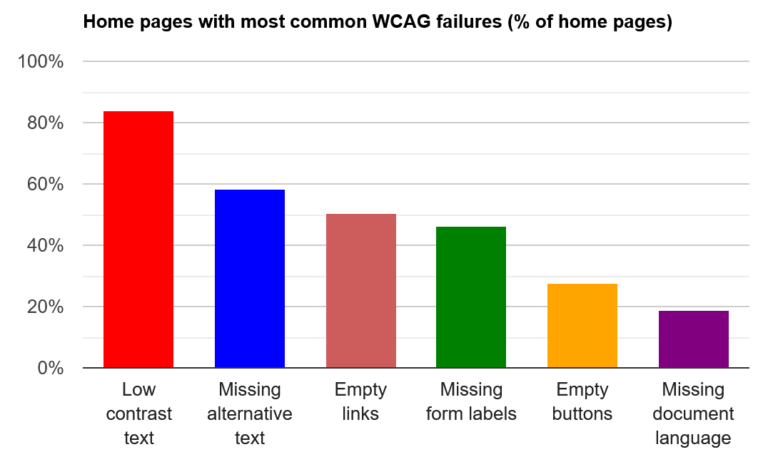
As seen in Figure 1, the six most common failures encountered on the top million most visited websites are:
- Low contrast text, occurring on 83.6% of pages (the red bar on the far left)
- Missing alternative (alt) text on 58.2% of pages (the blue bar second from left)
- Empty links are present on 50.1% of pages (the reddish-brown middle bar)
- Missing form input labels are a problem on 45.9% of pages (the green middle bar)
- Empty buttons exist on 27.5% of pages (the yellow bar second from the right)
- Missing document language affects 18.6% of pages (the purple bar on the far right)
What are your thoughts on these failures? Are they issues you're familiar with, or have you never heard of them before? Do you know how to fix these errors or prevent them from happening in the first place?
Luckily for you, I'll be going through each of these errors in detail, including what they are, how they occur, and of course, how they can be fixed (and prevented) quickly and easily.
First, a quick note: Although I understand why WebAIM has broken empty links and empty buttons into their own categories, in my opinion they're two sides of the same coin and really don't make sense to write about separately. With that said, let's talk about the Five Most Common Accessibility Errors.
Low Contrast Text
The most common issue detected in the WebAIM Million analysis is low contrast text, appearing at least once on 83.9% of pages checked. As per the (Web Content Accessibility Guidelines (WCAG)) success criteria, the AA guideline (AA guideline) requires a contrast ratio of 4.5:1 for text and images of text, with some exceptions (i.e., bigger text can usually have lower contrast and still be readable for most users).
If you're unfamiliar with Web Content Accessibility Guidelines (WCAG), these are the standards for accessibility that all automated accessibility checking tools use for their criteria, and in many countries, WCAG has also been incorporated into digital accessibility legislation. If you have a question or concern about digital accessibility, the WCAG probably has an answer for you. Additionally, the WCAG criteria are usually presented at three levels: A, AA, and AAA, where the A criteria is very basic and the AAA criteria is advanced. Legislation and accessibility checking tools will nearly always compare against AA criteria.
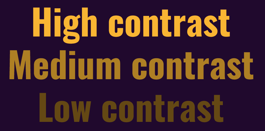
In Figure 2 the top line, labeled High contrast, has a contrast ratio of 10.26:1, which exceeds the AA 4.5:1 guideline, as well as the AAA 7:1 guideline. This text is highly visible against the background and should be distinct enough to be reliably viewed in many situations, such as bright sunlight, and/or by people with disabilities such as low vision or color blindness.
The second line in Figure 2 (Medium contrast) has a 5.14:1 contrast ratio. This is enough to meet the AA guideline, but not the AAA one. It's usable, especially when the text is large, but you can likely see how it's starting to blend a bit more easily into the background, and it will be harder to read than the top line for some people in some situations. This is the threshold that was checked in the WebAIM Million: the WCAG AA guideline of 4.5:1. Over 80% of the reviewed sites don't meet this requirement for text. Consider how many people must visit a site for the first time and then leave because they can't see or comfortably read any of the content.
The last line in Figure 2 (Low contrast) has a contrast ratio of 2.17:1. I created this example and I can barely read it, so if you're asking yourself “which third line?” I don't blame you. You may also be thinking, surely no one would create a site or page that's literally this bad? Not to name names, but there's a very popular online map website, the top in its category, where the default colors in the light theme are much lower than 4.5:1. Specifically, they use yellow, blue, and red place markers and text against a light grey or white background and each of those combinations are in the 2:1 contrast range. Unfortunately, accessibility remains an afterthought for many, even large and well-established companies in the tech industry, who really should know and do better.
Sufficient contrast for text is a fundamental piece of accessibility, as it can stop a user in their tracks. How can a user do anything on a site if they can't read the content? Contrast, as well as being an accessibility consideration, is also a general use consideration - think of when you've been on your phone while running errands and struggled to read an email or a page in an app while the sun glares down on your screen. If the contrast on those sites or apps was high enough, it would have been much easier to access the information you needed at that moment. Beyond websites and apps, think about games - a key aspect of Pokemon Go (a particular favorite of mine) is to get outside and catch Pokemon, and yet, every summer we players struggle to see what's happening on our screens as a result of the low contrast colors used throughout the game.
Any accessibility feature that also improves things for non-disabled people is known as the curb cut effect (https://en.wikipedia.org/wiki/Curb_cut_effect). Although those little dips at the corners of sidewalks onto the road were originally created to increase accessibility, it turns out they benefit all users, from those using mobility devices, to parents and caregivers with children in strollers, to people with suitcases or those moving cargo. Improving accessibility makes the world more usable for everyone!
Repairing and Preventing Low Contrast Text
Now that you know what the problem is with low contrast text and why it's an important accessibility consideration, how can you avoid triggering this error in your own work or fix it if it's already an issue?
The first step is to decide what level of WCAG you're going to target. In this case, there's no A requirement for contrast, so you need to choose between AA and AAA. AA is the default and there's no shame in simply meeting it. However, you may be in a place where you can advocate for a high-contrast version or theme, which would allow your default to meet the AA standard while also providing an avenue for those users where AA isn't sufficient for their needs.
Figuring out contrast ratios can be daunting: They almost feel like a high school algebra problem. Take color A and color B and derive number C. It's so simple! Well, it actually is pretty simple, because there are a lot of tools that can do the heavy lifting (aka math) for you.
As always, first look at the tools you already use. If your company uses Figma, there are plug-ins like Stark and Contrast that make it easy to verify contrast (and other accessibility concerns) as part of your existing process. If you're a developer, there are command line tools such as axe that you can integrate into your CI/CD pipeline to check for many accessibility issues, including contrast deficiencies. There are also web-based tools such as Siege Media's contrast ratio tool, where you can plug in a couple of colors and see the ratio in seconds. Take a few minutes to determine where you can build this type of checking into your existing processes so you're not part of the 80% failing the low contrast test.
And although the WebAIM Million is specific to text, there are also guidelines for the contrast ratio of non-text elements, such as buttons and other controls. In general, you're looking for a 3:1 ratio or higher for a UI element such as a link or button - and with UI elements, you need to check the ratio for each state of the element against the background and against each other. For example, if your button has an enabled and a disabled state, you'll need to check the enabled state against the background, the disabled state against the background, and also the enabled state against the disabled state. For bonus points, you could then look at your focus indicators, which also fall under the 3:1 guideline (check them against the element - all states - and the background). Checking the contrast on all UI elements is a bigger undertaking than just checking the text, so start small and work your way up to it.
Contrast and Corporate Branding
One possible roadblock as you begin to find and correct contrast issues are corporate branding guidelines. Although changing the color of a bit of text or even a button is a very simple change - just go into your style sheet and swap the low-contrast blue for a higher contrast one - you're going to run into problems if the higher contrast blue isn't the company's special brand of blue.
First off, one item to remember is that colors in logos and brand names are exempt from the WCAG guidelines on contrast. Changing the company's logo is never going to be a fight that you'll win and it's not one that's even worth fighting, so don't worry about it. If you're being directed to use the company blue for all the headers on a corporate website, you can make the change and see if anyone even notices. Maybe the corporate blue would meet contrast guidelines if the background of the page was more of a light grey instead of pure white, which means you don't need to change the blue itself.
I've definitely taken this route before, of making a change and then asking for forgiveness later, if necessary. You know your company and situation the best, and probably have a good idea if you're going to get support from your leadership with changes like this. And if you're not sure, it could be worth the conversation to set a baseline. Think about it: You're asked why the background color for the page is grey instead of white and you reply that it's to ensure we're meeting accessibility guidelines. I'd bet that in a lot of cases, the conversation would stop there, or shortly after explaining the value of improved accessibility. And if it doesn't, and even if you're forced to revert the change, you still have a better sense of what's reasonable to your leadership than you did yesterday, which will help the next time you work on an accessibility task.
Contrast can be a tricky error to fix because it's so visible, but all the rest of the top six WebAIM Million errors can be corrected with no visual indications at all, so don't be discouraged if you do receive some pushback at first. There are changes you can make for more accessible websites and apps, even without support from your leaders.
Missing Alternative Text
The second most common error found in the WebAIM Million is missing alternative (or alt) text. In WCAG, the relevant guideline is an A (yes, single A!) requirement to have text alternatives for non-text content that serves the equivalent purpose so the content can be changed into other forms, such as Braille, large print, or speech.
This is a very broad guideline as it applies to elements such as video (closed captions, described video) and audio (transcripts) as well as images, but the WebAIM Million only checked images and alt text. And again, this a single A requirement - the most basic of basics - so how awful is it that 55% percent of sites checked had one or more images with missing or unhelpful alt text. In addition to missing alt text, WebAIM also checked for what they call questionable or repetitive alt text. Questionable or repetitive alt text would be an image where the alt text was simply “image” or the file name, neither or which is actually helpful or a win for accessibility. In my opinion, if you're going to go to the trouble of adding alt text at all, you might as well make sure it's useful while you're in there.
Is It Required?
In HTML, alt is literally an attribute on the image tag, like so:
<img alt=" " src="" />
To fix missing alt text, all you need to do is ensure that the alt attribute is present, and then put some (meaningful, useful) text in there. If you're looking at a legacy site where accessibility has never really been considered, you may be looking at hundreds or even thousands of images that are missing alt text, but you don't have to fix them all at once. If you're in a particular area fixing a bug or adding a new feature, review the images and add in appropriate alt text. Then next time, tackle a different section. Or go ahead and spend half a day doing all the images at once - I'm certainly not going to stop you!
There are two key aspects to repairing alt text failures: First you need to determine if the image actually needs alt text, and then you have to write good, meaningful alt text, which can be really difficult! If alt text isn't needed, a space in the alt value, as in the code sample, is an indication that the alt attribute is empty on purpose, rather than accidentally (and images with empty alt text were excluded as errors in the WebAIM Million).
If you're not sure if an image needs alt text or not, use a tool such as the W3C's alt decision tree, which can walk you through all the considerations for including alt text on an image. For instance, if an item is purely decorative, such as an image used to separate sections, it usually doesn't require alt text. Or if there's an image on a button that also includes text (think of a save button with a floppy disk icon as well as the text “Save”), then providing alt text for the image would be redundant and thus not required.
Everyone's first instinct, when hearing about missing alt text, seems to be “alt text all the things!” which is an admirable reaction, but not a useful one. Although it feels like it would be easier to simply add alt text to everything, that can end up causing more issues than it would solve. At best, you'd be presenting the same information twice, which is frustrating and confusing (what if the alt text for my save button icon was “floppy disk” while the button said Save?). At worst you could be overriding useful alt text that was set somewhere else in the code.
Is It Equivalent?
Once you've determined that alt text is necessary, you need to write alt text for your image that's clear, concise, and mirrors the information that a visual user would receive. Icons are usually pretty easy to write alt text for. If you've got an icon that means save, then “Save” is the shortest, most correct alt text you can use. For logos, you'll want to note the name of the company and that it's their logo, not a description of the logo itself. Logos are generally a type of visual shorthand, which is why the details of the logo aren't (usually) relevant. If you have a bunch of logos on a page for the purpose of comparing and contrasting them however, then you would want to be more detailed as to the specifics of each logo.
A key item to remember for alt text is that including “image of” or “photo of” is redundant and unnecessary (most of the time). Assistive technology generally announces the underlying code for your image automatically, so there's no need to include it yourself. For example, a screen reader on a website usually announces an image as “image, alt text”, so by including “image of” in your alt text, the user would hear "image, image of ...". If you're creating a site for an art gallery where the difference between an image and a photo is important, you'd want to include this information in the alt text in some way, but consider doing so more conversationally, such as “a young girl facing the camera, smiling.”
For more complex images, make sure you're thinking about an equivalent experience. If I have a picture of a cat on a couch, is the focus the cat, the couch, or some other element in the photo? Understanding the purpose of your image will affect how you write your alt text. If the purpose of the cat-couch photo is to sell the couch, you'll want to include the style of the couch, the color, the type of fabric it's covered in. If the purpose is to show off your new kitten, then your alt text will be all about how cute and fuzzy the kitty is, maybe some information on their coloring and pattern, or if their little tongue is going (blep. And maybe there are actually two cats on the couch and you're doing a find the cat game on social media, in which case, you should indicate the second cat's general position, in addition to how well they're blending into the couch.
If you're working in a format that requires image captions, you may be unsure about the difference between captions and alt text. There are a lot of different opinions about how captions and alt text should be used in tandem (or not), but I personally think that captions are what, and alt text is why (these guidelines from the University of Alberta press may be helpful). A caption will tell you the image is a famous painting called “Cat” by the artist “Meow,” and likely include the date it was completed along with other basic information. The alt text for the same image would actually describe the painting: It's a lifelike oil painting of a black and white cat crouched on a messy desk, etc.
As a frequent speaker at conferences, I'm usually asked to provide a headshot of myself for their website, and I like to take a look at what they've done for alt text once it's up. A lot of the time it's not there, or it's the name of the file I sent them, or just my name.

Having someone's name as the alt text for a photo isn't the worst result - the alt text is present, it's more useful than the image's file name, and it would be announced as something like “image, Ashleigh Lodge” by assistive technology. It's not the best solution, but it's certainly functional.
But my photo is usually present on the website for a conference I'll be attending and speaking at. Think about why someone might be looking at the speaker page for a conference and how you'd provide an equivalent experience. Looking at Figure 3, what do you see? It's a headshot, from mid-chest up. It's of a white woman, with short dark hair and glasses. She is smiling. If you put all that together, you might have alt text of “a headshot of a smiling white woman, with short dark hair and glasses,” which is pretty solid. There are other details in the photo - I'm wearing a dark blue shirt with white stripes and there's a silver necklace around my neck - but alt text should always be as short as possible while conveying the required information. In the case of speaker photos for a conference they're meant to make the speakers recognizable to the other attendees, and in that case the other details (the shirt, the necklace) aren't relevant.
Maybe you're thinking, “but wouldn't anyone using the alt text for an image be completely blind, in which case all of it is basically useless?” No, absolutely not! Assistive technology can be and is used by those with low vision or who are partially blind, as well as people with cognitive disabilities such as ADHD or autism as an easier way to take in information. Writing good alt text is a skill and one that you need to learn, it's not always going to come naturally. If you're into social media, find someone who always does alt text on the images and memes they post and learn from them. There are also many guides to writing good alt text out there, a lot of which are targeted to specific situations (i.e., alt text for charts for example, which is usually complex and difficult to write well).
I love to take a look at what the various NASA accounts on social media have done for their alt text, particularly for a new JWST telescope picture.
Just Do It
If you're not sure how your team will react to you making changes focused on accessibility, or if you've had that conversation and know they won't be supportive, alt text is a great item to start with because it's basically invisible in the final product. Unlike making contrast changes on your website, unless someone is already familiar with accessibility and assistive technology (and/or disabled themselves), then they're not very likely to just stumble on alt text for an image that wasn't there last week.
If you do need to have a discussion about alt text, a solid argument can be focusing on SEO instead of accessibility. Having appropriate and relevant alt text for images on your site is taken into consideration for search engine ranking, so if ethical and moral arguments aren't winning people over, try a business one. Many search engines will penalize sites for doing keyword stuffing instead of proper alt text.
Empty Links and Buttons
As discussed earlier, empty links and empty buttons are actually two separate categories in the WebAIM Million, coming in at 50% and 27% respectively, but I've combined them because they're really the same issue with two different presentations.
The general definition of an empty link or button in an accessibility context is one that doesn't have an accessible label. Consider this link:
<a>
    <i class="fa-space-station-moon"></i>
</a>
There's an icon inside that link, a “space station moon”, but what is that? Where's this link going to take me exactly? Possibly to some very convenient plans with a fantastically effective weakness, but who knows!
Buttons can be set up in the same way. Think of buttons in the toolbar of an app that does text editing. If the button with the floppy disk icon is Save, but there's no text in the button or an accessible label, all an assistive technology user is going to know is that there's a button, but not what it (or the other 20 just like it) does.
<button>
    <i class="fa-floppy-disk"></i>
</button>
Text Always Wins
There are a few different options for fixing empty links and buttons, and, in order of difficulty, the easiest is just to put some text inside the button or the link:
<a>
    <i class="fa-space-station-moon"></i>
    Death Star plans available now!
</a>
This is the most simple, most clear, most accessible solution for all users. Of course, there are design and layout considerations for adding text (again, thinking of a text editor), so this may not always be possible.
<button>
    <i class="fa-save">Save</i>
</button>
If you're using an icon font as I am here, you can place the text inside the <i> tags, and, in most cases, assistive technology will pick it up while it remains hidden visually. Again, this is dependent on how you're bringing in your icons and will also depend on the browser and assistive technology the user has, so make sure to test it thoroughly.
If neither of those solutions work for you, it's time to consider non-visual solutions.
Screen Reader-Only Classes
Styling frameworks like Bootstrap and Tailwind have one or more classes that make content available to assistive technology while keeping it off the screen. If a class like this is available to you through your framework, or because you've created your own, you'll want to include a span inside the button or link with the screen reader-only class, which then contains the text:
<button>
    <i class="fa-floppy-disk"></i>
    <span class="sr-only">Save</span>
</button>
Frameworks will likely have done a lot of testing on their screen reader-only classes, but you should still spend some time validating that it works as expected in your particular environment.
A similar solution would be to use the title attribute on your link or button:
<a href="" title="Cancel">
    <i class="fa-xmark"></i>
</a>
Title can work well, but it's not as robust or well-supported as the previous options. Again, test, test, test! This is also a good time to mention that just like you need to test in Chrome, Firefox, and Safari, you'll need to test in Chrome + VoiceOver and Firefox + VoiceOver and Chrome + TalkBack and Firefox + Talkback etc. Each screen reader can respond differently depending on how the accessibility tree (https://developer.mozilla.org/en-US/docs/Glossary/Accessibility_tree) in the browser is structured, so unfortunately you can't always rely on a solution working in all browser and screen reader combinations.
ARIA: The Last Resort
Lastly, ARIA is an option for empty buttons and links, if none of the previous solutions work for you.
ARIA stands for Accessible Rich Internet Applications, and is a specification to guide developers and designers when they're creating non-standard controls and elements on websites. For instance, there's no native tab element in HTML, so to create a fully accessible one, a developer needs to include certain ARIA properties, roles, and relationships to ensure that it's usable by assistive technology.
Keeping in mind that the first rule of ARIA is to not use ARIA (because semantic HTML should always be considered first), these are well-supported features and easy to use. The two specific options are aria-label, which is very similar to the title attribute, and aria-labelledby, which works similarly to a screen reader-only class.
<!-- aria-label example -->
<a href="" aria-label="Save">
    <i class="fa-floppy-disk"></i>
</a>
<!-- aria-lablledby example -->
<a href="" aria-labelledby="linkName">
    <i class="fa-floppy-disk"></i>
    <span id="linkName" style="display: none;">
        Save
    </span>
</a>
One interesting thing to note from the WebAIM Million is that over 77 ARIA attributes were detected per page on average, and this number is increasing dramatically from year to year (up 29% compared to 2022). And pages with ARIA attributes have 68.6% more errors on average than pages without ARIA. This of course doesn't mean that ARIA is causing the errors, but people do seem to be using ARIA indiscriminately, knowing very little about how to do it properly. In a particularly striking example, 5% of pages were using an ARIA menu role, but of those, 31% were missing the additional ARIA markup needed to be fully accessible. The first rule of ARIA is “don't use ARIA” for a reason!
Simple Is Best
One of the key principles of accessibility is understandability: the ability of your users to know and understand what a button is going to do, or where a link is going to take them. Buttons and links without text aren't simple; they increase mental load, even for sighted users or those who don't use assistive technology, and the last thing you want is for potential users to leave a site or an app because they aren't able to understand the basic functionality or navigation.
The first solution to fixing an empty link or button is always going to be putting some text in there, but that's going to be a very visible change, so unless you've already discussed it and have some buy in, you're probably better off going for one of the less visible solutions presented here. Like with alt text, if you add a screen reader only class or an ARIA label to an empty link or button, no one is really going to notice unless they're in the habit of regularly inspecting random page elements.
Another interesting consideration for buttons and links that don't have text but do have icons is internationalization and localization. Icons and symbols can have wildly different meanings depending on the user's language and culture, and if the only thing telling a user that this button removes something is the X symbol, you're going to have a lot of problems in a country where an X doesn't mean what you think it does. Get some text in there that can be translated and save yourself from future headaches.
Missing Form Labels
Have you ever had to fill out a form that only uses placeholder labels, that is, the placeholder within the field is used to show what information is being requested? Where at least one of those placeholders indicated not only the type of information they want, but the format as well? One of my biggest pet peeves is a phone number or credit card field where the required format is only shown in the placeholder, which then disappears as soon as I start typing!
A similar pattern that can lead to missing form labels are “floating” labels. Floating labels initially appear to be text inside the input field until the user starts typing, which is when they float or rise above the field to look like a more traditional label. Floating labels tend to be combined with input fields that don't have distinct borders, so users don't know where to click or tap to start typing, and a user can mistake the label for an already populated field and end up missing it. The different ways of creating the floating animation can be problematic for users with some types of disabilities and contrast also tends to be low in floating labels. Basically, it's a terrible idea from beginning to end, in my opinion. But they're very popular, so what can you do to ensure that there's an accessible label on every form field, regardless of which design pattern is being used?
Semantic HTML
Much like with empty buttons and links, fixing missing form labels is down to properly structuring your HTML, or using ARIA to compensate if that's not possible. Ultimately, what you need to do is create a relationship between the label and the form field, ideally both visually and for assistive technology.
By using semantic HTML, you can rely on the browser to create this relationship for you. Either wrap your input field in the label element, or use the “for” attribute on the label to reference the ID of the input field:
<!-- wrapped input example -->
<label>Phone:<input type="tel" /></label>

<!-- for attribute example -->
<label for="phone">Phone:</label>
<input id="phone" type="tel" />
Both of these options tell the browser, and thus the accessibility tree, that these two elements are related. Assistive technologies then take this information and announce or display something like “phone, text field” (most specialized input fields, such as tel and url are still simply announced as text). These are both quick and easy fixes that are not necessarily going to be visible to the naked eye.
ARIA, If You Must
You can recreate the same type of relationship created by using the for attribute by using aria-labelledby instead, but why would you? For is much quicker to type than aria-labelledby (I always forget at least one L), and for is less likely to break or behave weirdly in some browser/assistive technology combinations. If you're stuck in a situation where using a label element is 100% not possible, aria-labelledby is your best option because you can use a div or a span for the text instead.
<div id="phone">Phone:</div>
<input aria-labelledby="phone" type="tel" />
There's one other solution to missing form labels, but it's very different from the previous three options. For each of those previous solutions, there's a visible label on the page. You're responsible for placing and styling those labels (even if they're divs or spans), but they exist and are visible. With aria-label, you're creating an accessible (as in available to assistive technology) label, but NOT a visual one. This could be your best solution if you're making heavy use of placeholders as labels and aren't able to quickly or easily make a lot of code changes. Visual users will likely still have problems with your form, particularly those with cognitive disabilities, but people using assistive technology will at least have some information available to them about what data they should be entering.
<input aria-label="Phone" type="tel" />
Visual Simplicity Isn't Useable Simplicity
Forms using placeholders and floating labels seem to have become common due to a desire to have simple, clean, and streamlined forms. And it's undeniable that these forms appear to be simple, at least at first glance. But people don't need to just glance at a form, they need to be able to fill it out, quickly, accurately, and with a high degree of confidence that the correct information is being captured. Sure, it's probably not the end of the world if you mix up the first and last name fields in a registration form, but what about a form related to your medical information? Or doing your taxes online? Mixing up your gross income and the taxes you paid locally would be pretty close to catastrophic if you didn't catch it in time.
As with empty links and buttons, simple is always best, but keep in mind that a form (and really a whole website or app) needs to be simple for the user to actually use, not just have a simple layout. In the case of forms, make them just a little bit more complex with labels and relationships, for everyone's sake.
Missing Document Language
Our last of the top five most common errors in the WebAIM Million is missing document language, and this is such an infuriatingly simple fix, it's mind boggling that 18.6% of websites haven't done it. And what is it, you ask? Set the lang attribute on your HTML element. That's it.
<html lang="en">
Seriously, that's it. You only have to worry about the simple two letter code (https://en.wikipedia.org/wiki/ISO_639-1_codes) for the base language in most cases, although you can be more specific if you'd like (i.e., en-US is American English, and en-GB is British English). The language for the page only needs to be set once, on the HTML element, although you can use the lang attribute on other elements if you have content in a mixture of languages on the same page. This is the ultimate in quick and invisible changes.
Changing Language
If you have a language switcher on your page, it does get a little bit more complicated, but not by much. You'll want to code the language switcher element itself in such a way that each language option will be properly announced in that same language, and also indicate to assistive technology that choosing that option will change the language of the page. Consider this code snippet:
<html lang="en">
    <ul>
        <li><a hreflang="de" lang="de" href="">
            Deutsch
        </a></li>
        <li><a hreflang="fr" lang="fr" href="">
            Fran�ais
        </a></li>
        <li><a hreflang="es" lang="es" href="">
            Espa�ol
        </a></li>
    </ul>
</html>
Although they might seem repetitive, the hreflang and lang attributes have different functions. As noted previously, the lang element tells the browser and any assistive technology which language the content is in. This is particularly important for assistive technology that verbalizes content, such as a screen reader. Hearing the word “Deutsch” in English and hearing it in German are going to be two very different experiences. Then you have the hreflang attribute, which is like a heads-up indicator that the content at the link is going to be in the language specified.
Taken all together, you have a page with English content (the lang on the HTML element), that includes a language switcher to bring the user to the same page in German, French, or Spanish. Depending on your particular set up, these may actually be completely separate pages with their own langs set on the HTML element, or you may be changing the language in a more dynamic way, in which case you'll need to use JavaScript to programmatically change the lang on the HTML element:
document.documentElement.setAttribute('lang', 'ar');

<!-- OR -->

document.documentElement.lang = 'ar';
Either of these examples will change the value of the lang attribute to ar, thus switching the content to Arabic (of course, Arabic is a language that is read right-to-left instead of left-to-right like English, so you'll need to ensure that your CSS is set up properly to support this language, as well as other RTL languages). Regardless of which option you chose for changing the language (separate pages or one page with swappable text), the language switcher will remain consistent from page to page.
Understandable
The four pillars for digital accessibility are Perceivable, Operable, Understandable and Robust, or POUR. There's absolutely no quicker or easier way to increase the accessibility of your website or app than setting the document language.
Written text has no accent, other than what the user brings as they read it. However, some people cannot and do not consume the internet as written text, and it's just as important that these users can understand your content as any other.
Other Common Errors
I've gone through each of the top five (or six) most common accessibility issues based on the WebAIM Million, and I hope you have a better understanding of what each error is, why they are errors, and what you can do to repair or mitigate them.
If you've looked at the full WebAIM Million report, you can see that there are a number of other common errors that occur less frequently than the top five, and you're in luck, because they are also generally quick and easy to fix!
Ambiguous Link Text
I don't know about you, but I've always rolled my eyes a bit at the common “click here” text at the end of a sentence on websites or in emails. “If you're interested in signing up for our newsletter, click here!” “To see today's specials, click here!” “For more information about our services, click here!”
It always seemed a little silly and redundant, and then I started using a screen reader and they were completely maddening. Many screen readers have a shortcut that provides the user with a list of all the links on a particular page, and you know what isn't fun? Trying to figure out if it's the first or fifth “click here!” link that's hiding what you're looking for.
Links that say “click here” or “more” or “continue” lose all context, even for visual users who may be skimming a page or email looking for the one specific link they're interested in. When you're creating a link, think about the most meaningful part of the sentence and make that text the link instead of adding “click here” to the end.
When you're creating a link, think about the most meaningful part of the sentence and make that text the link instead of adding “click here” to the end.
If you want to direct someone to sign up for your newsletter, just have a link that says “Sign up for our newsletter.” If you've got a section of your menu for the daily specials, just create a link for “Daily Specials”. And if you want to direct the user to a page with more information on your services, create a link that says “More information about our services”!
Getting rid of ambiguous link text is really two accessibility wins in one because short words like “more” can be harder to target and click for users with dexterity problems. We tend to want to create shorter links, but longer links (up to a point) are better because they're easier to click on and they have more context as to where the user will be taken when the link is clicked (or tapped or activated).
Semantic Headings
When we're talking about headings and accessibility, what a heading looks like isn't relevant. Anyone can make a heading level 1 (H1) super tiny and a heading level 4 (H4) super big, but when you talk about accessibility, you're generally talking about the semantics of the code being used: the meaning and context of each tag. In the case of headings, the meaning is a hierarchy: an H1 denotes the main title and can have one or more H2s underneath it for subsections. H2s can have H3 children, H3s can have H4 children, etc.
If you were looking at an ordered list or a table of contents that jumped all over the place - from 4 to 6 to 1 to 3 to 2 to 5 - you'd be very confused and have a lot of difficulty finding what you need, which is exactly what happens for assistive technology users when headings are used out of order. If your page jumps from an H2 to an H4 when I'm using a screen reader, I'm going to be wondering if there's something I missed because that's not how numbers work.
While I'm talking about headings, keep in mind that there should only ever be one H1 on a page, because again, that's the main title. If you have multiple H1s on a page, consider restructuring your headers to remove the extras.
Regions and Landmarks
Assistive technology can make use of what are called sectioning elements sectioning elements on a page to create a kind of directory and help the user navigate. For instance, the search element can help the user locate a search field that's hidden away in a footer somewhere without having to navigate through the entire page. Other landmarks like banner and aside can be used to help group your content and allow the user to choose to skip past sections they're already familiar with.
ARIA landmarks are more extensive than those included in the HTML spec, so if you think it would be valuable to create a region on your page but don't see one that meets your needs, take a look at what ARIA can offer.
Skip Links
Regions and landmarks and headings are great, but they don't solve all the issues with navigating using assistive technology. The beauty of a skip link is that it's one of, if not the first element on the page, and it quickly and easily drops the user into the most relevant area of the page, usually at the top of the content, thus “skipping” repetitive items like headers and navigation.
When you experience someone using a piece of assistive technology, like a screen reader, one of the first things you'll notice is how fast the voice is. Screen readers basically read out all the HTML used to structure the page as the user navigates. For a header this could be “My Website, heading level 1”. A button might be “Share, button” and a link could be “Log out, visited link”. However, when you look at navigation and menus, these contain a lot of structured HTML (lists, list items, and links) and they can be very, very tedious to listen through.
For example: “User Admin, menu item, menu popup. Report Admin, menu item, menu popup. Course Admin, menu item, menu popup. Courses, link.”
<ul role="menubar">
   <li aria-haspopup="true" role="menuitem">
       <a>Users Admin</a>
   </li>
   <li aria-haspopup="true" role="menuitem">
       <a>Report Admin</a>
   </li>
   <li aria-haspopup="true" role="menuitem">
       <a>Course Admin</a>
       <ul role="menu" aria-hidden="true">
           <li role="menuitem"><a>Courses</a></li>
       </ul>
   </li>
</ul>
That's an example of what a screen reader user would hear for the sample menu code, which is from a real-world app navigation menu but very truncated - the actual menu is at least 20 items long, many of which also have sub-items, like Courses under Course Admin. And please don't use this as an example of an accessible menu! This is both truncated code and a bad accessibility example, it is simply here to show you the connection between the code you write and what an assistive technology user may hear.
Imagine how long it takes a screen reader to announce smaller, less complex menus on your average website and then multiply that by the number of pages the user needs to navigate through, and you'll start to understand why most screen reader users have their settings on lightspeed.
Take a look at what it would take to create a skip link for your site or app. They're generally set up as a visually hidden link at the top of the page that has the header for another section (usually the main content) as their destination. And if you're going to implement a skip link, depending on the length of the content and complexity of your footer (if you have one), consider a back to top link as well.
Browser Zoom
Some of the other common errors discussed are very easy to fix, but can be harder to test, especially if you're not familiar with assistive technology like screen readers. On the other hand, we have browser zoom, which is very easy to test, but it can be difficult to fix, depending on the current state of your code.
The WCAG rule (https://www.w3.org/WAI/WCAG21/quickref/#resize-text) is that pages should work as expected up to 200% zoom, with no controls or text overlapping, or being pushed off the page in a way the user can't access. It's also nice to limit the amount of horizontal scrolling required as much as possible - just imagine having to scroll left and right for every few words of text you're trying to read!
Many people assume that zooming is an accommodation for visual disabilities, but most users in that category tend to be better served by changing browser-level text size options instead. Zooming is primarily beneficial for users with dexterity or fine motor control issues because it increases the size of non-text elements (such as buttons) on the page, as well as the text.
One of the biggest issues with browser zoom is developers including meta tags that deliberately remove or limit the user's ability to zoom, such as:
<meta
   name="viewport" content="width-device-width",
   initial-scale=1, maximum-scale=1,
   user-scalable="no"
>
Both the user-scalable and maximum-scale attributes in this meta tag will prevent a user from zooming the page, thus making it inaccessible.
To ensure that zooming works as intended, use relative units as much as possible in your code and don't restrict functionality using meta tags and you'll be off to a good start.
You Can Make a Difference
The most important thing you can do for better digital accessibility is to just do something. Anything. Bring it up in planning meetings and discussions. Ask your peers how they're going to make that awesome new feature accessible. And yes, maybe it's time for you to spend five minutes here and there making tiny little changes and fixes and no one is really going to notice - except your disabled users. And that's actually kind of beautiful, isn't it? You can make a substantial change to someone's day with less effort than it takes to make a cup of coffee.
I hope this article has given you more confidence in your accessibility journey, and the foundation to have discussions on accessibility at your company or organization. I have a lot of experience with leaders and peers who are, at best, neutral towards accessibility improvements, and at worst, actively hostile, so I want to make it clear that this is absolutely a marathon, not a sprint. But the race has to start sometime, and I hope you'll dive right in.