


I've been insanely busy the last several months. I had to put together a few prototypes outside of my normal work schedule (translation: I had to do it after midnight). The prototypes worked well enough for the users, but they didn't work well under the hood. I remember an old quote from Borland's founder, Philippe Kahn. I forget his exact words, but they were something close to, “First you make it work; then you make it work well.” But sometimes the question is, “When is then?” Let's all confess that we accumulate some developer debt, so the key is to clean the slate as quickly as possible. Sometimes it's just a matter of going off into a quiet room and restating the initial objective. That's my story for this issue.
A Mistake in 1987, a Mistake in 2018
When I was 22 years old, I tried to write a multi-column picklist utility using Turbo-C. It “worked,” and that's the best thing I'll say about it. I wrote about ten times more code than I needed for the utility and the code was nasty. Of course, I was young and needed guidance. Fortunately, another developer helped me to simplify everything and the experience made me wiser.
Well, there's nothing like some self-service humble pie to remind us how easily we can fall back into old habits. Recently, I had to create a dashboard page in SQL Server Reporting Services with X number of pie charts, similar to the basic example in Figure 1.
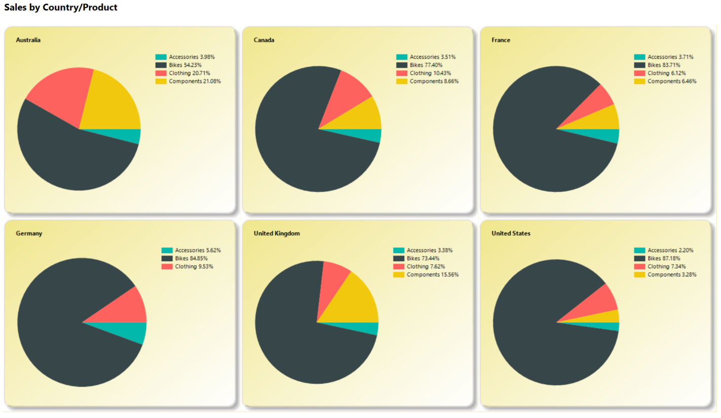
Figure 1 shows an output page of six pie charts, one for each country. Each country's pie chart breaks out sales by product.
OK, so what's the problem? Well, ask the developer (me) what happens if we have sales for a seventh country. If the developer's only interest is the quickest and most expedient fix, the developer does the following:
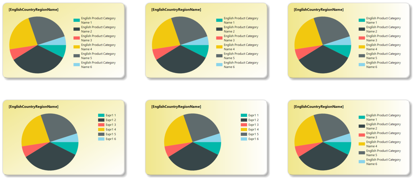
- Open up the SSRS designer for the report (Figure 2), which shows six report objects.
- Add a seventh report chart object by copying and pasting, much in the same way he copied/pasted to create the first six charts. (You can probably see where this example is going).
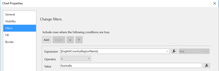
- Filter that seventh chart object on the seventh country, just like he did when he hard-wired country names in the chart filter for each of the first six chart objects (Figure 3).
- Say a prayer that no one else on the developer team will ever see this foolishness!
Yes, the ugly truth here is that this relatively attractive output back in Figure 1 has two nasty features under the hood: hard-wired countries and a dependency on a new chart object for each country. As far as developer sins go, my soul better start praying!
There's an old developer joke that when you do something very bad, it will “kill kittens.” Well, hard-wiring values in code won't kill kittens. But this kind of developer debt creates countless irritations (or worse) down the road. If you change the attributes for one chart, you have to manually change all six charts, if you remember to do so. The mere fact that you'd have to remember repetitive acts is proof enough that you have a very bad anti-pattern here. Therefore, developers should be tortured for hard-wiring values without first putting in the effort to create a more elegant solution!
Contrary to popular belief, hard-wiring values in code won't kill kittens, but it does create countless irritations down the road.
OK, so hard-wiring country values and creating a new chart object for a new country is almost like begging for termination. However, when you're using a reporting tool like SSRS, which is neither object-oriented nor fully programmable, how can you create a more generic solution?
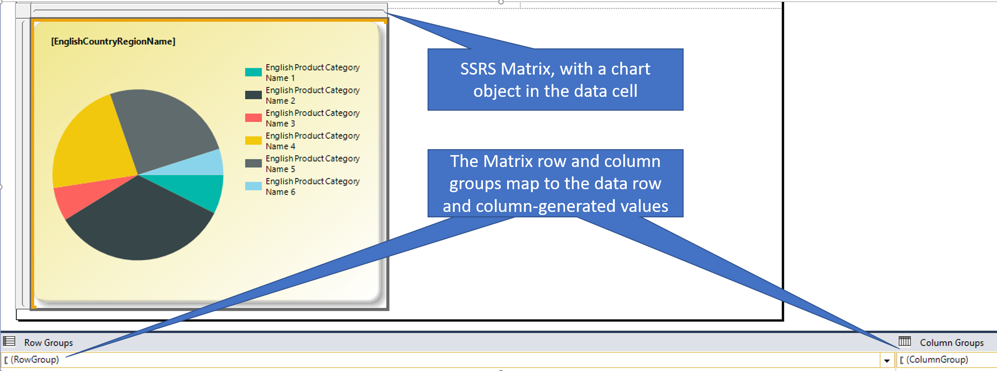
I went back to the original problem. I wanted to create a solution that would show pie charts for three countries across the top, and as many rows as necessary. Essentially, I wanted one massive matrix with charts inside the…wait a minute, did I say matrix? SSRS contains a matrix report object! But how can I define it so (for instance) the first three countries occupy the first row and columns 1–3, the next three countries would occupy the second row and columns 1–3, etc.
Well, I've (mostly) trained my mind that the SQL RANK functions work well for generating sequences of numbers. Therefore, I could use the SQL ranking functions to assign row and column numbers for each country (in alphabetic order), and then use those row/column numbers as the row/column group values in the matrix! Sometimes it's amazing how you can start to see a solution just by talking out the problem and thinking about prior software functions you've used to solve problems. (Some academics say this act is the basis of composition.)
RANK Functions to the Rescue!!!
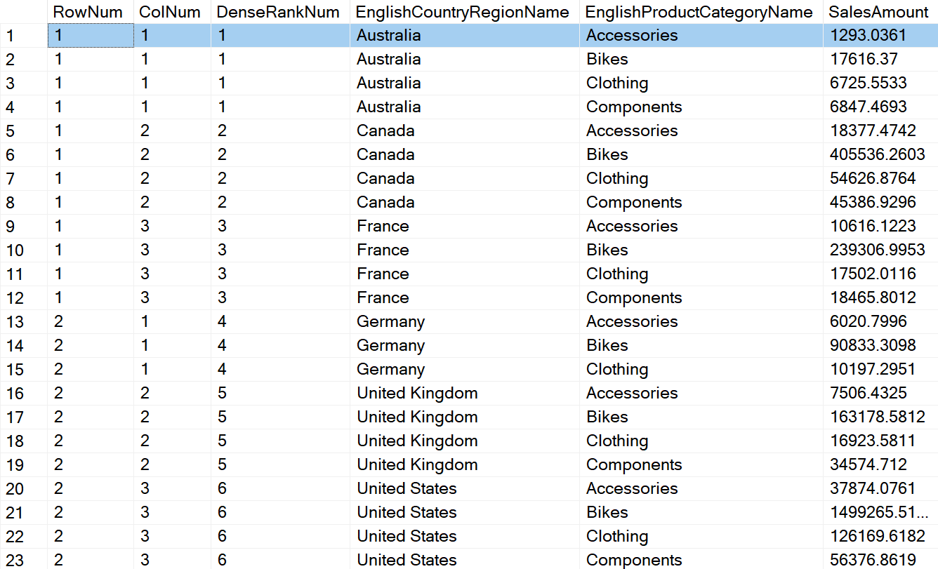
To repeat my goal, I want to create a matrix where each chart occupies a cell and that chart plots sales for the products in a specific country. I want to generate specific sequential row/column values that I can supply as row/group properties to the matrix (the result set in Figure 4), where each row/group combination represents a pie chart for a country.
Here's where I can use the SQL ranking functions. If I assign a rank number for each country, I can define row/column values based on the assumption of three columns (charts) per row.
Let's take Australia, Canada, and France, which have DENSE_RANK values of 1 through 3 based on name order. If I subtract 1 from each dense_rank, divide by 3, and then add 1 to the result, I'll have a value of 1 that I can use to indicate that they'll occupy row 1.
Similarly, if I take the same dense_rank, subtract 1, and then take the remainder after dividing by 3 (and then adding 1), I'll have the values of 1 through 3 that I can use to indicate that they'll occupy columns 1 through 3.
SELECT
((DenseRankNum-1) / 3) + 1 as RowNum,
(( DenseRankNum  -1) % 3) + 1 as ColNum,* FROM
    (SELECT DENSE_RANK() OVER (ORDER BY englishcountryregionname) as DenseRankNum, ...
Listing 1 contains the full query for the solution.
Listing 1: Full SQL code for reporting solution
SELECT
((DenseRankNum-1) / 3) + 1 as RowNum,
(( DenseRankNum  -1) % 3) + 1 as ColNum,* FROM
    (SELECT DENSE_RANK() OVER
        ( order by   englishcountryregionname) as DenseRankNum,
    DimGeography.EnglishCountryRegionName,
    DimProductCategory.EnglishProductCategoryName,
    SUM (FactResellerSales.SalesAmount) AS SalesAmount
    FROM FactResellerSales
        INNER JOIN DimReseller
            ON FactResellerSales.ResellerKey = DimReseller.ResellerKey
        INNER JOIN DimGeography
            ON DimReseller.GeographyKey = DimGeography.GeographyKey
        INNER JOIN DimProduct
            ON DimProduct.ProductKey = FactResellerSales.ProductKey
        INNER JOIN DimProductSubcategory
            ON DimProductSubcategory.ProductSubcategoryKey =
                DimProduct.ProductSubcategoryKey
        INNER JOIN DimProductCategory
            ON DimProductCategory.ProductCategoryKey =
                DimProductSubcategory.ProductCategoryKey
    WHERE (FactResellerSales.PromotionKey = 2)
    GROUP BY DimGeography.EnglishCountryRegionName,
        DimProductCategory.EnglishProductCategoryName ) t
ORDER BY EnglishCountryRegionName, EnglishProductCategoryName
Now that I have some supplemental values in the result set, I can do the following (as seen in Figure 5):
- Add an SSRS matrix control to the SSRS report.
- Map the matrix row and column group properties to the new rownum/colnum values in the result set.
- Add the pie chart as the lone data cell in the matrix (and stretch horizontally and vertically as needed).
Quite often, creating a generic and data-driven solution simply means creating some semi-intelligent data for software controls to use. You can build many solutions using the SSRS matrix, especially when you supplement the matrix with control values as I've done here.
You can build many solutions using the SSRS Matrix, especially when you supplement the matrix with control values.
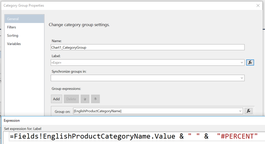
Also, if you're wondering how I was able to add the percentage of total in the legend text (which I personally prefer over data label lines), you can define a custom label in the chart's category group properties (Figure 6).
Doctors and Developers
I sometimes compare the medical industry to the software industry, with analogies ranging from serious to tongue-in-cheek. When you build a solution like the one I initially built (hard-wired values and propagated objects via copy-and-paste) with no serious intention to improve it, you're essentially putting a sick patient back on the street. Yes, that patient might walk the street with no visible signs of breaking down, but eventually that patient will collapse.
Don't fret. Be your own critic. Take action and improve where you can.
We've all created solutions we're not proud of, ones where design reviewers would rip it apart. Don't fret. Be your own critic. Take action and improve where you can. If you know you have five sick patients walking the street, make a plan to cure those patients. Get busy!!!