


Welcome to a new CODE Magazine series: the Post Mortem section. Here, we’ll share experiences from various projects and technologies. Each installment will describe parts of a real-world software development project and then tell you what went well and what was challenging, (and in some cases, what failed) in the hopes that other developers avoid some pitfalls in their own future projects and benefit from things that are known to work. Some post mortems will discuss particular projects (such as the one we have lined up for next issue). At other times, the post mortem will focus on a specific technology or a range of projects. Sometimes we can’t refer to a specific company or project name due to confidentiality issues (as in this post mortem), but the article offers real lessons.
For the first CODE Magazine Post Mortem ever, Markus Egger, the Publisher of this magazine, and also a developer and Chief Software Architect in his “other full-time job” at EPS Software Corp. (the owner of CODE Magazine), shares his experiences in creating polished WPF and Silverlight applications.
Project Overview
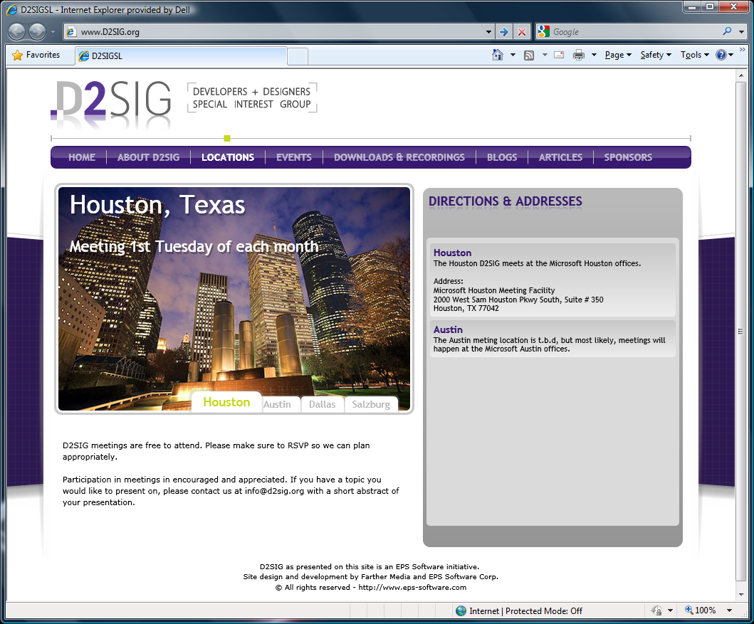
This post mortem covers a few separate projects. The development team at EPS Software Corp. has been engaged in various WPF and Silverlight projects (and generally is very involved in anything that has to do with these technologies, from development to community activities such as the D2SIG user group for WPF and Silverlight developers-www.d2sig.org-and other conferences). This includes a large spectrum of tasks, some of which we may write about in a future installment in this series. In this particular article I’ll discuss our involvement in WPF and Silverlight styling particularly for business applications.
EPS had a number of clients over the last year or more that all presented very similar scenarios. Generally, the scenario goes something like this: “We have this WPF/Silverlight application, and generally know how to program the app, but it just doesn’t look as professional and polished as it should.” You have probably seen similar scenarios yourself. How often do you go to a user group presentation or conference session where the presenter says, “I am not a graphics artist, and someone else could probably make this look really good, but... .” In general, developers simply aren’t good at creating anything visually appealing.
So who is good at this? Well, as it turns out, just about nobody! You can find quite a few design shops out there that do great design work for WPF and Silverlight user experiences. For example, I like The North Face Web site (www.thenorthface.com) and some other consumer applications and e-commerce sites. You may know a few people and companies who can make a really fancy shopping experience. Do you want your list of items in your Silverlight shopping cart to look really unusual and cool? No problem. Do you want all 500 data grids in your WPF business app to all look consistently polished and professional and also easy to implement? Good luck! This requires a combination of very sophisticated development and design skills. Two skills that seem to be diametrically opposed. As far as I can tell, there are very few companies other than EPS that can do this type of work. (And if you know of a company, ping us, as we might be very interested in a partnership.)
Since these WPF/Silverlight styling projects tend to have a lot in common (including the aspect that each and every one comes with an NDA), I decided to cover multiple projects in this article. Hopefully you will find our experiences beneficial and they’ll help you overcome challenges to your own efforts.
What Went Right
1. Using the Right Tools for the Job
Practically all projects that involve WPF and/or Silverlight styling require a wide range of tools. For all of them, EPS used Visual Studio 2008 for overall project tasks including the addition of new project elements such as classes or XAML files. EPS also used Visual Studio for all of our testing and debugging. We found Visual Studio vastly superior to other tools (namely Expression Blend) for these tasks, as Visual Studio seems to handle projects better (for instance, source control support is better and file templates are more suitable for developers) and Visual Studio 2008 also provides debug support for applications, which even the latest version of Expression Blend does not.
We used Expression Studio extensively for all editing tasks, and in particular we used Expression Blend for all styling and other visual editing tasks. Expression Blend provides a flexible and powerful visual editor and it is much better at handling XAML resources than Visual Studio is. Using Expression Blend still gets tricky when you need to manage a very large list of XAML resources (as we encounter them in almost all such projects), but it is much better than managing all of the XAML resources by hand. Also, Expression Blend’s support for things such as Animations and Effects are must-haves for anyone who deals with the creation of WPF styles and templates.
We use Expression Blend 3.0 (CTP) for all of our WPF work at this point and find it very stable and superior to Expression Blend 2.0. Expression Blend’s ability to edit XAML low level with IntelliSense support proved greatly beneficial. We also use Expression Blend 3.0 for Silverlight 3 projects (SL3 is currently in beta). However, for Silverlight 2 projects, you have to use Expression Blend 2.0.
In addition, we used Expression Design for all required images (using XAML-based art is superior in quality and performance to JPG or other pixel-based file formats, and they are also smaller in size and more flexible).
Additionally, we used various tools to profile applications, such as WPFPerf, which were invaluable for creating applications that perform well.
2. Iterative Creative Process
One of the things that is strange for developers is the iterative nature of the visual design aspects of WPF and Silverlight projects. We completely separated out the design and the functionality of the application (see below), which allowed us to start out with basic styles, templates, and skins. Our developers started using those styles (or in many cases, due to implicit styling) simply ended up with the desired behavior or look, without having to do anything special. The art team, on the other hand, moved forward enhancing and changing the styles.
Making initial versions of styles available to developers allowed for a very productive approach as neither side had to wait for the other. The design side is continuously improved in most projects as all project stakeholders chime in with their personal likes and dislikes. Using proper styling techniques allowed us to improve the visual elements of the design efficiently without the danger of breaking any of the code on the developer side.
3. Separation of Concerns
WPF does a very good job at separating visuals from the actual implementation of an application or a specific control. To a certain extent, this is also true for Silverlight, although Silverlight 2’s lack of support for resource dictionaries puts a bit of a damper on things. (Silverlight 3 supports resource dictionaries.)
Using this separation of concerns allowed us to improve productivity and quality and support multiple different skins in various scenarios. We found this to be extremely useful for business applications. Conventional wisdom seems to be that skinning is useful mostly for small consumer apps, such as instant messaging clients. While I think that skinning is cool in these scenarios, it is of much more practical value in business applications where the need for skinning can arise due to various considerations.
On several project we needed to provide a “classic” skin. We have worked on several projects where an application received a face-lift and afterwards sported a brand new look, often branded much like the overall branding and corporate identity of the organization. The challenge in these scenarios are users that do not like change. Using a classic skin we could recreate the look and feel of an older version of the same application in the new version as an optional switch. This is not just possible in WPF and Silverlight (3), but it is also feasible in almost all projects with less effort than most people assume. (A similar example is the creation of a competitive skin that makes an app appear more like a competitor’s app, allowing for easier migration for the other app’s users).
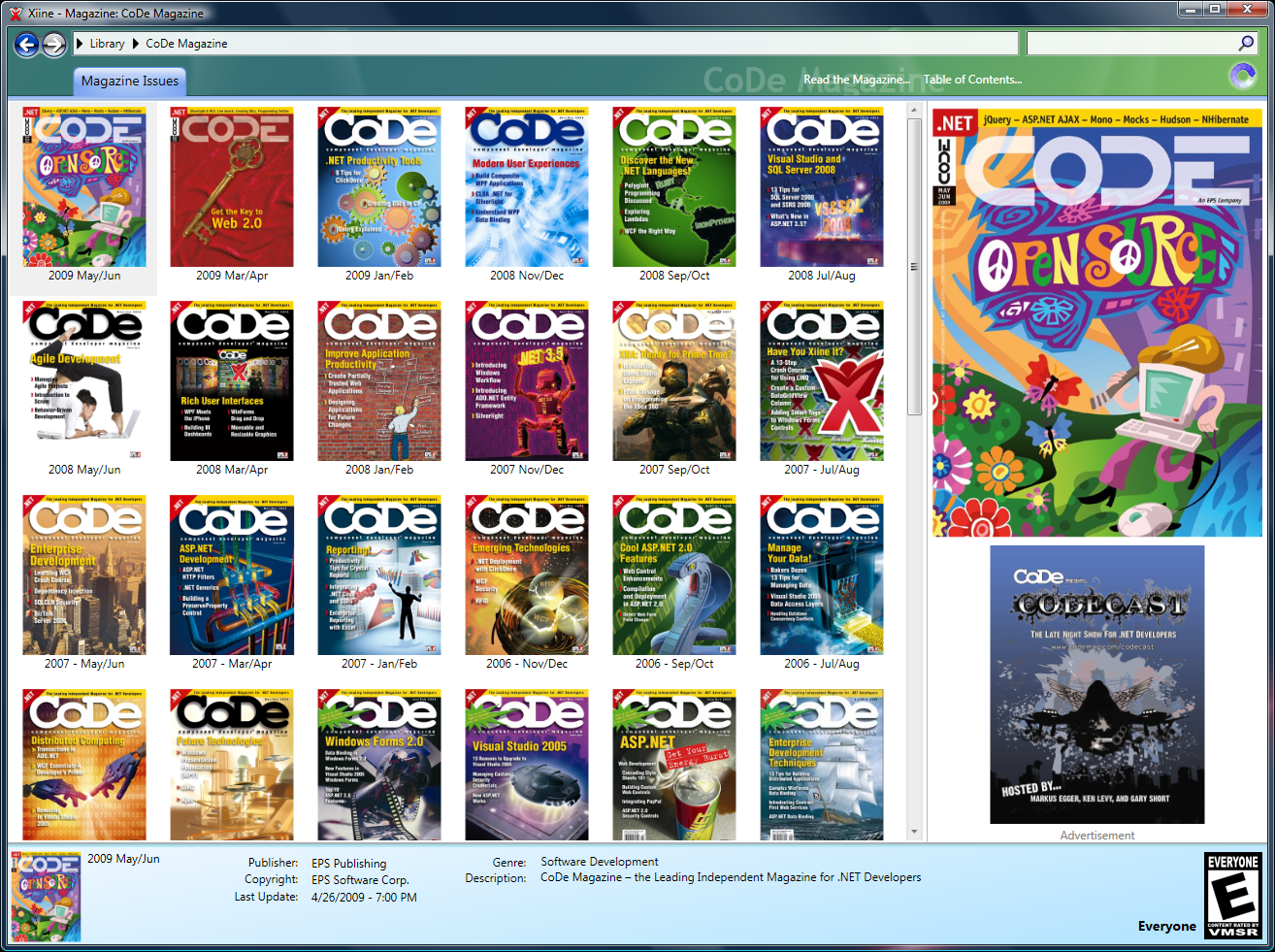
It is also possible to use skinning to improve the performance of the UI. You can usually create a second version of some parts of a style/skin that tend to be resource and/or performance intensive. For instance, our Xiine application (www.Xiine.com) has a skin that uses quite a few animations and other effects. Creating a secondary skin that is in many ways identical to the primary skin, but does not contain performance and battery-hungry elements is often very simple.
Silverlight, especially version 3, also adds another unique angle: reuse across sites. At CODE Magazine we are working on our magazine subscription control. We currently use an HTML interface but in the future we’ll use a Silverlight control. We can just drop the Silverlight control on any Web page, regardless of the technology it uses. Using styling and skinning we can use the same control on other pages with the same exact behavior, but a completely different look. For instance, a CODE Magazine associate can drop the control on a page but re-style it to make sure it fits the design of the page. Very cool and useful! I can’t wait for Silverlight 3 to ship, so we can roll this out.
4. Improving Developer Productivity
Developer productivity is always a concern in business application development. This is especially true in WPF and Silverlight scenarios where developers (who generally have no artistic skills) are asked to create very advanced and professional looking applications that are usually large in scope (generally larger than many Web site applets or controls). And in times of economic turmoil, the pressure is much greater than before. In a nutshell, developers are asked to perform a very large task in an area they are not very good at, in less time than they had in the past. Not a very promising prospect.
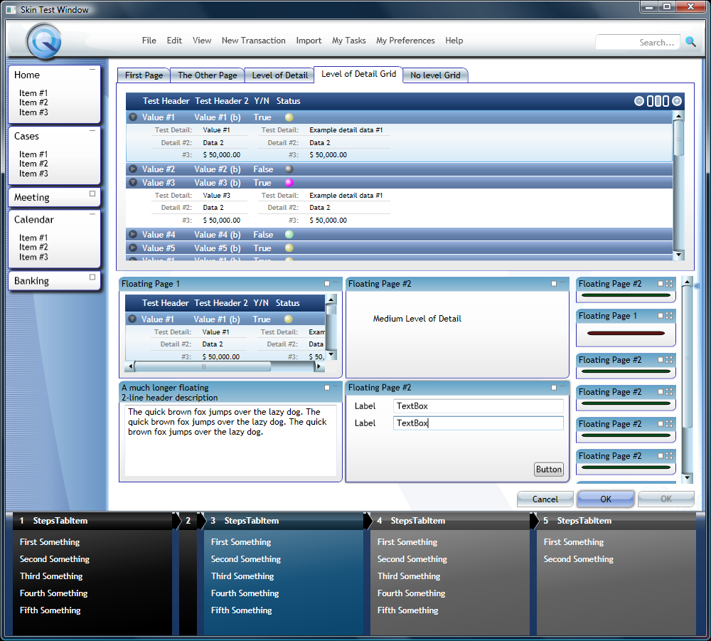
I am thus very happy to report that creating advanced styles and skins resulted in a drastic increase in developer productivity. This is simply due to the fact that well-defined styles handle a lot of things developers would otherwise have to do manually. For instance, we created a style for the WPF datagrid for one client that allowed our developers to drop controls into the columns and detail areas of the grid with complete disregard to the resulting layout. The skin simply arranged everything properly. Similarly, we re-styled tab controls for various purposes so developers could develop their apps with a standard tab control, but during runtime, styles added all kinds of animations and level of detail filters. These features would otherwise have been very time intensive to implement and could have only been done by the most senior members of our development team. A huge time sink for the most expensive resources available!
Probably the biggest productivity gain achieved through styling, templating and creating skins, besides the grids, is usually found in data entry forms. For one customer we implemented a custom layout container (so this involved a special control, not just a style) that-in combination with a skin-automatically laid out controls and labels in a very advanced fashion. Developers simply dropped controls into that container, once again with complete disregard to layout, and depending on the applied skin, the result was a very appealing and visually intuitive layout that could be seen in both read/write and read-optimized fashion.
One can’t make developers much more productive than removing all layout and design burden from their shoulders. In the end, our team was able to build WPF and Silverlight UIs drastically quicker than they could do the same task in Windows Forms or ASP.NET environments.
5. The Result
Creating visual styles for a business application is not a task to be underestimated, and in some projects, it took as longer than we desired (see below). However, all of our WPF/SL styling projects so far have one thing in common: The result has always been a great success that was liked by everyone involved.
Developers liked the result because it made it easy for them to create good looking applications without having to worry about graphical details if they chose not to be involved in those. In fact, they could create polished UIs faster than they could have created ugly UIs in the past regardless of what technology they used before.
Projects managers liked the result because overall developer productivity makes a big difference for business application projects. Much more so, in fact, than in consumer apps. Business applications often feature hundreds of grids or data entry forms. Even a small increase in productivity is a huge benefit in a business applications. So while the budget for some of these styling projects was often more than we wished, each and every one of them overall saved the project money.
Sales and marketing people like the result because professional looking applications are easier to sell. What would you rather look at, a trade show? An eyesore of a battleship gray Windows app that looks like just about any other app you saw in the last 20 years, or a nicely designed application? And which one would you be more likely to buy?
Users like the results of the SPF/SL styling because polished and well-designed UIs are easier and more pleasing to use. They also often add unique and useful features such as read/write UIs vs. read-optimized UIs. (In one instance, we had a data entry UI that showed some 30 date drop-down controls. It was certainly nice to have a read-optimized view that only showed the four dates that were actually filled in and one of them highlighted as coming up in the next week). A well-designed UI often provides very intuitive and useful data visualizations.
And certainly, the ability to switch to classic or competitive skins made those users happy that liked the look of the older versions of an app.
Challenges
1. Creating Styles that “Work”
One of the challenges we didn’t see coming when we started WPF and Silverlight styling work was how hard it can often be to create a style that works in a plethora of scenarios. For instance, a cool rounded glass effect in the background of a header may look awesome the way an artist designs it in PhotoShop, but once you try to use it in a resizable window, the effect may completely fall apart as proportions are off and the effect is basically broken in very small, very large, or oddly proportioned windows. In one application we had a very cool rounded element in the header that overlapped the content below. This looked awesome until a user collapsed the sidebar, at which point the element overlapped a textbox, making the UI unusable.
Another challenge is grid styling: If you are creating a shopping cart and the only list you have in the entire site is the list of items you sell, it isn’t all that hard to make that look good (and there are plenty of designers out there that specialize in that). However, if you want to create a grid style that works across hundreds or thousands of grids in your entire application in a consistent way, you have a different problem on your hands. And grid performance is very critical, so this isn’t just about looks.
We had to adjust some of the styles to enhance developer productivity. A style that is hard to use is a no-no in a business app. If you have a single pain point in a small consumer app, then that is probably manageable. If you have that same pain point on 800 data entry forms you may have a multi-month delay or perhaps a complete project failure.
And some style things are simply hard to pull off. In one example, we created a cool style that turns a simple tab control into a set of floating pages that could be expanded and collapsed, with multiple pages being visible at once. During expand and collapse operations, the individual pages floated around on the screen using animations. This was very simple to design in a graphical mock-up done in PhotoShop, but actually implementing this was a tremendously difficult undertaking.
By and large, creating styles that work was the biggest challenge we encountered in these projects. So far we have been able to master them all, although some required long nights of work and some took quite a bit longer to implement than expected. Also, this requires a combination of skills that is almost impossible to come by.
By and large, I consider creating styles that work to be the biggest and at the same time most underestimated challenge one faces.
2. Estimating
Estimating is always a problem in the software industry, right? Well, yes and no. I find a sense of pride in that we have a good estimation record at EPS Software. However, doing large scale styling really takes estimation problems to a whole new level.
Why is that? Well, by its very definition, design work is an iterative and subjective process. In software engineering, one simply looks at a problem and estimates the time required to solve it. A difficult task by itself, but when you mix art into the scenario you end up estimating the technical aspect as well as the personal likes and dislikes of individuals involved in the process. On several projects we implemented a skin completely and thought we were done just to end up with visual change requests based on personal opinion of involved stakeholders. Sometimes they even requested additional skins as they fell in love with the ability to change the look of the app or they found another competitive skin they just had to have.
None of this is bad. In fact, I think it is probably the desired result and part of what is needed to arrive at a pleasing result. However, it makes estimating a nightmare and everyone grossly underestimates the task at hand. (The iterative nature never reduces the required time either, so one hardly ever finishes early in these types of projects.)
Some may think that this isn’t much different from creating HTML or Flash-based Web sites. We found that this is not true due to the scale of things. Designing a single list of items in a shopping cart is a tiny task compared to creating the UI for an enterprise system. For this reason, much of our experience in Web design (or other graphical design for that matter, including print) was more a hindrance than an asset (for estimating).
3. Finding the Right Skills
So where do you find developers with enough design skills, or designers with development skills, or a combination of those skills in any way shape or form? Well, if you find an answer to that question, please let me know. We have done quite a bit of research around this. We have tried to find companies that can do that. We have tried to find individuals who can do this. We have even talked to Microsoft and other firms to see if they know of anyone. Result: Nothing! Zip. Zilch. Nada!
In order to overcome the shortage of available skilled new hires, we had to develop and train in these skills for our own team. We created a set of developer guidelines. We created style guides. We have trained our individuals, and we have even trained partner organizations that knew a lot about design but had some WPF, Silverlight, and Surface experience (but not to the extent we needed).
Overall, I find this combination of skills to be one of the rarest in the entire software developer community.
4. Import from Other Tools
We also used some other tools in several projects either because we thought they would be beneficial, or because customers used them, or simply because some assets were only available in other formats. In particular, I am referring to PhotoShop and Adobe Illustrator.
While these tools certainly are useful, they were problematic in other areas. For instance, you can import Illustrator graphics into Expression Blend and Expression Design, or turn them into XAML in other ways, but they usually ended up being less than ideal from a performance point of view. When one uses Illustrator to create print art or a JPEG file, it doesn’t matter whether a gradient shadow is made up of 1,000 elements or 1. But when used in XAML, it certainly does make a difference whether one instantiates 1 object or 1,000. This caused us to do a lot of manual clean-up work, which tends to be very time consuming.
We used PhotoShop to create UI mock-ups. As we later found out, what looks good in PhotoShop does not necessarily look good in an interactive UI. Sometimes, in fact, one can’t reproduce in XAML what was done in PhotoShop or it may simply perform very poorly. In the future, we will use Expression Blend’s new UI sketching feature to get around that problem as much as possible, and in other scenarios, we will try to get our artists to use Expression Blend and Expression Design more than Illustrator and PhotoShop.
5. Available Documentation
Another core challenge we faced was the available documentation. Many of the styles we created had no related documentation from Microsoft or anyone else. The fact that much of what we did was very unique and we couldn’t find any other people that had done it before also meant that there is very little information available in blogs and similar resources.
Luckily we have excellent connections to Microsoft and were able to contact WPF and Silverlight team members directly. On other occasions, we spent a lot of time digging through copies of standard styles or exercised Reflector to the extreme. And, of course, our vast network of contacts in the industry (such as MVPs) proved helpful too, although there were limits due to the lack of people doing this type of work.
Without our connections and extraordinary access to resources, I really don’t know how anyone could have pulled some off some things we did. Perhaps that is one explanation for why there aren’t all that many people doing this.
Conclusion
Creating styles, themes, and templates for WPF and Silverlight applications is a fascinating topic. It makes applications look great, easier to sell, and more usable. As it turns out, it also makes developers drastically more productive. The only downside (and this applies to a lot of WPF work, not just styling) is the learning curve. But once we overcame that, it was always well worth the effort.
Markus Egger