
The iPhone is one of the most compelling and exciting user interfaces to appear on any consumer electronic device, with many innovations that make it a pleasure to use. How can you deliver a similar experience with your .NET applications?
This article demonstrates how you can implement these features in your .NET applications in a step-by-step format as you recreate the iPhone interface using Windows Presentation Foundation (WPF) technology with both Visual Studio 2008 and Microsoft Expression Blend.
Just when you finally master creating Windows applications using .NET Windows Forms, Microsoft comes out with a new replacement technology-Windows Presentation Foundation-that is completely different in just about every possible way and requires a significant learning curve! Fortunately, this break with the past comes with tremendous benefits and the ability to vastly improve the quality of user interfaces you deliver to your end users. Before jumping into recreating the iPhone interface, let’s first get a quick WPF primer.
What Is Windows Presentation Foundation?
Windows Presentation Foundation (WPF) is Microsoft’s powerful new technology for building Windows user interfaces. WPF is one of four technologies (Windows Presentation Foundation, Windows Communication Foundation, Windows Workflow, Windows CardSpace) released by Microsoft as part of the .NET 3.0 Framework that are now a part of .NET 3.5.
WPF is preinstalled on Windows Vista and is available for installation on Windows XP Service Pack 2 and Windows Server 2003. Older versions of Windows such as Windows 98 and Windows 2000 cannot run WPF! Unfortunately, if you need to support older operating systems you can’t use WPF.
WPF Benefits
The benefits WPF provides are well worth the time and energy you need to spend in yet another learning curve:
- With little or no code you can display eye-catching animations and transitions that place your user interface head and shoulders above your competitors
- WPF vastly improves the speed of the user interface whether you are creating standard business applications or using complex animations
- Unlike Windows Forms technology where you wrestle with creating a user interface that looks good regardless of the end user’s settings, WPF user interfaces easily resize and reformat to display any DPI or font size, dynamic content, and different languages due to its resolution independence.
- Its declarative user interface and separation of layout from code makes it easy for a designer to create the look and feel and the developer to implement the user interface behavior
- You can display rich text content anywhere in the user interface
- You can easily implement audio and video in your application
- As far as end users are concerned, your user interface is the application. Anything you can do to improve the user experience can translate into user satisfaction and increased sales!
So Long GDI+, Hello DirectX
WPF offers so many benefits because it uses DirectX technology rather than using GDI+ as does Windows Forms. The technology in GDI+ is over 10 years old and doesn’t take advantage of modern advancements in display technologies. In contrast, WPF, and in turn DirectX, offloads as much processing as possible to the Graphics Processing Unit (GPU) on your computer’s graphics card, providing a tremendous performance boost.
Getting Started in Windows Presentation Foundation
Although you can create WPF applications using the .NET 3.0 Framework in conjunction with Visual Studio 2005 and WPF extensions, I do not recommend it. The WPF extensions support for WPF is extremely weak and not worth the effort. Instead, you should go directly to the following technologies:
- .NET 3.5 Framework
- Visual Studio 2008
- Microsoft Expression Blend 2 (December 2007 CTP)
As I write this article, Microsoft Expression Blend 2 is still in Community Technology Preview (December 2007 CTP), however it’s still worth using this version because it has support for Visual Studio 2008 and contains many important features not present in Expression Blend Version 1.
If you really can’t move to Visual Studio 2008 yet, you can still follow the step-by-step instructions in this article by using Visual Studio 2005 and installing the WPF/WCF Extensions for Visual Studio 2005 which you can download from Microsoft’s web site (http://www.microsoft.com/expression/). You won’t see many differences between Visual Studio 2005 and Visual Studio 2008 as you go follow the step-by-step instructions in this article since it only uses Visual Studio for editing code, but as mentioned previously, for regular WPF development you should definitely move to Visual Studio 2008 as soon as possible.
WPF Standalone Applications vs. XBAP Applications
There are two main types of WPF applications-WPF standalone applications and XAML browser applications (XBAPs).
WPF standalone applications are the equivalent of a Windows Forms application. You install this standalone Windows executable on a computer using an MSI, XCOPY or ClickOnce technology and it runs in a standard Window. By default, it executes with full trust.
In contrast, a XAML browser application is hosted within Internet Explorer. XBAPs are not web applications. They are Windows applications that are hosted in an Internet Explorer browser. By default, they run in the Internet zone which restricts access to system resources such as the file system (including databases) or the Windows Registry. Although you can elevate the permissions on an XBAP application, rather than forcing the issue, you should instead create a WPF standalone application.
These restrictions severely limit the kinds of applications you can create as XBAPs. That said, there are some incredible XBAP applications out there. One of the best examples is the Museum of London’s Turning the Pages application which is an incredible showcase of WPF capabilities: http://www.bl.ui/onlinegallery/ttp/ttpbooks.html. When you go to this site, make sure you click on the link that takes you to the WPF version of the site (rather than the Flash version). You can turn the pages on famous works by the likes of Leonardo da Vinci and Lewis Carroll-you can even turn on audio and listen while Alice in Wonderland is read to you!
Microsoft Expression Blend
In a perfect world you would just be able to use Visual Studio 2008 to create your WPF applications. However, there were some major pieces left out of Visual Studio 2008 that make it difficult to work with WPF. Fortunately, you can find most of these missing pieces in Expression Blend.
For example, when you edit a WPF user interface in Visual Studio 2008, the property sheet doesn’t have an events button (lightning bolt) as it does when editing a classic Windows Forms user interface. Fortunately, the Expression Blend Properties window does have an events button. Also, there is no easy way to data bind user interface controls to data or business entities in Visual Studio 2008. Again, Expression Blend picks up the slack and has an IDE for data binding the user interface. As you will see in this article, Expression Blend also has a far better set of tools for creating animations, as well as for designing and rendering the user interface. One key advantage Visual Studio 2008 has over Blend is it has good support for IntelliSense when directly editing XAML files-which you will need to do often when using Visual Studio 2008 alone.
Based on the fuller feature set of Expression Blend, in this article you will start out using Expression Blend to create and edit your WPF and see how it works in conjunction with Visual Studio 2008. As you will see, Expression Blend can create and edit Visual Studio 2008 solutions and projects. However, it doesn’t have a code editor, so whenever you need to add code to your project you are automatically taken to Visual Studio 2008.
Creating a WPF Host Application
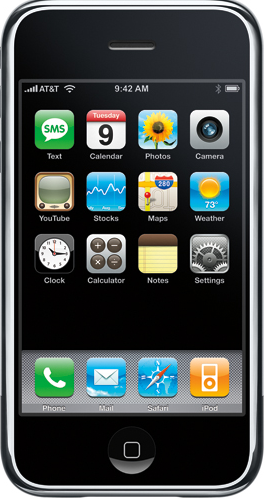
Figure 1 shows a picture of the iPhone interface which you can refer to throughout this article to see the final goal of the features you are going to create.
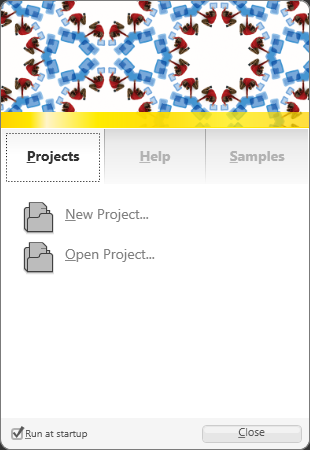
When you launch Expression Blend it displays a Welcome Screen as shown in Figure 2. You can create new projects or edit existing projects from this screen. I highly recommend checking out the Samples tab where you can see several impressive examples of WPF in action.
Click the New Project… link to launch the Create New Project dialog box. You can create WPF standalone applications, WPF Control libraries, and Silverlight Sites. You can’t create an XBAP application in Expression Blend but you can create one in Visual Studio 2008 and edit it in Blend.
With the WPF Application (.exe) option selected, change the project Name to iPhone, specify the location where you want to create the WPF project, and choose your .NET Language. Also, make sure the Target is set to .NET Framework 3.5, then click OK to create the project.
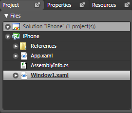
As shown in Figure 3, the Project palette in the upper right corner of the IDE displays the newly created project. This palette is equivalent to the Visual Studio Project window. As you can see, the project contains a Window named Window1.xaml an App.xaml file and an AssemblyInfo.cs/vb file.
If you expand the References node you will see the three main WPF assemblies:
- PresentationCore
- PresentationFramework
- WindowsBase
- If you expand the App.xaml and Window1.xaml nodes you will see the associated App.xaml.cs/vb and Window1.xaml.cs/vb code-behind files. The separation of user interface elements in XAML files and code in associated code-behind files provides physical separation that allows a designer to create the look and feel in XAML and the developer to create the application functionality in code.
Expression Blend Is a WPF Application!
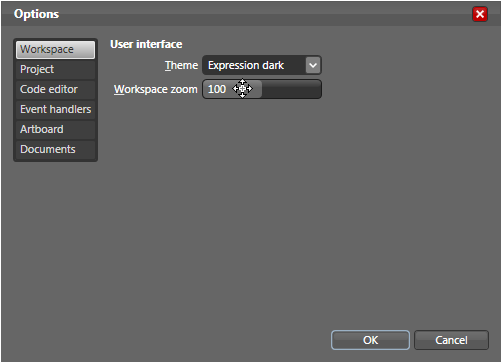
It’s important to realize that Expression Blend is a WPF application. All of the features you see in its IDE are part of the WPF technology. With this in mind, one of the first (very cool) features you should check out is Blend’s Workspace zoom. To access this feature, select Tools | Options from the Blend menu to display the Options dialog. As shown in Figure 4, hover your mouse pointer over the Workspace zoom slider control. Click the left mouse button and drag the mouse up towards the top of the screen. The value in the slider increases proportionately and so do the palettes and toolbars-this is WPF resizing at work! After setting the Zoom to the desired setting, close the Options dialog box.
Creating the Main Window
WPF uses the term Window instead of Form (traditionally used in Windows Forms). To start off building the iPhone interface, you could use the existing Window1.xaml file that was automatically added to the project. However, renaming XAML files in Expression Blend is not implemented well-you can rename the file, but doing so doesn’t automatically rename the contained class as it does in Visual Studio.
The easiest way to create the main window is to delete Window1 and add a new window instead. To do this, right-click Window1.xaml in the Project palette, select Delete, then confirm the deletion. Next, right-click the project (the second item in the Project palette) and select Add New Item… from the shortcut menu. In the Add New Item dialog box, select Window, change the Name to iPhoneWindow.xaml, and click OK.
Your project’s App.xaml file contains a StartupUri setting that specifies which form is instantiated at application startup. Previous versions of Expression Blend automatically changed the value of this setting from Windows.xaml to iPhoneWindow.xaml for you-but it seems the latest CTP does not! So, double-click the App.xaml file and change the value of StartupUri to iPhoneWindow.xaml. At times, Expression Blend inadvertently deletes the setting from the XAML file. If this happens, press Ctrl+Z reenter the value again, and then save the file.
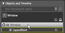
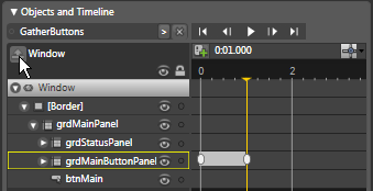
Now you need to set some properties on the Window so it looks more like an iPhone. To do this, double-click iPhoneWindow.xaml in the Project palette. Next, select the Window in Expression Blend’s Objects and Timeline palette by clicking on the Window item as shown in Figure5. You will learn more about this palette later on, but for now, just know that it displays a hierarchical view of all elements contained in your Window and allows you to easily select them.
Once the Window is selected, click on the Properties palette. This displays an overwhelming number of properties sorted by categories such as Brushes, Appearance, Layout, Common Properties, Text, and Miscellaneous (just a few of these are shown in Figure6). After using Expression Blend for a while you get to know which properties are in each category, but the Search box in the Properties panel is a great feature that allows you to quickly find any property if you know its name. For example, if you type the word Height in the Search text box, it shows only the properties that contain the word “height” filtering out all other properties (this is a great new feature that is also included in Visual Studio 2008!)
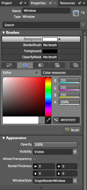
Now that you can see the Height property, set it to 550. To clear out the Search box, click the [X] button to its right. Now enter the word Width in the Search box and then set the width to 275. Note that both properties are in the Layout category. Once you know this you can just look in the Layout category for these properties.
Shaping the Main Window
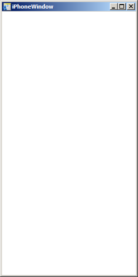
Now run the project to see what you have so far. To do this, press F5 (just as in Visual Studio). As shown in Figure7, the Window is the correct size as the iPhone, but it’s the wrong shape and you need to remove the title bar and control boxes. To do this, close the form by clicking the “X” in the upper right corner, and go back to Expression Blend. With the Window selected in Objects and Timeline, go to the Properties palette and in the Appearance category set the WindowStyle property to None. This removes the title bar and control boxes.
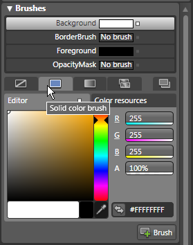
The next step is to change the shape of the Window to a rectangle with rounded corners to match that of the iPhone. To create a non-rectangular Window in WPF you must make its background transparent. To do this, under the Appearance category, check the AllowsTransparency check box. Next, in the Brushes category, select the Background property. As you can see in Figure8, by default, the background is set to a solid color white brush (you will see how other types of brushes are used later on). To change the background to transparent, change the Background property’s alpha value (A) from 100% to 0**%.** Doing this immediately causes the Window to become transparent in the designer.
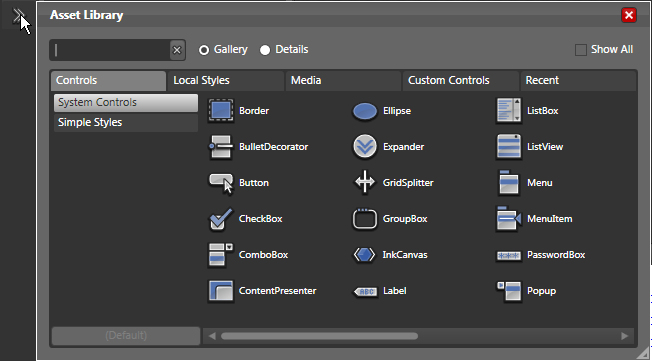
Now you need to add non-transparent content to the Window to give it a visual shape. The easiest way to do this is add a Border control (sounds like a political issue) to the Window and round its corners. This requires the use of Blend’s Asset Library. As shown in Figure9, you can open the Asset Library by clicking the double-headed arrow in the Expression Blend Toolbar on the left side of the IDE. The Asset Library has a convenient Search box that works just like the one on the Property Palette. However, you don’t need to use it since you can just click the Border control in the upper left corner of the Asset Library panel. As soon as you select the Border control, the Asset Library closes and the Border is displayed in the Toolbar’s most-recently-used assets list as shown in Figure 10. Before adding the Border to the Window, double-click the Window item in the Objects and Timeline palette. This displays a yellow border around the Window.
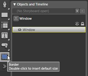
Now go back to the most-recently-used list and double-click the Border control. This adds the border to the Window, sized to its full height and width, and removes the Original Grid from the Window. Although you can’t see the Border inside the Window on the design surface, you can see it in the Objects and Timeline palette.
To recreate the silver border of the iPhone, go to the Properties palette, and under the Brushes category select the BorderBrush property then select the Solid color brush. Next, set the R, G, B values to 170, 170, 170. You won’t see any visible change to the appearance of the Border, because its BorderThickness is set to zero by default. To change this, go to the Appearance category and set all BorderThickness settings (top, bottom, left, right) to 5. Finally, to round the corners of the Border, set the CornerRadius property to 30, 30, 30, 30.
Creating Application Resources
Now it’s time to change the Window background to black and as you do so, you will learn about application resources. To do this, go to the Brushes category and select the Background property. By default, there is no brush set for this property, so select Solid Color Brush. By default, it sets the background color to black, which is what you want.
There are four main ways to change the color of the solid brush:
- Change the RGB value (currently 0, 0, 0)
- Change the hex value (currently #FF000000)
- Click in the color editor to select a new color
- Click the eye dropper and use it to select a new color
There are several places where the black background you just selected is used in the iPhone user interface. Rather than manually hard-coding each user interface element to black, you can create a resource that can be reused throughout the application-and can be changed in one place for all elements that use this resource. This is similar to the styles that are used in Microsoft Word.
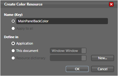
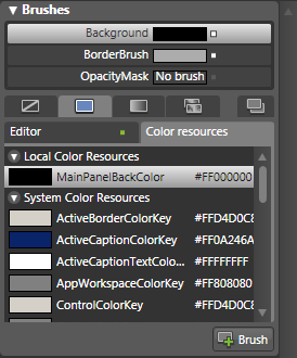
To convert the background color to a resource, click the double arrow button to the immediate left of the hex value text box (it has the tool tip “Convert color to resource”). This launches the Create Color Resource dialog as shown in Figure 11. In this dialog, change the Name to something friendlier, such as MainPanelBackColor. Since you need to reuse this resource elsewhere in the application, select the Define in | Application radio button and then click OK to save. As you can see in Figure 12, this new resource is displayed in the Brushes category under the list of color resources. Behind the scenes, this resource is stored as XML in your project’s App.xaml file.
Adding Event Handlers
Now you’re ready to run the application to see what it looks like so far. To do this, press F5. As you can see, it’s starting to more look like an iPhone, but you may notice there is no obvious way to close or move the window since the title bar and control boxes have been removed. You can address this by adding code to the Window’s code-behind file. For now, just close the form by pressing Alt+F4.
Up to this point you have not added any code to the Window’s code-behind file. Expression Blend does not have a C# or Visual Basic code editor, so you need to do all code editing in Visual Studio. To do, first open your Expression Blend project in Visual Studio by going to the Project palette, right-click the iPhone solution, and select Edit in Visual Studio from the shortcut menu.
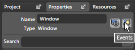
After you’ve launched Visual Studio, go back to Expression blend. To add an event handler to the Window, make sure you’ve selected Window in the Objects and Timeline palette, then go to the Properties palette. As shown in Figure 13, you can see the list of events for the Window by clicking the lightning bolt button at the top right of the Properties palette. To create code that closes the window when you right-click on it, find the MouseRightButtonDown event and double-click its associated text box. Go over to Visual Studio and you will see the iPhoneWindow code behind file has a new handler method called Window_MouseRightButtonDown**().** Add the following code to this method.
In C#:
this.Close();
And in Visual Basic:
Me.Close()
Now go back to Expression Blend again and this time, create a handler for the MouseLeftButtonDown event by double-clicking the event in the Properties palette. Go back to Visual Studio and enter the following code in the Window_MouseLeftButtonDown() method.
In C#:
this.DragMove();
And in Visual Basic:
Me.DragMove()
Type Ctrl+S in Visual Studio to save all changes. To test out these new handler methods, you can either press F5 in Visual Studio or in Expression Blend to build and run the project. You should now be able to left-click on the Window and drag it around. You should also be able to right-click the form to close it.
Adding a Layout Grid
There are two golden rules of WPF user interface layout-don’t hard code the position of user interface elements and don’t hard code their sizes (if you want them to resize). This allows you to take advantage of the excellent resizing functionality of WPF.
WPF has a set of layout containers that allow you to lay out the user interface with resorting to hard-coded positions or sizes. You commonly nest layout panels inside each other to get the positioning you need. It’s a completely different process for laying out a user interface in WPF than it is with Windows Forms. With WPF, you need to think ahead and determine which layout containers you need to position and resize the controls as needed.
As shown in Figure 1, there are five main areas of the iPhone interface:
The first (and most powerful) layout container you will use is the Grid. This layout control is similar in concept to the Windows Forms TableLayoutPanel, but with greater functionality. You can define any number of columns and rows in a Grid, although you should typically only place one user interface element per Grid cell.
When you create a new Window in Blend or Visual Studio it automatically contains a Grid as the highest level layout container. However, when you added the Border to the Window earlier in this article, it removed the Grid and replaced it with the Border. To add a Grid inside the Border control, go to the Expression Blend Objects and TimeLine palette and double-click the Border. This places a yellow highlight bar around the element. Next, go to the Asset Library and select the Grid, then double-click the Grid in the most-recently-used list. This adds the Grid inside the Border as indicated by the hierarchical representation under Objects and Timeline.
Now go to the Properties palette (which should automatically have the Grid selected) and change the name of the Grid to grdMainPanel. This also changes the name of the Grid to grdMainPanel in the Objects and Timeline palette, making it easier to identify.
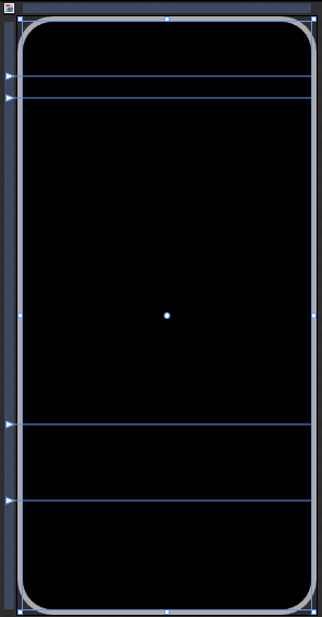
You can now add five rows to grdMainPanel to mark out the five sections of the iPhone interface. To do this, go to the top of the Properties palette and select the Properties button (to the immediate left of the Events button). Next, locate the RowDefinitions property and click its associated ellipses button which launches the RowDefinition Collection Editor. Click the Add another item button five times to add five rows to grdMainPanel (numbered 0 through 4).
Select each Row and set its Height property to the following value:
- Row 0 - 50 pixels
- Row 1 - 20 pixels
- Row 2 - 1 - Star
- Row 3 - 85 pixels
- Row 4 - 80 pixels
Click OK to save changes, then go to the Objects and Timeline palette and double-click the Grid. This displays the Grid rows as shown in Figure 14.
Note that pixels in this context refers to device independent pixels or device independent units that are approximately 1/96 inch regardless of the monitor or screen size resolution. The star settings is a percentage-based setting. In this case, Row 2 takes up all the available space left over after the other four rows are sized. You can also specify fractions of star value such as .5* and .25*.
Creating the iPhone Status Bar
Now it’s time to create the iPhone status bar that displays signal strength, carrier, current time, and battery charge level. On the CoDe Magazine web site you’ll find a zip file associated with this article that contains a number of graphics you can add to your project that will allow you to recreate the iPhone look and feel. To do this, unzip the file into your project’s root directory which is C:\iPhone\iPhone (WPF projects are contained in a subfolder below the solution folder). Next, go to Visual Studio’s Solution Explorer (not Expression Blend), select the iPhone project, and then click the Show All Files button at the top of the Properties palette. This displays all the files you just unzipped into your project’s root folder.
Right-click the Images folder and select Include in Project from the shortcut menu. This includes these files and folders in the project as indicated by the change in their associated icons. Now go to the Visual Studio File menu and select Save All. Next, press Alt+Tab to go back to Expression Blend and click Yes in the dialog asking if you want to reload the project. This closes all open files and displays the newly added files and folders in the Project palette.
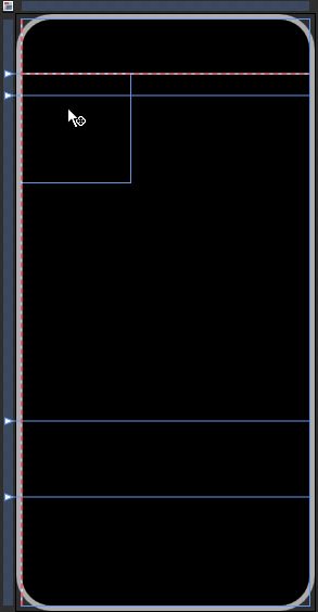
Double-click iPhoneWindow.xaml file in the Project palette to reopen it. To create the status bar you need to add a child Grid to grdMainPanel’s second Row (Row 1). To do this, double-click the Grid control in the most-recently-used list. This adds a new Grid to the top left corner of grdMainPanel. Go to the Properties palette and change the Name of the newly added Grid to grdStatusPanel. Next, go to Blend’s Toolbox and select the Direct Selection tool (the white arrow second from the top). Click on the newly added grdStatusPanel and position it in the far left and top of the second row of grdMainPanel until you see red dotted lines displayed on the top and left of the Grid as shown in Figure15. This indicates the Grid is positioned at the very top and left of the grdMainPanel’s second row. To resize the new Grid, go back to the Blend Toolbox and choose the Select tool which is the dark arrow at the very top of the Toolbox. (Note that you can also press the letter A to toggle the selection pointer to Direct Selection and press the letter V to toggle to regular Selection.) Resize grdStatusPanel until you see a red dotted line on the far right and bottom of the Grid. If you have done this correctly, grdStatusPanel’s Width and Height properties should be set to Auto, and all its Margin settings should be zero (0). In addition, its Row property should be set to one (1**),** indicating it is located in the second row of the parent Grid.
To position the different controls that you will be placing in the status bar, you need to add four columns to grdStatusPanel. To do this, go to the Properties window, find the ColumnDefinitions property located in the Layout category and click its associated ellipses button (to see this property you may need to click on the arrow at the bottom of the Layout category which displays advanced properties). This launches the ColumnDefinition Collection Editor dialog box. Click the Add another item button four times to add four columns to the Grid. Click OK to close the ColumnDefinition Collection Editor. Go to the Objects and Timeline palette and double-click grdStatusPanel to see the four new columns you have added.
Now it’s time to add a signal image to the status bar. This is a static image rather than a true indicator of signal strength since there really is no cell phone signal strength to display. To add this image, go to the Project palette and expand the Images folder, then expand the Signal folder. Find the FSO_5_Bars.png image file then double-click it to add it to the first column of grdStatusPanel. If the image is positioned correctly, its Column property should be zero (0) and all of its Margin settings should also be zero (0).
Next, go back to the Projects palette and this time select the Images | Battery | FSO_BatteryCharged.png image and drop it in the far right of the fourth column of grdStatusPanel. Reposition the image until you see a red dotted line on its right, top, and bottom.
Now you are ready to add two labels to the status panel. First, select the Label control from the Asset Library then drag it directly from the Asset library (rather than from the most-recently used list) and drop it in the second column of grdStatusPanel. Reposition the label so it is in the far left of the second column. By default, a label’s text is black, so you won’t see any text yet. To make the text visible, with the label selected, go to the Properties palette, select the Foreground property and change the R, G, B value to 255, 255, 255. Again, rather than hard-coding this foreground color everywhere it’s needed, it’s best to create a style resource instead. As you did previously, click the double-headed arrow button next to the hex value text box to launch the Create Color Resource dialog box. Specify the Name (Key) as TextForeground, select the Application radio button to create an application-level resource, and then click OK to save it. At this point you may notice the label text is only partially displayed. To display all of the text, go to the Properties palette and set the label’s Padding property to 0, 0, 0, 0. Finally, change the label’s Content property to AT&T.
Notice the label is displayed far to the right of the signal icon rather than right next to it as shown in Figure 1. This is because the Width property of all columns in grdStatusPanel is set to * (star), which specifies that each column width is divided evenly. This setting is easiest for laying out the status bar, but now you need to change it so you can position elements in the status bar properly. To do this, first select grdStatusPanel in the Objects and Timeline palette. Next, go to the Properties palette and edit the Column Definitions property. In the Column Definition dialog box, set the Width property of columns 0, 1, and 3 (not 2) to Auto, which specifies the columns only take up the space needed for the elements they contain. Click OK. Notice the AT&T label is now butted right up against the signal icon without any space between. To fix this, select the label (using the Direct Selection arrow) then go to the Properties palette and change its Margin property so the left margin (the left arrow button) is 5.
The final item that needs to be added to the status bar is a label that displays the current time. Since you have already created a label that has many of the settings you need, select the AT&T label and press Ctrl+C, then Ctrl+V to make a copy of it. This places the new label on top of the old label. Without manually repositioning the label, go to the Properties palette and set the following properties on the new label:
- Name - lblTime
- Column - 0
- ColumnSpan - 4
- Margin - 0, 0, 0, 0
- HorizontalAlignment - Center
- Content - 12:00 AM
When you are finished, your status panel should look like the status panel shown in Figure 1.
Working with DispatcherTimer
If you run your iPhone project by pressing F5, you will see the status bar clock is always set to 12:00 AM. To make this clock functional you can enlist the help of WPF’s DispatcherTimer class. Unlike the traditional .NET Timer class, DispatcherTimer runs on the same thread as the Dispatcher of the user interface so the UI can be updated when its Tick event fires.
Since the application needs to set the clock when the Window first loads, you need to create a handler for the Window’s Loaded event. To do this, go to the Objects and Timeline palette and select the Window (the top-level element), then go to the Properties palette and select the Events (lightning bolt) button. Next, find the Loaded event and double-click its associated text box. This opens the iPhoneWindow.xaml.cs/vb file in Visual Studio. Before adding code to this method, import the following namespace by adding this line of code to the top of the code-behind file.
In C#:
using System.Windows.Threading;
And in Visual Basic:
Imports System.Windows.Threading
In addition to adding code to the new Window_Loaded event handler method, you need to add a new class-level variable named Timer and two additional methods named Timer_Tick() and SetClock**().**C# developers should add the code shown in Listing 1 to their code-behind file. Similarly, VB developers should add the code in Listing 2.
The Window_Loaded method (which fires when the form first loads calls the SetClock() method which in turn sets the initial value of the label to the current time. Next, it instantiates a DispatcherTimer, sets its Interval property to one minute, and registers a handler method with its Tick event that calls SetClock() once each minute.
Press F5 to run the project again and you will see the current time displayed in the label. If you wait one minute you will see the time automatically change.
Creating the Main Button Panel
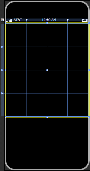
Next, you will create the main panel that contains the iPhone application buttons. To do this, go to Expression Blend’s Objects and Timeline palette and double-click grdMainPanel. In the Asset Library, drag a Grid element and drop it in the row directly below the grdStatusPanel. To position the Grid, select the Direct Selection arrow from the Toolbox then drag the Grid to the upper left corner of the row until the red dotted lines appear to its top and left. Next, in the Toolbox select the Selection arrow (first in the list) and resize the Grid until it fills Row 2 as indicated by the appearance of the red dotted lines to the right and bottom. If you have positioned the Grid correctly, its Row property should be set to 2 and all Margin settings should be zero (0). In the Property palette, change the name of the Grid to grdMainButtonPanel to make it easier to identify.
Now you need to add columns and rows to the grid to accommodate the iPhone application buttons. To do this, go to the Properties palette, click the Properties button and under Layout extended properties, click the RowDefinitions property’s ellipses button. In the RowDefinition Collection Editor, click Add another item four times to add four rows to the Grid then click OK. Next, go to the Property palette and click the ColumnDefinitions property’s ellipses button. In the ColumnDefinition Collection Editor, click the Add another item button four times to add four columns to the Grid then close the editor. To see the newly added rows and columns as shown in Figure16, go to the Objects and Timeline palette and double-click grdMainButtonPanel.
Creating an iPhone Button User Control
Now you’ll create the iPhone application buttons. As you can see in Figure 1, the iPhone button contains both an image and associated text. In addition, there is no visible button border as is usual with WPF buttons. This requires you to create a custom button control to imitate this look. All WPF controls are “lookless” in that you can change everything about their appearance while maintaining their behavior. You can use this feature when recreating the iPhone application buttons. Since you need to create multiple iPhone application buttons (one for each application) it make sense to create a reusable user control that contains an image and a label but allows you to specify the displayed image and label text.
To start, go to the Projects palette, right-click the project (the second node in the list) and select Add New Item… from the shortcut menu. In the Add new Item dialog, select UserControl and change the name of the control to iPhoneButton.xaml. Make sure you’ve selected the Include code file checkbox and then click OK to create the new user control.
Next, in the Objects and Timeline palette, select the UserControl item, then go to the Properties palette and under Layout set Width to 50 and the Height to 75. Although it may seem that you are hard-coding the control’s size, you aren’t-you are simply setting its default size when you drop it on a design surface.
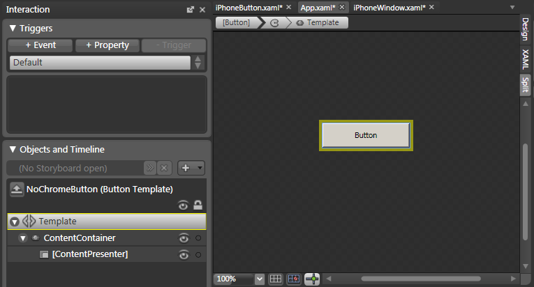
Now you need to add a standard WPF button to the User Control. To do this, go to the Asset Library, select a Button, and drop it in the User Control. Afterwards, go to the Properties palette and set all Margin values to zero (0). Next, right-click the Button and select Edit Control Parts (Template) | Edit a Copy… from the shortcut menu which launches the Create Style Resource dialog box. Set the Name (Key) value to NoChromeButton, set the Define in option to Application and then click OK to save. This puts you into template editing mode as shown in Figure17. The Objects and Timeline palette now displays the subelements that comprise a Button-in this case, a ContentContainer and ContentPresenter. Since you need to provide a completely different look for the iPhone button, right-click the ContentContainer in the Objects and Timeline palette and select Delete from the shortcut menu. This completely removes all visual aspects of the Button. However, in order for this custom Button to display custom content, you need to add a ContentPresenter element back into the Button. To do this, go to the Asset Library, select Content Presenter then double-click the ContentPresenter in the most-recently-used list. You are finished editing the control template, so click the up arrow at the top of the Objects and Timeline palette (it has a Return Scope to UserControl tool tip) which takes you out of template editing mode. You can now see the Button outline in the upper left corner of the user control. To make it fill the entire user control, go the Properties palette, and reset the HorizontalAlignment and VerticalAlignment properties. To do this, click the tiny square to the right of these properties (they have the Advanced Property Options tool tip) and select Reset from the popup.
Now it’s time to add an Image and Label inside the button to give it a visual appearance. First, add a Grid to the button that allows you to position these elements. Go the Objects and Timeline palette and double-click Button to select it as the active container. Next, go to the Asset Library, select Grid and drop it in the Button. With the Grid selected, go to the Properties palette and under Layout extended properties click the ellipses button next to the RowDefinitions property and add two Rows to the Grid by clicking Add another item twice. Before exiting the dialog box, select Row 0 and set its Height property to .75 - Star. Next, select Row 1 and set is Height property to .25 - Star. This allocates 75% of the Grid height to Row 0 and 25% to Row 1. Click OK.
To see the new Rows, go to Objects and Timeline and double-click Grid. Now go to the Asset Library, select Image, and drop it in Row zero (0) of the Grid. Reposition the Image so it is in the upper left corner of Row zero (0), then resize it so it fills the Row. If you have done this correctly, the Image should have a Row property value of zero (0), RowSpan of one (1), all Margin values should be zero (0). Now set the Width and Height of the Image to 50. Next, go to the Asset Library, select a Label, and then drop it in row one (1) of the Grid. Rather than manually positioning and resizing the Label, go to the Properties palette and make sure its Row property is set to one (1), HorizontalAlignment to Center, VerticalAlignment to Bottom, and all Margin values to zero (0).
You can’t see the text of the label because by default, its Foreground color is black. You have already created a style resource for text, so let’s use it on the Button’s Label. To do this, make sure you’ve selected the Label and then go to the Properties palette and under the Brushes category select the Foreground property. Select the Color resources tab and then select the TextForeground style you created earlier in this article. The text of the Label should now be white, but notice it is only partially displayed. To fix this problem, in the Property palette’s Layout category change all Padding settings to zero (0).
Next, to give a little breathing room around the Image at the top of the button and the Label at the bottom of the button, select the Grid in the Objects and Timeline palette, go to the Properties palette, and in the Margin property set both the top Margin (the arrow pointing up) and the bottom Margin (the arrow pointing down) to five (5).
Using Dependency Properties
At this point the iPhoneButton user control contains an Image and Label. However, if you drop one of these controls on a WPF design surface, you cannot set the Image’s Source property to specify the image to display or the Label’s Text property to specify the display text. Why? Because you cannot access user interface elements contained inside a user control.
To get around this problem, you can add properties to the outer user control container and use them to set the image and text indirectly. However, rather than adding regular .NET properties, it’s best to add dependency properties instead. A dependency property is a special kind of property that has additional behavior that you can use in this scenario. It features the ability to data bind to the dependency property. You can easily data bind the contained Image’s Source property to a custom ImageSource dependency property defined on the parent user control and data bind the contained Label’s Text property to a custom LabelText dependency property.
To do this, go to the Project palette and expand the iPhoneButton.xaml file by clicking the arrow to its left. Afterwards, double-click its associated iPhoneButton.xaml.cs/vb file to open it in Visual Studio. At the top of the source code file, add the following statement to import the specified namespace.
In C#:
using System.ComponentModel;
And in Visual Basic:
Imports System.ComponentModel
Next, if using C# add the code in Listing 3 to the class definition, and if using VB use the code in Listing 4. Notice this code contains the definition of two dependency properties named LabelContentProperty and ImageSourceProperty. They have two associated properties, LabelContent and ImageSource, which are standard .NET properties that act as wrappers for the dependency properties. This allows you to use the dependency properties just as you normally use regular .NET properties. Press Ctrl+Shift+S to save all changes.
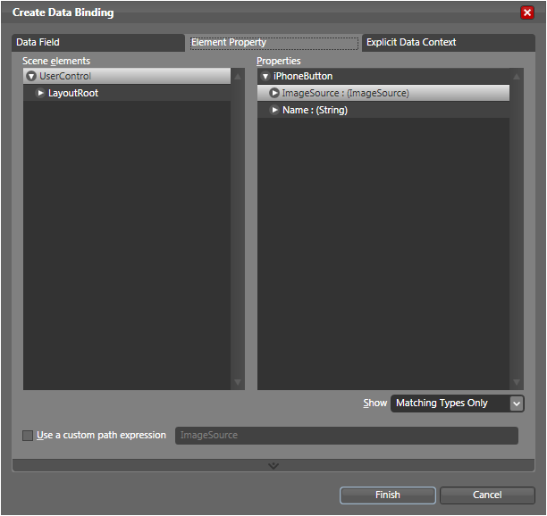
Now go back to Expression Blend and press Ctrl+Shift+B to compile the code you just added in Visual Studio. Next, select the Image element in the Objects and Timeline palette then go to the Properties palette and under the Common Properties category, locate the Source property. Click the tiny square to the right of the property (its tool tip says Advanced Property Options) and select Data Binding… from the popup. This launches the Create Data Binding dialog box. Since you need to bind to the user control’s dependency property, select the Element Property tab as shown in Figure 18. Afterwards, in the left side of the tab under Scene elements, select UserControl. Then on the right side of the dialog under Properties, select the ImageSource property and click Finish to close the dialog box. Now the Source property of the contained Image is data bound to the ImageSource property of the user control. Notice there is an orange rectangle with rounded corners displayed around the ImageSource property in the Property palette. This indicates a data bound property.
Finally, to data bind the contained Label, go to the Objects and Timeline palette and select the Label. Go to the Properties palette and under the Common Properties category find the Content property. Click the tiny square Advanced Properties box to its immediate right and select Data Binding from the popup. In the Create Data Binding dialog box, select the Element Property tab. On the left side under Scene elements make sure you’ve selected UserControl. Then on the right side under Properties, scroll down and select the LabelContent dependency property and click Finish. Now the Content property of the contained Label is data bound to the LabelContent property of the user control. Notice the Label text no longer appears in the design surface of the user control. This is because the Content property is no longer hard-coded to the string “Label”.
Now it’s time to use the iPhoneButton user control. To do this, first rebuild your project by pressing Ctrl+Shift+B or by selecting Build Solution from the Projects menu. Next, select the Projects palette and double-click iPhoneWindow.xaml to open it for editing. In the Objects and Timeline palette, double-click grdMainButtonPanel to select the Grid and display its columns and rows. Now go to the Asset Library and select the Custom Controls header. Select iPhoneButton, drag it in Column zero (0) row zero (0) of grdMainPanel then reposition and resize it so it fills the entire cell. Next, go to the Properties palette and under Common Properties, locate the ImageSource and LabelContent properties. These are the dependency properties you created for the user control. They are listed under the Common Properties category because they were adorned with the Category(“Custom Properties”) attribute (as shown in Listing 3 and 4). Expand the ImageSource property’s combo box and select the Text.png image from the list. This should automatically display the image on the button. Notice the default value of the label’s Content property has been set to Text. This is because when the LabelContentProperty dependency property was declared in Listing 3 and Listing 4, the default value of the property was specified in this parameter:
PropertyMetadata(“Text”)
Oddly enough, you actually want to leave the default value intact since Text is the correct string indicating this button is used for text messaging. To finish up the SMS text button, go to the Properties palette and under the Layout category, reset the Width and Height properties to Auto by clicking the button to their immediate right (it has the tool tip “Set to Auto”). Next, go to the HorizontalAlignment and VerticalAlignment properties and reset them to Stretch. Also, make sure you set all Margin values to zero (0). This should visually center the button in the upper left cell of the Grid.
The easiest way to add the other application buttons is to copy the Text Messaging button by pressing Ctrl+C and then Ctrl+V. This places the new copy of the button directly on top of the SMS Text button. Afterwards, just move it to the next column in the row then change its ImageSource and LabelText properties as shown in the following list (make sure each button’s Margin values are set to zero (0) and its Row, Column, RowSpan and ColumnSpan properties are set properly):
- Row 0 - text.png | Text
- Row 0 - calendar.png | Calendar
- Row 0 - photos.png | Photos
- Row 0 - camera.png | Camera
- Row 1 - youtube.png | YouTube
- Row 1 - stocks.png | Stocks
- Row 1 - maps.png | Maps
- Row 1 - weather.png | Weather
- Row 2 - clock.png | Clock
- Row 2 - calculator.png | Calculator
- Row 2 - notes.png | Notes
- Row 2 - settings.png | Settings
When you’re finished, your application button panel should look like the panel shown in Figure 1. At this point the buttons don’t do anything, but if you want to see how it looks so far at run time, press F5 to compile and run the project.
Working with Animations
Now you are ready to add some “wow” effects to the user interface. The first effect you need to create is the button “scatter” effect. In the real world, when a user clicks any iPhone application button, all the buttons scatter vertically, horizontally, and diagonally off the screen. After the buttons have scattered, the iPhone displays the application associated with the clicked button as a tiny rectangle in the center of the button panel. The application then quickly grows to fill the whole button panel.
You can use WPF *animations * to recreate all of these different iPhone visual effects. WPF contains a full set of animation classes that allow you to change the value of any dependency property on an object to create a visual animation. For example, you can change the value of an object’s Height or Width to make it grow or shrink. Typically, you change the property from one value to another value and specify the duration-how long it takes to go from the starting to ending value.
When creating an animation, you must first determine which property you want to animate. In the case of the button scatter effect, changing the Margin property of grdMainButtonPanel to a negative value causes all sides of the grid to expand beyond the visual boundaries of the main Window. As the Grid expands, the contained cells grow proportionately, and if you set the value to a large enough negative number, the expansion causes all buttons to scatter off the main Window.
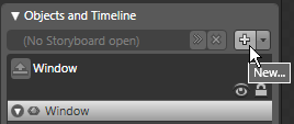
Expression Blend provides a powerful visual environment for creating animations. To get started, go to the very top of the Objects and Timeline palette and click the New button [+] as shown in Figure 19. A Storyboard allows you to define multiple animations, specifying the property to be animated and the timeline in which you want the animation to occur. In the Create Storyboard Resource dialog box, enter ScatterButtons as the Name (Key) and then click OK. This closes the dialog box and places the Objects and Timeline palette into Storyboard editing mode as shown in Figure 20.
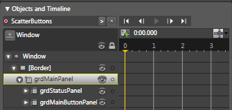
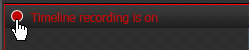
As soon as you create a Storyboard, Expression Blend is placed in Timeline recording mode as indicated by the red border around the main design surface and the red text Timeline recording is on in its upper left corner. In recording mode, you can select objects in the Objects and Timeline palette and change their property values in the Properties palette. Blend watches what the values you change and records them in a timeline.
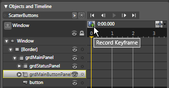
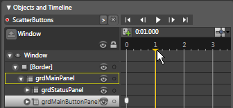
Since you want to animate the Margin property of the main button panel, select grdMainButtonPanel in the Objects and Timeline palette. To record this object with its initial design-time settings, click the Record Keyframe button as shown in Figure 21. This adds a small keyframe ellipse to the Timeline next to grdMainButtonPanel indicating the initial property values. Next, click and drag the playhead to the one second mark as shown in Figure 22. Afterwards, go to the Properties palette and change all four Margin property values to -700. As you change these values, you can see the sides of the button panel Grid expand positioned accordingly. After changing the Margin values, go back to the Objects and Timeline palette again. Notice a second keyframe has been automatically added to the timeline at the one second position. Since you are finished with this animation, go to the top-left corner of the main design surface and click the Timeline recording is on button as shown in Figure 23 to turn off recording.
Now you’re ready for the fun part-playing back the animation. To do this, go to the top of the Objects and Timeline palette and click the Go to first frame VCR button. Next, click the Play button. The iPhone application buttons should scatter as the parent Grid expands. You can also step frame-by-frame through the animation by clicking the Go to previous frame and Go to next frame VCR buttons.
As an aside, if you manually step through the different frames using the VCR buttons, you will see that as the application buttons are scattered, they are not visually confined to the original button panel area, but are visible in other panels of the main grid. I’ll show you how to address this undesirable behavior later in this article.
Specifying Animation Event Triggers
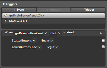
Your next step is to specify the user action that begins the animation. In this case you want the click of any application button to initiate the scatter effect. However, rather than associating each button in the panel with the animation you can specify the association in one place, taking advantage of a WPF feature known as routed events. Unlike regular .NET events, routed .NET events can automatically bubble up or tunnel down the container hierarchy. For example, when you click a WPF button the Click event fires on the button itself then travels up the container hierarchy all the way up to the top level Window. This provides a powerful event handling model that allows you to place common handler code at a higher-level container. This is exactly what you need in this situation. You can place code at the grdMainButtonPanel level that executes regardless of which button is clicked.
To do this, go to the Expression Blend Triggers panel. As shown in Figure24, when you create a new Timeline, it automatically creates an associated event trigger for Window.Loaded. If you click on this event and look in the middle of the panel, there is a combination of text and combo boxes that says When Window Loaded is raised-ScatterButtons Begin. This means that by default, the animation you just created will begin when the Window is first loaded-which is not what you want. To change the object that fires the event, under Objects and Timeline, select the grdMainButtonPanel object. Next, go to the middle portion of the Triggers panel and in the first combo box, select grdMainButtonPanel as the object that raises the event. The second combo box allows you to select the event that raises the event; however, since the event that fires the animation doesn’t belong to the Grid but belongs to each of the buttons, you need to manually specify the event trigger in XAML.
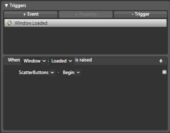
To do this, go to the XAML editor and under the <Window.Triggers> element change the EventTrigger subelement’s RoutedEvent attribute from FrameworkElement.Loaded to ButtonBase.Click (if you can’t see the XAML window, select Split from the Design | XAML | Split chooser to the right of the main design surface). When you’re done, the XAML should look like this:
<EventTrigger RoutedEvent=“ButtonBase.Click”
SourceName="grdMainButtonPanel">
Now, if you go back to the Triggers panel and select the grdMainButtonPanel.Click event, the text in the middle bar should read When grdMainButtonPanel Click is raised ScatterButtons Begin.
You can now test how this works by pressing F5 to build and run the project. Clicking any application button should now cause the buttons to scatter.
Now that you have successfully created the scatter effect, it’s time to create the effect that gathers the buttons back to their original positions. The real-world iPhone has a button at the bottom of the front panel that closes any open application and gathers the buttons back to their original position. Rather than creating an exact replica of this button (you now know enough to do it on your own) you can create a reasonable likeness and spend more time on the important WPF features.
Go to the Objects and Timeline palette and double-click the grdMainPanel object. Next, go to the Asset Library, select a Button, then drag it on the bottom row of the Grid. Afterwards, go to the Properties palette and set the following properties:
- Name - btnMain
- Background - Color Resource | MainPanelBackColor
- Width - 20
- Height - 20
- Content (clear it out)
- HorizontalAlignment - Center
- VerticalAlignment - Center
- Margin - Reset all values to zero (0)
Now you need to create an animation that can be started by this new button. Go to the top of the Objects and Timeline palette and click the New Storyboard button [+] as shown in Figure 19. In the Create Storyboard Resource dialog box, set the Name to GatherButtons then click OK. This creates a new storyboard and turns on Timeline recording. In the Objects and Timeline palette, double-click grdMainButtonPanel, to select it then go to the Properties palette and set the all Margin values to minus 700 (-700**).** This automatically adds a keyframe at the zero (0) second mark. Next, select the recording play head and drag it to the one second mark as shown in Figure 22. Go back to the Properties palette and set all Margin properties to zero (0). This is the reverse of the GatherButton animation. Since you are finished creating the animation, click the Timeline recording button to turn off recording as shown in Figure23. You can use the VCR buttons in the Objects and Timeline palette to test your animation.
To hook the new animation to the btnMain button you just created, go to the Triggers panel and select the second event in the list, which is again defaulted to Window.Loaded. Go to the Objects and Timeline palette and select btnMain. Now go back to the controls in the center of the Triggers panel and in the first combo box, change the selection from Window to btnMain. Go to the second combo box and change the selection from Loaded to Click. The text and controls when read together should say When btnMain Click is raised GatherButtons Begin.
To test both animations at run time, press F5 to build and run the project. When you click any application buttons it should cause them all to scatter. When you click btnMain it should cause them to gather.
To stop editing the animations, go to the top of the Objects and Timeline palette and click the up arrow as shown in Figure25.
Working with Clip Property and Geometries
As mentioned earlier, when the application buttons scatter, they don’t stay within the boundaries of the iPhone application button panel-they scatter over the top panel, status bar and even the Window border. Although you could create solid shapes for the top and bottom areas of the Window, the images would still cover the Window border when they scatter and gather causing a slight flicker. Instead, it’s best to use the Grid’s Clip property to constrain the button display to the main button panel.
Although you can use the Expression Blend IDE to specify the Clip property (see Blend’s Apply or remove a clipping path Help topic for details) since you need to animate the clipping region you have to edit the Window’s XAML file directly. First, you need to locate the XAML for the main button panel. To do this, go to the Objects and Timeline, and select grdMainButtonPanel. This highlights the starting tag of the XAML that comprises the Grid. Directly beneath the first line of selected XAML, and directly above the <Grid.RowDefinitions> element, add the following element:
<Grid.Clip>
<RectangleGeometry Rect=“0,0,265,300”
x:Name=“ButtonPanelGeometry”/>
</Grid.Clip>
This tells WPF to clip the Grid within the bounds of the RectangleGeometry object. The first two numbers specify the location of the RectangleGeometry object. As the Grid grows and shrinks, the location of the RectangleGeometry needs to change accordingly. The best way to do this is to add animations that change the location in tandem with the animation of the Grid. However, because this requires the animation of the complex Grid.Clip property, you again need to edit the XAML directly to add the animations. First of all, go to the top of the XAML file and search for the phrase “Storyboard”. You should see a storyboard element with the key ScatterButtons. Add the following XAML animation directly below its Thickness animation which animates the location of the ButtonPanelGeometry to 700, 700 which offsets the animation of the parent Grid’s Margin property:
<RectAnimationUsingKeyFrames
BeginTime=“00:00:00”
Storyboard.TargetName=“ButtonPanelGeometry”
Storyboard.TargetProperty=“Rect” >
<LinearRectKeyFrame KeyTime=“00:00:01”
Value=“700,700,265,300” />
</RectAnimationUsingKeyFrames>
Next, locate the storyboard element with the key GatherButtons and add the following XAML animation directly below its Thickness animation which resets the ButtonPanelGeometry back to its original position of 0,0:
<RectAnimationUsingKeyFrames
BeginTime=“00:00:00”
Storyboard.TargetName=“ButtonPanelGeometry”
Storyboard.TargetProperty=“Rect” > <LinearRectKeyFrame KeyTime=“00:00:01”
Value=“0,0,265,300” />
</RectAnimationUsingKeyFrames>
You can test the result of the new Clip property setting and its associated animations by pressing F5 to build and run the project. When the buttons scatter they should no longer expand over the other panels or the Window border.
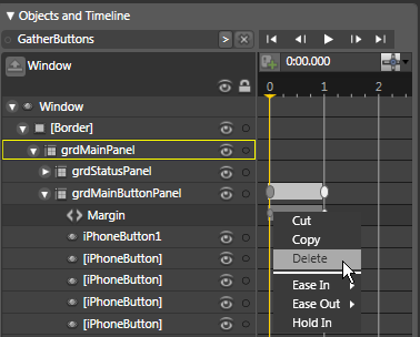
Before moving to the next step, there is one fine point to note. If you press btnMain when the application buttons are not scattered, it first scatters them then gathers them. Why does it do that? It’s because the animation you defined has both a “From” and “To” value. When the animation starts, the “From” value of the animation is set which gathers the buttons. To fix this problem, go to the Objects and Timeline palette and select the GatherButtons storyboard from the controls at the top of the palette. Next, locate the Margin animation listed under grdMainButtonPanel. Right-click the keyframe ellipse located at the zero seconds mark as shown in Figure 26 and select Delete from the shortcut menu.
Typically, you don’t need a “From” value in an animation because you are often not concerned with the current value of an animated property-you normally just want to animate it “To” a particular value. Removing the “From” value often prevents odd behavior from occurring. With this in mind, go back to the top of the Objects and Timeline palette, select the GatherButtons storyboard, and delete the Margin animation’s zero second keyframe too. When you’re done, click the Close Storyboard [x] button at the top of the Objects and Timeline palette to get out of Storyboard editing mode.
Creating the Lower Button Panel
Rather than provide highly detailed instructions for creating the lower button panel (the panel that contains the four main application buttons as shown in Figure 1), you should be able to create this lower button panel with minimal instructions and if need be, you can refer back to the more detailed instructions at the beginning of this article.
First of all, add a new Grid to the Row three (3) of grdMainButtonPanel. Set the following properties on the new Grid:
- Name - grdLowerButtonPanel
- Background - Solid Color Brush (170, 170, 170)
- Add four column definitions (accept all defaults)
- Add two row definitions (set the Height of Row 0 to 1 - Star and Row 1 to .30 - Star)
Next, add a Rectangle element to Row 1 (the second row) of the Grid, sizing it to fill the row. Set its Fill color to Solid Color Brush (130, 130, 130).
Add four new iPhoneButtons to grdLowerButtonPanel. Have each button in its own column, but have them span two rows so they fill the entire Grid. Set the ImageSource and LabelContent properties to the following values:
- phone.png - Phone
- mail.png - Mail
- browser.png - Safari
- ipod.png - iPod
When you’re finished, your lower button panel should look like the panel shown in Figure1.
When you press real-world application buttons, the bottom button panel fades until it is no longer visible. To add this effect, go to the top of the Objects and Timeline palette and click the New button (+) and in the Create Storyboard Resource dialog box enter LowerButtonsHide and click OK. In the Objects and Timeline palette, select grdLowerButtonPanel. Next, move the recording playhead to the .5 second mark. Afterwards, go to the Properties palette and set the Opacity property to 0**%.** This should cause the lower button panel to disappear. Select the Timeline recording is on button to turn off recording. By default, a new Window.Loaded event was added to the Triggers panel. Since you want to associate the new timeline with the grdMainButtonPanel.Click event, go to the Triggers panel, click the Window.Loaded event and then click the -Trigger button to delete the trigger. In the top of the Triggers panel, select grdMainButtonPanel.Click. This displays the associated ScatterButtons animation in the lower half of the panel. Since you want to add a second action for this event, click the Add new action button (+) in the middle of the Triggers panel. Next, in the first combo box in the newly added action, select LowerButtonsHide. When you’re done, the Triggers panel should look like Figure27.
Now you need to create a corresponding animation to display the lower button panel when a user clicks the main button. To do this, create another new storyboard in the Objects and Timeline panel and name it LowerButtonsShow. Next, select the grdLowerPanelButtons item in the Objects and Timeline palette then go to the Properties panel and change the Opacity setting to 0**%.** This adds a keyframe at the zero (0) second mark. Next, move the recording playhead to the one (1) second mark and change the Opacity property to 100**%.** This adds a new keyframe to the timeline. Even though you had to create a keyframe at the zero second mark, you no longer need it for the completed animation, so right-click the zero second keyframe and select Delete from the shortcut menu. When you’re finished, turn off timeline recording.
You need to associate this new animation with the btnMain.Click event. To do this, go to the Triggers panel again, select the Window.Loaded trigger and click the -Trigger button. Next, select the btnMain.Click trigger and click the Add new action button (+) located in the middle of the Trigger panel. In the newly added action, go to the first combo box and select LowerButtonsShow from the list.
To test the new animations, press F5 to run the project and try scattering and gathering the buttons and you should see the lower panel buttons dissolve then fade back in as the main panel buttons scatter and gather.
Conclusion
This article presented many great features of WPF, Expression Blend, and Visual Studio. However, you can do much more to this project to demonstrate additional features of WPF. In a future article I’ll demonstrate how to launch a corresponding application when a user clicks an application button. The article will demonstrate the use of business objects in WPF as well as additional data binding features in WPF.
Listing 1: iPhoneWindow.xaml.cs
protected DispatcherTimer Timer;

/// <summary>
/// Window.Loaded event handler
/// </summary>
/// <param name="sender"></param>
private void Window_Loaded(object sender, RoutedEventArgs e)
{
this.SetClock();
this.Timer = new DispatcherTimer();
this.Timer.Interval = new TimeSpan(0, 1, 0);
this.Timer.Tick += new EventHandler(Timer_Tick);
this.Timer.Start();
}

/// <summary>
/// Timer.Tick event handler
/// </summary>
/// <param name="sender"></param>
void Timer_Tick(object sender, EventArgs e)
{
this.SetClock();
}

/// <summary>
/// Sets the time on the iPhone clock
/// </summary>
public void SetClock()
{
this.lblTime.Content = DateTime.Now.ToShortTimeString();
}
Listing 2: iPhoneWindow.xaml.vb
Protected Timer As DispatcherTimer

''' <summary>
''' Window.Loaded event handler
''' </summary>
''' <param name="sender"></param>
Private Sub Window_Loaded(ByVal sender As System.Object, ByVal e
As System.Windows.RoutedEventArgs)
    Me.SetClock()
    Me.Timer = New DispatcherTimer()
    Me.Timer.Interval = New TimeSpan(1, 0, 0)
    AddHandler Me.Timer.Tick, AddressOf Timer_Tick
    Me.Timer.Start()
End Sub

''' <summary>
''' Timer.Tick event handler
''' </summary>
Private Sub Timer_Tick()
    Me.SetClock()
End Sub

''' <summary>
''' Sets the time on the iPhone clock
''' </summary>
Public Sub SetClock()
    Me.lblTime.Content() = DateTime.Now.ToShortTimeString()
End Sub
Listing 3: iPhoneButton.xaml.cs
/// <summary>
/// LabelContent dependency property
/// </summary>
public static readonly DependencyProperty LabelContentProperty =
                       DependencyProperty.Register("LabelContent",
                       typeof(object), typeof(iPhoneButton), new
                       PropertyMetadata("Text"));

[Category("Common Properties")]
public object LabelContent
{
get { return (object)GetValue(LabelContentProperty); }
set { SetValue(LabelContentProperty, value); }
}

/// <summary>
/// ImageSource dependency property
/// </summary>
private static DependencyProperty ImageSourceProperty =
               DependencyProperty.Register("ImageSource",
               typeof(ImageSource), typeof(iPhoneButton));

[Category("Common Properties")]
public ImageSource ImageSource
{
get { return (ImageSource)GetValue(ImageSourceProperty); }
set { SetValue(ImageSourceProperty, value); }
}
Listing 4: iPhoneButton.xaml.vb
''' <summary>
''' LabelContent dependency property
''' </summary>
Public Shared ReadOnly LabelContentProperty As
                       DependencyProperty = _
                       DependencyProperty.Register("LabelContent",
                       GetType(Object), GetType(iPhoneButton), New
                       PropertyMetadata("Text"))

<Category("Common Properties")> _
Public Property LabelContent() As Object
    Get
        Return CType(GetValue(LabelContentProperty), Object)
    End Get
    Set(ByVal value As Object)
        SetValue(LabelContentProperty, value)
    End Set
End Property

''' <summary>
''' ImageSource dependency property
''' </summary>
Private Shared ImageSourceProperty As DependencyProperty _
               = DependencyProperty.Register("ImageSource",
               GetType(ImageSource), GetType(iPhoneButton))

<Category("Common Properties")> _
Public Property ImageSource() As ImageSource
    Get
        Return CType(GetValue(ImageSourceProperty), ImageSource)
    End Get
    Set(ByVal value As ImageSource)
        SetValue(ImageSourceProperty, value)
    End Set
End Property