


Scorecards, test results, report cards, summaries-nearly everyone wants to skip past the details and see the bottom line.
Whether it is “pass or fail”, “go or no go”, managers evaluate professional efforts based on performance. Microsoft’s Business Intelligence tools provide developers and power users with the tools and methodologies to produce scorecards and other summaries that graphically represent performance. This article will create a Web-based Dashboard using several Microsoft products, including the newest product in the BI stack, PerformancePoint Server.
Introducing the Players
If you’ve been following Business Intelligence lately, chances are good that you’ve heard the term “Microsoft BI stack”. This term refers to the set (or pyramid, as some call it) of products that comprise Microsoft’s BI offerings.
First, the foundation for data storage and analysis capabilities is SQL Server 2005 which includes Analysis Services, Integration Services, and Reporting Services: three key pieces of a BI solution.
Second, a collection of Office products work on top of SQL Server 2005 to deliver attractive, customizable output. These products include Microsoft Excel, Reporting Services and ProClarity.
Third, Microsoft PerformancePoint Server works as a portal to integrate output into a series of Dashboard pages. PerformancePoint Server includes the Scorecard and Dashboard functionality from Business ScoreCard Manager 2005.
Dashboards and Performance
So, you may be asking, what is a Dashboard? Generally speaking, a Dashboard is an interface (usually Web-based) that displays summarized information so that viewers can easily analyze it. Dashboards usually contain some combination of reports, scorecards, and charts: all designed and arranged for the viewer to see information about the data being presented. Dashboards usually contain Key Performance Indicators (KPIs), where there are financial measurements to evaluate performance.
This article presents a fictional Jewelry company that I’ll call JewelDestiny, with retail stores across the United States. JewelDestiny tracks sales by both a geography-dependent and geography-independent sales hierarchy, as well as a product brand hierarchy. They measure each salesperson/store performance by six factors:
JewelDestiny evaluates and monitors performance by whether an employee, store, and sales hierarchy meets these six factors-six for six is perfect, five for six is good, and four for six is acceptable. JewelDestiny management wants a web site Dashboard that essentially provides four things:
What’s on the Menu?
This Baker’s Dozen article will provide the necessary steps to meet the requirements for JewelDestiny performance monitoring.
- Presenting the end result, a five page Dashboard
- Building the database and the OLAP solution
- Introducing the PerformancePoint designer, and creating the scorecard (Dashboard Page 1)
- Building a simple Dashboard (Dashboard Page 1)
- Assigning filters for the scorecard (Dashboard Page 1)
- Building a top 10 sales report (Dashboard Page 1)
- Creating a pie chart from Excel (Dashboard Page 2)
- Reading the pie chart from Excel Services, and placing it into a Dashboard (Dashboard Page 2)
- Building an analytic line chart (Dashboard Page 3)
- Building an analytic, drill-down sales cube report (Dashboard Page 4)
- Building a report from SSRS that utilizes custom MDX and reporting parameters (Dashboard Page 5)
- Incorporating the SSRS report into PerformancePoint (Dashboard Page 5)
- Deploying to solution to JewelDestiny’s SharePoint site
Note that some of these tips are “continuation” tips (e.g. Tips 11 and 12 are a set). I’ll annotate these where necessary.
A Few Notes Before You Begin
As this article covers a complete BI solution, let me take a few minutes and talk about the elements of the download solution:
- The relational database containing all the raw sales data for JewelDestiny.
- A SQL Server 2005 Analysis Services project that creates an OLAP database consisting of a sales cube and dimensions for Products, Sales Geography, and Dates.
- Separate SQL Server Reporting Services projects and Excel spreadsheets for specific pages of the JewelDestiny Dashboard.
- A PerformancePoint Workspace project that contains the definition for the JewelDestiny Dashboard, which consists of the following: the JewelDestiny scorecard for the six sales performance measures, references to external reports and charts, as well as PerformancePoint analytic reports and charts.
- While not required to run the examples, the option to deploy the JewelDestiny Dashboard to a SharePoint site.
Important note: normally you would not use all of these tools to design reports and charts for a Dashboard. One of the objectives of this article is to show the different available tools and their capabilities. Excel, Reporting Services, ProClarity, and even the PerformancePoint designer all provide nice reporting/charting tools. They are also subsets and supersets of one another-this can initially drive you quite mad! You should learn the capabilities and limitations of each of these. There is no one perfect designer.
A Quick ‘411’ on Using PerformancePoint Server
You can download a trial version of PerformancePoint Server by doing a web search on “Office PerformancePoint Server 2007 Trial Software". Microsoft offers a trial version for both 32-bit and 64-bit environments. You will only need to install the Monitoring module: the other major module (the Planning Module) is beyond the scope of this article. PerformancePoint has a few prerequisites such as running on a server-based operating system that includes the .NET Framework 2.0, the ASP.NET AJAX extensions, SQL Server 2005, etc. I built these examples using RC1 of Windows Server 2008, though you should be able to run the examples using Windows Server 2003 R2.
Microsoft has designed PerformancePoint Server to install on http://localhost:40000. You launch the PPS designer using the shortcut address http://localhost:40000/DesignerInstall/. (The PPS designer is actually a .NET 2.0 ClickOnce application.) You can use the designer to build Dashboards, preview them in a web browser, and then publish them to a SharePoint site.
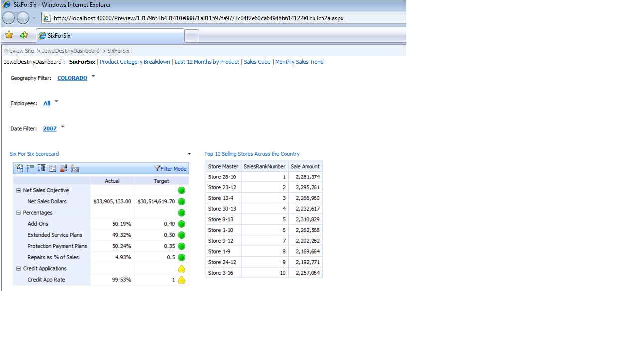
Tip 1: Presenting the End Result
It’s always good to define the end result up front, especially when you’re dealing with visual requirements. Figures 1-5 show the following, respectively:
Along the way, you’ll see how to build the Dashboard and pages using a combination of PPS, Excel, and SSRS. You’ll also see the role that MDX plays in customizing output and building filter pick-lists.
Tip 2: Understanding the OLAP Database
Figure 6 shows the diagram of the JewelDestiny OLAP database, which consists of the following:
- Fact tables for Daily Sales and Repairs, along with counts for Extended Service Plans, Payment Protection Plans, and Credit Applications.
- Dimension hierarchies for Date, Sales Area (two separate hierarchies for sales by geography and sales by business), and Product.
- A Visual Studio 2005 Analysis Services Solution (Figure 7).
- MDX Custom Named Sets and Custom Member calculations from Analysis Services (Figure 8). You’ll see through the article that these MDX code pieces will play an important role in customizing output.
Tip 3: Getting Started with the PPS Designer
Launch the PPS designer again. The PPS designer is a ClickOnce application that uses the local PPS web service http://localhost:40000/WebService/PmService.asmx.
(Before I go any further-Tips 3-5 create the first dashboard page. As usual, the first one is always the hardest! At the end of Tip 5, I provide a numbered list of the steps so if you find yourself lost at any point, or just want to see a recap, check that list).
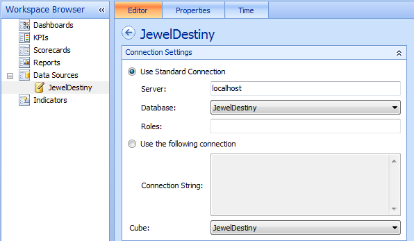
Once you are in the designer, you’ll need to immediately define a data source for the dashboard. From the Workspace Browser pane on the far left, right-click on Data Sources and select “New Data Source”. The PPS designer will prompt you for the type of Data Source: select “Analysis Services”, and then name the Data Source JewelDestiny. Finally, in Figure 9, select the server, database, and cube.
Also note in Figure 9 that the JewelDestiny data source icon (in the Data Source Workspace Browser) has a small pencil symbol inside. The pencil symbol indicates that you’ve made a change to a local element of the workspace, and you need to “publish” it to the server. So right-click on the JewelDestiny item in the Workspace Browser and select “Publish”.
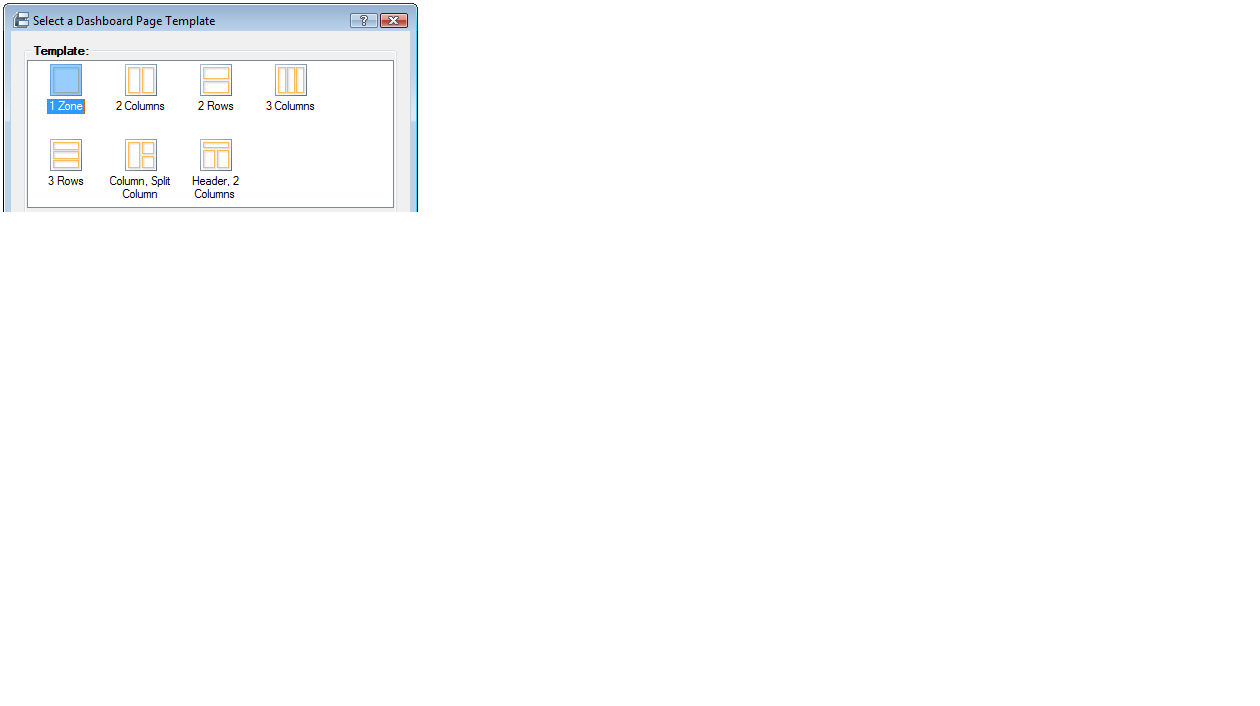
Now that you’ve defined a Data Source, you can get down to the business of creating the scorecard for the six sales factors. You can actually create all five web pages for the entire Dashboard and then fill them in as you go. To create the Dashboard, right-click on the Dashboard item in the Workspace Browser and select the option to create a new Dashboard. You’ll see a screen to create a new Dashboard page (Figure 10). This allows you to split each page into one or more zones. If you need to display more than one report on a page, you can select a template that best suits the page. (You can select a single zone for the entire page, and then add zones/columns later). In the case of the first page you’ll place the sales factor scorecard in the upper left, the filter selections for the scorecard in the upper right, and the top 10 store sales report on the bottom.
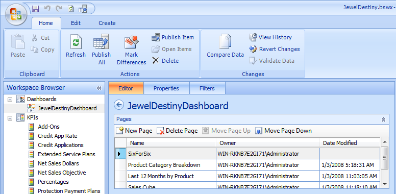
Next, Figure 11 shows how you can create multiple pages for the Dashboard. You can specify a specific name for each page that will appear as a tag page when you go to deploy (or preview) the dashboard.
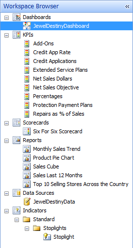
Throughout the article, you’ll create KPIs (Key Performance Indicators), Scorecards, and Reports: Figure 12 shows how the PPS designer arranges these elements.
Finally, you can save your work as the workbench file (an XML file with a BSWX extension).
Tip 4: Creating the KPIs and the Scorecard for the First Dashboard Page
Finally, with all these “housekeeping” steps out of the way, you can create the scorecard. Scorecards are comprised of KPIs (Key Performance Indicators). If you’re not already familiar with the concept of KPIs, you can easily find definitions in blogs, web searches, and books. Suffice it to say that the six sales factors for JewelDestiny are KPIs: financial measurements to evaluate performance. The goal is to create a dashboard that displays how an employee or store or other geographic sales area is performing, according to the six sales factors.
To create each KPI, right-click on the KPI item in the Workspace Browser to add a new KPI. With each new KPI, you need to specify the actual value and the target value as the Sale Amount measure and the Sales Goal measure from the OLAP cube (Figure 13). You can then select the threshold scoring indicator: the range of values to measure the actual data against the target data (Figure 14). In the example for actual sales versus sales goal, anything at or above 100% is good (green light), anything below that but greater than 85% is a mild warning (yellow light), and anything below that is a red flag (red light).
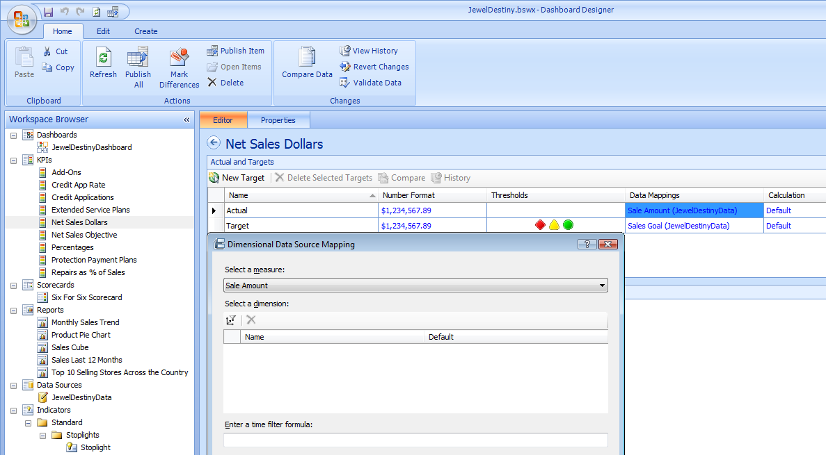
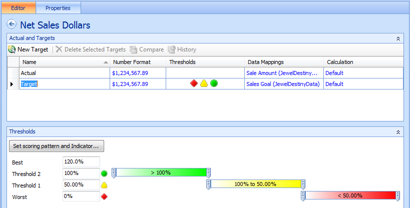
After you create the first KPI, the remaining ones are easy: just create a KPI with a name, select the actual and target values and an indicator range. Note that in the case of the percentages, the target values are stored as a fixed value (e.g. 35% for Payment Protection Plans). Obviously you could also create a measure column in the OLAP database to handle this.
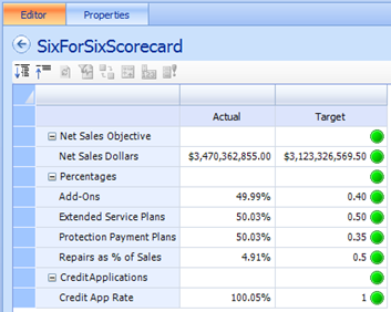
Finally, if you want to create labels that drill down (for instance, the Scorecard in Figure 1 shows Net Sales Objectives, Percentages, etc.), you can create a special kind of KPI called an Objective KPI. (You select the KPI type when you first create the KPI-either as an Objective KPI or a Blank KPI).
After you finish creating the KPIs (and you also publish them), you can create the Scorecard that will display the KPIs by right-clicking on the Scorecard item in the Workspace Browser and selecting “New Scorecard”. You can give the new Scorecard a name and then drag the KPIs from the Details list on the far right (Figure 15). After you publish the scorecard, you can go back to the Dashboard and drag the scorecard to the appropriate dashboard page.
Tip 5: Linking the Scorecard with Filters
You’re almost there! Now you need to define filters for the scorecard so that the end user can view the scorecard by Sales Hierarchy or Employee, and by Date Hierarchy.
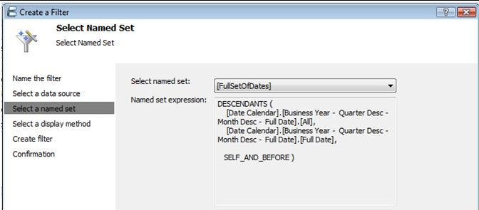
On the dashboard page, you can go to the third tab marked “Filter” and add a new filter. The PPS Designer gives you options to define a new filter by a custom MDX query, a simple Member Selection, or a Named Set. In this instance, you want to display the entire Geography hierarchy. Essentially, the code will amount to the following, which uses the MDX DESCENDANTS function:
DESCENDANTS (
[Store Master].[Geography Hierarchy].[All],
 [Store Master].[Geography Hierarchy].
                       [Store Master],
SELF_AND_BEFORE )
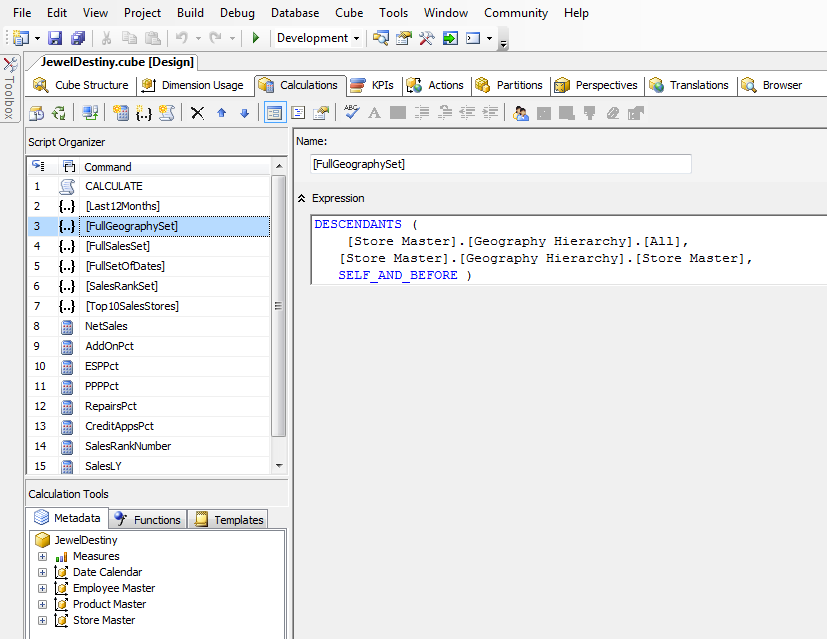
While you could just enter a custom MDX query, you may find that you’ll want to use the query elsewhere. In this case, it’s better to define the MDX query as a Named Set in the OLAP database, for reusability. Listings 1 and 2 show the MDX code for calculated named sets in the OLAP database. You’ll find the code from these listings in the calculations tab of the JewelDestiny OLAP cube (in the Analysis Services project, Figure 8).
Once you’ve defined these MDX Named Sets (which you can now use anywhere), you can select them when you create your filters (Figure 16).
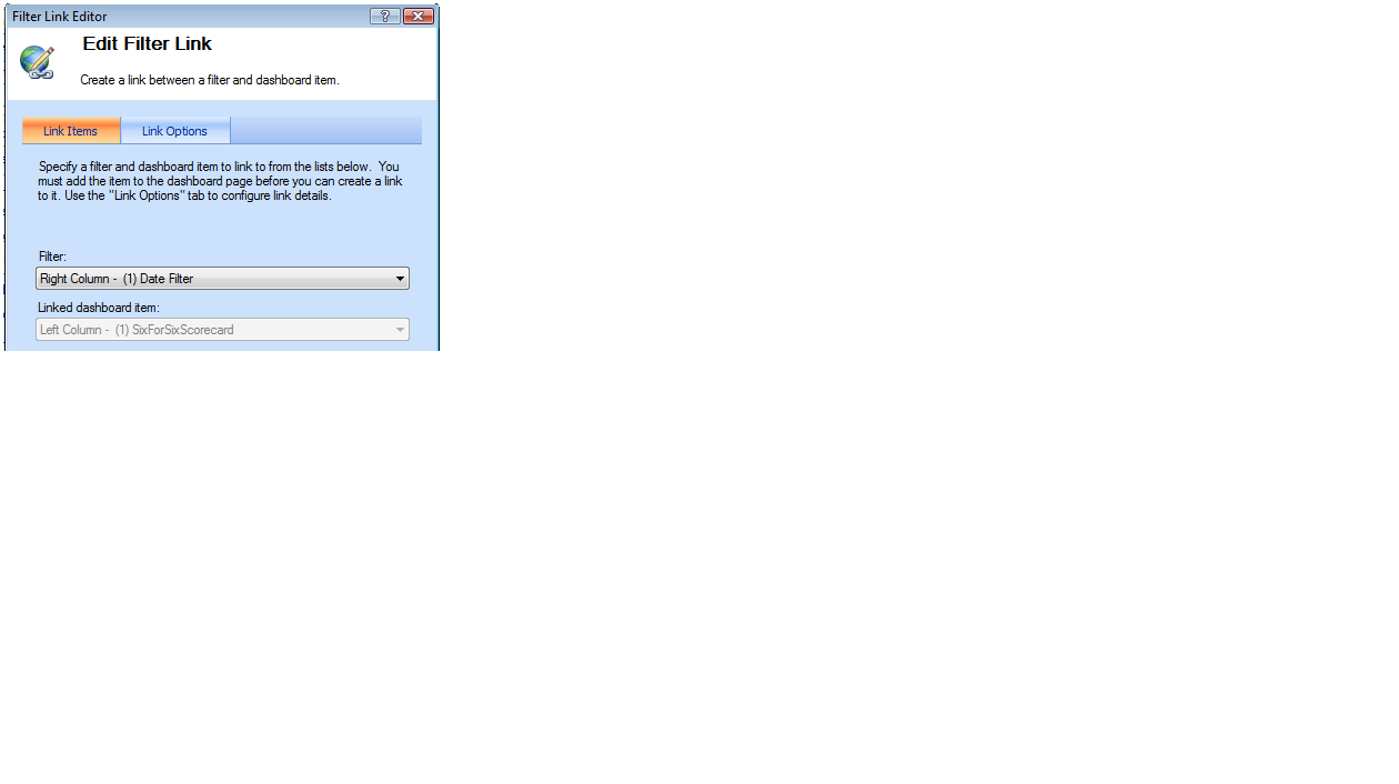
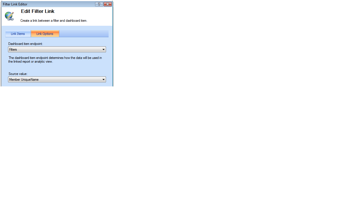
One more step! You may be asked, “OK, I created my scorecard….I created my filter….how does the scorecard recognize the filter?” Good question! The answer-filter links! You can either right-click on the scorecard that you dropped onto the page, or you can click the Create Links toolbar option at the top of the PPS designer to create filter links.
You create filter links in two steps on the two-tab dialog boxes in Figures 17-18). First (on the Link Items tab), you select the filter that you wish to associate with the scorecard, so select the Geography Hierarchy filter first (you’re going to do this three times, for each of the three filters). Second (on the Link Options tab), you select the Endpoint Item Filters, and select Member UniqueName as the Source Value.
That’s it! OK, that was quite a bit of work. So before I go any further, let me stop and review what you’ve done so far:
Tip 6: Building a Top 10 Report (Dashboard Page 1)
Now that you’re an expert on the process, you can take a crack at the last remaining part of the first page (back in Figure 1). You want a report showing top 10 stores by sales amount, for the date range filter only.
As you might have guessed, you need to write a little bit of MDX to handle the logic of top 10 stores. Once again, the Analysis Services project has two named sets called SalesRankSet and TOP10SalesStores. Note that they must appear in that order in the OLAP cube, as the latter references the former.
// Named Set SalesRankSet
ORDER(   [Store Master].[Store Master].children ,
   [Measures].[Sale Amount], BDESC )
// Named Set TOP10SalesStores
TOPCOUNT([SalesRankSet],10)
Now, you could stop here-however, the requirements call for you to actually show the ranking number for each store. You can do that easily by creating a calculated member (also in the list of available calculations for the OLAP cube) that used the MDX RANK function to assign a sequential number to each store within the SalesRankSet.
// Calculated Member SalesRankNumber
RANK([Store Master].[Store Master].CurrentMember,
      [SalesRankSet])
At this point, you just need to create a simple analytic grid in the PPS designer to utilize these measures and sets. Right-click on Reports in the Workspace Browser, select Analytic grid as the report type, and provide a name (“Top 10 Selling Stores Across the Country”). In the design area (Figure 19), select Top10SalesStores for the rows, SalesRankNumber and Sale Amount for the columns, and the Date Calendar Hierarchy as the Background (for any filter links).
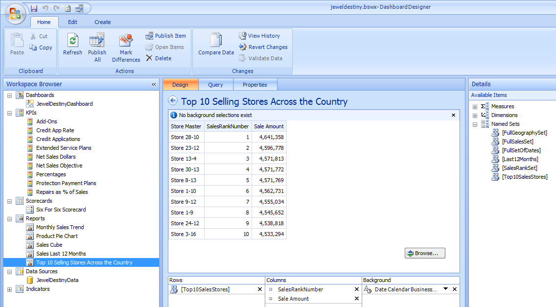
Finally, publish the report, and then drag it into the first page of the Dashboard (you’ll want to create a zone to the right of the scorecard). Then you can create a filter link between the Date filter and the report.
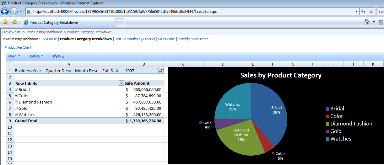
Tip 7: Creating a Pie Chart from Excel Services for the Second Page
One of the more humorous ironies of the modern software era is that despite all the capabilities in new tools, some users still prefer the familiarity of stalwart product names. The most ubiquitous tool is arguably Microsoft Excel, which many power users continue to rely on for many business tasks. Despite the designer capabilities in PPS, SSRS, and other tools, some business analysts still prefer to create chart definitions in Excel.
Fortunately, the news is good. Excel 2007 allows users to create charts and reports against an OLAP database and then publish them to Excel Services. From there you can create a report definition in PPS that is associated with the spreadsheet.
Figure 20 shows how you can create a chart against an OLAP database in Excel.
- Select the Data pull-down menu, select Other Sources, and then select Analysis Services.
- Enter your server name (where the OLAP database resides) and any login credentials.
- Select the JewelDestiny database and then click Finish.
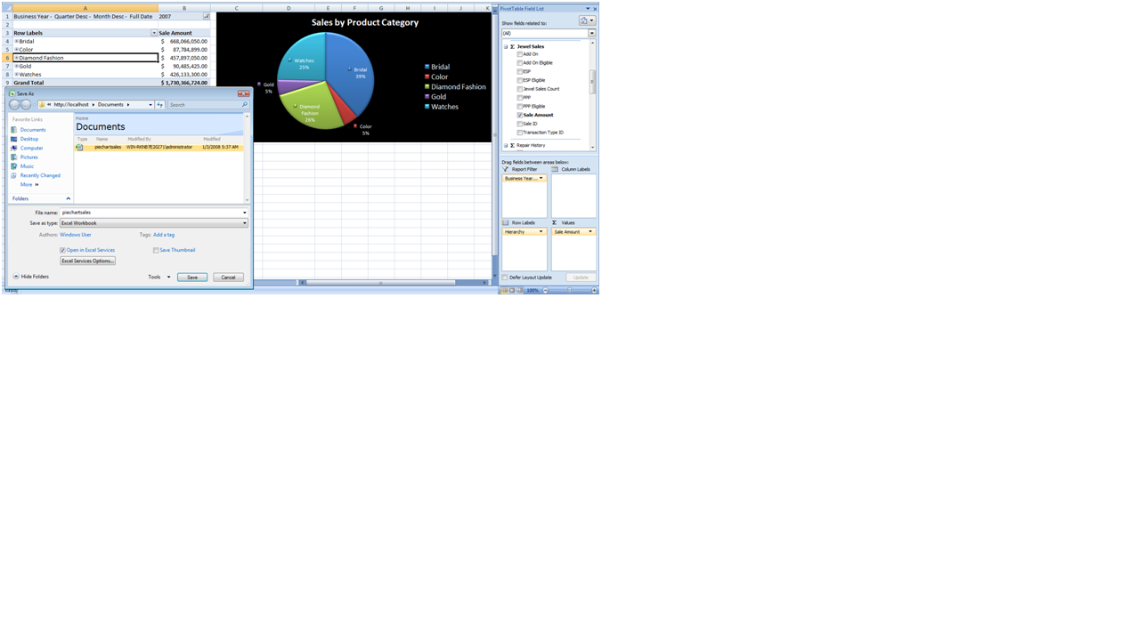
At that point you can select from the Field List to design a chart the way you would normally create a PivotChart in Excel. For this chart, I’ve created a pie chart that shows sales by product Category by a date element.
After you design the chart, you can publish it to Excel Services by selecting Publish…Excel Services, and then navigating to the URL/site where you will deploy the spreadsheet. In Figure 20 I’m simply publishing to the Documents area of my local SharePoint installation. Also note that you’ll want to click on the Excel Services Options button, which allows you to publish just those parts of the spreadsheet that are relevant.
Tip 8: Reading the Pie Chart from Excel Services for the Second Page
Now that you’ve created the Excel chart, you can easily access it from PPS. In Figure 21, I’ve created a new report with a template type of Excel Services-this prompts me for the default SharePoint site and Document library, and then will display all the available Excel spreadsheets in that library. Simple!
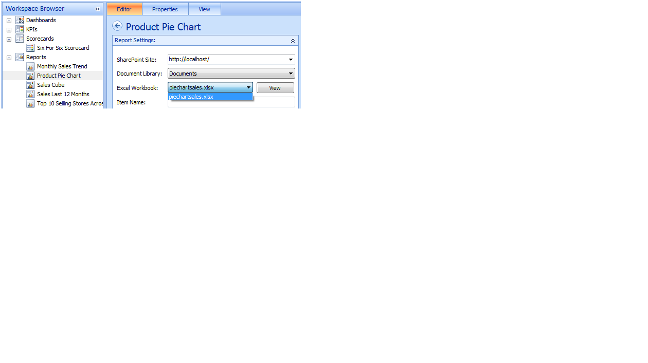
After you’re satisfied with the display of the spreadsheet, you can add this spreadsheet to the dashboard by selecting the dashboard from the workspace browser and dragging the published spreadsheet to page two of the dashboard.
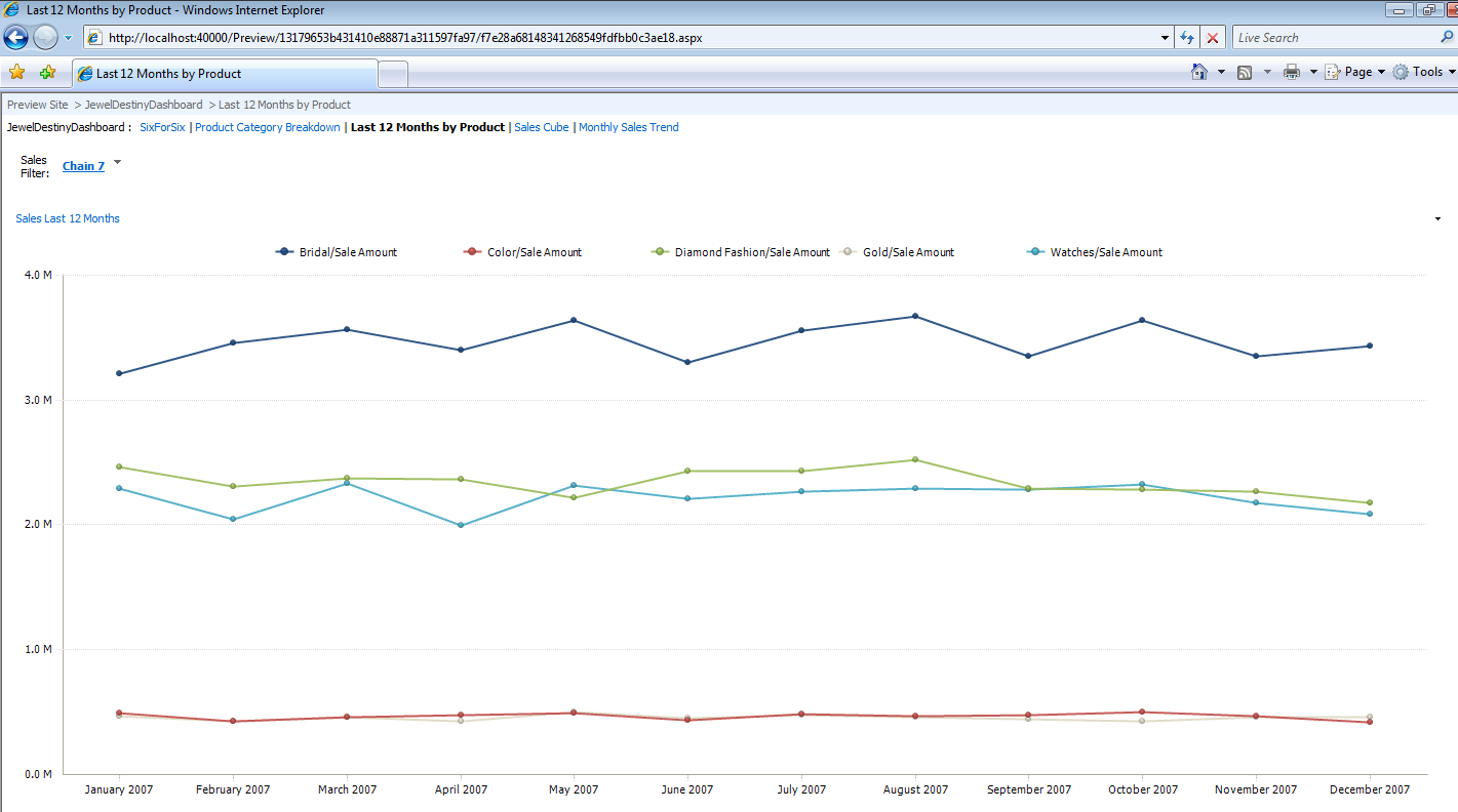
Tip 9: Building an Analytic Line Chart for the Third Page
Figure 3 contains a web page that shows a line chart of monthly sales for the most recent twelve months, broken out by product category, with an option to select an element from the Sales Geography Hierarchy. The chart also allows users to hover over a data point with the mouse and view the actual data value.
To produce this report, you need to define the data you want to plot (Sales Amount by Product Group), the x-axis range (the last 12 months, which you’ll define through a simple MDX named set), and a filter link so that a user can run the chart for a specific sales geography element. You can build this page using the PPS designer (Figure 22) by doing the following:
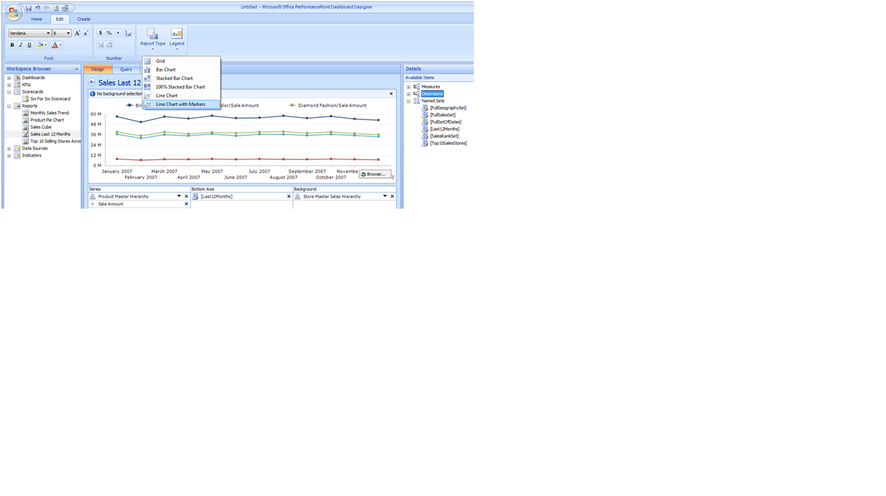
- Right-click on the report item in the PPS Workspace Browser, add a new report, and select Analytic Chart from the list of available report templates.
- Under the Report Type option pull-down, select Line Chart with Markers.
- Drag the Product Master Hierarchy and Sales Amount measure from the available items on the far left, into the Report Series area.
- Drag the named set Last12Months from the available items into the Bottom Axis area. You can find this named set as an MDX formula in the JewelDestiny sales cube:
// Named Set: Last12Months
LastPeriods ( 12,
   [Date Calendar].[Month Desc].LastChild)
- Drag the Store Master Sales Hierarchy into the Background area. This allows you to define a filter link on the web page based on the same dimension hierarchy.
Note that you can click the Browse button in the lower right corner of Figure 22: This allows you to preview the analytic grid before you save and publish the grid. Finally, you can add this analytic chart to the dashboard by selecting the dashboard from the workspace browser and dragging the published analytic chart to page three of the dashboard.
Because you defined the Store Master Sales Hierarchy as the background filter, you’ll also need to define a filter for the third page, and then establish a filter link with the analytic chart. You can add a filter by doing the following:
- Since a sales geography filter already exists (remember that you created one for the scorecard on page one), you can create a new zone above the zone for the analytic chart, give the new zone a small amount of the vertical area (e.g. 15%), and drag the Store Master Sales Geography Hierarchy into the zone.
- Click on the analytic chart zone and then click on the Create Link option button on the main PPS designer screen. Then create a filter link between the analytic chart and the filter, in the same manner that you created filter links back in Tip 5/Figures 16-17 (essentially, select the Sales Filter on the first tab of the Filter Link Editor dialog box, and then select Member Unique name as the Source Value on the second tab).
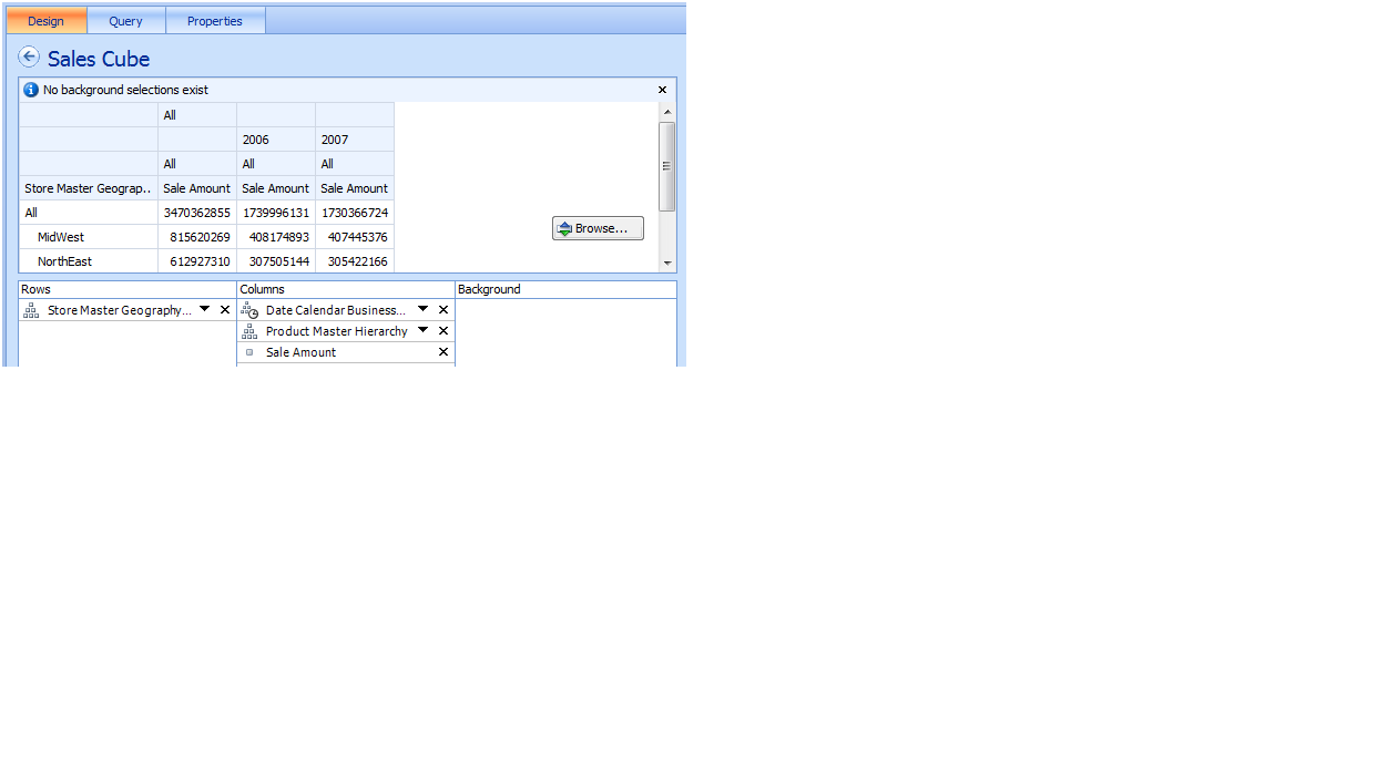
Tip 10: Building an Analytic, Drill-Down Report for the Fourth Page
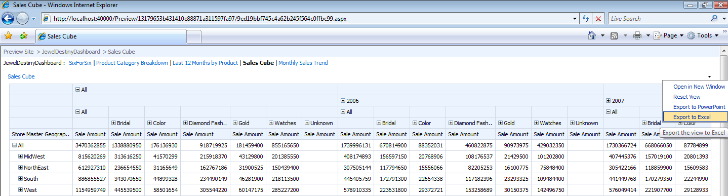
Figure 4 shows a web page that allows a user to start at a very high level of sales data, and drill-down by store sales geography, product hierarchy, and date hierarchy. The drilling down (and up) is almost instantaneous.
You can easily create this type of page using PerformancePoint Server. To do so, right-click on the report item in the PPS Workspace Browser to add a new report, and select Analytic Grid from the list of available Report Templates.
Figure 23 shows the layout designer for an analytic grid. From the list of available measures and dimensions, drag the Geography Hierarchy into the Rows area in the lower left. After that, drag the Date Calendar hierarchy, Product Hierarchy, and then Sales amount Measure into the columns area. (If you want to view the data differently than what’s in Figure 4, by all means, arrange the rows and columns to your liking.)
Note that you can click the Browse button in the lower right corner of Figure 23: This allows you to preview the analytic grid before you save and publish the grid. Finally, you can add this analytic grid to the dashboard by selecting the dashboard from the workspace browser and dragging the published analytic grid to page four of the dashboard. Almost too easy, isn’t it?
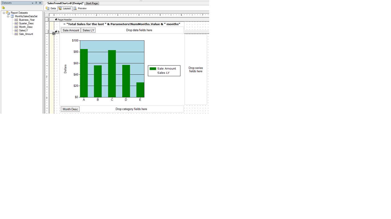
Tip 11: Building a Report from SSRS for the Fifth Page
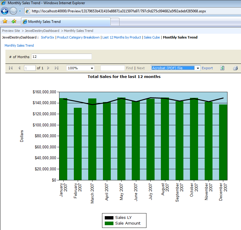
The fifth and final Dashboard page is a Monthly Sales Trend Chart-a bar chart that shows a single vertical bar for total sales by month (Figure 5). By default, the chart shows the last twelve months of available sales data; however, the user can select a number other than twelve. Additionally, the chart must plot sales from the same time period last year as a solid black line. You will use SSRS for the report, as SSRS allows you to define end-user parameters.
Before you even build the report, you’ll need to define a calculation to return the total monthly sales for the same time period, one year prior. Listing 3 shows the code for the calculated member SalesLY, which uses the MDX function ParallelPeriod to define the date scope as 12 months prior to whatever the current month happens to be. With that calculated member safely stored in the OLAP cube, you can use the member in SSRS.
I covered the mechanics for building an SSRS 2005 report against an OLAP database in the January/February 2008 issue of CoDe Magazine (Tip 13). Essentially, you want to enter the MDX code from Listing 4 into the MDX editor. Note that the code contains a parameter for the number of months (NumMonths): You’ll need to define this parameter by clicking on the Query Parameters button in the report’s data tab.
In the report’s layout area, you can insert a new chart from the SSRS report toolbox and define the chart type as a Column….Simple Column chart. To populate the chart data properties, drag the column Month Desc from the report dataset to the Category Fields area, and the Sale Amount and Sale LY columns to the Data Fields area (Figure 24).
To plot the Sale LY column as a horizontal line (a common question on SSRS technical forums), do the following (Figure 25):
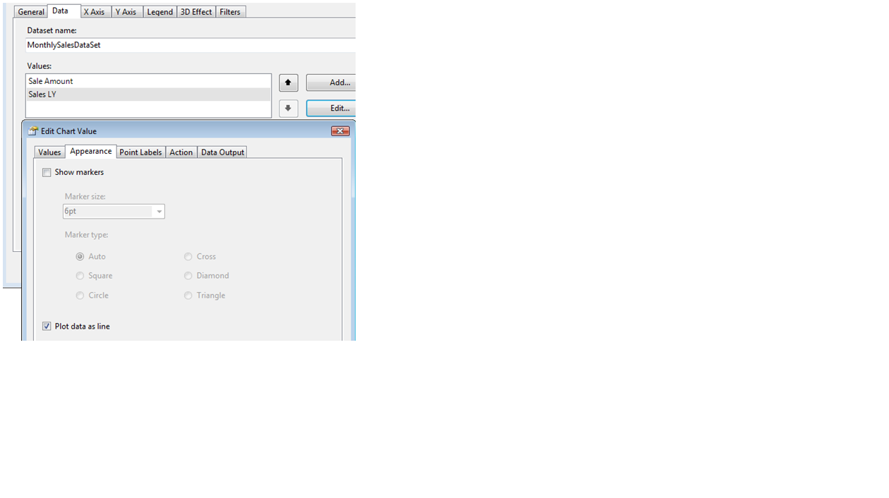
- Right-click on the chart to access the chart properties.
- Go to the Data tab, click on the Sales LY selection.
- Click Edit to Edit the Chart Value.
- In the Edit Chart Value dialog box, choose the Appearance tab, and check the option to Plot Data as Line.
Before you preview the report, you’ll note in the Report Parameters pull-down that SSRS automatically translated the NumMonths query parameter into an actual report parameter. You can customize the label for the prompt in the Report Parameters dialog prompt.
Finally, you’ll need to deploy the report to an SSRS Report Server so that you can access it from the PPS designer. To deploy, you must set two items in the Report Project: the TargetReportFolder (SSRSJewelDestinyReports), and the TargetServerURL location where the SSRS report server resides (http://localhost:8080/reportserver). On the latter, note the port number: If you’ve installed SharePoint, you’ll need to provide the port number for your default web site).
Tip 12: Incorporating the SSRS Report into PerformancePoint for the Fifth Page
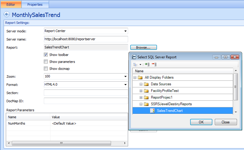
After you create and deploy the SSRS report, accessing it from PPS is a breeze. From the PPS Workspace Browser, right-click on report to add a new report and select SQL Server Report as the Report Template. Give the report the name MonthlySalesTrend.
In the editor for the new report (Figure 26), enter the same server name that you used for the TargetServerURL report project property back in Tip 11. After you enter the server name you can click on the Browse button in Figure 26 to navigate to the Report folder and actual report name. Note that you’ll need to check on the options to show the SSRS toolbar and SSRS parameters so that the user can enter a parameter for the number of months.
Finally, publish the report (right-click on the report to publish it). Then on the fifth page of the Dashboard, you can drag the report from the list of available reports on the right into the main page zone. That’s all there is to it!
Tip 13: Deploying to SharePoint
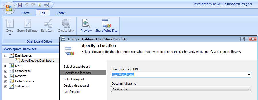
Finally, after you have previewed all of the pages using the PPS designer and you are satisfied with the output, you can deploy the Dashboard to a SharePoint site. Click on the SharePoint Site icon on the PPS main toolbar to display the dialog box, Deploy a Dashboard to a SharePoint Site (Figure 27). You can specify the site URL, the Document library, and (on a subsequent dialog box) the Master Page layout.
Final Thoughts/Next Issue
Check my blog (www.TheBakersDozen.net) for any follow-up tips, additional resources, and notes on Baker’s Dozen articles. The next Baker’s Dozen article will present 13 tips for building a data-driven ASP.NET 3.5 application.
Listing 1: Full Geography Hierarchy filter set
CREATE SET CURRENTCUBE.[FullGeographySet]
  AS DESCENDANTS (
     [Store Master].[Geography Hierarchy].[All],
     [Store Master].[Geography Hierarchy].[Store Master],
SELF_AND_BEFORE ) ;
Listing 2: Full Date Hierarchy filter set
CREATE SET CURRENTCUBE.[FullSetOfDates]
AS DESCENDANTS (
 [Date Calendar].
     [Business Year - Quarter Desc - Month Desc - Full Date].[All],
 [Date Calendar].
     [Business Year - Quarter Desc - Month Desc -  Full Date].
                                     [Full Date],
 SELF_AND_BEFORE ) ;
Listing 3: JewelDestiny sales cube calculation for Sales Last Year
CREATE MEMBER CURRENTCUBE.[MEASURES].SalesLY
   AS ([Measures].[Sale Amount],
       ParallelPeriod ([Date Calendar].
            [Business Year-Quarter Desc-Month Desc-Full Date].
              [Month Desc],12 )),
  FORMAT_STRING = "Currency",VISIBLE = 1  ;
Listing 4: SSRS MDX query for Tip 11
--  Retrieve Sales for This year and for Last year,
--  for the last X Number of Months
--  Note the @NumMonths parameter
SELECT NON EMPTY { [Measures].[SalesLY],
     [Measures].[Sale Amount] } ON COLUMNS,
   ([Date Calendar].
        [Business Year-Quarter Desc-Month Desc-Full Date].
            [Month Desc].ALLMEMBERS )  ON ROWS
  FROM
    (SELECT (LastPeriods(@NumMonths,
        [Date Calendar].[Month Desc].LastChild)) ON COLUMNS
          FROM [JewelDestiny])