


This article follows up on CODE Magazine COVID-19 articles (Stages of Data: A Playbook for Analytic Reporting Using COVID-19 Data and Stages of Data: A Playbook for Analytic Reporting Using COVID-19 Data, Part 2) I wrote back in 2020 with one more (and hopefully last) project article that summarizes COVID deaths in the United States over the last three and a half years. In this project, I'll blend some practices for presenting aggregated data in a summarized storyboard narrative, while also making users aware of potentially meaningful breakout metrics that are just one click away. Along the way, I'll present a sanity check for validating source data and not “assuming” the result if you summarize the entire source file. Additionally, I'll talk about misleading interpretations of data that I've seen in the general media. Although a good portion will come down to Math/Statistics 101, it's important to remember this: To the degree that leaders use statistics to act, you need to calculate and present aggregations that clearly define the context of the aggregation. Finally, in recognition that self-service BI tools indeed have a place in the world, I'll create a data project without using SQL Server (or any other back-end database), and I'll explain why this matters to database developers.
Personal Disclaimer
I'll repeat what I said in CODE Magazine two years ago: This is a tragic topic. As I write, we've had over one million COVID deaths in the United States since early 2020. Analysts can debate the deaths directly attributable to COVID versus deaths where COVID accelerated existing health conditions, etc. Even so, we've had over one million deaths in the United States in three years. I appreciate the weight of the sadness with each word I type. We're dealing with a horribly impactful event in our history. I can try to be philosophical and say, “Yes, these last few years were horrible, but it represents less than 4% of my lifetime.” That's tougher to explain to a younger person whose experience of this tragedy represents a much bigger ratio of their total memories. Still, this has been one of the most significant instances in our lifetimes of data presentation to the general public. As someone with no formal affiliation, I've seen different sources make mistakes (honest or otherwise) and I've seen different sources “get the data right.”
I'm 58 and the COVID era represents less than 4% of my lifetime. To someone younger, the COVID era represents a much larger percentage of their memory. A single state in the country can have the “third best ranking” in terms of COVID deaths, but the impact has still been enormous. Perspectives matter.
On the Agenda for Today
I'll present a data dashboard project for showing COVID deaths from the start of 2020 through the end of the second quarter of 2023. The dashboard project features breakouts by state/region, month/quarter/year, and age group. The project shows COVID deaths as reported by the CDC, as well as death rates per population and square mile, deaths by age group as a percentage of total deaths, and any increases/decreases from quarter to quarter. The dashboard project also calls out significant instances of variation of one breakout with respect to others. You can look at 100 different dashboard projects, each with a distinct subject matter, and still find a common theme of surfacing major spikes, variances, and instances that just plain stick out.
In my last two COVID articles, I went full speed on a detailed solution to show COVID case and death statistics at the United States county level. This time, I'll take a step back and show a summary recap of COVID deaths in the United States, while still showing some interesting breakouts by different categories.
If you're the type of person who likes to read the end of a book first to see what happens (I'm guilty of that!), you might want to read the section toward the end of this article, called “Analytic Findings.” They represent all the findings and items of potential interest that I'll highlight in this project. Because I've been reading this data since the beginning, I already knew some of the items of interest, but there were others I didn't realize until writing this article.
Here are my objectives:
- Produce a summary dashboard project that shows a clean presentation of the information yet still provides a pathway toward more specific information without making the overall presentation overly cluttered.
- Along the way, show how certain components in Microsoft Power BI can achieve these ends easily.
- Demonstrate how someone might create a Dashboard project without using a full-blown database management system (like SQL Server). So yes, I'm going to go against my proverbial grain, and show how a power-user can create an analytic application with good tools other than SQL Server. Why? It boils down to two sobering and sometimes humbling admissions: As a developer, I don't always have the time to write SQL code and model a SQL database, and power-users shouldn't have to wait, if they're armed with both good tools and a guideline of decent practices. This is an article for both developers and power-users: For the latter, I'm assuming that the user can write moderately complicated Excel formulas and maybe even a little VBA/procedural code or script.
- Present some sanity checks for vetting source data. Some developers make the innocent but critical mistake of assuming they know the full level of detail in source data. Although no solution can proactively capture every possible data issue, there are some techniques and patterns you can use to vet source data, regardless of whether you're using SQL Server, SSIS, C#, or even Excel.
- All our adult lives, we've seen statistics in print/social media, TV graphics, etc. Just watch an hour of any prime-time news show and you'll hear statistics on consumer prices, unemployment rates, crime statistics, etc. Along with COVID, many authors/media sources have presented statistics: some are correct, some are incorrect, some are misleading, and some are just plain sloppy. Just like English teachers reacting harshly to misuse of “lay” and “lie,” or confusing “they're/their/there,” the equivalent in the analytic world is a sloppy sentence/conclusion that doesn't represent what the actual data tells us. The sentence might take a valid piece of information but communicate it in a different context. In the last week, I counted five instances in the general media where the presentation of data made me wonder if the author received misleading data or took excessive liberties with the interpretation. I'll cover this further, but there are three terms I often see misused: variance, trend, and rate.
This article is broken up into three sections:
- The source data I'm using and the general calculations I want to present. In this section, I'll also show some basic validation techniques you can use to make sure that you reduce the number of surprises you might otherwise see at the end.
- A dashboard project I created using Power BI. The runtime link can be found here: https://bit.ly/3Epv0mx. Borrowing from the master of the Magic Data Wall (CNN's John King, one of my idols for his skills with data and presentations), I'll show the dashboard using the result first, and then break it down the underlying data.
- How I pulled all this together. This is where I'm doing something different. I've come to the realization that I can't seize every data opportunity to create a staging model and a reporting model database in SQL Server. Jokingly, I have accepted the dark side, that sometimes power users want to create applications using nothing but Excel or Power BI or other power-user self-service BI tools.
Step 1: Introducing the Data Elements and Calculations
Here are my general goals for the dashboard project. Using United States deaths from the CDC by State and by Month from early 2020 through the end of the second quarter 2023, I want to:
- Rank states/regions by total number of deaths, deaths per population, deaths per square mile, and deaths for one age group with respect to all age groups
- See instances where one state/time period might vary greatly from the national average
- See instances where one metric spiked (or dropped) the most from the prior quarter
There's a term many businesses use: IOI, or Items of Interest. Years ago. I participated in weekly sales calls. The opening minutes were devoted to IOIs, and some weren't necessarily ones you'd think would be covered first. In this case, returns/damages, although a fact of life, were scrutinized heavily. At the end of this article, I'll show a list of major findings, or IOIs, from this data presentation.
Before I get to the source data, let's talk about specific data and mockups of what I'd like to present to an end user.
Figure 1 shows COVID deaths for Texas and Pennsylvania in Q2 and Q3 of 2021, along with the U.S. total deaths. For each of the three, I'm showing the population and land square miles, along with total deaths and deaths for one of the age groups I want to analyze. (In a few minutes I'll get to the age groupings.)
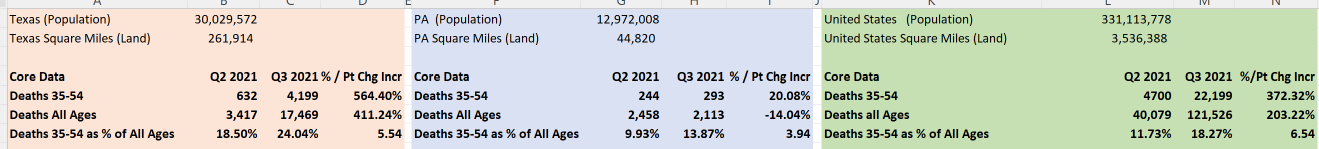
Now let's look at some of these numbers again for the two states, across all of time (Figure 2).
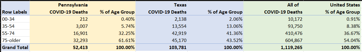
You can see that Texas experienced nearly double the total deaths overall, Pennsylvania's deaths age 75-older were 18 percentage points higher than Texas, and that Texas had a greater percentage of deaths in the lower age groups. You can also see that Pennsylvania's percentages are a bit more adjacent to national averages. You might want to know what periods a state's age group percentage varied the most (positively or negatively) compared to the national average. Additionally, comparing the raw sum of numbers needs to also factor in state population and square miles.
Now have a look at Figure 3. Again, Texas had twice as many deaths, although their population is more than two times that of PA: As a result, PA has a higher death rate per population (per 1,000 residents). However, Pennsylvania's land area is roughly six times smaller than TX, which means a much higher population density. The question is whether PA's deaths per square mile being roughly three times greater means a different death rate if the states were the same size.
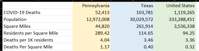
Here is where we must exercise caution. Many public policy experts have written about other factors when comparing states, such as access to health care, health care resources, population density in the larger cities versus the smaller cities, etc. The numbers I'm showing can provide a starting point for discussion of outcomes, but they are by no means the only factors - far from it. COVID hit ALL states very hard. I have seen this carried to the level of “my state” versus “your state” silliness. Having said that, if you look at general pictures of time for different areas, you can see different potential stories going on.
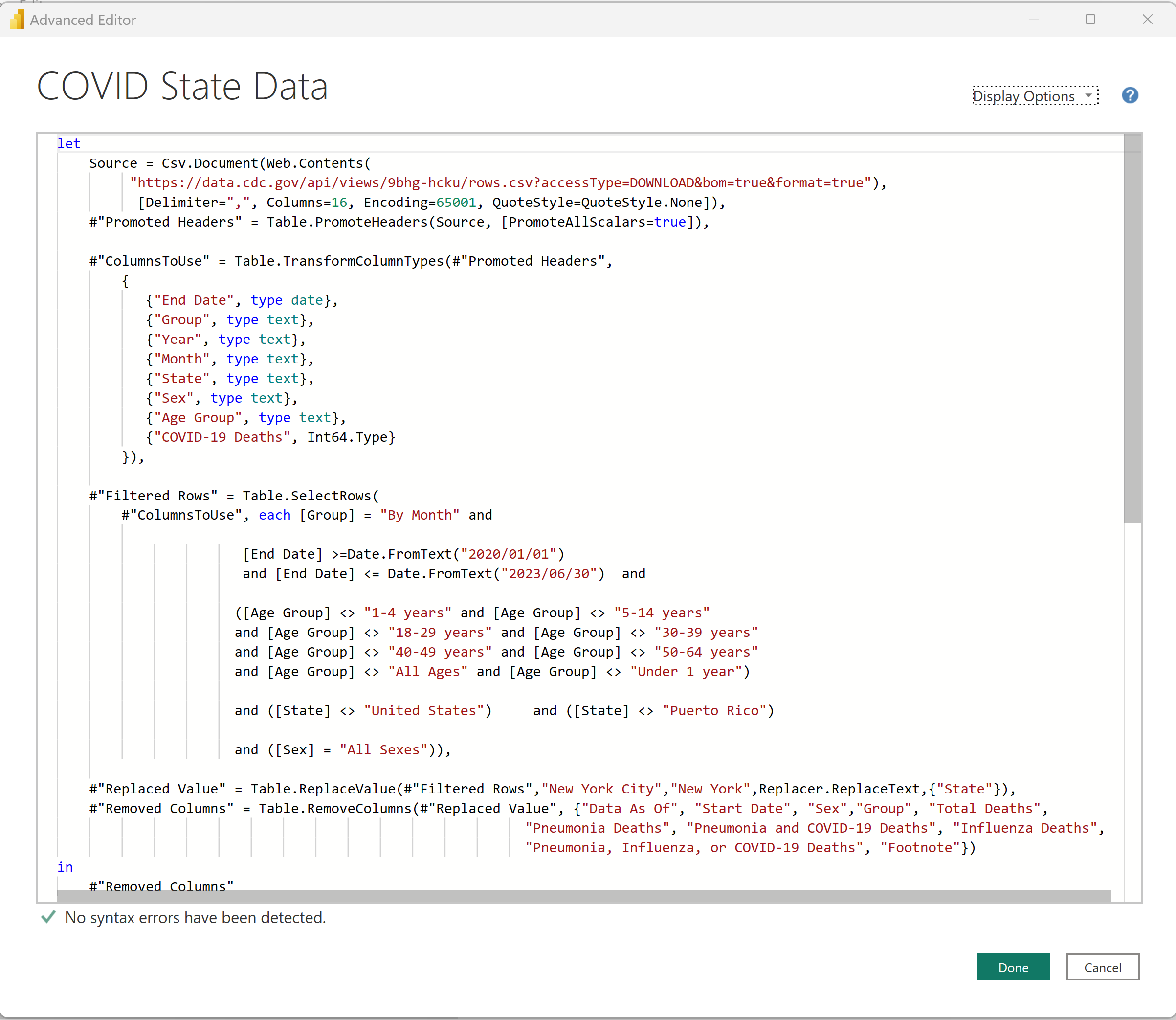
I'm using a data feed from the CDC: the link is https://data.cdc.gov/api/views/9bhg-hcku/rows.csv?accessType=DOWNLOAD&bom=true&format=true. This downloads a CSV file called “Provisional_COVID-19_Deaths_by_Sex_and_Age.csv”.
One of the first things I do when I read a new data feed is manually verify some of the rollups. As of this writing (early September 2023), multiple credible sources list the U.S. death toll from COVID as roughly 1.1 million, from early 2020 through mid-2023. Anyone who's looked at aggregate numbers at the national level realizes that multiple sites show slightly different numbers based on their sources and timing: Still, I need to make sure that a simple roll-up of COVID deaths from a CSV file is close to the target number I want to validate.
Figure 4 shows a good handful of rows from the CSV file. The first thing I notice is that the feed contains total deaths and deaths from other respiratory diseases in addition to COVID. For the purposes of this article, I'm only going to retain the COVID-19 deaths. In the future, I'd like to include the other figures for additional comparisons but for now, I'll only cover COVID deaths.
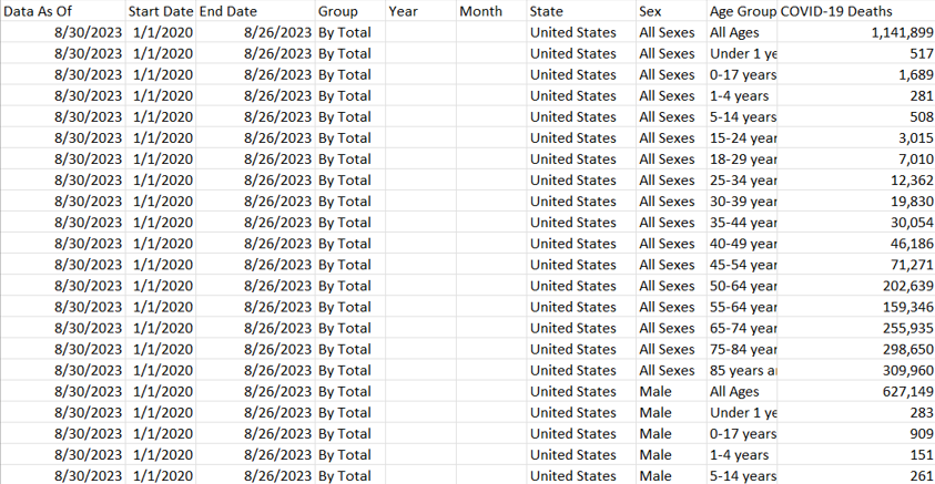
If this CSV indeed contains death counts at the state level, I should be able to sum the COVID-19 deaths column to a number that's close to the 1.1 million I want to validate. I have some work to do. As it turns out, there are multiple levels of subtotals by sex, by age group, for the country, etc. Basically, I need to weed out the subtotals and retrieve just the core data I want to sum. Fortunately, this is one of the many things that the world's oldest business intelligence tool (Excel) does very well.
Yes, SQL Server has good data profiling tools. Excel is also a great tool for verifying/weeding out data. Experience helps too.
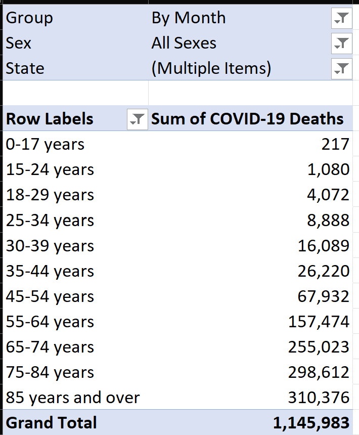
I'll delete all the columns I don't need and create a pivot table (Figure 5) that summarizes all the non-aggregate columns (i.e., anything before the COVID Deaths column). Take note that the data breaks out deaths by male and female. Even though this project won't include breakdown by gender, I still want to use it in the initial data discovery, if only to filter out extra subtotals.
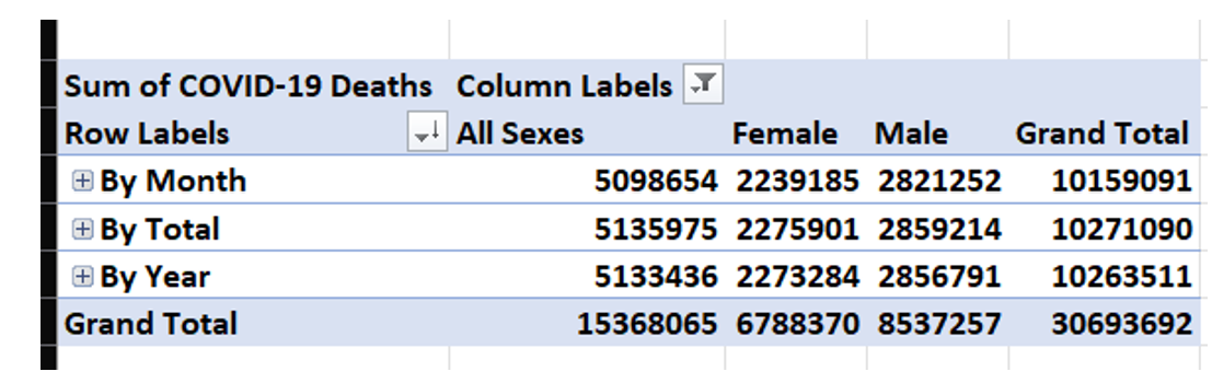
I only want the data “By Month” (it's actually by month/year), and not for any subtotals for “Total,” nor for Year, nor for Sex. I could set up a basic filter in the pivot table (Figure 6) and hope that I've identified filtering that gets me to roughly 1.1 million. If you're paying attention, you're probably thinking that I have more filters to go!
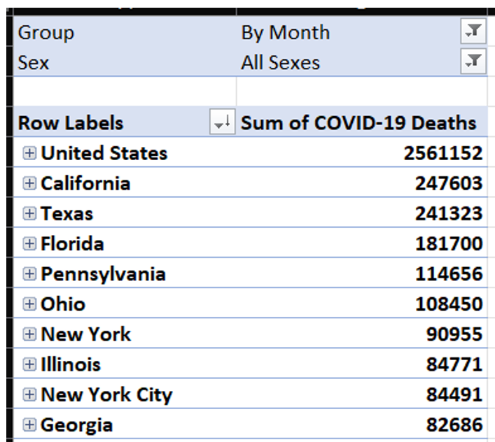
I'm still looking at a grand total of over five million: 2.5 million for the embedded U.S. total and then 2.5 million for the sum of the states. I need to filter out “United States” from the State column, and then break out the data by age group and hope that gets me much closer to the 1.1 million (Figure 7).
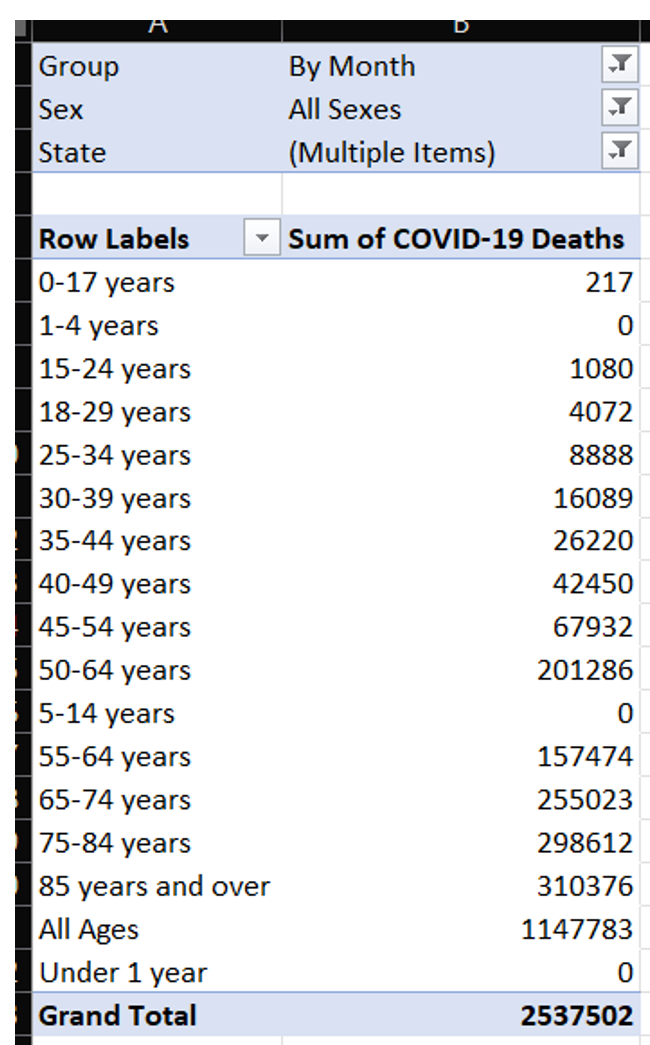
Unfortunately, the grand total is still more than twice the target amount. You can see that there's an “all ages” embedded total that I want to filter out, so that I can just roll up the age groups. I'll spare a screen shot along the way and say that just filtering out “All Ages” alone won't do the trick. Notice the age groups: There are multiple overlapping group definitions! There's 35-44 years, and there's also both 30-39 years as well as 40-49 years! Very likely, this was for the CDC to satisfy multiple reporting needs by different age groups. Regardless, I need to decide what groups I'll take and what groups I'll suppress.
I'm going to keep specific age groups, and I'm going to summarize them further (Figure 8). This project will use the four General Age groups in Figure 8 (although I'll retain the more specific age groups in the data, if someone wants to modify the project files. Four general age groups will display better on charts than nine age groups, but you're free to change that.
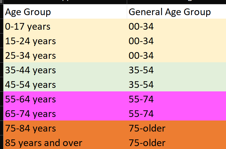
Take note that in the 00-34 General Age group, I'm still taking overlapping ranges (0-17 and 15-24). Why? It's a long story and I had to read across several sites to understand, but here's the bottom line: In the lowest age groups (1-4, 5-14) there are some gaps in the data resulting in zeros for those age groups and they're collectively captured in the 0-17 and 15-24 age groups. This is certainly not ideal. However (and this is not to diminish even one death), the grand total of both those age groups is approximately 1,300. Yes, we're probably talking about double-counting 100 or so deaths. Again, not ideal, but because this age group represents such a lower % of overall deaths, we'll just have to accept that.
For that matter, I'll also say that someone could take summaries of county-level reporting for a single state and find different numbers than what the CDC reports by state/month/age group. Some of this could be due to inconsistent reporting, some due to late-arriving or missing data, etc. Trying to resolve these numbers with absolute-zero percent variance is implying a level of accuracy that simply doesn't currently exist in the data.
If I further filter in my Excel sheet on these age ranges, I get a number that is very close to my target (Figure 9). Yes, this was tedious, and some developers might want to automate this process. I often try to explore source data in Excel when possible, because I might think of new validations or discover items I didn't realize. Either way, the key point here is to vet the data. Know thy data!
I would use the expression “it's close enough for jazz,” except I'm a big jazz fanatic with a room full of Miles Davis posters. And there's one more thing to verify: Are we getting all fifty states plus the District of Columbia, as well as territories like Puerto Rico and Guam? I'll move the age group up in the filter and then specify State for the rows in the pivot table (Figure 10). I don't want to show a screen shot of all 50 states here, but I'll highlight one more issue:
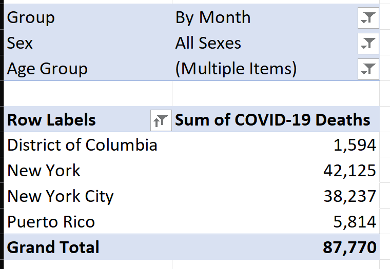
I filtered out all fifty states (save for New York), to illustrate one final issue. First, this data includes the District of Columbia and Puerto Rico. Just for demonstration purposes, I'm going to filter out Puerto Rico from this exercise. (Obviously, the reader is free to take the download files and handle Puerto Rico differently). Also notice that New York and New York City are listed separately, as COVID severely impacted NYC in the first year. I'm only interested in state analysis, so I'll need to combine those.
I've taken a journey through the source data and know that I need to do the following when I load it:
- Only include the group “By Month” and ignore the subtotal rows for other time periods
- Only include the sex of “All Sexes” and ignore subtotal rows for Male and Female
- Only include the age groups specified back in Figure 8 (and then summarize them further into the age groups I want for the analysis)
- Filter out “United States Total” and “Puerto Rico,” and rename any instances of “New York City” to “New York”
Step 2: Showing the Result from the Outside
Every election night, I watch John King's presentations on CNN. King is a master at presenting data, so I'll do my best imitation of John King (imitation being the most sincere form of flattery):
Page 1: U.S. State Map and Shading Based on a Metric
On page 1 (U.S. Map), I'll plot the sum of COVID deaths for the time period of Q1 2020 through Q2 2023 (Figure 11). Note in the yellow dropdown that you can plot different measures to highlight the states, so the overall deaths are highest in the darkest shaded states. Note that there's also a table on the right to show other states and also note the callouts in Figure 11.
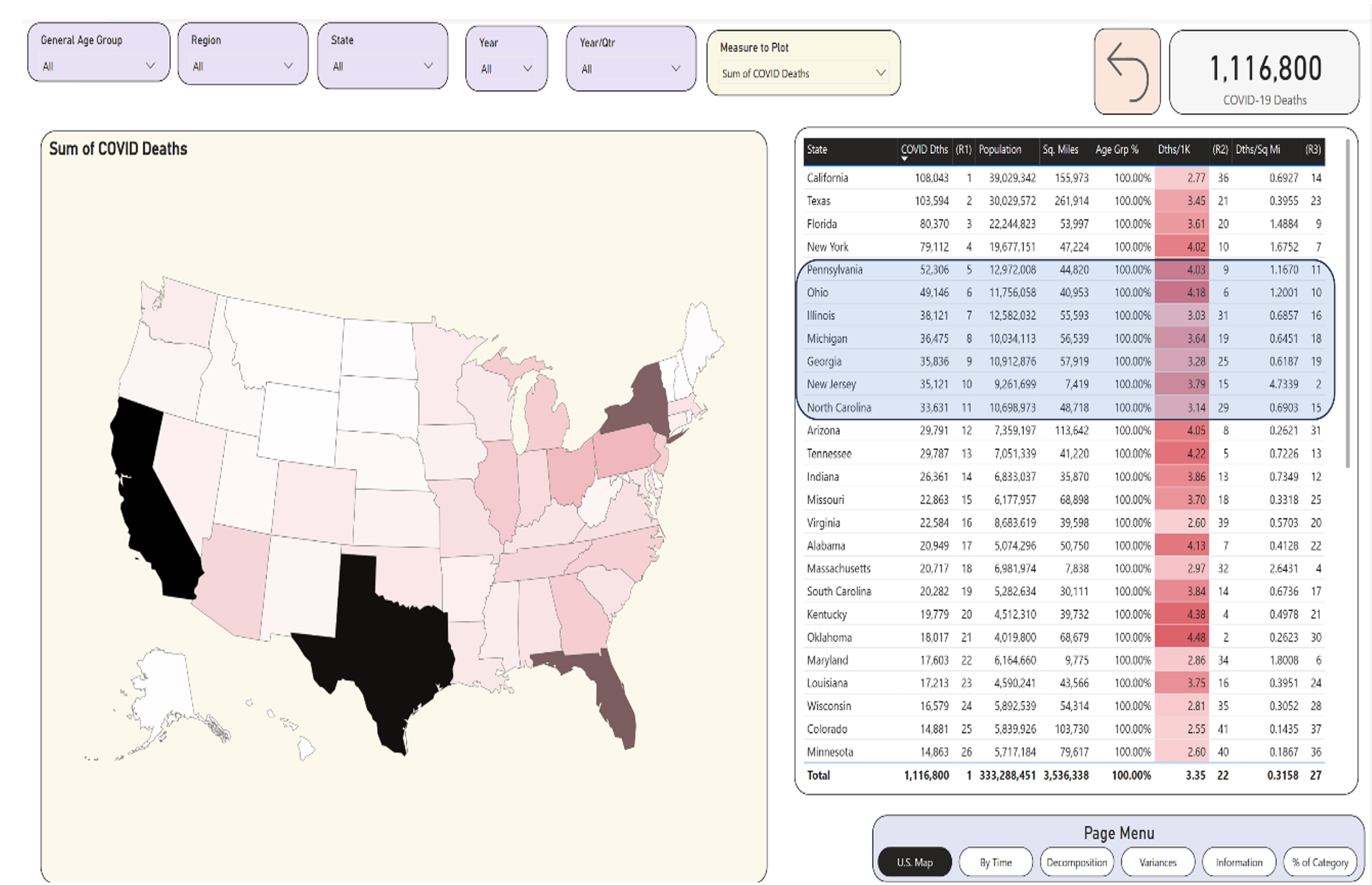
Of note: The states highlighted in blue on the right represent “mid-size” states with populations between nine and 12 million. Yes, the differences between (say) Pennsylvania and New Jersey are enormous, and you can see that in the other stats for deaths per population and deaths per square mile.
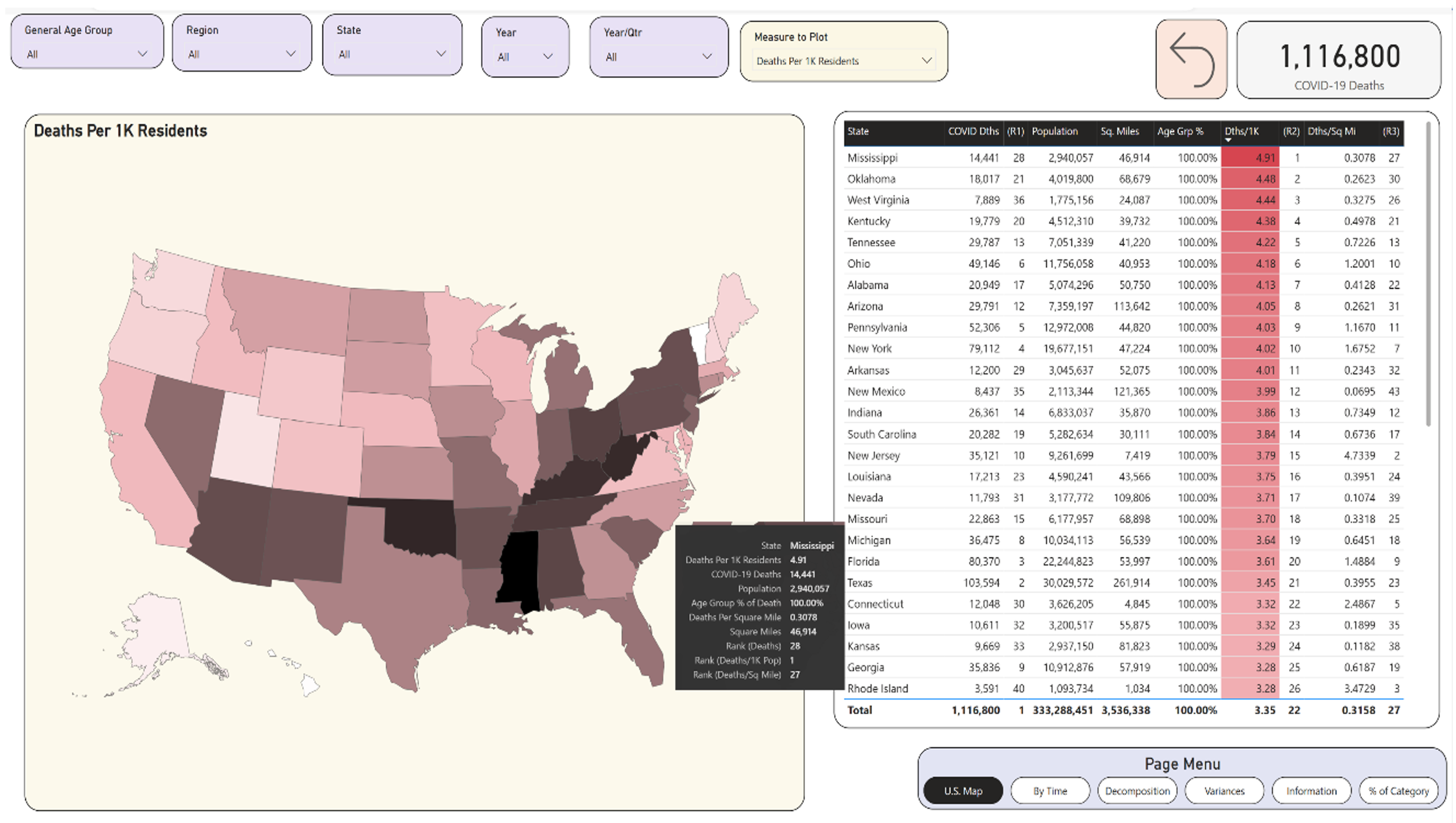
One of my goals is to allow the user to select one of multiple measures without needing to create a separate page for each measure. Let's plot each state by the deaths with respect to the state's population (Figure 12). Again, this can be the proverbial apples to oranges, as two states can have similar populations but very different population densities due to the size of the state. Still, you can see something interesting: Mississippi was 28th in terms of overall deaths, and 27th in terms of deaths per square mile, but they had the highest death rate per population.
If you have four separate pages to show the breakout of four different measures, and each page is essentially a copy, think about dynamic measures to prevent an unnecessary proliferation of pages.
The term “rate” can either be the most obvious term in the world, or perhaps not. When someone asks my IT rate, I usually reply, “X dollars,” or “X dollars per hour.” I once heard someone say that state XYZ had the highest death rate in the summer of 2021 and they used the total deaths to prove it. Yes, state XYZ was the highest in “something” and that something is often significant, but it's not what a rate represents. A rate is ALWAYS something “per” something. My blood pressure rises when I hear someone mistake a pure sum with a rate. Additionally, I've seen published material that references a rate, but the material is very unclear on the denominator. Sometimes just a simple annotation for clarity can make all the difference.
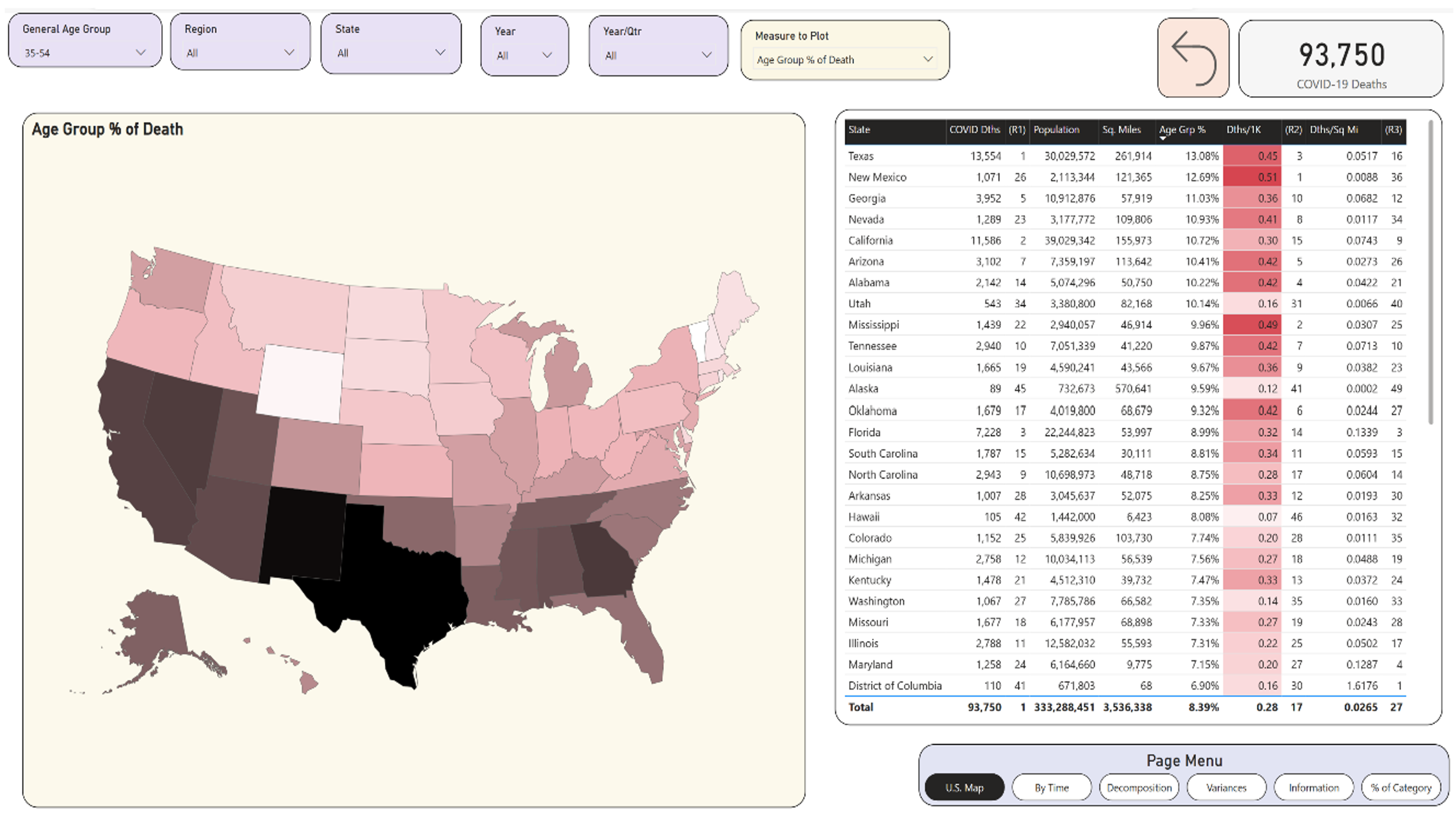
Now let's look at the country in terms of age-group deaths as a percentage of total deaths (Figure 13). For this one, you need to look at a filter. If you simply plot “Age Group % of death” without filtering on an age group, you'll get 100% for each state. As a general statement, you know that COVID deaths impacted the older populations most severely. Having said that, you might want to know what states had higher proportions of deaths in the younger ages. Later, you might want to know if there were any sudden quarterly spikes in deaths for an age group as a percentage of total deaths for that state. I'll filter on the 35-54 age group. You know from general reading that this number was highest in 2021 (and I'll verify that later), but for now I'll stick with the entire time period. I'm going to devote some time to this age group, because it represents one of the larger variances where COVID deaths significantly impacted a younger age group, and also because of the differences across regions of the country for this age group.
What you see is that Texas had the highest deaths in the 35-54 age group with respect to total deaths for the state: a little over 13%. You'll see later that, in some time periods, it spiked even higher. Conversely, Vermont had the lowest deaths in that age group as a percent. Yes, those two states are in two different parts of the country, two different sets of demographics, and two different age groups.
Note: A side exercise might be to determine the age breakout of living residents in each state. State XYZ might have a higher death rate in one age group than State ABC, partly because XYZ has a much higher proportion of residents in that death rate. What might also be interesting is to find those states with a higher death rate in one age group, despite having a statistically lower rate of residents overall in that age group.
Page 2: Breaking Out by Dates and Age Groups
Page 2 breaks out deaths by year, and then shows the deaths by Age Group as a 100% stacked column chart (Figure 14). In viewing the chart on the right, you can see there have been three general periods of COVID:
- In 2020, COVID deaths in those aged 75 and older (purple) represented more than half the deaths in the U.S. Deaths in age groups 55-74 represented percentages in the 30s, and deaths in the younger age groups (as a percentage of total deaths) were much lower.
- In 2021, you can see two changes. First, deaths in age groups 75+ (purple) represented a decreasing percentage of total deaths. That doesn't necessarily mean total deaths for age group 75+ went down in 2021 (although, as it turns out, from the chart in the upper left, there were 228K deaths in 2020 in that age group, and 205K in 2021). You'll see later that in some states, deaths overall dropped from one quarter to another, and deaths for one of the age groups rose.
- In 2022, you can see a pronounced change back to 2020, and even more so. We see more purple for the quarters in 2022, as the deaths in the oldest age group rose to even higher rates than 2020 with respect to all age groups. In 2022, the total deaths for the age group 75+ dropped to 130K, but they represented a much bigger share than at any point. And as you look at data from 2023, with deaths continuing to drop, the percentage share for 75+ continues to increase.
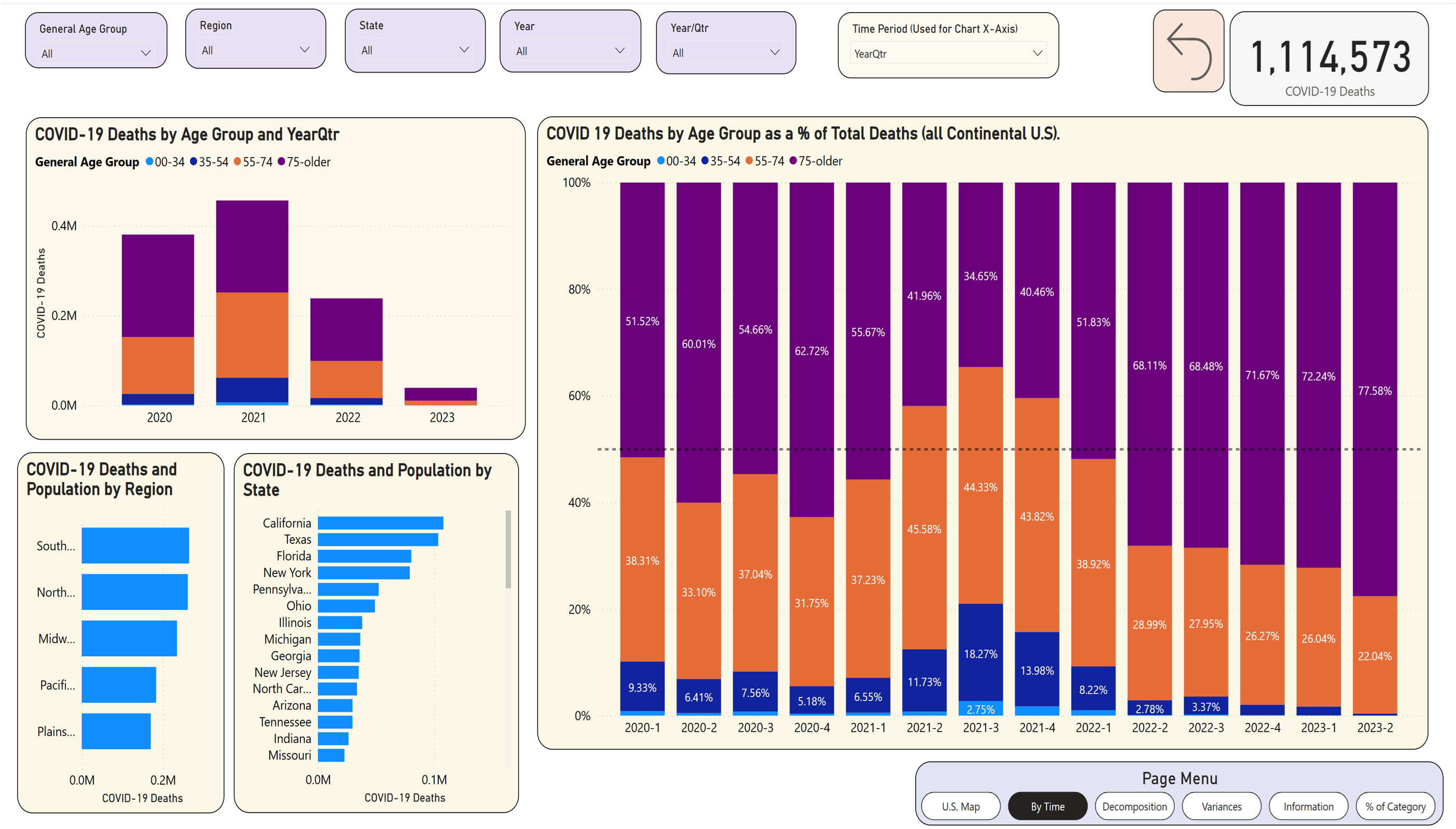
Okay, let's now look at that spike from Q2 to Q3 of 2021, where deaths in the 35-54 age group went from 11.73% to 18.27%, an increase of over six percentage points. First, was that one of the largest quarter-to-quarter percentage spikes in an age group? Second, what states drove that, both in terms of quantity and percentage?
If I click just on the shaded blue on the far right for Q3, 2022, the vertical column chart on the lower left shows what you see in Figure 15.
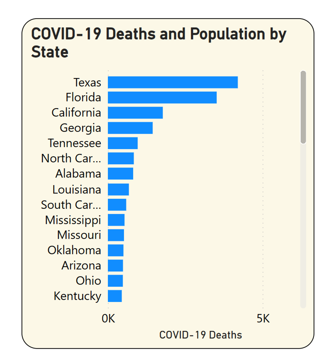
You can see that Texas had the highest number of deaths across the country for the age group 35-54 in Q3 2022. Was that the highest percentage of total deaths for that state? Maybe, maybe not. As it turns out, the state with the highest percentage of total deaths in that age group for Q3 2022 isn't even on that list. Okay, so how can you see it?
Here's where I get into a philosophical dilemma: How to best show both the size AND the percentage so you can see both. There are a couple of options:
- You could show a horizontal bar chart with a dual Y axis where the secondary Y axis shows the age group death percentage. Unless that chart is wide enough, you still might not be able to see that state unless you scroll horizontally.
- You could render that data as a scatter chart (Figure 16), with the X axis as the deaths and Y axis as the deaths as a percentage of the total. I've sometimes done this before, often with good results.
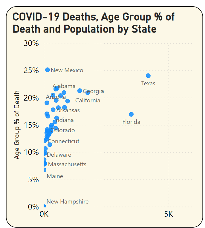
A scatter chart seems to provide the best of both worlds: You can see that Texas is the furthest out on the X axis (total deaths), but the highest on the Y axis (deaths as a percentage of age group) belongs to New Mexico, at nearly 25%. Having said that, the number of deaths was much lower in New Mexico overall. This is simply to illustrate that there are multiple factors at play.
There have been times when I simply implemented a scatter chart for the solution. But there's another option here. These charts are only as good as the amount of flexibility and options you provide. I've learned over the decades that no matter how clever I try to be, I sometimes err on the side of trying to pack too much into a dashboard page or report. I can never predict every possible navigational path, and so I need to provide users with a roadmap to retrieve information in an ad hoc manner.
Wouldn't it be nice if users could start with a measure and then decide, “I want to break it down high-to-low by region, then pick a region, and then decide I want to break it down by product,” etc.? What if you could tell the user to “pick a measure such as Deaths, Deaths as a percentage of Total, or Deaths as a percentage of population,” and then allow the user to drill down, high-to-low, by any grouping provided in the data?
Page 3: The Power BI Decomposition Tool
It would be awfully rude of me to raise hopes and then turn around and say, “Well, maybe someday we'll have that feature.” As it turns out, Microsoft has had this feature for ad hoc reporting in their overall product wheelhouse for years. A bit of history as I wax nostalgic: Those who followed SharePoint and PerformancePoint Services in 2010 will recall that Microsoft provided a decomposition tree visual, which they later incorporated into Power BI. Suppose you give the user a dropdown to “plot this measure,” and they pick “Age group as a percentage of total” (Figure 17).
Every dashboard project should include some type of ad hoc page for users to break out measures by any of the available metrics. Every Power BI Project I create these days contains a page with the decomposition tool.
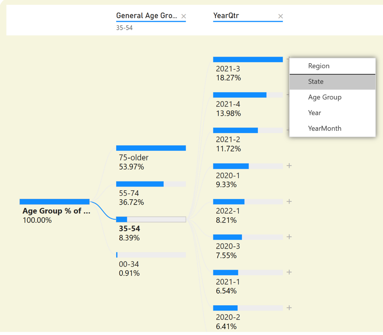
Well, the first breakout would be 100% because you haven't picked any age groups. You can hover over the single horizontal bar and plus sign, and take the option to break out further. Let's do it by Age Group. Okay, so overall, across all of time, COVID deaths in the 35-54 age group represented about 8.38%. (Notice how the age groups are sorted high to low based on the metric picked). Now let's break it down further by Year/Qtr in Figure 17.
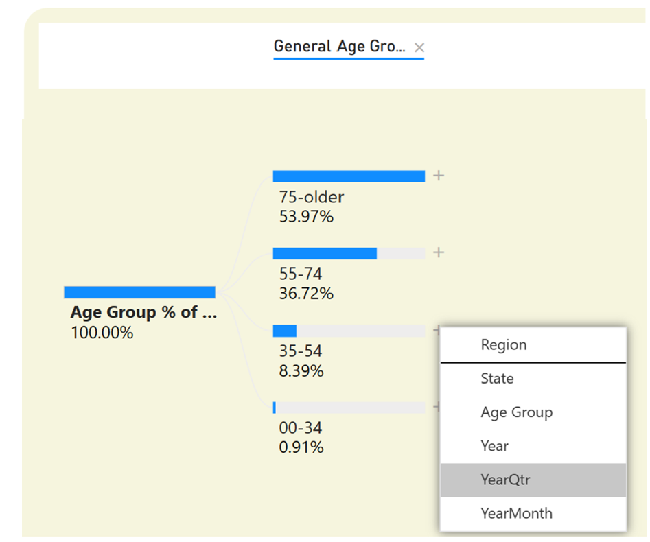
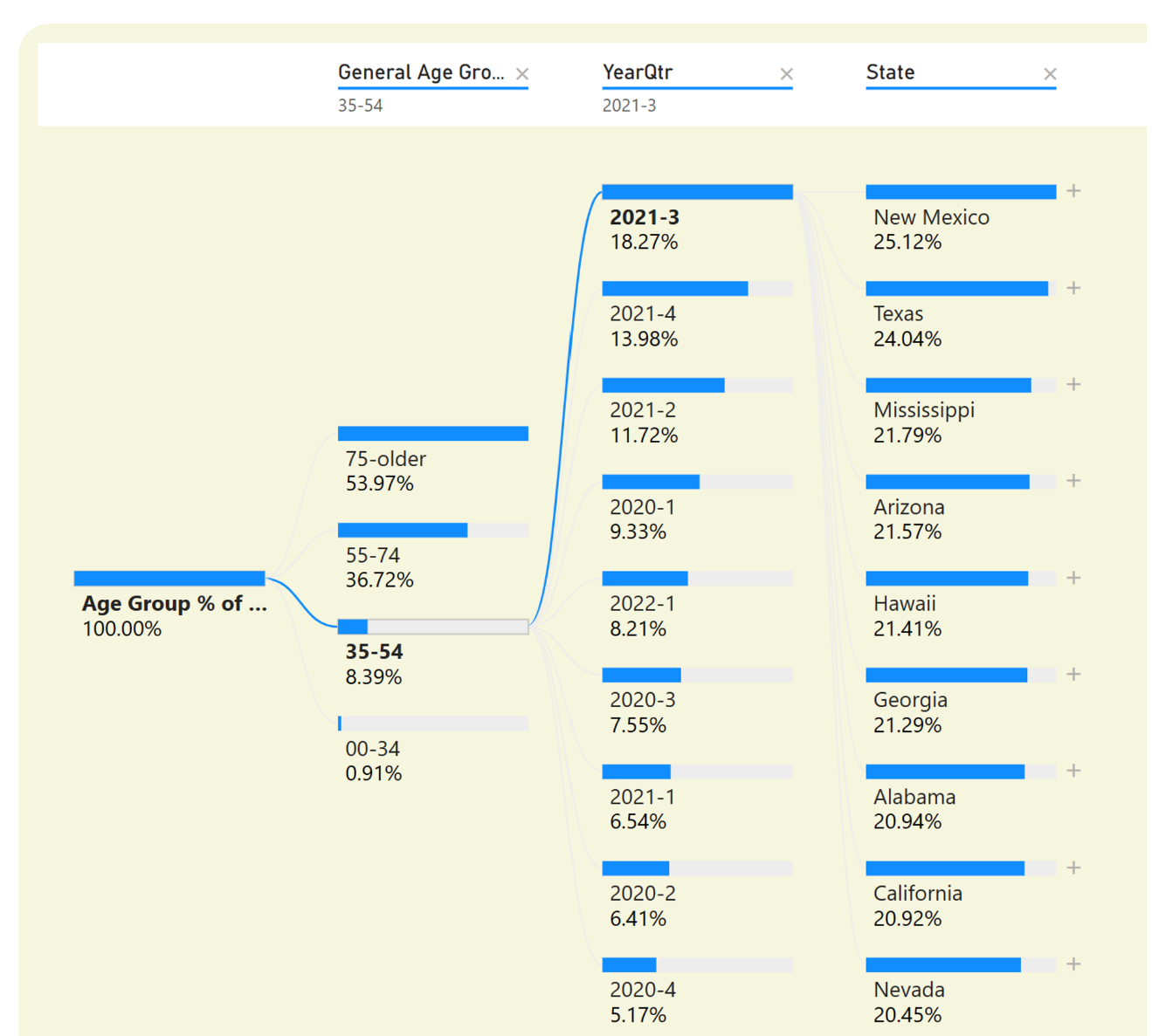
You see the same thing you saw back on the chart on Page 2: In Q3 2021, deaths in the age 35-54 group represented the highest percentage of total of any quarter over time. (You can also put the mouse over the horizontal bar to get a tooltip and see the number of deaths). Next, let's click on state, to see the state with the highest percentage (Figure 18).
You can see the same thing you saw in the scatter chart (Figure 19), that New Mexico had a higher share for that age group, even though the total deaths in New Mexico overall were much lower.
This simply illustrates that there are multiple options for showing data that pits one metric against another, across multiple states. Although I like the scatter chart and often use it, sometimes just giving the user a clean open path with the decomposition tree for ad hoc discovery will do just as well, if not better.
Page 4: Showing Variances from the National Average
Now let's talk about variances. When most data points go in one direction but some go in a different direction, that might be worth exploring. Page 3 in the dashboard is the one that I recognize has the biggest opportunity for improvement. The idea is to show, at any point in time, when the deaths for one age group, as a percentage of total deaths for that state, varied the most from the national average. Analysts in different areas are often looking for these types of variances, where one grouping is an “outlier,” trended in a different direction, etc.
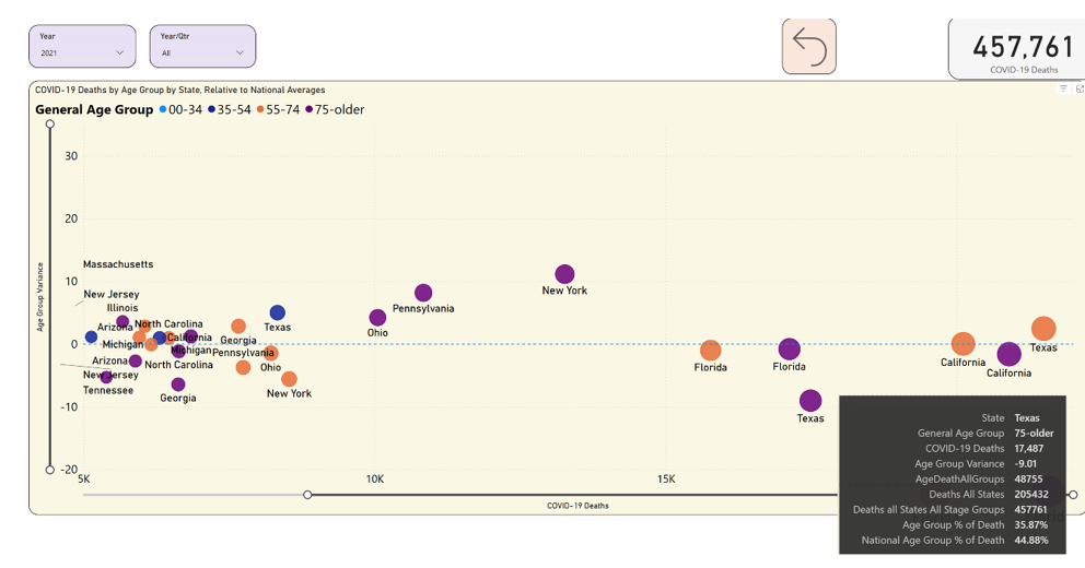
I might be interested in times when the death rate of one age group in one state, as a percentage of total deaths in that state, varied the most from the national average. In Figure 20, I've plotted each state by age group, and selected 2021. The COVID deaths are on the bottom axis, and the Y axis represents the positive (or negative) variance.
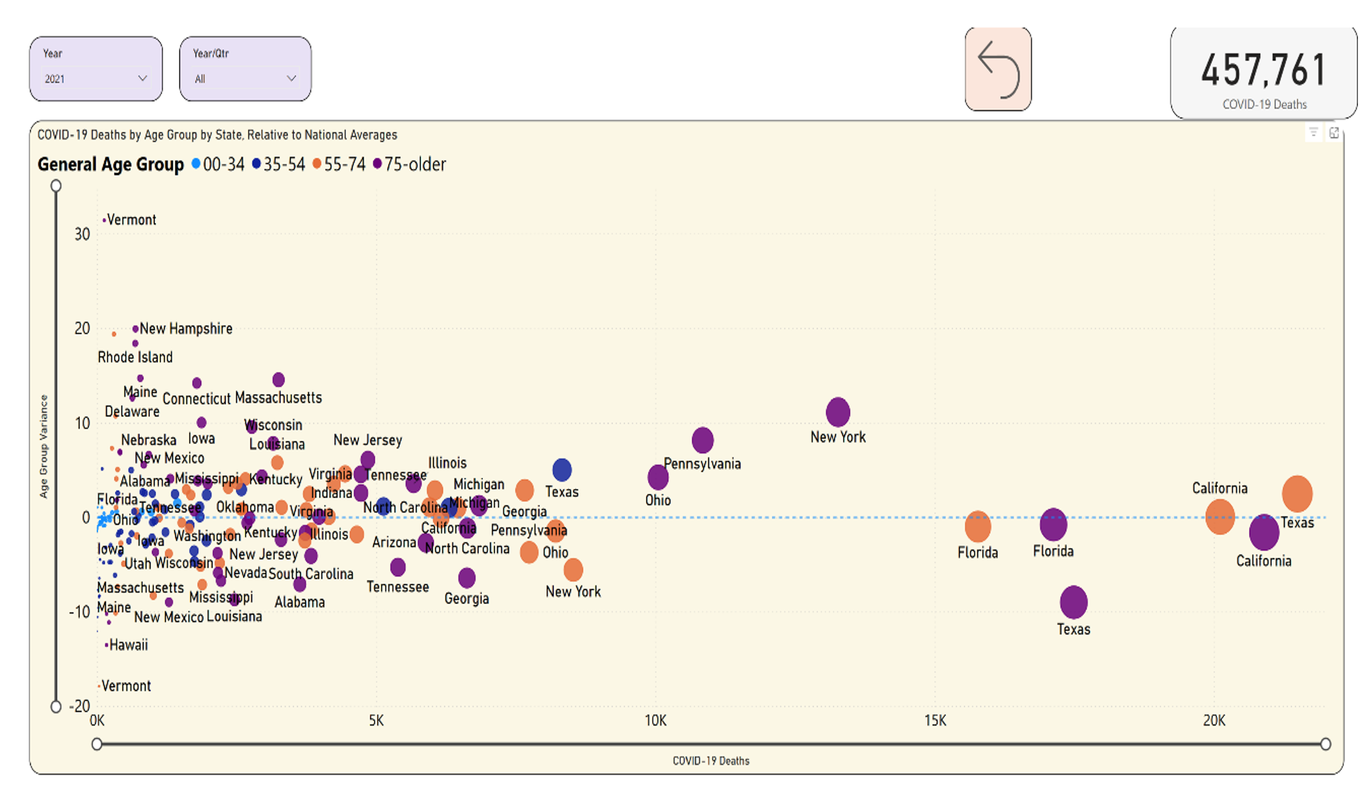
Okay, before you do anything, let's focus on the bigger states. The mid-size states are still important, but you might want to do this a step at a time. I can use the horizontal slider bar at the bottom to scroll out to the right, to limit the states to those with more than 5K deaths in an age group for the year. In Figure 21, notice Texas in purple, below the dotted line. In 2021, Texas had well over 15K deaths in 2021 in the 75+ age group, or 35.87% of total Texas deaths in 2021 (as you can see from the tooltip). However, the national average was 44.88%. This means that Texas varied by nine points lower than the national average. You could almost think of this chart in quadrants: Anything in the lower right means a higher number of deaths in a state/age group, where the deaths in that age group in that state were still lower than the national rate. By contrast, look at Texas and Georgia, both in orange. Texas had over 20K deaths in age group 55-74 and Georgia had about 7.5K deaths for the same age group, and both states exceeded the national average.
This page probably requires some work to be a final polished tool for an end user, but I'm still showing plot variances over a national average.
Page 5: Showing the Biggest Trend Increases
I've shown the spike in deaths from one quarter to another for different age groups. On the final page, note the chart on the left and the table in the lower left (Figure 22). This plots the deaths by age group as a percentage of total for each quarter.
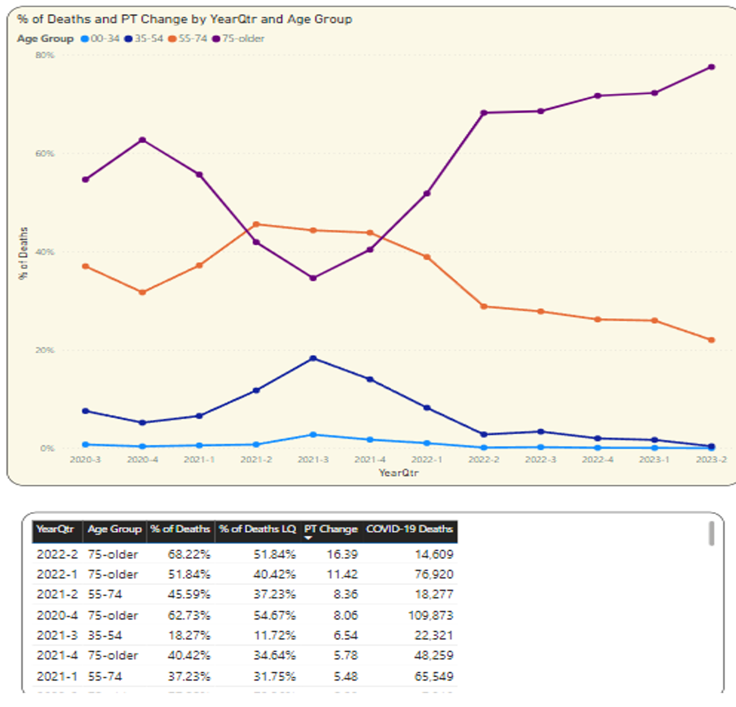
I asked a while ago about that spike to 18.27% in Q3 2021 for the age 35-54: Was that the biggest spike? Well, if you simply used a line chart, it might be difficult to say for sure: Sometimes a good old-fashioned data recap, sorted by a column, will tell you what you need (Figure 22). As it turns out, that was the fifth highest spike over time. The pronounced increase in deaths in the higher age group in the first two quarters of 2022 was higher (although overall deaths were starting to drop).
You might want more information on that quarter for Q3 2021 for the 35-54 age group. Click on that single marker (highlight the marker you want to click), shown in Figure 23.
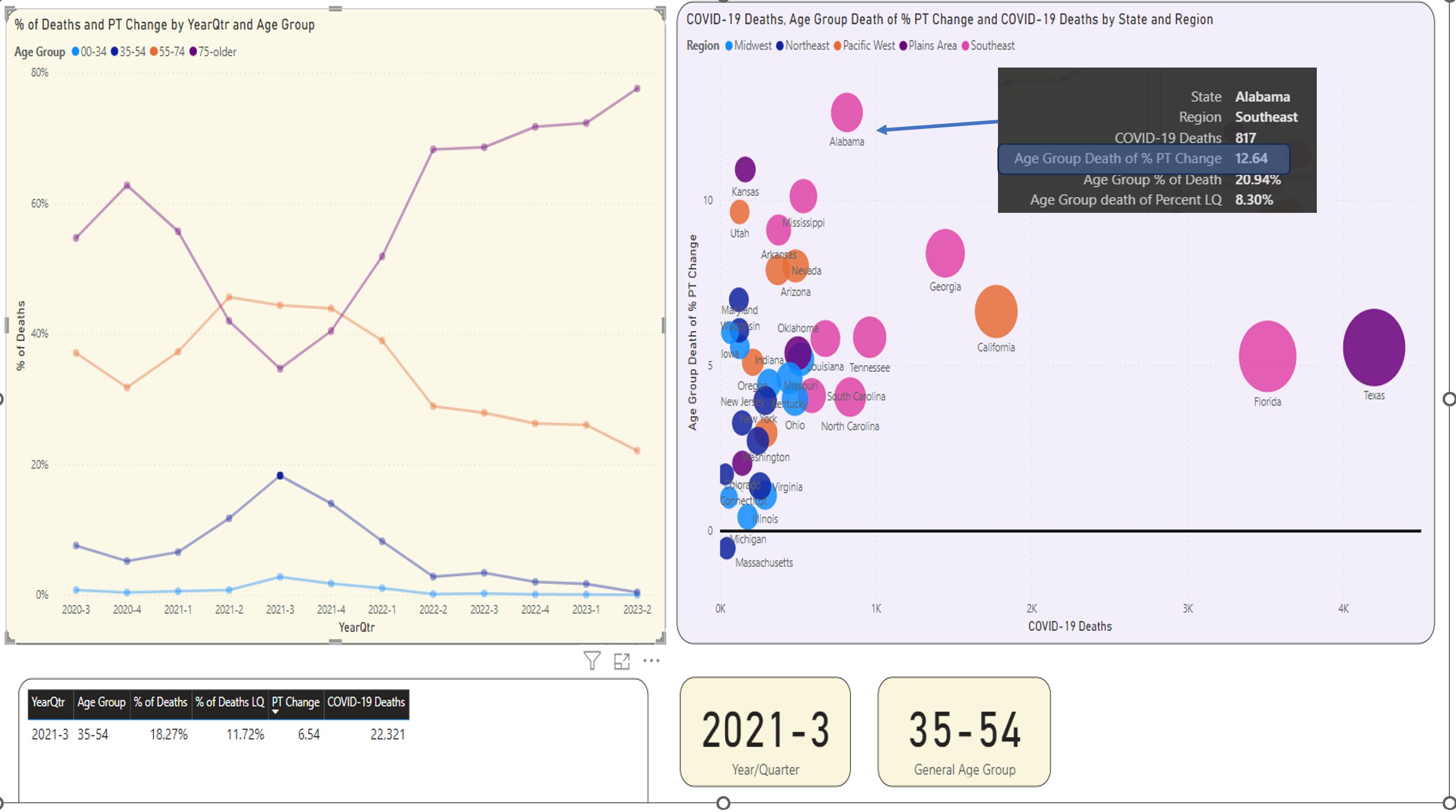
On the right, you can see the states that had the biggest spike from the prior quarter. Once again, Texas had the highest number of deaths. But look at the Y axis, which is plotting the point change over the prior quarter. You know that Texas had a roughly five-point change from Q2 to Q3 2021 for the lower age group but look at Georgia and Alabama. Although their deaths were lower, they had a much bigger spike in deaths in that age group.
Step 3: How I Built This Without Using SQL Server
A fair number of steps here involve glorified “click here, paste in this code, click here, set these settings,” etc. I could write a full instruction manual on these steps but I want to keep it brief while still highlighting the key areas. As I mentioned, one of the objectives was to put this together without using SQL Server or any standard developer tools: In other words, pretend I'm a power user. Perhaps you want to show power users how to create certain projects so that they don't always need to come to you.
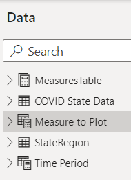
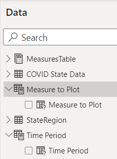
This project has five data sources:
- The main data feed from the CDC (COVID State Data)
- A control table with the list of measures a user can select for plotting charts (MeasureToPlot)
- A separate list of the 50 states, their regions, state populations, and land square miles (StateRegion)
- A control table for the user to select whether to plot a chart by year, quarter, or month (Time Period)
- A table (in Figure 24) that contains calculated measures that you'll use for some of the analytics
For the COVID data itself, there are many websites and YouTube videos that show how to create a Power BI data source from a web feed, so I'll just stick with the script (Figure 25). If you're new to Power BI, you might be asking, “is the code in Figure 25 DAX code?” No. The code is Power Query. From Microsoft's website, "Power Query is a data transformation and data preparation engine. Power Query comes with a graphical interface for getting data from sources and a Power Query Editor for applying transformations." In short, a power user can use Power Query inside Power BI to retrieve data from sources and perform some of the cleanup I talked about earlier without needing to write something in SQL, SSIS, etc.
Remember from above, you needed to take the full feed and filter out what you needed, and those pieces are reflected in the script in Figure 25 (Filtered Rows, Replaced Value, Removed Columns).
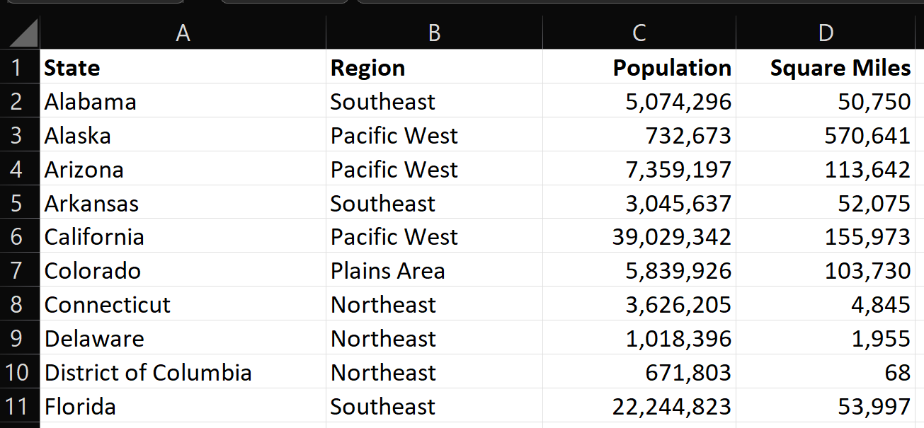
You also need a data source for the State population and square miles (Figure 26). I'm using the regional definition from the Department of Agriculture.
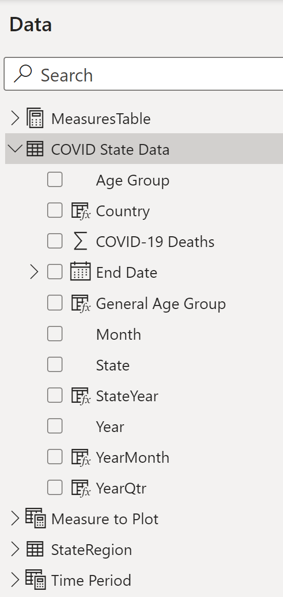
Once you establish the main COVID State Data source table, you'll want to add some basic expression columns, either to concatenate existing columns (StateYear), create a column for display purposes, or further summarize the age groups. In Figure 27, note that there are five columns with a formula icon to the left. Listing 1 shows the basic code for these expressions (this is also considered Power Query).
Listing 1: The new source-level columns based on expressions
Country = "United States"

General Age Group = switch( 'COVID State Data'[Age Group],
 "85 years and over","75-older",
 "75-84 years","75-older",
 "65-74 years","55-74",
 "55-64 years","55-74",
 "45-54 years","35-54",
 "35-44 years","35-54",
 "00-34")

StateYear = 'COVID State Data'[State] & "-" &
    'COVID State Data'[Year]

YearMonth = convert(year('COVID State Data'[End Date]),STRING) &
 "-" & right("00" &
       trim(CONVERT(month('COVID State Data'[End Date]),STRING)),2)

YearQtr = year('COVID State Data'[End Date]) & "-" &
   quarter('COVID State Data'[End Date])
Back in the first section when I talked about aggregation calculations, you needed to use the DAX expression language to create these calculations. DAX expressions are measure calculations, often based on aggregations, and are different from the Power Query derived expression columns I created above.
Power BI allows you to create a separate table that only stores the measure calculation definitions (Figure 28).
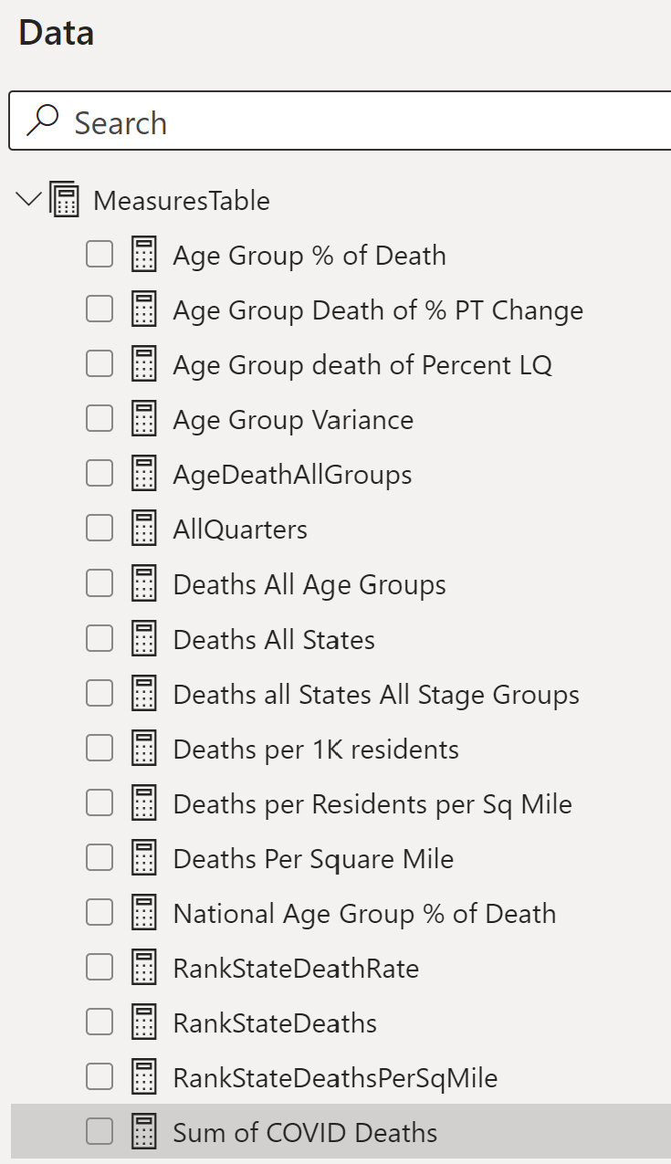
Listing 2 shows the DAX code for all of the new calculated measures. Note that Figure 28 shows the measures in alphabetic name order, and Listing 2 shows them in logical order (as some calculations are based on others).
Listing 2: New Measure columns
Sum of COVID Deaths = sum('COVID State Data'[COVID-19 Deaths])

Deaths All States = calculate( [Sum of COVID Deaths],
     all('COVID State Data'[State]))

Deaths all States All Stage Groups = calculate( [Sum of COVID Deaths],
   all( 'COVID State Data'[State]),
   all('COVID State Data'[General Age Group]))

AgeDeathAllGroups = calculate(  [Sum of COVID Deaths],
      all('COVID State Data'[General Age Group]))

AllQuarters = CALCULATE( [Sum of COVID Deaths] ,
     REMOVEFILTERS(('COVID State Data'[YearQtr])))

Deaths per 1K residents = [Sum of COVID Deaths]  /
      (sum( StateRegion[Population]) / 1000)

Deaths per Residents per Sq Mile = [Sum of COVID Deaths] /
    ([Residents per Square Mile])

Deaths Per Square Mile = [Sum of COVID Deaths] /
      sum( StateRegion[Square Miles])

National Age Group % of Death = ([Deaths All States] /
 [Deaths all States All Stage Groups])

RankStateDeathRate = RANKX(   all(StateRegion[State]),
[Deaths per 1K residents])

RankStateDeaths = RANKX(   all(StateRegion[State]),
[Sum of COVID Deaths])

RankStateDeathsPerSqMile = RANKX( all(StateRegion[State]),
       [Deaths Per Square Mile])

Age Group death of Percent LQ = CALCULATE( [Age Group % of Death],
    FILTER(all('COVID State Data'[YearQtr]),
'COVID State Data'[YearQtr] =
   if(  quarter(min('COVID State Data'[End Date])) > 1,
      year(min('COVID State Data'[End Date])) & "-" &
      quarter(min('COVID State Data'[End Date])) - 1,

      year(min('COVID State Data'[End Date]))-1 & "-" & "4" )
  )
)

Age Group Death of % PT Change = ([Age Group % of Death] �
 [Age Group death of Percent LQ]) * 100
The calculations (Figure 28 and Listing 2) fall into four major categories:
- The first set are different aggregate contexts for the sum of COVID deaths. You use a basic
SUMthat applies to whatever current filtering/slicing context exists (i.e., show deaths broken out by region/quarter/age group, etc.). But you also want to show deaths for the current filter context (Deaths in Arizona) as a percentage of deaths across states (essentially “wiggling out” from the current state context). You can define[Deaths All States]by calculating Deaths across all states, regardless of any filter. You also have a total of deaths across all states and all age groups, all Age Groups, and All Quarters. - The second set is the
Deaths Per [some other measure]. You have the Deaths per 1,000 residents (the sum of deaths divided by State population (divided by 1,000), the Deaths Per Square Mile, and the deaths for one age group as a percentage of Deaths for all age groups. On this last one, if deaths aren't being broken out/filtered for a specific age range to begin with, the result will always be 100%. - The third set are basic static rankings for the sum of deaths, the deaths as a percentage of population (per 1K residents), and the deaths as a percentage of square miles.
- The fourth set is per quarter, with the ability to calculate a measure for the current quarter and for the prior quarter.
Here are a few notes on the DAX calculations. First, to simply sum COVID deaths for whatever is the current filter/breakout context in the dashboard.
Sum of COVID Deaths = sum ('COVID State Data'[COVID-19 Deaths])
When you want to compare the sum of COVID deaths for the current breakout state or age group with the sum of deaths for all states or all Age Breakouts, you can create new calculations that express the base sum of COVID deaths in terms of an alternate context (all States, all Age Groups, etc.).
Deaths All States = calculate([Sum of COVID Deaths],
    all('COVID State Data'[State]))
AgeDeathAllGroups = calculate([Sum of COVID Deaths],
    all('COVID State Data'[General Age Group]))
When you want to calculate a percentage/rate expression, you can simply divide the sum of the numerator by the sum of the denominator (and then any additional math you need).
Deaths per 1K residents =
    [Sum of COVID Deaths] / (sum(StateRegion[Population]) / 1000)
Next, if you want to rank states (or some other breakout entity) across all states according to a measure, you can use the DAX RANKX function.
RankStateDeathRate = RANKX( all(StateRegion[State]), [Deaths per 1K residents])
Finally, in Figure 29, you need to provide control tables for the user to dynamically select a measure to plot, and to dynamically select whether to break out death numbers by Year, Quarter, or Month.
Time Period = {
    ("Year", NAMEOF('COVID State Data'[Year]), 0),
    ("YearQtr",.
Listing 3 shows how you can create a dynamic measure table using DAX code: The code itself creates an array/collection (Time Period, Measure to Plot, etc.) and uses the DAX NAMEOF function to reference each of the columns you want to surface to the user. Power BI allows you to reference the name in a filter/slicer or in a report/chart breakout, and displays/plots the corresponding measure that the user selected.
Listing 3: Expressions for new Dynamic Measure and Time Period table
Measure to Plot = {
    ("Sum of COVID Deaths",
        NAMEOF('MeasuresTable'[Sum of COVID Deaths]), 0),
    ("Age Group % of Death",
        NAMEOF('MeasuresTable'[Age Group % of Death]), 1),
    ("Deaths Per 1K Residents",
        NAMEOF('MeasuresTable'[Deaths per 1K residents]),2),
    ("Deaths Per Square Mile",
        NAMEOF('MeasuresTable'[Deaths Per Square Mile]),3) ,
    ("Deaths Percent Pt Change",
        NAMEOF('MeasuresTable'[Age Group Death of % PT Change]),4)
}

Time Period = {
    ("Year", NAMEOF('COVID State Data'[Year]), 0),
    ("YearQtr", NAMEOF('COVID State Data'[YearQtr]), 1),
    ("YearMonth", NAMEOF('COVID State Data'[YearMonth]), 2)
}
Findings from This Analysis
When I started this article, I knew in general about the different waves of COVID and the changes in age-group breakdown in 2021. I also knew some state numbers because of prior experience with the data. Having said that, there were specific (and significant) statistics I didn't know until I wrote this article. Here are the findings from this Dashboard project:
Approximately 1,116,000 people died from/with COVID from the beginning of 2020 through the second quarter of 2023, with the top five states in population (California, Texas, New York, Florida, and Pennsylvania) leading in total deaths, respectively (Figure 11).
When you look at the next set of states by population (Ohio, Illinois, Michigan, Georgia, New Jersey, and North Carolina), the ranking for total deaths becomes mixed (Figure 11).
Mississippi had the highest deaths per capita in the nation (i.e., per 1,000 residents) at 4.91, as seen in Figure 12. The next highest state is Oklahoma, with 4.48 deaths per 1K residents. This difference of 0.43 is the single highest gap between states. In my opinion, this is perhaps one of the biggest statistics of those I didn't immediately realize. (The average difference in deaths per capita when you rank the states is about 0.08. I'll leave it to the reader to plot this difference, as it's quite compelling).
For the age group of 35-54, Texas had the highest deaths as a percentage of all age groups for their state, at 13.08% (Figure 13).
As far as age group distribution of deaths, the timeline in Figure 14 shows three general time periods:
- In 2020, COVID deaths in age 75+ represented about 60% of all COVID deaths.
- In 2021, that number dropped to 44.91%, with the next two age groups (55-74 and 35-54) each increasing by eight and six percentage points, respectively.
- In 2022, COVID deaths dropped in half from 2021, and the distribution returned to the 2020 percentages with a sharp increase in the percentages for the highest age group throughout the year. The deaths in 2023 continue to drop significantly, with the highest age group accounting for almost 72% of COVID deaths.
Also from Figure 14, one of the sharpest quarterly increases in 2021 in the lower age groups was deaths in the 35-54 age group in Q3 2021, compared to Q2 2021.
From both the scatter chart in Figure 16 and the Decomposition chart in Figure 19, you can see that for the age group 35-54 in Q3 2021, Texas had the highest number of deaths (17,469) and one of the highest state percentages with respect to all state groups in that state at 24.04%. However, New Mexico's percentage of deaths in that age group in that period was even higher at 25.12%, even though the sum of deaths for that category was lower.
The spike in deaths as a percentage of age groups rose significantly (over six percentage points) for 35-54 in Q3 2021. Was that the single highest jump in the percentage for any age group/any quarter? No. As a matter of fact, Figure 22 shows that the highest point increase for this statistic was in Q2 2022, as deaths age 75+ rose by 16.39 percentage points in Q2 2022, and the second highest was the same age group in Q1 2022. So, as I said back in the age group distribution bullet, 2022 saw a huge return to deaths in age 75-up.
Finally, going back to the Q3 2021 statistic for 35-54, you saw back in the scatter chart bullet that Texas and New Mexico were highest in the sum of deaths and percentage of capita for that age group quarter. The state that had the highest point increase in this statistic over the prior quarter was Alabama (Figure 23), going from 8.3% to 20.9% (12.64 percentage points).
Closing Remarks
It's rare when I start an article with (N) number of main objectives, and finish with the same number. I wanted to show how someone could summarize data, and yet still provide some hooks into breakouts without cluttering the initial display. Finally, as someone who uses SSMS and SQL Server even to store basic personal finance data, I wanted to show how someone could use other tools that fall under “self-service BI.” With each passing year, businesses need more and more access to information, and it grows difficult to have an IT SQL Server project for each one. I've accepted the reality that power users will want tools to do ad hoc projects and don't want to wait (and don't want to bother) the IT developers. Yes, I realize that's a perilous path if power users work without any guidance from IT, but still, tools like Power BI CAN help free up developers.
I can't emphasize this enough: Regardless of whether someone is using SQL code, SSIS, C#, or just using a power-user tool, you need to vet the data. Know thy data!