
When the dust settles, it's the execution that matters. At Rocksauce Studios, the Digital Design and Development Agency I founded in 2010, we have these words spelled out big and bold on our conference-room doors. We want every new entrepreneur to read them, learn them, and live them.
Who is this article for? Any developer who has an idea for his or her own software, but needs some guidance on tackling all of the steps that happen before the development stage. That may not be you today, but it may describe you tomorrow. At the very least, every developer can gain some insight into the why and how of things that occur during the concept, planning, design, and redlining stages of a project.
These stages help you determine if you have a good idea, plan what you're building and how, then define what the look, feel and branding are that appeals to your target audience. This way, once development starts, the engineers can focus on building the best product possible.
So, let's get the hard part out of the way first: Your idea isn't worth much to anyone but you. In fact, you can't even copyright an idea; you can only copyright certain aspects of the implementation of that idea. Unless you want someone else building a better widget, you need to put a lot of your effort into how the idea will be implemented in a way that will knock the socks off of your intended users.
You need to put a lot of your effort into implementing your idea in a way that will knock the socks off of your intended users.
Every day, someone thinks that they have the Next Big Thing gestating and growing in the back of their brains. Most don't stop to consider whether or not anyone else cares about their concept. Even fewer have thought anything more profound than, “It would be great to have a piece of software that did X!”
These dreamers surely aren't thinking about log-in screens, resetting passwords, or what happens if a user loses data connection for some reason.
“But,” you croak. “I'm a developer! I know how to make software!”
To that, I say, “You know how to code software, but you may not know how to design things so that people will care enough to download it in the first place.”
Lately I've realized that I'm an old man in the technology industry. The year 2017 marked 20 years that I've been building software, from design to code and back again. I taught myself PaintShopPro as the dotCom bubble began its initial ascension, and I learned HTML and CSS to make my ideas come to life. My aging mind has learned (and forgotten) ASP, ColdFusion, ActionScript, PHP, JavaScript, jQuery, Sass, and too many others to count.
My point is that when you read this, you aren't just listening to some hoity-toity graphic designer telling you how they think things should work. The advice I give comes from a guy who's helped create hundreds of different pieces of software, for all types of platforms. I've rolled with the punches that the industry and users have thrown me.
I'm battle-hardened from the wars of designing everything to be pixelated to match Windows95. My battles were fought on the shores of transitioning to rounded, bubbly fun when XP and OS X grabbed hold of the world. And I light candles in a vigil to respect the hundreds of hours designers spent creating skeuomorphic interface elements, only to be usurped by the trend of flat color and nifty-fonts.
One thing, however, has remained the same: User delight defines successful software. A good idea is essential, sure, but the software world is littered with the corpses of great ideas about which users didn't care. Before Facebook, there was MySpace, and before that, there was Friendster. Why is Facebook king? It focused on great features, delightful interactions, and it never stopped iterating. If new technology needed to be created to keep up with users, so be it.
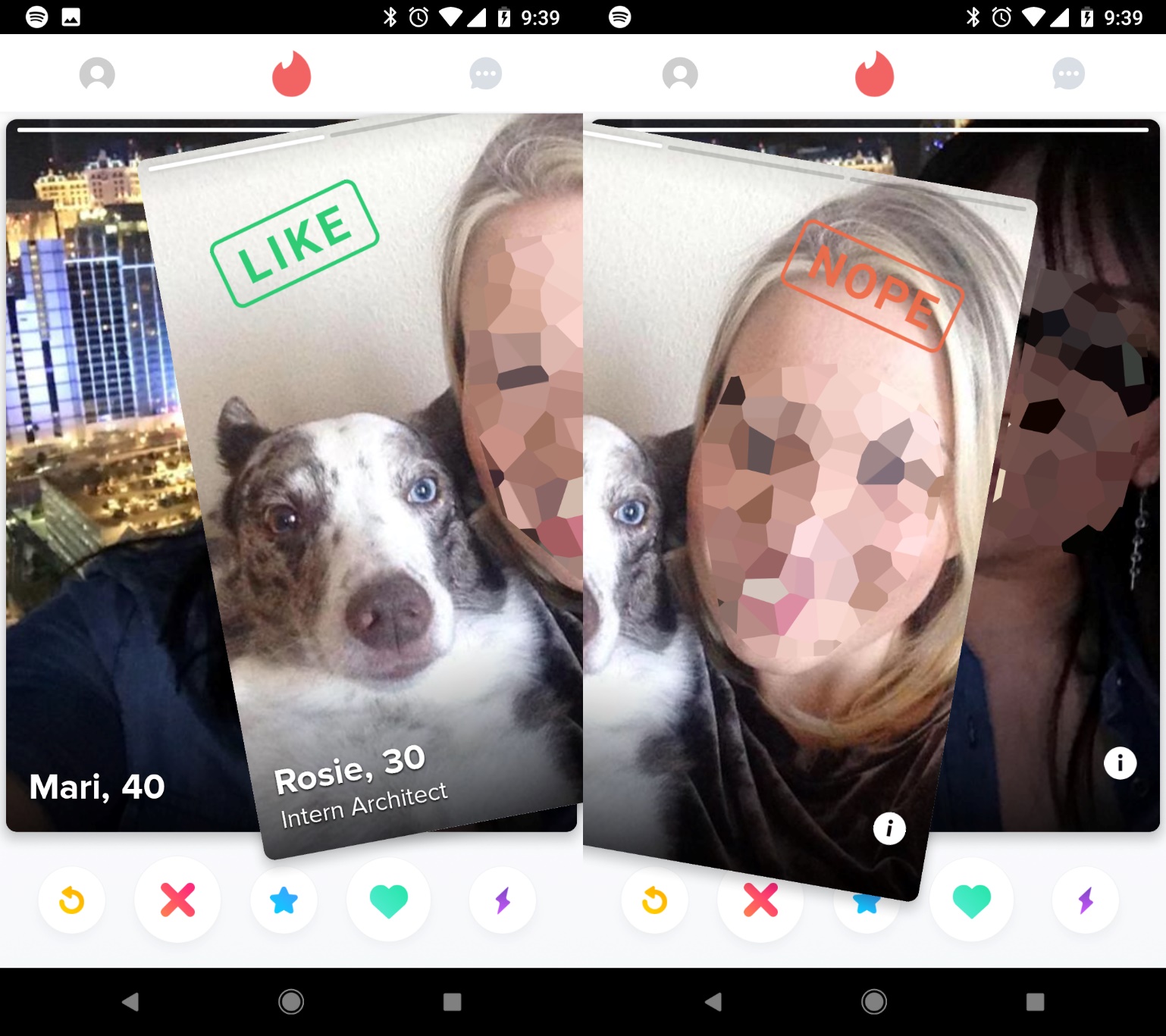
Don't fall into thinking that money is what makes the difference. Back in 2012, Tinder came into a crowded dating market with literally hundreds of competitors and did so without tens of millions of dollars.
What made Tinder a hit? It focused on a pure prospect: both participants needed to opt-in, and Tinder created a ridiculously gratifying interface of swiping left if you found a person unattractive, and swiping right if you saw that person as desirable, as you can see illustrated in Figure 1. Today, the term “swipe left” is ubiquitous for finding someone unappealing.
Tinder didn't need Facebook's money to completely change the dating or user interface landscape. Focus on a simple idea, with a distinctive user-tested interface, made them an overnight success.
Engineers solve problems based on functional requirements, but legendary software solves problems based on user behavior and creating audience satisfaction. Great software needs great development, but development alone and $2.00 will buy you a cup of coffee, and that's about it. Everyone reading this article has felt the pain of using a solution created by engineers who only tapped into other engineers as their test audience.
So, do engineers just give up? Just tip their hats to the designers or user experience folks of the world and wait for their marching orders? No, engineers do what engineers do?break down the problem into specific parts, approach the situation systematically, tackle each one, then move to the next, until a solution exists.
Defining a Sample Project
Explaining this whole process works much better when I refer to something specific. Let's define a fake project to fuel the examples. Table 1 breaks down the details for the sample product.
Why This Project?
Everyone has familiarity with social media of some sort, so chatting about specifics on this project will make sense to most people. As for the name, SocialFeedReader is straight-forward and says what the product does. SocialFeedReader fits the personality of the type of users I see using this project. Plus, I like it.
Are You a Good Fit?
Just because you had a bright idea about something doesn't mean you want to live and breathe it for the next five years. Do you fall asleep thinking of this solution? Does your mind drift to it while you're in meetings or conversations? What makes you the right person to create this solution?
If yes, then you're in a good position. If no, you have to ask yourself, “Why am I trying to build this product?” Your lack of passion will show up in the software, sabotaging its success potential from the start. Instead, why not find an idea you actually want to suck up every minute of the next few years?
Creating your own NBT (next big thing) isn't the same as working for someone else. You've had a satisfying career in building software for other people. Building tech has driven you in the past, even if you didn't buy into the vision or love the end-product. Now it's time to build your own.
Creating a piece of popular software is no different than creating a restaurant, a bar, a nursery, or any other business. Long hours are needed. Sacrifices are made. Failure comes way before success, and you may want to quit along the way at least once, if not for long stretches of time. Perseverance and a good solution are what gets you through the insanity that comes with running a software startup.
This sample social media app falls right into my wheelhouse as an avid social media user, early-adopter of software platforms, and general tech enthusiast. Running daily visions for the NBT in social media would suit me fine.
Strategy and UX
Once you have a plan, all you have to do is work out the details, right?
Your goal is to build an MDP (minimum delightful product) here. An MDP is required to make a project useful and compelling to users. Anything more than this creates feature bloat, scope creep, and pushes success further out. An MVP (minimum viable product) is the bare minimum that a project needs to be useful. It's important to know the difference.
The Homework Phase of Every Successful Project
If you start developing now, with only the idea and none of the facts, you'll be the only user defining what the project should be. No great piece of software was built in a tunnel, no matter how magical a confident CEO or head of development may appear. Memorable, long-lasting, popular solutions do one thing: They solve a problem that needs solving on a large enough scale.
Three questions serve as the foundation for your application. Here they are:
- What's the problem that this software will solve?
- How does my solution solve the problem better than other apps?
- Does the problem need solving often enough to drive continued usage?
Do these seem obvious? You'd think so. However, millions (billions?) of investor dollars could have been saved over the last 20 years had the innovators behind failed software taken the time to answer these questions. Every day, this is what I ask of burgeoning entrepreneurs. Rarely do they have answers. Mostly, they thought up a neat idea, then never thought to try to pick it apart.
Questions like these don't just keep bad projects from starting, they help great projects get created. Facing reality on the validity of what you're attempting to build might kill off bad ideas, but it saves heartache, time and money.
Be honest with yourself. Sometimes there's a problem that can be solved, but solving it won't help enough people enough to generate a decent ROI (return on investment). An integrated EchoSign or Adobe Sign solution that only helps rural veterinarians who focus on rodents smaller than a Guinea Pig may be a valid solution for someone to design. But the problem and the audience are too small to be useful to enough people to validate the investment needed to build the software. That's great for a lazy Sunday afternoon's coding endeavor, but it's not the type of thing that gets Mark Cuban to invest.
Okay, so now you've identified a problem that needs solving, you have an exciting way to solve it, and you think the problem can be solved frequently enough to be a viable piece of software.
What if someone already beat you to the punch, and you just don't know about it?
Applying the Questions to SocialFeedReader
Let's look at some sample answers for the SocialFeedReader project.
- What is the problem this software will solve? Social media currently requires active ingestion, making it non-viable for multi-tasking.
- How my solution solves the problem better? Currently, social media ingestion is active, requiring site or app visits, and active reading, active scrolling. Moving this intake to passive means the act becomes a multi-tasking item, similar to listening to the radio or a podcast, rather than something requiring full attention.
- Does it need solving often enough to drive continued usage? There are potential strong use cases for athletes, office workers, drivers, or others who want to experience social media updates while performing other activities
SocialFeedReader answers two out of three of these, with a high probability to be three out of three. Not bad. If an entrepreneur came to me with this idea, I would give an enthusiastic thumbs-up to the concept.
You Can't Beat 'Em If You Don't Know 'Em
Entrepreneurs occasionally have ideas that already exist, but they haven't done the research. Maybe they relied on Apple's terrible search algorithm or they searched on only the most obvious keywords, unaware that a vernacular and jargon is already defined for the industry they hoped to tackle. Whatever the reason, in 2018, most problems already have a solution in some way or another.
Your job is to prove the solution. Other software is out there at this moment, solving the problem you thought was being ignored. Maybe hundreds, thousands, or millions of people use it each day. Perhaps they love it, and already have that software's logo emblazoned on the back windshields of their cars, next to those little proxy figures of their children and animals. Brace yourself, but there might even be annual conferences held each year for users to meet up, learn tips and tricks, and socialize about how this software changed their lives.
Some problems may have dozens of existing software competitors of which you aren't aware. How many CRM competitors like Salesforce are out there? Or Project Management solutions, like Basecamp or Asana? Even something as specific as source code versioning has multiple competitors, from GitHub to Bitbucket. Each has a fanbase, and each swears that this solution is the end-all, be-all way the problem should be solved. Knocking these competitors out of their top spot is the goal. Another approach is having a completely new idea.
To prove the solution, you have to become intimately familiar with the existing solutions. Be a spy to learn everything you can about how each answers the issue.
- Go to every screen and take screenshots. Understand them.
- Try to accomplish the goals you want to fix with your own solution. Note whether or not you can.
- Keep a spreadsheet of features so you know who's doing what.
- Look at their pricing models because they are who you'll need to go up against.
- Define who the market leader is and how much marketing/advertising they're doing on a regular basis.
- Ask yourself, “Is my solution so kludgy that it would be a better plug-in for existing software, rather than a competitor?”
Data is gold. Intimate knowledge of what's out there is vital in making sure you're creating something the market won't only support, but will decide to use instead of what's already out there. Competitors have at least one advantage: they're already on the market. Concerns about validity, UX direction, user personas, branding, UI paradigms, and other questions that you need to ask have already been answered to your competition's satisfaction.
Get to know what they're doing well and what they're doing wrong. Then ask yourself, “Does my solution solve the problem better?”
If “No” Is the Answer?
It happens. Here's what you do.
- Take a moment to mourn: Be glad you chose to investigate the market before spending six to twelve months creating a solution that would be inert once it launched.
- See if a new solution comes to mind: Mediocre or partial solutions sometimes inspire better answers. You're now aware of what the competition is doing. Your old idea may be inadequate, but regular usage may encourage a new solution that doesn't already exist. With that, you can move on to the next steps.
- Take your solution to a different problem: Great software is sometimes just taking what worked for one industry, and applying it to another. Your answer may work for an entirely different industry or a different concept. Think of how frequently you see the “swipe left” paradigm in software that has nothing to do with dating.
- Go back to the beginning: Release yourself, because some ideas just don't get out of the starting gate. Life is full of hundreds of problems, however, so now that you know the formula, find a different problem/solution pair to tackle.
If “Yes” Is the Answer
How exciting!
- Take a moment to celebrate: Whether you were aware of the market or not, you came up with a great way to solve a problem that others seem to share.
- See what else needs solving: Use the expertise you've gained in this particular software market, and see what additional problems need addressing. Keep track of them, and see if they pass the same tests as your initial solution and mesh nicely with other features. If so, then you've now grown your software's potential further.
Awareness of your competition is tackled. Validation of your approach is defined. Your next step is to understand who your users are, and what they want.
SocialFeedReader Competition
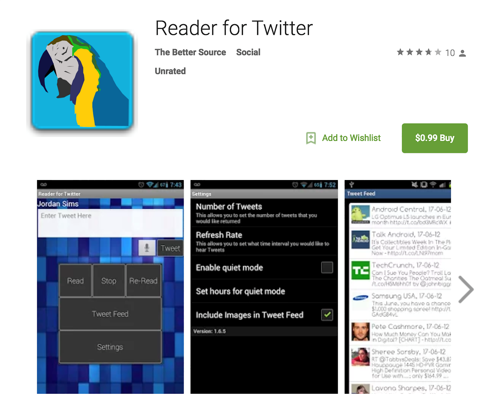
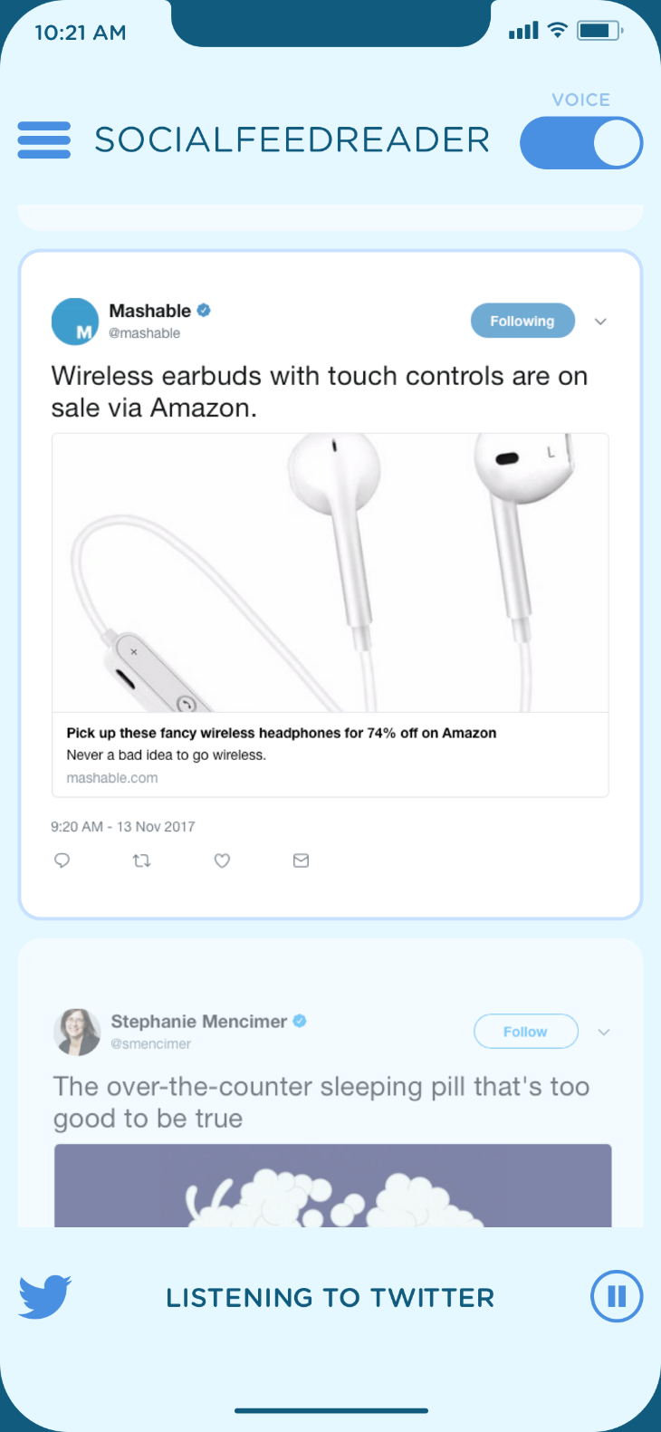
Competition in the text-to-voice arena is nearly non-existent. A handful of homegrown apps or plug-ins attempt to make the concept work for Twitter, although Facebook is a different story entirely.
As Figure 2 shows, competition for this product was tough to find, and what existed wasn't pretty. Reader for Twitter is poorly designed, uses old Android OS user experiences, and functions poorly.
You're Set Up for Success
No plan or advice can guarantee you success in the marketplace. Nothing can guarantee you a smooth development cycle, when APIs may break or functional requirements for operating systems may change with a new release.
No competition can be a bad thing. Typically, this is a critical indicator that the technology may not be feasible, creating what I call a “Magic Unicorn” situation. If this were a real project, the next step is creating a “Proof of Concept” to verify that the technology (text-to-voice engines, Social Media APIs, etc.) supports the app's goals.
Perhaps the reason there's no competition is simply because no one wants the solution. This is very likely, and the reason why user research is so vital to creating a great product.
For this article, I'll continue forward, ignoring the Magic Unicorn technology required to bring the app to life.
No Software Works for Everyone
User interfaces for games don't work for CRM solutions. Dating apps are bright, colorful, and full of images of different people, but that approach fails for a project management solution in the food industry.
You have to know your audience. Smart approaches to a problem don't mean much to users when they can't figure out how to operate the software. Pinpointing the types of people who'll be using the application gives you a reference point to keep features in check and goals in mind.
User personas shouldn't be based on imaginary users. Base user personas on real data, culled from the types of people who'll be using the product. Eventually, you'll decode all of the user research and use that to define a few vital types of users who will use the software.
Typically, you want between two and five user personas. More features and capabilities mean a more extensive selection of user types. Fewer features mean defining fewer ideal users.
Audience Interviews
Identify who has the problem. Is it nurses? Construction professionals? Filmmakers? Stay-at-home dads? Teenage girls? Who?s the audience that needs your software? Identify as many as you can, but be realistic: Facebook may work for 87-year-old grandmothers and 17-year-old teenage boys at the same time, but it's taken a decade and billions of dollars to get to that point. Don't try to tackle everyone, everywhere, right out of the gate. Take a glance at Table 2 for a list of sample questions.
With this set as a basis, you have a good foundation to break down the need for the solution, to see what people are currently using, what works/doesn't work about it, and why they may not have changed to a different solution if they are unhappy with their current choice.
Don't ask about your specific solution to the problem. People want to be nice and will gladly tell you they can't wait to use what you're coming up with, even when they have no intention of doing so. I've never had an entrepreneur tell me, “I asked people if they liked my idea, and most didn't, but I'm going to make it anyway.”
The purpose of the questions is to see what problems need better solutions, not confirmation bias of what you've already planned to build.
Find People to Interview
Users come from everywhere. Dozens of services exist that can hook you up with people to toss your questions at. Some are better than others, but generally, these can be helpful. Industry-specific niche solutions may have a harder time getting quality information. Consumer apps that target broad groups will have more success with these groups.
If you want to discover and vet participants, here are a few places to get started:
- Trade Organizations tied into specific industries
- Local networking for the sector or group
- Twitter/Facebook groups for the industries
- Friends and Family
- CraigsList ads, offering a gift card or other carrot to participate
- Depending on your solution, “person on the street” interviews could work.
Find your participants, ask your questions, and get your information. Be affable, conversational, and, as engaging as possible. Granted, this may not be your strong suit, so bring in someone else to handle this piece for you, if you need to.
Investigate the Data
With user interviews done, you need to parse through the data and find the items that stick out. The goal of this is to see specific requests that users have, things they love or hate, and what type of people are currently using the solution. This group of people is your demographic, and your job is to create a solution that works for them more than anything else.
Distill feedback into two buckets:
- How is the problem being solved currently?
- What type of people are using the solution?
The first is necessary for creating your user stories and app features, to ensure you're on the right track. The second bucket is tapped for creating the key user personas who make up your audience.
Pick Your User Personas
Through the interviews, fundamental types of users should come into focus. Their specifics could be age, gender, work environment, daily routine, education, or demographics like that. From these similarities, you should be able to pinpoint different types of key user personas that have various needs from the software.
One user may have poor eyesight and care most about the ability to print from any page. Another user may be more interested in syncing data across multiple devices, because of their on-the-go lifestyle. Whatever it may be, these are the users, and their adoption of your software is vital to success.
Usability.Gov is a great resource, with details, information, and recommendations for defining an excellent User Persona. You can find them here: https://www.usability.gov/how-to-and-tools/methods/personas.html
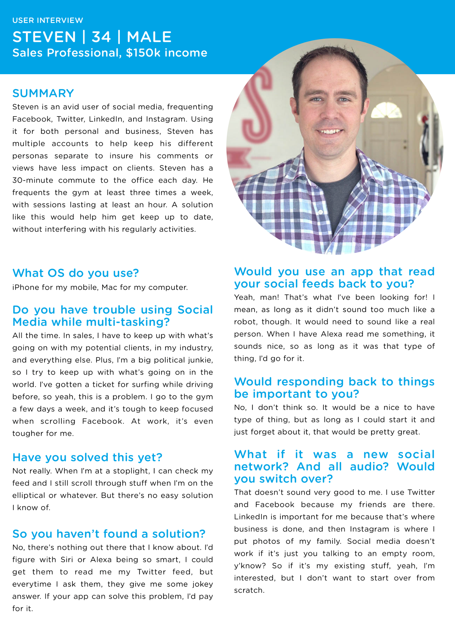
In Figure 3, you can find an example of Steven, who serves as a potential SocialFeedReader user, age 34. Steven is a composite user, built from details pulled from the user interviews.
You can see why User Personas are helpful to the UX process. Knowing who the software is for and how and why they'll use it drives the interaction decisions on the project. Without personas, engineers (or designers) wind up as the end-user, and that usually leads to mediocre software that misses the mark on creating a good user experience.
User Experience Design
Whether you're building your project using Waterfall or straight Agile, taking the time needed to put in the hard work of creating user stories, tap-throughs, and A/B testing your initial concepts is vital. Development is, after all, the longest part of the process. The goal with UX is to figure out as many problems as you can in advance, before you start figuring out which fonts work, and way before you start writing code for lists, views, or data connections.
Create a Strong Foundation
Making changes during UX can take minutes. In development, those same changes could take days, if not weeks.
User Stories: What Your Software Does
Every project has a particular set of user stories, driven by the user personas. These are the ways people use a piece of software, and here's where you start getting granular. User stories are when you see how large or small your project is. For the first time, you'll be able to break down the project into digestible tasks that can be estimated.
You've taken the time to create the user personas, and from that, individual user stories, needs, and features have come into focus. Hopefully, some ideas have also moved out of focus or into a future iteration of the project, to keep you closer to the MDP. If not, don't worry. Breaking down each feature is a sobering way to scale your project into something manageable.
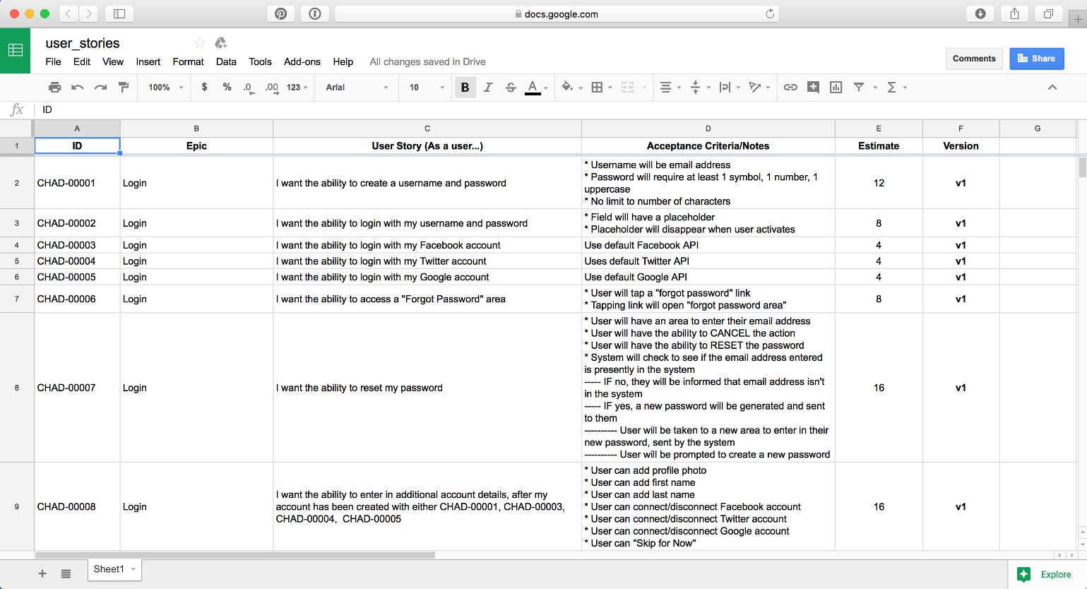
User interview questions give you a leg-up on features that you'll need to have. User personas help ensure that you're solving problems for multiple audiences that may be using the solution. Table 3 below breaks down some important elements for defining a good user story. In Figure 5, you can see an example of what a set of SocialFeedReader user stories would look like.
Every Single User Story You Can Think Of
You're not going to figure out every feature of your project up-front. Developers, better than anyone, know that it's the unknown that bites you later in a project. The goal with this step is to mitigate as many of those unknowns as possible. Reducing it by 25%, 50%, or even 80% is a massive gift down the line.
This process also gets rid of mediocre ideas or items that don't fit into the first version of the MDP. User stories, particularly those that are estimated out in hours or story points, help you see just how big a project is, and what may be “fluff,” or un-needed features. Use this to your advantage, and start moving elements into Version 2 if they aren't vital to creating your lean-mean-MDP.
You'll return to the user stories document throughout the rest of the project, to add new stories that come up. Figure 4 shows how these user story details can work in a real-world scenario, and helps you see how granular each item can get.
Wireframing and Testing
Every screen, feature, detail, and flow of your project needs to be created first in the UX process. The end result is a digital prototype that you put in front of potential users to see what works and what doesn't. You do this during UX, before you start designing and way before development begins, to help make sure the right thing is being built.
Ideas become user stories. User stories become blueprints or wireframes. Wireframes become software with a purpose. Just as houses aren't built without blueprints, no piece of software should be either. It can't be repeated enough: Figuring out problems in the UX phase is far faster and more cost-effective than reworking development over and over.
Just as houses aren't built without blueprints, no piece of software should be either.
Wireframes come in different levels of fidelity. As with audio, you have low-fidelity and high-fidelity options. The level of fidelity is determined by how closely the wireframe resembles the final product. Sketches on a whiteboard are low-fidelity, whereas designs built in Illustrator or Sketch may be high-fidelity. The closer a final wireframe looks like the end-product, the more time the UX process can save.
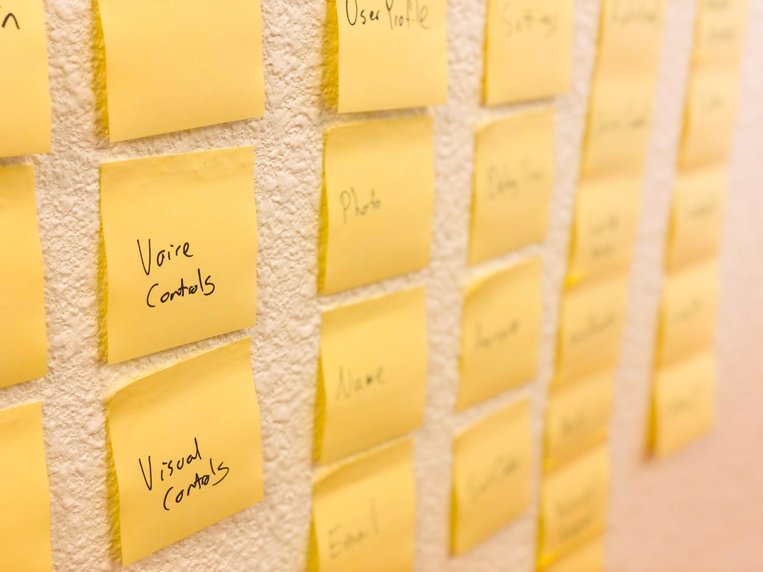
Typically, a project starts with a series of sticky notes with features/user stories written on them, as seen in Figure 5. Notes like this make it a cinch to move around the order of a project, helping you define a user path through the application. Or, if there are multiple persona types, the multiple different paths, based on user needs. Sticky notes are also great ways to A/B test these flows among potential users.
Not interested in A/B testing the concepts this early? Use a whiteboard or a pad of paper to get initial concepts and flows nailed down.
All of this leads to high-fidelity wireframes. These define which specific items sit on distinct pages, what buttons lead to different areas, and how much content can fit into a typical screen or view. User stories drive everything that needs to be in the high-fidelity wireframes, and the wireframes can further add to user stories.
Missing functionality or features will appear, so add those back into the user stories document. Higher fidelity mockups begin to define the exact acceptance criteria expected on various screens. Most of the time, the initial version of user stories won't have much acceptance criteria outlined. These will continue to grow through UX, and especially, during design.
Keep your user interviews in mind as you're working through these first versions of your software. What did users love or hate about the competing solutions? That data is priceless when you're attempting to build innovative, usable solutions.
Interactive Tap-Through Process
A useful experience is to put sticky-notes in front of users, who then pretend to use the app. This is especially good for higher-level flows or functionality. As higher-fidelity wireframes are created, the goal is to develop interactive prototypes that can pinpoint more detailed actions.
If an interactive prototype is for a mobile device, it's called a tap-through. (When the prototype is for the Web or a desktop piece of software, it's called a click-through.)
To create these high-fidelity wireframes, I recommend Sketch if you're on a Mac, or Adobe XD if you're on a PC (although XD is on Mac as well). Both of these pieces of software have a small learning curve for design and are created specifically to design interface elements. Figure 6 shows what the wireframe looks like in Sketch on a Mac.
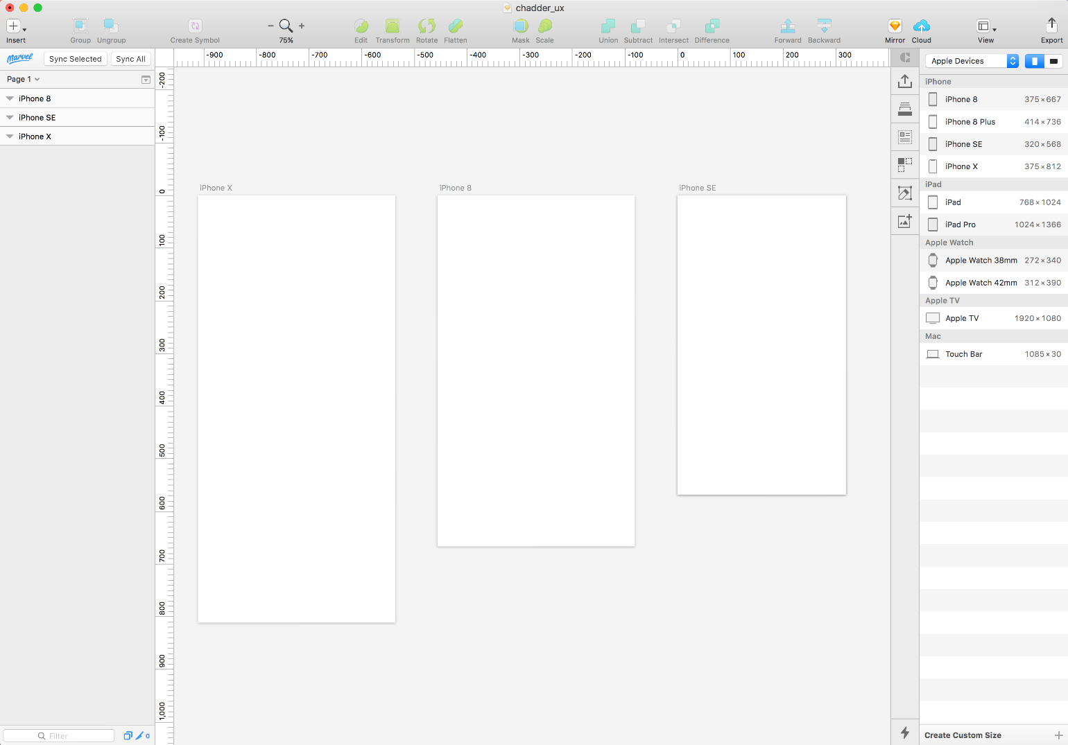
With both Sketch and Adobe XD, you can create a new “page” and define which type of device you're creating for (iPhone 8, Android, Responsive Web, etc.), and immediately have the right aspect ratio in front of you. All of the tools are easy to figure out, and dozens of tutorials exist online to help. Check out Figure 6 to see how Sketch handles setting up different screen sizes and artboards.
Here's where intuitive interface concepts come into the picture. What those are depends on the details you gleaned from the user interviews. Spots where your demographics felt frustration or confusion are ripe for an interaction shake-up. Play around with different concepts, making sure to steer clear of things that feel too gimmicky.
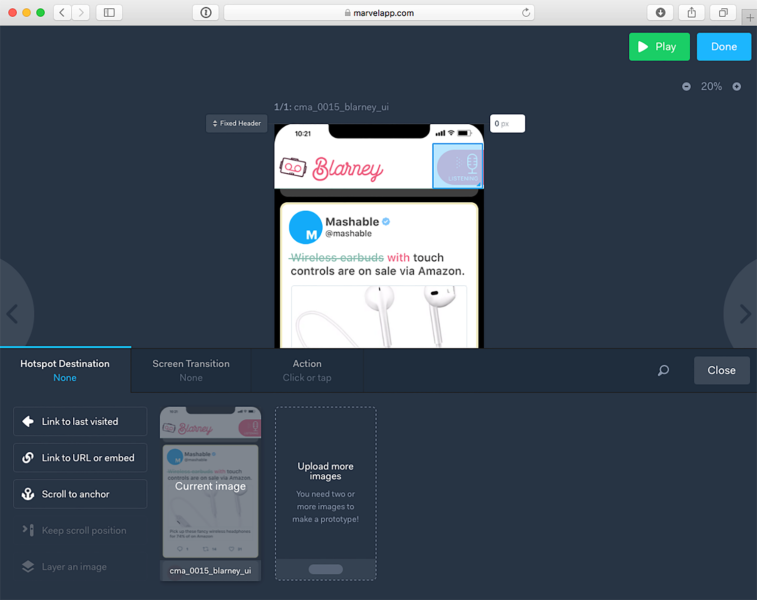
Magic really happens when you take those pages and push them into Marvelapp.com, Invision.com, or, if you're using Adobe XD, publish to Adobe's own Web server. Marvel, Invision, and Adobe all do the same thing: They let you connect flat images to one another as if they were real pieces of software. With these tools, you can have a “login” button that takes the user to the “logged-in” version of the application or show a user what a scrolling news feed looks like (see Figure 7).
Interactive tap-throughs not only make A/B testing more useful but also help creators figure out if their flows make sense in the bigger picture.
For high-fidelity designs make sure that the right screen size is used. For the Web, this can be forgiving, but for mobile apps, screen size matters. Popular software, like Sketch, lets you define the type of screen you're hoping to design for, so picking iPhone SE or Android or similar gets you the 1x version of that screen. For SocialFeedReader, handling the UX of main user feed was vital.
The 1x screen is where assets start, and during the exporting process at the end, the assets are cropped out for 2x, 3x, MDPI, HDPI or whatever sizes are needed. All of this starts with 1x sizing as a baseline, so make sure your team is getting this right.
Don't just look up a device's resolution on the Web and think designing to that will work. You'll be kicking yourself later when all of the artwork has to be resized.
A/B Testing
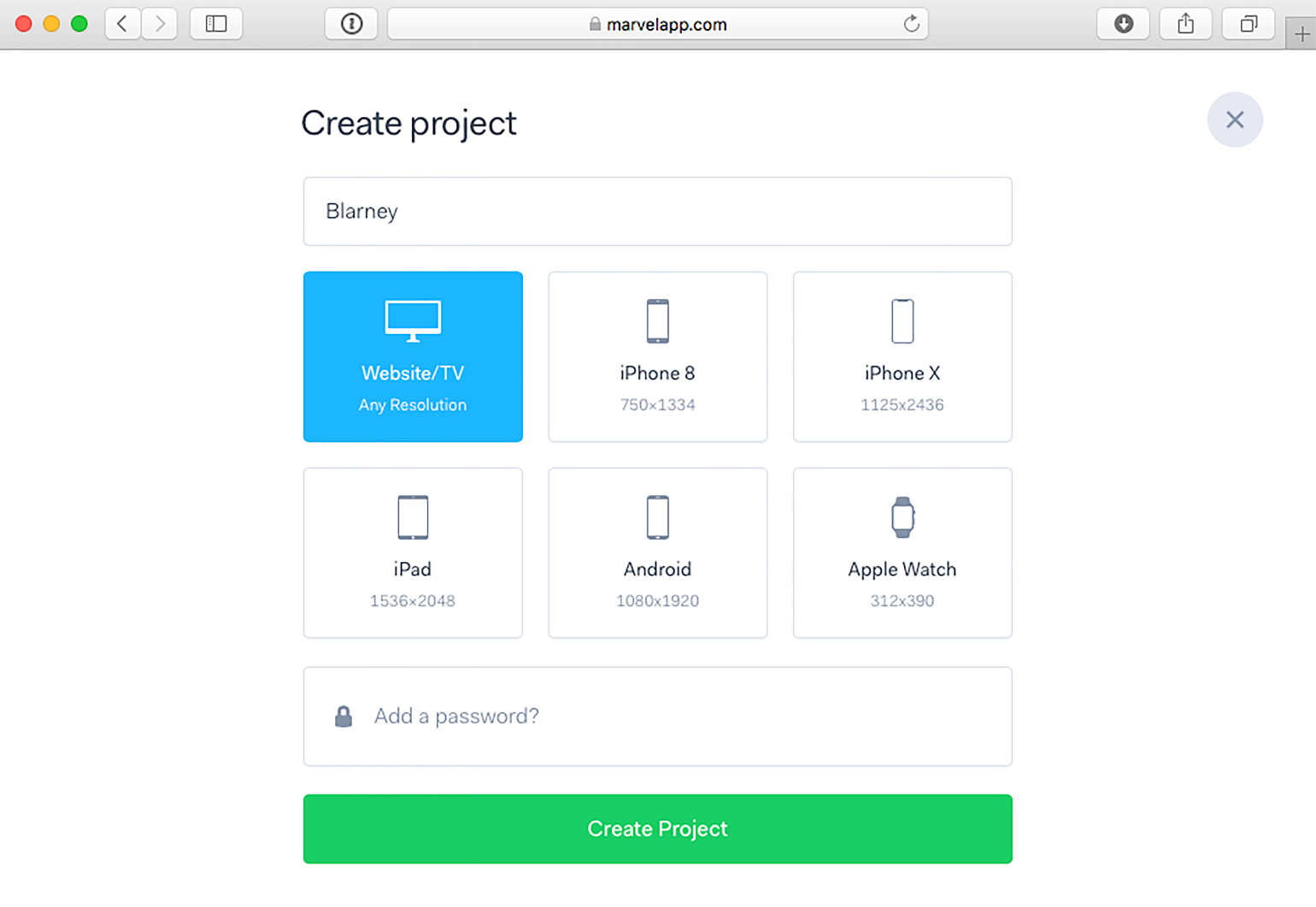
A/B Testing is a fancy name for the process of seeing which item/flow people like better. For best results, a large group of people are shown either A or B, give their feedback on what they used, and then the data is tabulated. Most of the time, getting enough folks available for a truly blind A/B test is tough. Instead, many test subjects are shown both A/B options and asked to provide feedback on which they prefer. (For a look at how Marvel App does this, see Figure 8.)
However you do it, A/B testing in any way is going to put you in a better spot than had you merely built the software based on your own biased uses. Making sure your project works for a wide audience can only help user-adoption of the software. That's the goal.
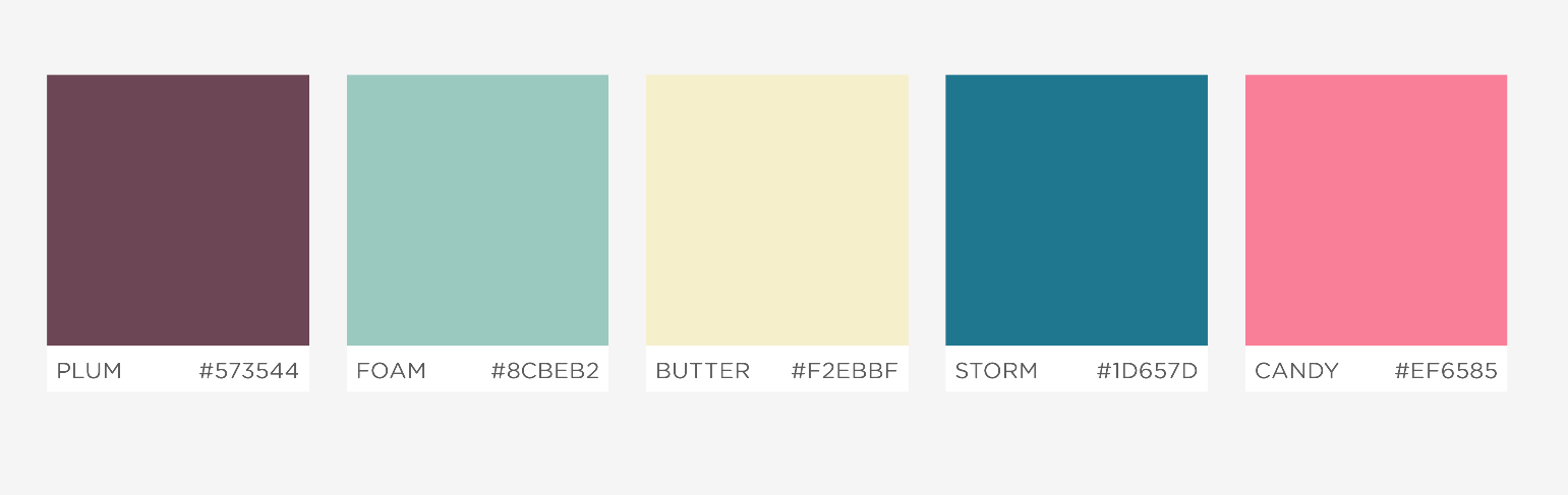
A/B testing for UX should focus most on making sure that users understand how things flow from screen to screen, general placement of objects, and whether or not the solution is clear to the user. To help ensure this, keep high-fidelity wireframes monochromatic in order to keep conversations away from things like color palette choices. Additionally, use the same font throughout, and only use variations of bold and font-size to differentiate items when it's useful to the UX.
Whether your monochromatic palette is shades of blue, shades of gray, or shades of green, keep it consistent. You don't want prejudice against colors or combinations to get in the way of conversations about flow or functionality.
Take a Deep Breath: The UX is done
Enjoy a moment of relief because a lot of the hard problems on the project have now been figured out. Sadly, much remains to be sussed out. Happily, the base of the software is defined in a systematic, structured way that means the project will be able to grow and pivot more easily. Far more is now known than is unknown.
The next phases of the project are defining the brand, personality, distinctive user interface visuals, and then getting everything ready for pixel-perfect art implementation during development.
Generic Software Is a Bore to Use
“It just?feels better.” Most likely, you've heard this phrase when someone tried to describe why they prefer one piece of software over another. Although it may have seemed like an unquantifiable subjective viewpoint, the truth is that aesthetics, fit, finish, and polish are what drive most winners in the software world.
The software we tend to use has a strong brand, and typically, a pretty interesting personality. Usually, our favorite apps provide little moments of gratification for performing various tasks, and they have easy to read text, and, most of all, consistent visual elements to create a design language.
Whether it's Facebook, Salesforce, Basecamp, or Twitter, we all want software that does things in a beautiful way.
Developer-created software is like store-bought cereal. Kellogg's Frosted Flakes isn't any tastier than Great Value Sugar Frosted Flakes, but you know which one you'd rather eat. Maybe it's Tony the Tiger or something else, but you're drawn to the brand.
Engineer-driven applications rely on a set of checked-off features to attract users. Substantial software brands, however, have a memorable brand, a distinctive visual identity, and either a design system or brand guidelines that drive the aesthetics of the project.
Maybe you don't think it matters if your fonts all match or if the margin on rows is always the same. Think that way, and you're throwing away every hard-worked development hour. People may not be able to point out those specific problems, but they can tell you “something about this feels?cheap.”
Apple became the world's largest software company by focusing on putting user experience first, and then letting the engineering team figure out how to make it happen.
Defining Brand and Personality
Amazon isn't named OnlineBookStore, and eBay isn't called OnlineAuctionWebsite. Naming, branding, and personality come from a lot of places, but typically, it's about resonating with a particular audience.
Jeff Bezos wanted a company that would sell everything from A to Z, and the name Amazon evoked a sense of grandness. It's a bold choice for branding, but it's a lesson that we can all follow. Think of the brands you love, and most of the time, it isn't always clear what they do. Often, the name of a product becomes synonymous with the action or product, such as Googling or Tweeting something. In the year 2000, these words would have sounded like nonsense. Heck, maybe they still do.
Of course, a catchy name isn't a requirement for, or guarantee of, success. Salesforce is pretty on the nose, as is IBM or Whole Foods. So how do you start to figure some of this stuff out?
Great branding can be built from mediocre names, such as Microsoft or Gap, but often, a unique name goes hand-in-hand with an unforgettable brand, as we see with Instagram or Twitter.
Re-visit User Interviews and Competitive Analysis
During the UX phase, you did a significant competitive analysis of the current software landscape. Was there a particular visual style that seemed consistent across the competition?
If so, you can either follow-suit or choose to shake things up by being creating a disruptive brand that's unexpected.
How do you pick? User interviews and user personas should guide the way. Who is your primary psychographic and demographic? Do you need to appeal to an audience that loves the outdoors? Or is it a more unisex product where legibility for those with bad eyesight is most important? In some cases, you may need to consider playing into a specific gender stereotype because that's your primary audience. Whether it's politically correct or not, there's a reason that the sports supplement industry feels hyper-masculine; it's because marketers have determined that this is what repeatedly draws in their buyers.
Design is about communication. You can't communicate if people won't engage.
A/B Test?to a Point
Design by committee is garbage. Every designer will tell you this, and eventually, you'll have to be the ultimate decider of the right choices. The benefit of A/B testing is to help inform your decisions by giving you real feedback from potential users.
Use the A/B groups you have previously tested with, as well as new individuals who haven't been exposed to your materials before. See what direction resonates with these groups and individuals. Your gut instincts matter here, and ultimately, you'll be responsible for interpreting their advice to make sure you head in a direction that feels good for your audience.
A word of caution: Avoid analysis paralysis because you will never please everyone all of the time.
Don't be afraid to be bold. Meek requests never get fulfilled. Middle-of-the-road brands that look like the rest of the competition never get noticed.
Be bold. Be strong. Be distinct. Make powerful and memorable claims in your brand statements and back that up with equally delightful visuals.
Professionals can help. If you're not handling design duties yourself, make sure to stay clear of $99 logo farms or $5-gig websites. Places like those are full of people who have a collection of stock materials that they just regurgitate for clients. Your product could be indistinguishable from all the rest, or even worse, you may end up paying for someone else's logo.
Amazing artists don't give their work away for free, any more than skilled developers would. Professionals get paid for what they do. If you want your work to stand out, you need to pay for the skills to help it get there.
If you want your work to stand out, you need to pay for the skills to help it get there.
A talented creative partner could be the catalyst to beating the competition. Don't be afraid to give them a big chunk of equity if you can't afford a solid hourly rate. Just stay clear of insulting them with requests for free work for exposure. Exposure doesn't feed their kids and a good artist has lots of opportunities to work on projects at a substantial rate.
Trademarks and Copyrights. Hire a lawyer for this, because you'll need to do a real search and file the right paperwork. Not seeing a product on Google or the AppStore doesn't mean much of anything. You want to make sure you can own the rights to use whatever great brand you create. The worst day ever is discovering that you've spent the last 12 months writing code, and not only are there three other products just like it already on the market, but that you're being taken to court for infringement by a massive company that funded one of them.
For names, do this search early to make sure you don't base your entire company on a brand you aren't legally allowed to use. Or that someone else is using for chewing gum.
Name the Sample Project
Most people I meet with already have a name picked out for their project, and almost always, they are pretty attached to the name. For the sample project, my initial thought was SocialFeedReader.
A quick search on Google reveals that the name SocialFeedReader is used for a poorly branded social media private messaging application. So at this point I have a choice: Either come up with a new name or move forward with SocialFeedReader, knowing that I will have to compete in Google searches, that I will have to fight for social media handles, website domain, and probably a dozen other points of contention.
If I choose to move forward, that means getting a lawyer involved sooner rather than later. The existing app may not have a copyright or trademark, but they do have pre-existing technology and have been on the market, all of which plays into a court's decision.
As far as my thinking went and the name suggests, SocialFeedReader was intended to evoke a clear and simple social brand, meant for all audiences, relying heavily on illustrations of animal icons as heavy brand elements.
To keep that direction, a new name is needed. I wanted something whimsical.
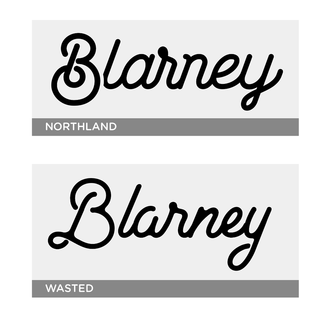
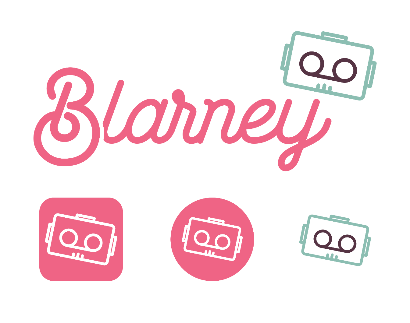
“Blarney” immediately came to mind. Both fun to say and memorable, blarney means “talk that aims to charm or flatter.” So, that fits the goals of the software, too. Plus, a search of Google and various app stores shows me that “Blarney” isn't being used by itself. Just saying the word aloud immediately caused a logo concept to materialize in my head, as you can see in Figure 9.
Lawyers and research are still needed to lock the name in, but I'm far more confident in Blarney than I am with moving forward SocialFeedReader. And, now that I think on it, I like it even more. Blarney is more interesting than SocialFeedReader, which is a descriptive name, but nothing more.
Does this naming process seem arbitrary? Yeah, of course it does. Sometimes, you come up with a great name that really fits your product, but most of the time, you're seeking something distinctive and memorable. You want to own a certain portion of your audience's mind, and the more distinct a name is, the higher that likelihood is too.
Remember not to get too attached to the first name out of your head. I've helped rename over 50 project, and it's followed a methodology a lot like the one I just showed you. A thesaurus can be your best buddy during this process.
Great Design Can Be More Important Than Any Line of Code
First impressions matter, and your product's interface is the first impression people get of your solution to their problem.
Mobile apps typically have about 30 seconds to one minute after installation to compel a user to keep using the software. Websites have even less time to impress, because tapping “back” is so simple. In-depth SAAS solutions may get a few minutes or so to make their case, but users need to see the benefit right away if you want them to keep going deeper. Most of all, people need to enjoy their experience with the solution.
UX does the heavy lifting for defining the project features, as well as the flow from screen to screen. In some places, UX will pick the size or placement for a button and it will be perfect. In other places, though, the UX will benefit from some finesse that the design phase can offer. If the UX works well, don't change it, but always leave room for design to make tweaks or changes that create a better experience.
Design is the closest the project will get to its final state before development. A good tip here is to have the designer, be that you or someone else, do their design work literally on top of the UX work. With software like Sketch or anything in the Adobe Creative Suite, the whole file or an individual element can be duplicated. Then, a designer can just lock the UX elements, and put their new pieces on top.
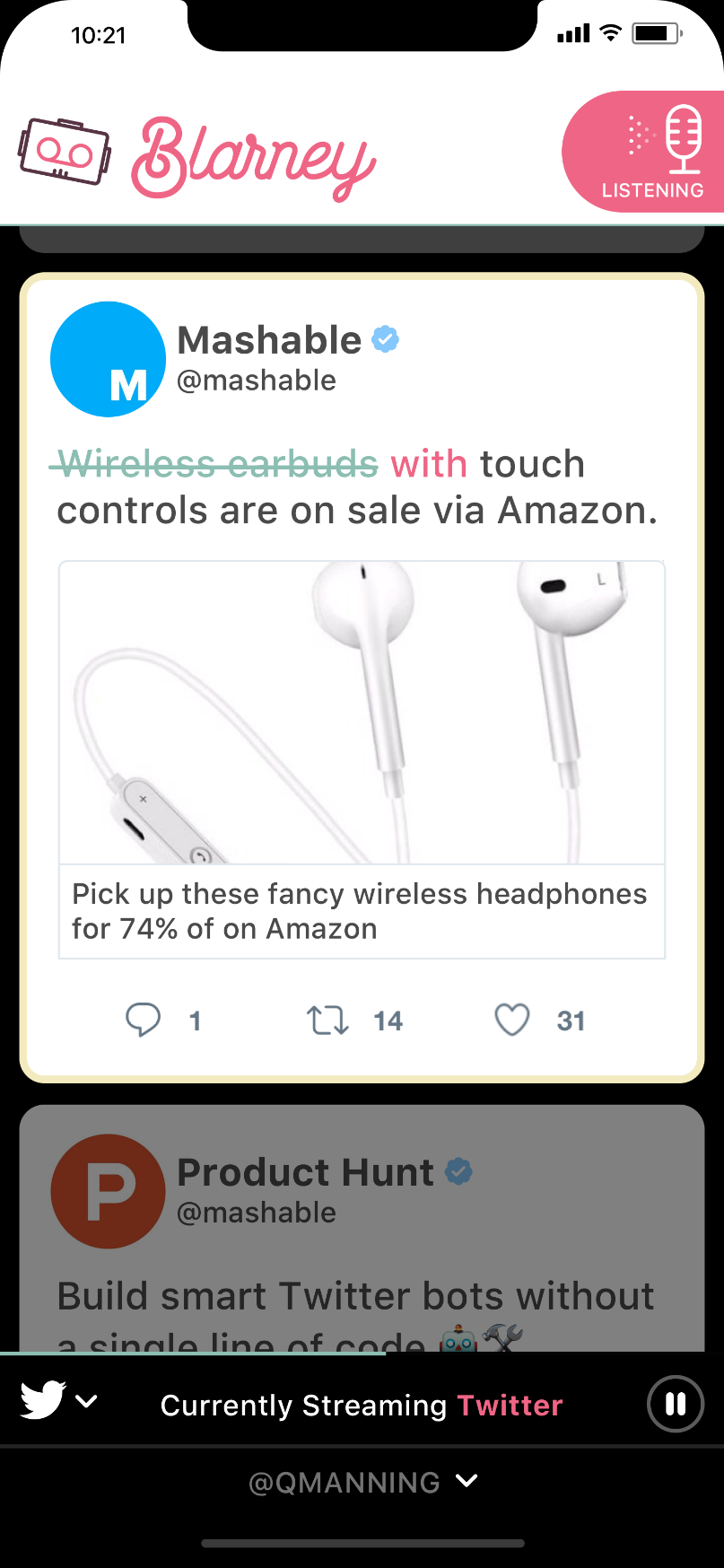
This makes for a great before/after comparison, as you can check in by looking back at Figure 9 and ahead at Figure 10.
Photos may get bigger, font sizing can change, button radii might get modified, but overall, the goal is to let the good work of the UX phase support the design work that's needed. After all, it went through A/B testing to find a great balance, so trust that good research even if someone else suggests tossing it away.
Fix the mistakes of the competition. Issues with interfaces drive a vast majority of user complaints. Take advantage of your research to improve in spots where the competition is failing. Users can be quick to change software if it solves a problem more intuitively, even if they have invested in the ecosystems (software, user accounts, training) of competing software.
Define a consistent visual language. Software isn't always linear, but the same functionality should have the same interface. Form fields should always look the same whenever a user encounters them. Buttons shouldn't change shape or color unless there's a potent reason behind a specific instance. User profile images should always have the same border radius and be of a consistent size. The margin from the left-side of the screen should be the same everywhere in the application any time text shows up.
This consistency creates a great user experience by defining a visual language. Consistent buttons mean a user immediately knows to tap that button. Similar header treatments throughout mean a user can quickly discern body copy from header copy. Defining a color palette that can be used throughout helps familiarity, as seen in Figure 11.
Muscle memory patterns are magic. Everyone runs the mouse cursor over words with underlines. This is muscle memory, when the body reactively performs a series of actions, without the user putting too much (or any) conscious thought into the action.
This kind of behavior is muscle memory that's been ingrained in us since the beginning of the Internet. Muscle memory patterns help users accomplish hundreds of software tasks daily, all without really thinking about them.
Consistent design leads to muscle memory. Your job is to create a few consistent muscle memory patterns for significant actions in your software, so when a visual cue appears, your users immediately know to react. Create new muscle memory points where needed, but don't rewrite what the operating system or trendy platforms are already doing.
Pull-down to refresh is second nature. Don't make it “swipe left to refresh” just to be different. Users will instinctively attempt to pull-down, so let them. Piggyback or borrow good ideas from prevalent software like Snapchat, Instagram, Facebook, or others. If you're doing the same thing they are, there's no reason to break the mold.
With all of this, be wary of copyright infringement. Any iconography, imagery or symbols you see are brand distinctive, and you shouldn't simply copy them. Want to use a head for a User Profile Icon like Facebook does? Great, but design your own that isn't exactly the same. For icons, a great resource is The Noun Project (http://thenounproject.com), which has a lot of options you can purchase. Even your logo and branding can be influenced by the competition, as seen in Figure 12, but still has these potential concerns.
Some software interactions are patented or are protected by copyright, though if it exists as part of the operating systems Human Interface Guidelines (HIG) or is part of their coding standards, it most likely falls under fair use. Always double-check to make sure.
A different OS means different interactions. Web apps can be platform-agnostic in their design. Mobile software needs to take heed of what each OS does differently.
For instance, iOS has a Las Vegas-style picker wheel that pops up instead of a drop-down menu. Android has a small, scrollable action sheet instead. The iOS apps tend to place the navigation along the bottom of an app. Android software puts that navigation at the top or within what's known as a fab menu (the little circle you see at the bottom of Google software, the one you tap and a new menu pops open).
Operating systems change regularly, and with it, the HIGs do as well. Currently, Material Design is a big mover in the Android world, where an object (such as a fab) turns into an overlay when you tap a button. Note that iOS doesn't use this concept, so although there are pieces of software that use it, there's a learning curve for iPhone users.
Tapping into what an OS user expects will make your app “feel right.” Making an Android owner use an iOS-style picker wheel feels “odd.”
Animation Frameworks Are Pretty Cool
Hundreds of animation frameworks/libraries exist that are available to your project. Choosing one can save dozens to hundreds of hours of development and give your software some polish.
ASMR (autonomous sensory meridian response) is a bit of a buzzword in 2017, but tapping into the phenomenon sets some of the most popular software parts from the competition. Think of it as a sense of gratification or satisfaction; ASMR is that pleasant tingly sensation you get from believing you have accomplished something.
Animation sequences help create these moments of ASMR in software. For better or worse, this is some of the same psychology that Facebook and others have used to create “addiction” in users. It's ASMR that makes Tinder feel so satisfying, as you complete the task of swiping left or right.
Animations are in all your favorite apps. "Favorite "something on Twitter and the little heart explodes. Swipe away an email with Google Inbox and watch a series of cascading animations as the row disappears, the rows beneath it move up, and a Material Design Toast (small notification that pops up like, well, a piece of toast) appears to let you know the action has completed, and you have a short time to “undo” that action. Open your phone or go to your favorite SAAS website and you'll see this ASMR in action.
Even the simple act of a link transition fading from one color to another can fire-off this response. ASMR is deployed everywhere in modern-day applications because it adds to the user's sense of things processing as they should.
ASMR is deployed everywhere in modern-day applications because it adds to the user's sense of things processing as they should.
All of these items can be created from scratch, but using an animation framework (or multiple libraries) can help designers pick specific interactions for specific actions, and have those deployed verbatim by a development team without hours of back and forth tweaking.
Some frameworks, like those based on Google's Material Design ideology, serve as a design system, a brand guideline, and as an animation framework. If Android is your destination, using one of these structures is a no-brainer. Even if your output is on the Web, you get access to some well-thought out, delightful interaction points.
Here are a few great frameworks to look up and test out:
- Material Design Lite: https://getmdl.io/. Official Google framework, this is a lightweight Material Design framework for the Web
- Polymer: https://www.polymer-project.org. Also, an Official Google project, if your output is Ionic, this is for you.
- Angular Material: https://material.angularjs.org/. Maintained by a team in Google, this is great if you're using the Angular.js.
- Animate.CSS: https://daneden.github.io/animate.css/. A ridiculously lightweight set of CSS animations that can easily be deployed in any Web-based project.
- Hover.css: http://ianlunn.github.io/Hover/. A large collection of hover-effects for the Web
- Vivus.js: https://maxwellito.github.io/vivus/. One of my favorites, Vivus.js animates in SVG objects on the Web.
- Lottie: https://github.com/airbnb/lottie-ios. For the designers who want to design their own screen movements. Created by AirBNB, Lottie is a library that turns After Effects animations into animations for both iOS and Android.
- Facebook Origami: https://origami.design. A prototyping tool that helps you animate iOS and Android interactions and transitions.
- Facebook Pop: https://github.com/facebook/pop. An animation Framework that was used in the late great Facebook Paper.
All of this is just the start. Simple Google searches can find so many more examples that all you'll need to do is decide on one that can work as a shared language between the design and development team.
Final Screens Get You Closer
Once the last designs begin to materialize, it's time to get another set of interactive tap-throughs created.
A good rule of thumb is to duplicate the existing UX tap-through, then begin replacing screenshots with the final designs as they start flowing in. This way, no vital screens are forgotten during the art phase, and as a user taps or clicks through, they won't run into a dead end where something wasn't designed. UX screens can serve as a backup in case a final artwork file isn't there.
Design A/B testing should still focus on flow and placement, but with much of that figured out during UX testing, your real goal is to make sure that the choices made will resonate with the userbase. Or, hopefully, that you haven't broken any of the functionality validated during UX. Figure 13 shows gives some insight into the Marvel App interface for creating a prototype for A/B testing.
For design A/B testing, you want to validate the changes you made that aren't necessarily UX. Anything can be A/B tested, either solo or as a series of new questions during user interviews. Some of these key items are:
- Logo
- Font
- Colors
- Tone of voice
- Margins
- Text treatments
- Overlay styles
- Tutorial Styles
- Animation implementation
Be wary, however. Design can be polarizing, and someone may detest what you show them simply based on a dislike for the color palette. Test with enough users that you can find commonality and clear and repeatable feedback.
If one user dislikes your iconography choices, that's subjective. If 75% of people take issue with your icons, you have a problem. So how do you avoid allowing this feedback turn into “design by committee?” You take in everything you learn, and be the final decision maker.
Getting It to Development
Users have given you the thumbs up for your designs. Now all that's left is to make sure that the developers implement it correctly.
For many projects, this can be a desperate situation. UX artists and designers spend hours discerning what the right placement is for an element, or moving text back and forth, up and down, in order to choose just the right amount of spacing between it and other items on a page. Then, when it gets to development, it seems all bets are off.
Developers, by and large, aren't designers, and you shouldn't expect them to be. Looking at a screenshot, then picking out 5px of space versus 10px can be a significant pain. Now apply this to the dimensions of logos, images, font-sizes, and a hundred other items.
Exporting, also known as slicing or crop and compress, gives developers the assets and tools they need. Every single asset needs to be exported for use in development, meaning every logo, photo, icon, divider line, background or any other artistic element that the developer won't be creating in code.
File Set-Up
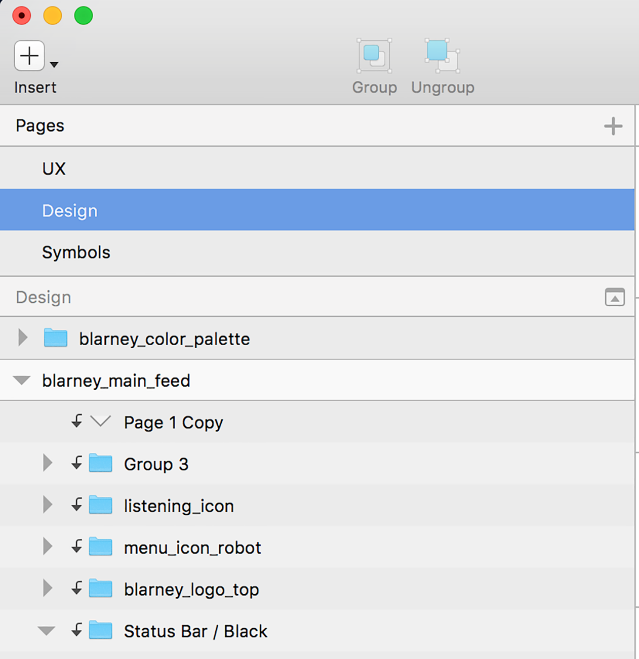
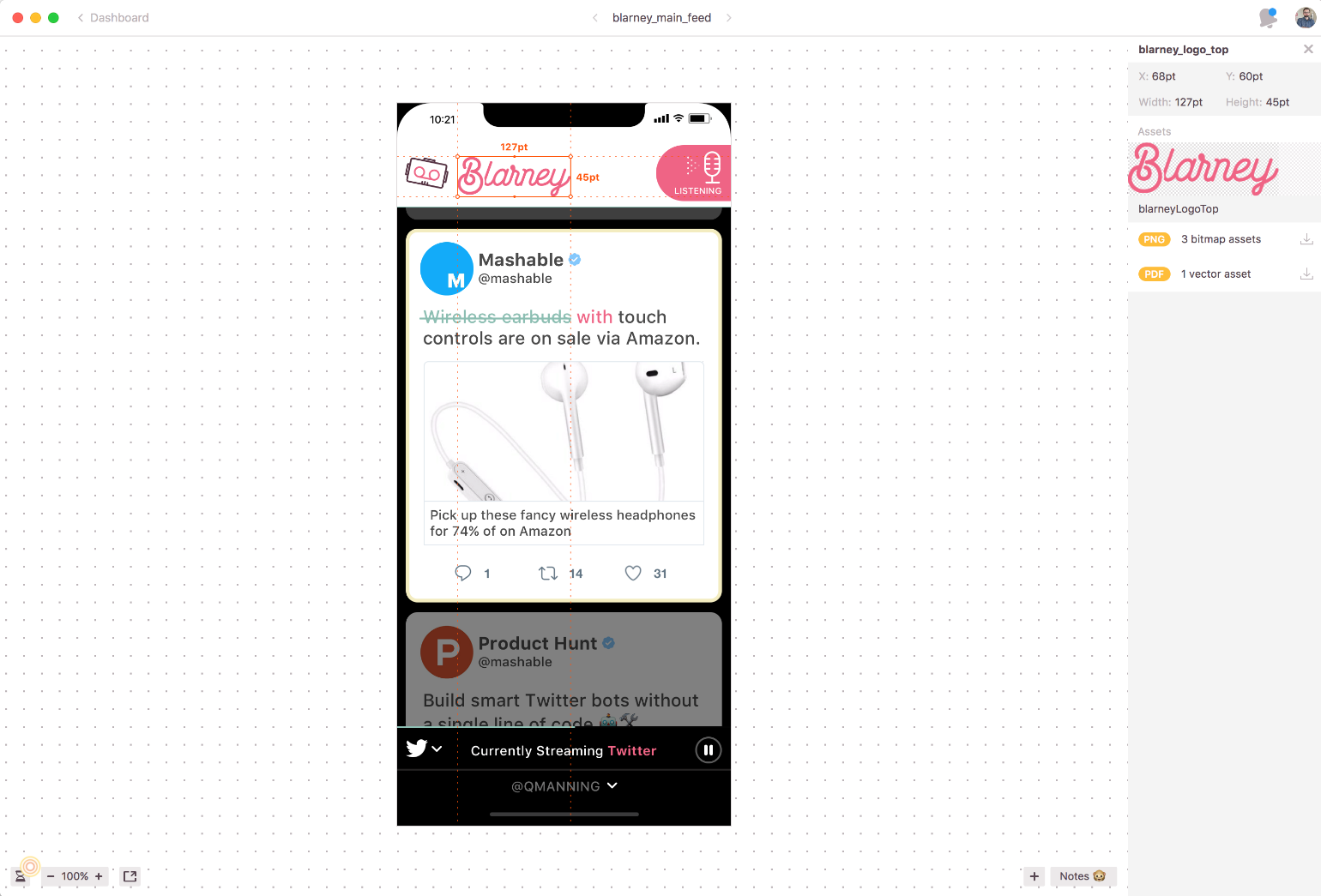
Using the software mentioned earlier, designers can group and name each of these assets on the screen, as you can see in Figure 14.
If it's going to be exported, it needs to be named. These are brought into the build of a project, so you need to make sure that the file names are correct.
Here are some quick tips for filenames that work for Android, Web, or iOS:
- No spaces
- Underscore (_) instead of dashes (-)
- Avoid using periods (.)
- Use all lowercase letters, not camelCase
For example, “header_background_image.png” is a good filename that should work for all platforms.
Exporting Files
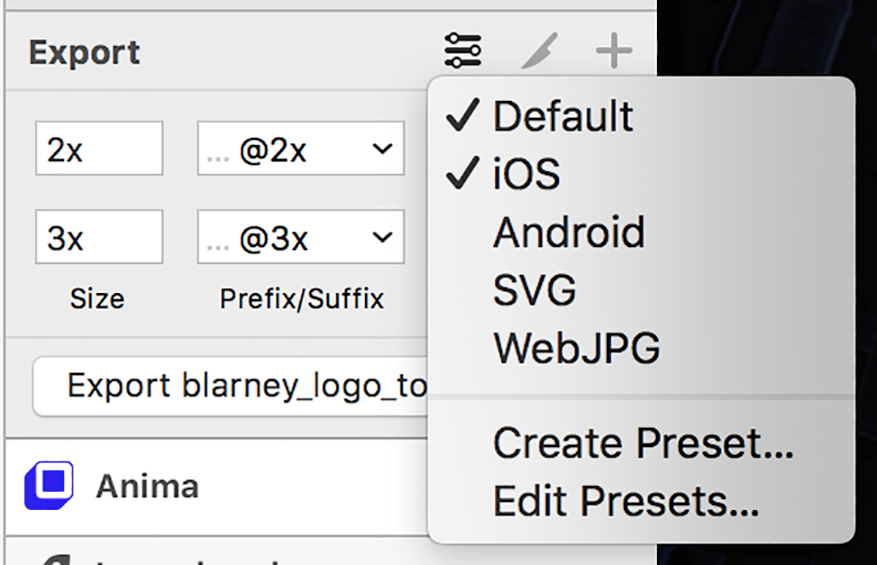
Depending on the software, the way you export varies. Sketch, on Apple computers, automatically appends @2x or @3x to assets, as well as places files into MDPI, HDPI, or similar folders for Android usage. These things save time on projects, and get all of the right resolution files to the developer with the correct names. Adobe XD, Photoshop, and Illustrator also now provide exporting of assets in various resolutions, although they don't offer the automatic folder creation that Sketch does, as seen in Figure 15.
For anything with a transparent background, like icons or logos, use PNG-24 or SVG. For any photograph, you want to use a JPG. These are good rules of thumb for any platform.
Optimizing Files
Whether dealing with website download times or mobile app package size, you want to have your assets as small as possible.
For icons, logos or items with a transparent background, the use of a vector SVG is ideal due to their small byte size, their ability to be resized infinitely with no degradation, and how they don't require any @1x or multiple DPI options. However, mobile operating systems may have issues with implementing SVG files without individual plug-ins or libraries.
With the launch of the iPhoneX and iOS11, Apple is now recommending using PDF files when possible. Like SVG, a PDF is just a vector file format. PNG files and JPG files need to be optimized as much as possible; otherwise, you can quickly get into the hundreds of megabyte size range. Use a PDF in the same places you would use SVG.
Whether PNG or JPG, numerous optimization options exist out there; my go-to service is http://tinypng.com.
TinyPNG is one of the few places that creates a lower-sized, color-indexed PNG-8 and gives it a true alpha channel. True alpha channels allow the PNG to be placed anywhere, on any background design or color, without the presence of any aliasing. TinyPNG can also optimize JPG, though choosing the right level of compression is typically a subjective decision.
Redlining Is Vital
Redlining is taking an art file and annotating all of the measurements on the screen. Include things like the size of graphics, the distance from one object to another, the size of fonts, and so on. Measurements like these ensure that your project comes across as pixel perfect.
Numerous options exist out there for redlining, but I use http://zeplin.io. Zeplin is a desktop/SAAS combo that takes a Sketch or other layered file-type, and automatically creates all of the necessary redline measurements for you. You can see the Blarney design in Zeplin in Figure 16.
Using Zeplin or other automatic redline tools can shave dozens of hours off of a project, while also giving accurate results that developers can trust.
Table 1: Define the sample project, called SocialFeedReader
| Detail | Answer |
| Project Name | SocialFeedReader |
| Project Type | Unnamed Social Media Text-to-Voice and Reply |
| Platform(s) | iOS, Android, with eventual Web |
| Audience | People who want to use social media while doing other things |
| Logline/Summary | SocialFeedReader is a service that lets people connect their social media accounts (Twitter, Facebook, LinkedIn, etc.), and have text-to-voice read-aloud social posts in real-time while using a voice-driven interface to allow for voice responses in return |
Table 2: Sample User Interview Questions
| ID | Questions | Follow-up |
| 1 | Name | None |
| 2 | Occupation | None |
| 3 | Gender | None |
| 4 | Income | None |
| 5 | Operating System/Type of mobile device commonly used | Any reason why? |
| 6 | Do they have the problem you are looking to solve? | If no, define why not? |
| 7 | Are they currently solving this problem with software? | If yes, move to question 9 |
| 8 | If no, why not? What prevents them from solving the problem? | Do they wish they could solve? |
| 9 | What software are they currently using to solve the problem? | What made them choose it? |
| 10 | What do they like/dislike about their current solution? | What could it do better? |
| 11 | Have they tried an alternate solution? | If yes, what? Why didn't they stick with it? |
Table 3: Simple user story template
| Column Name | Description | Example |
| Unique ID | Seems silly to tell you this, but you need an identifier. It's much easier to cut, discuss, or modify a user story by its identifier, rather than trying to describe it each time. | CHAD-0001 |
| Epic | Epics are collections of user stories that accomplish a goal. Think of it as a folder or container if that helps you out. | User Login |
| User Story | A user story is a specific task that needs to be accomplished by a user in the application. These should always come from the user's perspective, which is driven by the User Personas. | “As a user, I want the ability to use my email address as my username.” |
| Acceptance Criteria | What defines success or failure for the user story is your acceptance criteria. If there are any specific interactions, animations, or other concepts that need to make it into development. | Email address must be validated to contain both “@” and “.” characters |
| Dev Estimate | Estimate how many hours, or points, you think each particular epic, user story, and acceptance criteria will take to code. | 5hrs |
| Version | In what version of the project is this feature expected? Most features start out as Version 1, but by the end of the UX process, many of these get moved into Version 2 or later as the genuine MDP comes into focus. | v1 |